Search
MaxDiff (short for Maximum Difference Scaling) is a type of survey question used to measure preferences or priorities among a list of items. Instead of asking respondents to rate each item individually, MaxDiff shows them a smaller subset and asks them to choose the most and least important, appealing, or preferred item from that set.
In this article we will cover the following topics:
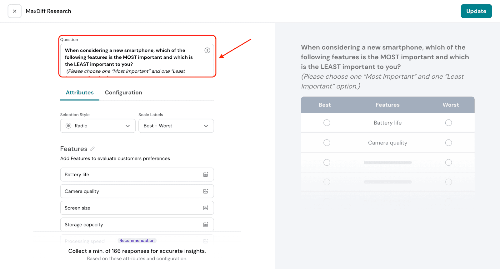
In a MaxDiff question, attributes are the items you're testing—these could be product features, service benefits, brand values, or any options you want to compare. They represent the things you want to know your audience’s preferences about.
A MaxDiff task might then show a subset of 3–5 of these and ask the respondent to select which is most important and least important.
For example let’s say a phone company wants to understand what features matter most to customers when choosing a new phone. They might consider attributes like:
These features are called attributes in a MaxDiff question.
MaxDiff helps you understand what truly matters to your audience. Instead of asking people to rate each item (where everything can seem equally important), MaxDiff shows a few options at a time and asks them to pick the most important and least important.
This forces real choices, helping you see clear priorities—not just general preferences. The result is more accurate and actionable insights than you’d get from traditional rating scales.
Lets see how to create a MaxDiff question.
3.2. You will be able to choose the selection style from Radio; Check, Cross; Thumbs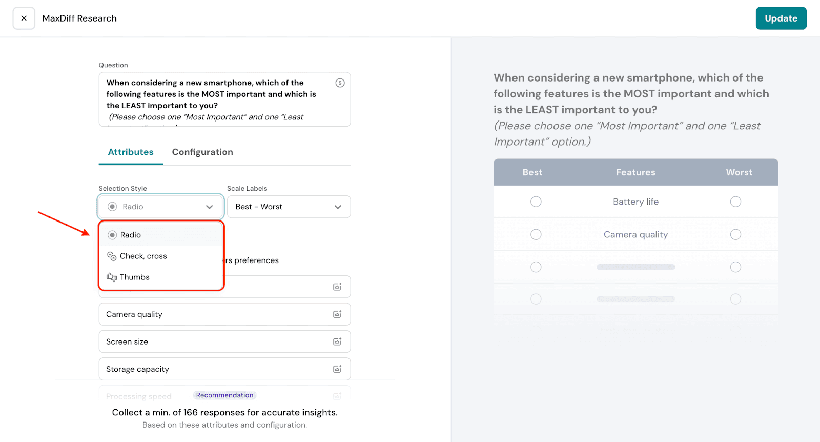
3.3. You can also choose the labels for the scale or even custom create a label.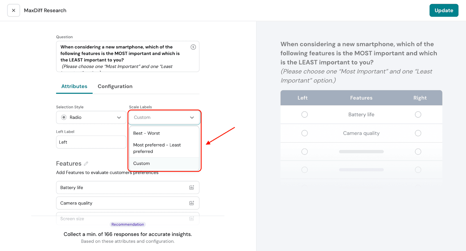
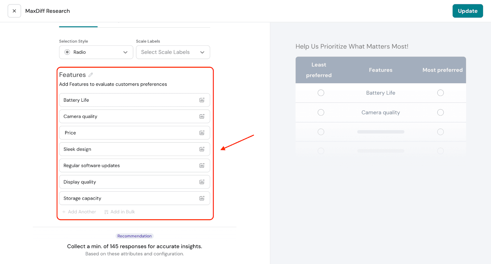
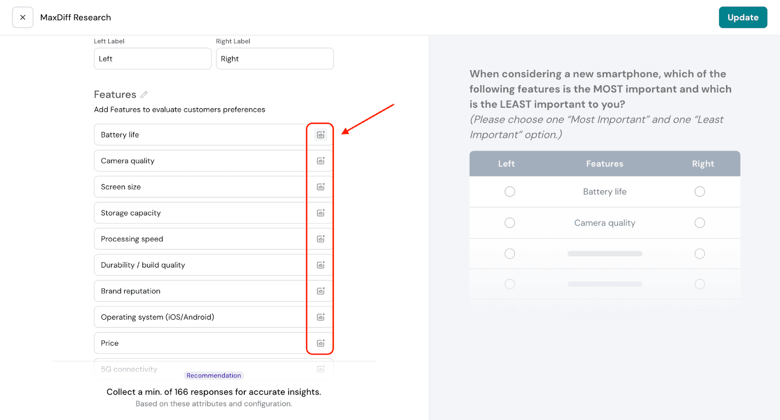
3.4. Under features, you will be able to add the list of attributes.
Note:
When you add an image, it replaces the text label for that attribute. For example, instead of showing “Camera quality,” you might use a photo highlighting the phone’s camera. If the image file has a clear name, you can choose to show the file name to make the option easier to identify.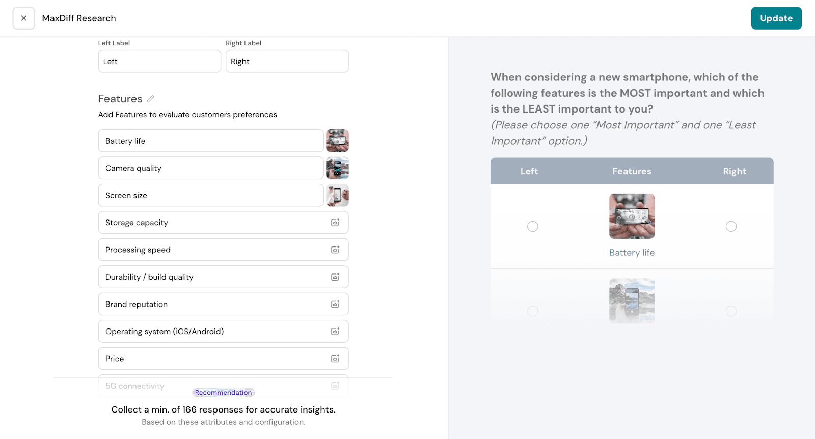
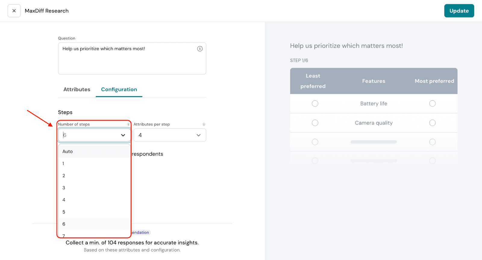
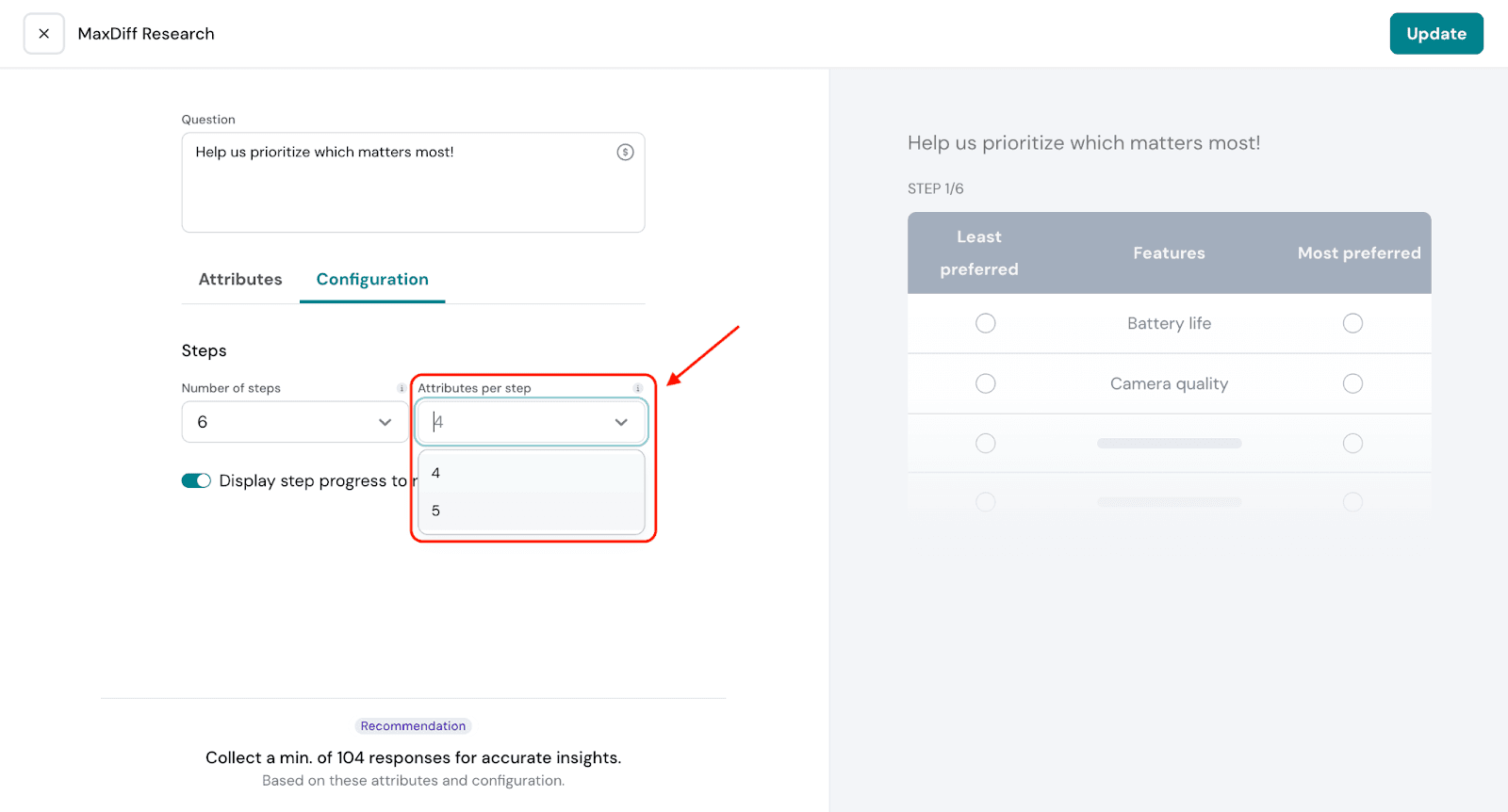
Under Configuration:
In the configuration settings, you can control two key aspects of your MaxDiff question:
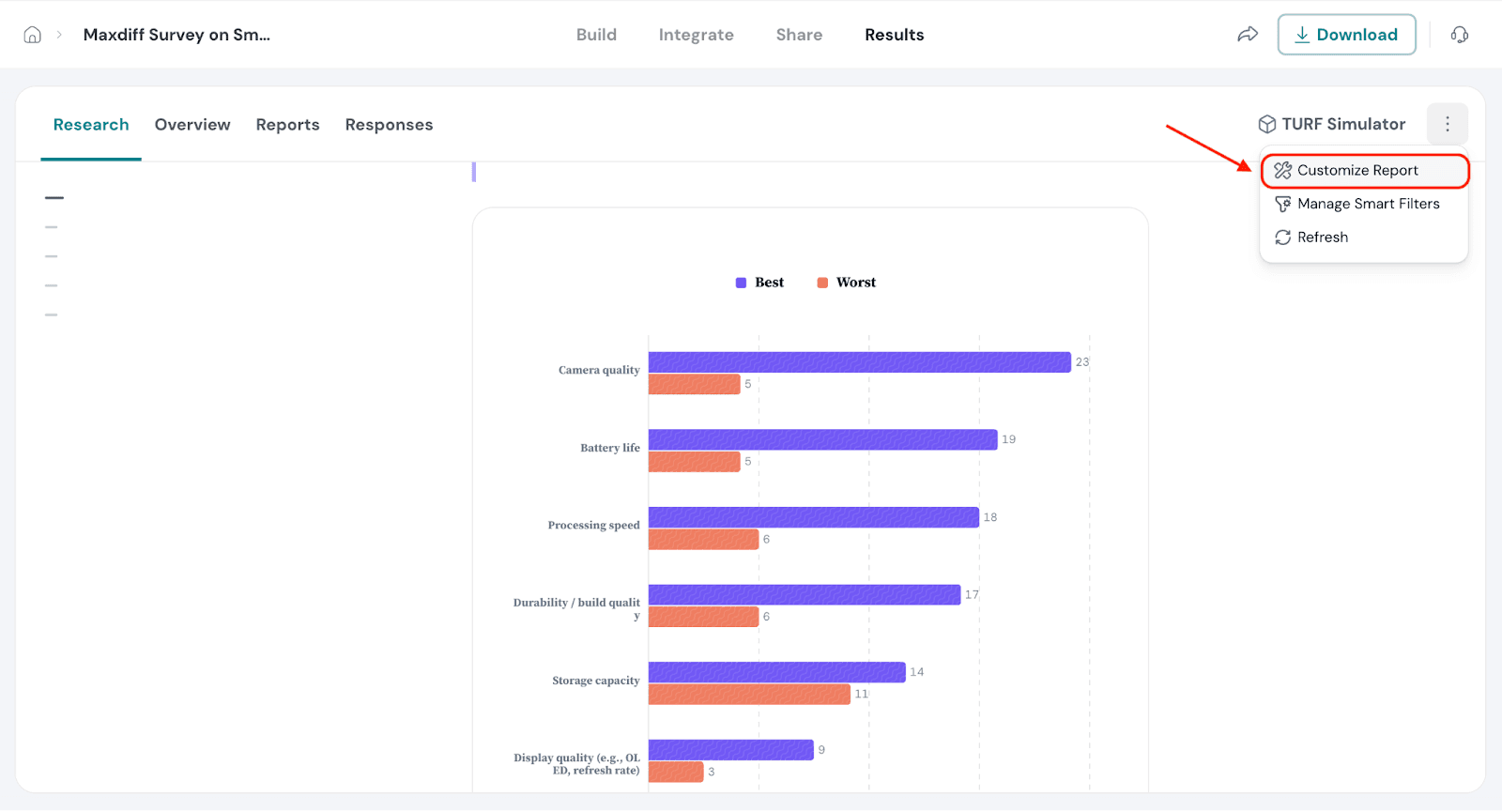
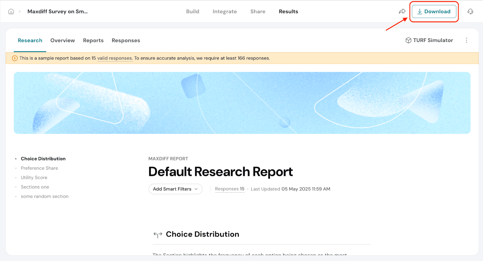
1. Navigate to the results tab.
2. Go to Research. Under Research you will have 3 main analysis - Choice Distribution, Preference Share and Utility Score.
You’ll also see the minimum number of responses needed for reliable insights. This is calculated based on how many features you’ve added, how frequently each feature appears across choice sets, and how many features are shown per set.
Meeting this threshold helps ensure your MaxDiff results are stable and statistically valid.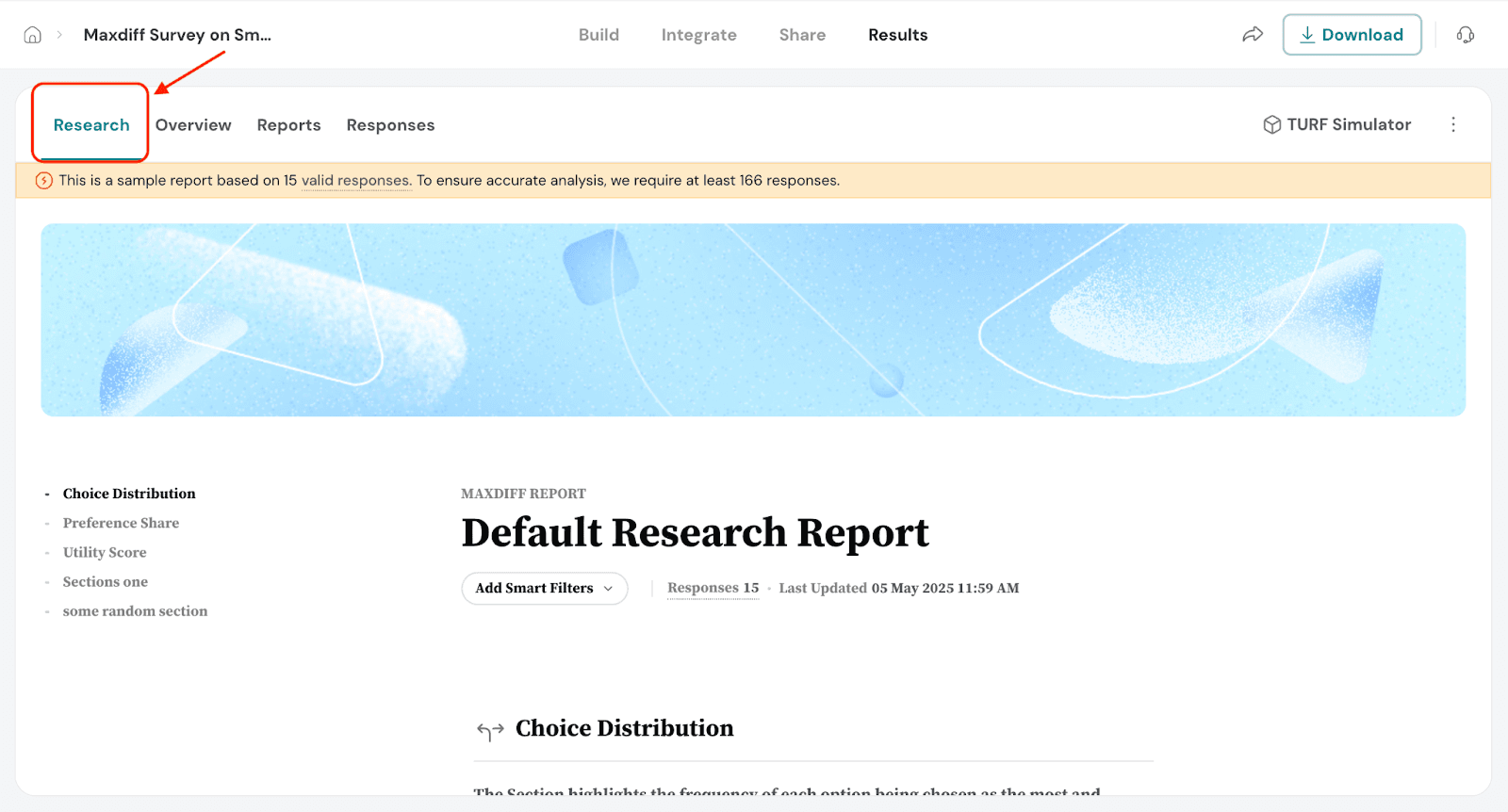
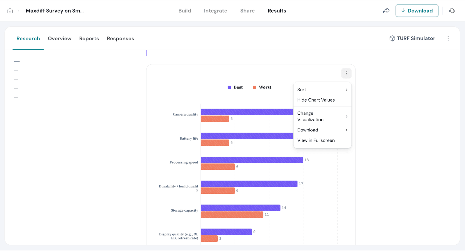
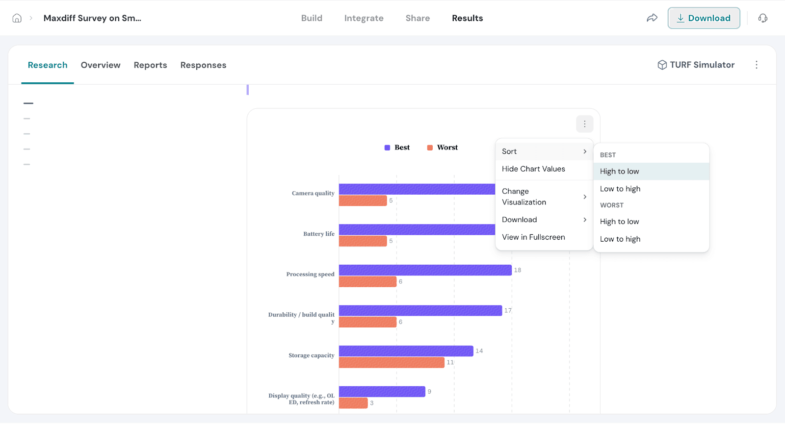
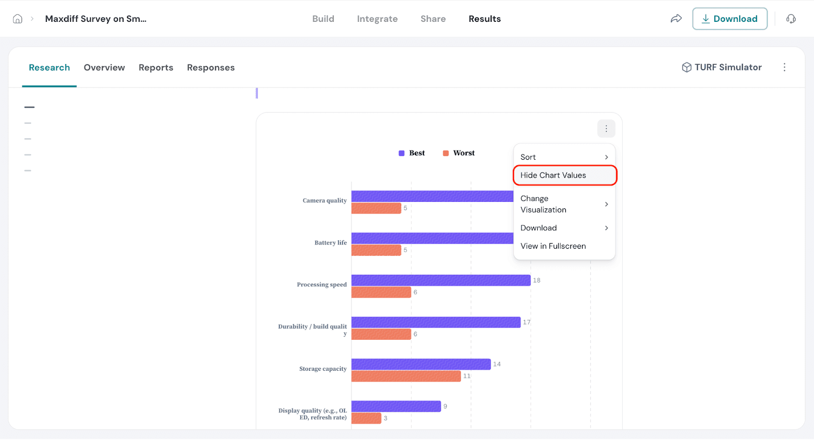
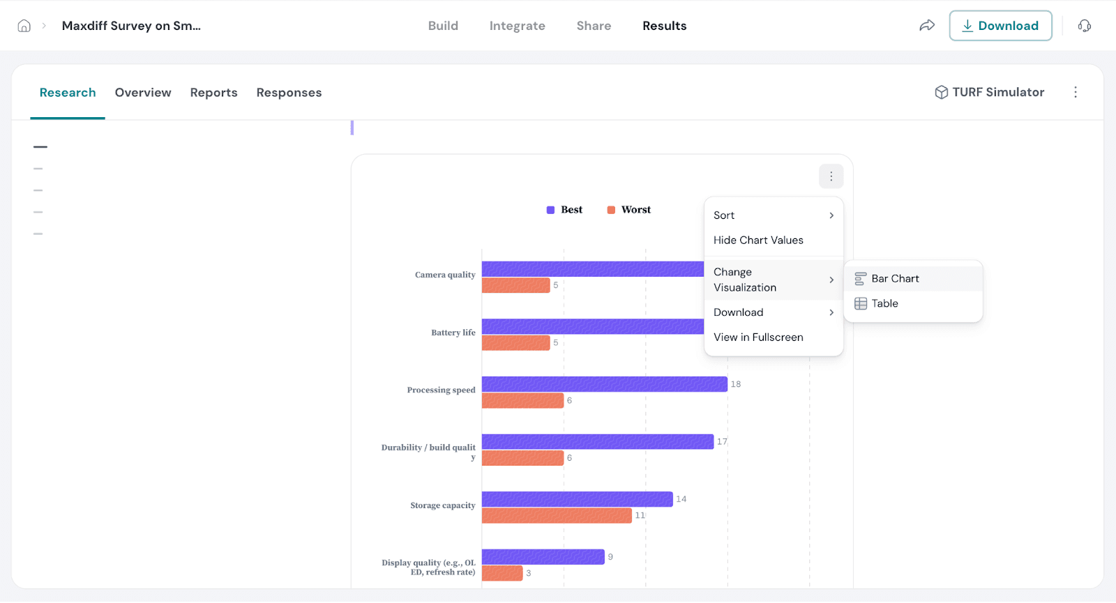
This highlights how often each feature was selected as the most or least preferred when shown to respondents. It gives you a quick overview of how each attribute performed based on actual selections, helping you spot which features stand out positively or negatively.
This section displays:
These details provide a clear picture of respondents’ selection patterns and overall preferences.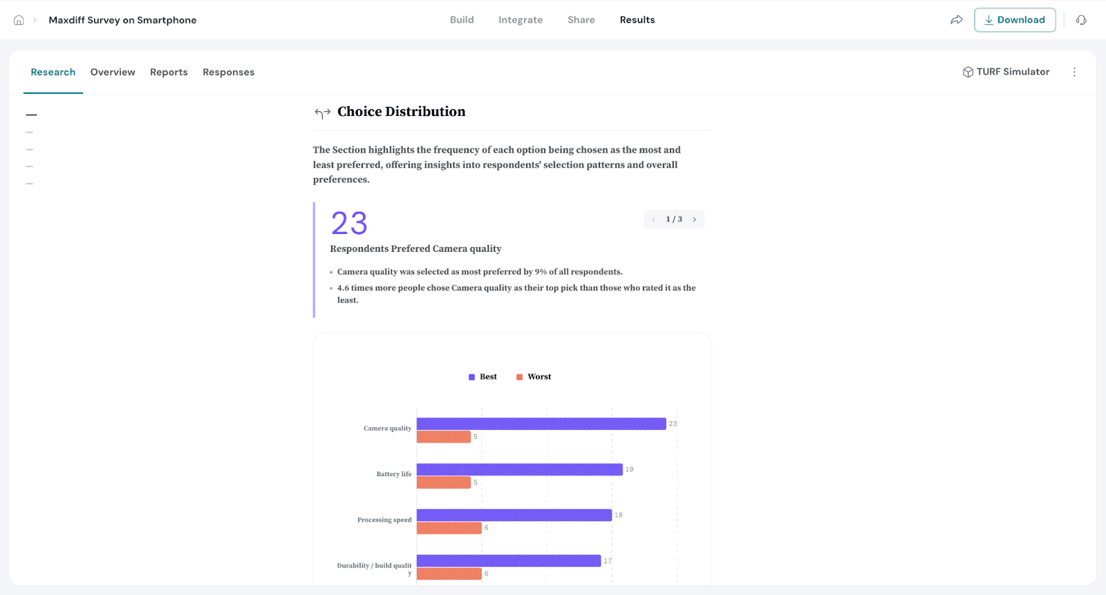
The Preference Share section shows the relative popularity of each feature based on modelled probabilities, not just raw selections. It represents how likely a feature is to be chosen as the most preferred when compared to all other options.
This metric is calculated using a statistical model that transforms utility scores into probabilities, allowing each feature to be compared on a common scale. The values are expressed as percentages, summing to 100%, and help pinpoint which attributes hold the strongest appeal across your audience.
You'll also see how each attribute compares to the average, making it easier to spot standout features—or those that may need improvement. This insight supports data-driven decisions around product design, marketing focus, and feature prioritization.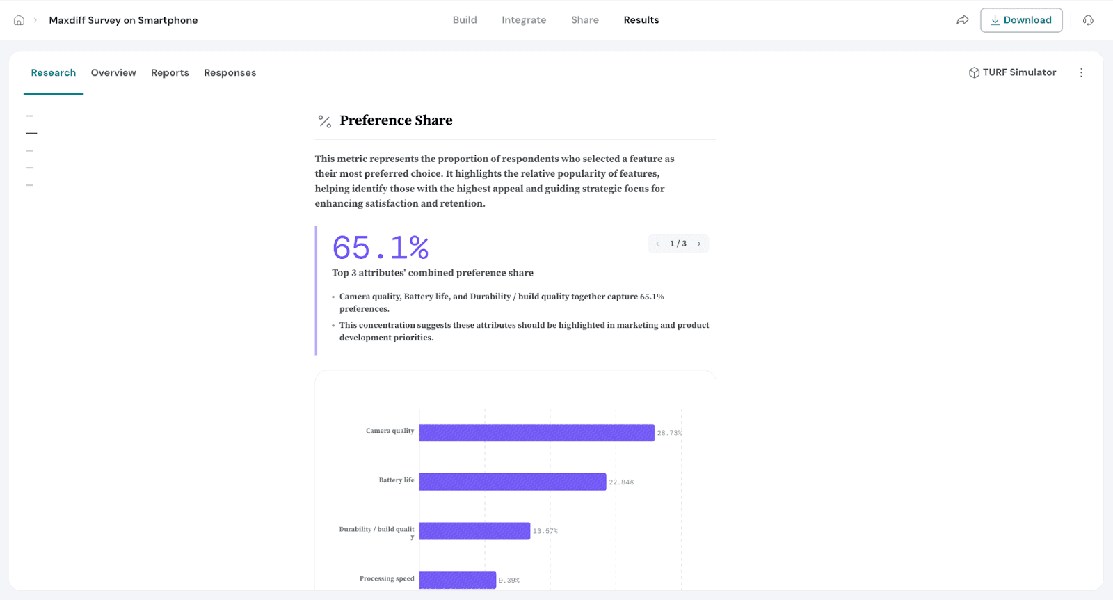
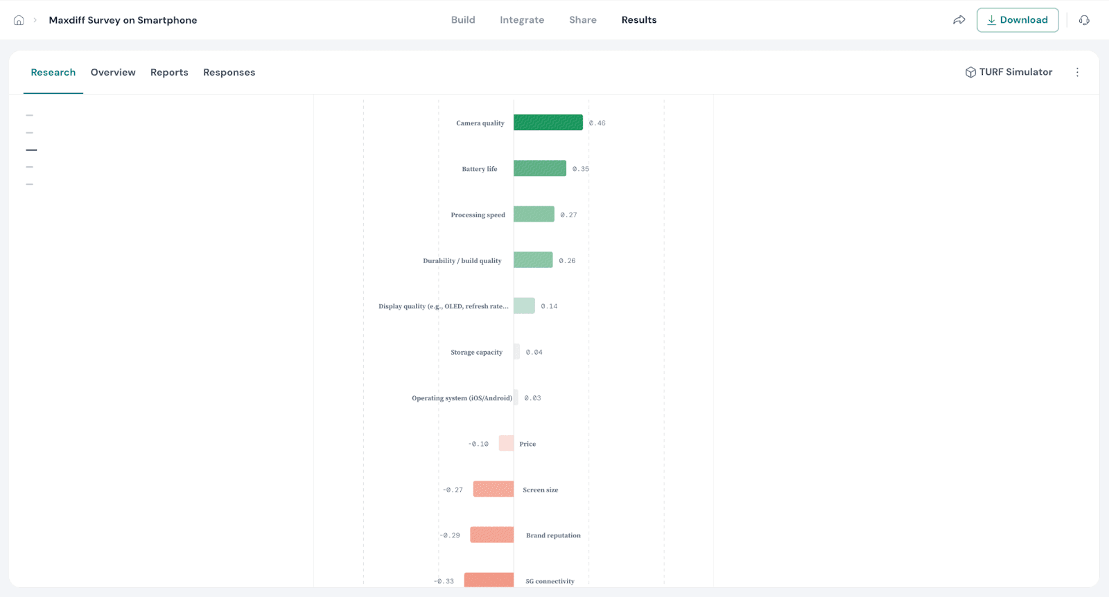
The Utility Score section shows the perceived value of each feature based on respondents' preferences. It reflects how much each feature is valued relative to others, with positive scores indicating greater appeal and negative scores suggesting less interest.
This metric is calculated using the Hierarchical Bayesian model that takes into account each respondent’s choices, adjusting the scores to ensure fair comparison across all features. The scores are averaged to give a clear view of each feature's relative importance.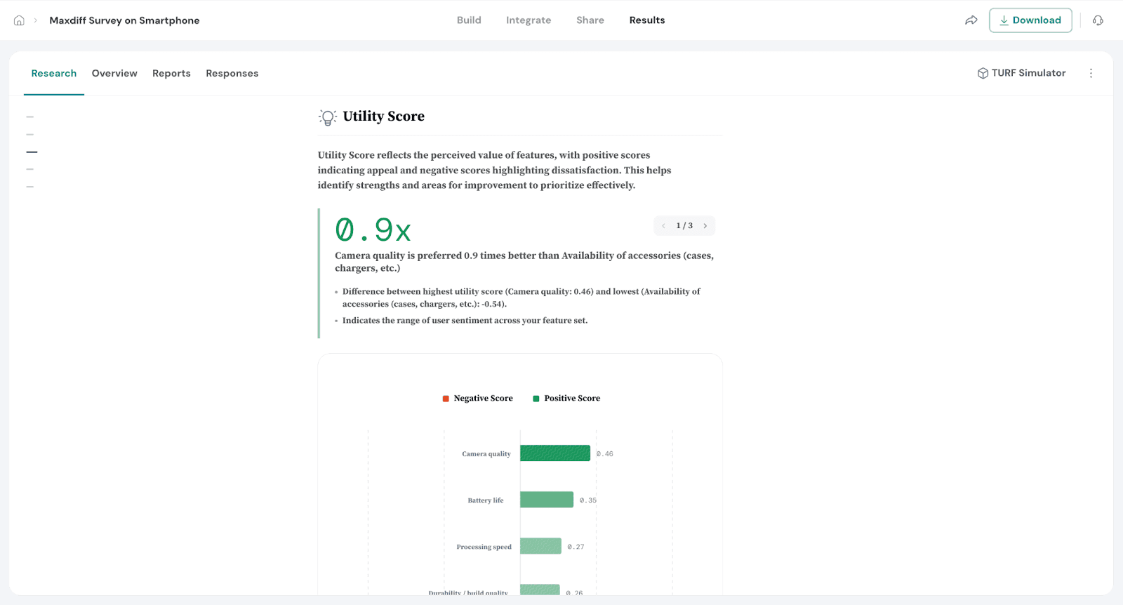
Smart Filters are especially useful when you've included additional questions in your survey. For example, if you ask respondents to share their age group, you can use a filter to compare preferences between younger and older age segments.
These filters help you focus your analysis on a specific group of respondents, making it easier to uncover trends, compare segments, and draw meaningful conclusions. Once applied, the filters automatically update your charts, tables, and exports to reflect only the data that matters to that group.
This saves time, reduces manual work, and ensures your insights are always relevant.
Lets see how to create Smart Filters.
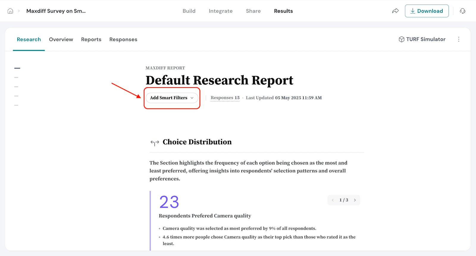
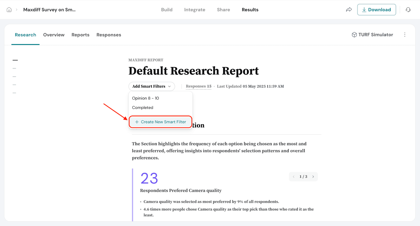
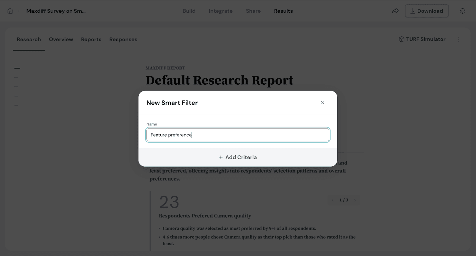
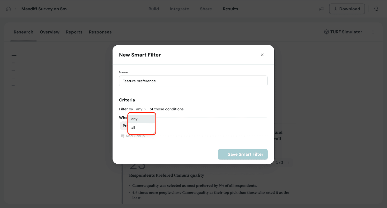
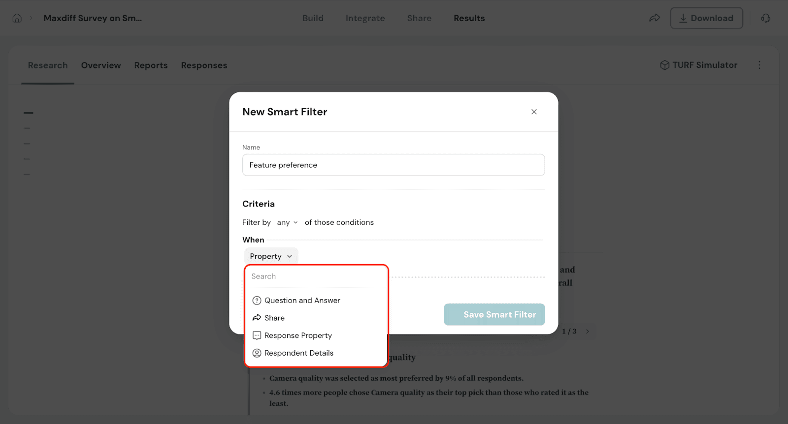
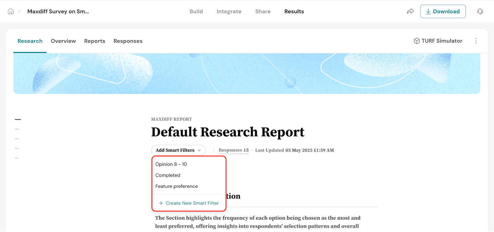
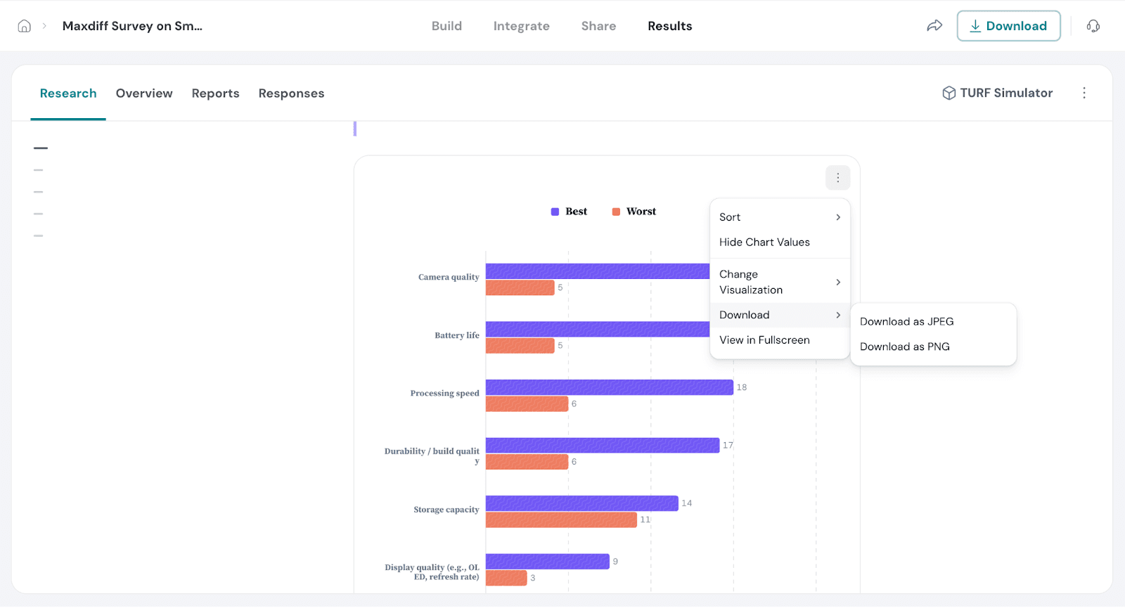
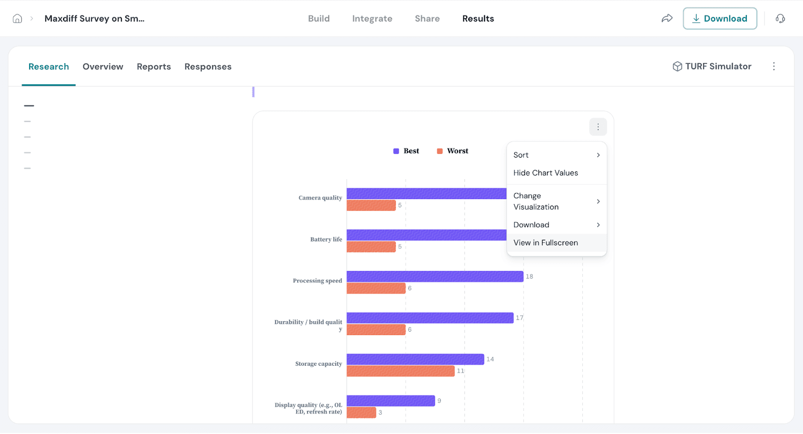
Chart options allow you to control how data is visually presented in your report. They help you adjust the look and layout of your charts, making insights easier to read and interpret at a glance. This ensures your findings are clear and consistent.
Let's see how to do this.
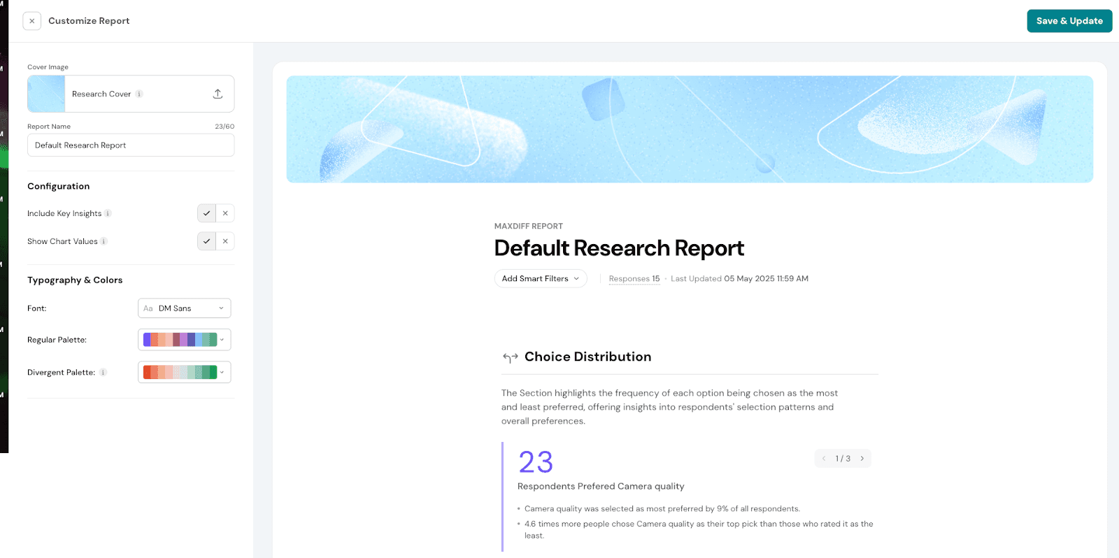
With report customization, you can change colors, fonts, and include specific insights to enhance the visual appeal and clarity of your MaxDiff report. This allows you to present your data in a way that is both visually engaging and tailored to your audience's needs, making the insights easier to understand and more impactful.
Let’s see how to customize our report.
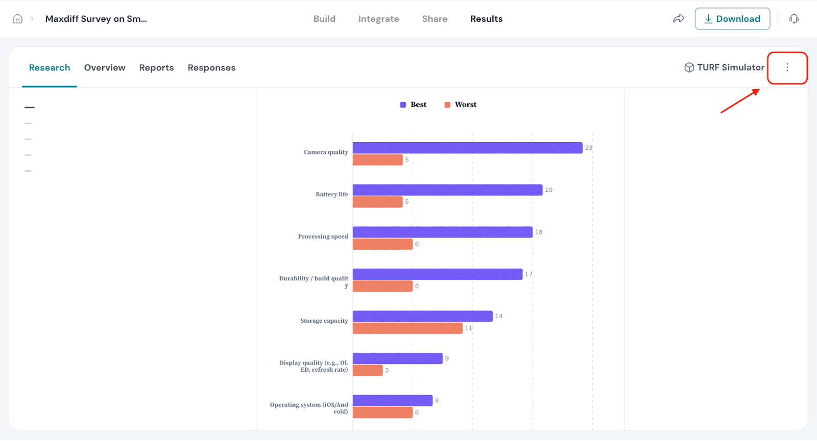
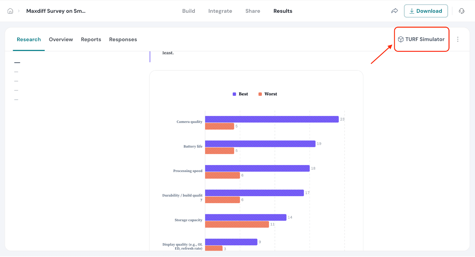
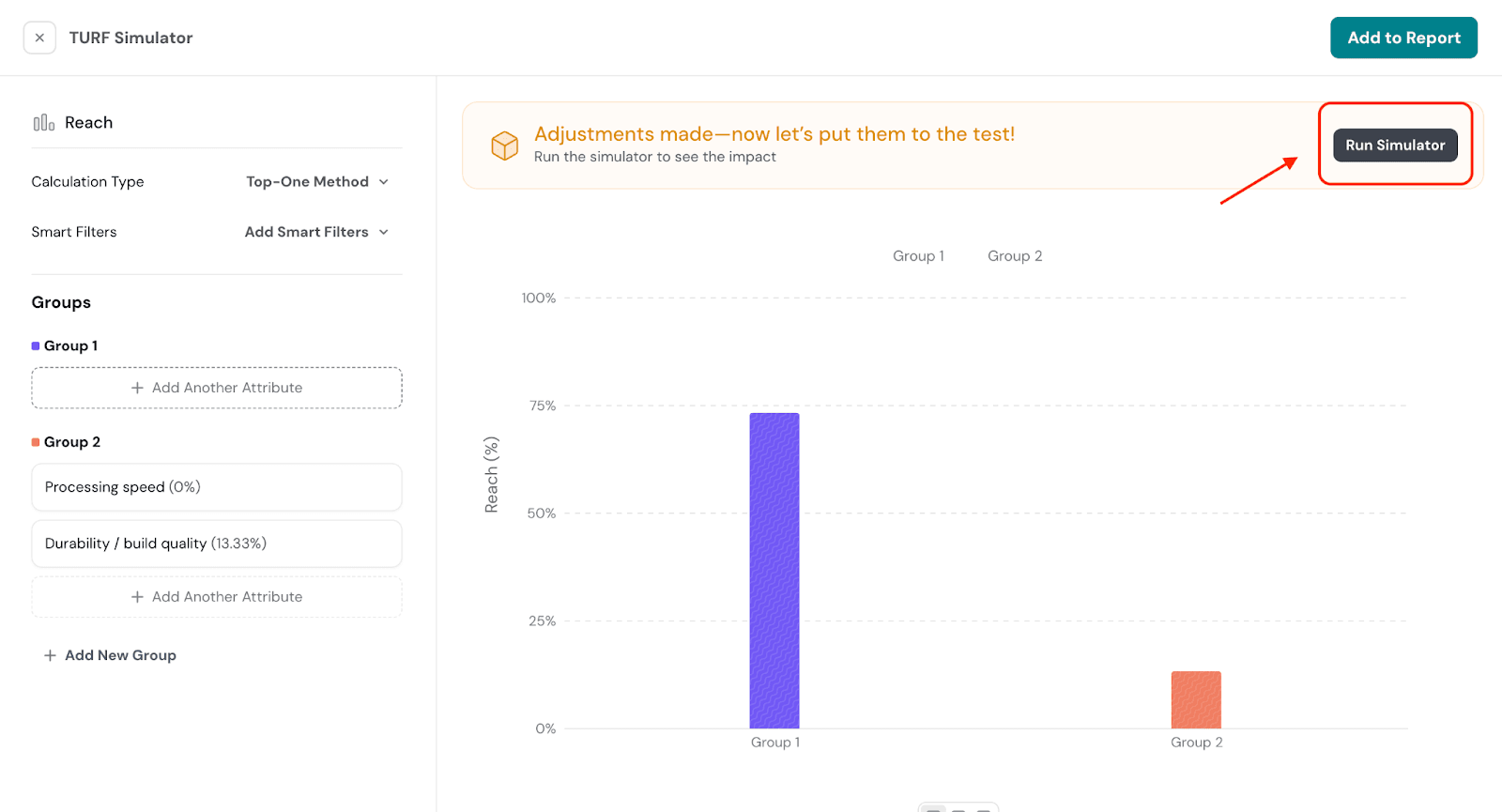
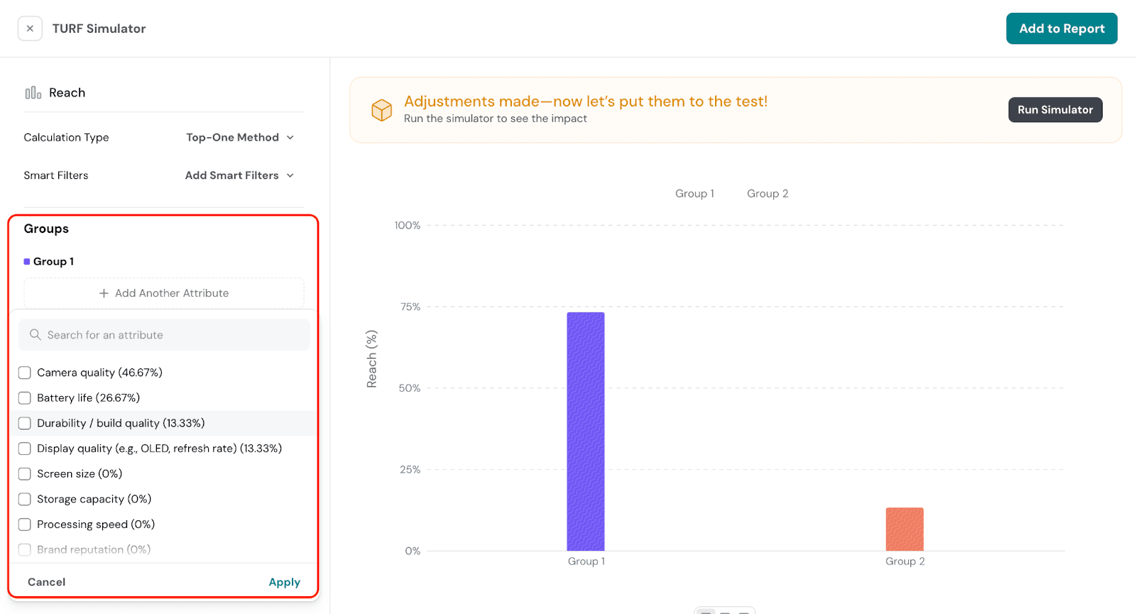
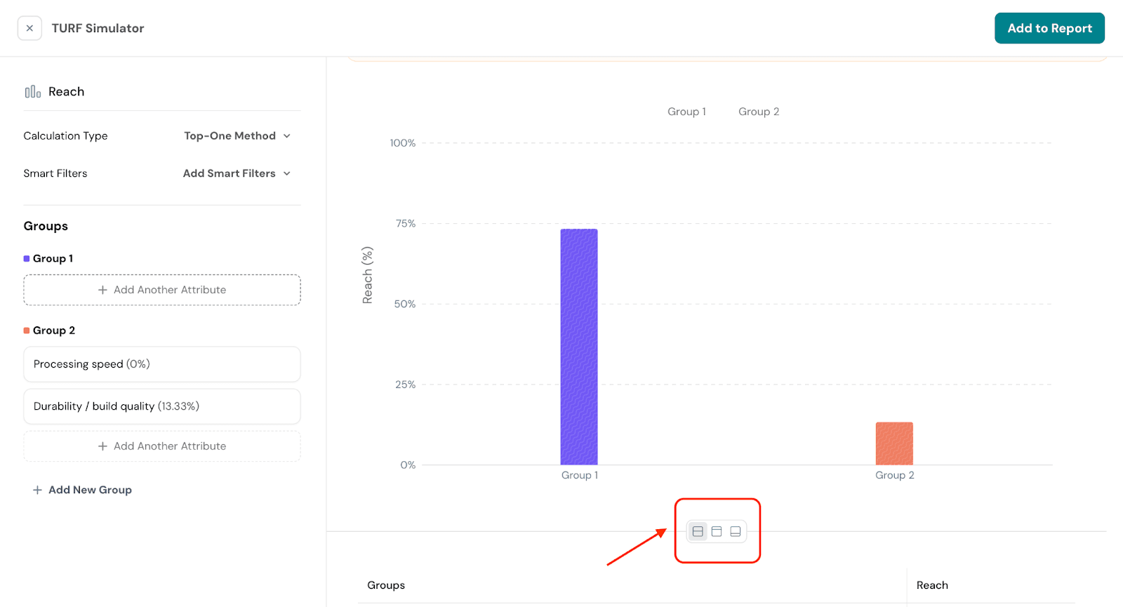
TURF (Total Unduplicated Reach and Frequency) Simulator helps identify the combination of features that will appeal to the largest share of your target market. It calculates the reach of different combinations of items, helping you prioritize those that resonate the most.
Top-One Method
This method calculates the percentage of the sample that is "reached" by each product combination, based on the most preferred option. It determines the proportion of respondents who would select that combination as their top choice.
Top-Two Method
The Top-Two method expands the approach by considering the percentage of respondents who would choose a product combination as either their most preferred or second-most preferred. This helps identify combinations that are highly likely to be favored overall.
Hierarchical Bayesian (HB) Method
The Hierarchical Bayesian method uses a statistical model to calculate the likelihood of a combination being selected, taking into account the preferences of individual respondents. It provides more granular insights by incorporating individual-level data, resulting in more precise predictions of consumer choices.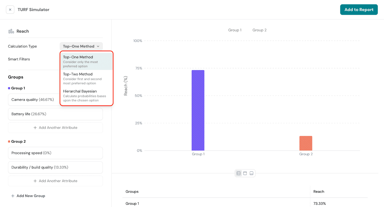
Responses section
The Responses section provides a detailed view of how respondents interacted with the MaxDiff survey. It helps you analyze individual-level data to understand patterns in their preferences and decisions.
In the Responses section, you can view individual-level data such as:
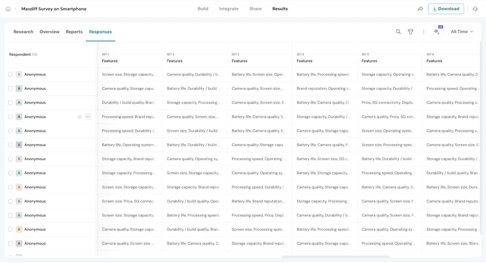
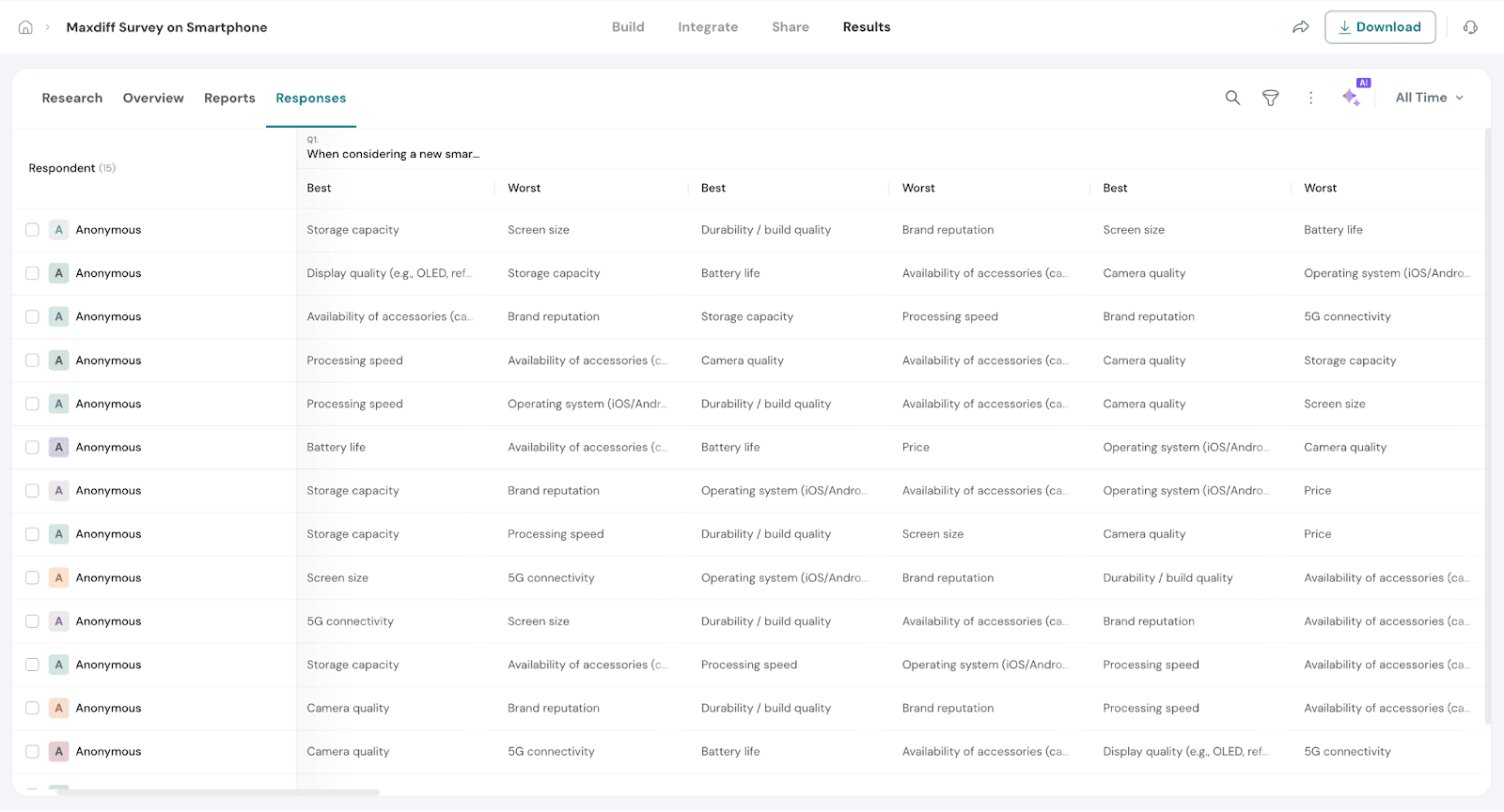
This helps you gain insights into how respondents engaged with the MaxDiff tasks and what choices they made.
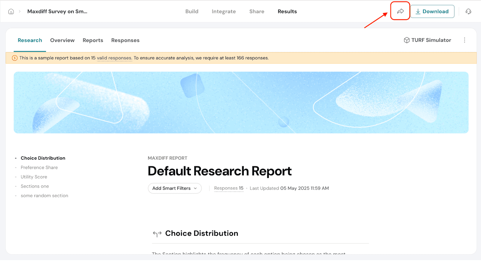
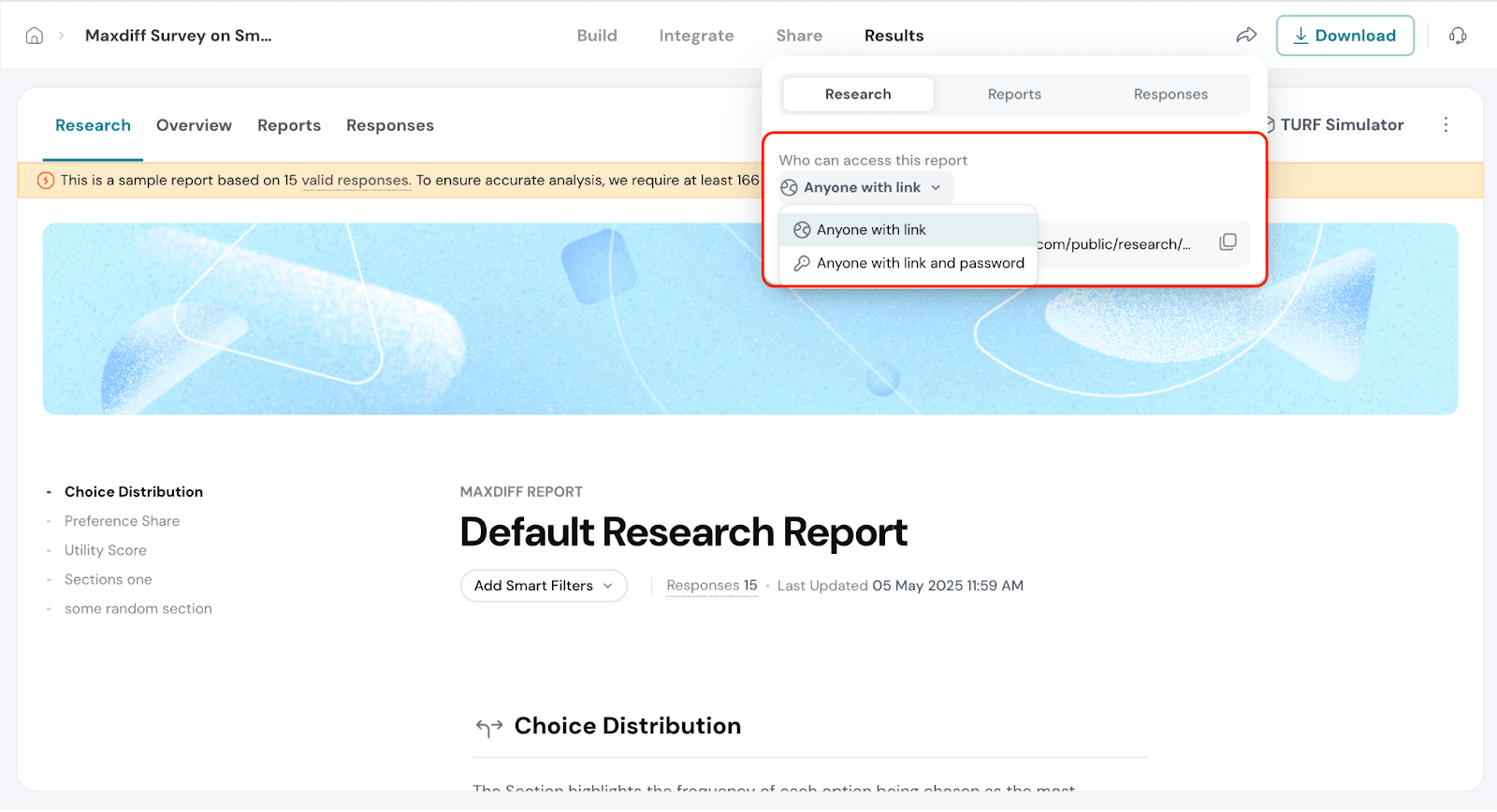
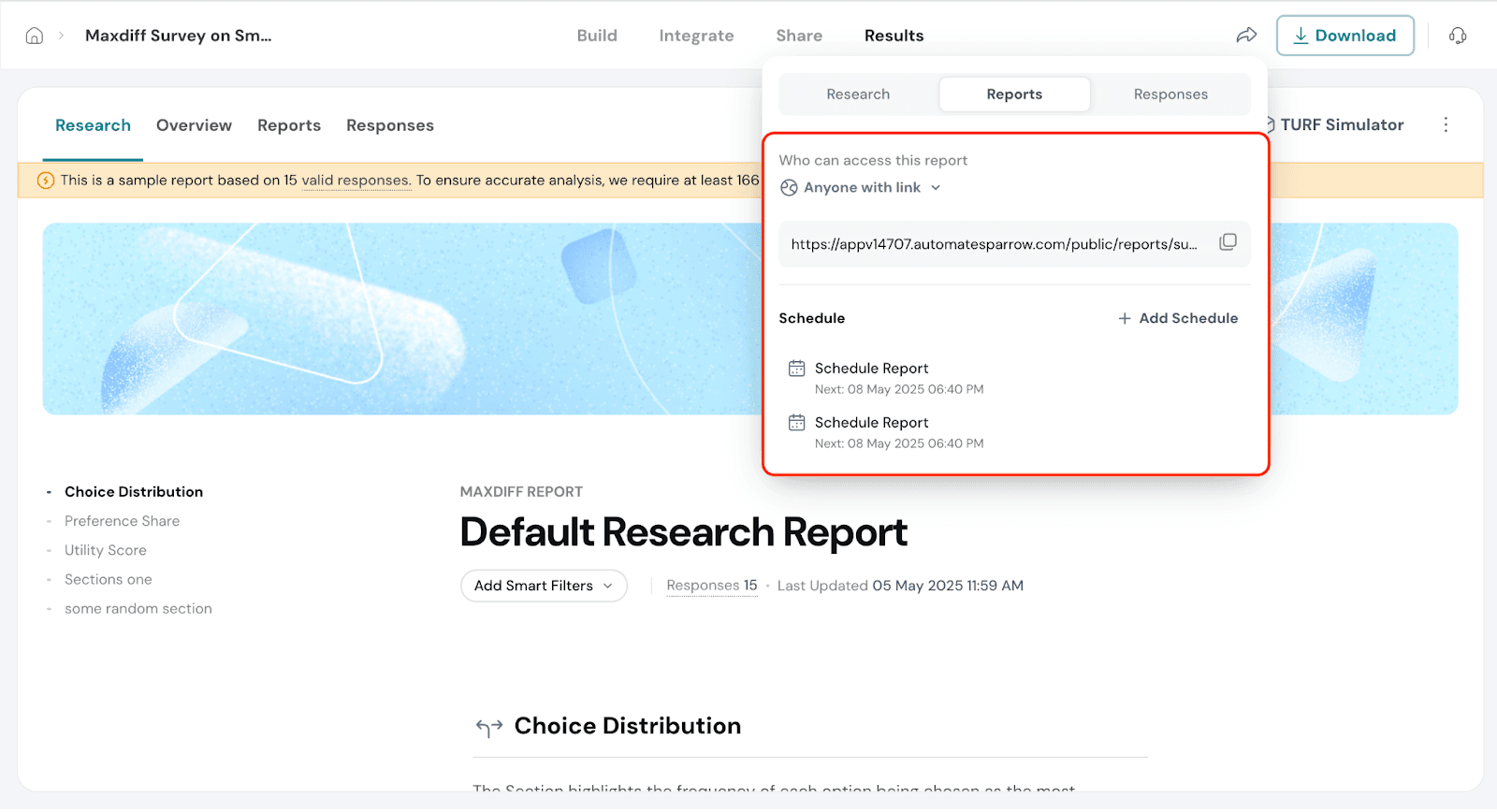
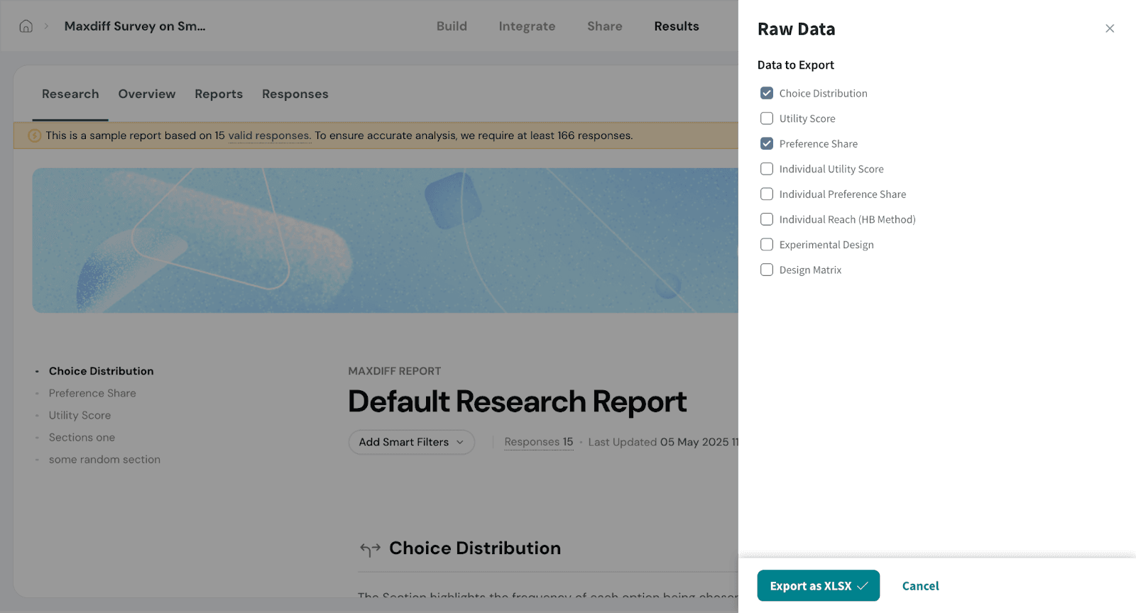
You can download both the report and the raw data for further analysis. Additionally, you have the option to share reports and responses directly with others, making collaboration and decision-making easier.
Let’s see how to share the reports and responses
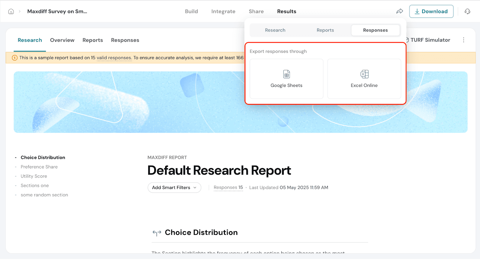
Let’s see how we can Download the reports and responses.
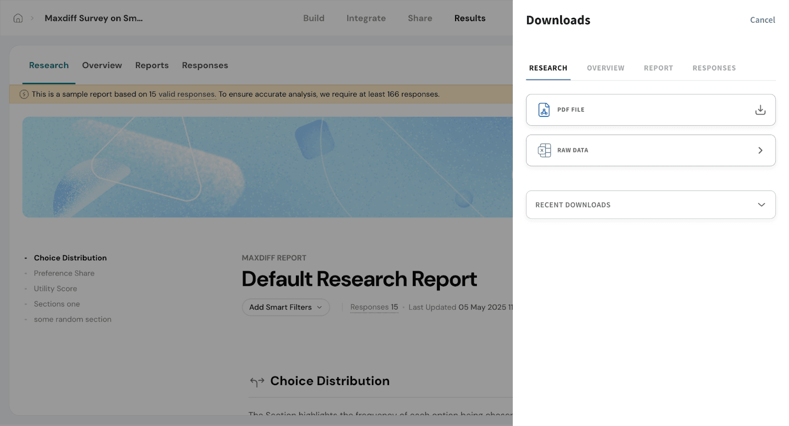
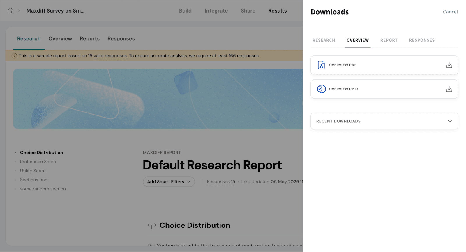
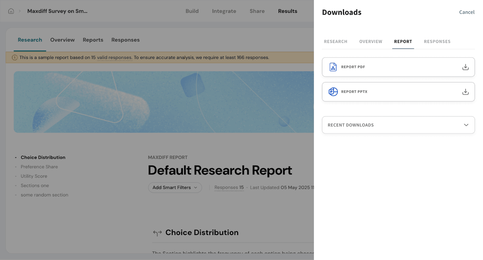
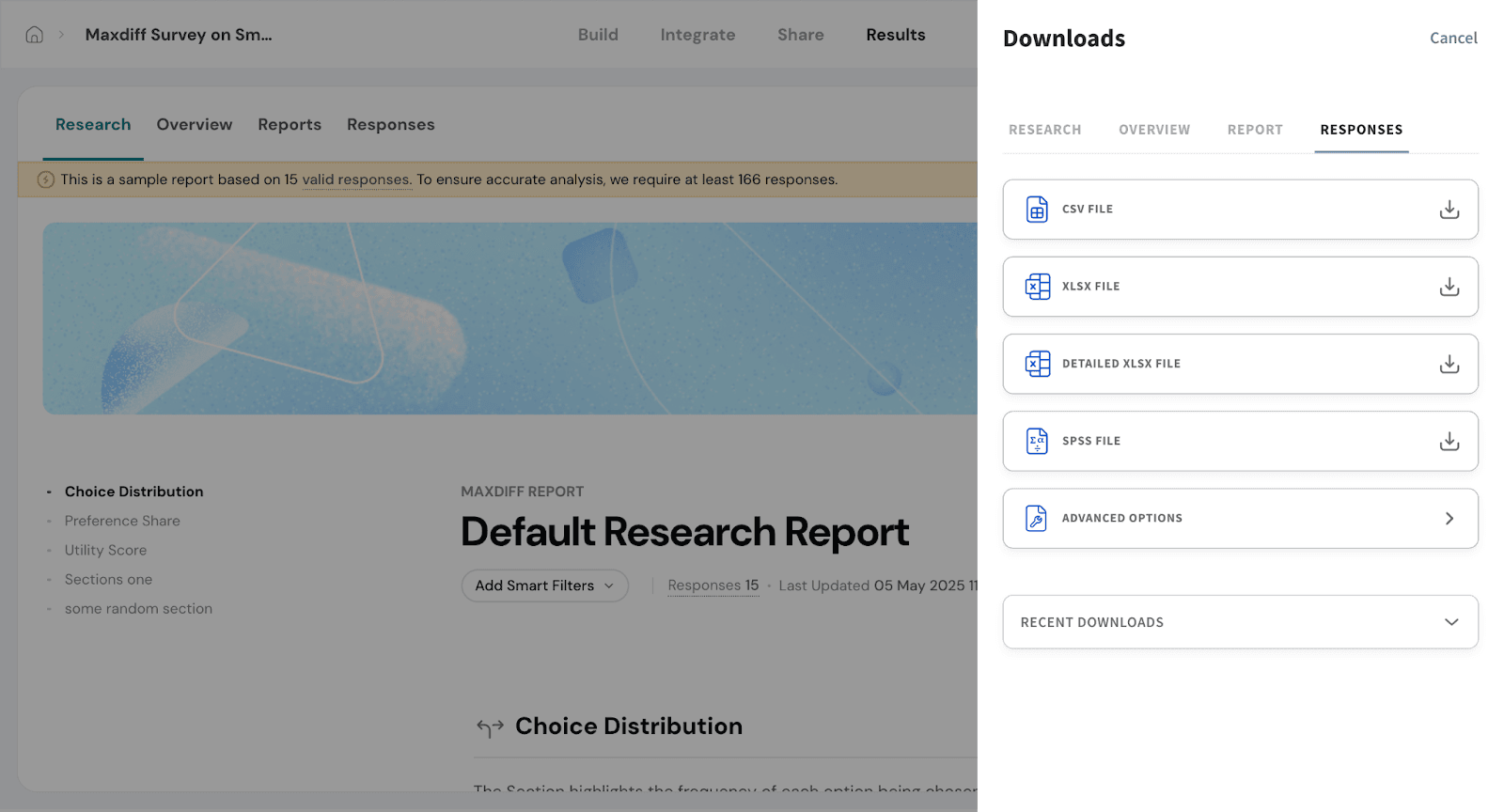
Recent Downloads
This section appears across all four download types. It lets you quickly access the reports, responses, or data files you’ve recently downloaded—so you don’t need to export the same file multiple times.
Feel free to reach out to our community if you have questions.
Powered By SparrowDesk