Search
Conjoint Analysis is a choice-based research method that reveals how customers trade off features and price when selecting between product or service options. By presenting respondents with realistic packages and asking them to choose, it uncovers the relative importance of features, the value of different configurations, and how price influences demand. These insights enable teams make confident decisions about product design, packaging, and pricing.
For example, when evaluating mobile phones, a respondent might be asked to choose between different combinations of storage, camera quality, color, and price. By analysing these choices across respondents, conjoint analysis reveals which attributes matter most, how much value each feature adds or subtracts, and how price influences preference and demand.
In the sections below, we’ll use this mobile phone example to show how to build a conjoint study in SurveySparrow and how to interpret the resulting reports.
Some key terms to understand for a Conjoint Study:
Attribute: An attribute is a key characteristic of a product or service that influences a customer’s decision. In the above example, storage and camera quality are different attributes of a mobile phone that are being evaluated in the study.
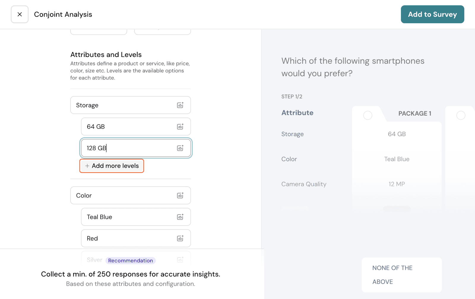
Level: A level is a specific option within an attribute. So, for the Storage attribute, you will have 64GB, 128GB, 256GB, and 512GB. Each of these is a level under this attribute.
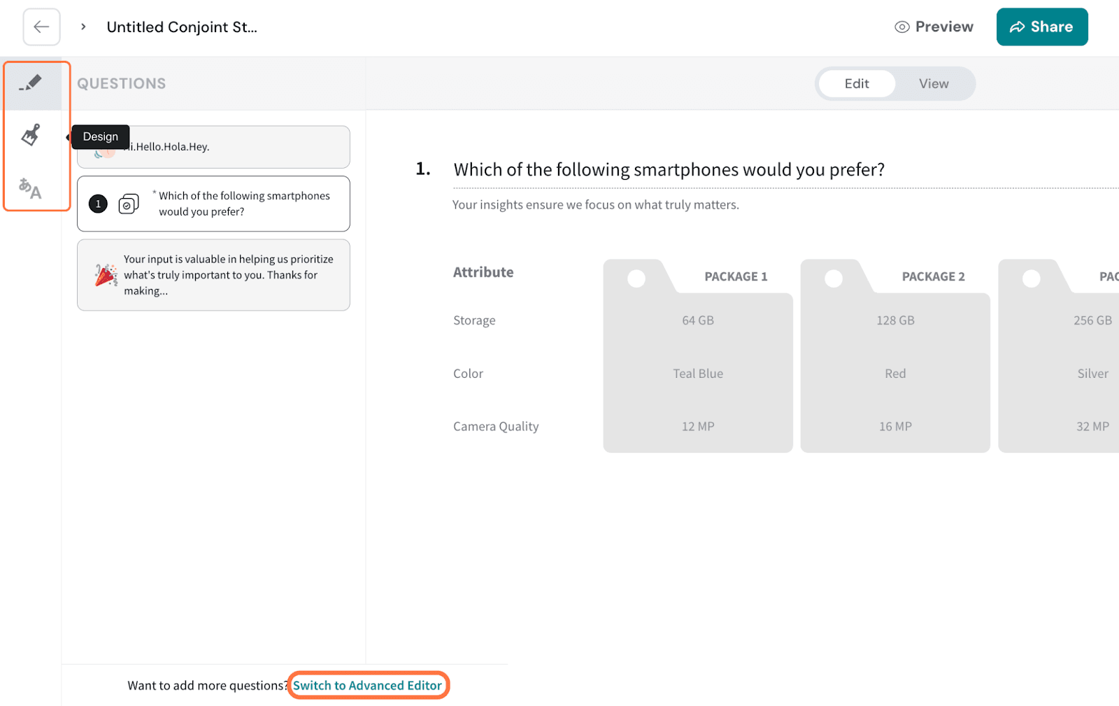
Package: A package is a combination of one level from each attribute shown as a single option to the respondent. So, here, a package would probably be a phone:
Color: Teal
Storage: 256GB
Camera: 16MP
Price: $300
Now, let’s get to the creation of the Conjoint Study
Click on New Survey
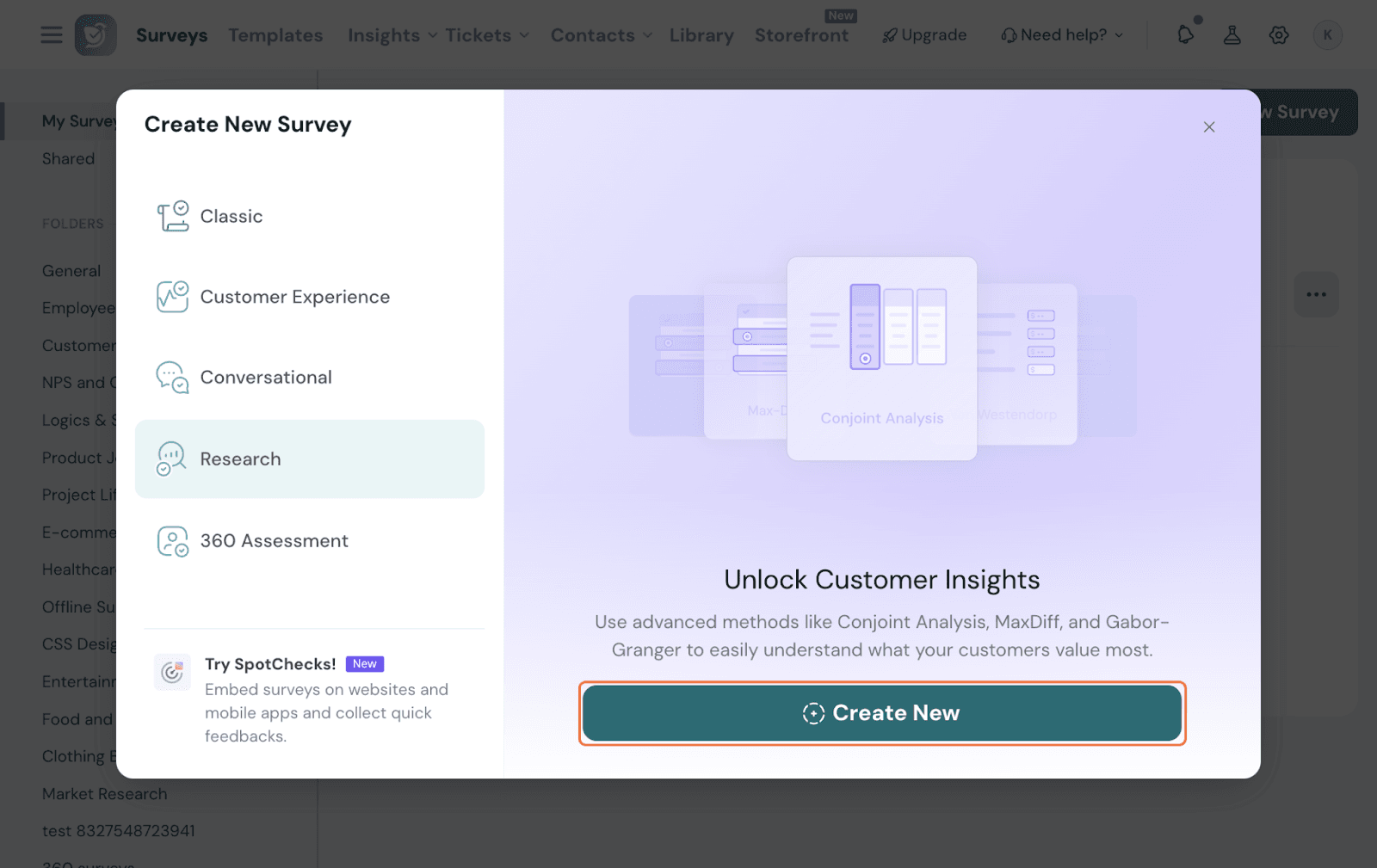
Select Research 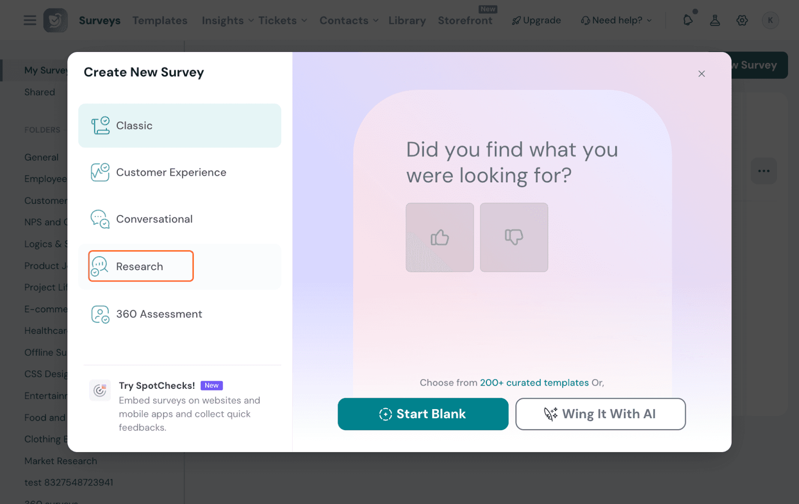
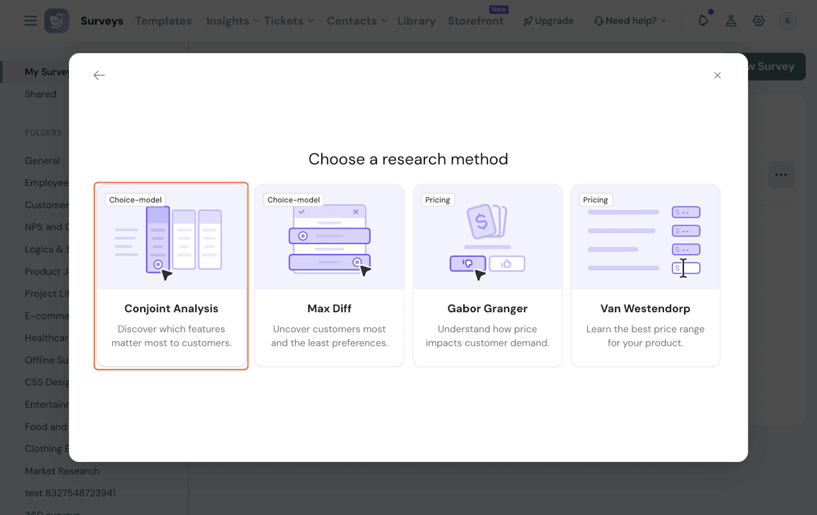
Pick Conjoint from the options.
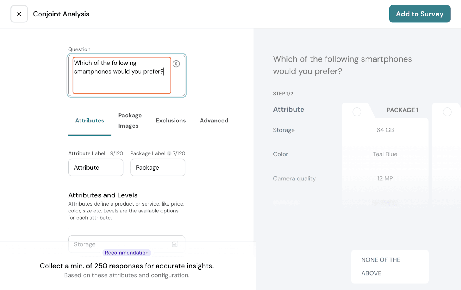
Now, you will be in the section to edit and set up your Conjoint Question.
First, you get a pre-filled question text by default. You can edit it to your preference. Here, we can make it specific to phones by making the question “Which of the following smartphones would you prefer?”
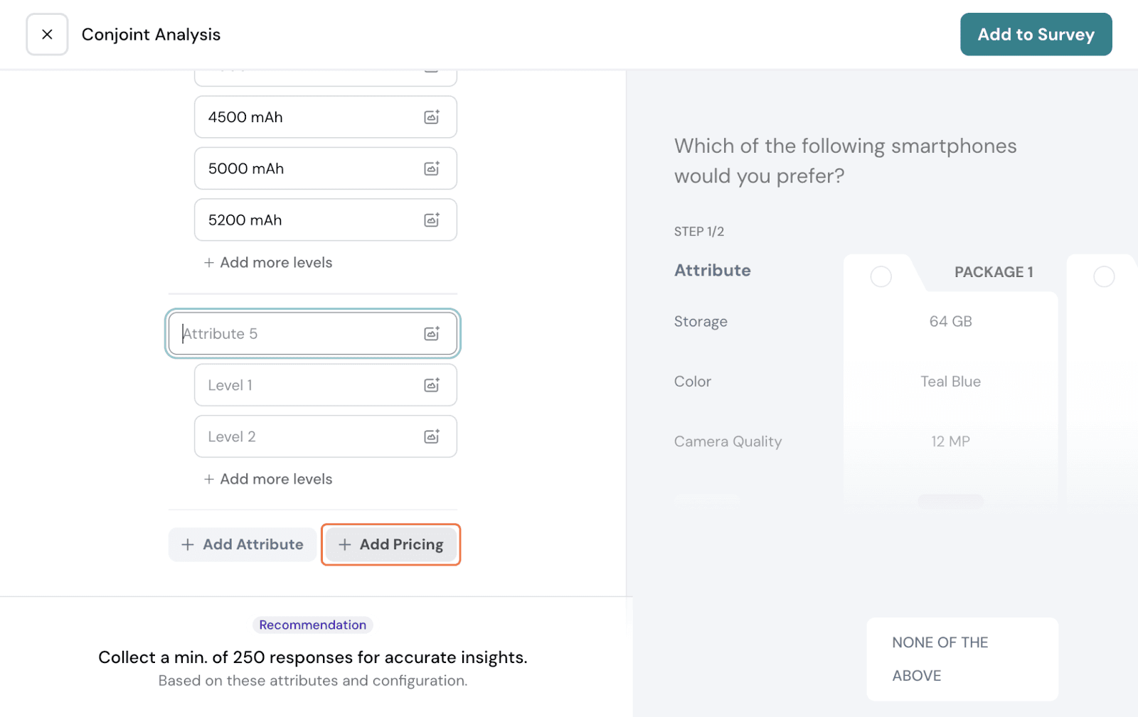
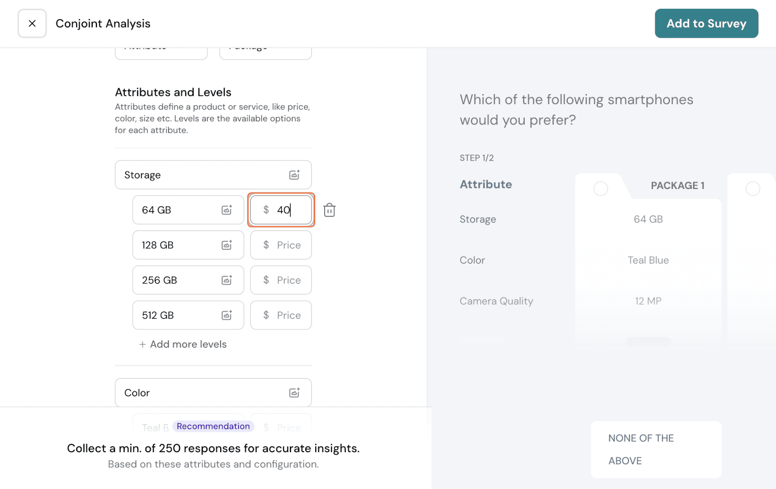
Next comes the package setup. You will need to add your attributes and levels corresponding to each attribute.
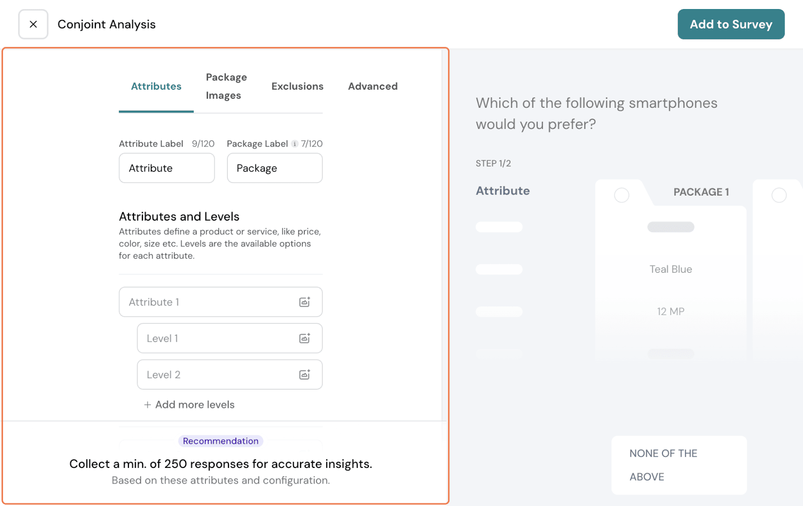
You can add a maximum of 10 attributes and 10 levels under each attribute.
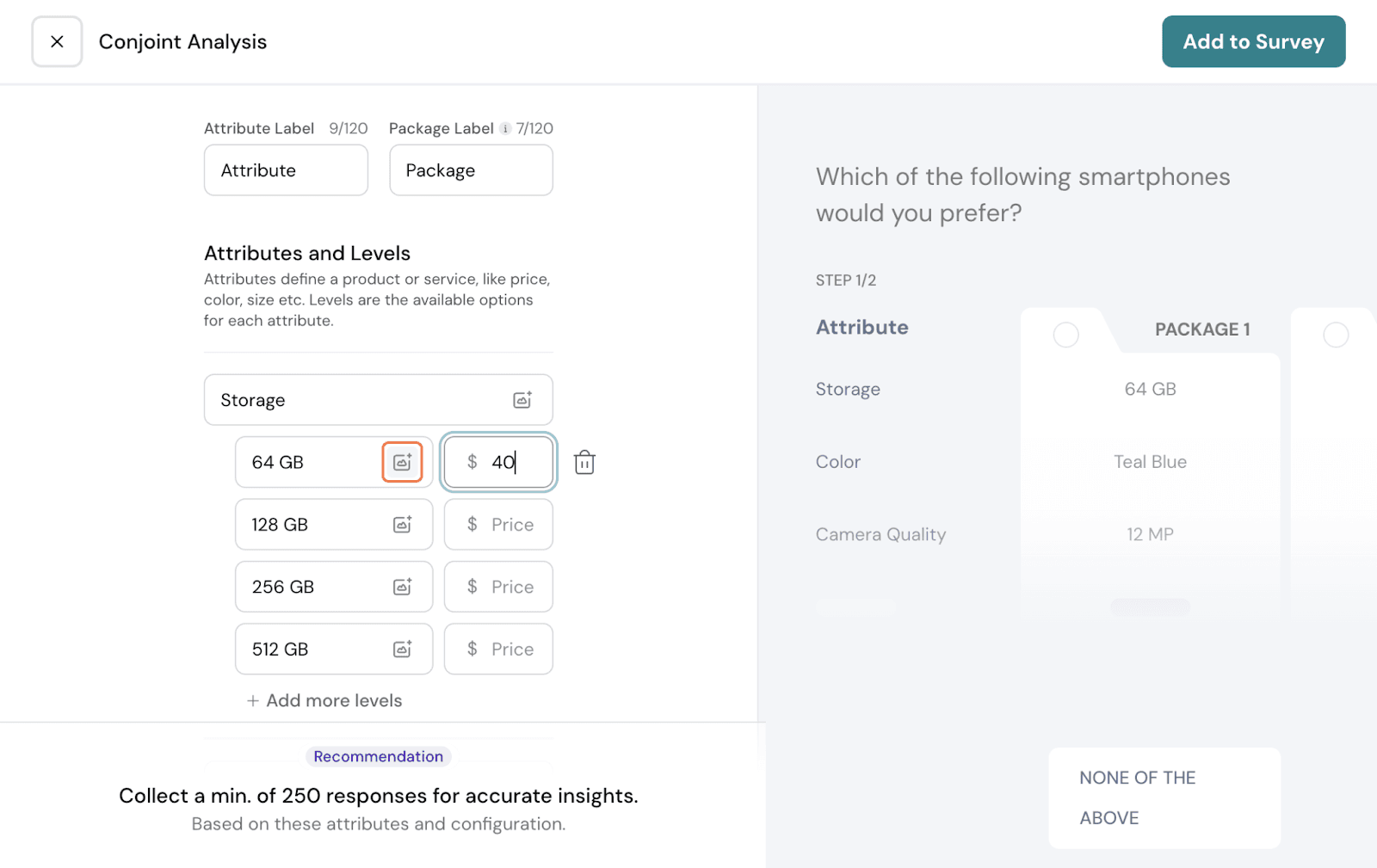
Here, let us go with 4 main attributes: Storage, Camera quality, Battery, and Color.
Under each attribute, we will add corresponding levels. Click on New Level to add an option under the attribute.
If you want to add a new attribute, click on New Attribute.
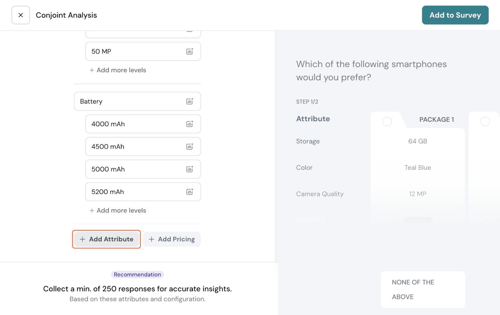
You can also add Pricing. Click on Add Pricing.
You can do it two ways:
Fixed: In this, Pricing gets added as an attribute that can be assigned to packages randomly. You follow the same process as setting up other attributes like Storage for pricing as well.
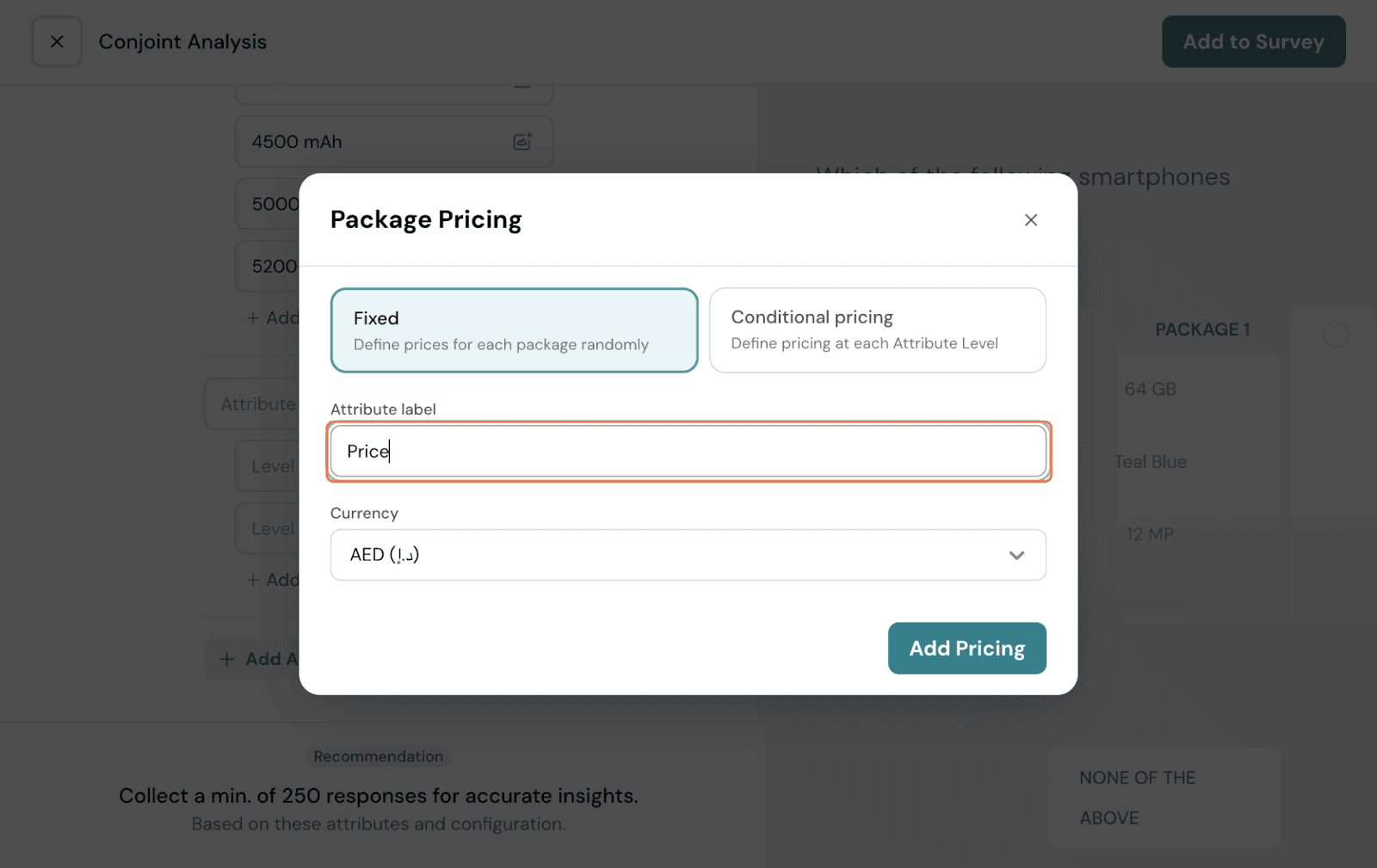
Conditional: In this, you add a base price for the unit, and add a price to every level manually. Let’s take this mobile phone example. Here, you can set the base price to $100.
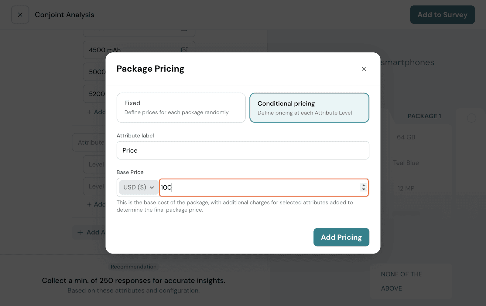
And for every attribute level here, the price is set: Storage - 64GB: $40; Color - Red: $20; 16MP camera - $50; Battery - 4000 mAh: $40
If this package is selected, the price associated with each individual attribute level is added to the base price, and the total pricing will be displayed as: 100 + 40 + 20 + 50 + 40 = $250.
You can have the currency changed to your preference. Once you proceed with your preferred choice of pricing, click on Add Pricing.
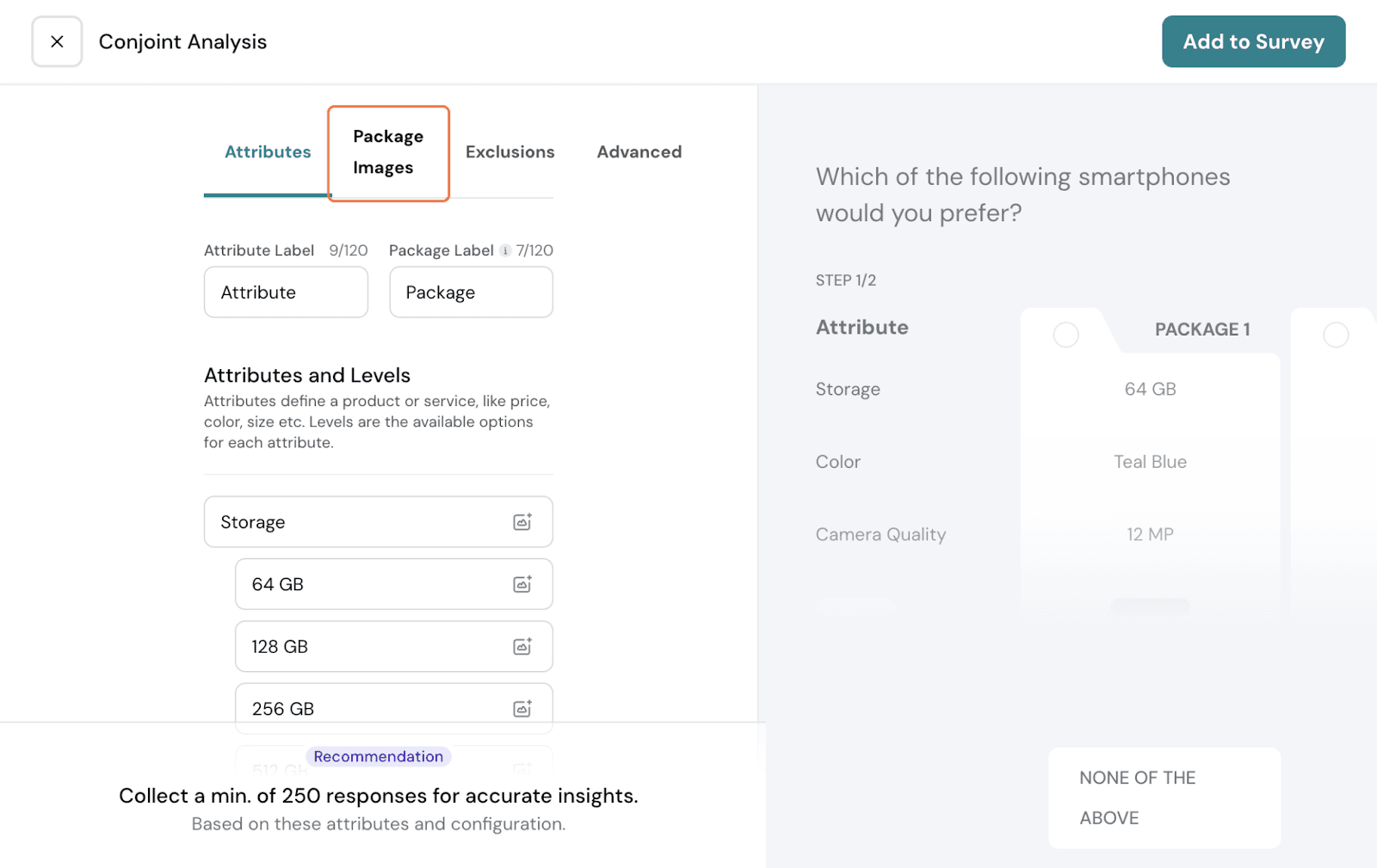
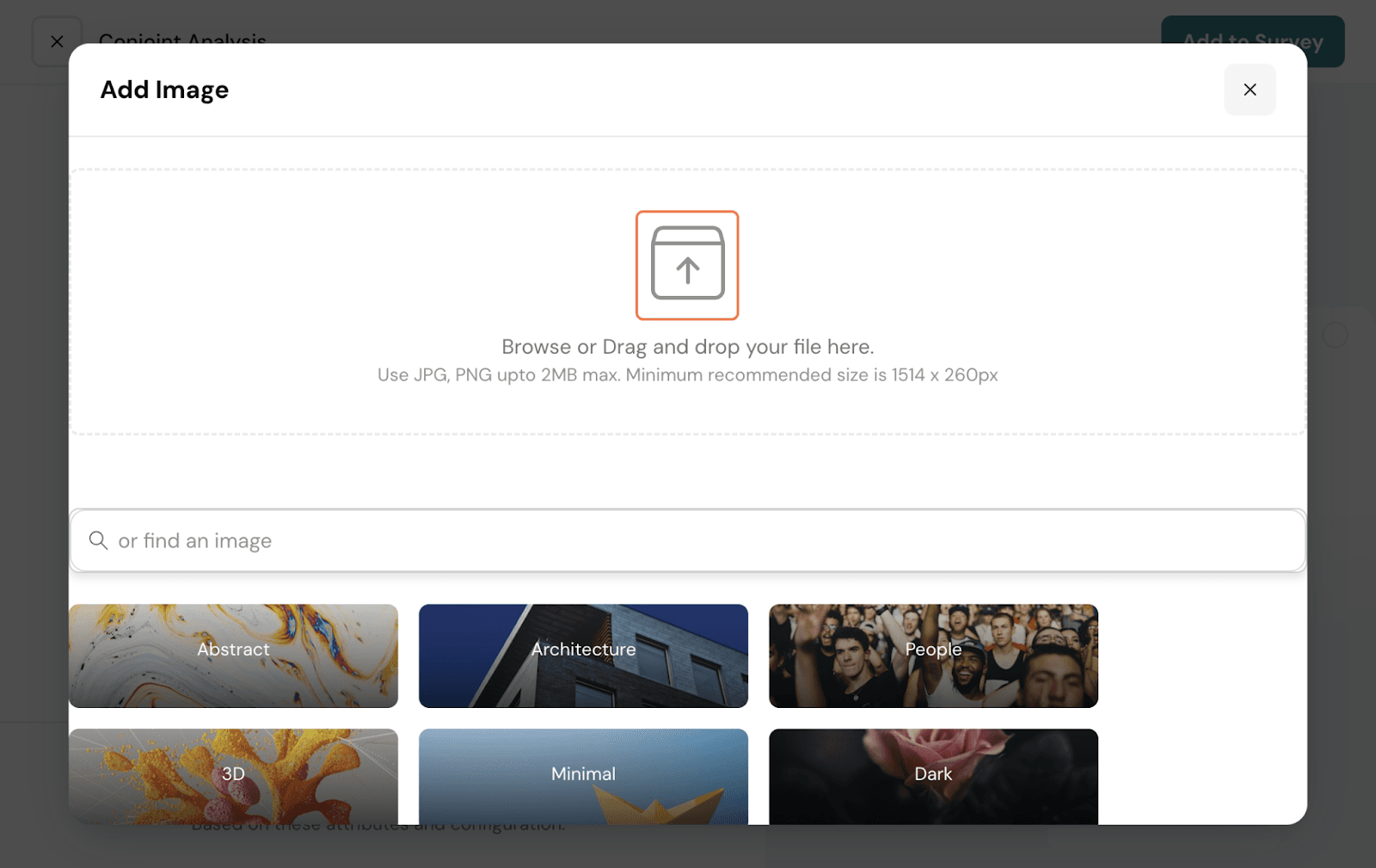
If you wish to add images, you can add them at every level by clicking on the image icon.
Otherwise, you can also do it from the Package Images tab. Click on it.
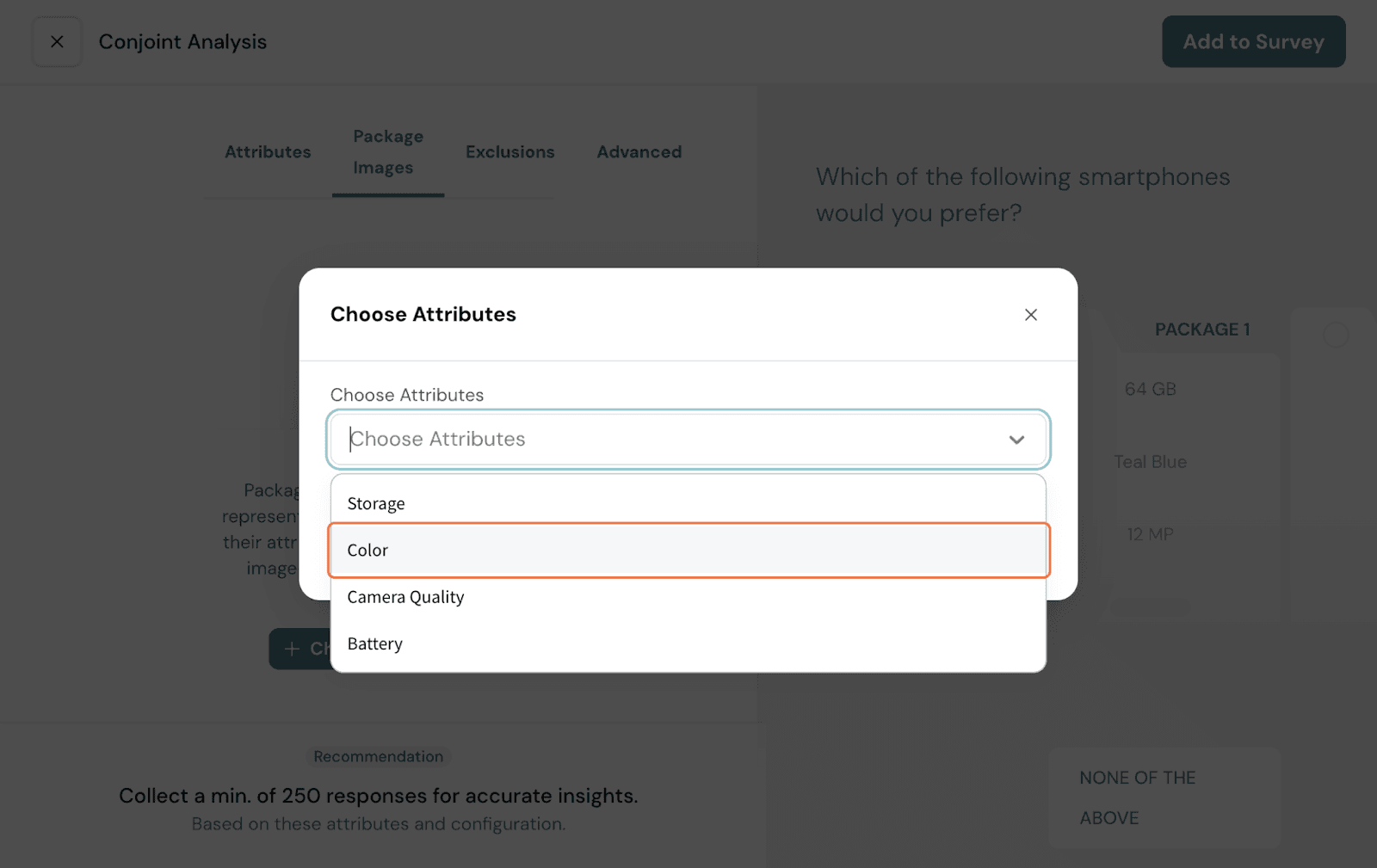
Here, choose attributes that you want to have images for. In this case, let us show for Phone color. Select that from the dropdown. Click Add.
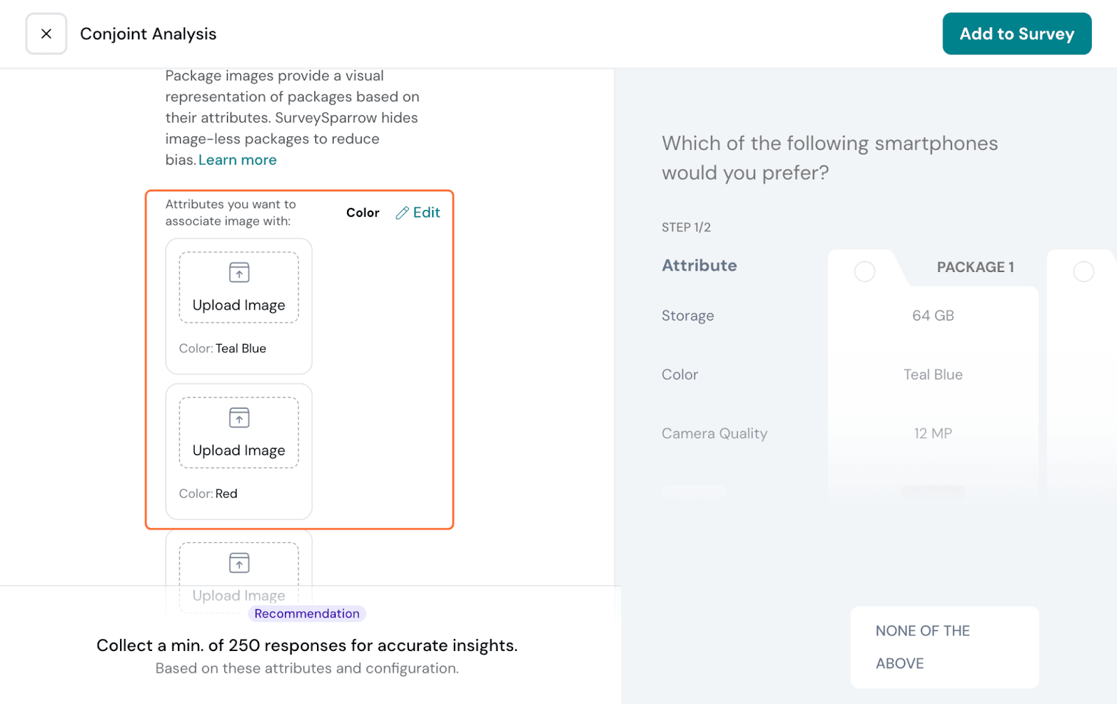
You have every level listed; add images one by one.
Choose from stock images or upload your own image.
Choose from stock images or upload your own image.
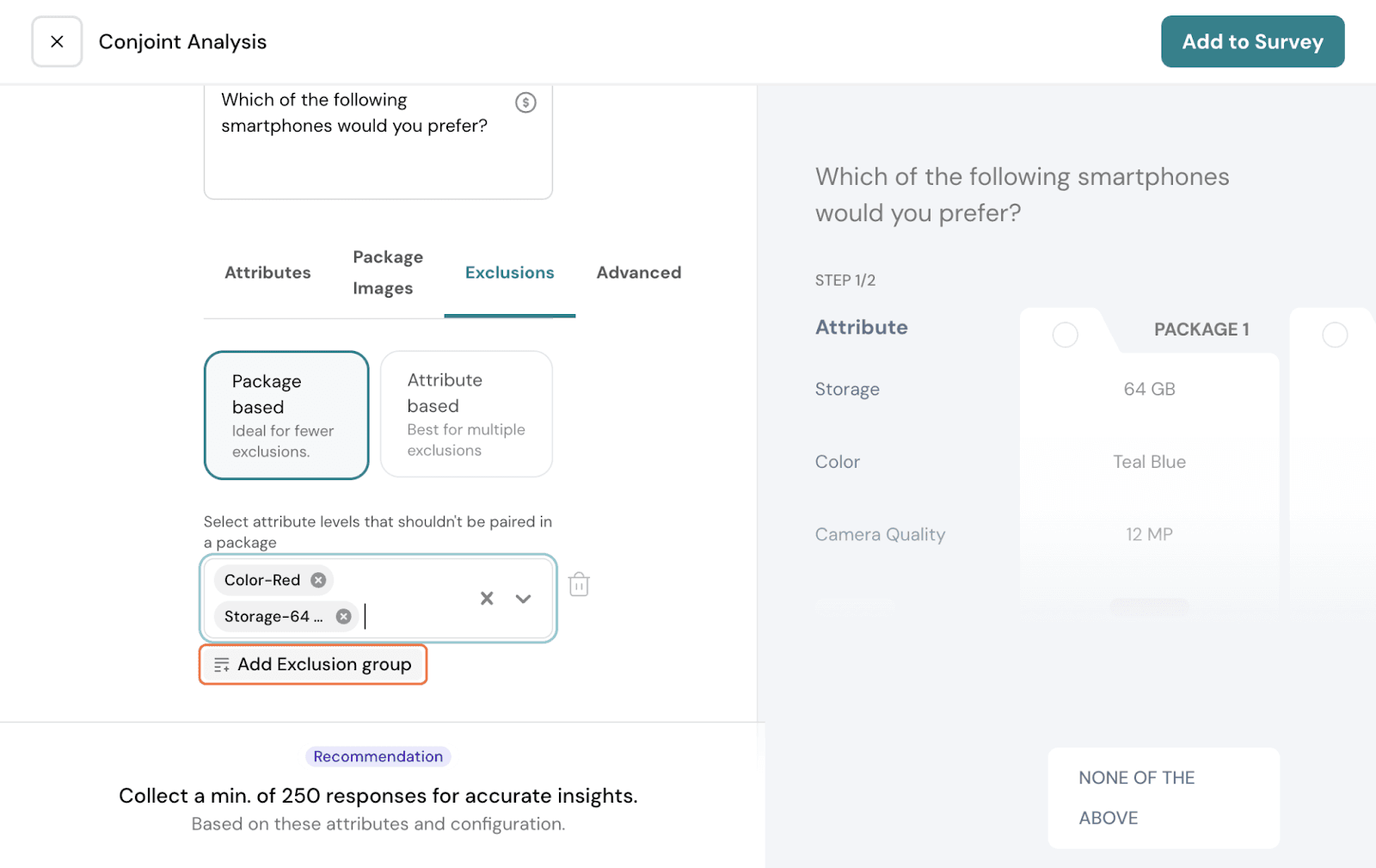
Attribute levels get randomly assigned as packages, which means that some packages maybe showing product combinations that do not reflect your actual products. In which case, you can set up exclusions.
Click on the Exclusions tab.
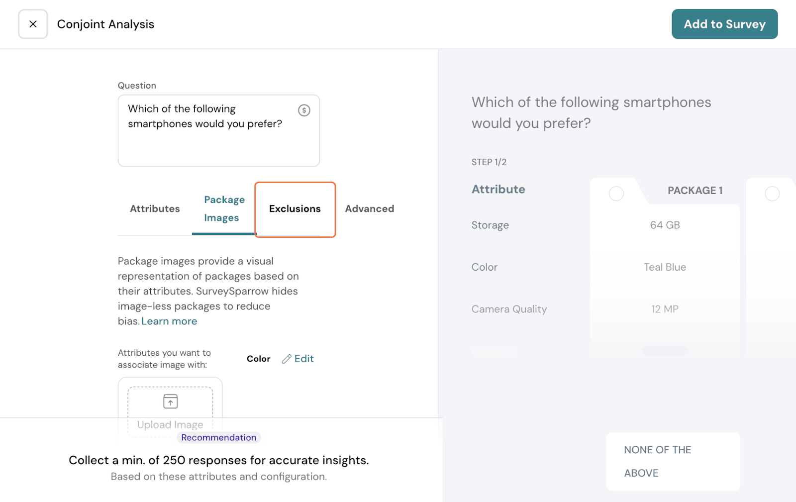
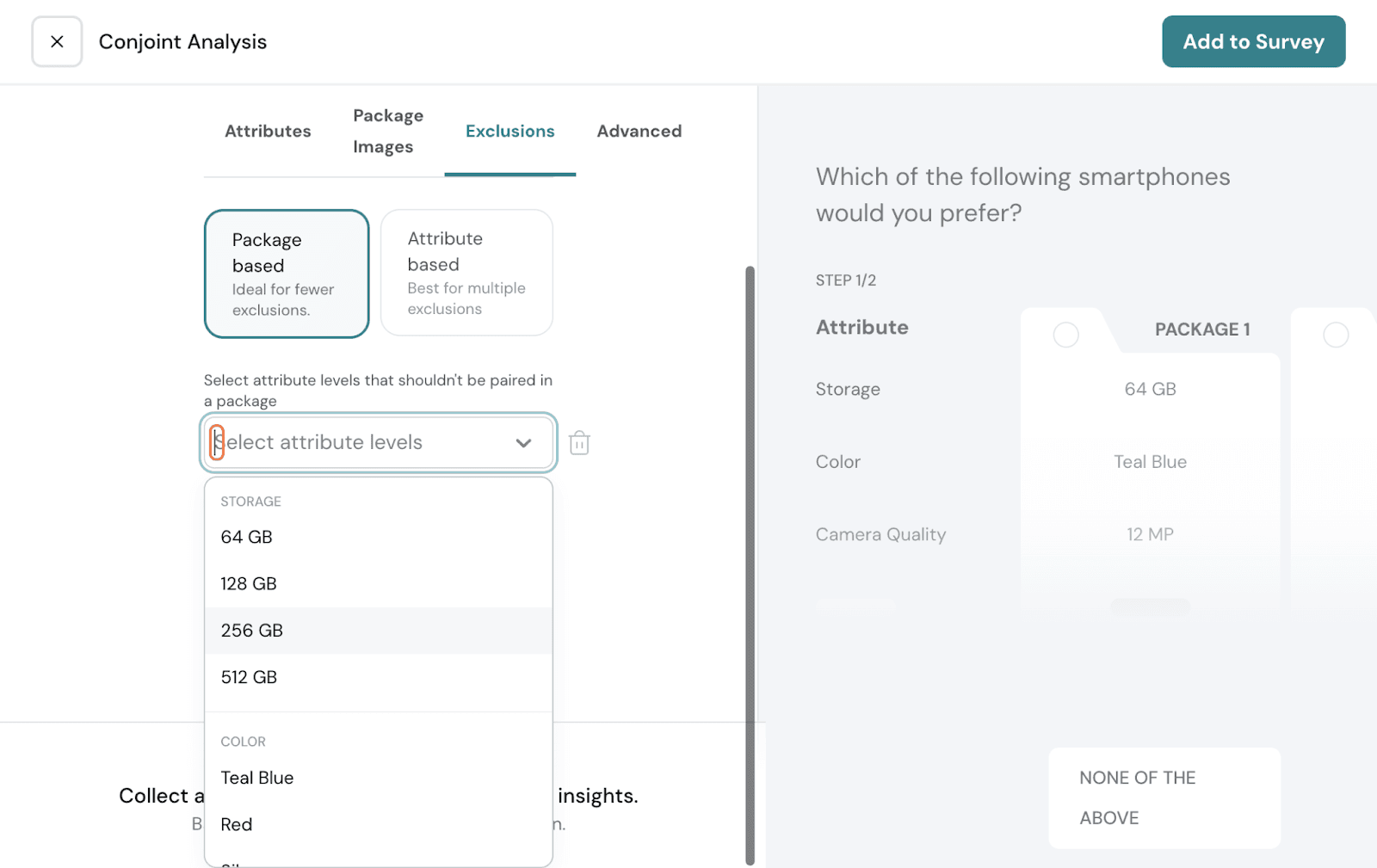
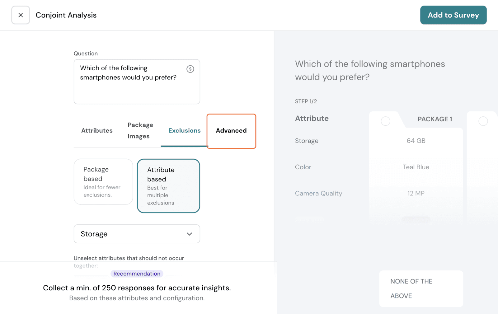
It can be package-based or attribute-based.
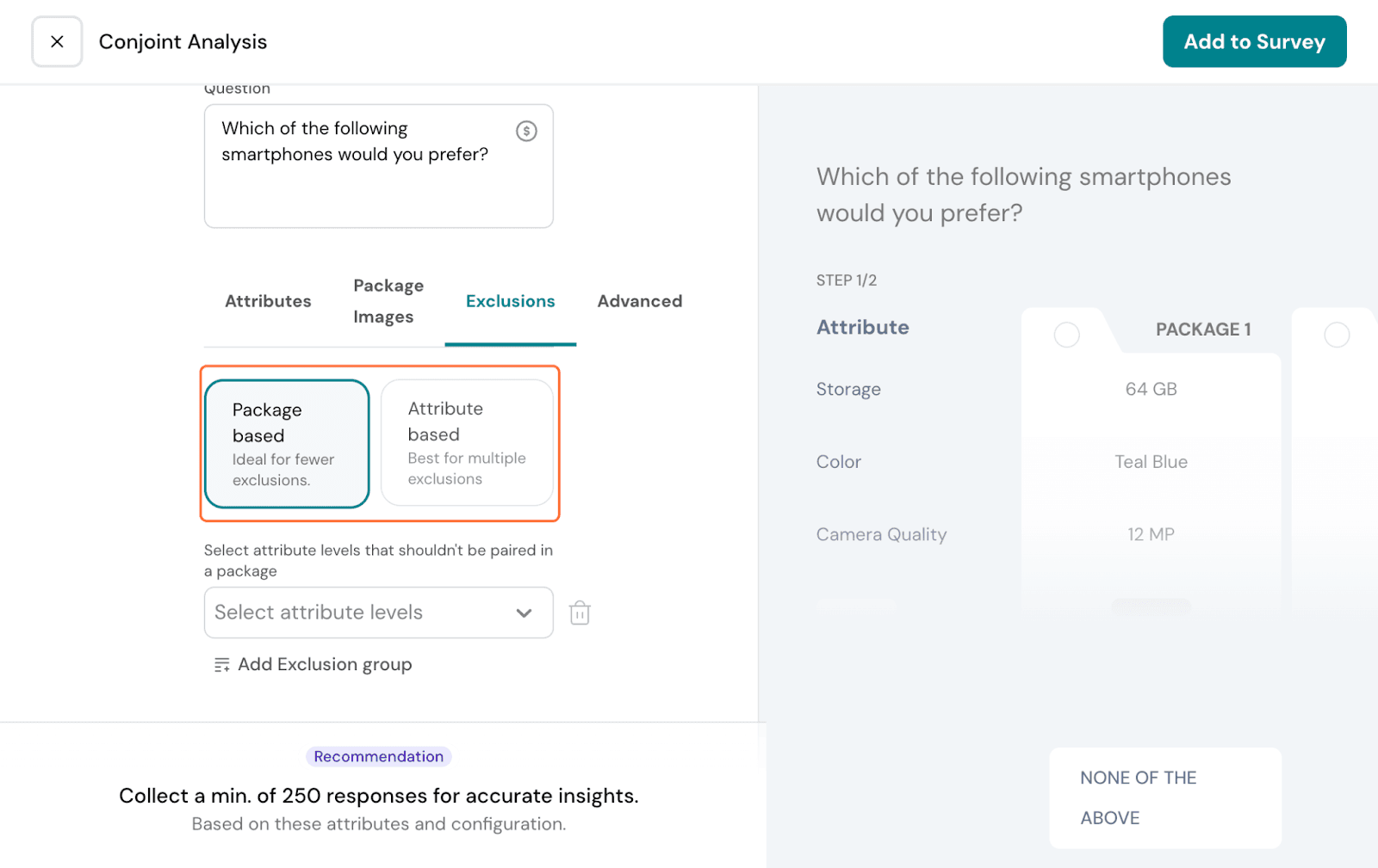
Package-based: You can choose specific scenarios here: ex., phones with 64GB are not available in red color. In this case, you can choose the specific levels alone, and the packages formed will never show this combination.
If you have another, click Add Exclusion group and do so.
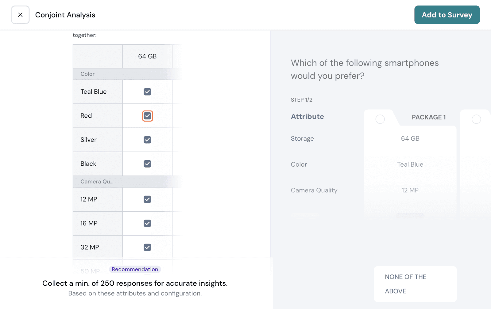
Attribute-specific: You can use this to exclude if you have multiple scenarios. Here, you can choose one attribute as a baseline, and the other attributes are shown together in a matrix. You can exclude other attribute levels row-by-row.
Once set up, go to the Advanced tab.
Packages: Choose how many packages need to be shown per step. Choose between 3 and 5.
Steps: A step is the number of screens shown to respondents. Show how many steps need to be shown to respondents.
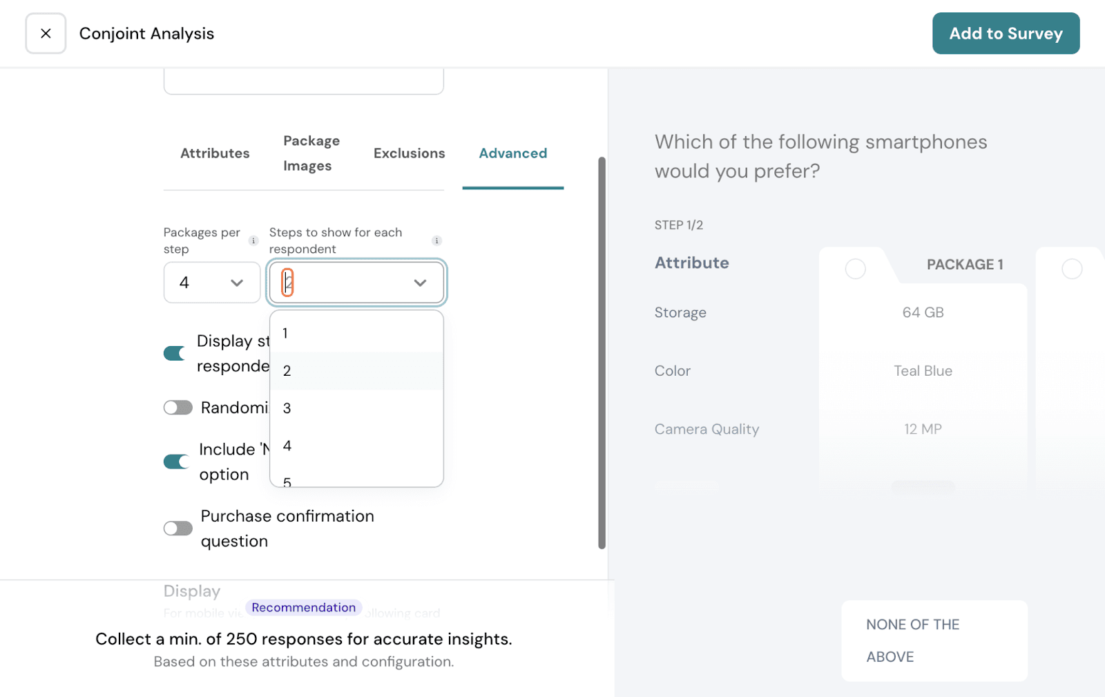
You can choose display options. Choose if you want to display the number of steps to respondents. You can randomise the order shown to respondents. You can include none of the above steps if needed.
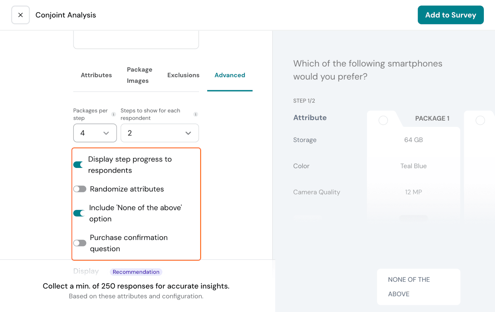
You can add a follow-up question to validate whether the respondents are willing to buy the chosen product. Choose the toggle on and customise the follow-up question.
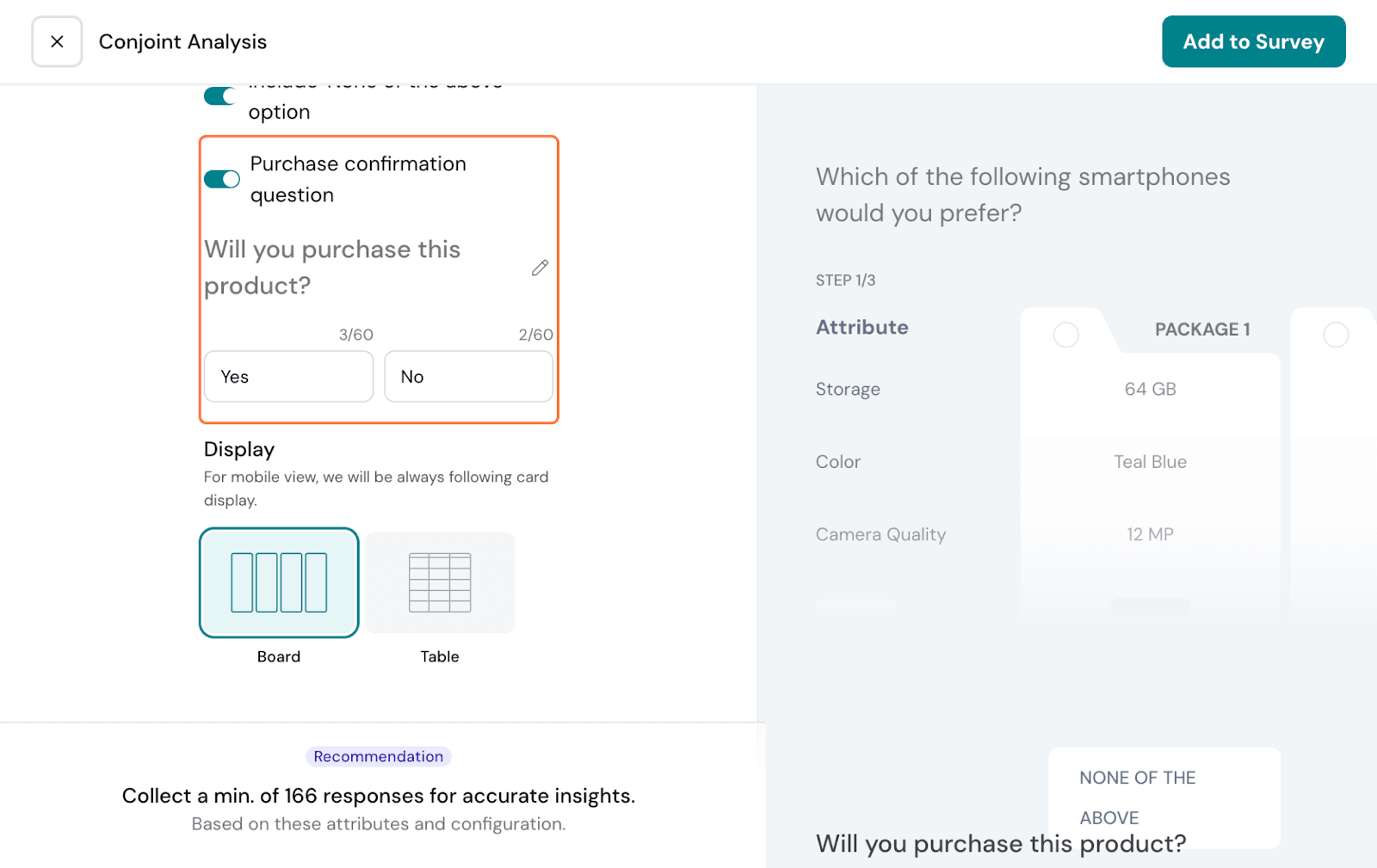
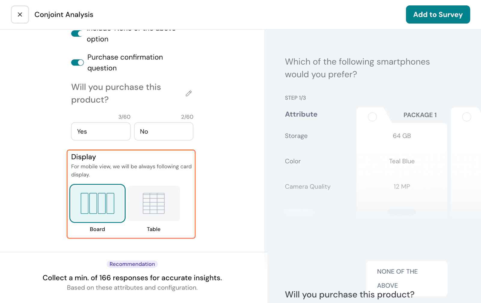
Lastly, you can choose how the packages are displayed: as a board or a table.
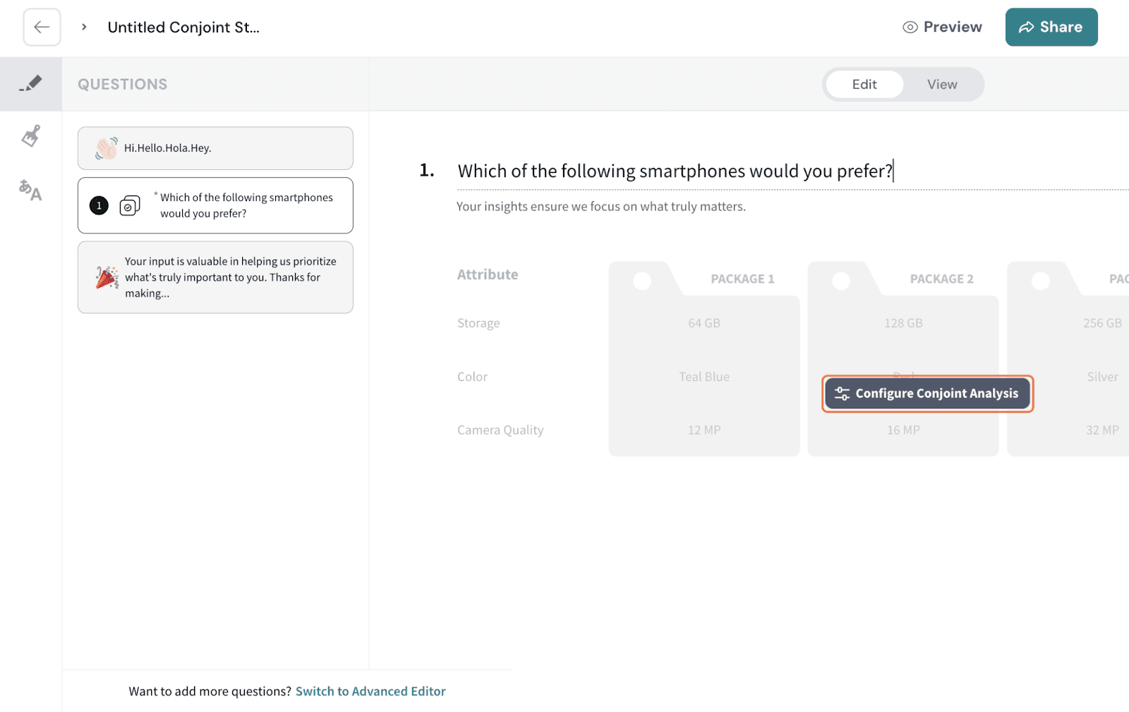
Once customised per your preference, hit Add to Survey.
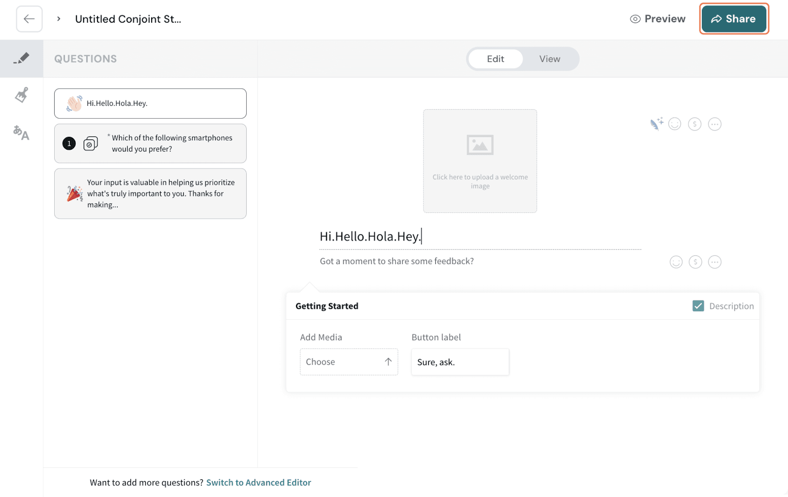
It gets added as a question to the survey; you can choose to configure the survey question again if needed. Hit on Configure Conjoint Analysis to refine the setup.
If you want to add any more questions to the survey, switch to Advanced Editor to do so. You can customise the design of the survey or make the conjoint study available in multiple languages.
Once done, click Share Survey.
Note that the Conjoint Analysis cannot be edited once responses start coming in.
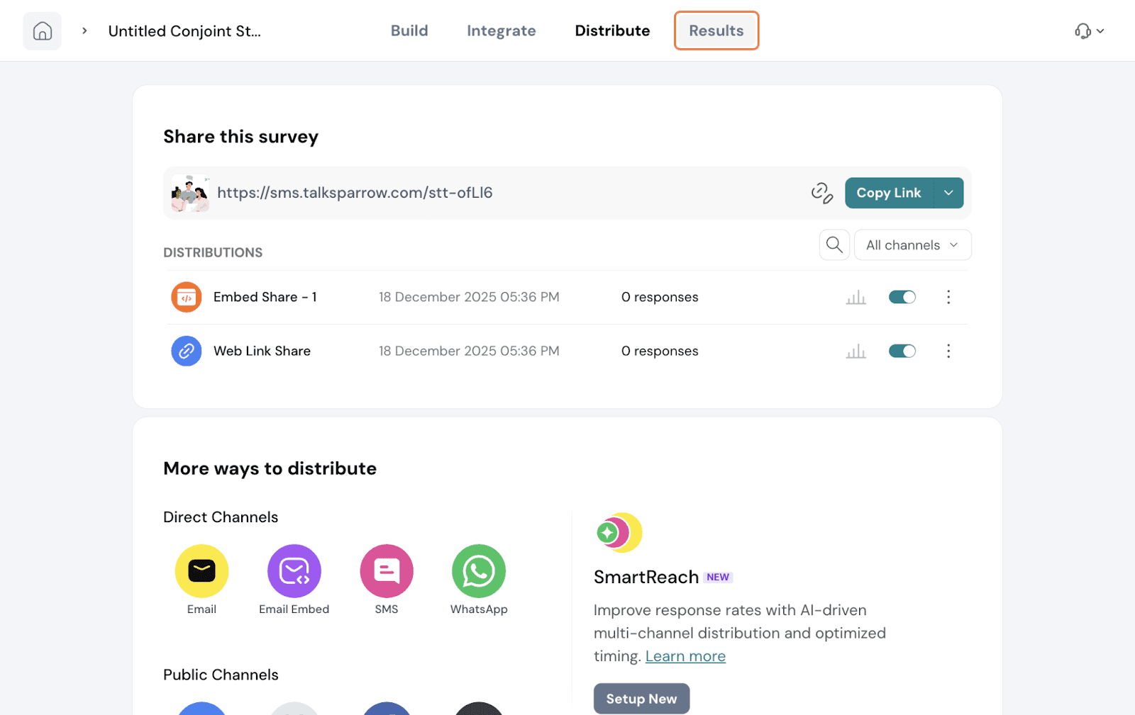
Navigate to the Results tab.
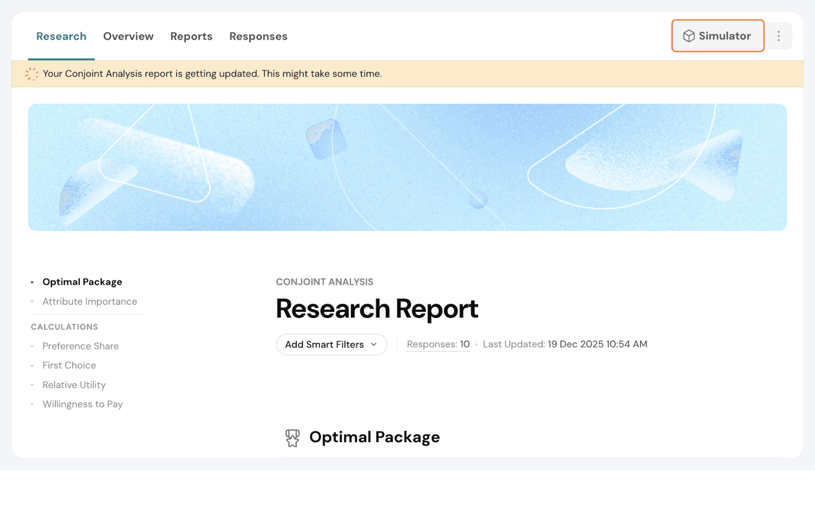
Go to Research. You will have a research report generated with various sections. It shows the ideal number of minimum responses needed for an accurate report.
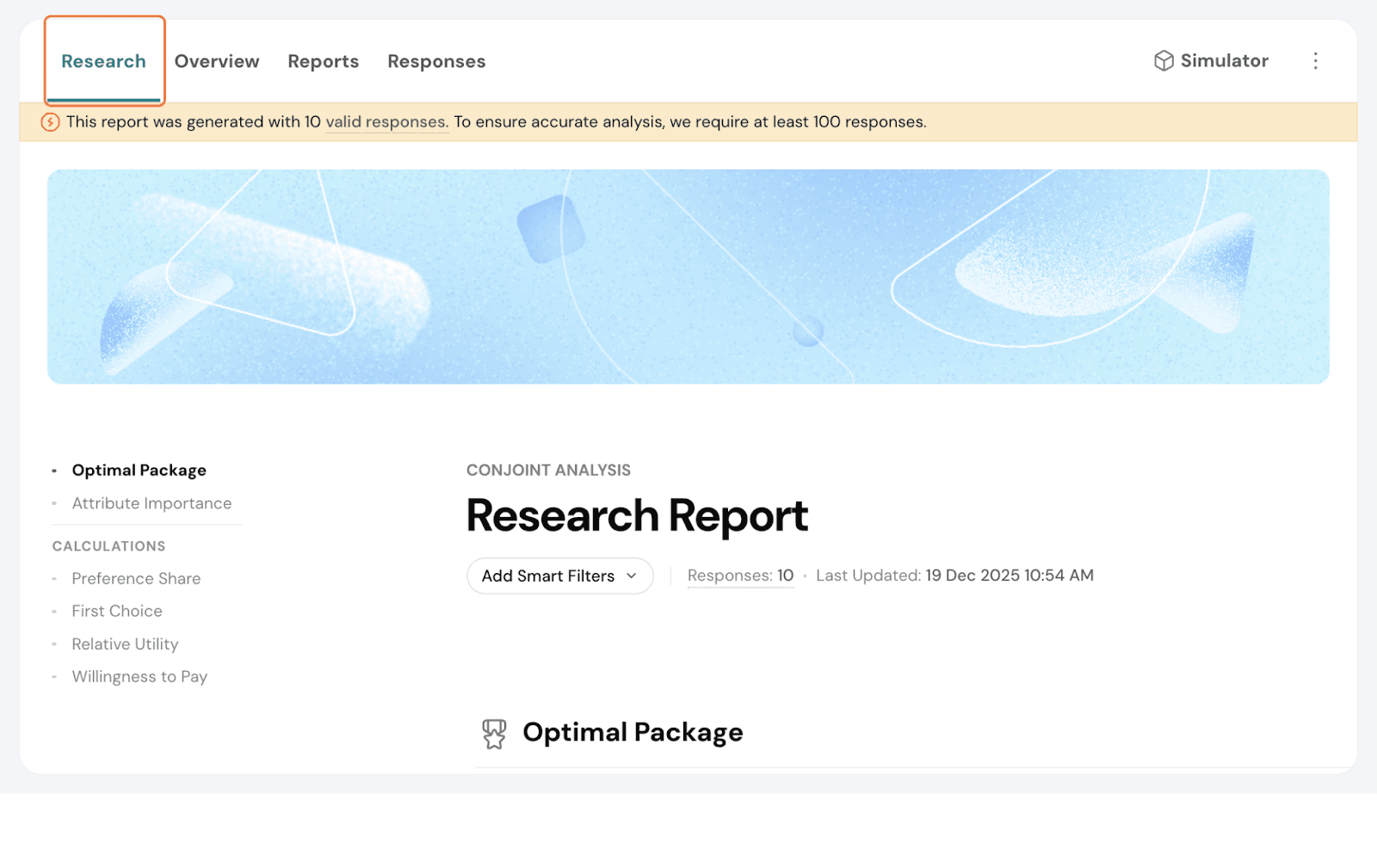
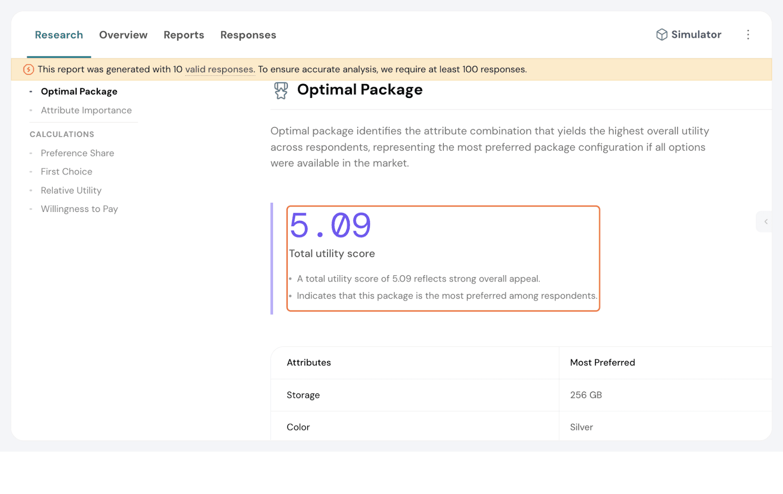
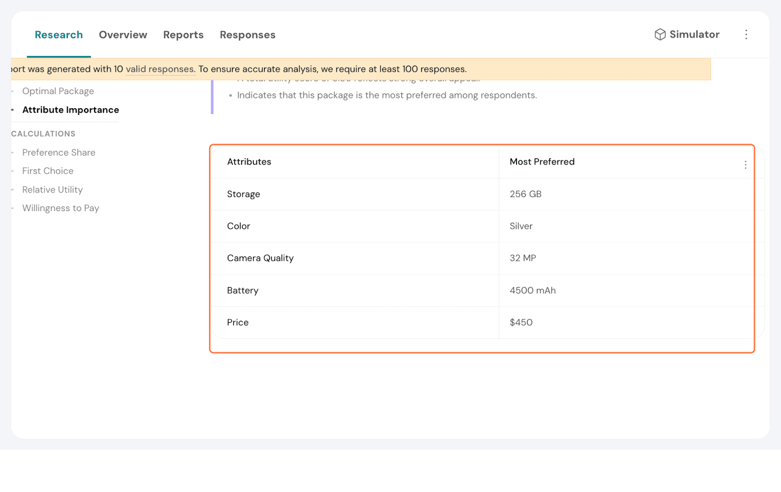
Optimal Package
The optimal package table displays the most preferred package across respondents. Both preference and utility are taken into account when determining this.
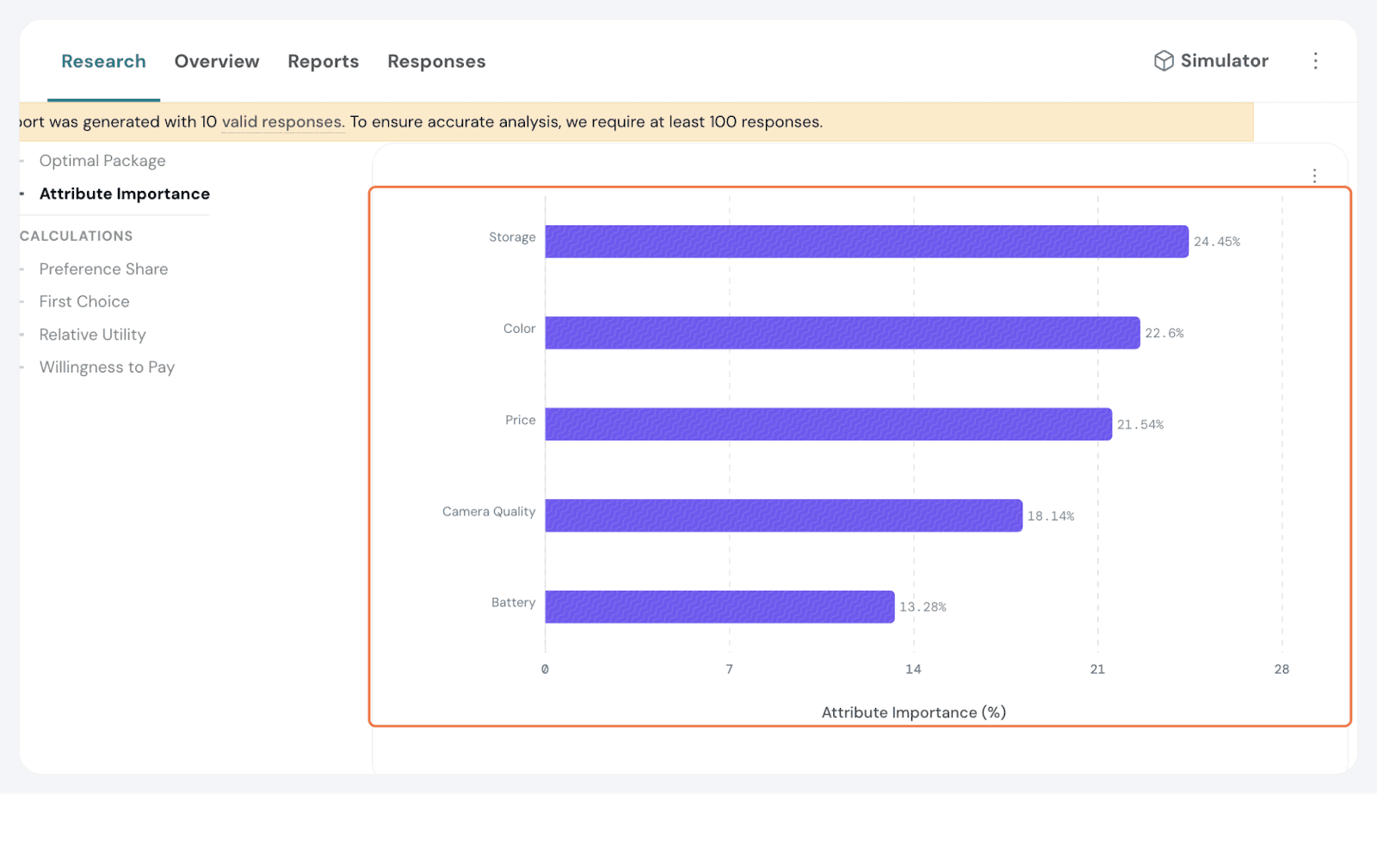
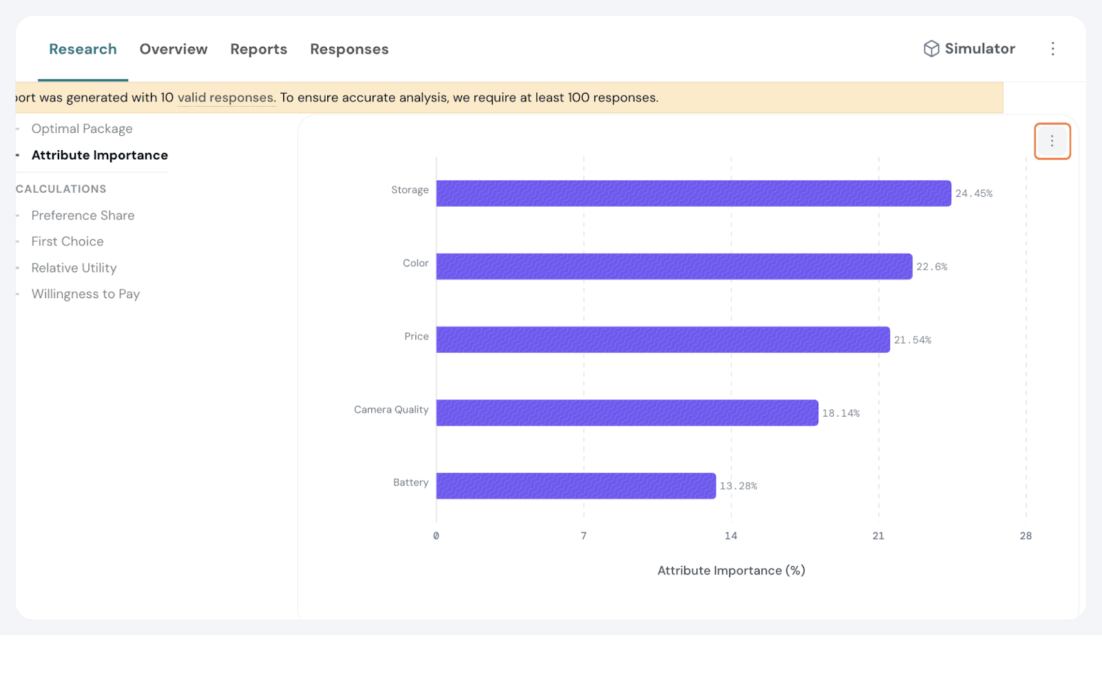
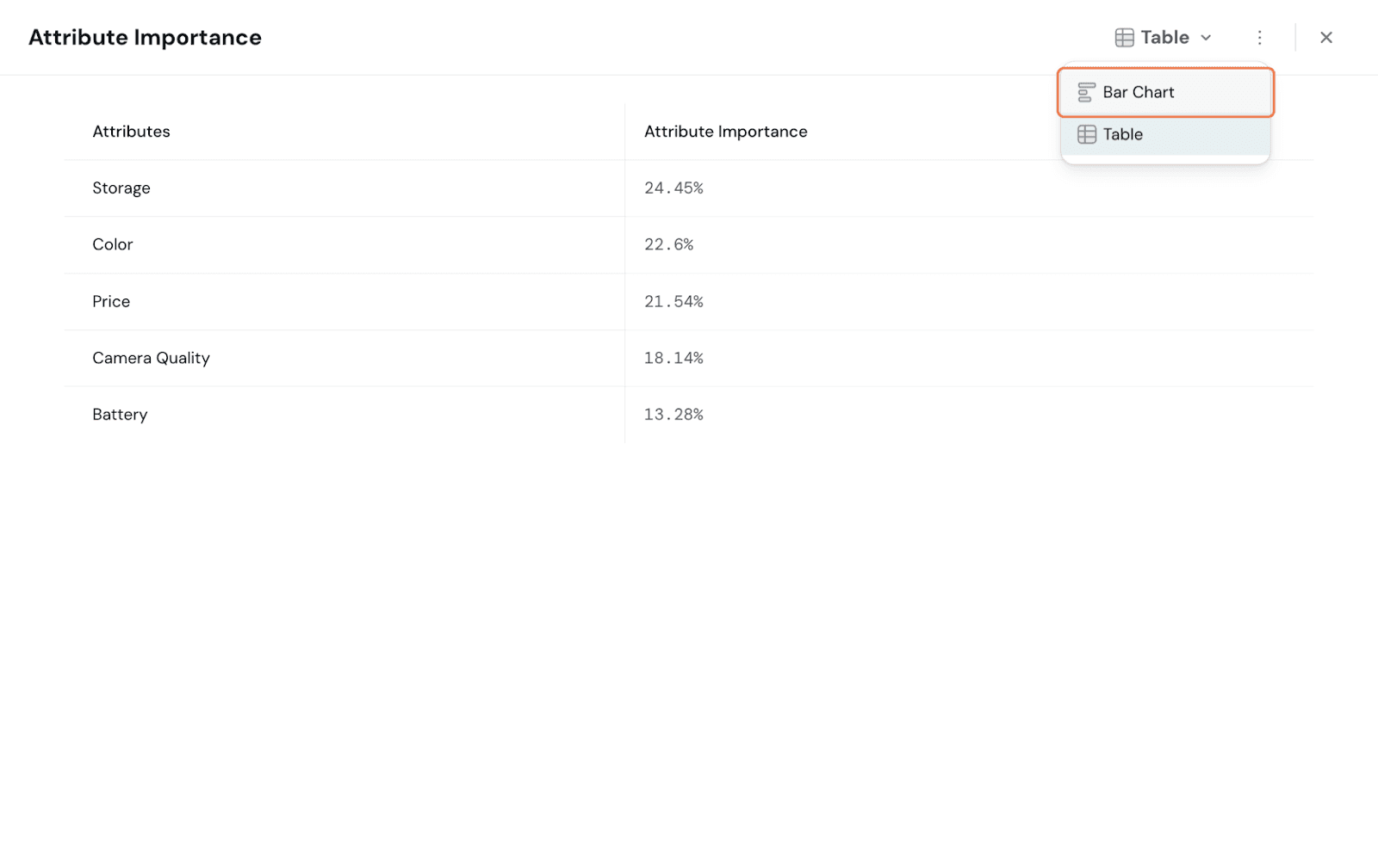
This measures how much each attribute influences the preference of a package. So, the higher the importance, the greater its influence on the respondents’ decision-making.
Here, Storage is considered important, followed by Battery.
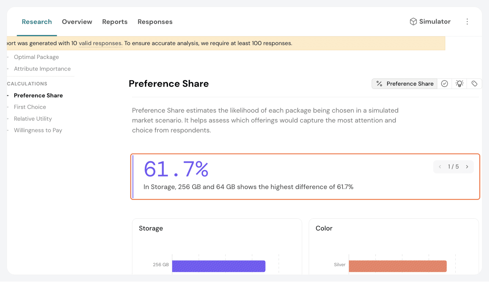
Preference Share
Preference Share represents the likelihood that a particular level of an attribute would be chosen over others, assuming all other attributes are held constant.
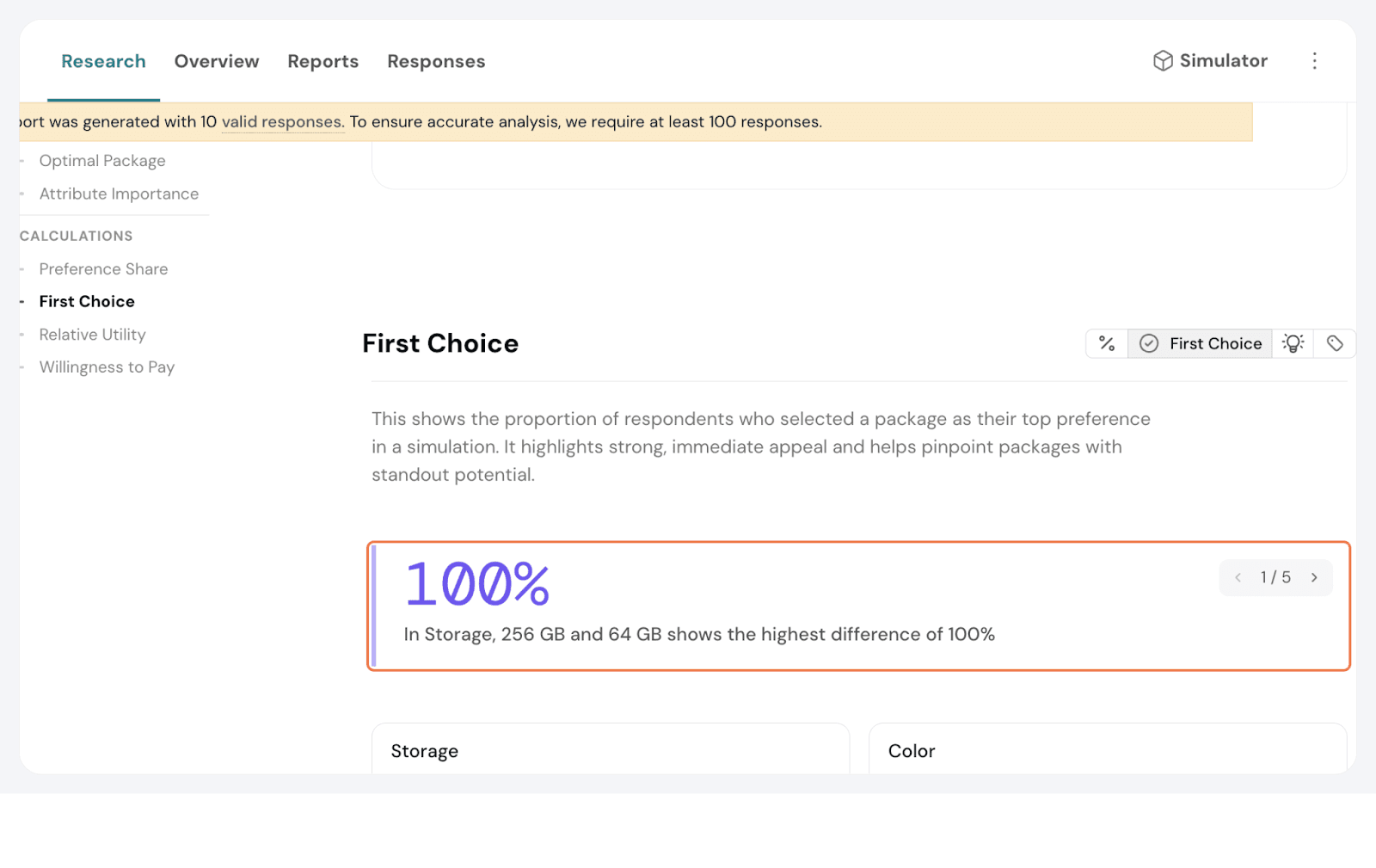
First Choice
The First Choice shows what respondents are most likely to select if they always choose the option with the highest utility.
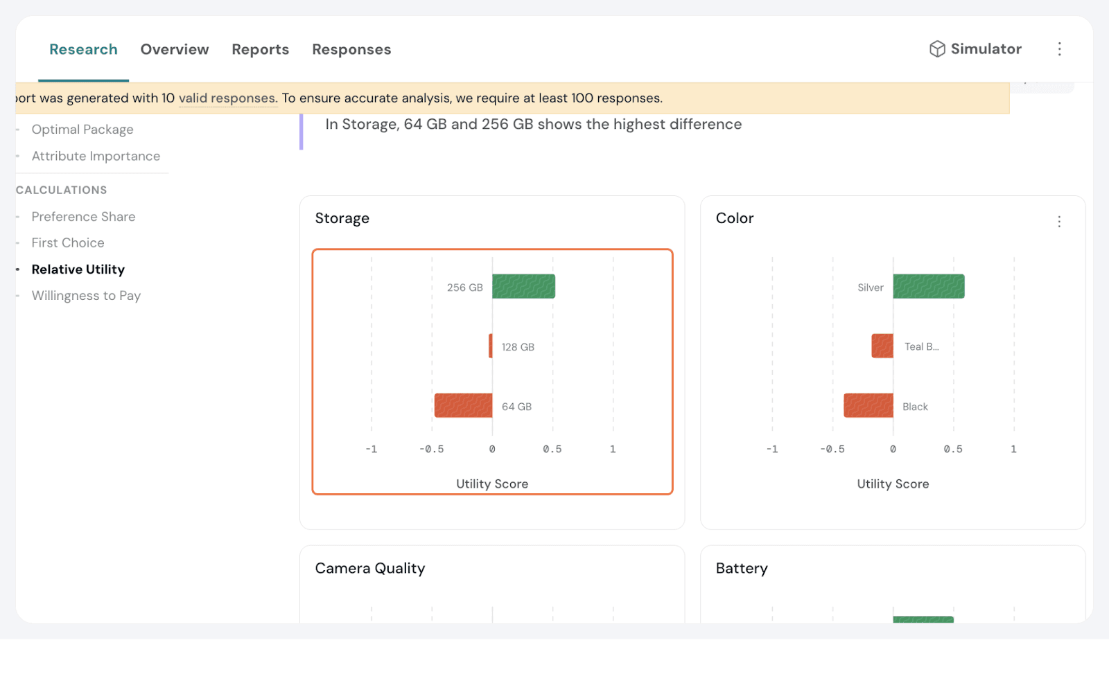
Relative Utility Scores
Relative utility scores represent the relative value respondents assign to each attribute level.
Utility scores should always be interpreted relative to other levels within the same attribute, not in isolation.
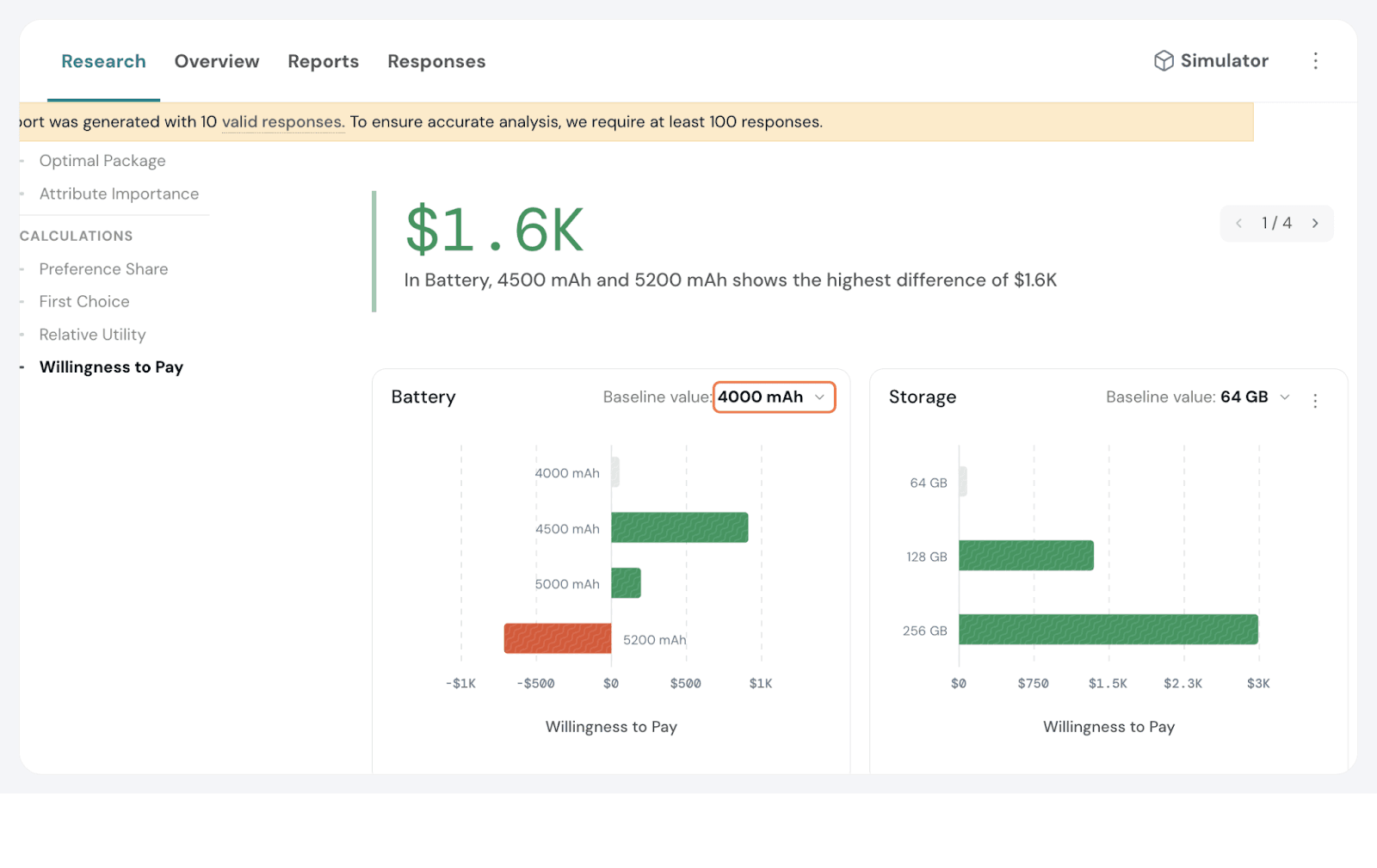
Willingness to Pay shows how much more or less respondents are willing to pay for a specific attribute level compared to a baseline.
This report is only available when price is included as a fixed pricing attribute.
Here, we can see that for Battery, with 4000mAh as the baseline, 4500 mAh and 5200 mAh shows the highest difference of $1.6K.
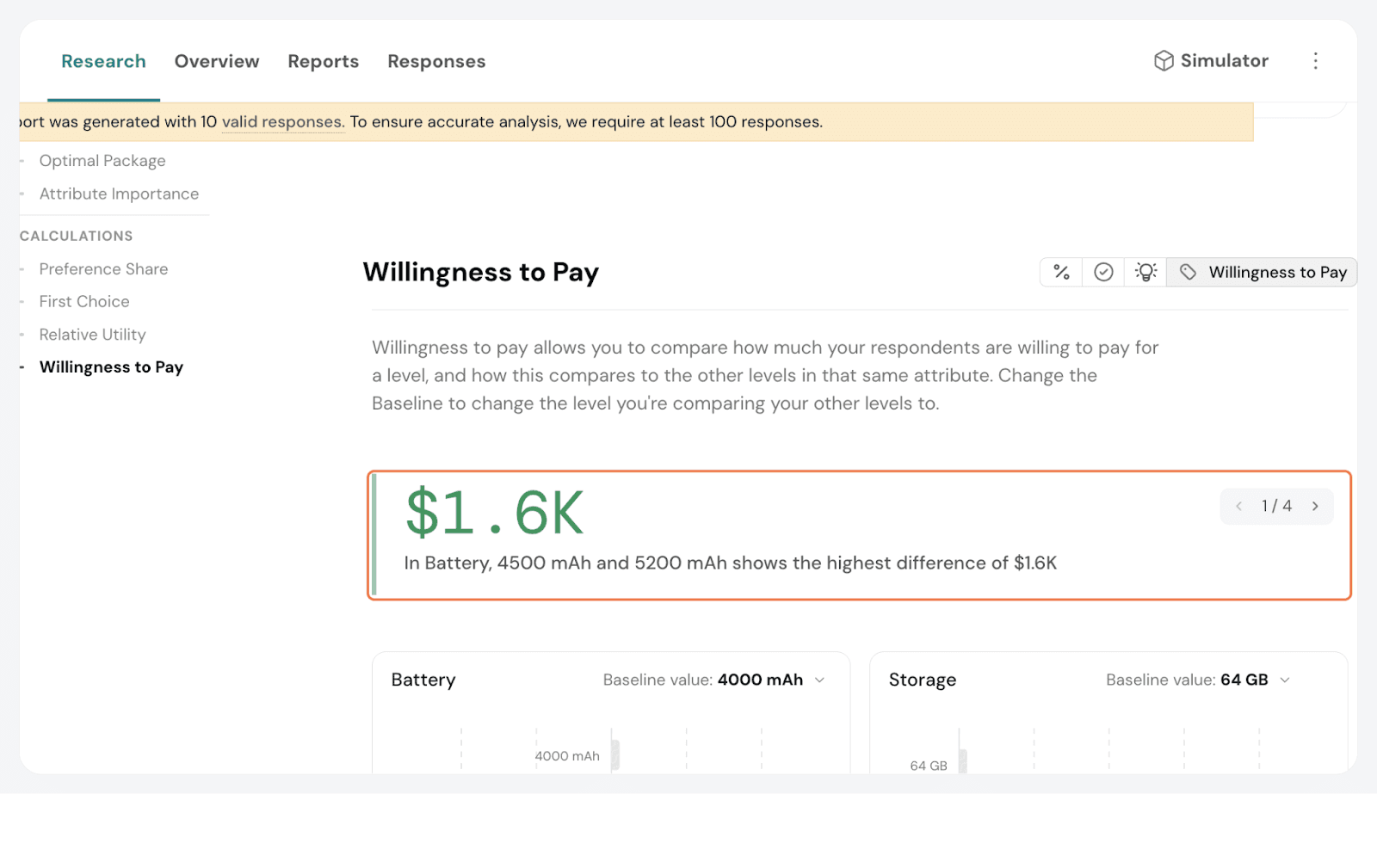
You can change the baseline and see how it varies. Simply click the toggle on the chart/s and modify accordingly.
Smart Filters
You can filter the data further with the help of Smart Filters. They are especially useful when your survey includes segmentation questions. For example, if respondents share their age group, you can instantly compare preferences between younger and older segments.
By narrowing your analysis to a specific audience, Smart Filters help you spot trends faster, compare segments clearly, and draw sharper insights. Once applied, all charts, tables, and exports automatically update to show only the data that matters.
Click on Smart Filters. Click on create a new one.

Let’s have this one focus on locations: create a filter specifically for respondents from New York City.
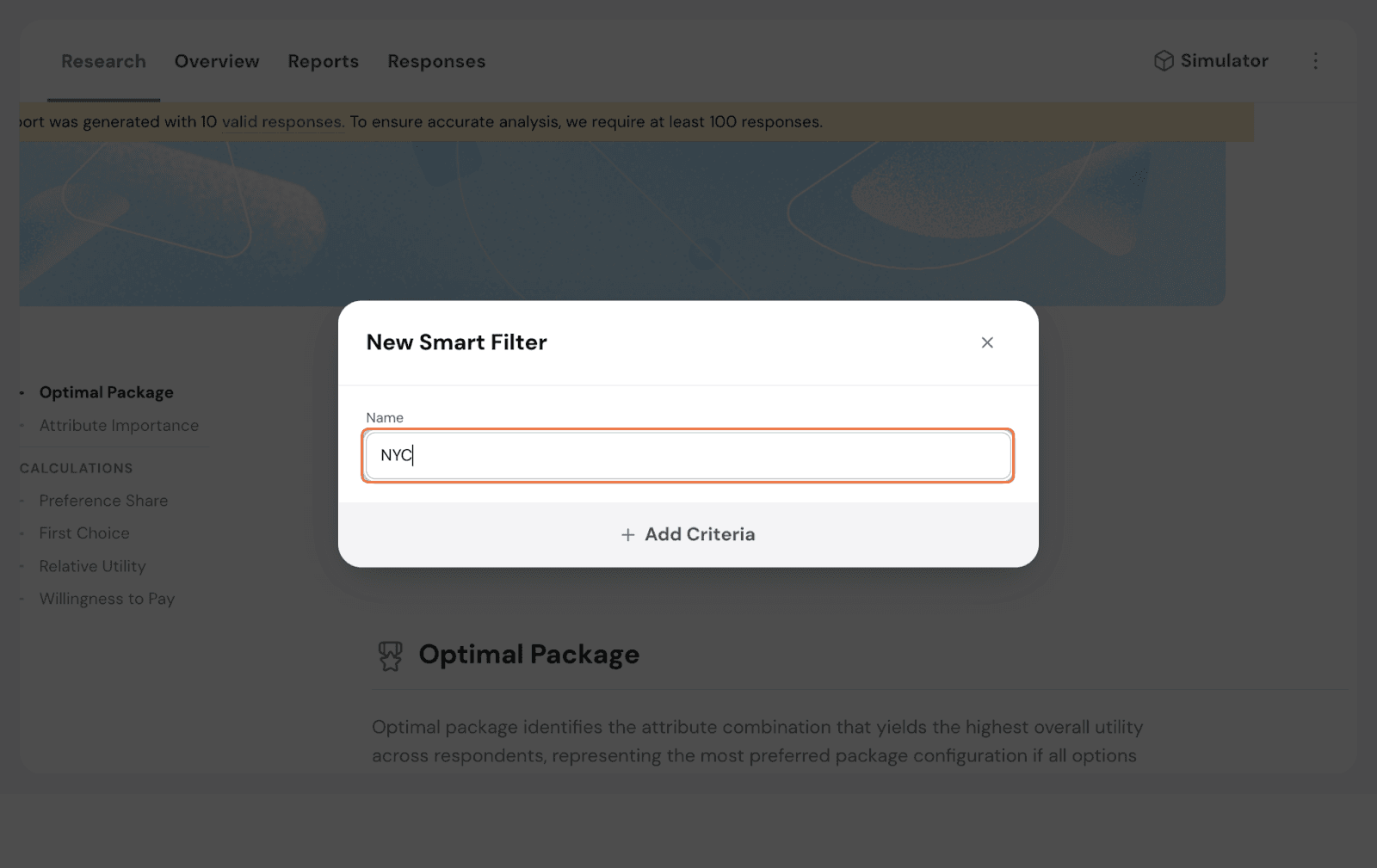
From the options below, choose all the filters that matter and set them up.
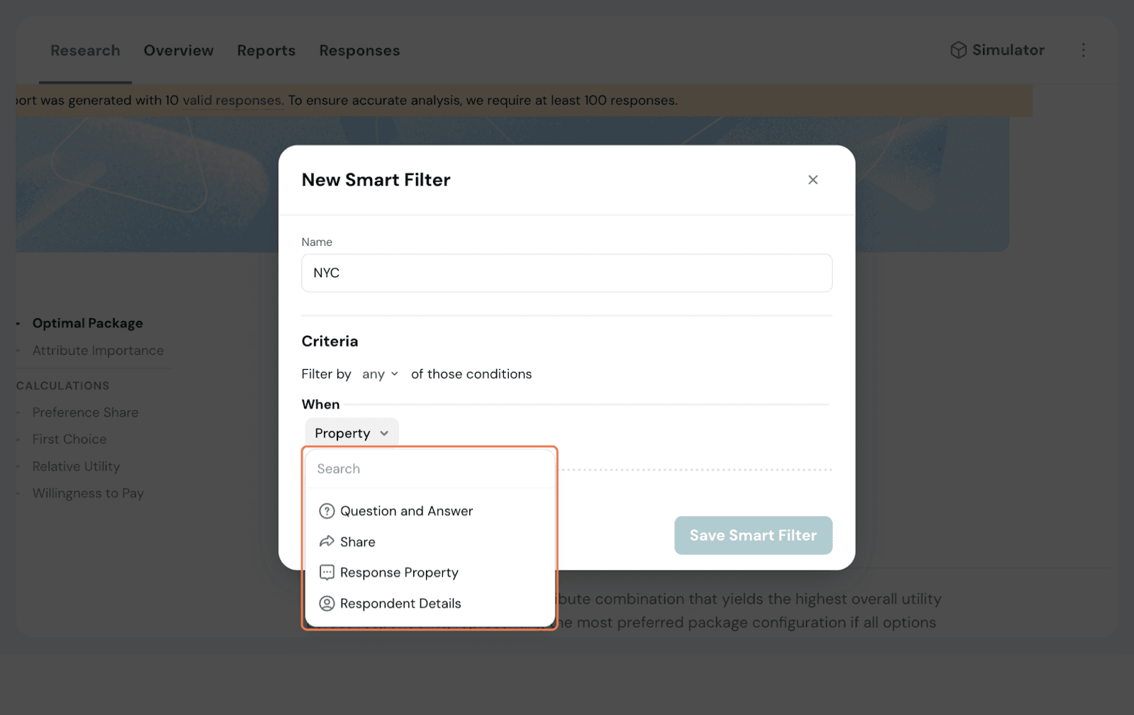
This Smart Filter is now available across results.
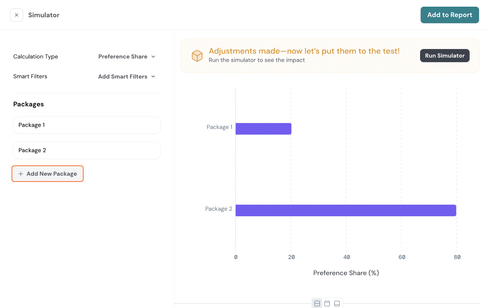
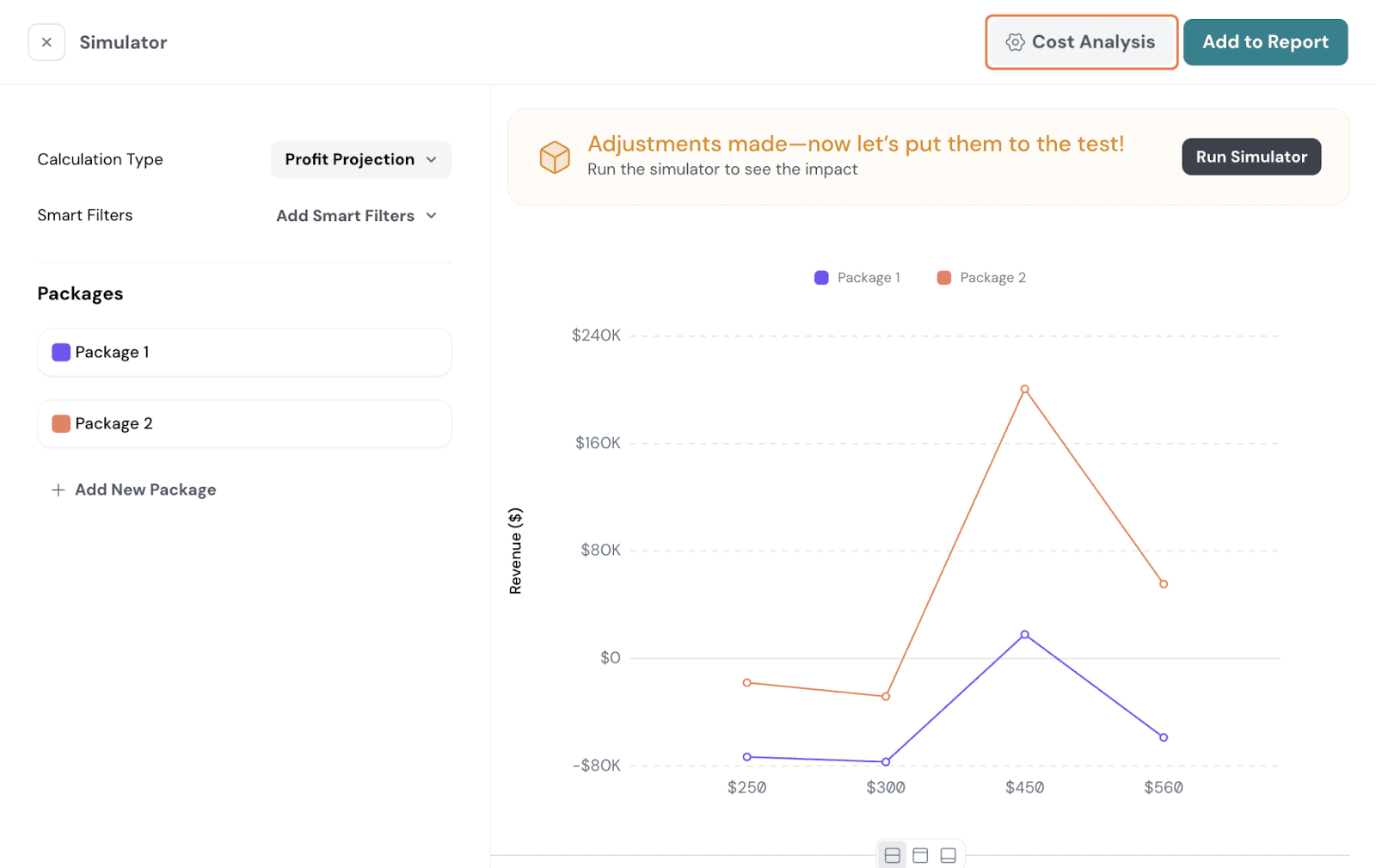
If you want to test out how different packages may work, you can run it in the Simulator. By default, it tries to display the two packages with the highest contrast as package 1 and package 2, but it is important to adjust the simulator to get a better idea of the impact each package will have in comparison to the other.
Go to the Simulator on the top right.
Here, you have 6 calculations. Let’s go over them one by one.
Preference Share
This shows the preference for one attribute level over others, as seen in the above section. You can add an existing smart filter or create a new one and apply it if needed.
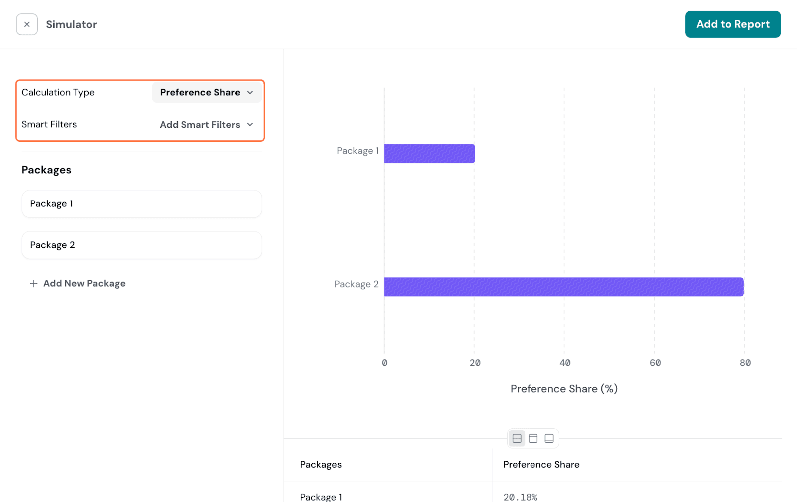
Packages: Here, by default, you have 2 packages with maximum contrast given. You can edit the given packages or add a new one.
Click on the pencil icon to rename the packages for identification.
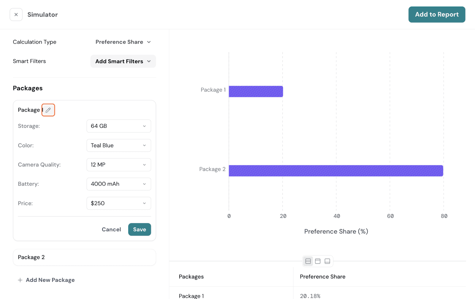
Once configured, click on Run Simulator. It will now show the Preference Share for the configured packages.
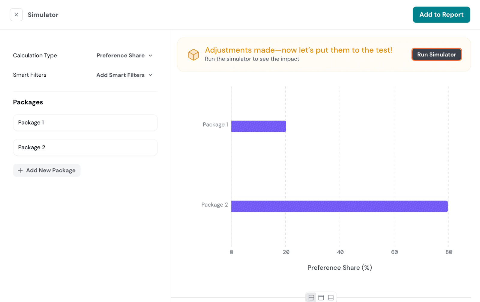
If you prefer to add it to your report, click on Add to Report, and it will be added as a section.
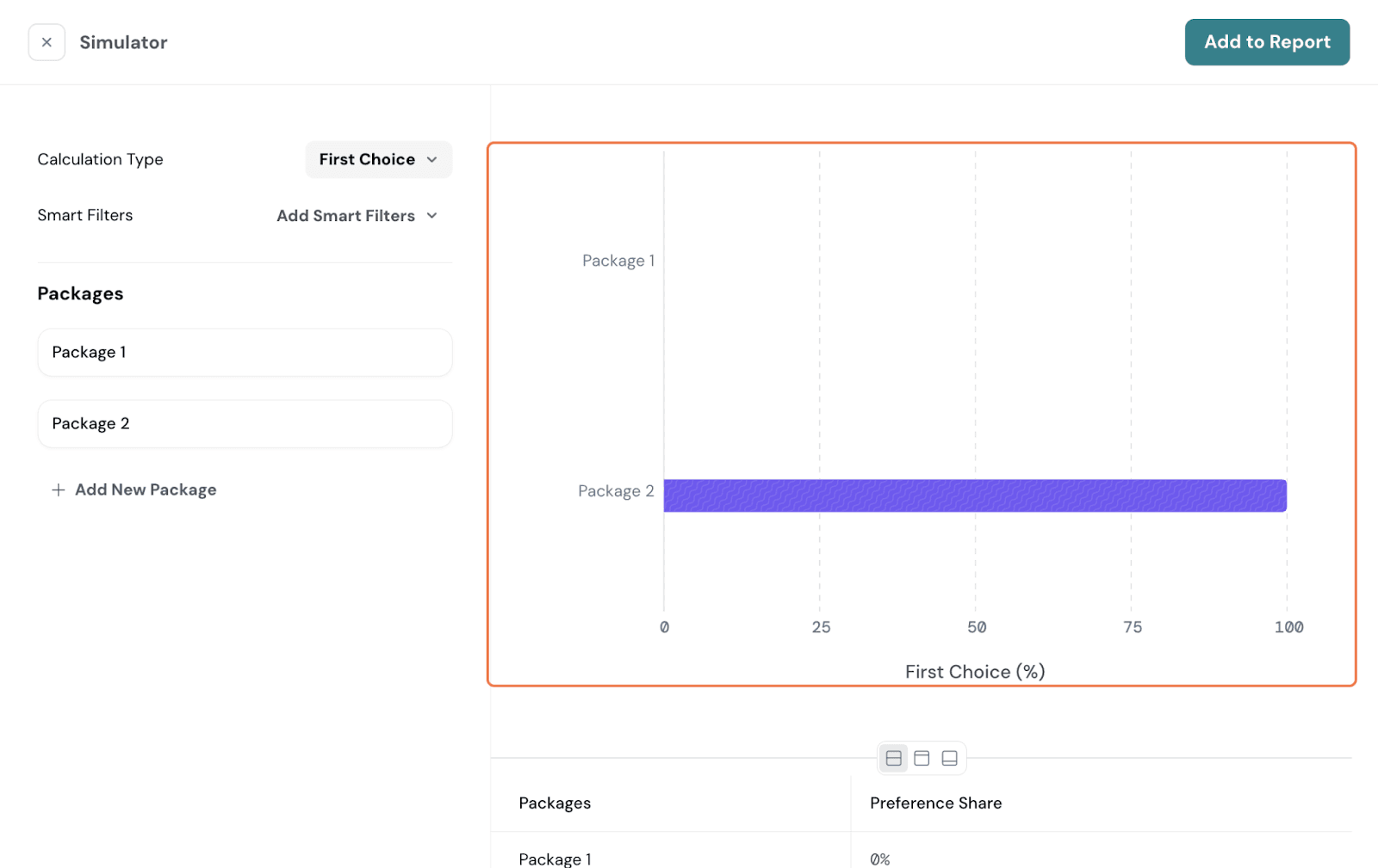
First Choice
Switch the toggle to First Choice.
Here, you’ll be able to see what respondents are most likely to select as their first choice. This model assumes respondents will select the package with the highest utility.
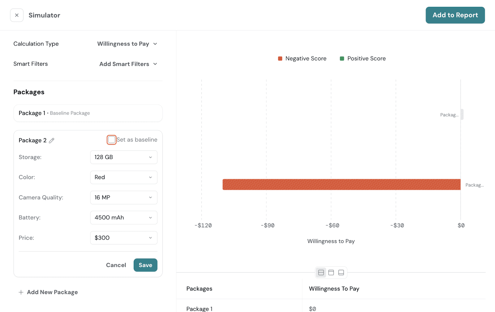
Willingness to Pay
Next, you can switch it to Willingness to Pay.
You can see how much people are ready to pay for the configured packages, with one of them set as the baseline. By default, the first one is chosen as the baseline.
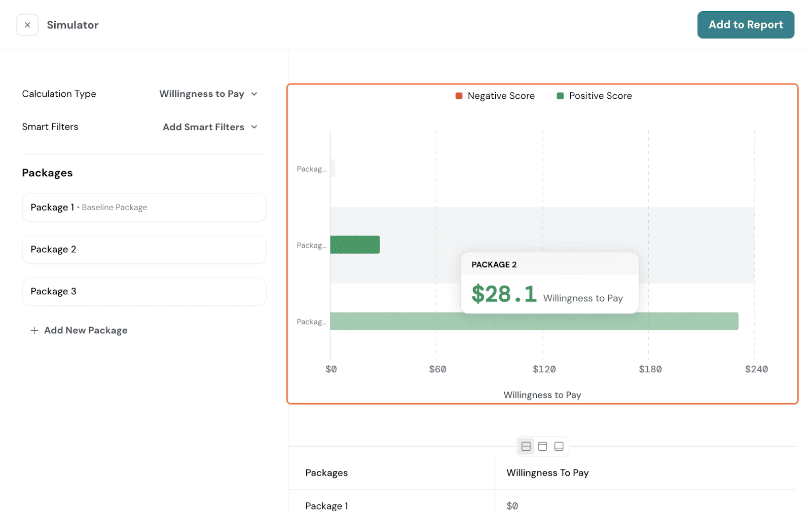
If you prefer to switch, go to the other package. Select Set as Baseline, and it will now be the baseline.
Demand Estimation
Demand Estimation shows how the preference is affected by price variation. With this graph, you can determine when your price or price multiplier is getting too high and is affecting demand.
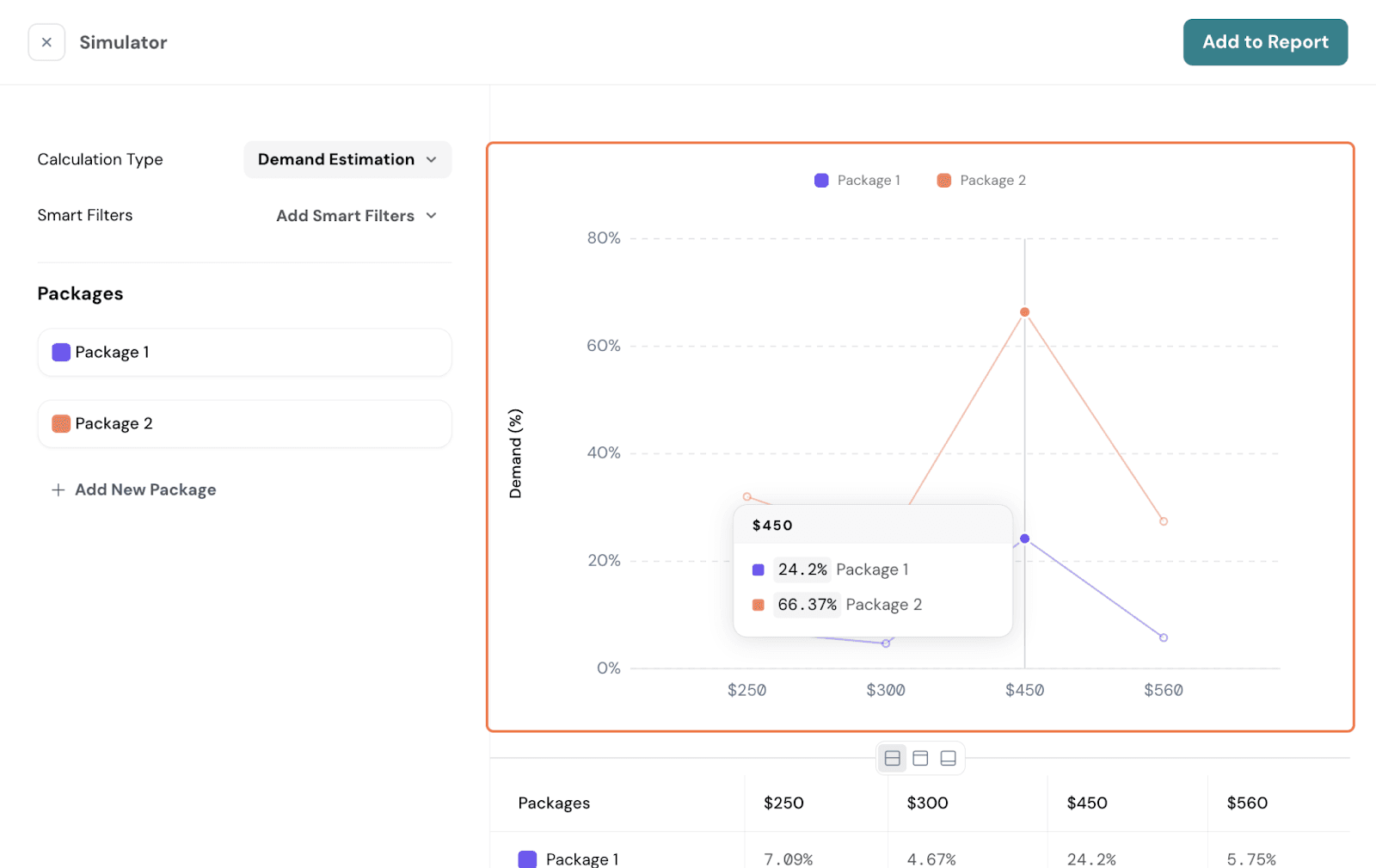
For this to be available, your Conjoint Study needs to have:
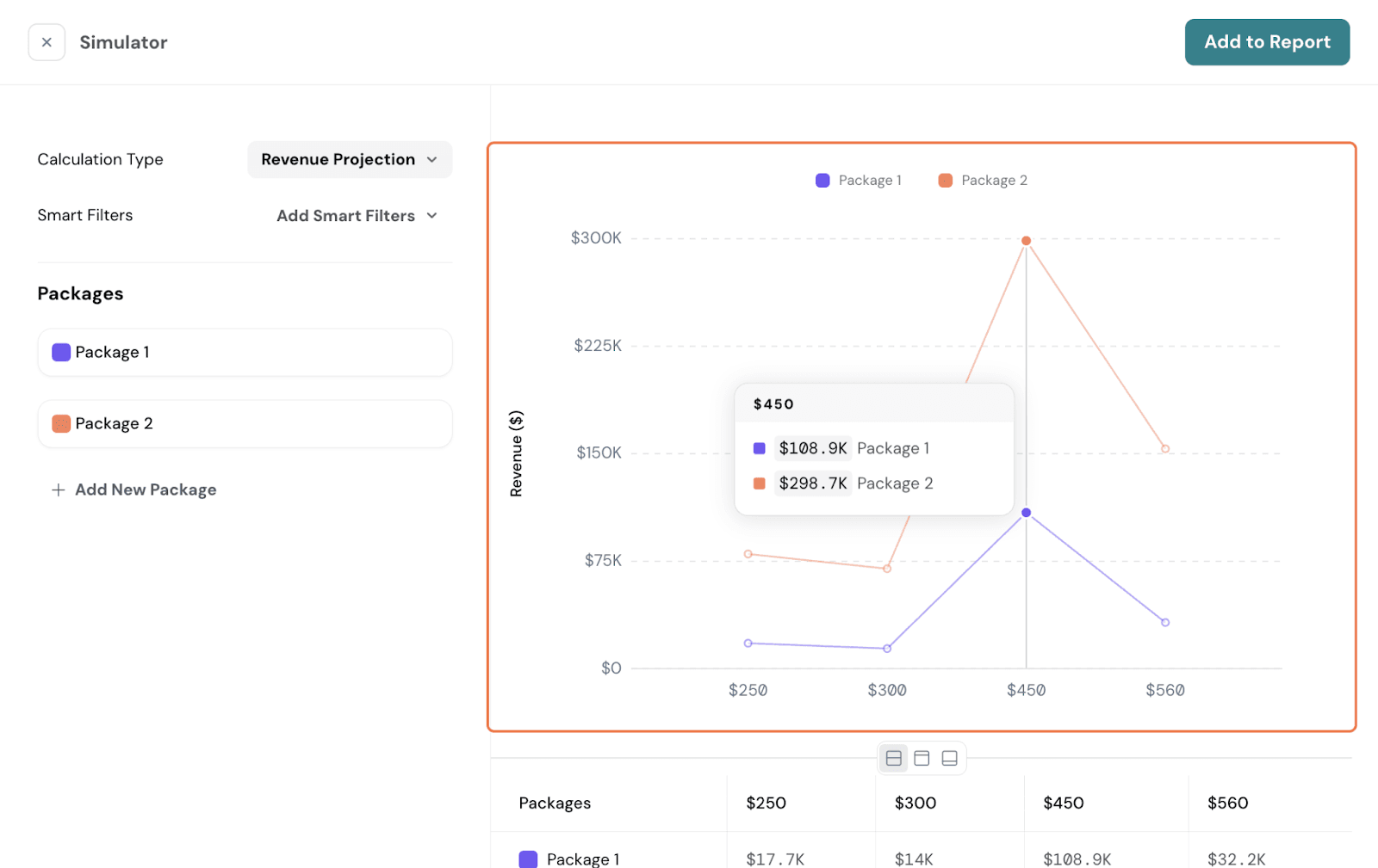
Revenue Projection
The Revenue Projection report displays your projected revenue at each price point. Simply put, revenue is calculated by multiplying demand by the price. For this to be available, you would need these:
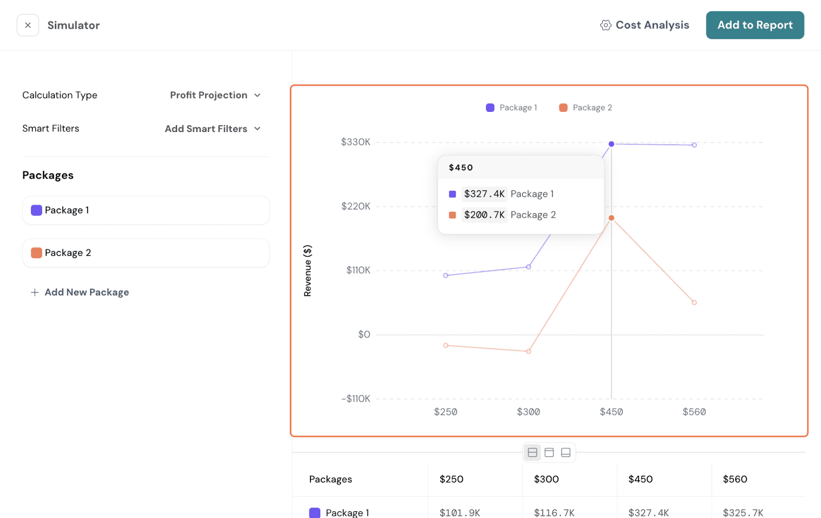
Profit Projection
Profit Projection shows the projected profit at each price point. It takes the revenue at that price and subtracts the cost to arrive at profit. You can use this graph to find what price or price multiplier leads to the highest profit.
For Profit Projection to work, your study needs to have these criteria met:
For Profit study, a cost structure should also be set up. Here, click on Cost Analysis.
You will get this box below. Be sure to set up a base cost and cost per attribute. Ensure to fill it for every level; only then can the cost be calculated.
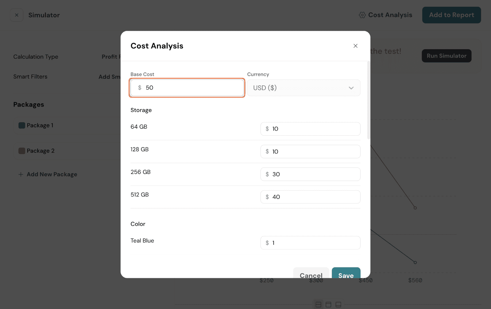
Once done, hit Save.
You should now be able to see your Profit Projection and make pricing decisions accordingly.
Click on the 3 dots on the top right of the chart. You will see a list of options.
Sort: You can sort the chart by Low to High or High to Low.
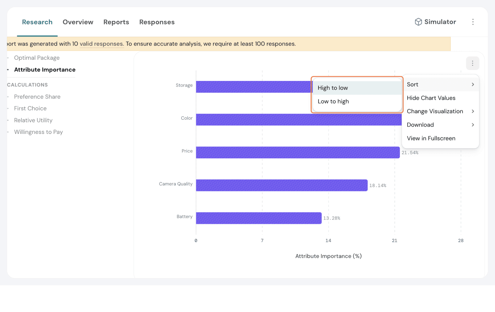
Hide Chart Values: You can choose to hide the number labels on the bar graphs, displaying only the visual representation of the data.
Change Visualization: You can switch between a bar chart and a table view, depending on your preference for data presentation.
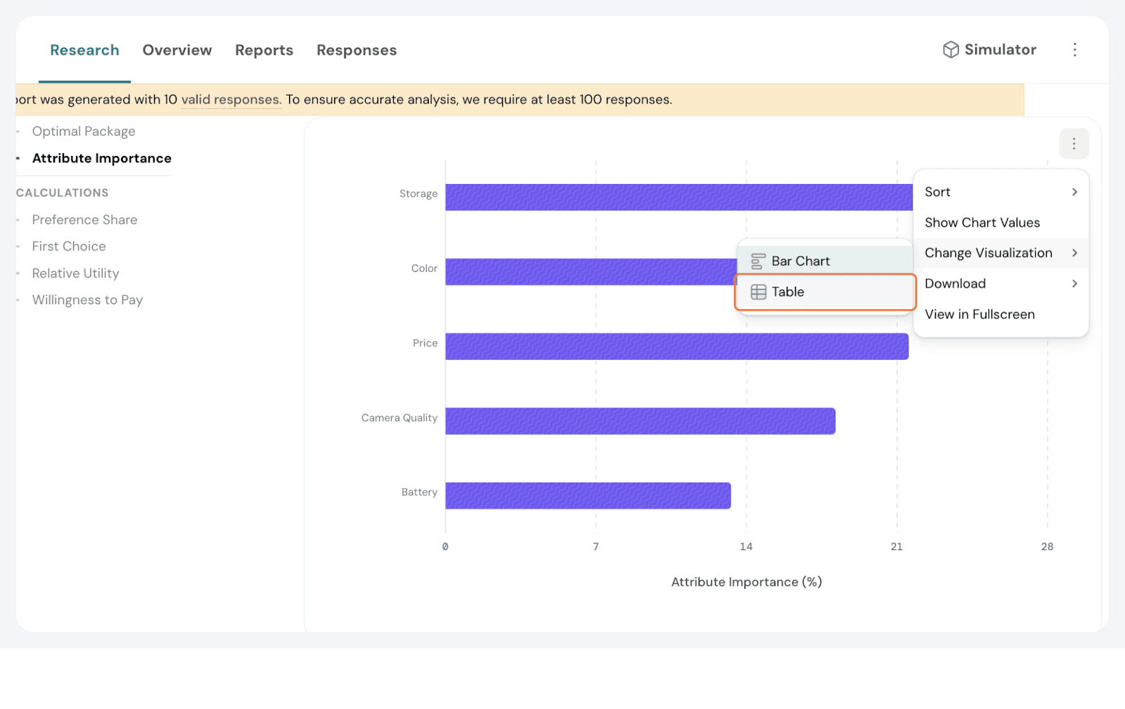
Download: You will be able to download the chart in either JPEG or PNG format for easy sharing or inclusion in reports. If the visualisation is in a table, the download option will be CSV.
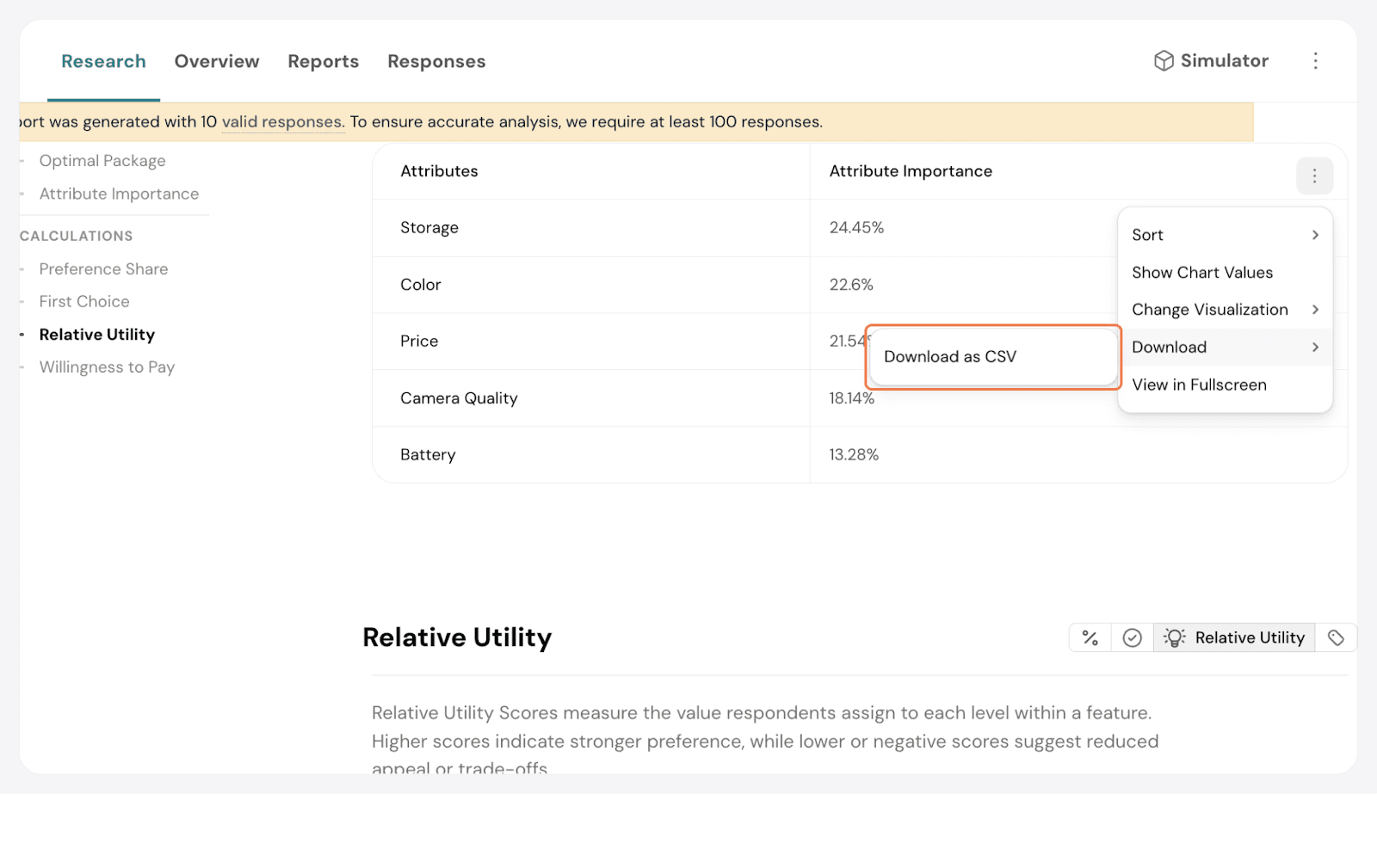
View in Full Screen: You can expand the chart to full screen for a clearer, more detailed view.
Click on the 3 dots. Select Customise Report.
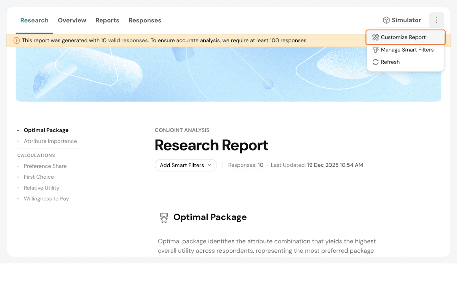
Here, you have the following options:
Change the cover image: You can update the default cover image to something else for your report
Report Name: Change this to update to your preference.
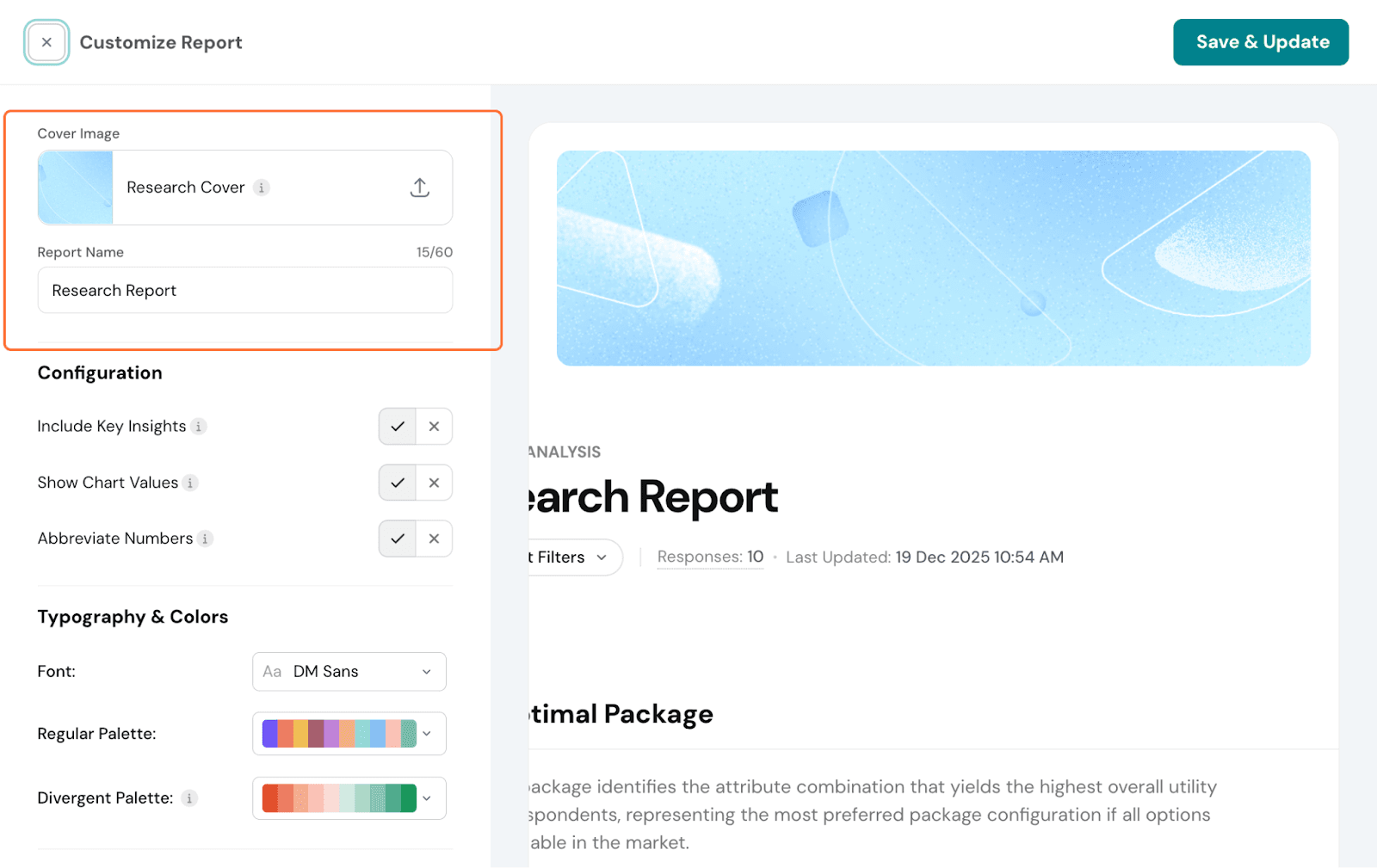
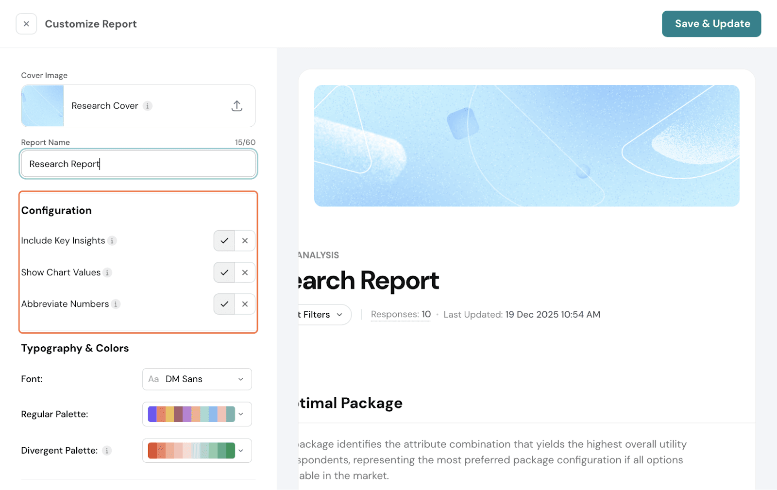
Under Configuration, you can choose to include insights. Enabling this will display key findings on respondent preferences and provide a summary of the results. You can also choose whether or not to display the chart values.
Under Typography, you can change the font and change the colours. There are 2 aspects for which you can choose the palette. Regular palette- this is for all the charts. Divergent palette- Ideal for showing positive and negative values, especially for variations in Utility Scores.

Smart Filters: You can add Smart Filters from here as well.
Refresh: You can refresh the report to be updated.
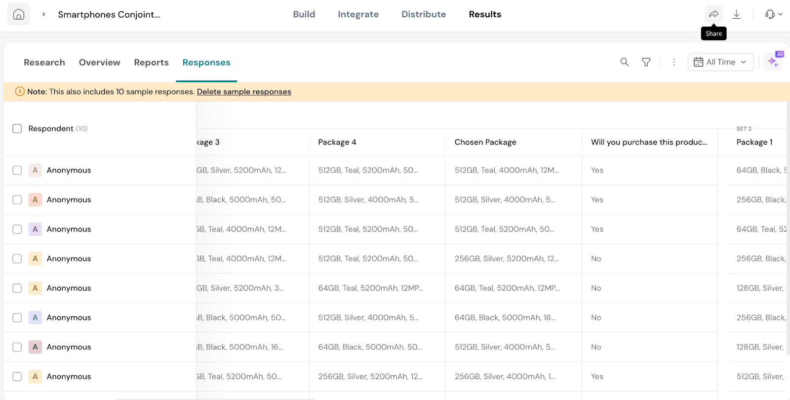
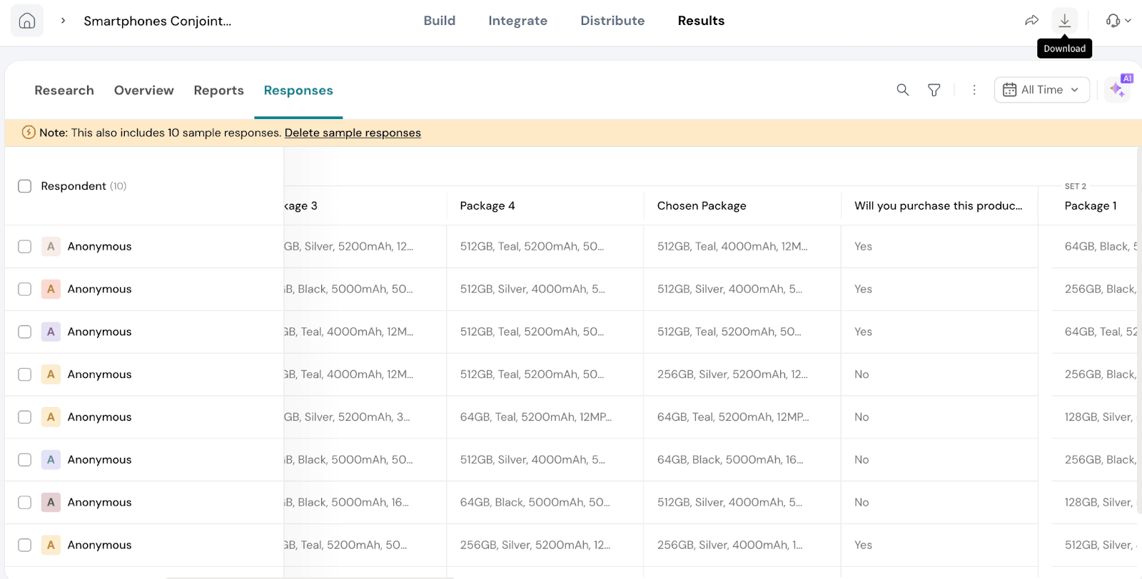
The Responses section provides a detailed view of how respondents interacted with the Conjoint survey. It helps you analyze individual-level data to understand patterns in their preferences and decisions.
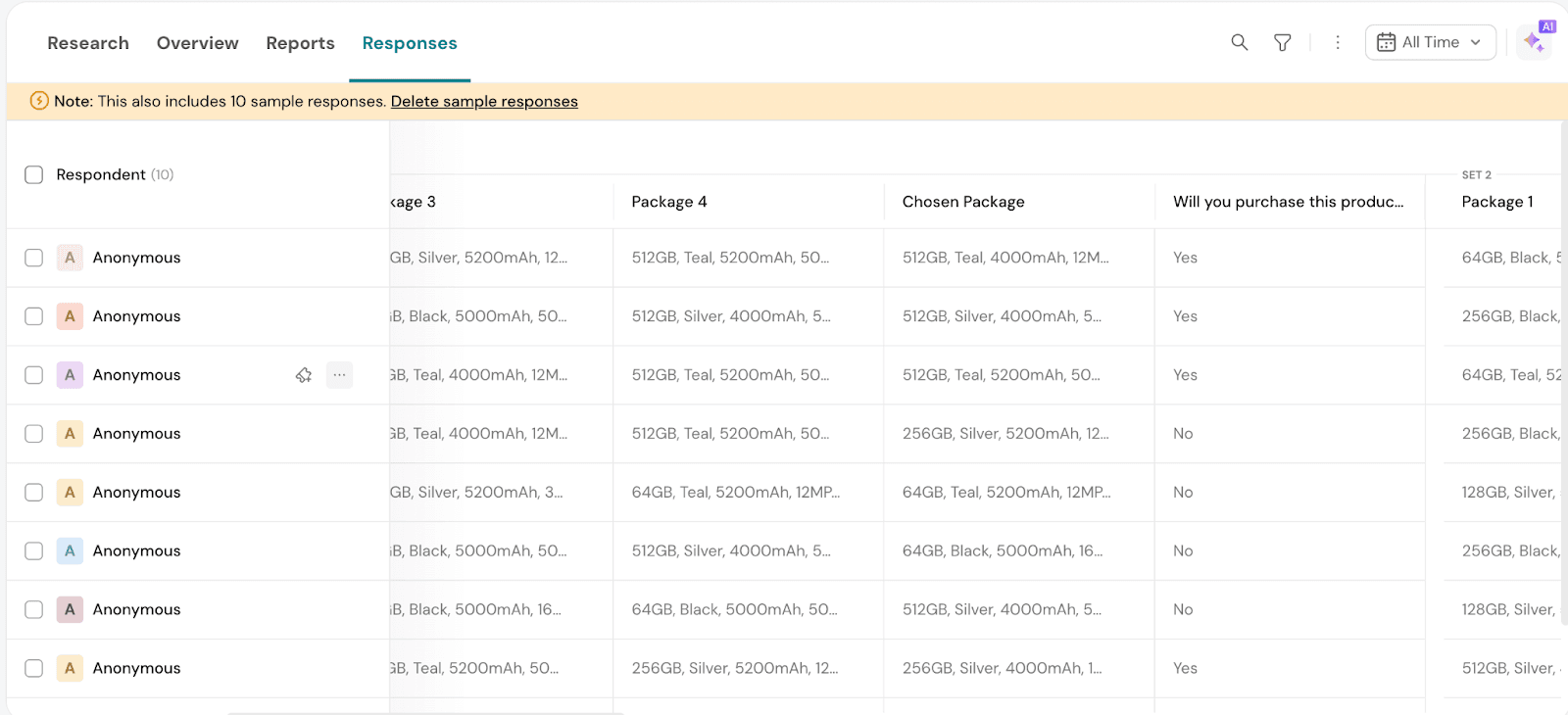
In the Responses section, you can view individual-level data such as:
This helps you gain insights into how respondents engaged with the Conjoint packages and what choices they made.
You can download both the report and the raw data for further analysis. Additionally, you have the option to share reports and responses directly with others, making collaboration and decision-making easier.
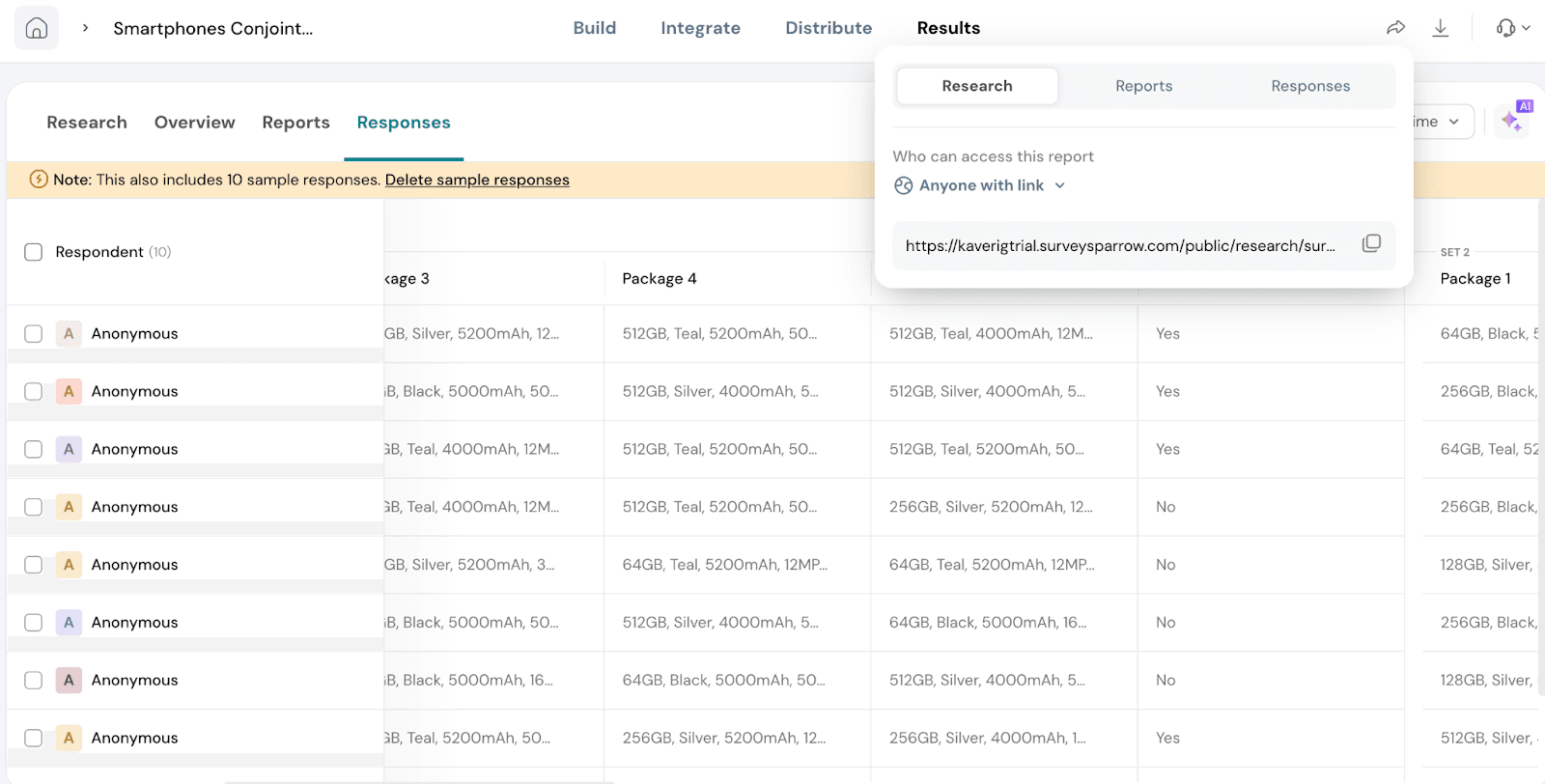
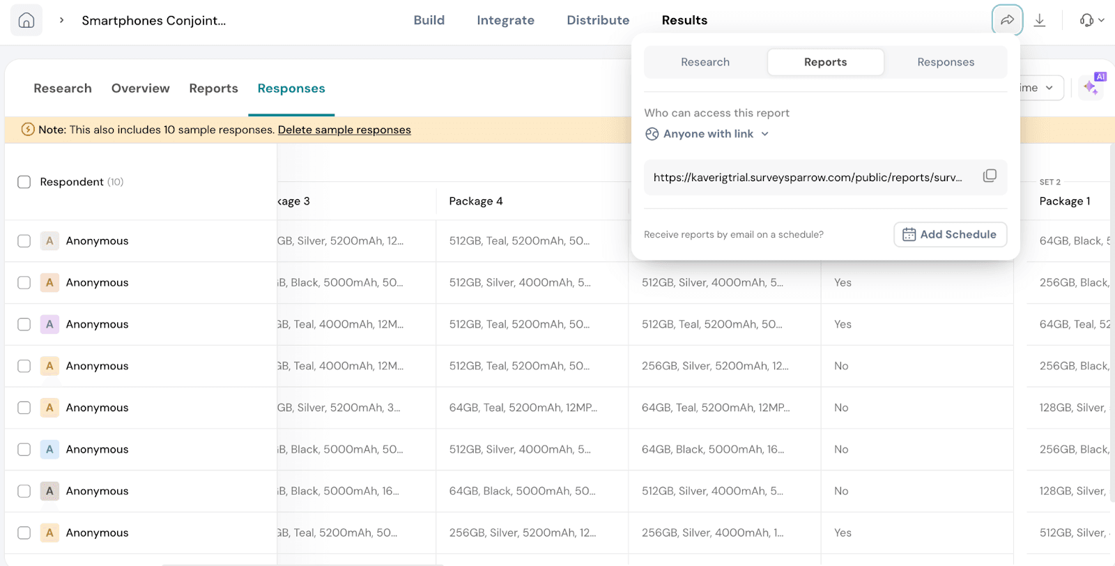
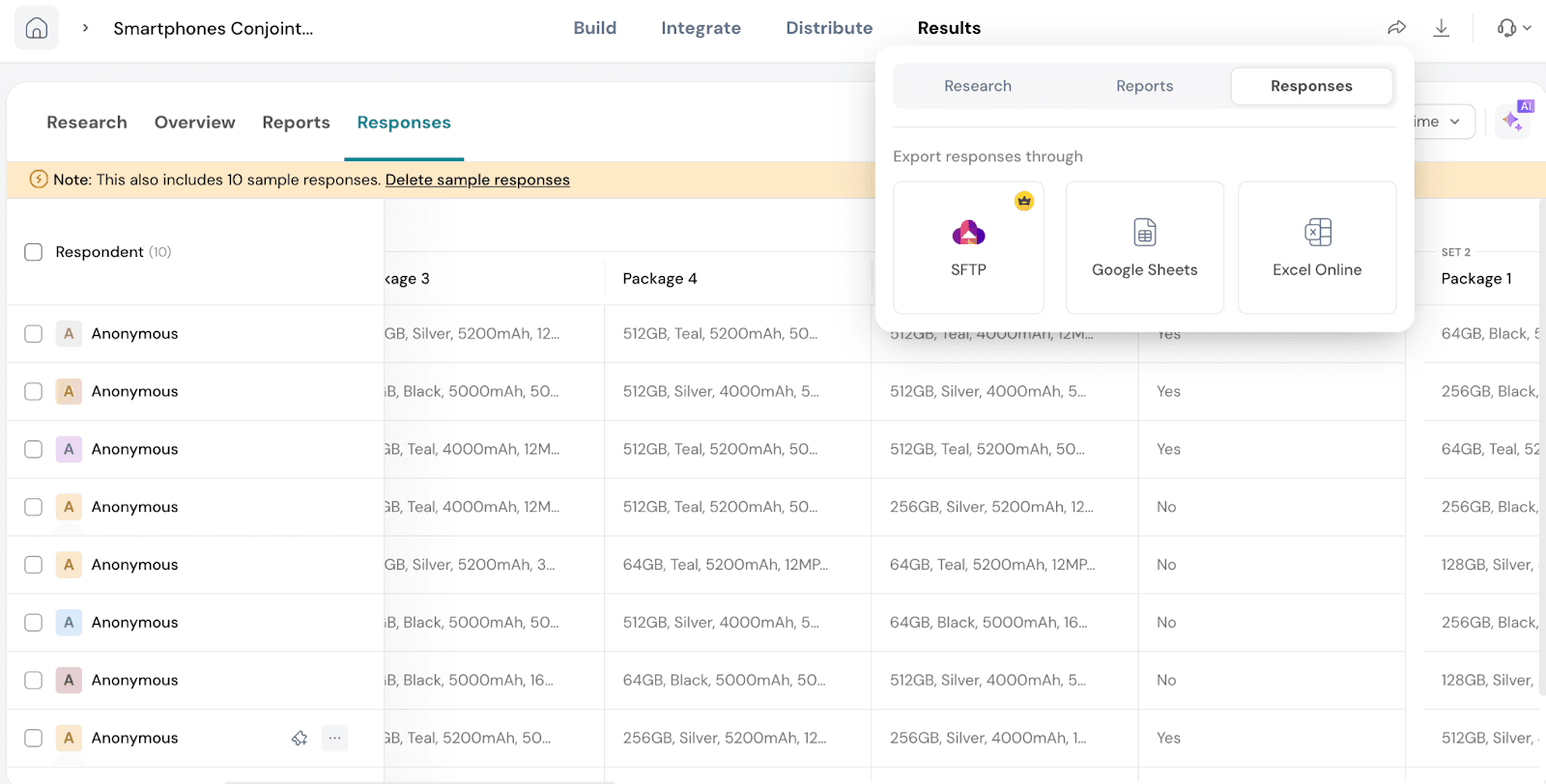
Let’s see how to share the reports and responses. Click on Share.
Go to the arrow on the top right.
You will see 3 options:
Research: You will be able to share the MaxDiff report with anyone who has the link or anyone with the link and password. You will be able to share as a link.
Reports: You will be able to share the Default report with anyone who has the link or anyone with the link and password. You can also be able to schedule the report.
Responses: You will be able to export the responses using SFTP or as Google Sheets or through Excel Online.
Let’s see how we can download the reports and responses.
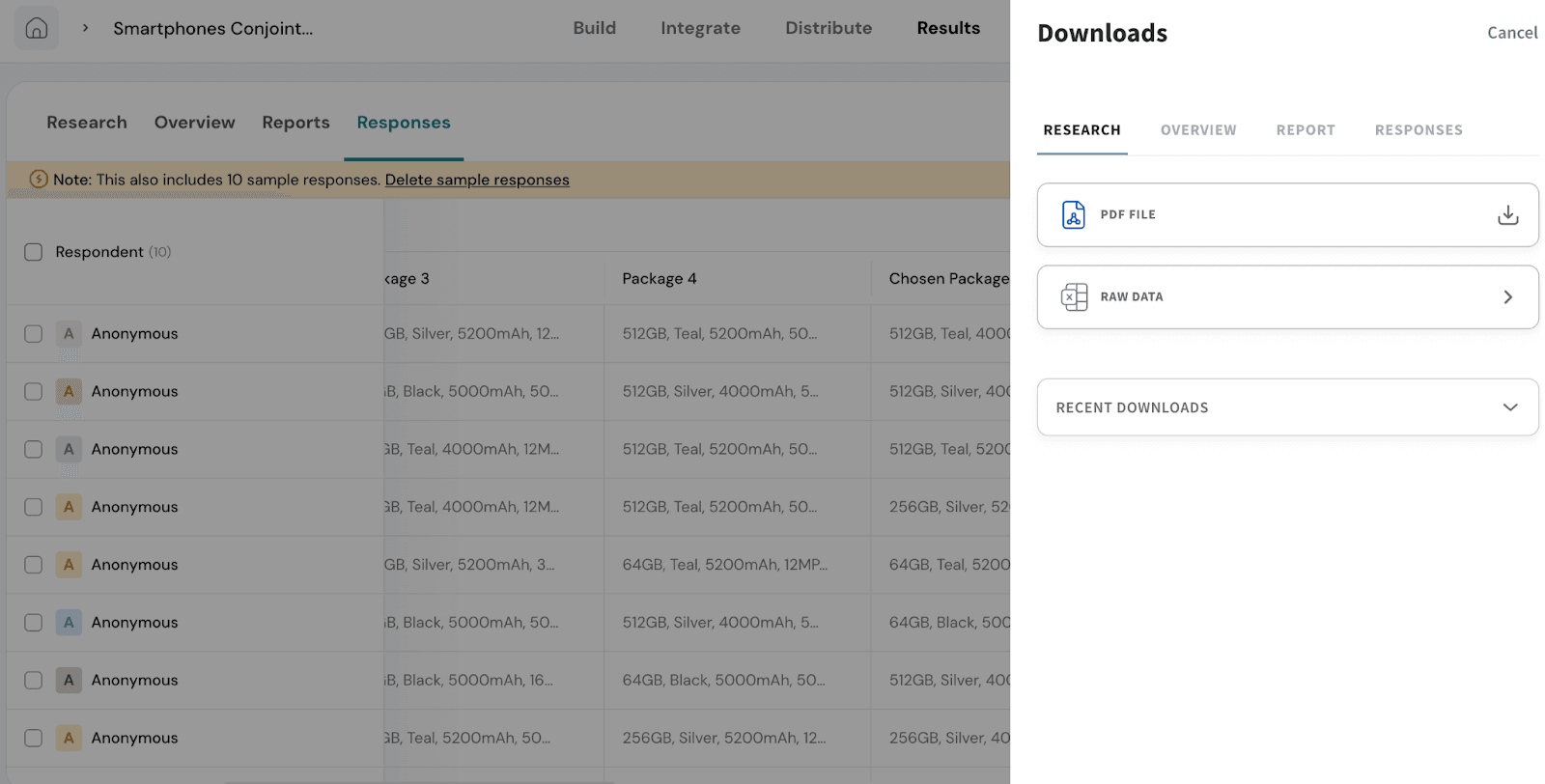
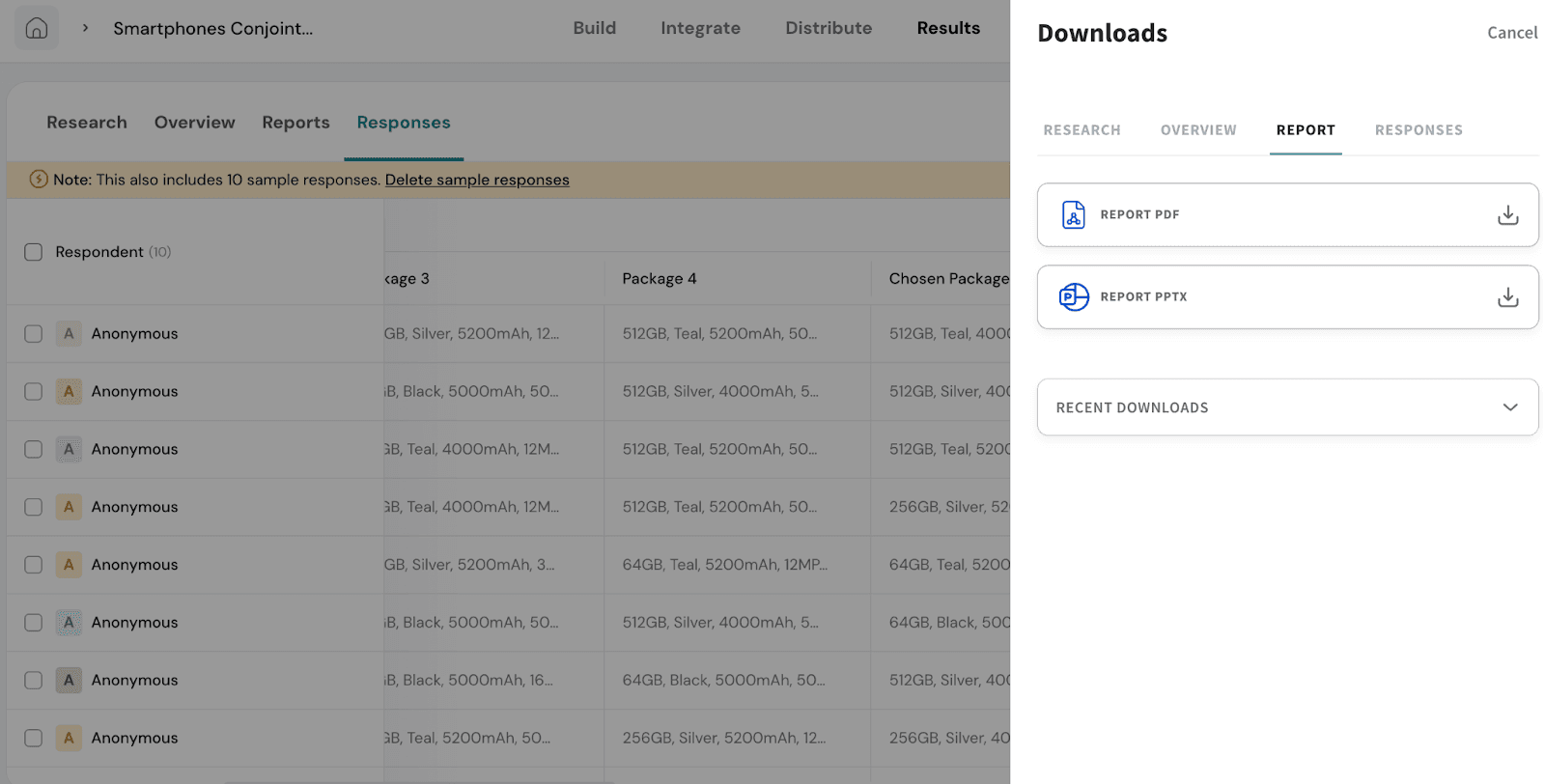
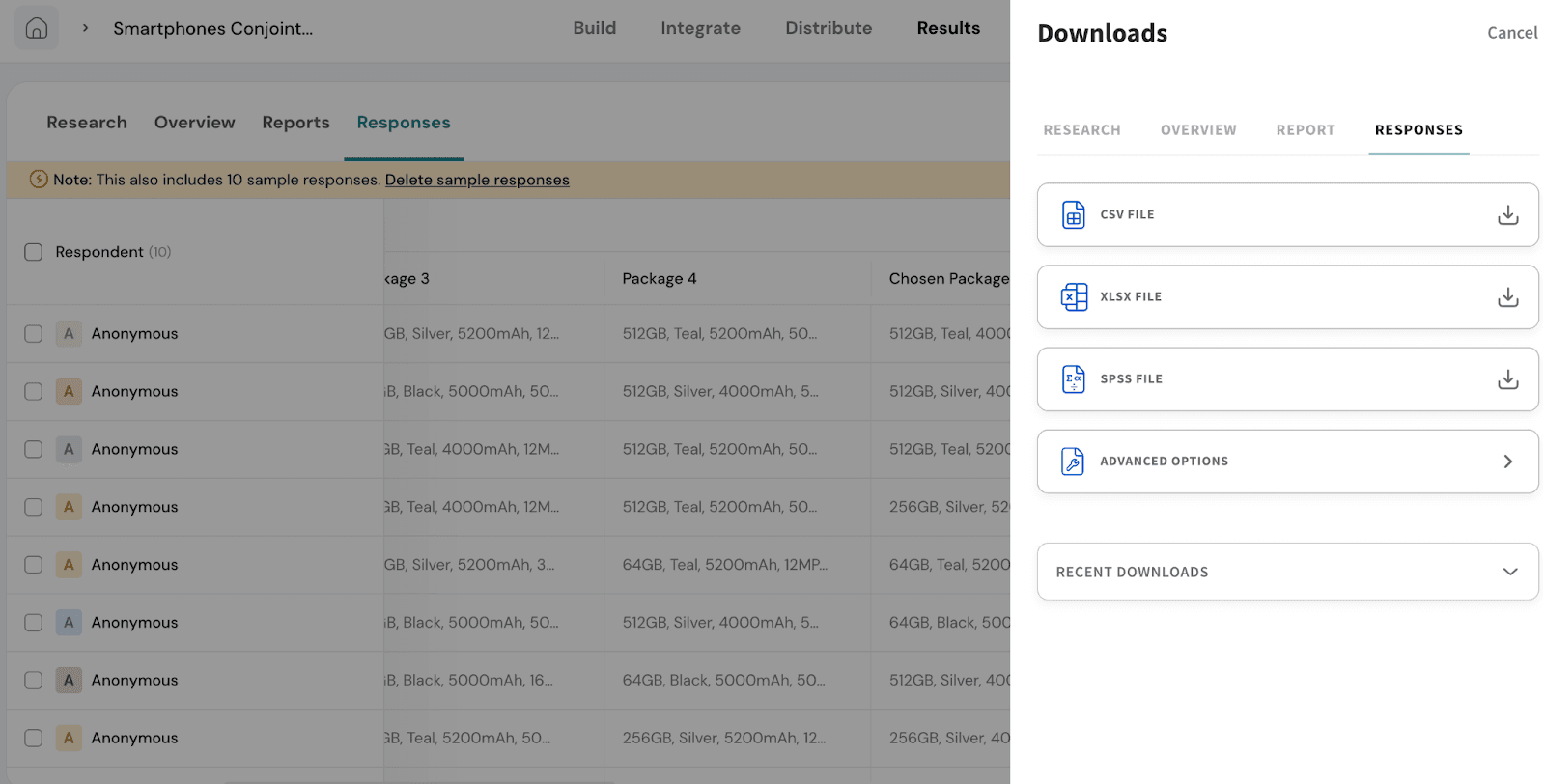
Go to Download on the top right.
You will have 4 options:
Research: You can download the MaxDiff report as a PDF or choose to export the Raw Data.
Under Raw Data, you’ll be able to select specific sections like Optimal Package, Preference Share, etc.
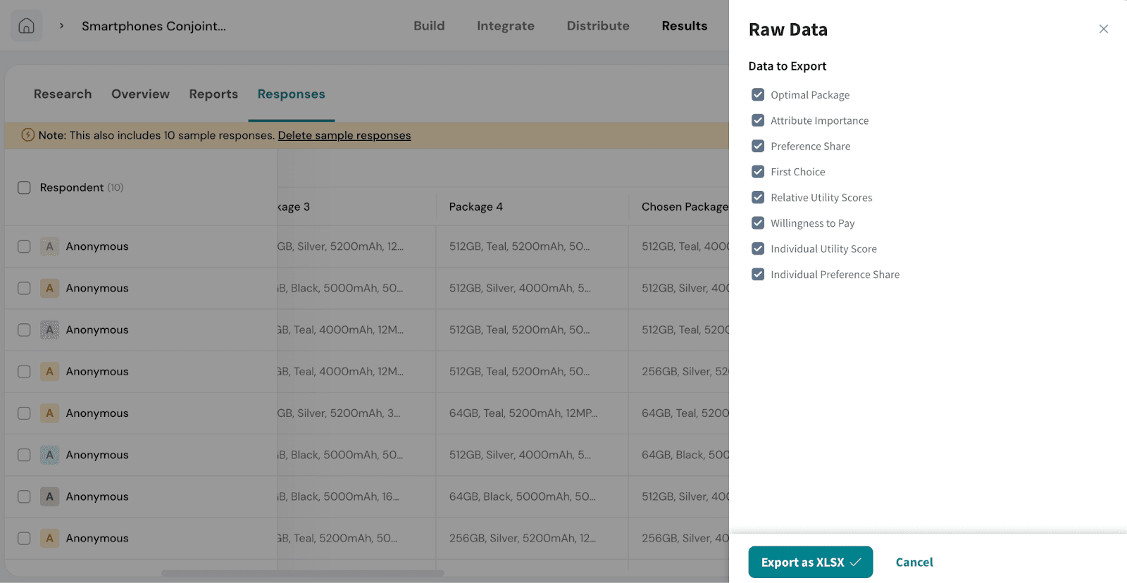
Once selected, click Export as XLSX to download.
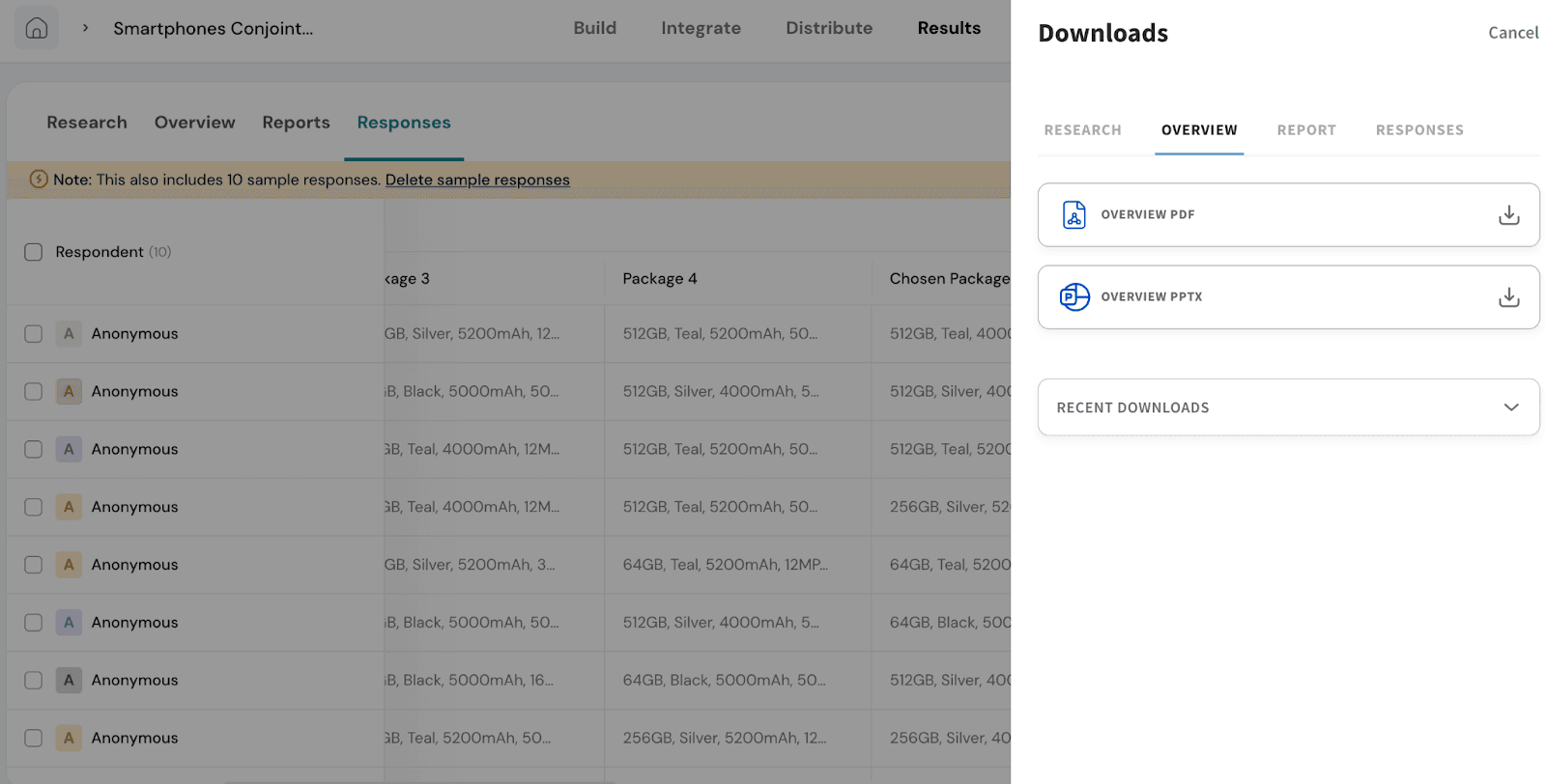
Overview: You can download a summary report that includes details like average time taken to complete the survey, language used, and distribution type. You can download it in PDF and PPT formats.
Report: You can download a version of the report that includes insights at the question level, helping you understand how respondents interacted with different choices. You can download in PDF and PPT formats.
Responses: You can export individual responses for deeper analysis. You can download in formats like CSV, XLSX, or SPSS.
Recent Downloads
This section appears across all four download types. It lets you quickly access the reports, responses, or data files you’ve recently downloaded, so you don’t need to export the same file multiple times.
Feel free to reach out to our community if you have questions.
Powered By SparrowDesk