Search
The Executive Dashboard is a place where the data from different surveys can be compared and correlated to get useful insights. In a dashboard, multiple widgets can be configured to compare data from different surveys.
Let’s create a dashboard:
1. Click the Dashboards option found at the top of the Home Page.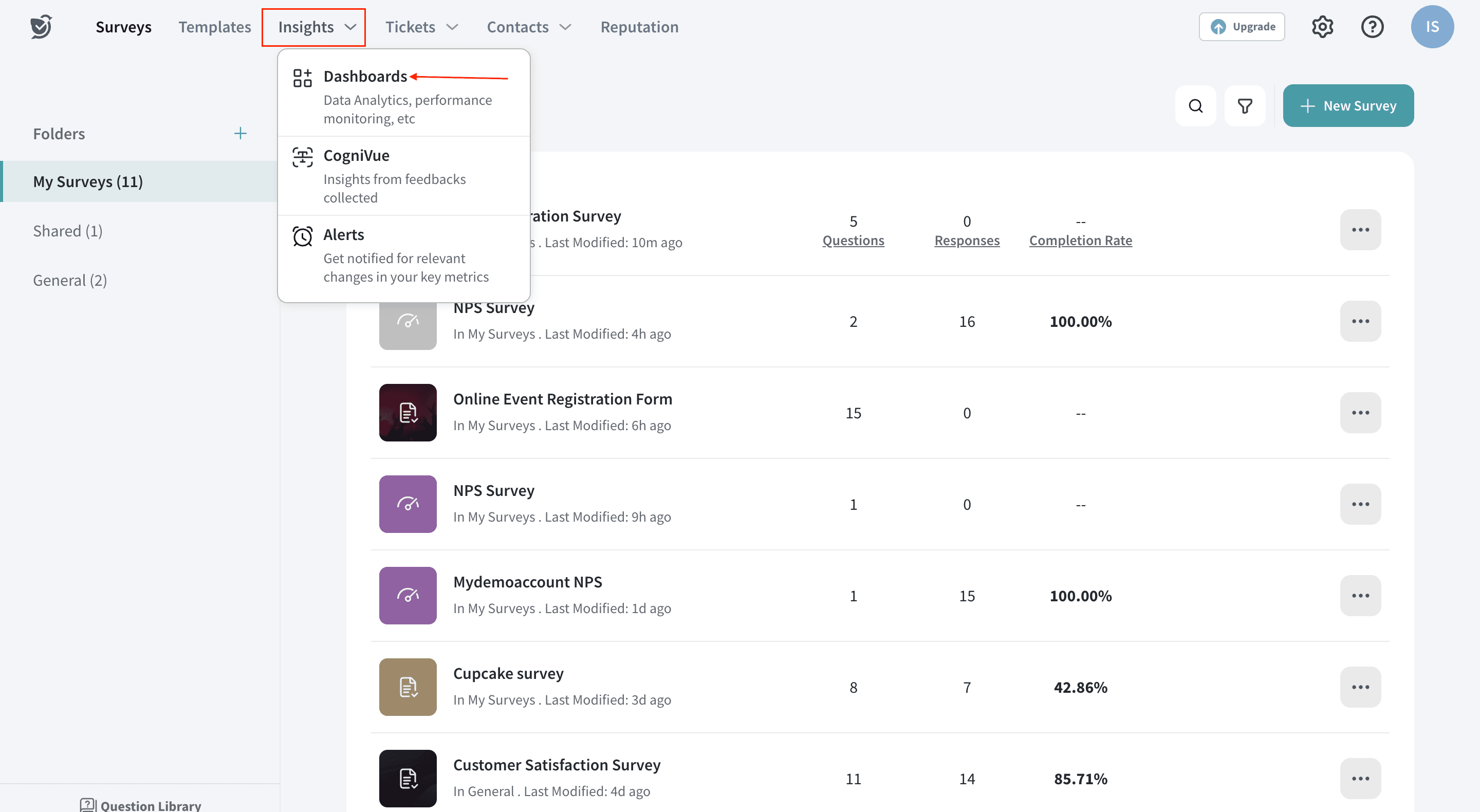
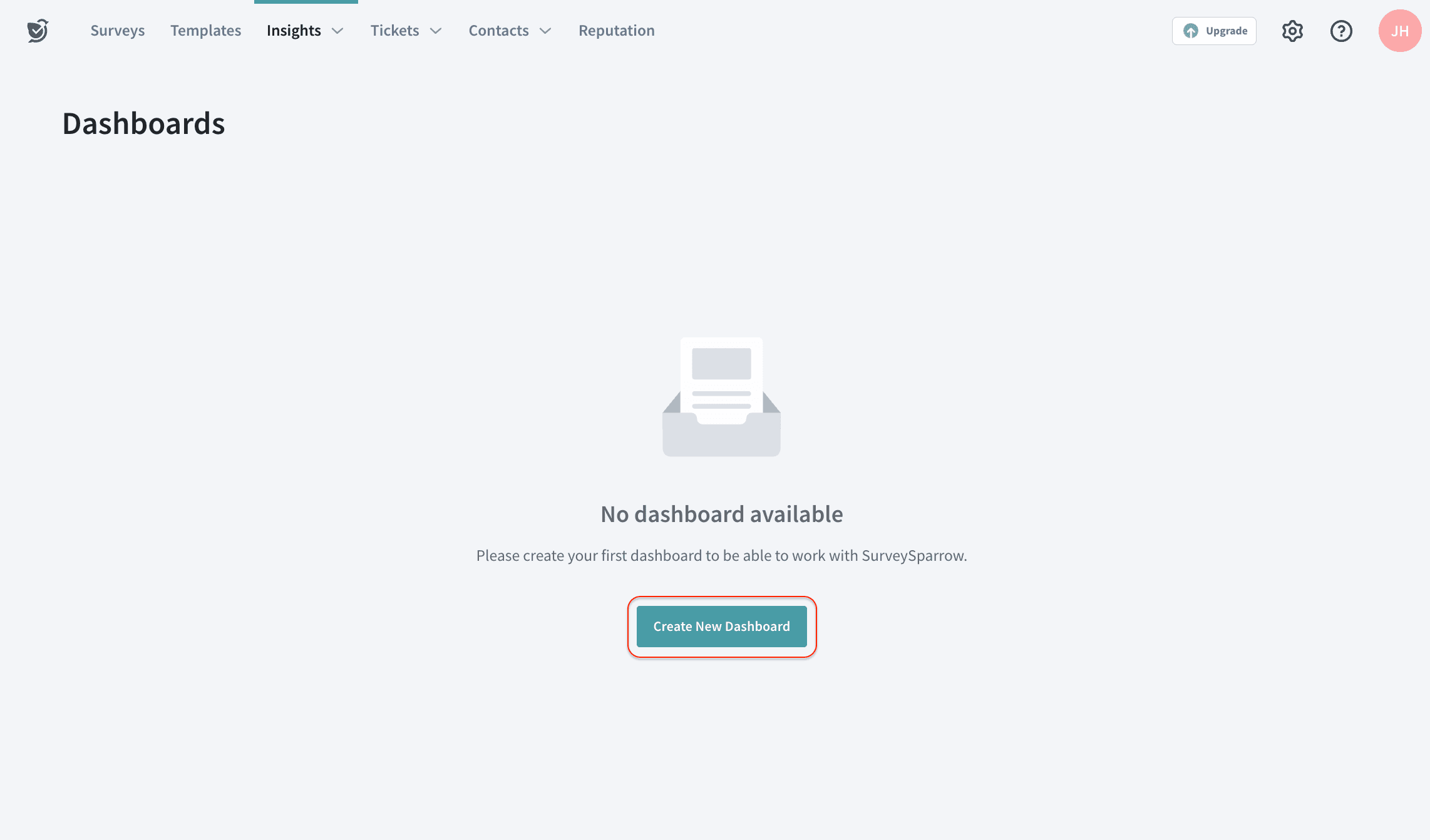
2. If this is your first dashboard, the option below appears. Click on the Create New Dashboard.
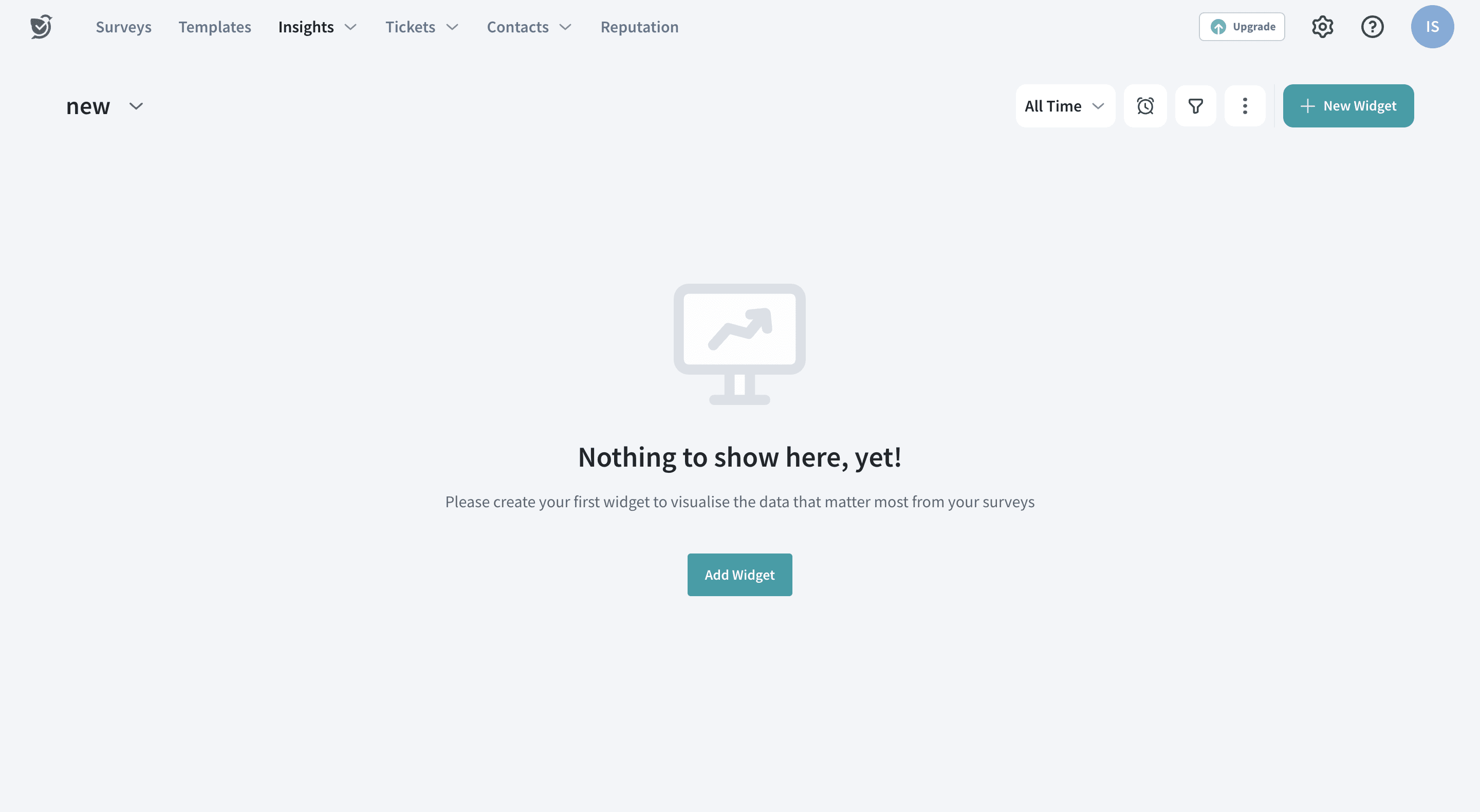
(or) If there are existing dashboards, the following option will appear: Click on New Widget and choose New Dashboard as highlighted below.
3. Enter the Title and Description for future reference. Once done, click Create New Dashboard.
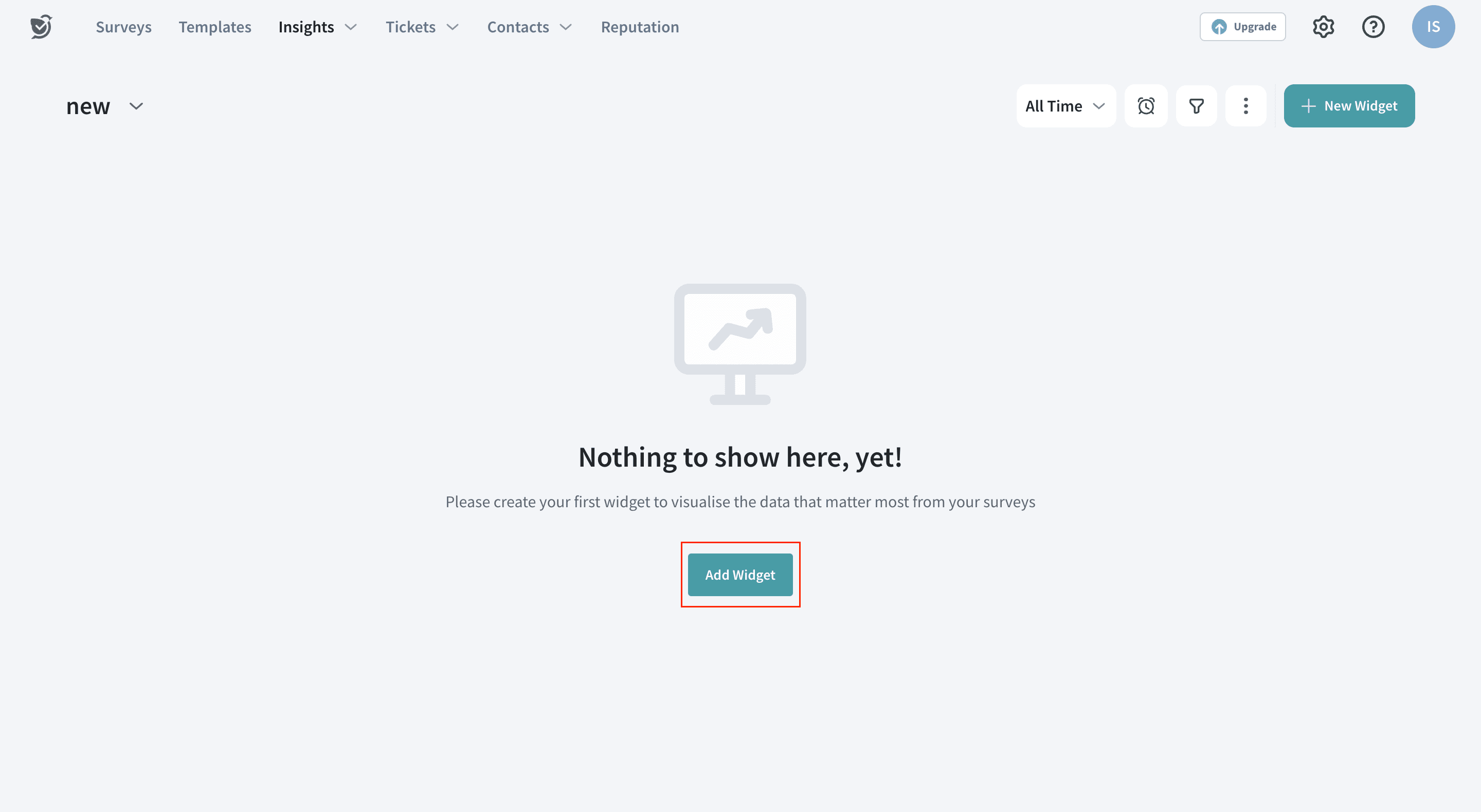
4. Wonderful! The Customer Feedback dashboard is created. To add a new widget to the dashboard, click “Add Widget” on the screen.
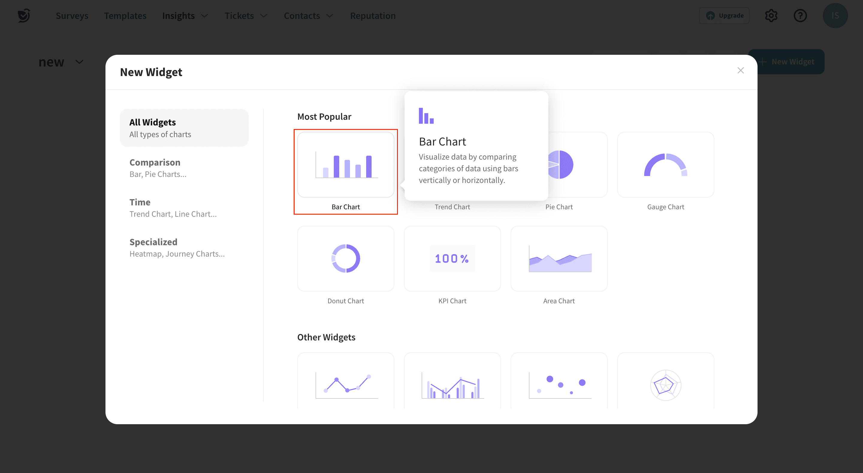
5. When the Add Widget is clicked, all the available types of graphs are shown. Let’s choose a Vertical Bar Chart to create a simple graph.
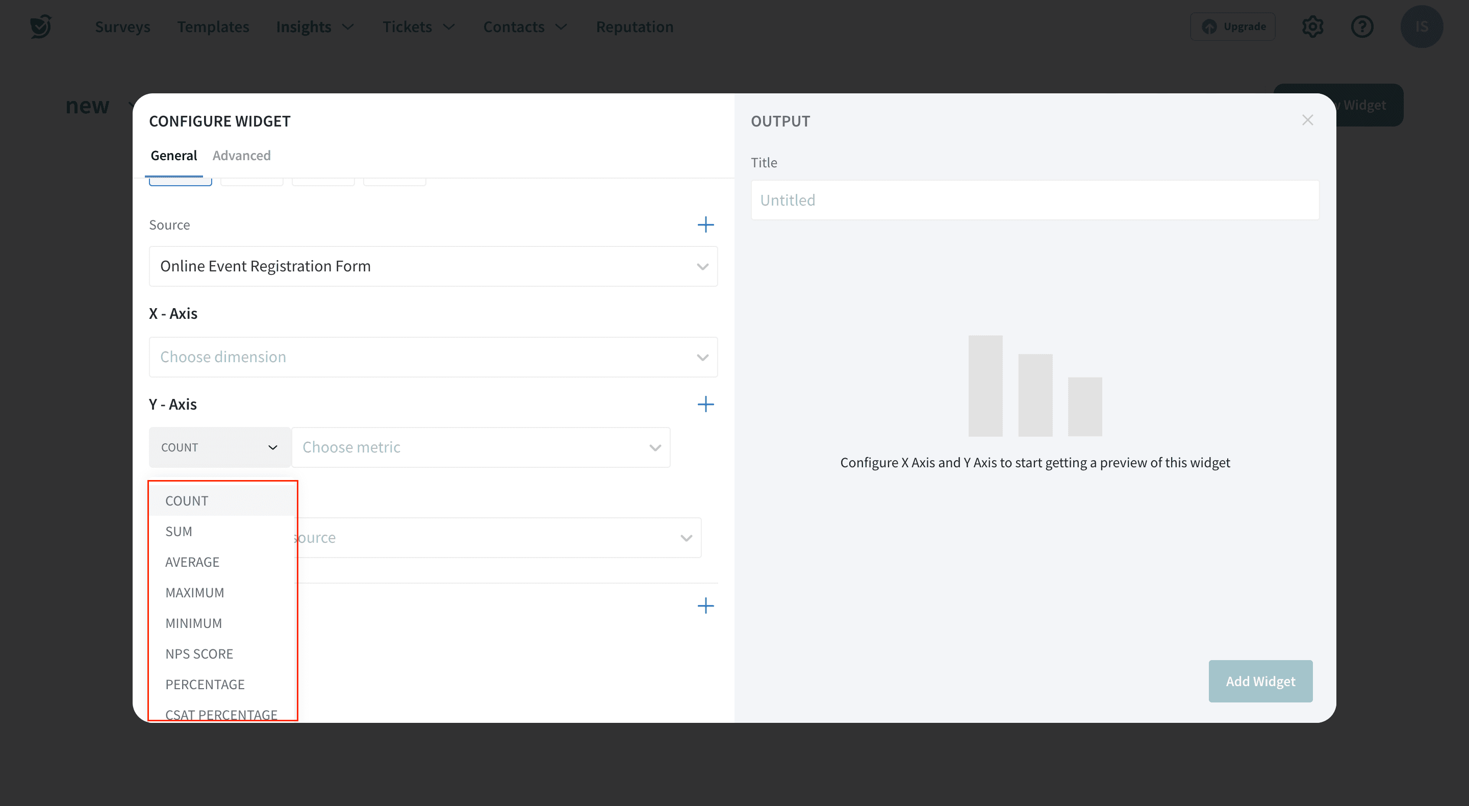
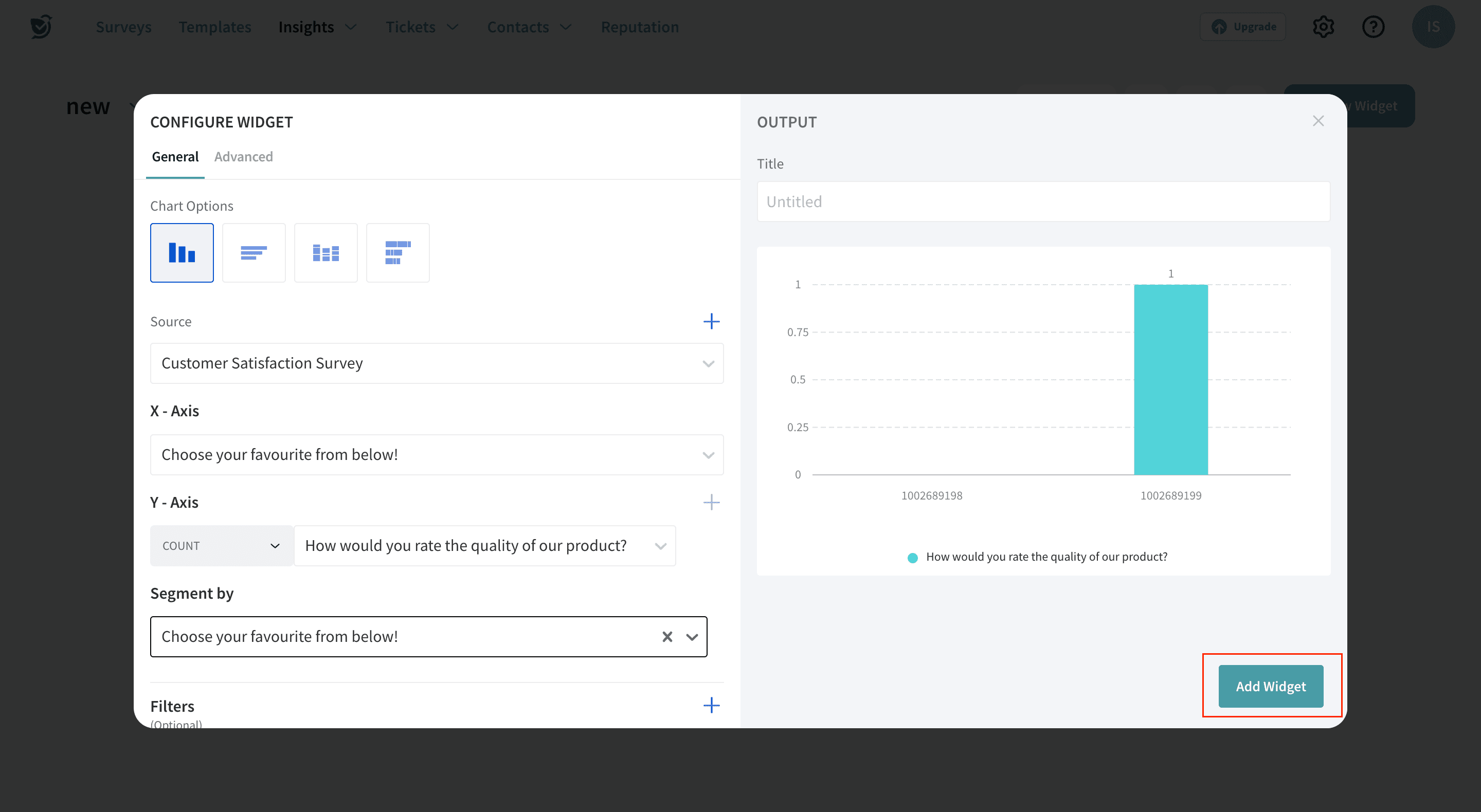
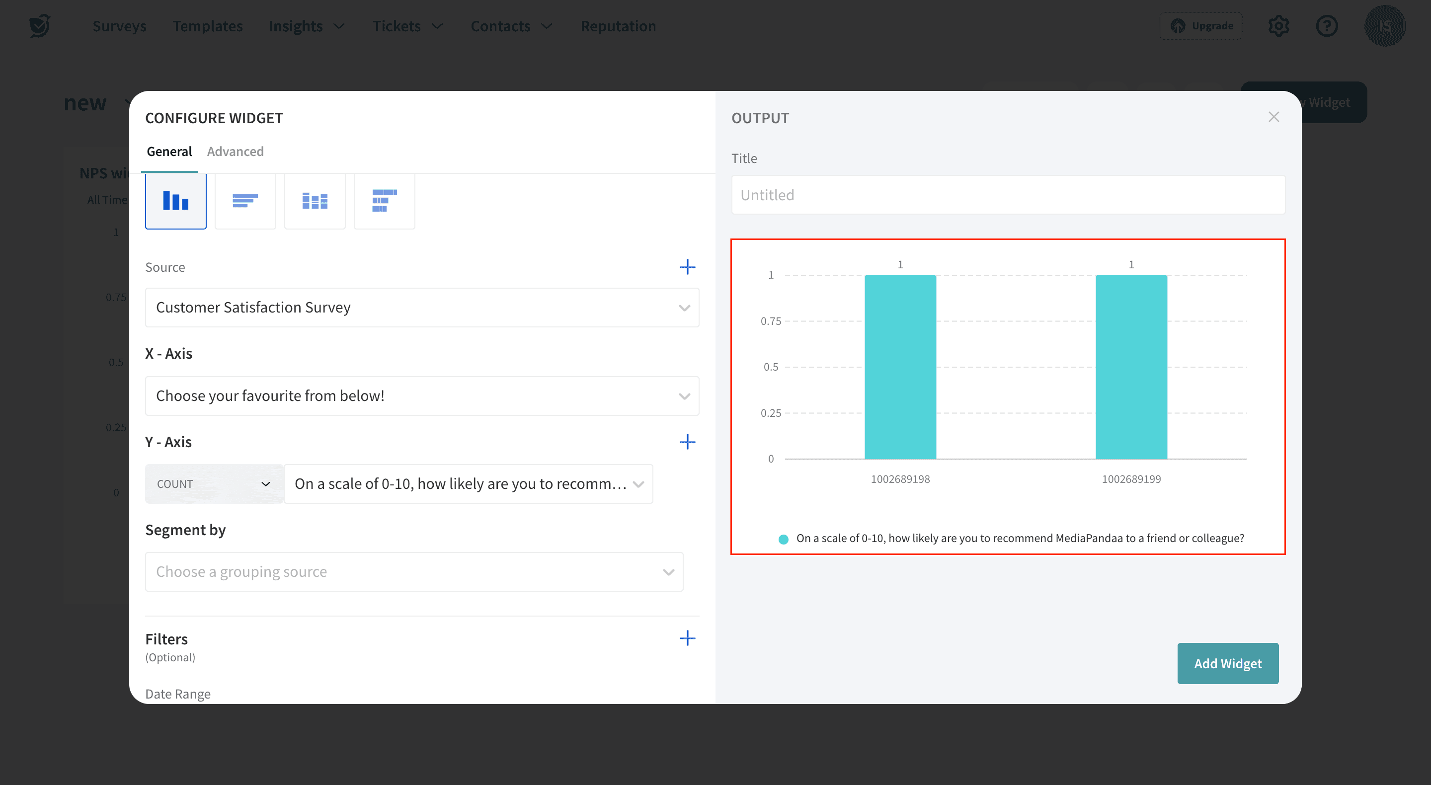
6. Choose the Survey Name(Source), X-axis and Y-axis for the graph. In the Y-axis, you can choose operations that are highlighted below.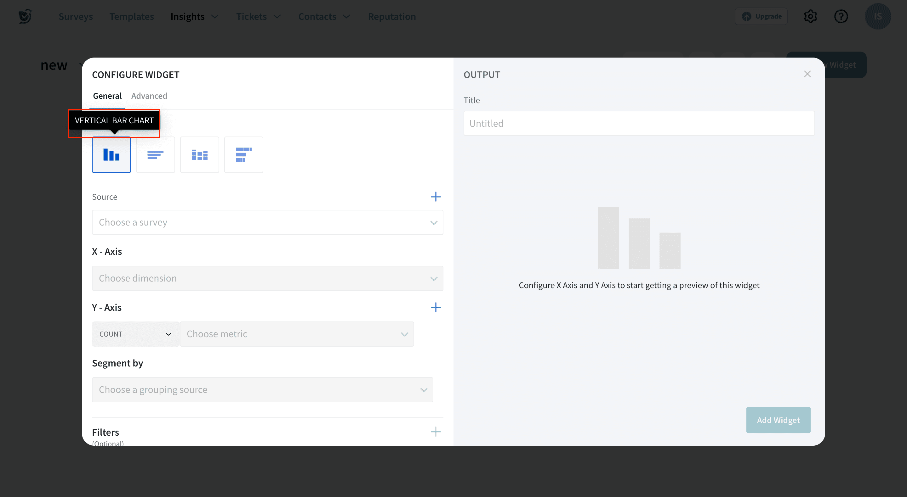
7. Once the required data is chosen and the graph appears, hit Add to Dashboard.
Yaay! And the first widget in your dashboard is all set.
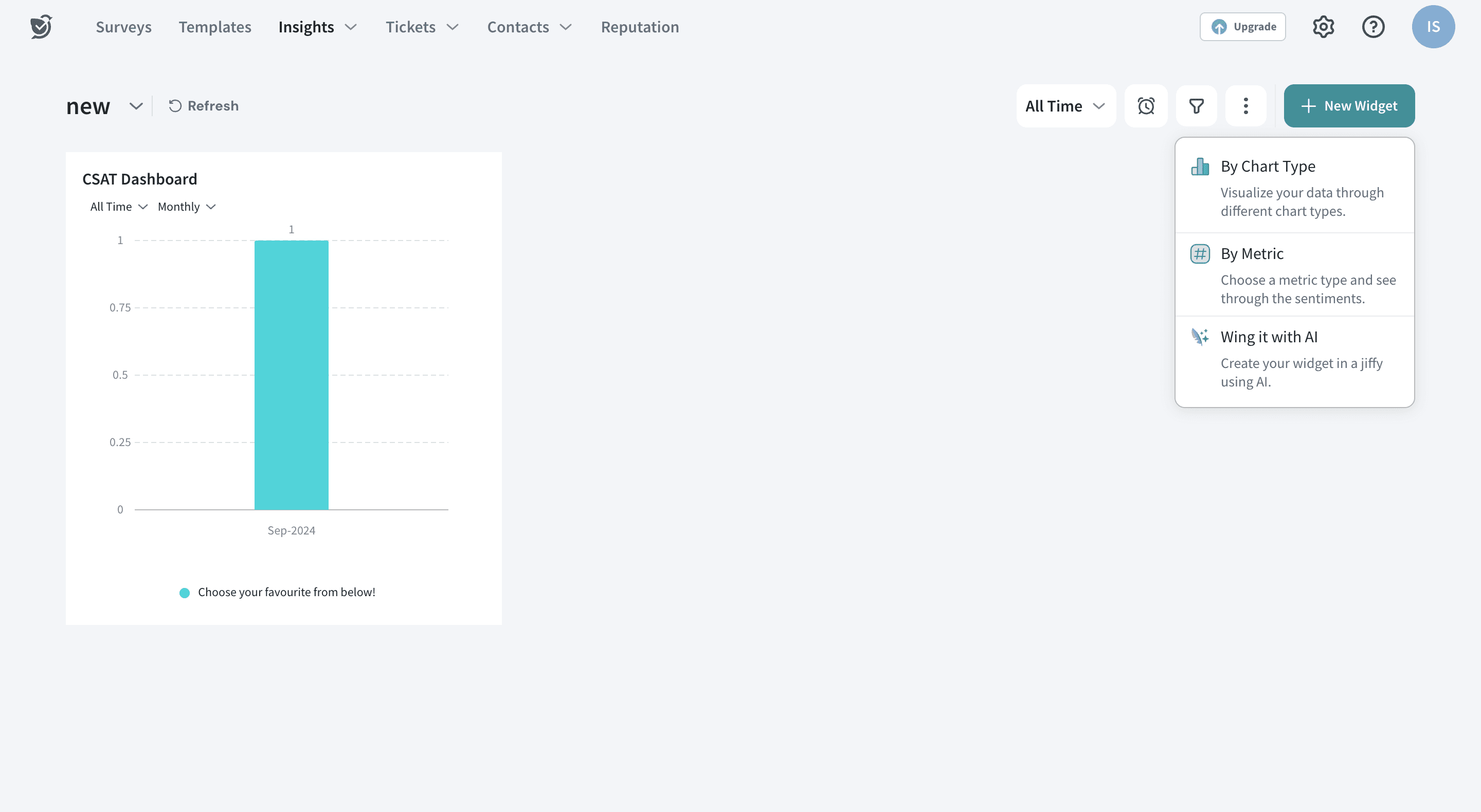
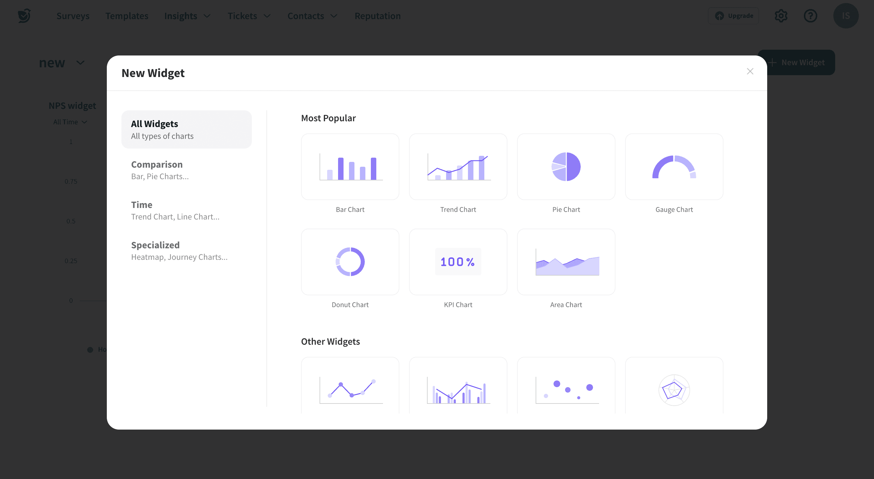
In addition to this, you may add as many widgets as you need by clicking on the plus or New Widget buttons.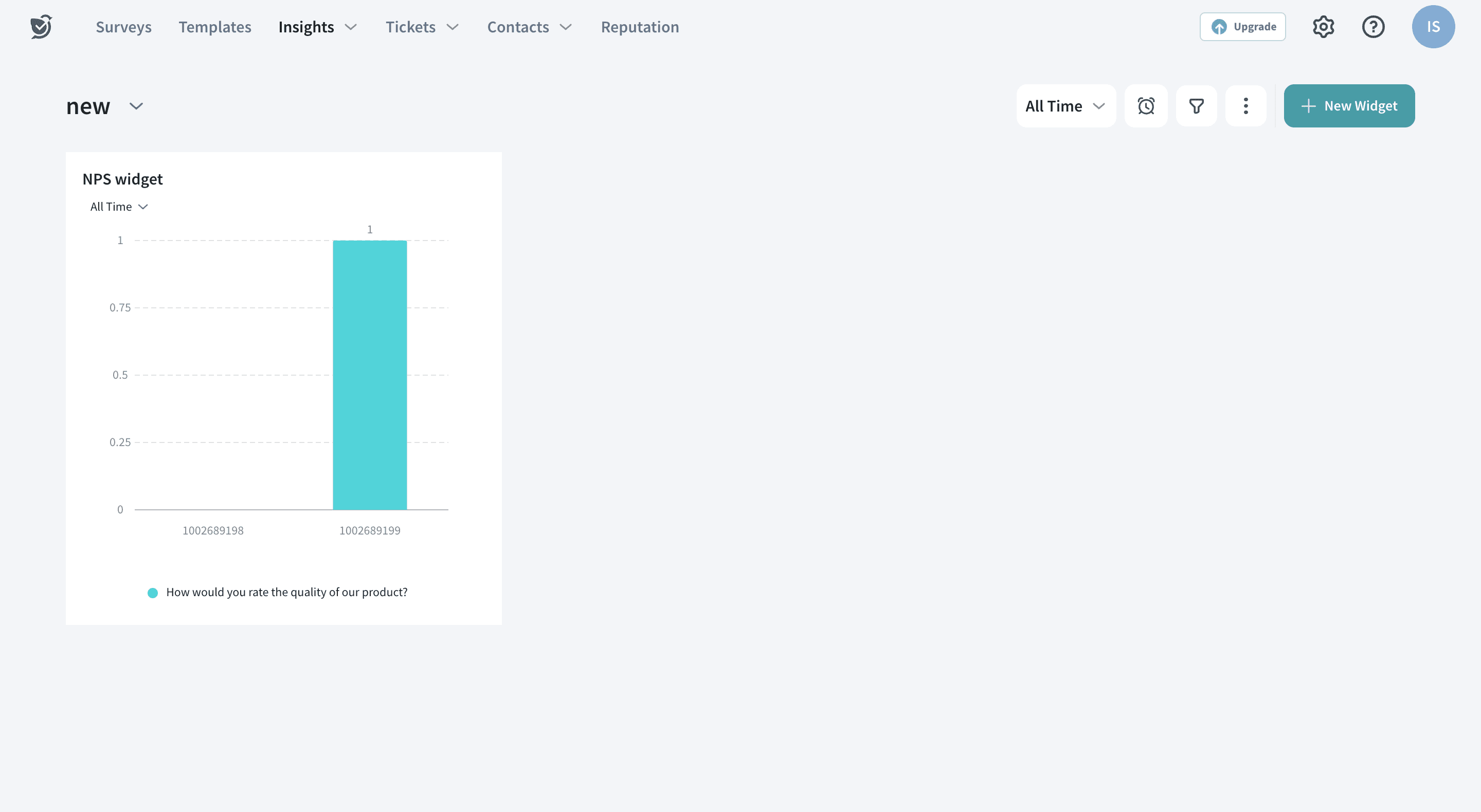
Once you click on New Widget, all chart types are listed. Each of these chart types are discussed in detail below
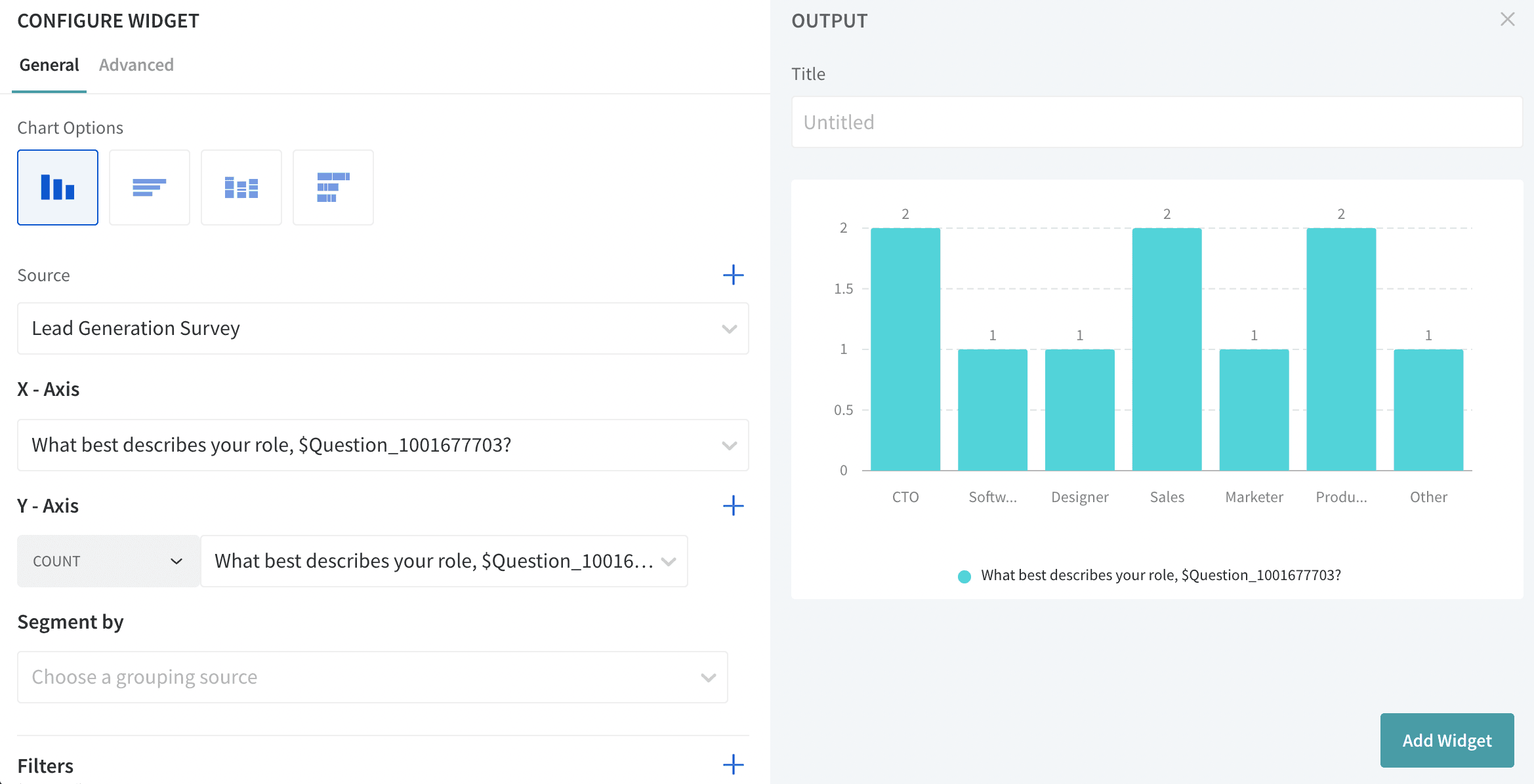
The vertical bar chart shows the Y-axis variable in vertical bars. Upon choosing Survey Name(Source), X-axis and Y-axis variables, the vertical graph is generated automatically.
Supported Question types
The horizontal bar chart shows the Y-axis variable in horizontal bars. Upon choosing the X-axis and Y-axis variable, the horizontal graph is generated automatically.
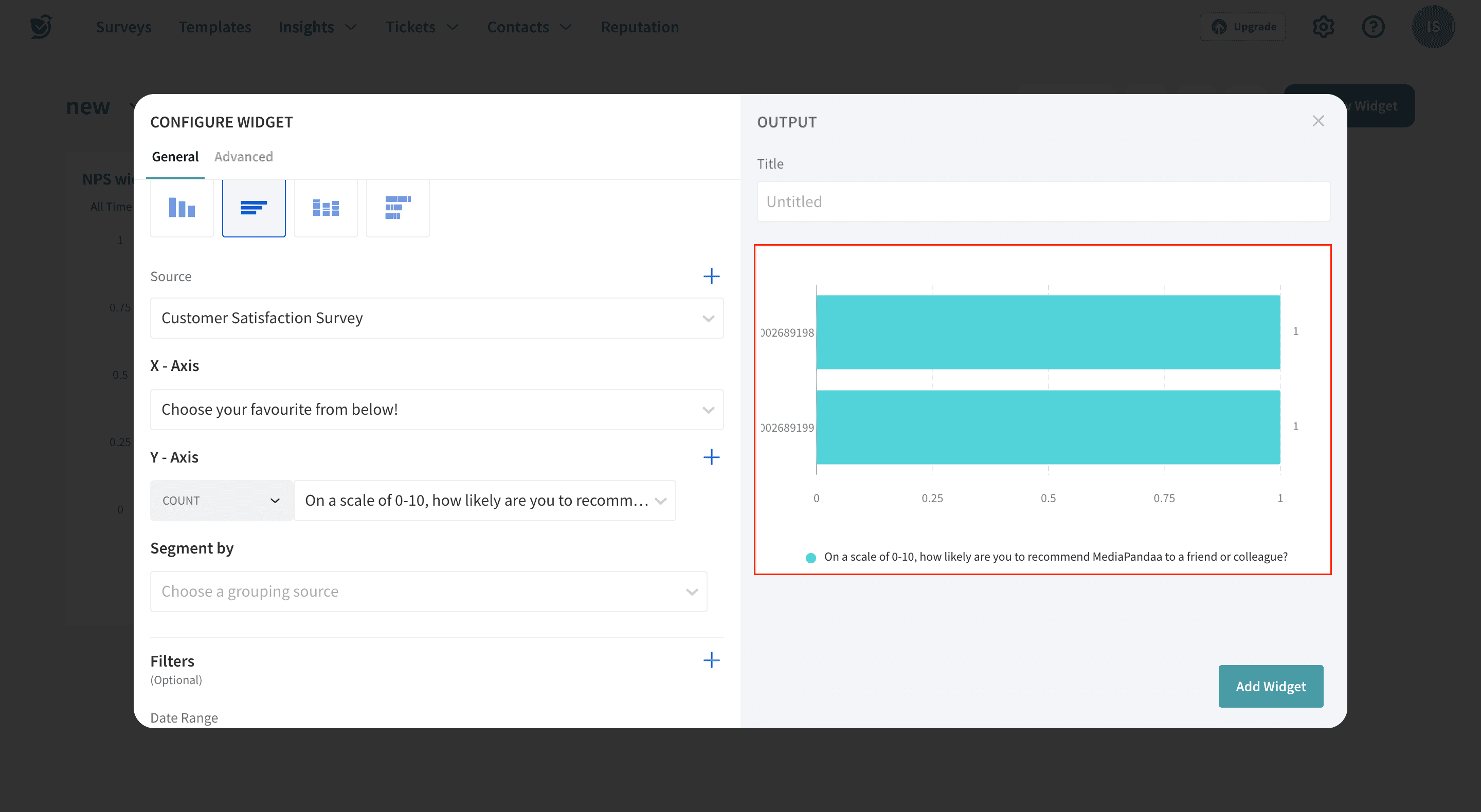
Supported Question types
A stacked bar chart uses bars to show comparisons between different categories of data. Add dimensions by clicking on the “+” icon, which lets you compare the data of different categories under one axis.
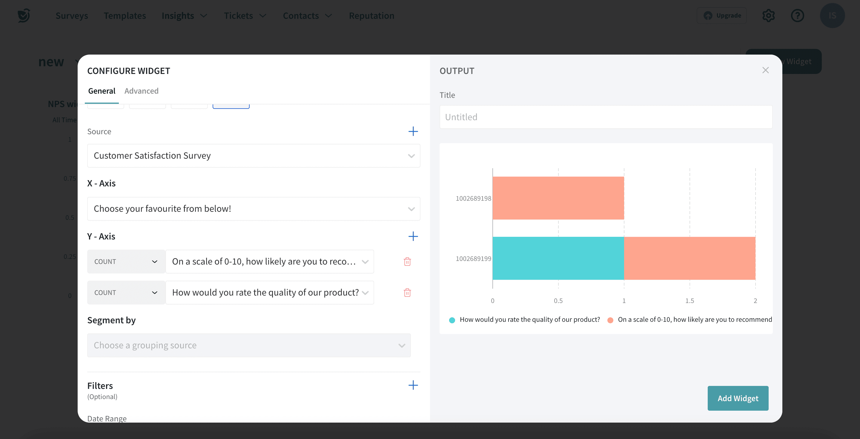
Supported Question types
A pie/donut chart is a type of graph that represents the data in the circular graph.
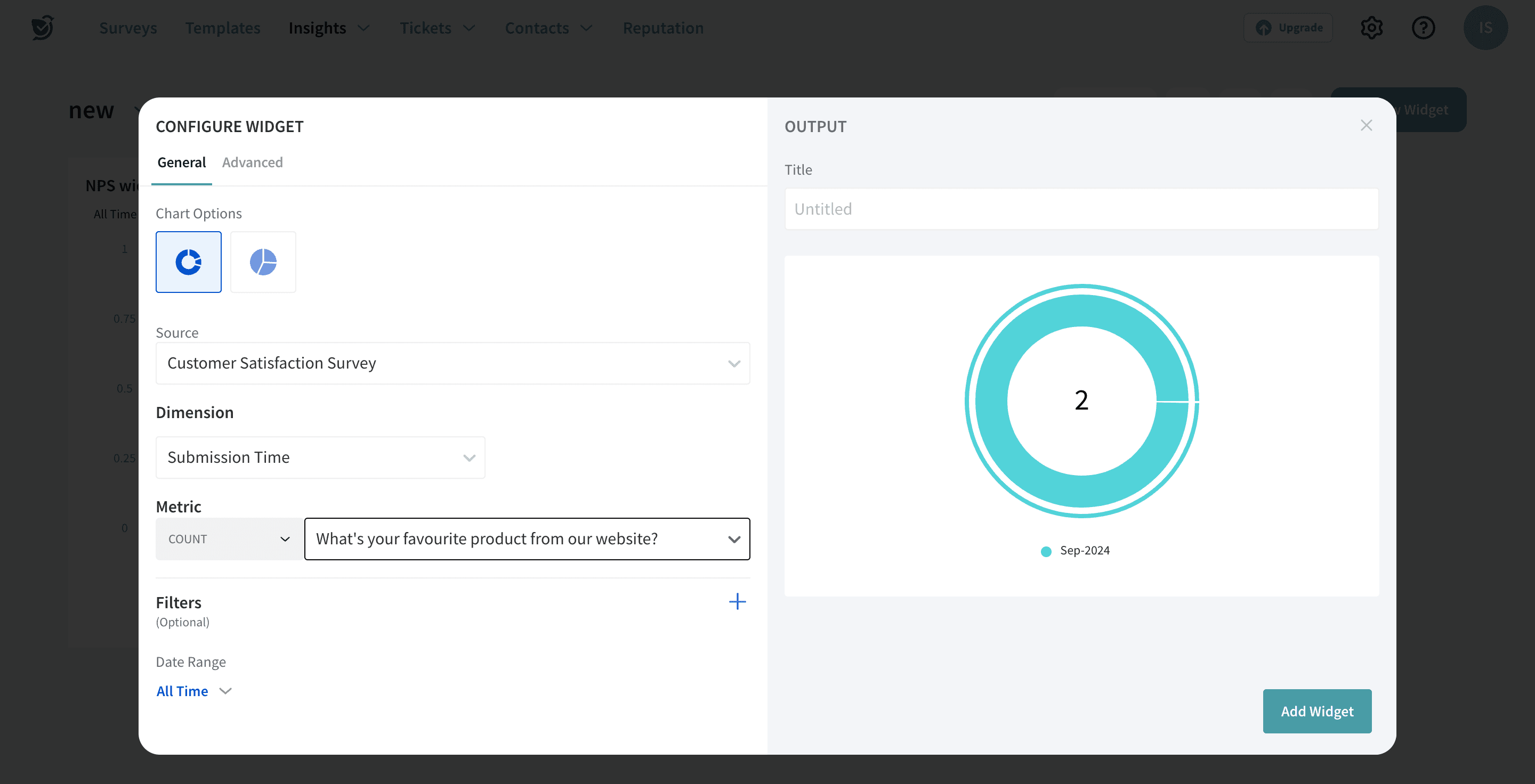
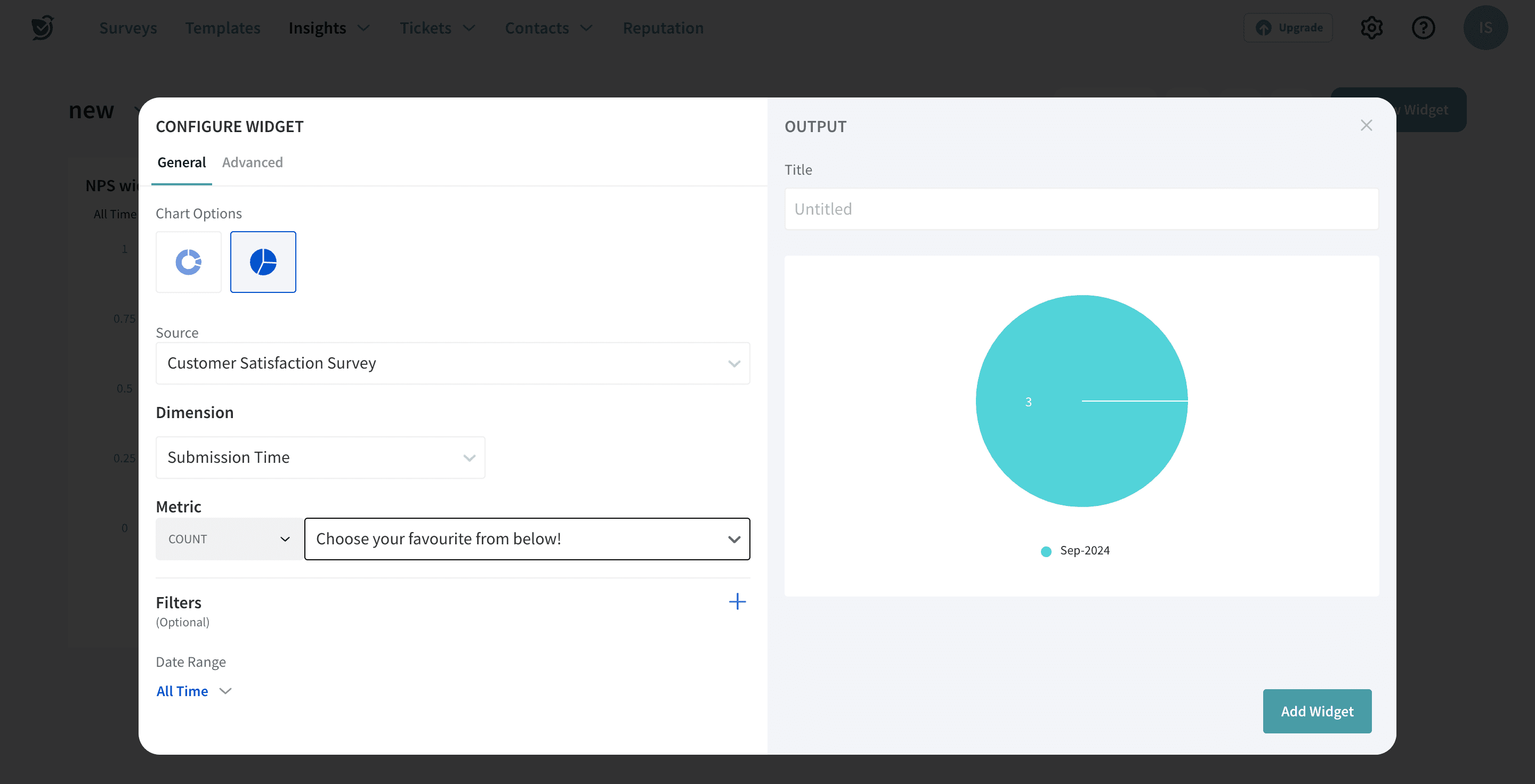
Supported Question types
A line chart displays information as a series of data points connected by a straight line.
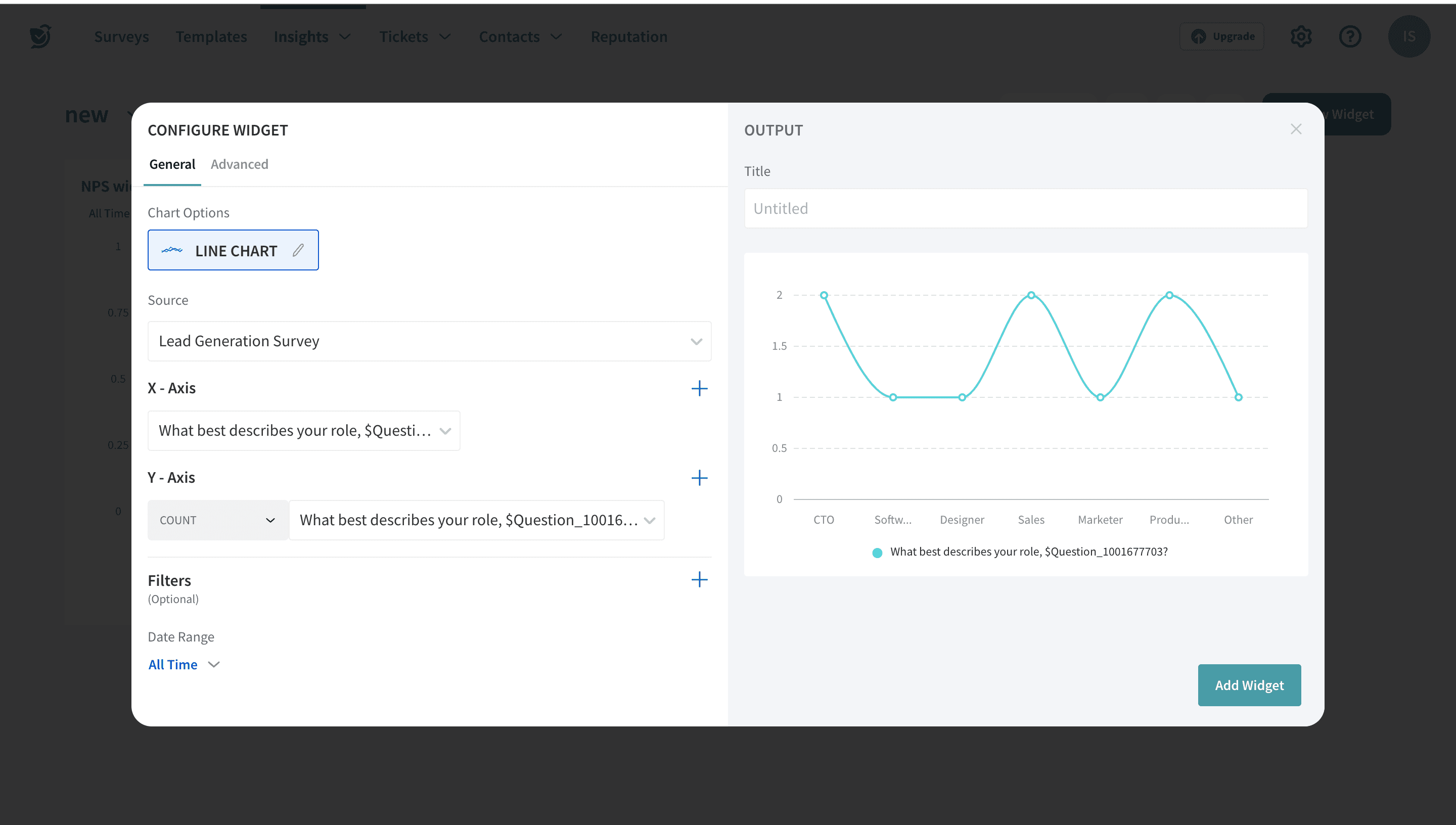
Supported Question types
A composite chart is the combined visualisation of both Line and Vertical Bar charts(two variables in the Y-axis)
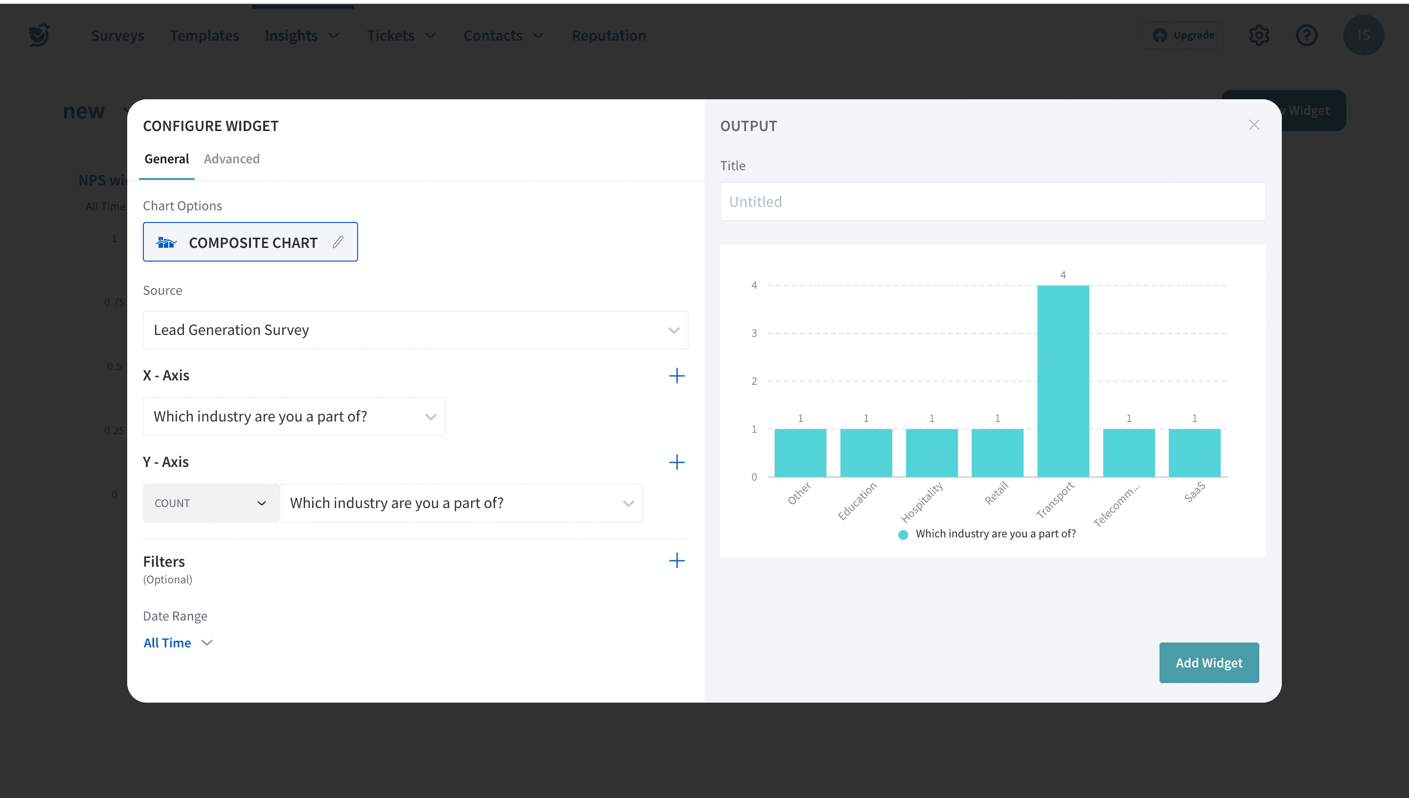
Supported Question types
An area chart or area graph displays graphically quantitative data. It is based on the line chart.
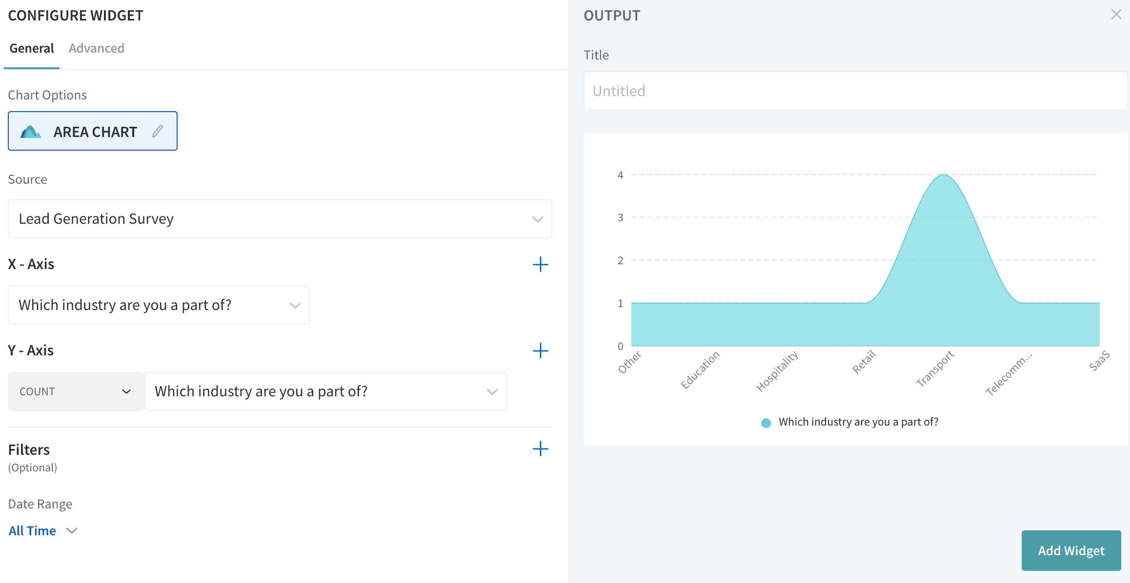
Supported Question types
Journey charts in Executive Dashboard lets you compare and correlate the survey data between different touchpoints in one visually immersive frame. You can easily create multiple stages in one dashboard and analyze the performance metrics of all the stages.
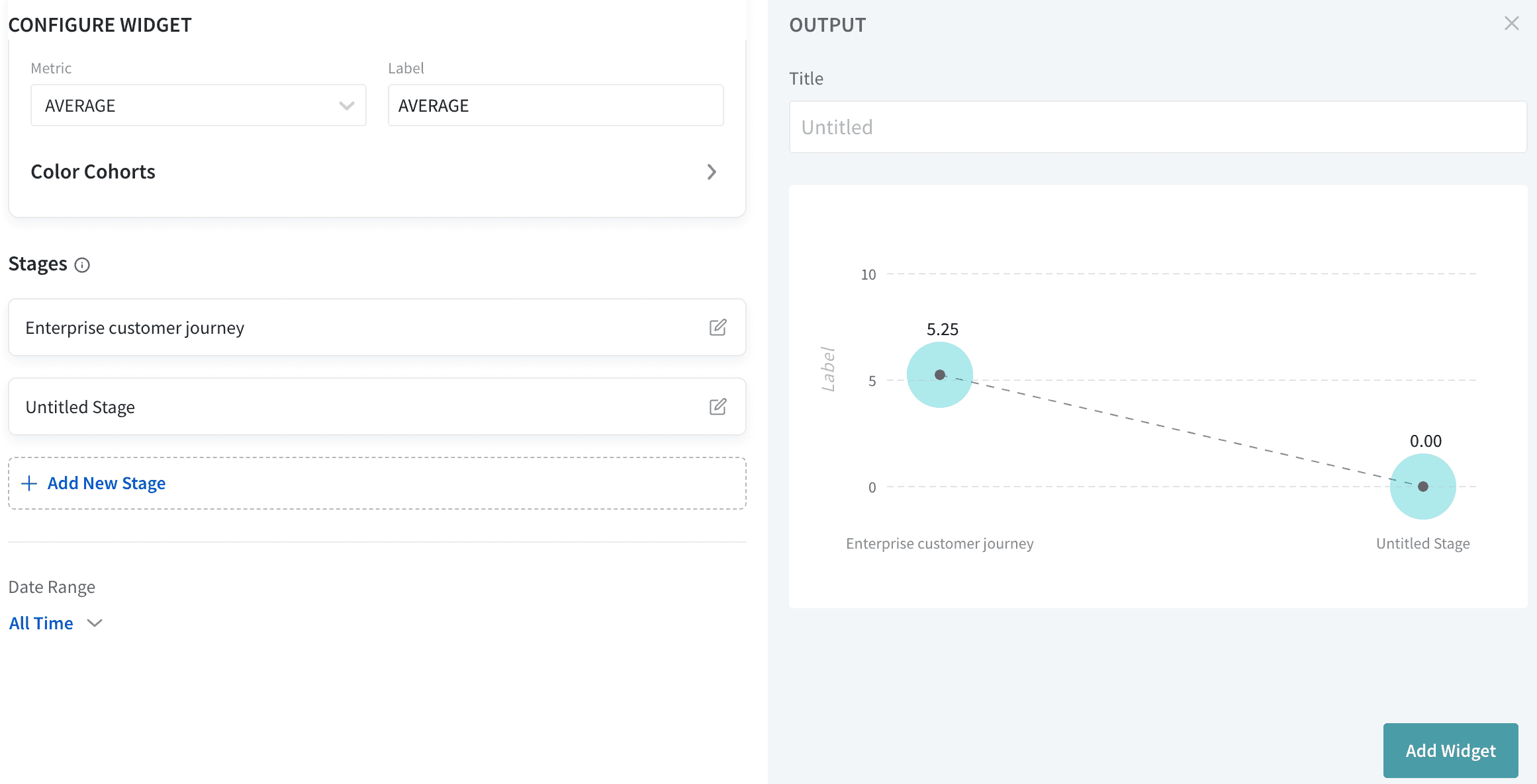
Supported Question types
A pivot chart helps us to quickly measure large amounts of data within a small table. Here, I have taken the example of the orders for which we are processing the feedback.
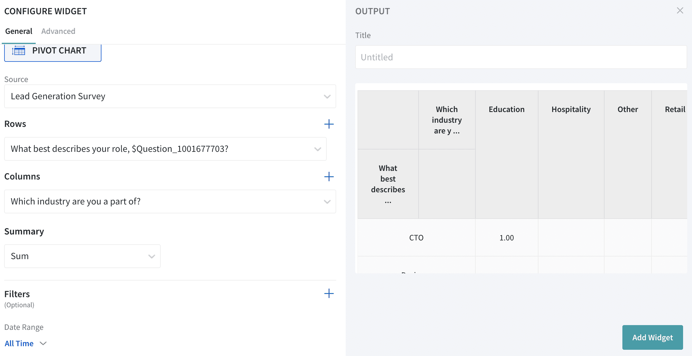
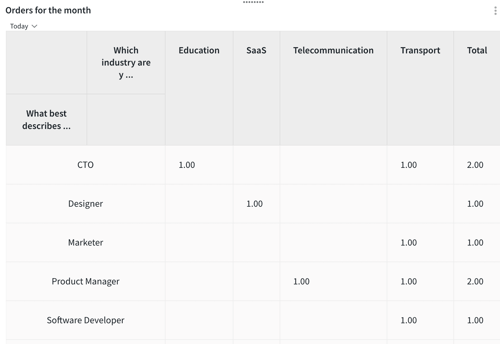
Here is the view of the pivot table after it is added to the dashboard
You can add up to 2 rows and 2 columns in the Pivot table as below
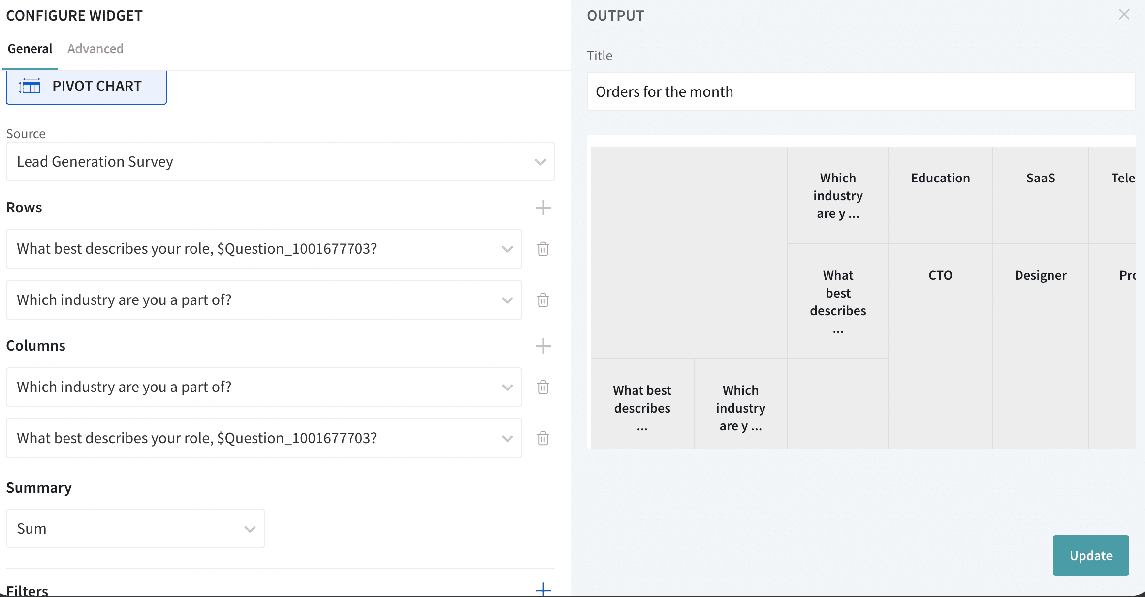
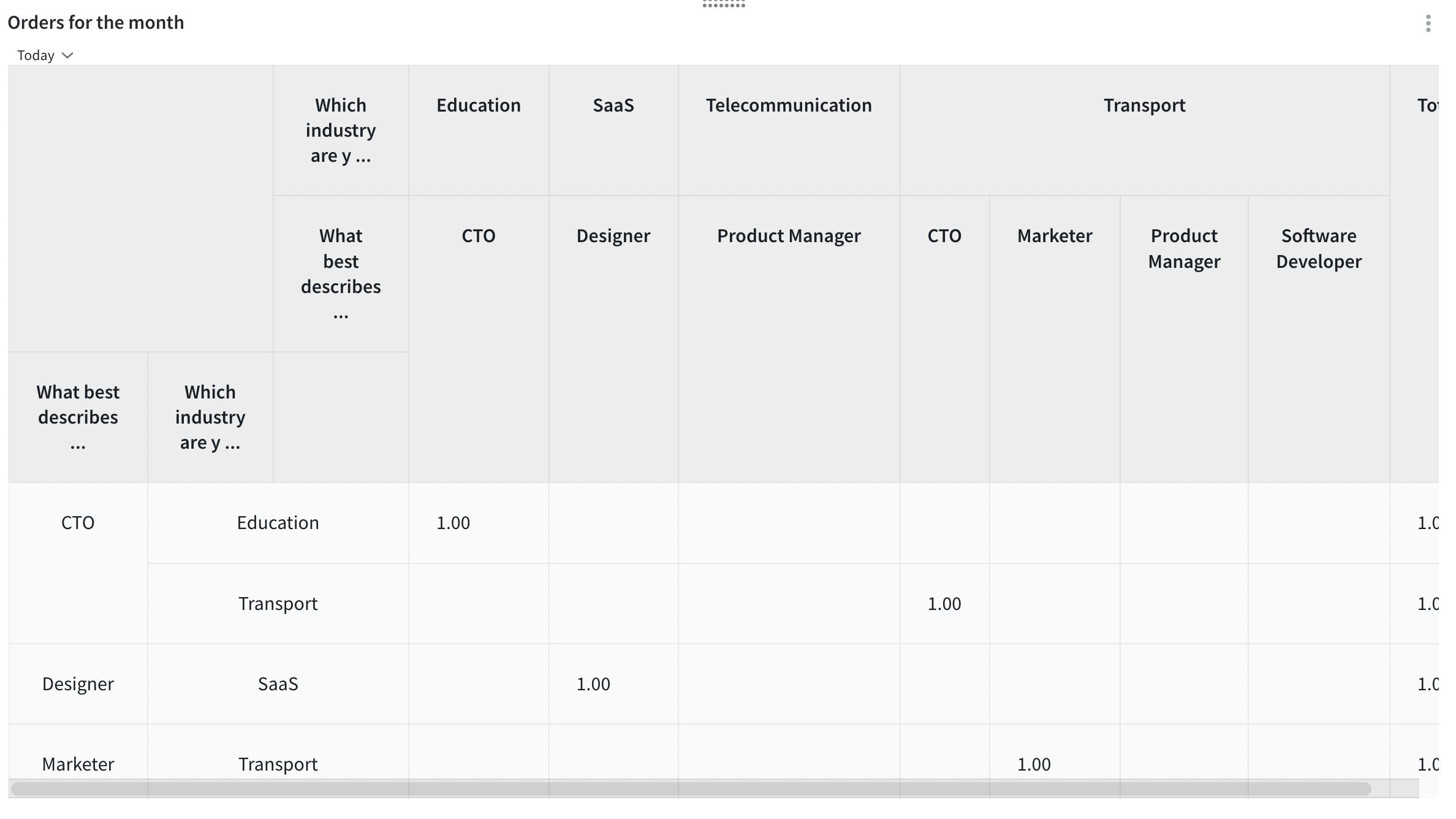
Tadaa! Here is an order chart with two rows and two columns:
Supported Question types
The Word Cloud widget lets you identify and view the most commonly used words in your survey responses.
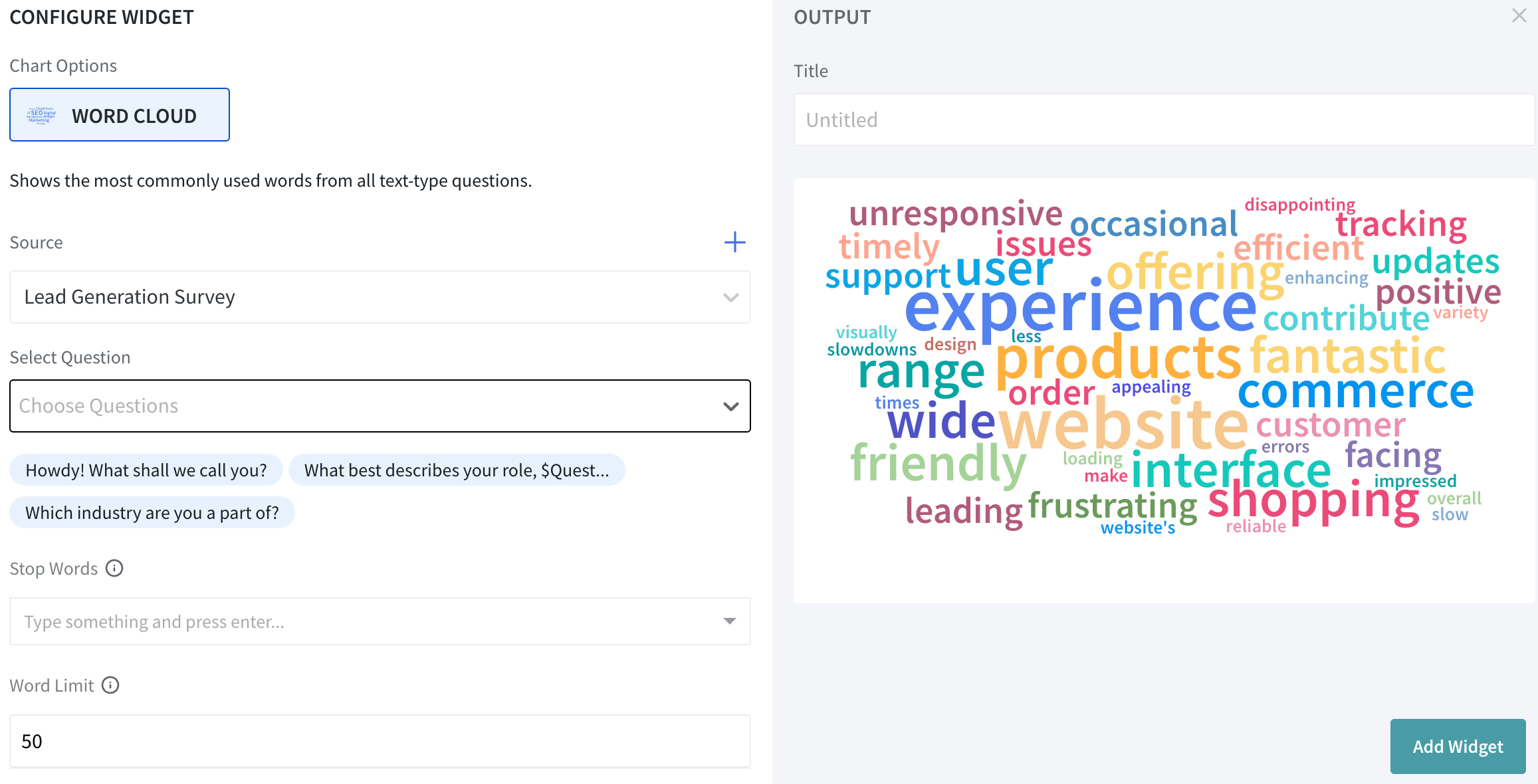
Supported Question type
The trend chart has ‘Submission Time’ as the fixed variable in the X-axis. In the Y-axis, we shall choose the data we want to visualize over time. You can add up to 4 surveys in the Y-axis of Trend Chart to get to visualize the trends of different parameters.
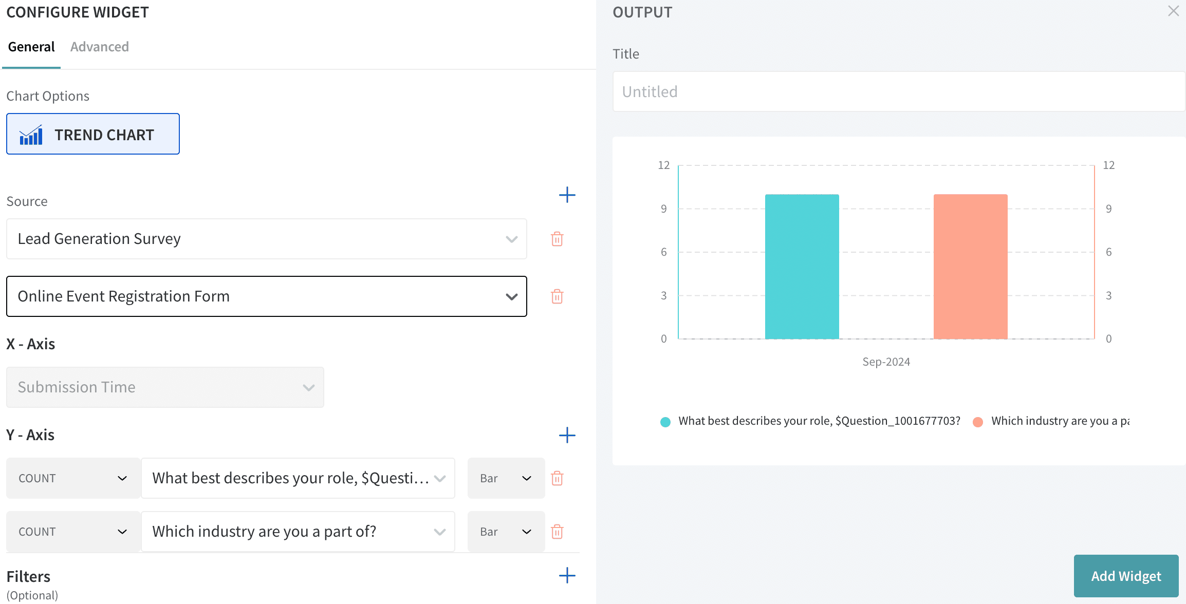
Supported Question types
A gauge chart shows the data similar to readings in a dial. By choosing the metric on the left side, the categories will be auto-calculated.
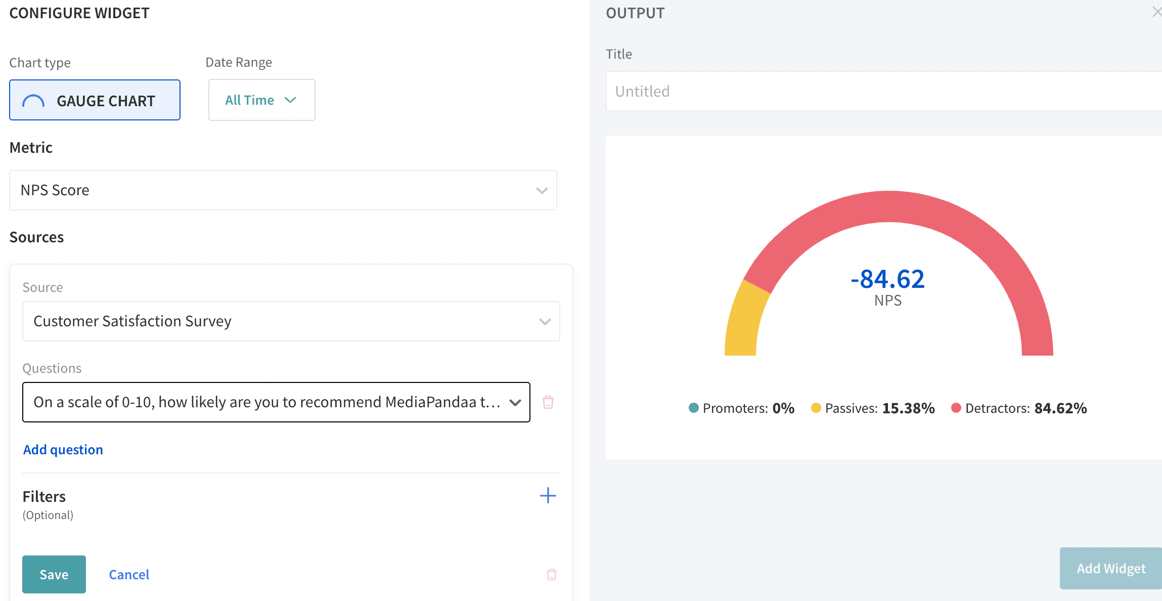
Supported Question type
To filter out the data in the chart, you shall choose the plus button highlighted:
By default, the Date Range is set to be All Time, you shall change it by clicking on the All Time option highlighted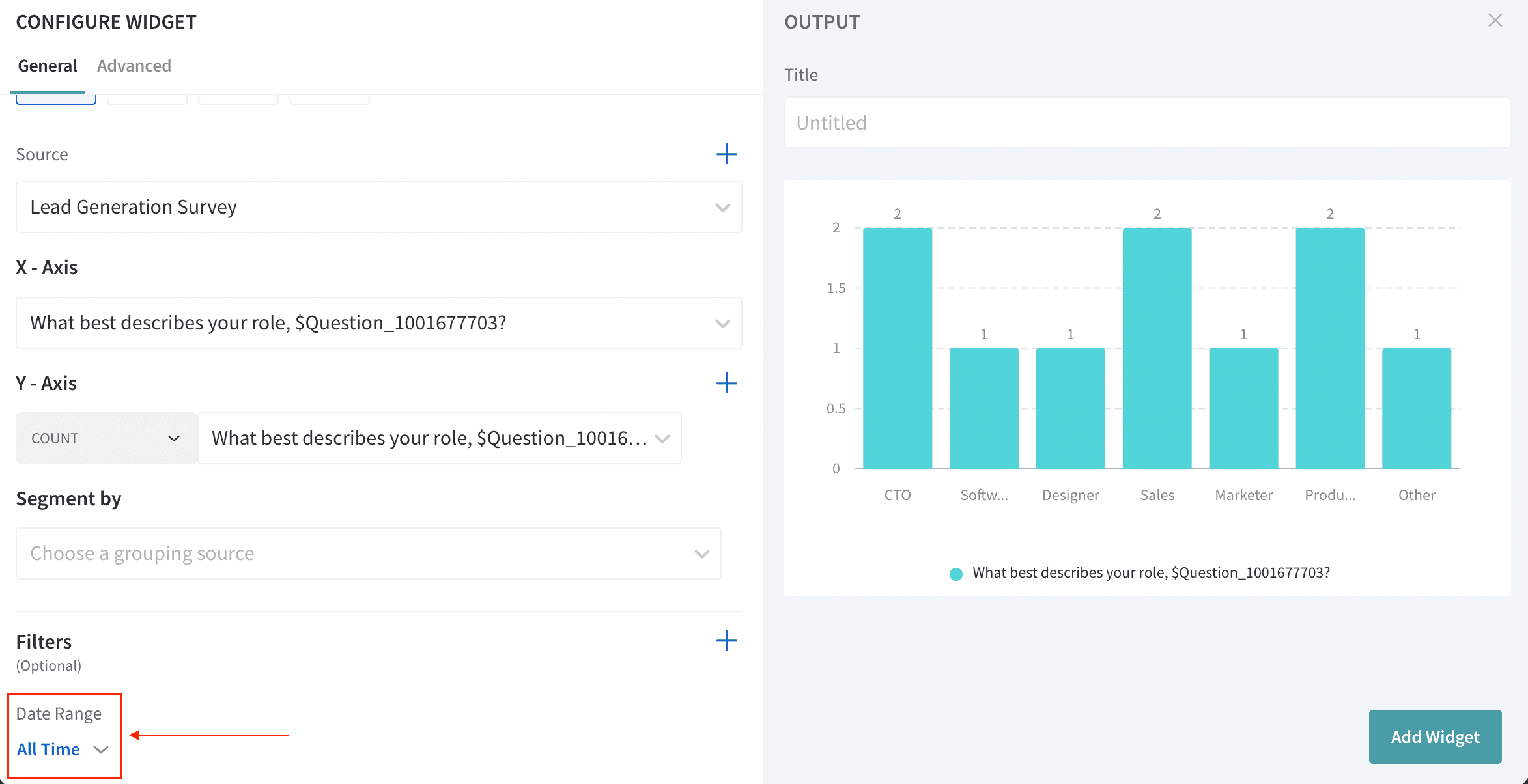
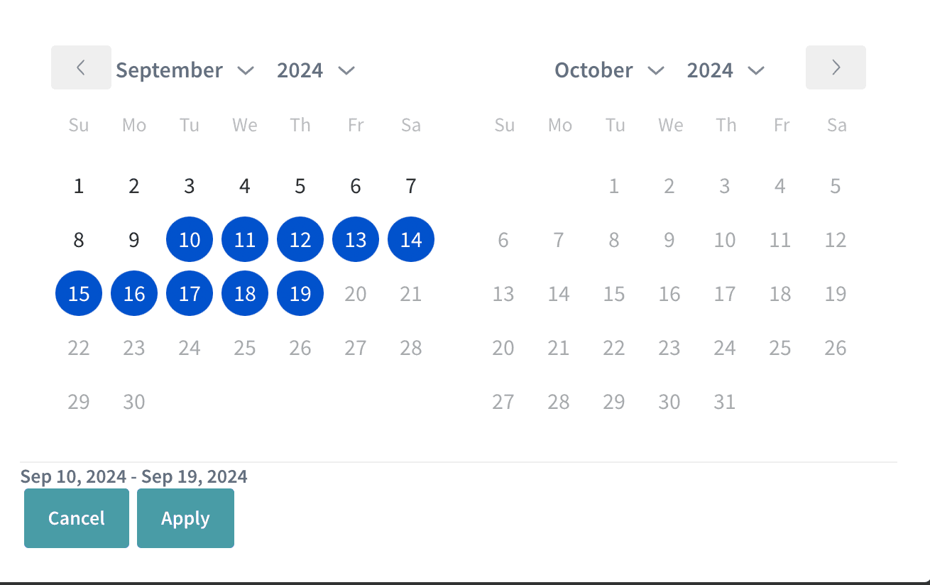
Once you click on the All Time, the following screen appears. You shall choose from the available date ranges or custom date range highlighted below.
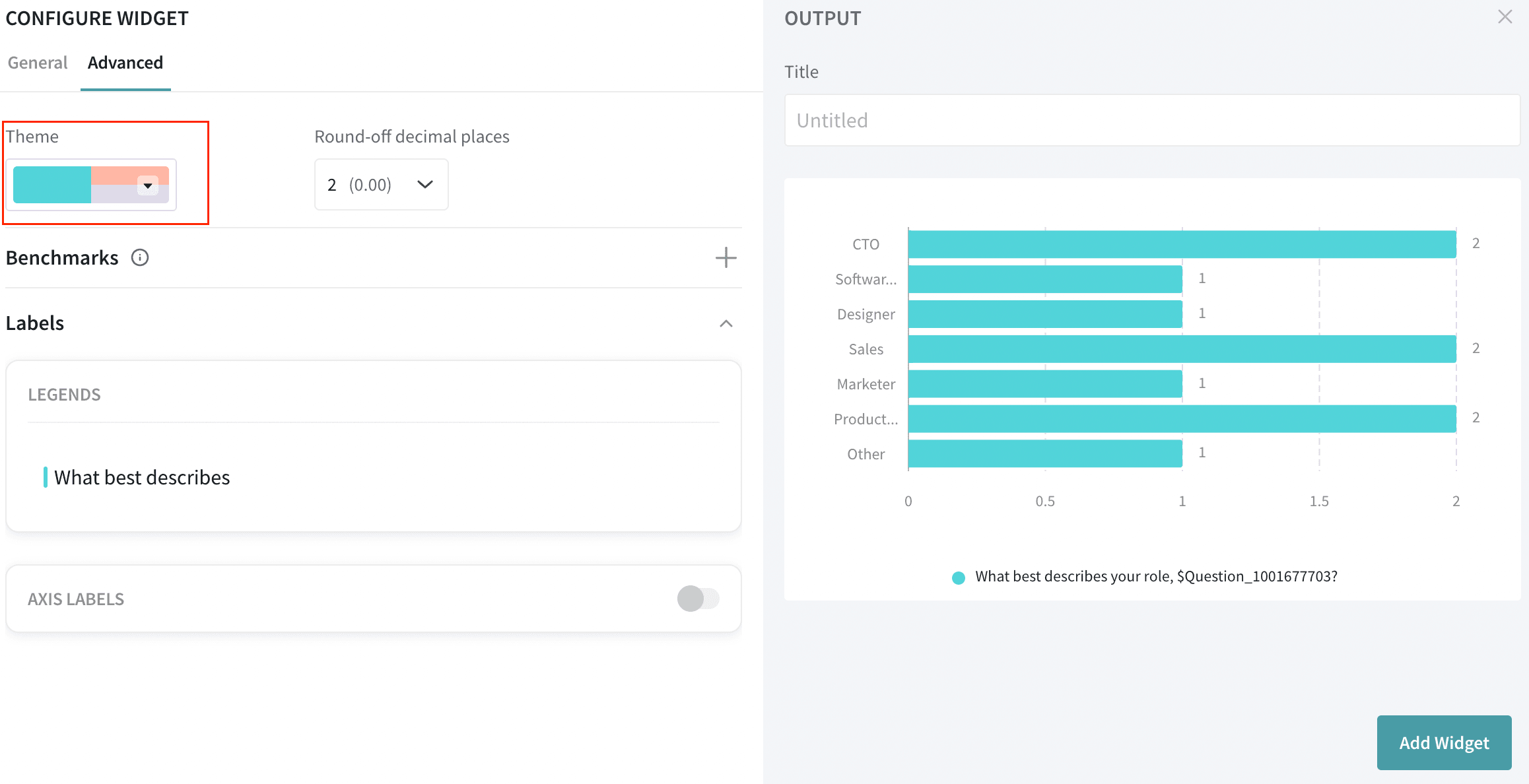
You can customize theme colors based on your preferences.
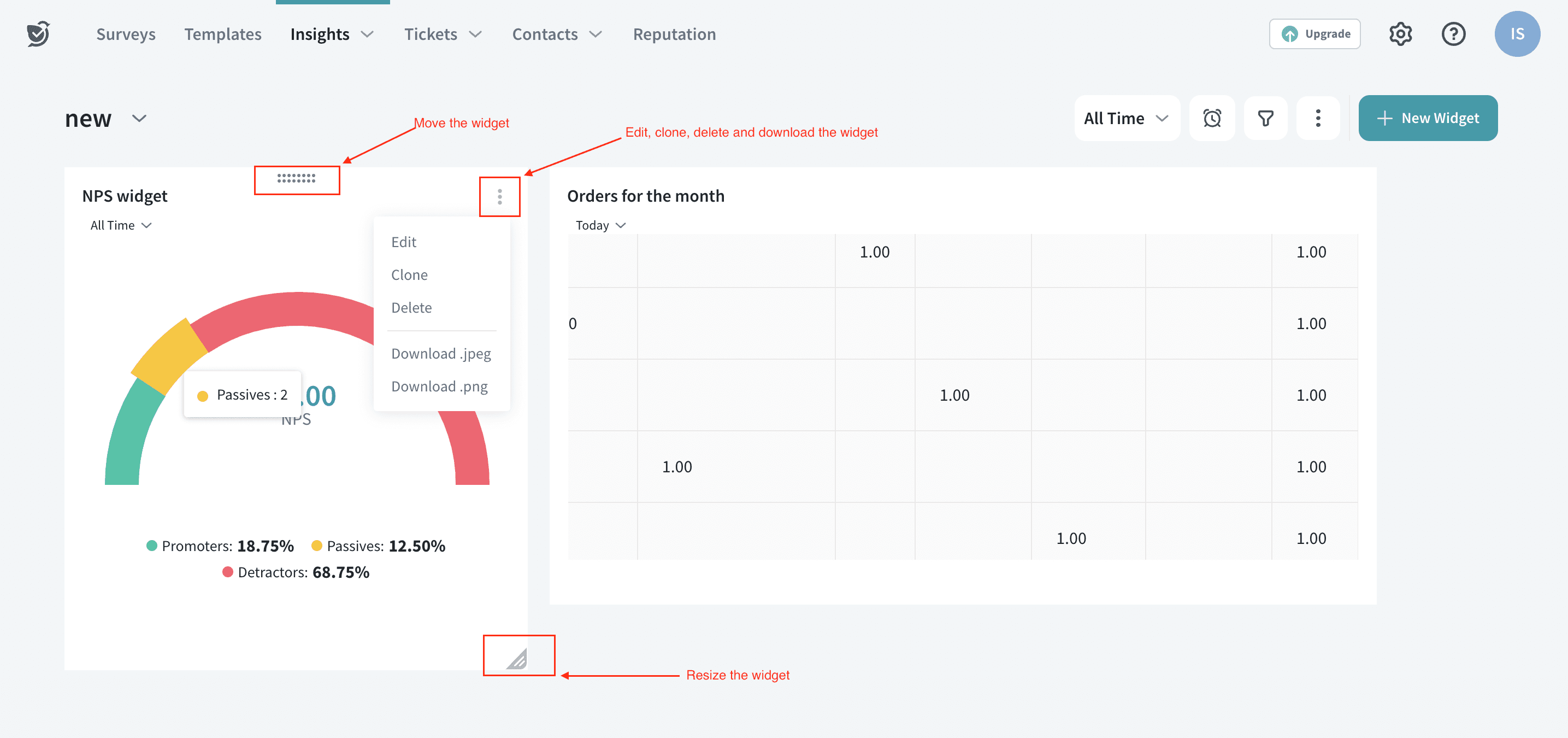
You may also move, edit, delete, download and resize widgets using the options highlighted below
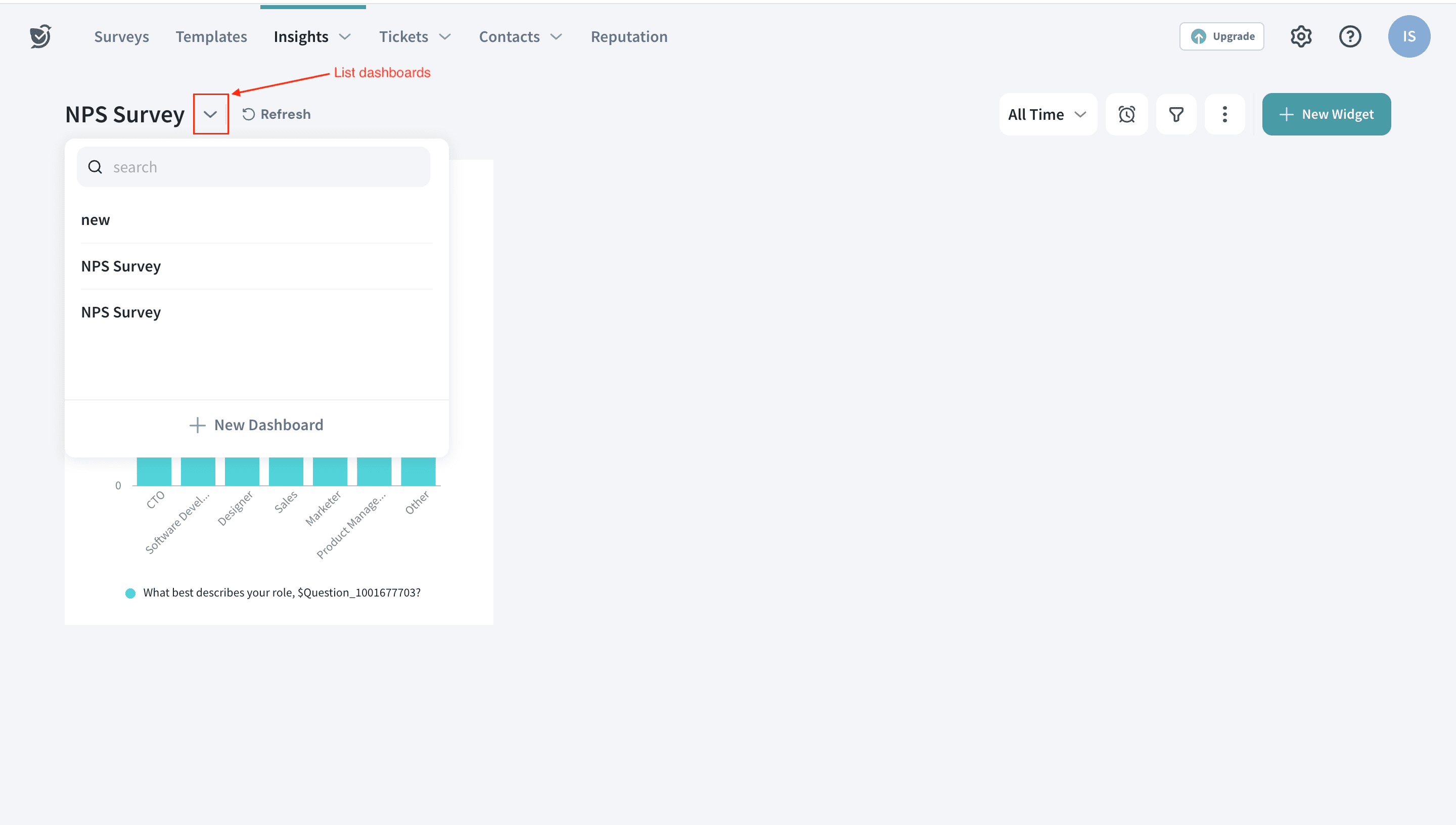
You can create multiple dashboards for different surveys to have a holistic view of all the survey data in one place. You can view the list of dashboards by clicking on the option highlighted
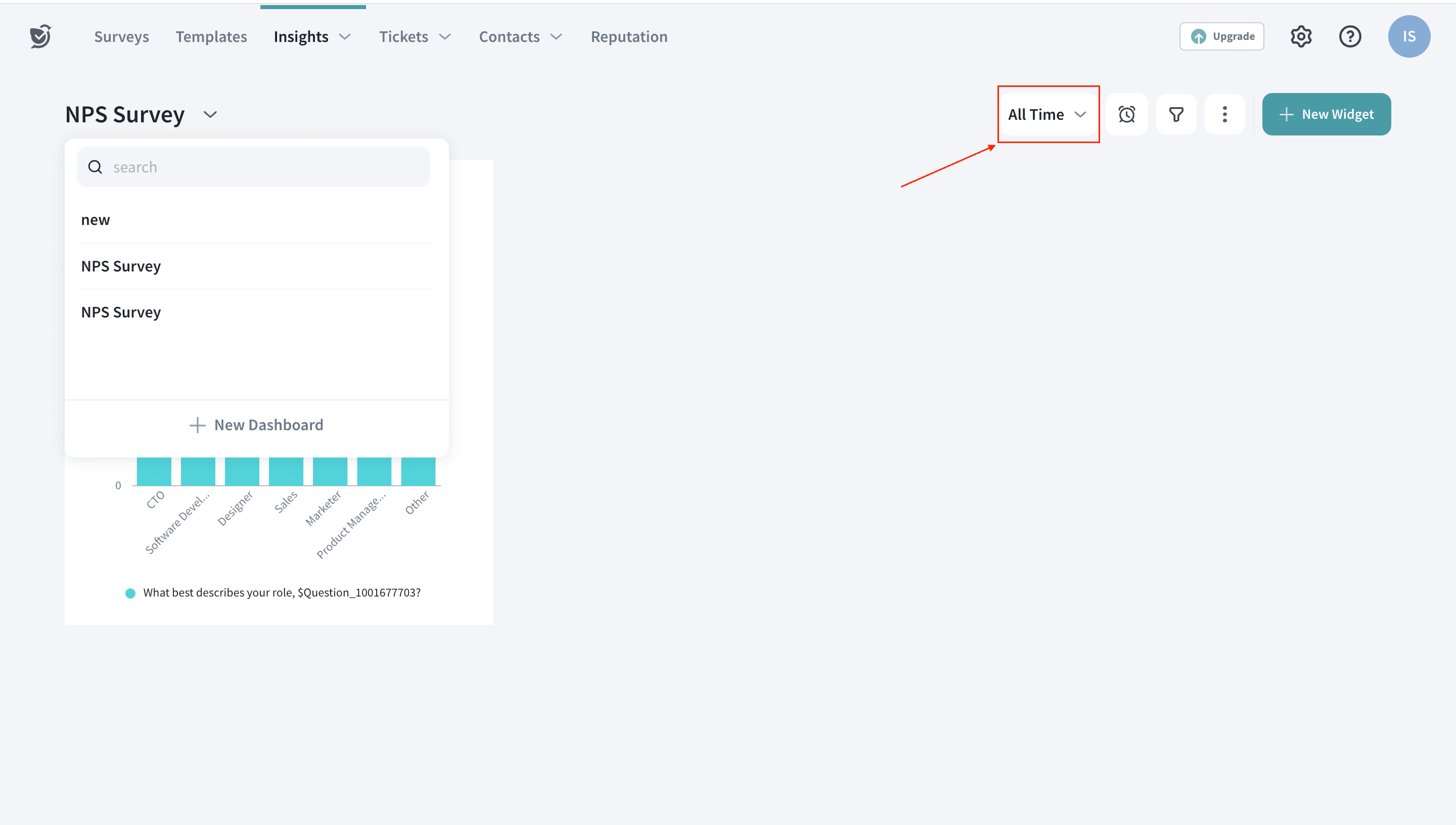
Just like the widget level date range we discussed above, you can filter out the dates for the overall dashboard by clicking on All Time.
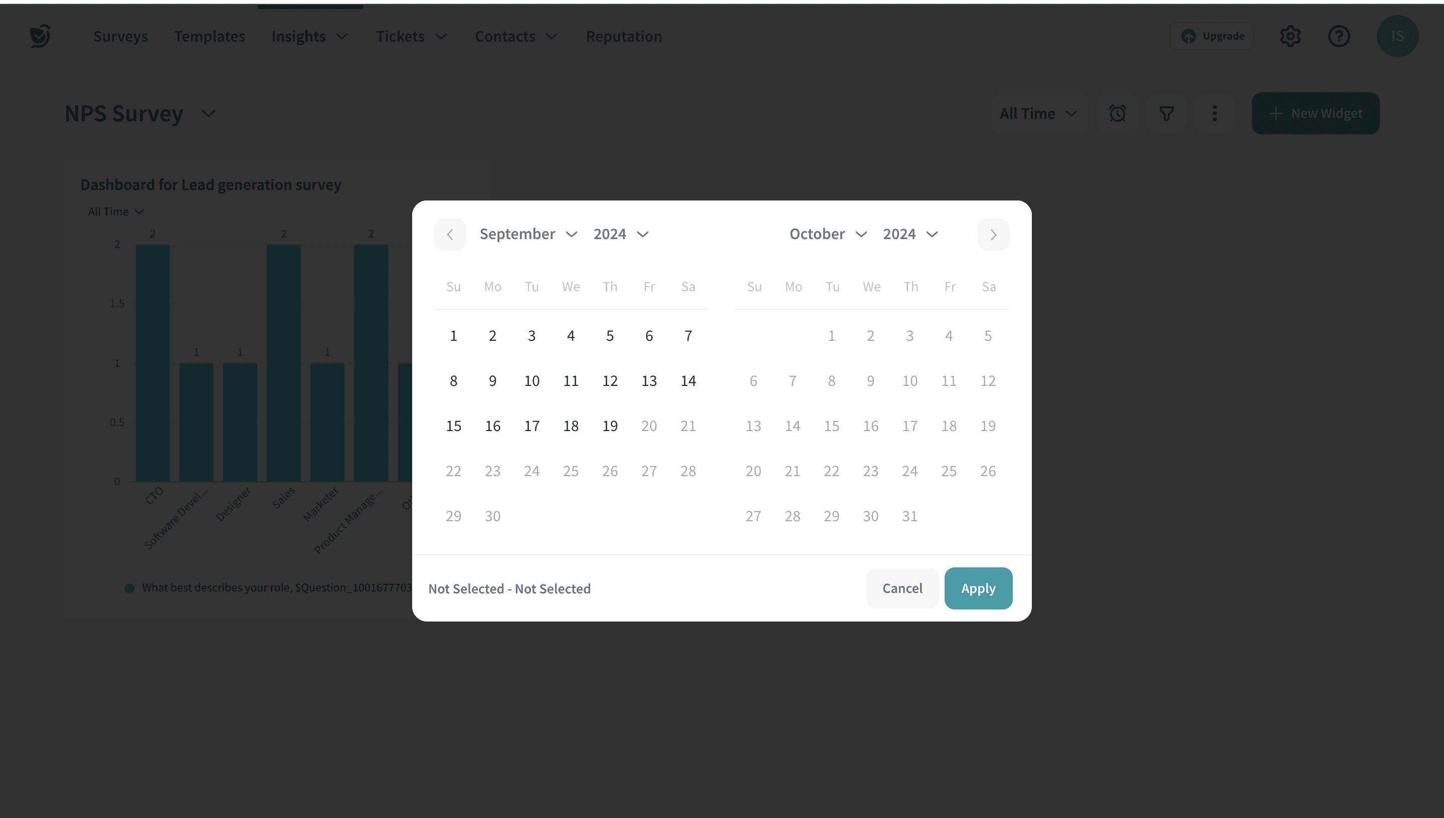
Once you click on All Time, the following screen opens. You can choose the date range from here
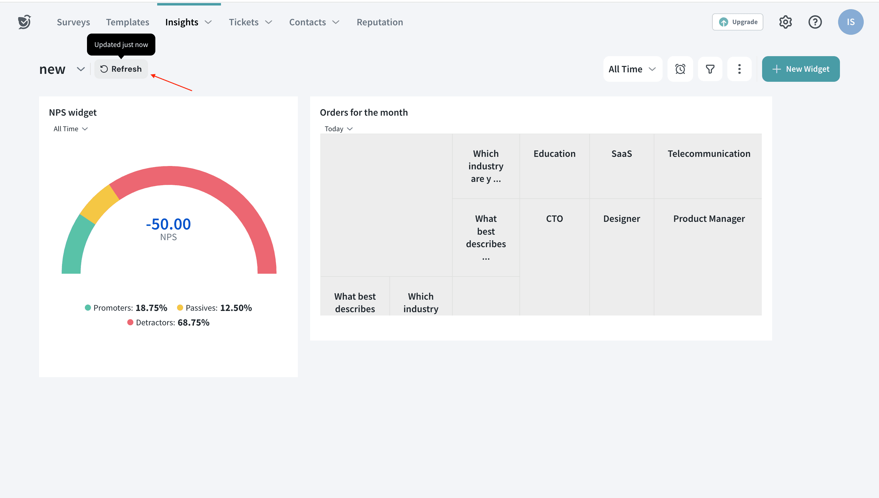
This option helps you to refresh the dashboard and update it with the latest data from the surveys
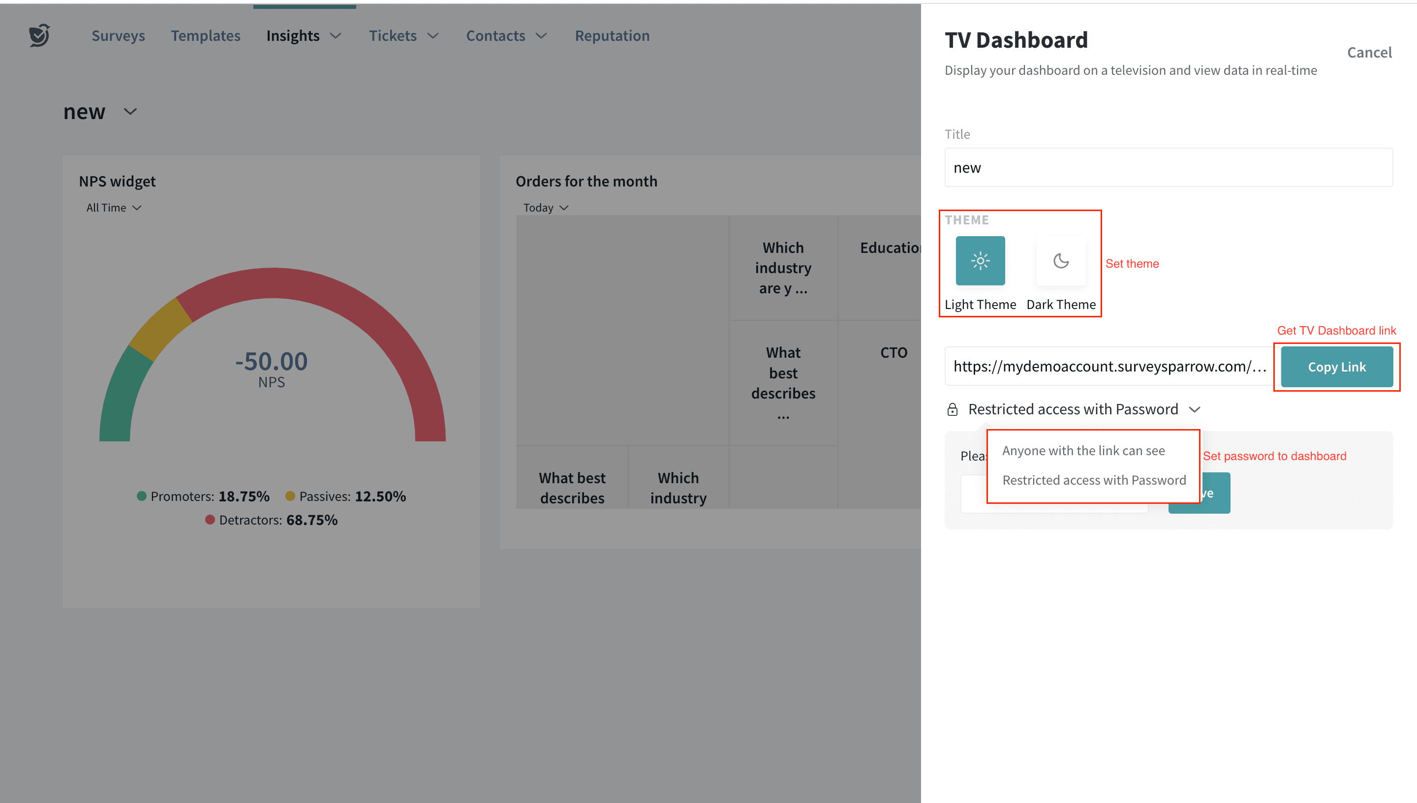
Want to view the dashboard in a full screen for presentations? We have recently launched TV Dashboard option to view dashboards exclusively.
Click on the TV Dashboard option.
Here are the settings for the dashboard:
You can set the theme, get the dashboard link and edit passwords from here
The link can be shared with anyone to view the dashboard
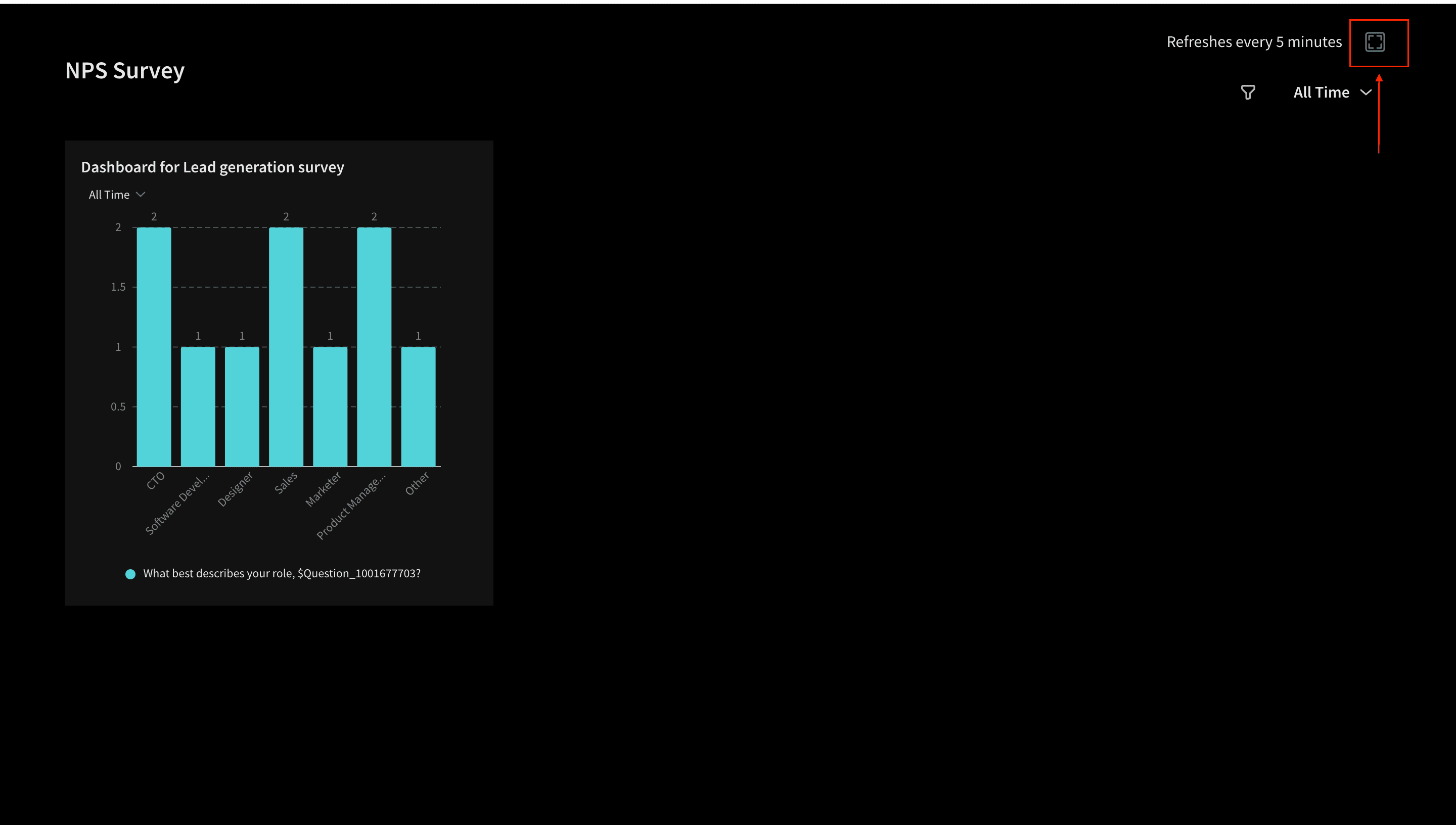
Once the settings are done, the dashboard appears as below. This screen refreshes every 30 seconds and can be viewed in Full screen.
To know more about Dashboards, check this article
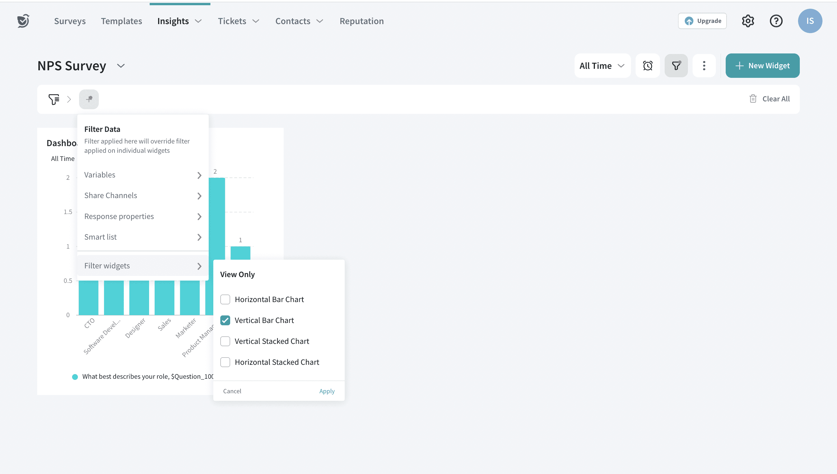
You can also filter out the dashboard based on the chart type. Click on the filter option and choose the chart type.
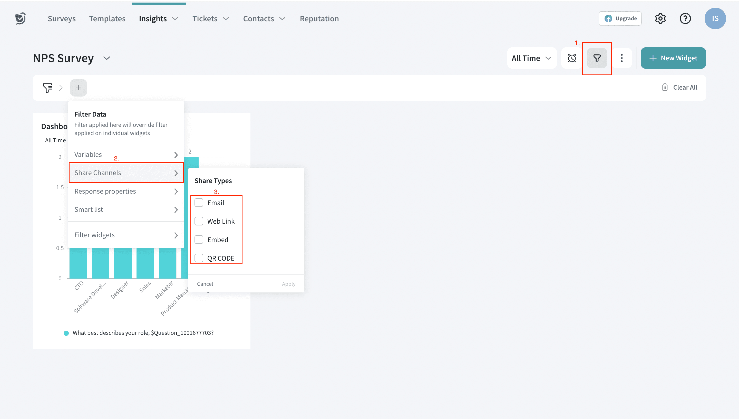
Yaay! Here is the filtered view, only the chosen chart-type widgets will be shown as below.
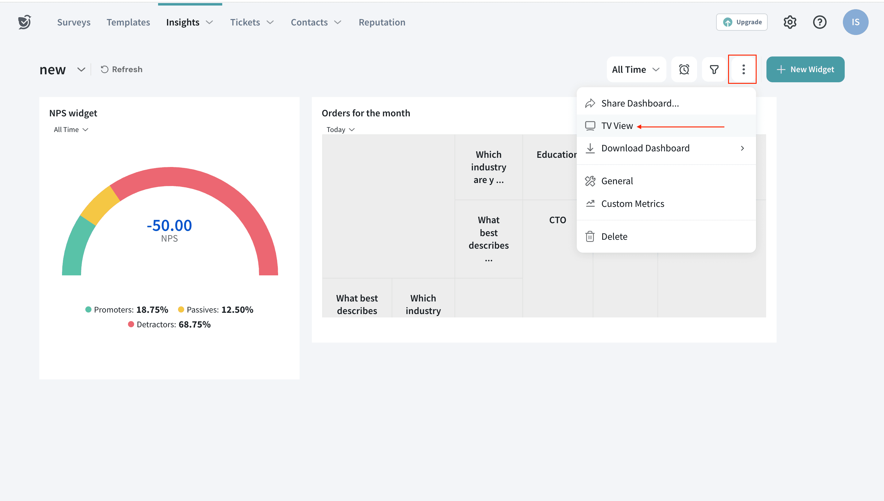
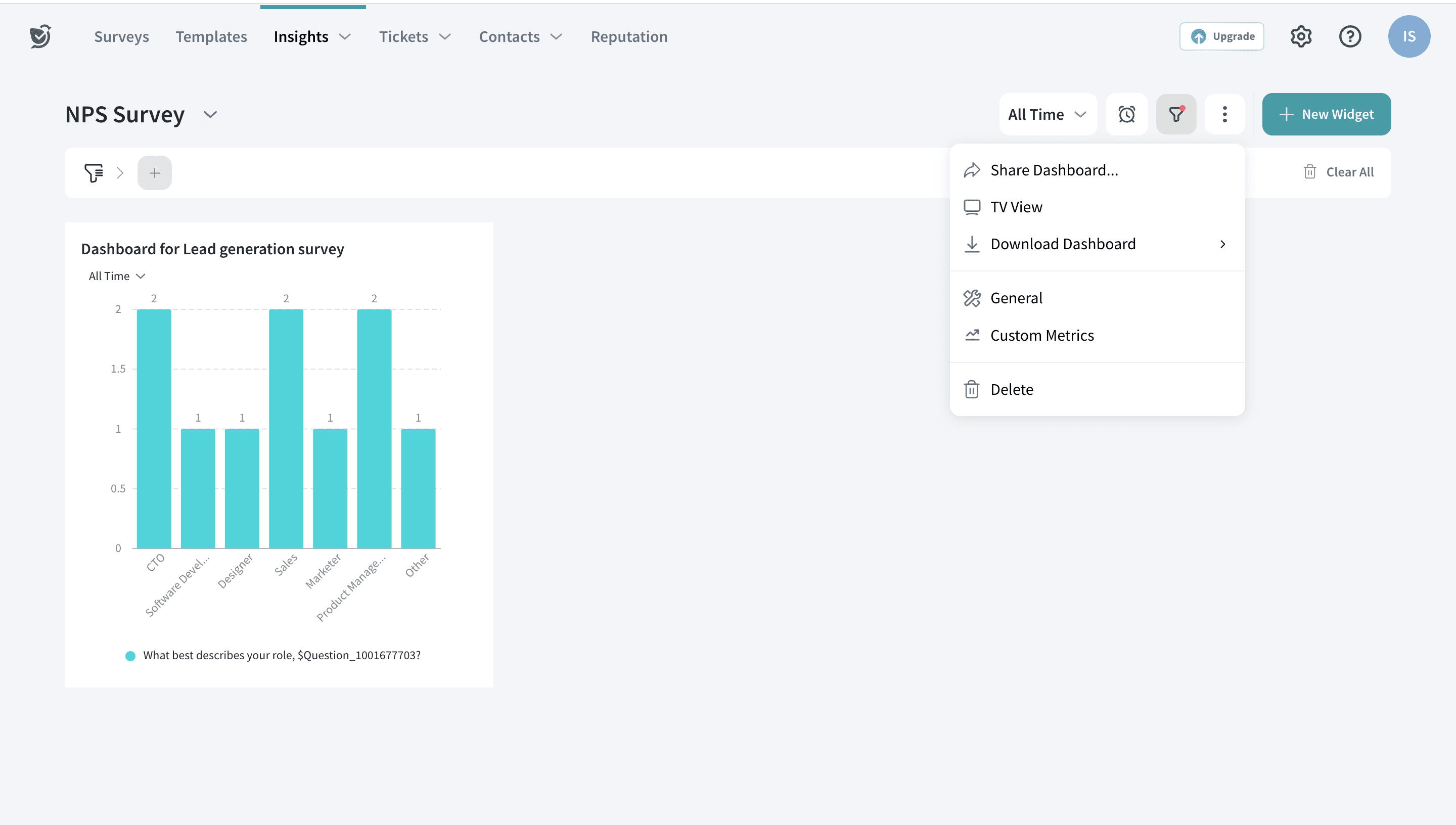
To play more around the options in the dashboard, click on the three options highlighted. You can edit, share, download or delete the dashboard from here.
With this, we come to the end of this article. Before we close, here are a few advantages of Executive Dashboard that you must know:
Now that you have learnt how to create interactive dashboards, click here to create one for you.
Reach out to us anytime if you have questions. We are more than happy to help you :)
Powered By SparrowDesk