Search
After collecting all responses for your NPS survey, an NPS feedback tool with an in-built reporting module will come super useful for receiving valuable insights on customer feedback.
Let’s see how we can carry out an in-depth analysis of NPS scores and feedback using SurveySparrow:
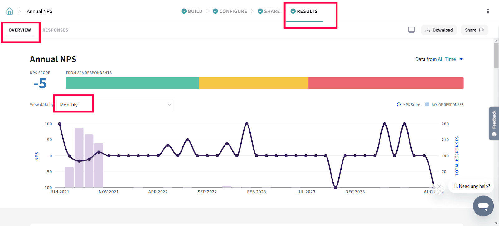
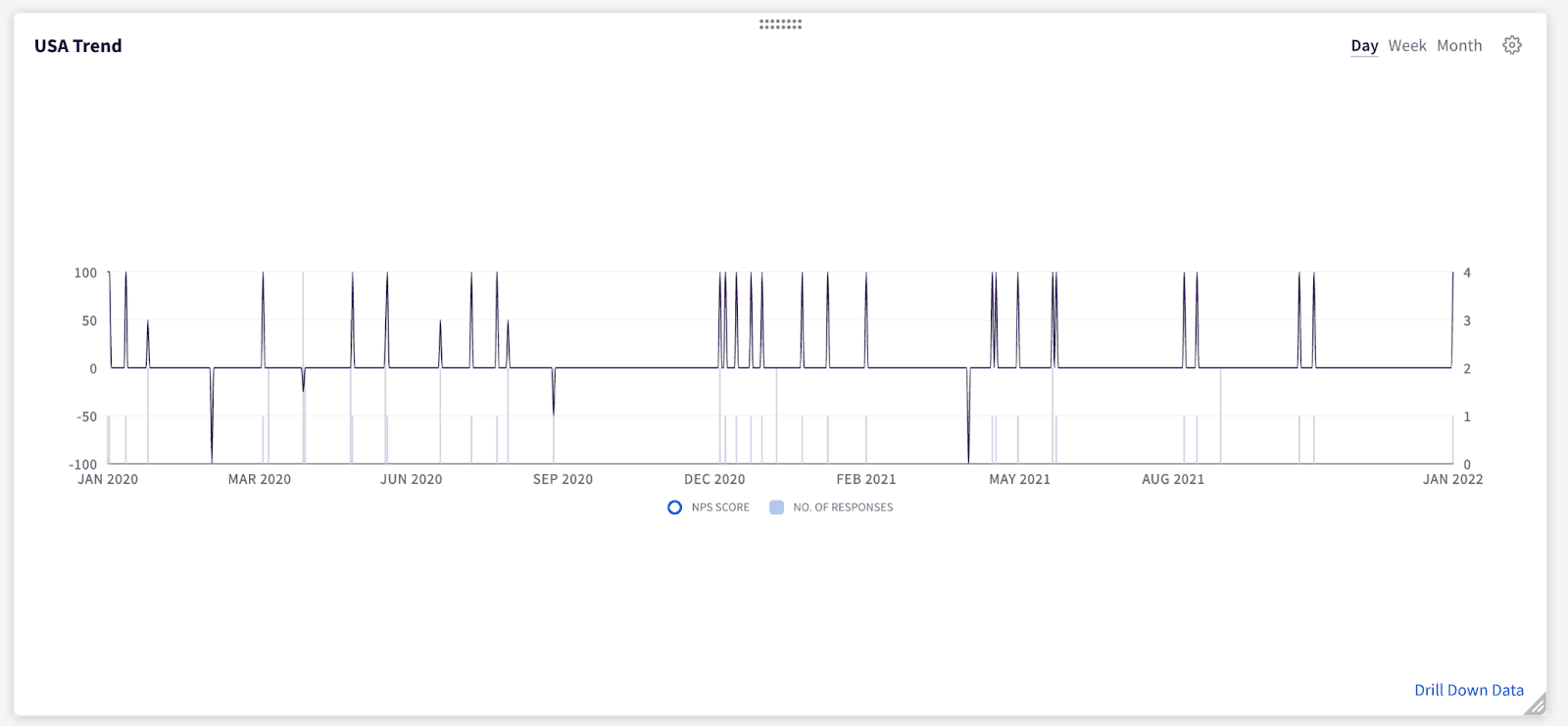
1. In the Results section of your survey, under Overview, you’ll see a trend of NPS responses over time. You can adjust the trend to show responses daily, weekly, monthly, yearly, or on a 30 day rolling average.
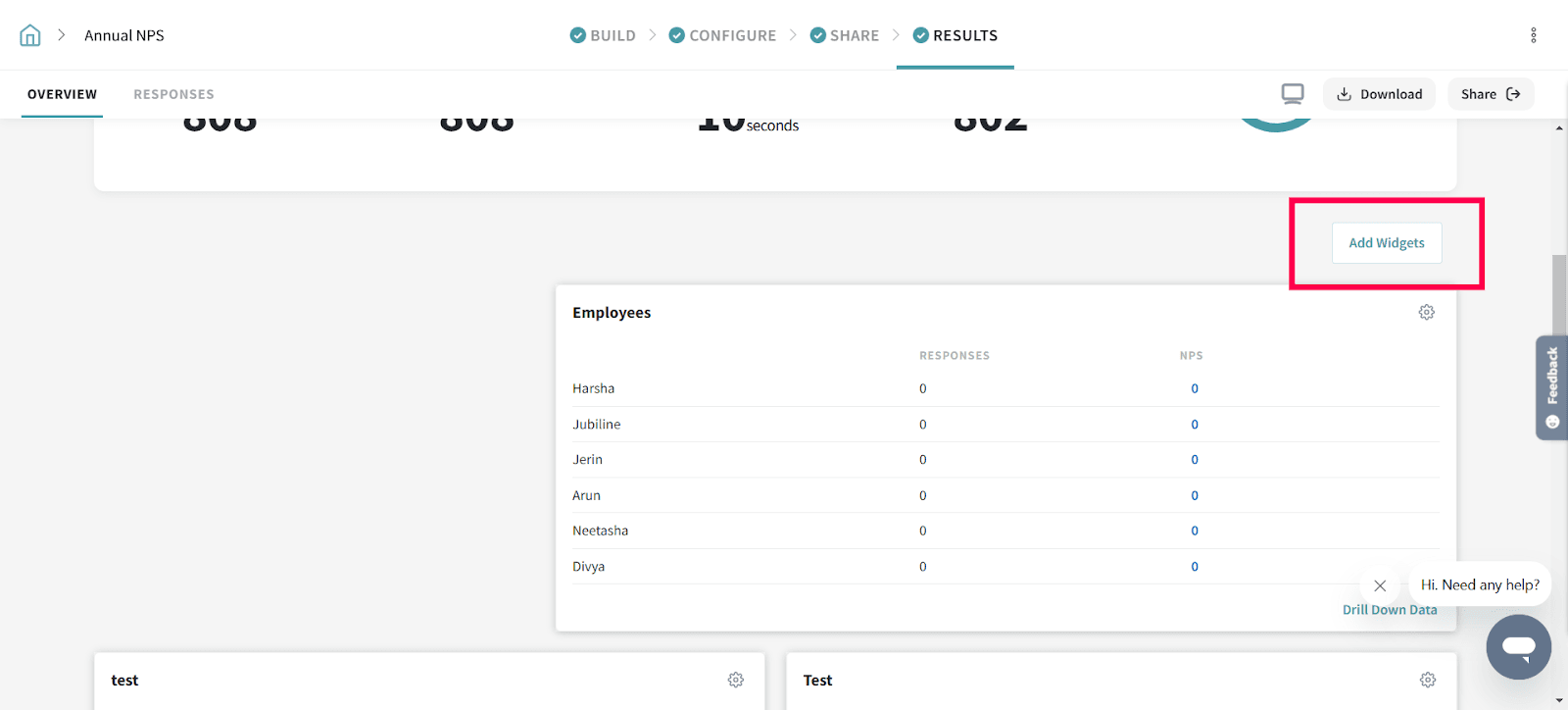
2. Widgets help you dissect your data better and gain deeper insights for your business. Select any of the widgets by clicking on the Add Widgets button.
The widgets we have are:
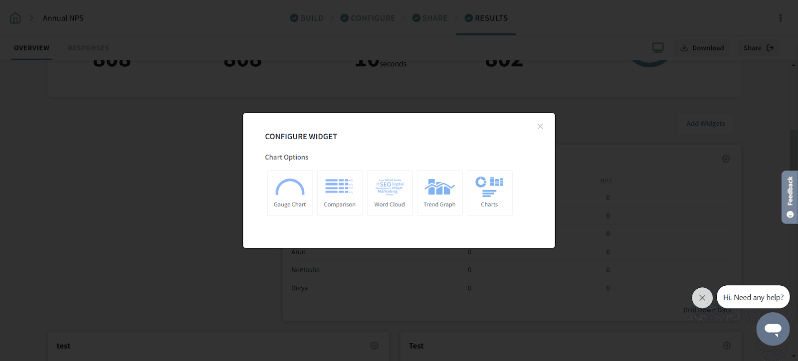
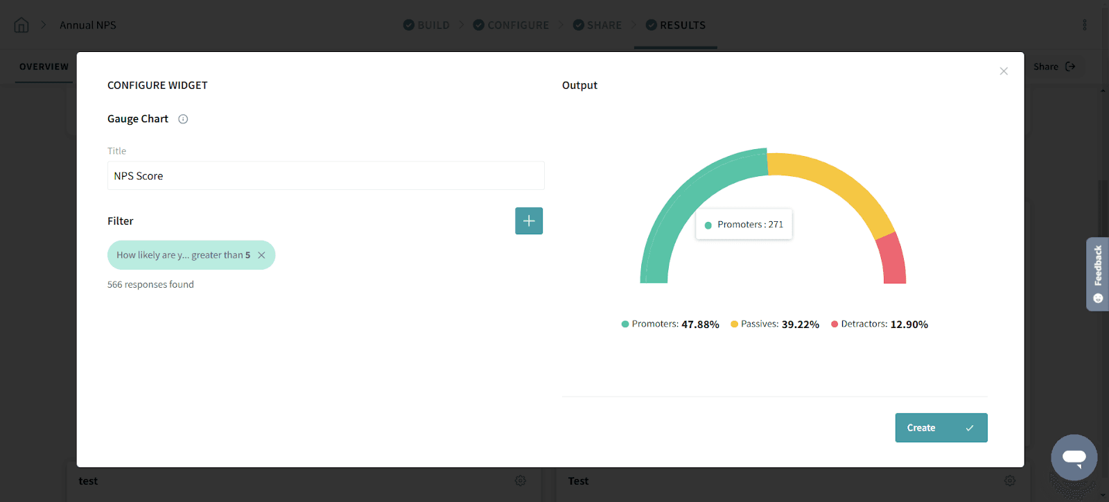
The Gauge Chart widget lets you segment your responses using filter groups and see the breakdown of promoters, passives, and detractors. You can add multiple segments to identify & track their performance.
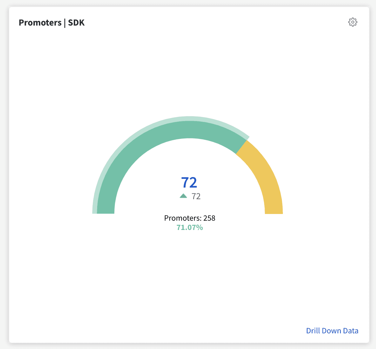
Provide a title to your Gauge Chart and add filters as per your intent. Click Create once you’ve set the conditions.
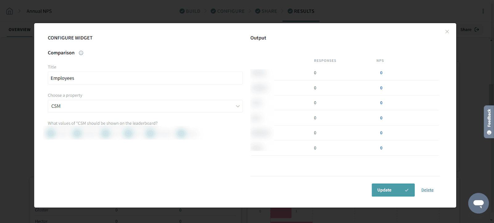
With the NPS Comparison widget, you can compare the responses provided by different segments of respondents (for example, customers under different pricing plans).
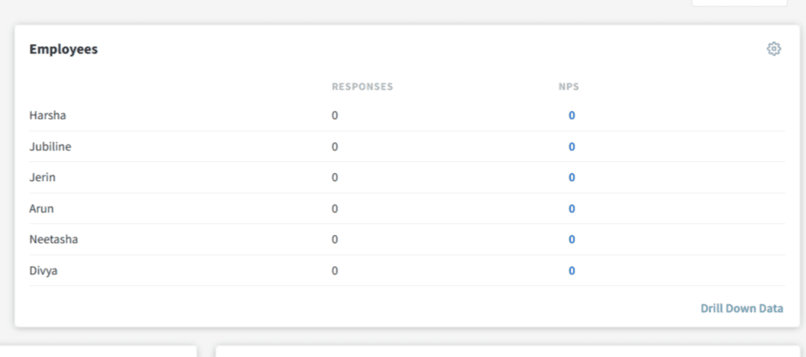
Add a title, select the contact properties or variables available, select the values you wish to compare and click Create.
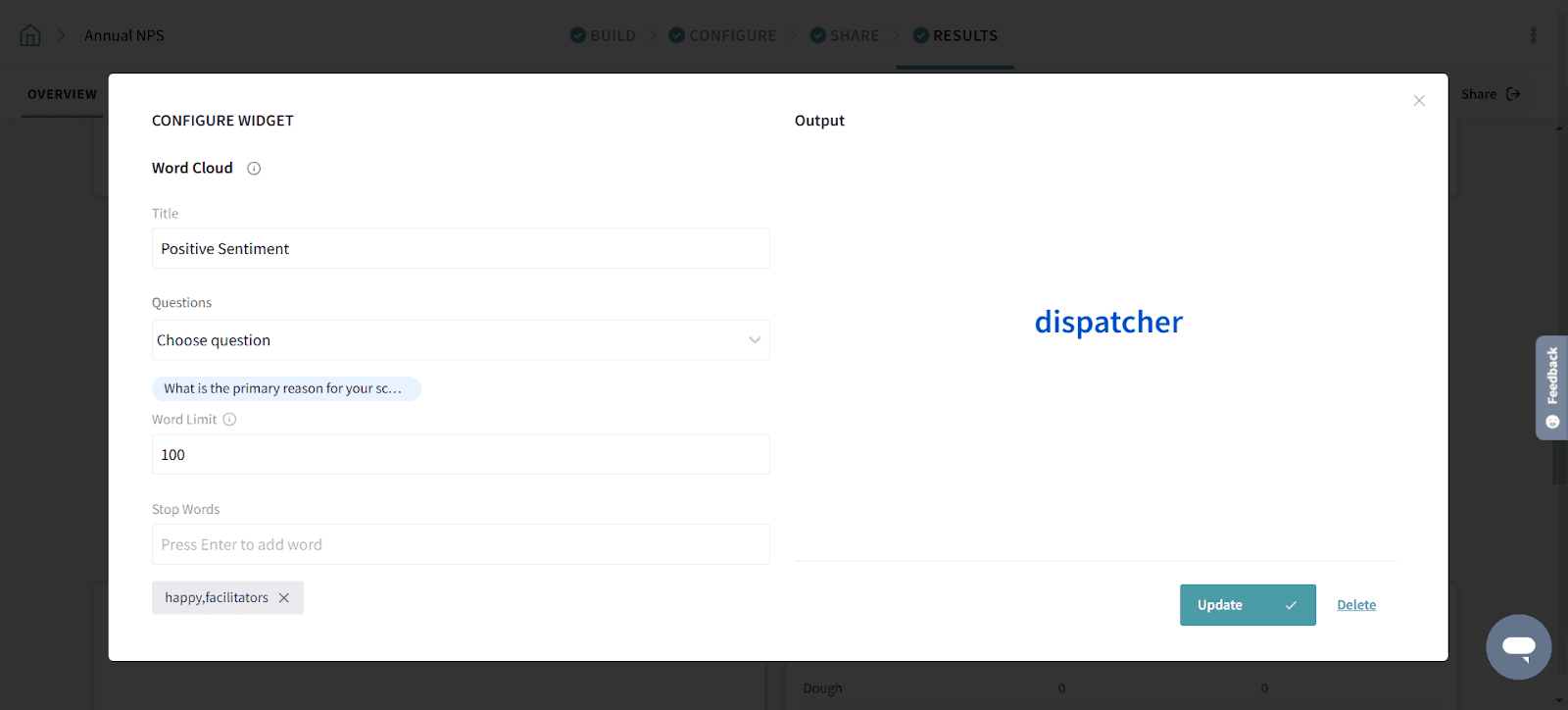
The Word Cloud widget lets you identify and view the most commonly used words in NPS responses. The word cloud is a cluster of words with the size of the words indicating how often the word appears in your collected responses.
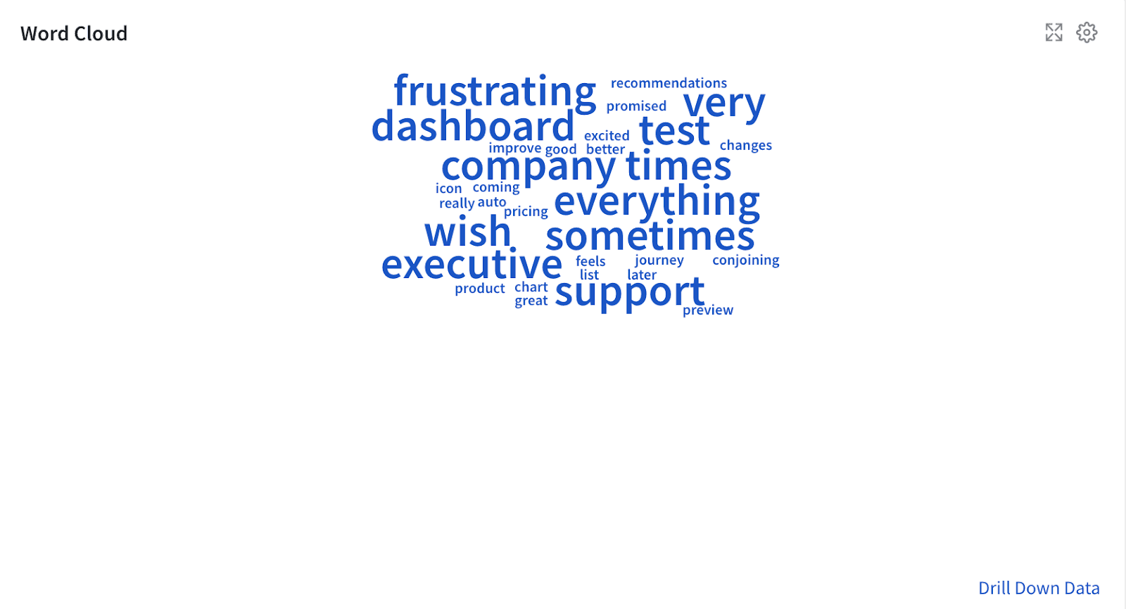
After choosing the Word Cloud widget:
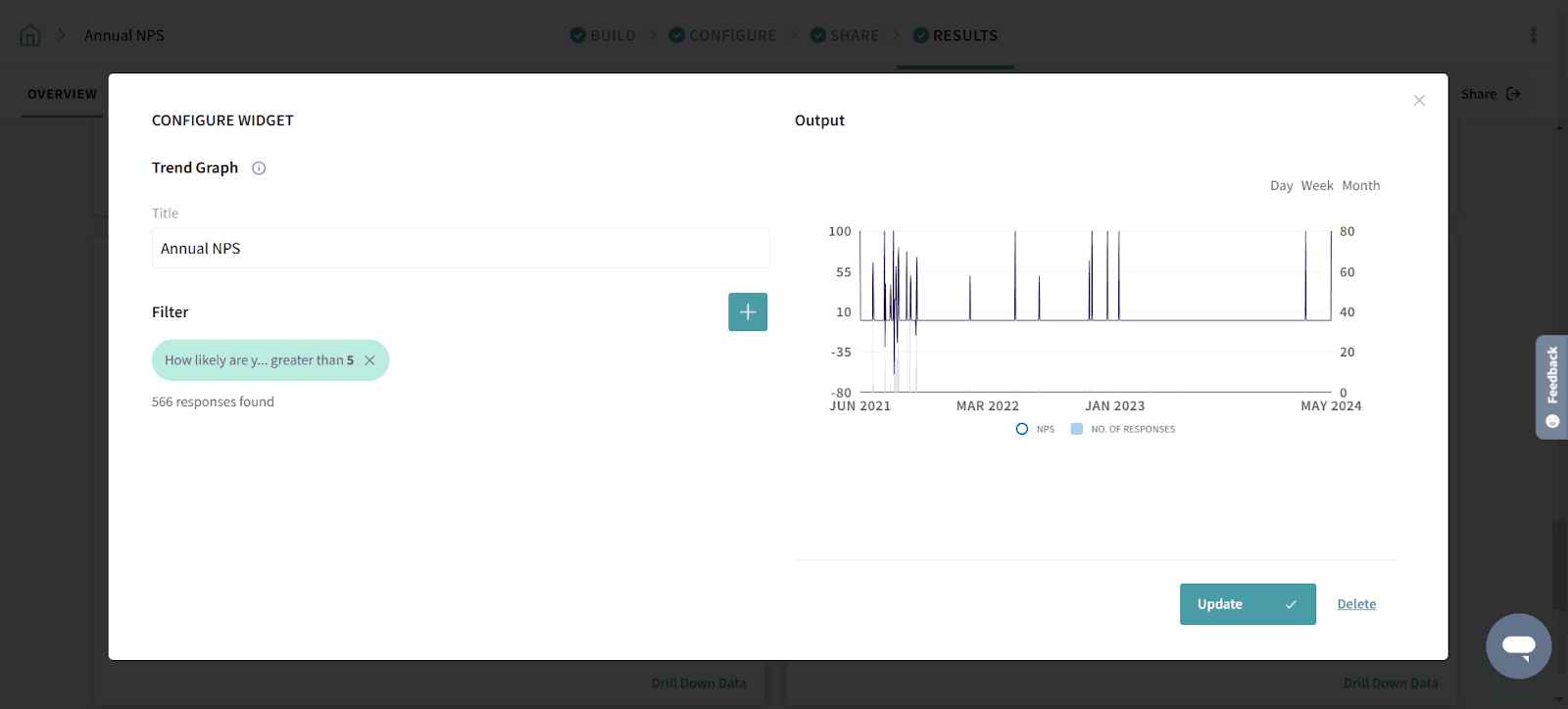
The Trend Graph widget shows you a trend of NPS responses over time and lets you apply a set of rules and conditions to slice through your data.
Add a title to your graph, add the necessary filters, and click Create.
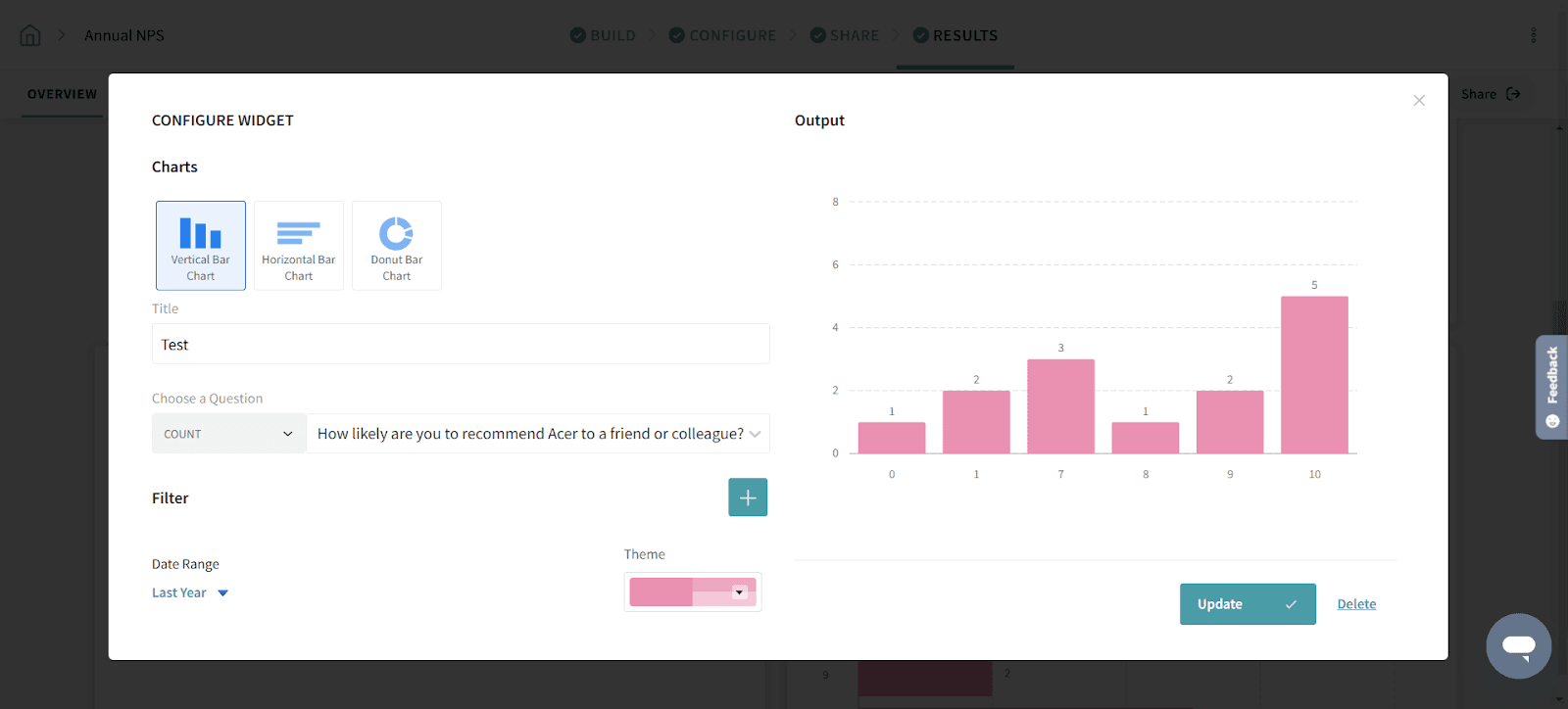
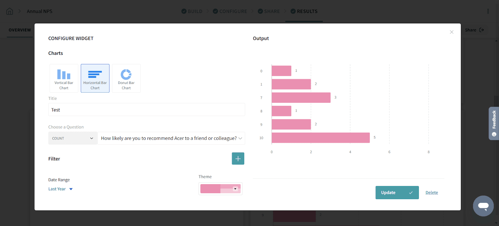
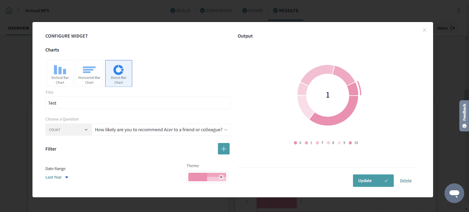
There are three types of Charts - Vertical Bar Chart, Horizontal Bar Chart and Donut Bar Chart.
Vertical Bar Chart
The vertical bar chart lets you represent your NPS data in a vertical format. You can see the number of the respondents and NPS scores using vertical bars.
Horizontal Bar Chart
The horizontal bar chart lets you represent your NPS data in a horizontal format. Simply choose a question and visualise your NPS data, the SurveySparrow way.
Donut Bar Chart
A donut bar chart is a pie chart that shows the percentage of each value of the NPS score that contributes to a total.
Wonderful! You have mastered the art of analysis NPS data.
Powered By SparrowDesk