The Gabor-Granger pricing technique is a market research method used to understand customers’ willingness to pay for a product or service. It helps businesses determine optimal pricing by testing different price points with potential customers and observing their purchase intent.
In a typical Gabor-Granger survey, customers are shown a price and asked a simple question: “Would you buy this product at this price?” If they say “yes,” a higher price is shown; if they say “no,” a lower price is shown. This process continues until the ideal price range is identified.
This method is particularly valuable because it:
Measures price sensitivity and elasticity.
Helps identify the maximum acceptable price before sales decline.
Provides data-driven guidance for pricing decisions.
Let’s look at an example to better understand.
An electronics brand is preparing to launch a new smartwatch. They know it has great features and strong market potential, but they’re unsure what price will attract customers while still making a profit.
With the Gabor-Granger method, they can:
Ask customers if they’d buy the smartwatch at a certain price.
If customers say “yes,” they try a higher price; if they say “no,” they try a lower one.
Repeat this process to see what most people are willing to pay.
Set a launch price that feels fair to customers while meeting business goals.
This way, the brand takes the guesswork out of pricing and uses real feedback to make pricing related decisions.
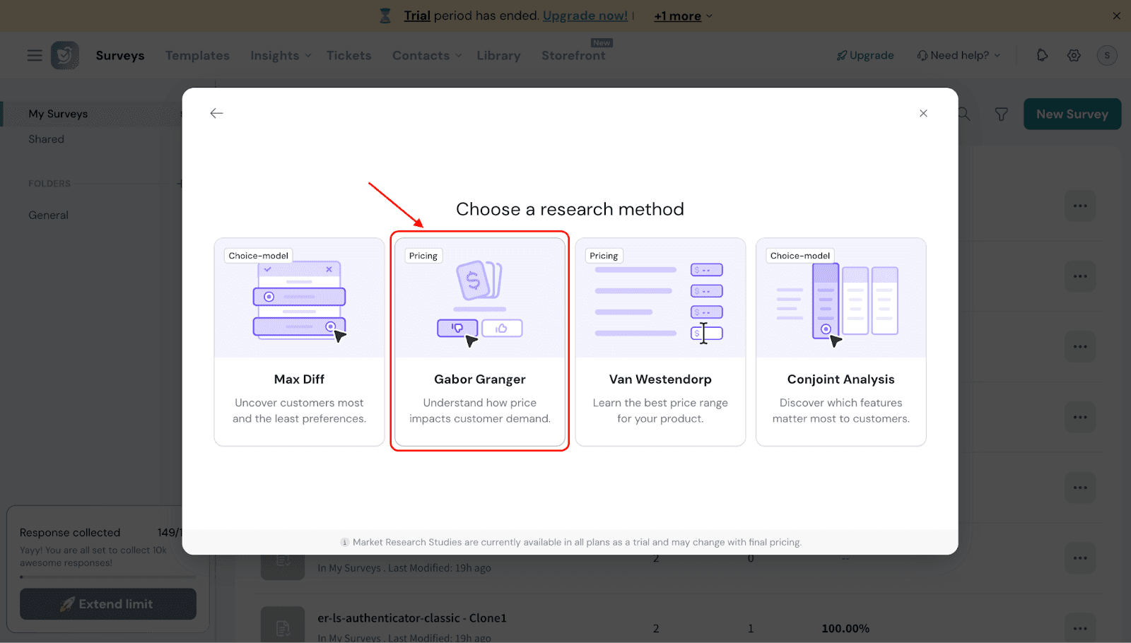
Let’s see how to use Gabor Granger in SurveySparrow.
Navigate to the Research section and select “Create New.”
You will see four research methods. Select Gabor-Granger.
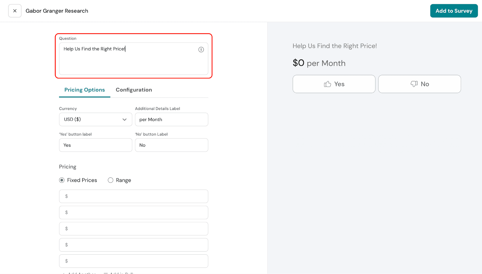
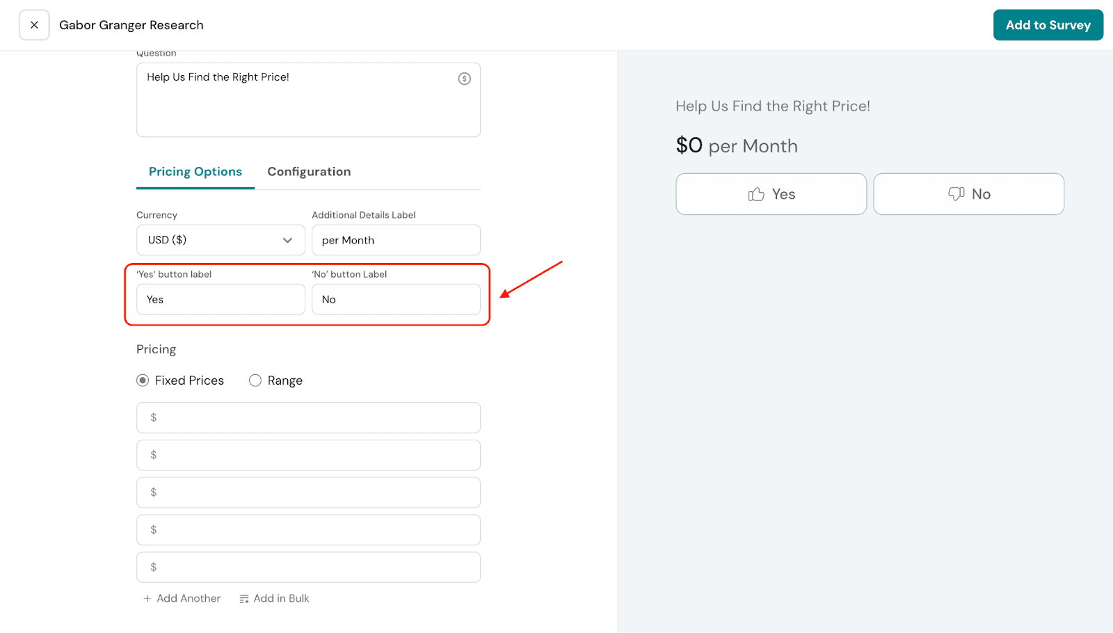
You can edit the question however you like. By default, it will read: “Help Us Find the Right Price!”
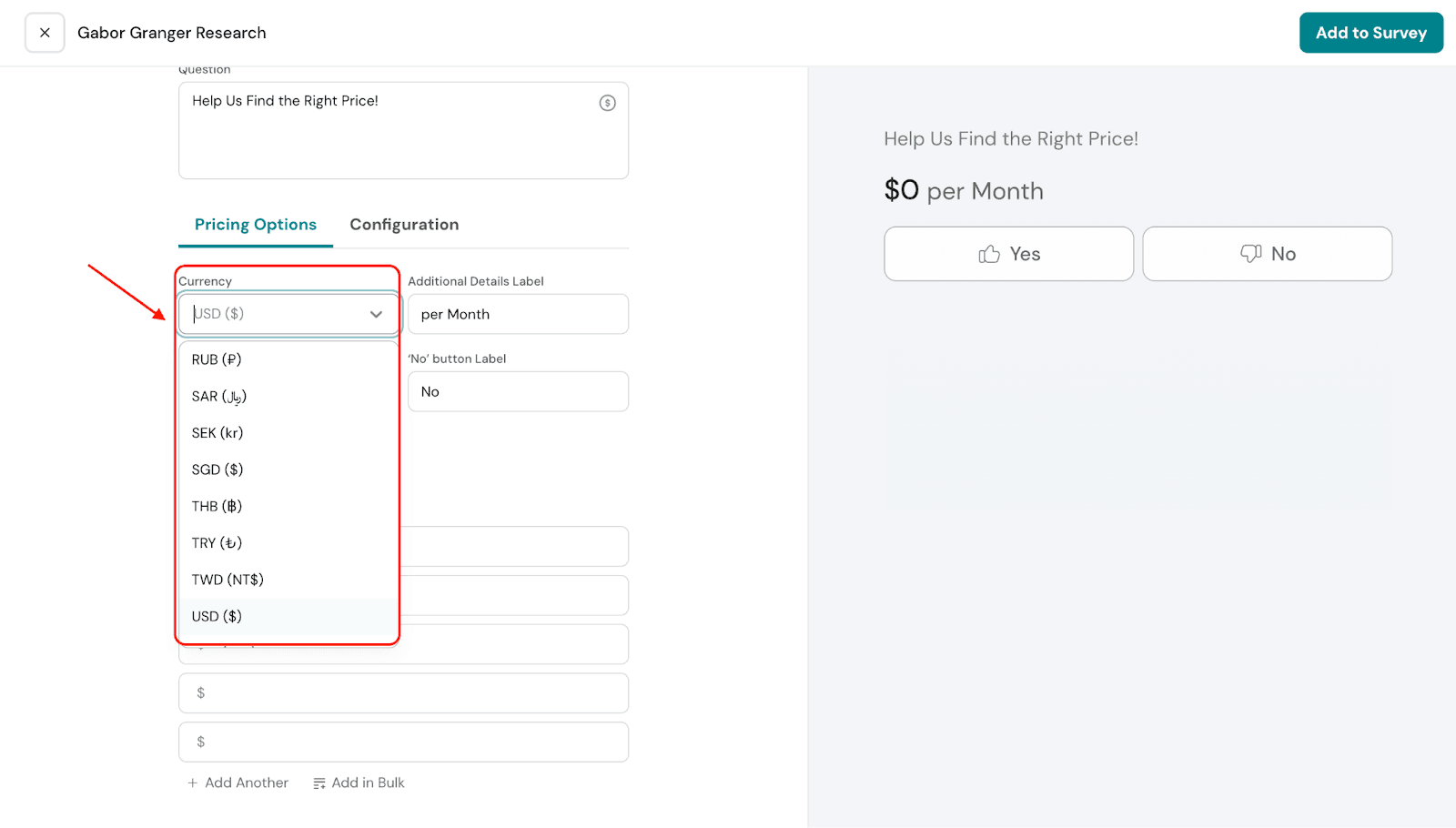
Under Pricing Options, you can select the currency for your survey. This determines how all price points will be displayed to respondents, ensuring clarity and consistency in the results.
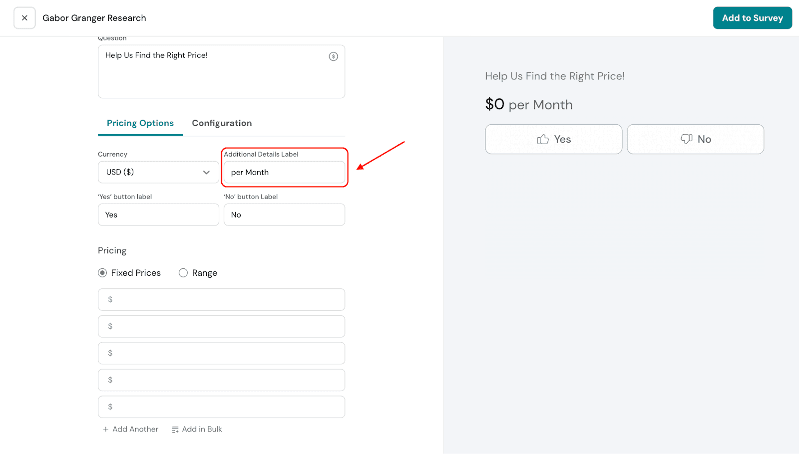
You can add additional label details to clarify the pricing for your audience. For example, whether the price is per month, per year, or any other unit. By default, it is set to “per month,” but you can edit it as needed.
The labels for the pricing options can also be edited. By default, they are set to “Yes” and “No.” When respondents see a price they find acceptable, they select “Yes.” You can customize these labels to better suit your survey.
Fixed Prices: You can provide specific price points by manually entering them For example, in our electronics scenario, the price points could be $300, $350, $400, and so on.
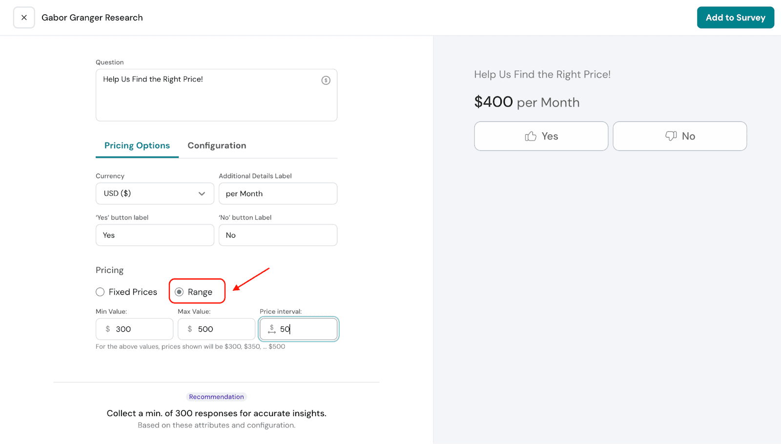
Range: You can set a price range by specifying the minimum price, the maximum price, and the price interval. The system will automatically generate all prices within this range.
For example: In our electronics scenario, you could set a minimum price of $300, a maximum price of $500, and a price interval of $50. The resulting prices would be $300, $350, $400, $450, and $500.
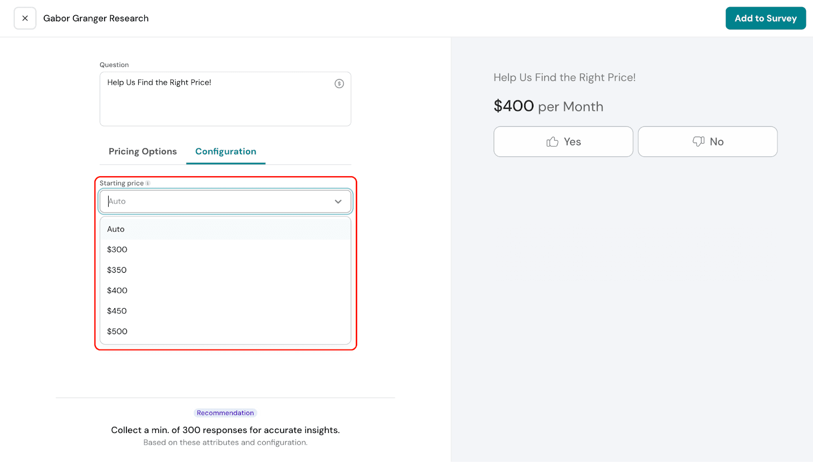
Under Configuration, you can choose the starting price for your survey. You can select a specific price from the dropdown, or choose Auto.
If you select Auto, the system will show a random starting price. Based on the respondent’s answer, the next price will be adjusted automatically.
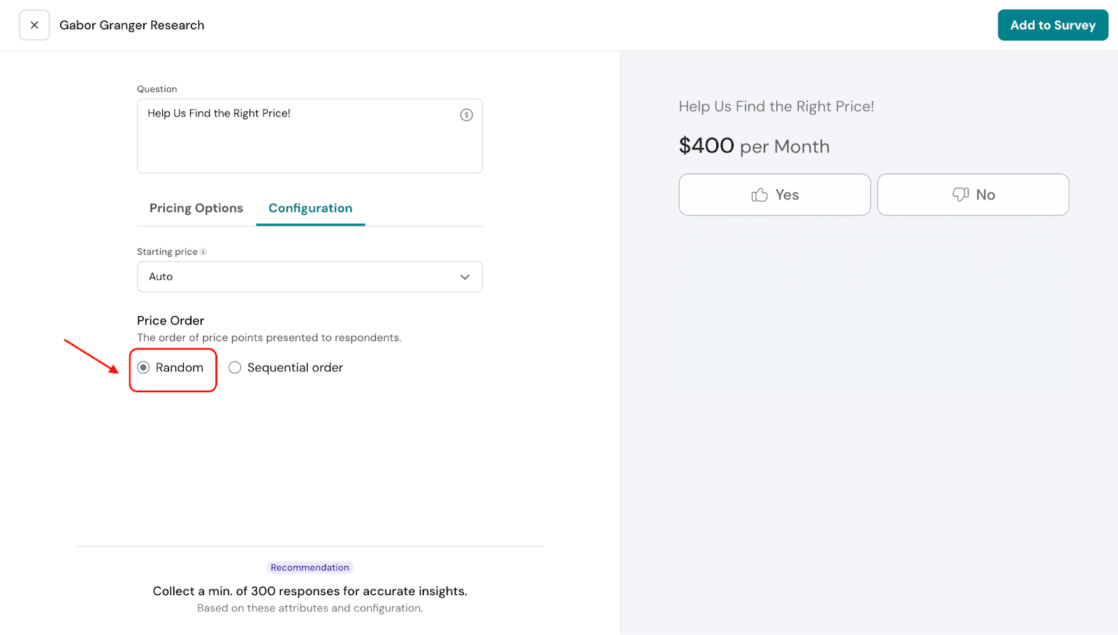
Price Order determines the sequence in which price points are shown to respondents, helping guide the survey flow based on their answers.
Random: The order in which price points are shown to respondents is random. After the respondent answers the primary question for the starting price, the subsequent price shown will also be random.The system determines whether to show decreasing or increasing prices next, based on the respondent’s previous selection.
Sequential: The subsequent prices are shown in a sequential order. This means the next price will increase or decrease systematically, depending on the respondent’s choice for the starting price point.
11. Once you’re done, click Add to Survey to save and continue building the rest of the survey.
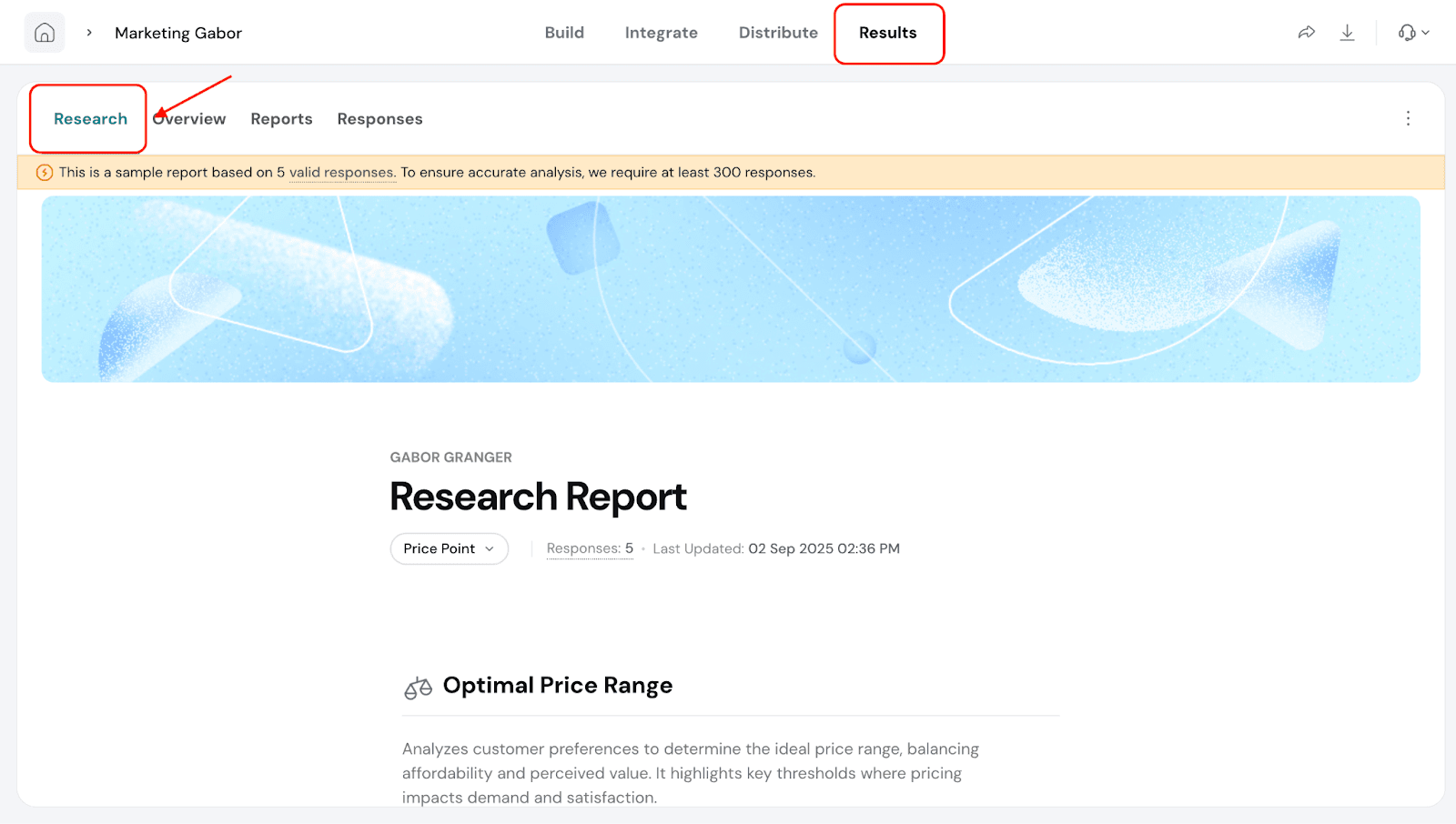
Results Section of Gabor-Granger
Let’s take a look at the Results section and see how the reports appear, as well as how to interpret them.
Navigate to the Results section and select Research.
Optimal Price Range: This shows the price range that best balances customer willingness to pay and perceived value. It highlights the key points where changes in price may affect demand and customer satisfaction.
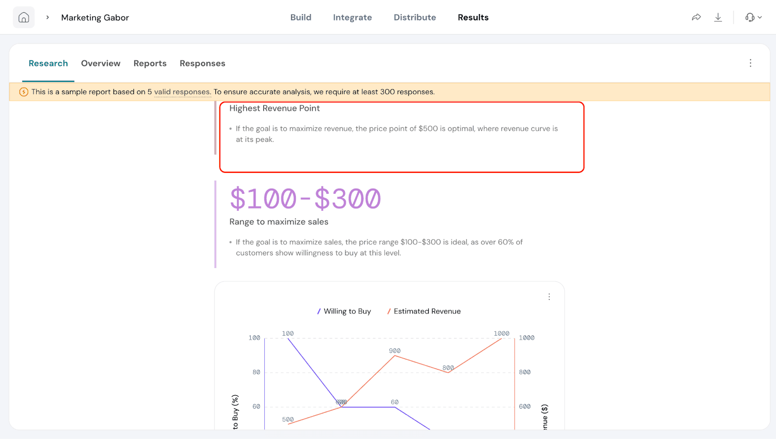
You can also see the highest revenue point, which is the price that generates the most revenue.
In our example, if the price range is set from $100 to $500, the highest revenue point would be $500.
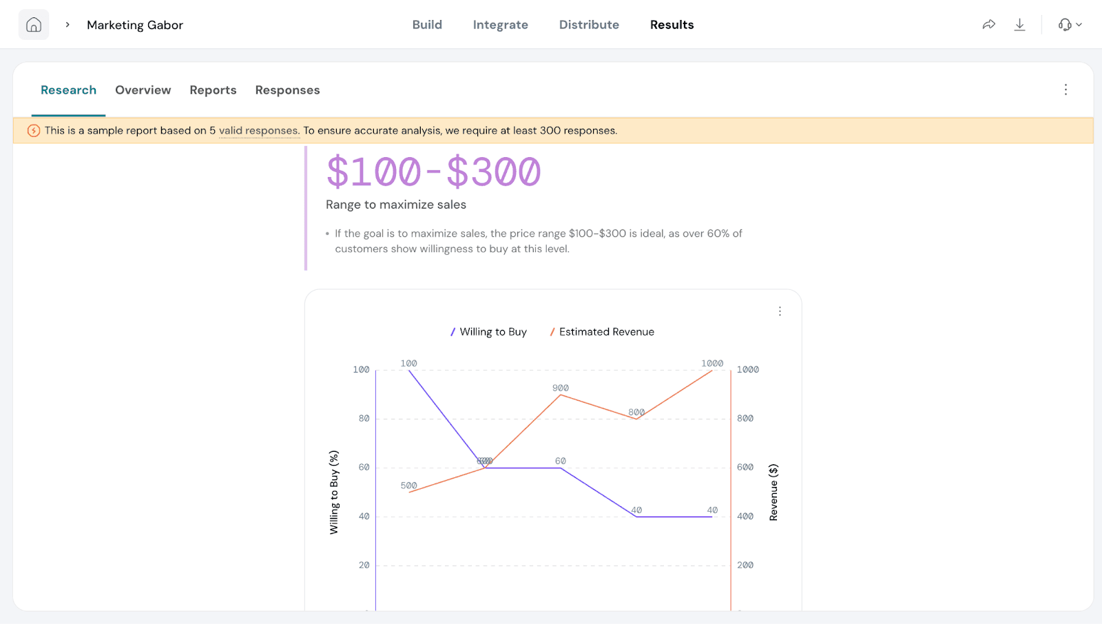
Based on the prices selected and preferred by customers, you’ll see a recommended price range to maximize sales. In our example, this means customers are most likely to buy if the price is between $100 and $300.
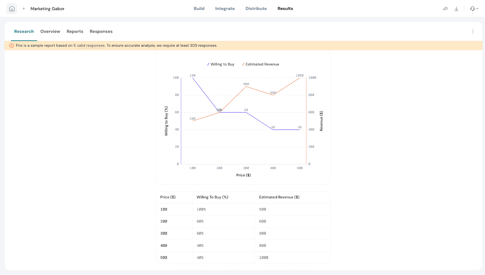
Charts and Visuals:
A chart displays Willingness to Buy (%) on the Y-axis and Price on the X-axis.
The Willingness-to-Buy curve shows how demand changes as prices increase.
The Revenue Curve highlights the price point where revenue is maximized
By combining these insights, you can confidently select a price that covers costs, maximizes revenue, and maintains customer interest.
A detailed table with the underlying data is shown below the chart for easy reference.
Smart Filters
Smart Filters are especially useful when you’ve added extra questions in your Gabor-Granger survey. For example, if you ask respondents about their age group, location, or product usage, you can use a filter to compare pricing preferences between different segments.
These filters let you focus your analysis on a specific group of respondents, making it easier to uncover trends, compare segments, and draw meaningful conclusions. Once applied, the filters automatically update your charts, tables, and reports to reflect only the data for that group.
With Smart Filters, you can save time, reduce manual work, and ensure your pricing insights are always relevant and actionable.
Lets see how to create Smart Filters.
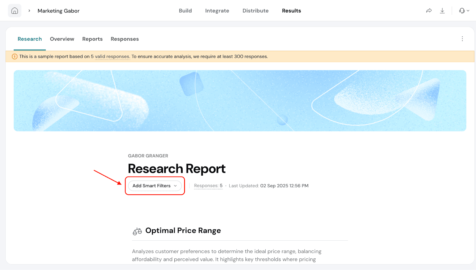
Go to ‘Add Smart Filters’.
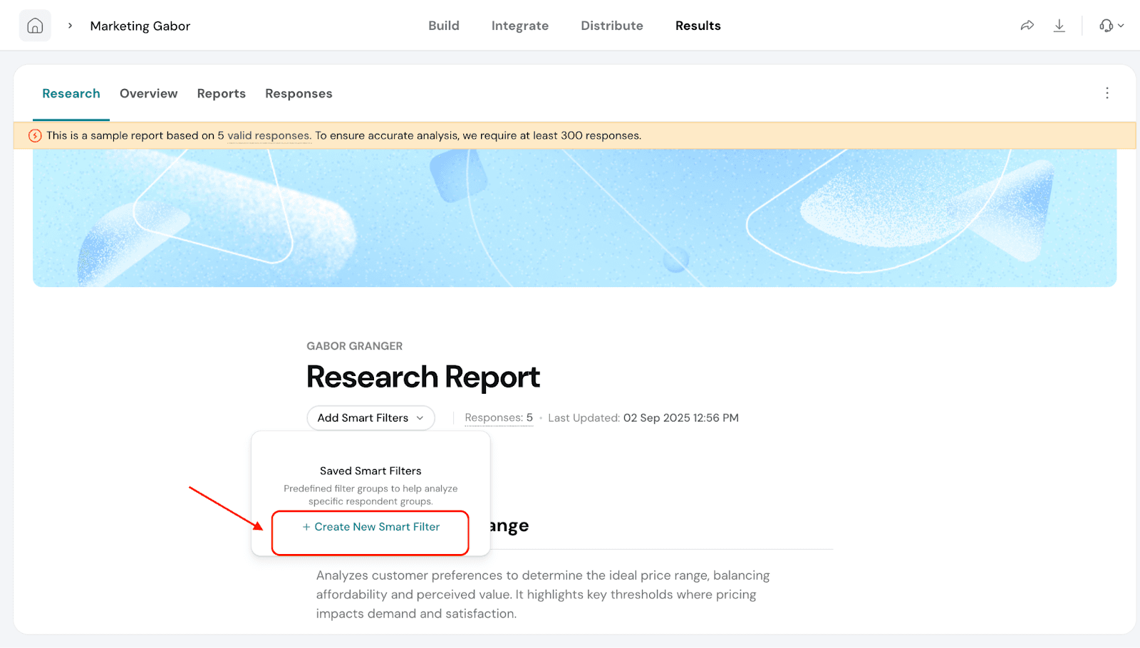
Click on Create New Smart Filter.
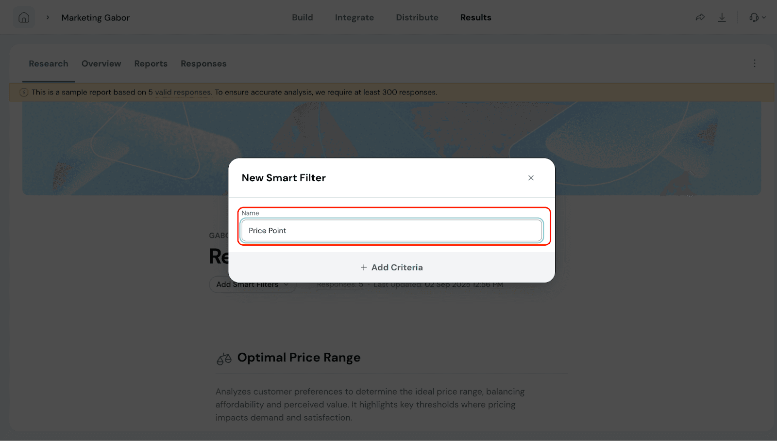
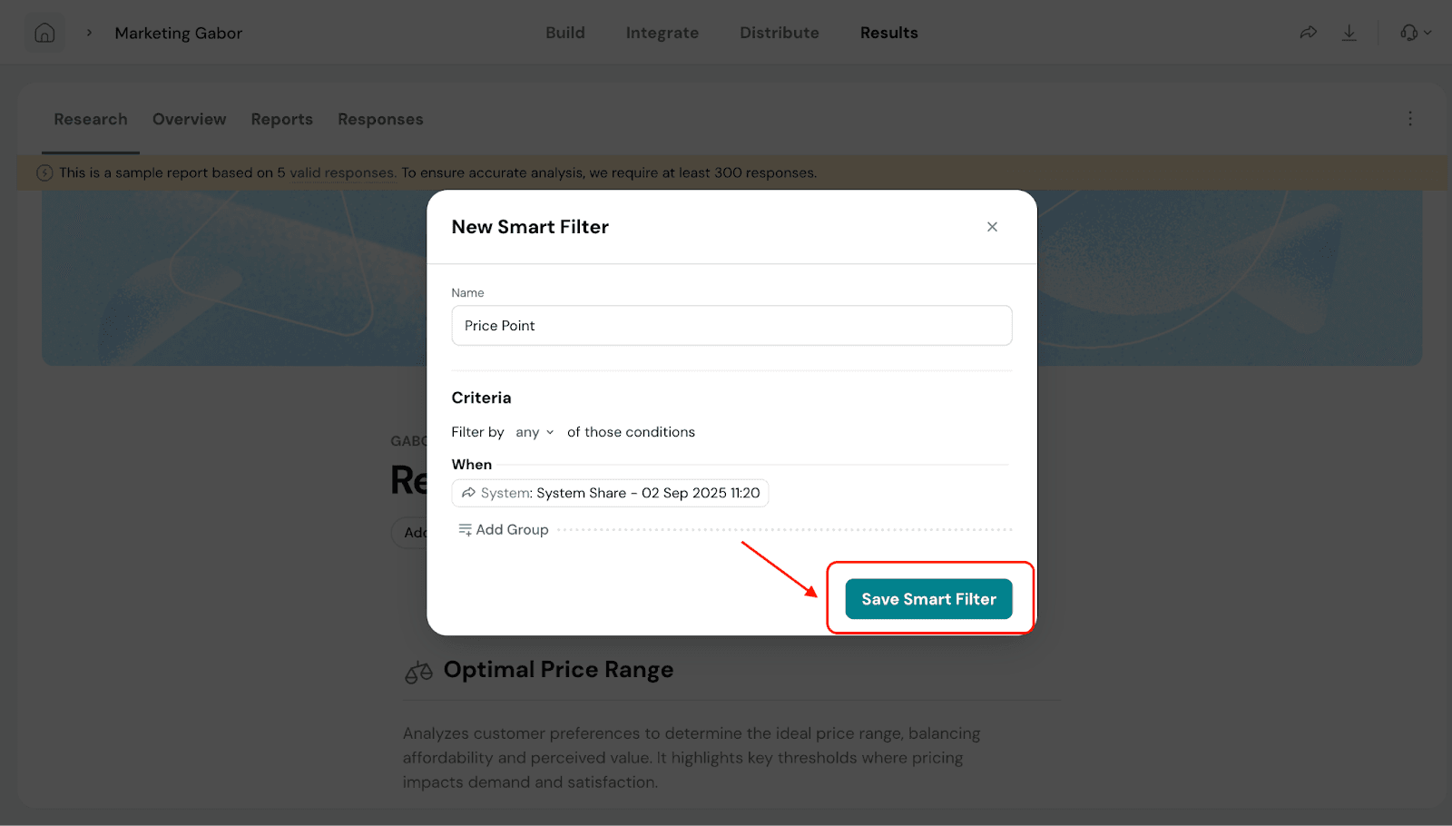
Give a name for your filter and click on Add Criteria.
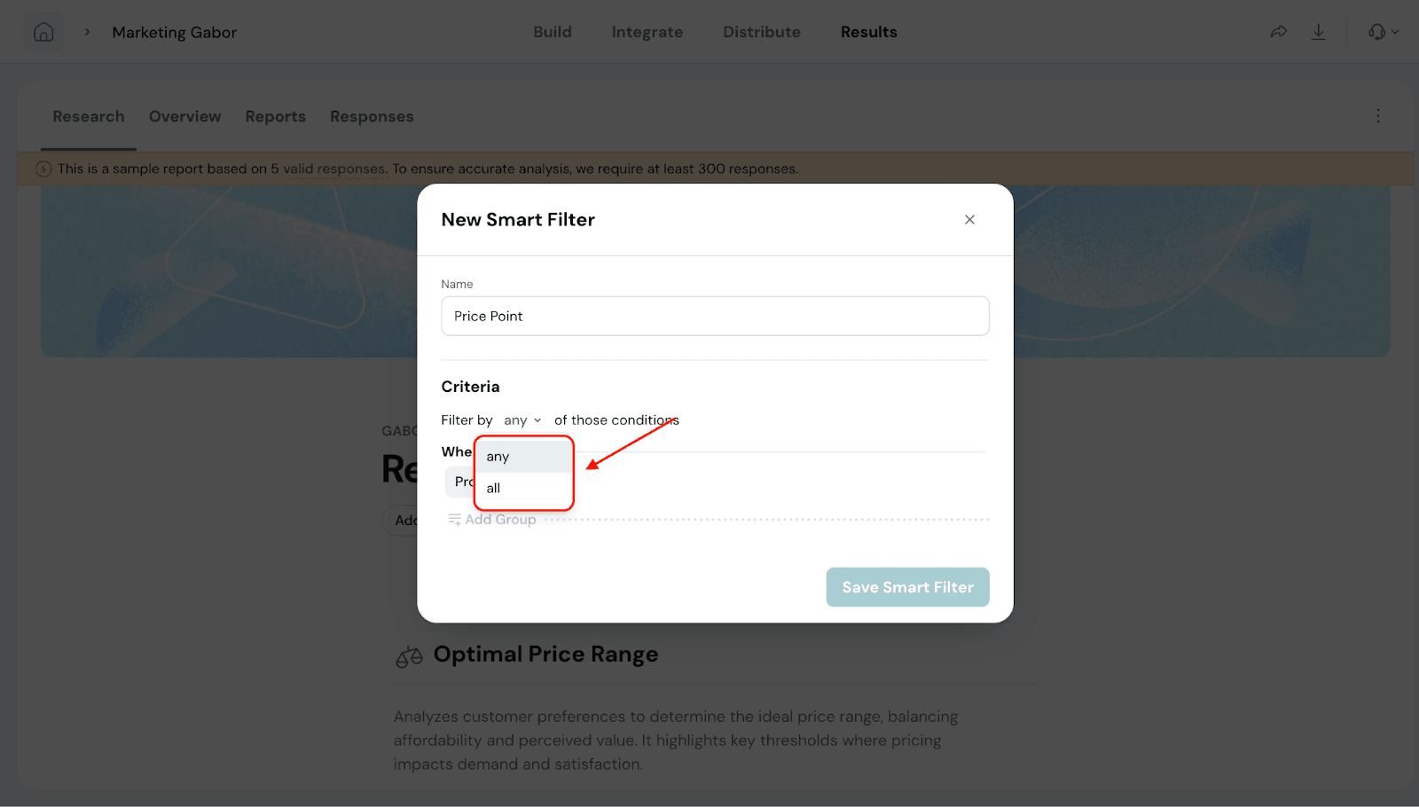
Under Criteria, you will be able to filter by any or all conditions.
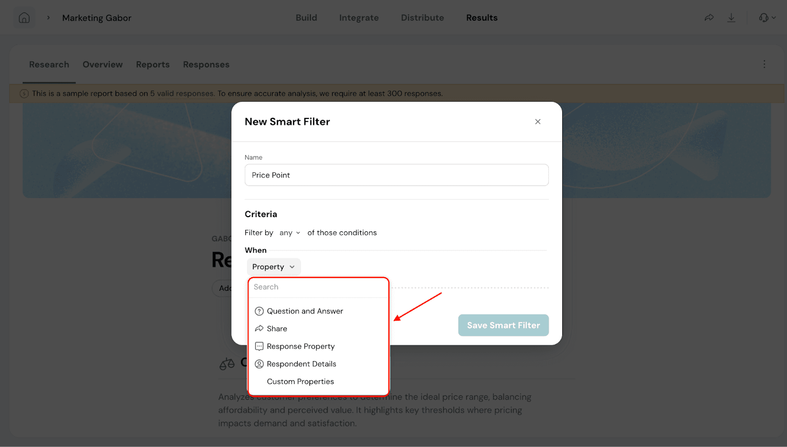
5. Under When, you will be able to select the property for filtering based on Question and Answer, Share channel, Response Property and Respondent Details.
Note: You can also have multiple Properties to filter. To do this click on ‘Add Group’.
6. Once done, click on Save Smart Filter.
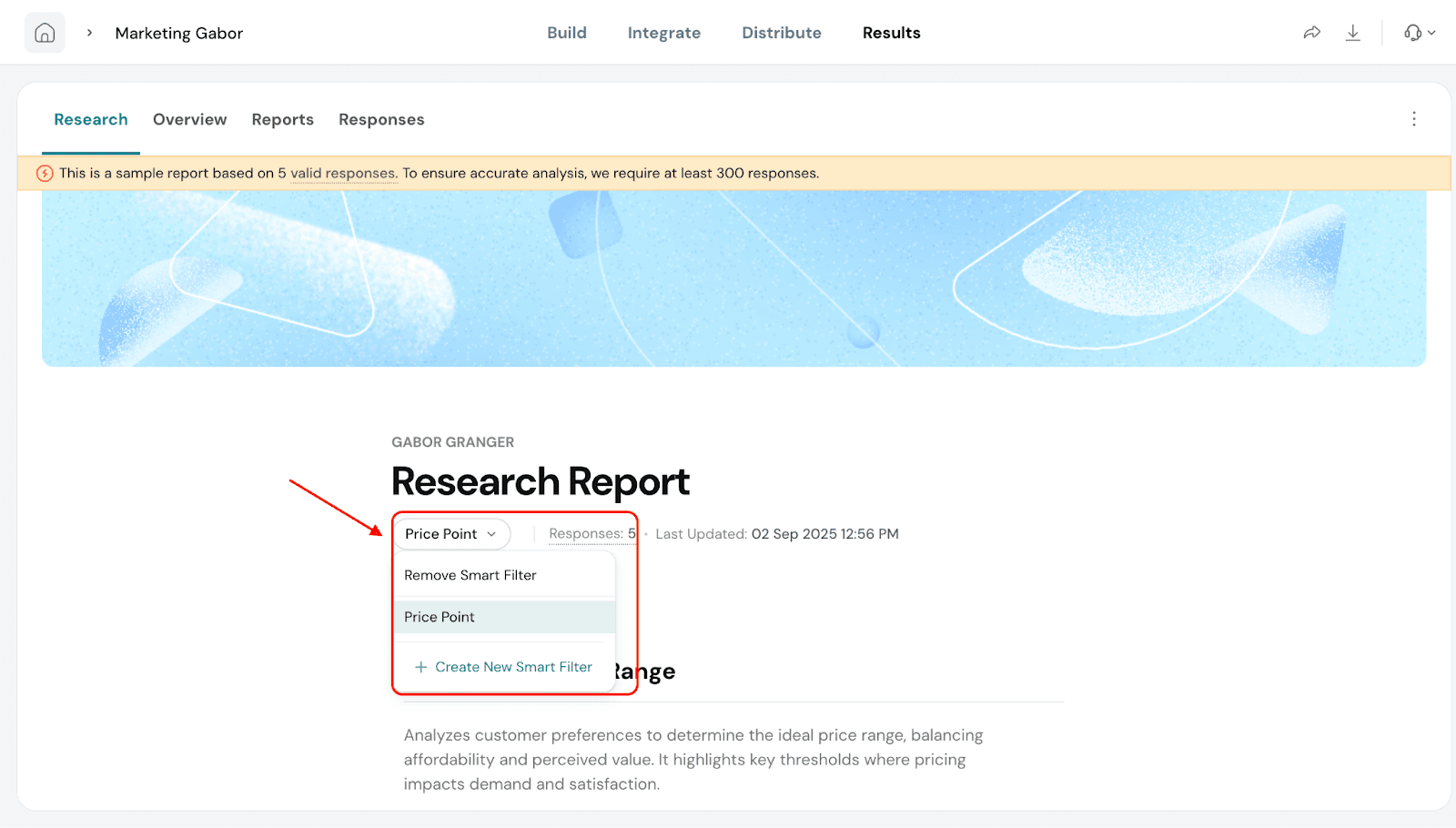
7. Now, click on Add Smart Filters and you will see a dropdown with the filter name you created. You can choose to apply the filter.
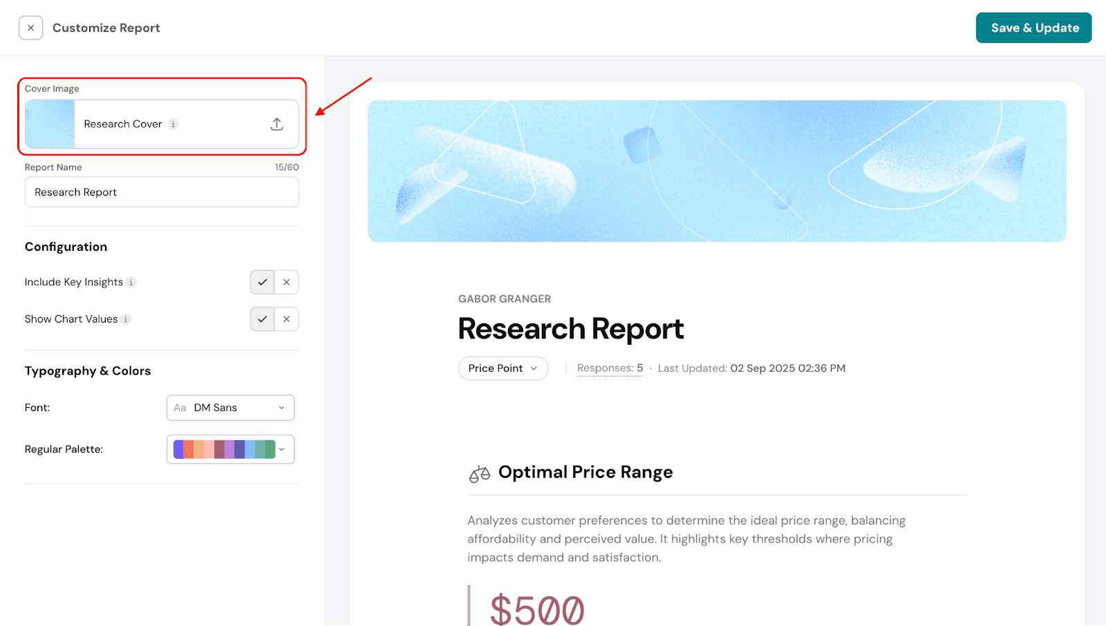
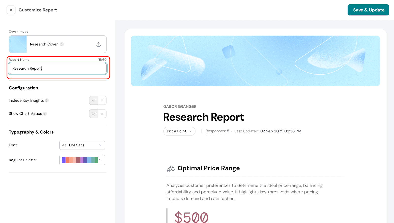
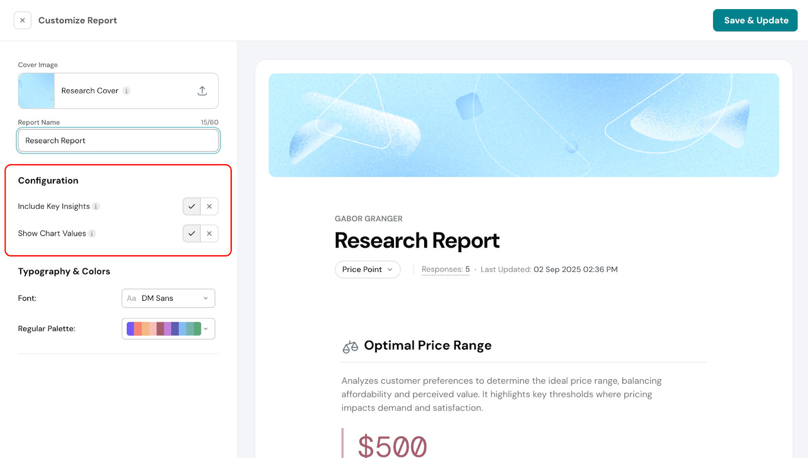
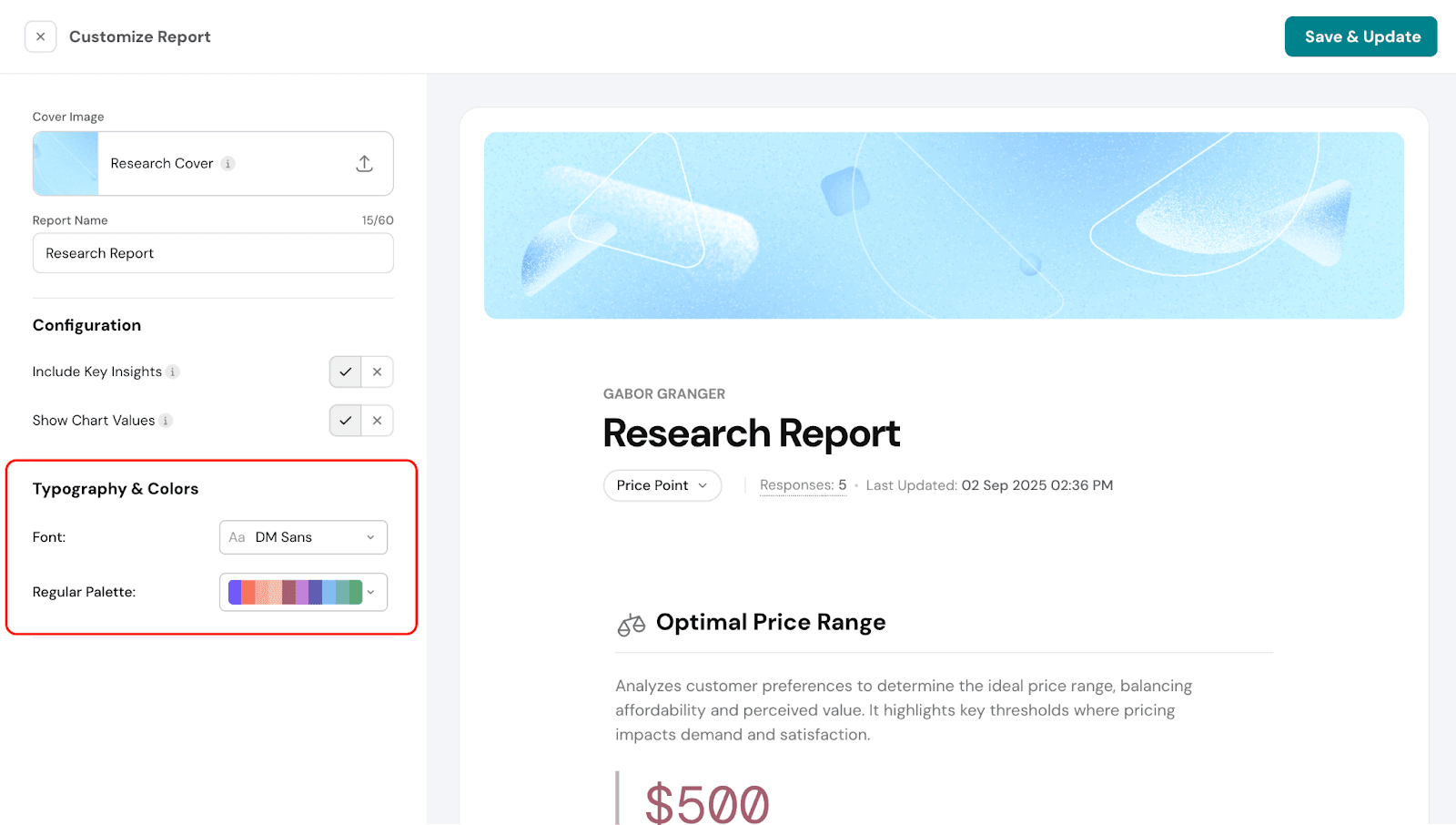
Report Customization
You can customize the look and content of your report to suit your needs.
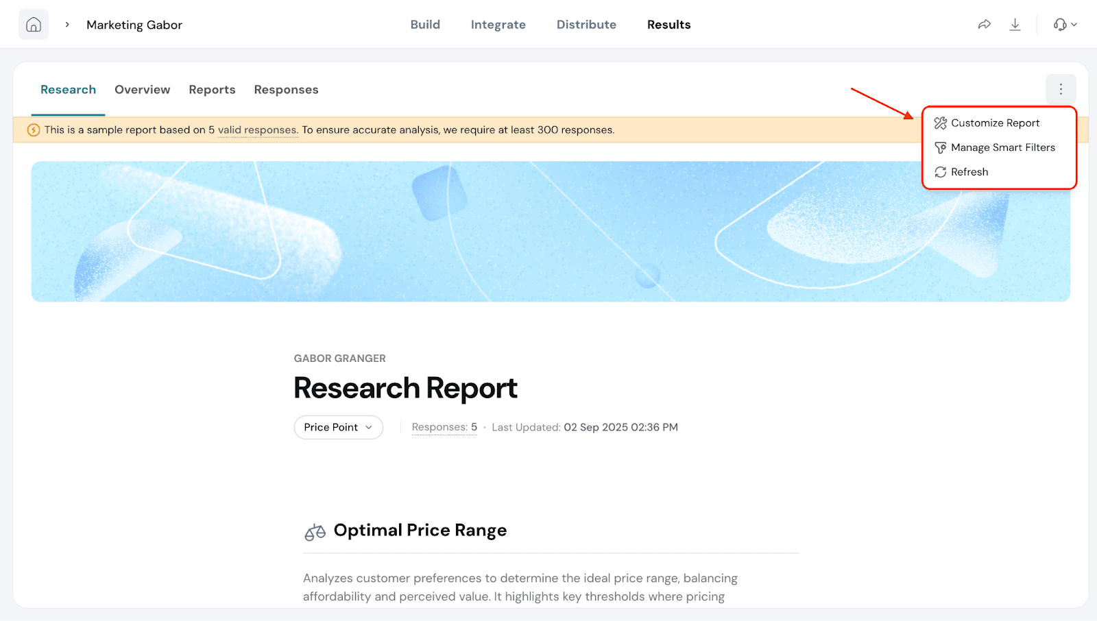
Click the three dots in the top-right corner of the report
Select Customize Report.
You can do the following:
Change the cover image by uploading a design of your choice.
Rename the report.
Configure additional options, such as including or excluding key insights and choosing whether to display values on the charts for easier interpretation.
Customize typography and colors, including changing the font style and chart colors.
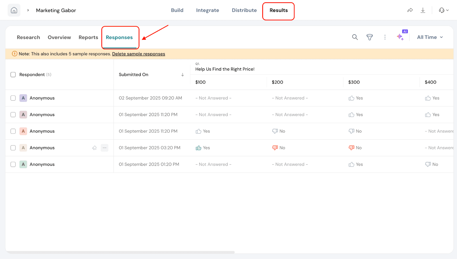
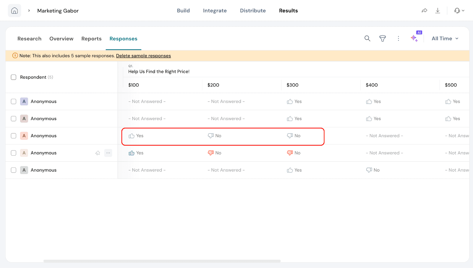
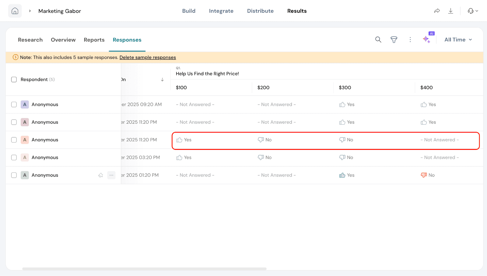
Responses Section
In this section, you can view how individual respondents answered for each price point. This allows you to see detailed responses and understand preferences at a granular level.
Go to Responses under the Results section.
2. Under each price point you can see if the respondent has said yes or no.
3. Not Answered: In some cases, you may see “Not answered” for certain price points. This means that the price was never shown to that respondent based on their previous answers.
Example:
Suppose the starting price is $300.
If the respondent answers “No” to $300, the next price shown will be $200, and their response to $200 will be recorded.
If the respondent answers “Yes” to $300, the next price shown will be $400, and their response to $400 will be recorded.
Any other price points that the respondent never saw will appear as Not answered.
This helps you understand how each individual navigated the pricing survey and which price points influenced their decisions.
That's about Gabor Granger.
Feel free to reach out to our community if you have questions.