Search
The Grid Widget brings survey response data directly into your executive dashboard, making it easier for busy teams to access and analyze feedback in one place. Instead of switching back and forth between survey reports, you get the same level of detail, down to individual responses, without leaving the dashboard.
It’s designed to give you the best of both worlds: the high-level overview execs need, and the ability for analysts to drill down into granular response data when needed.
Let’s take an example:
Suppose you are running a post-purchase feedback survey. By adding the Grid Widget, you can display customer responses alongside scores and details within your performance dashboard. Executives can monitor trends at a glance, while analysts can expand individual responses to understand the reasons behind the scores.
Let’s look at how to set this up.
Grid Widget Setup
Grid Widget Actions
1. In the Executive Dashboard, Click on New Widget.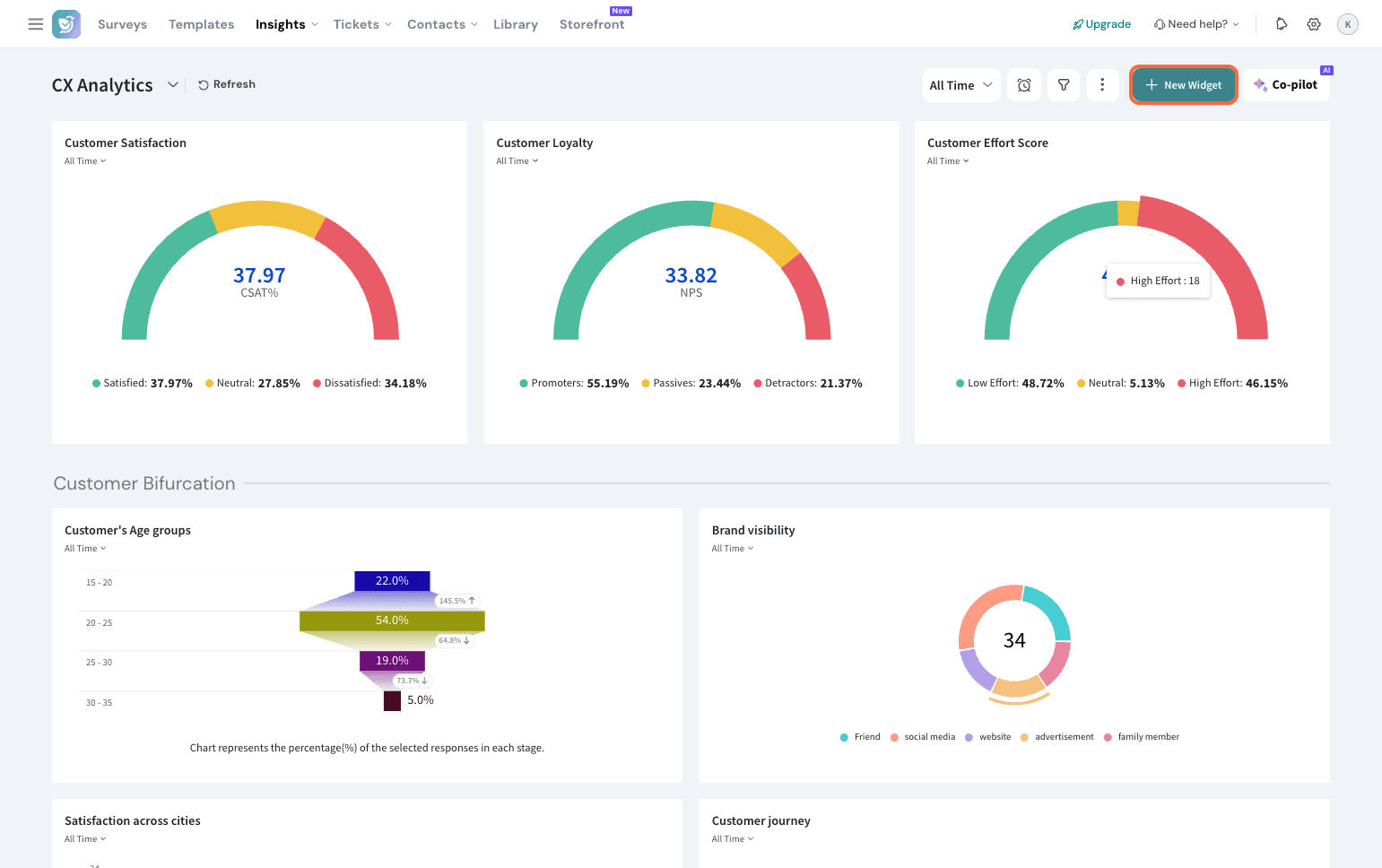
2. Select By Chart Type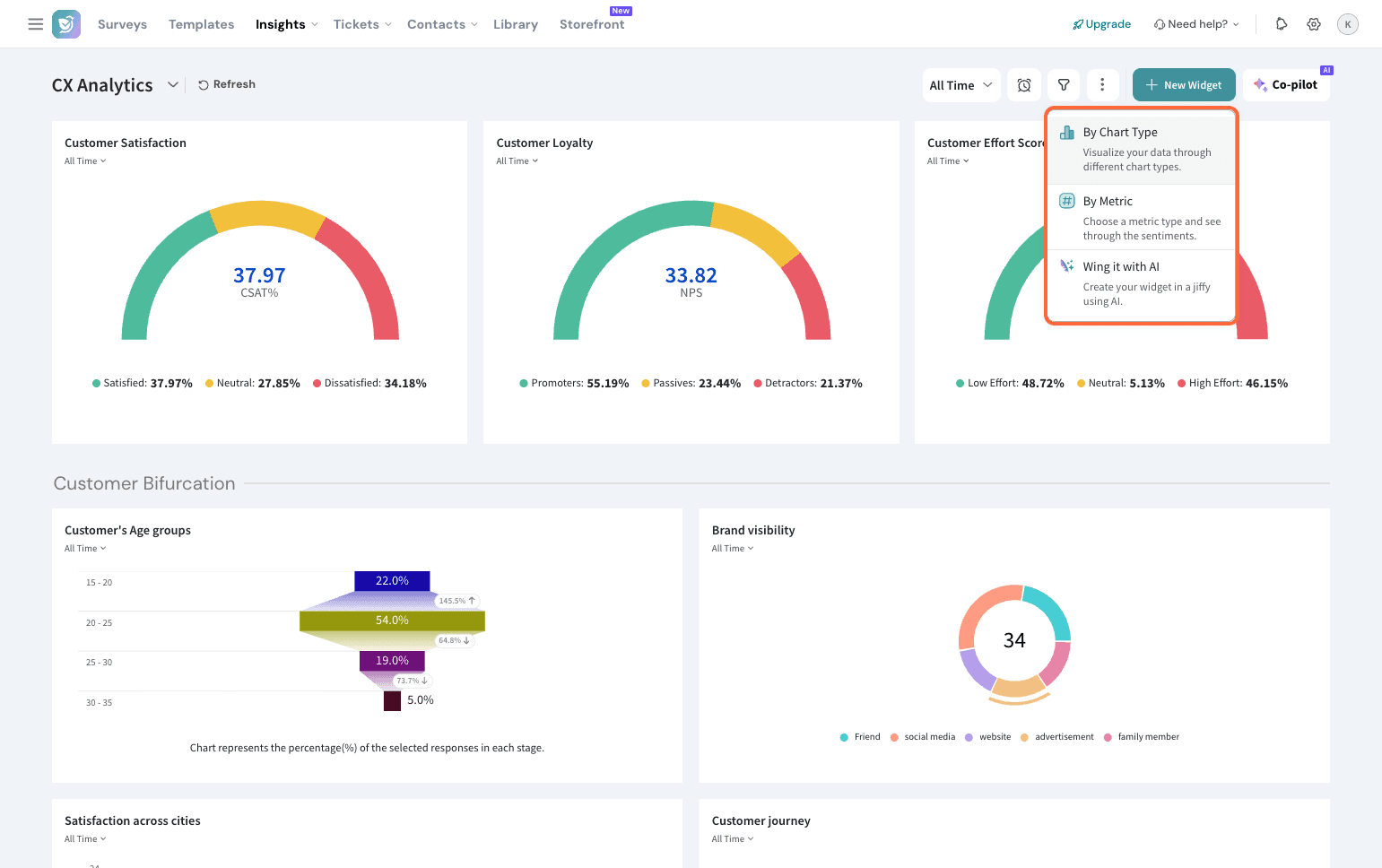
3. Choose Grid Widget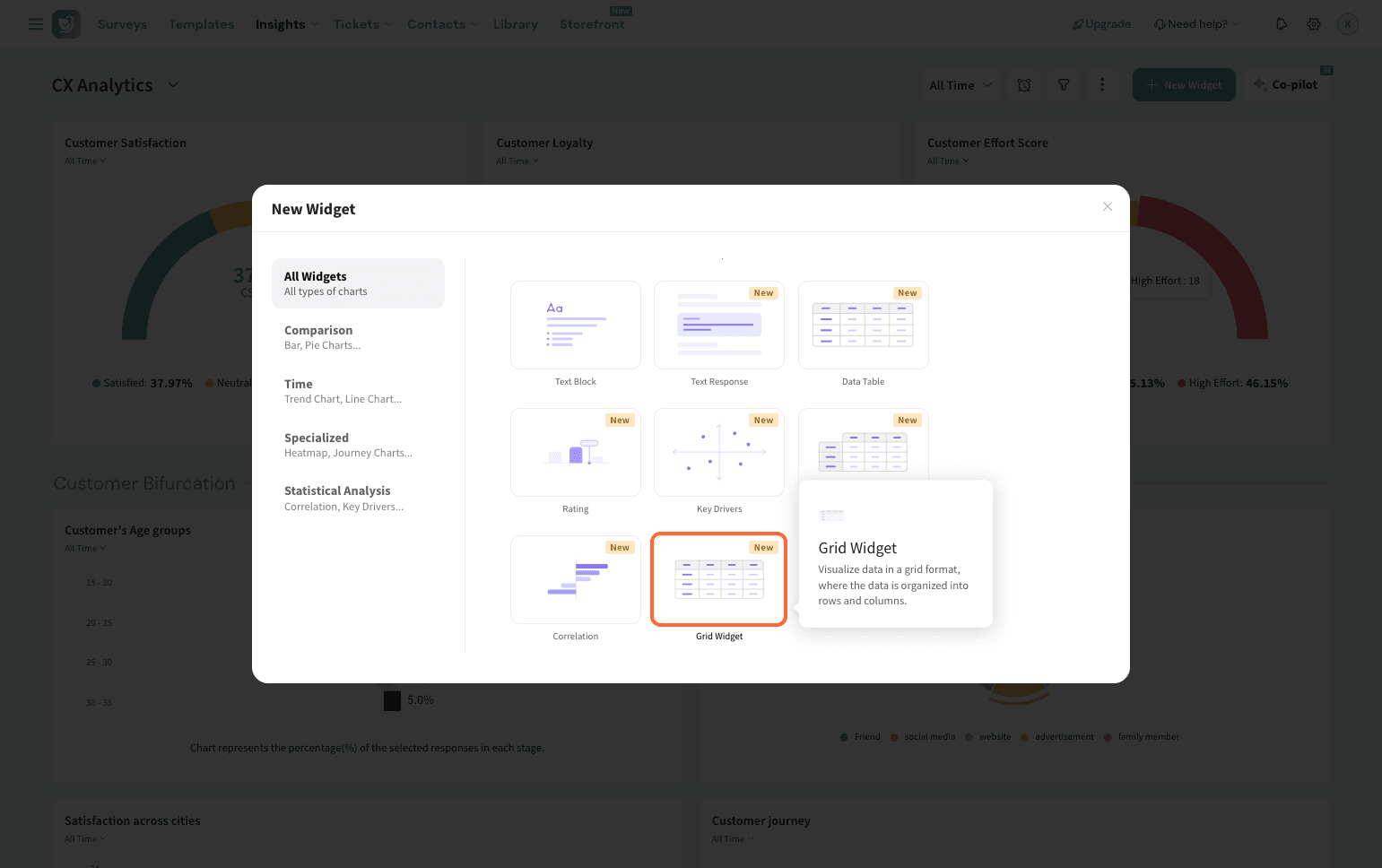
4. Set the Source by selecting the survey whose responses you want mapped into a table.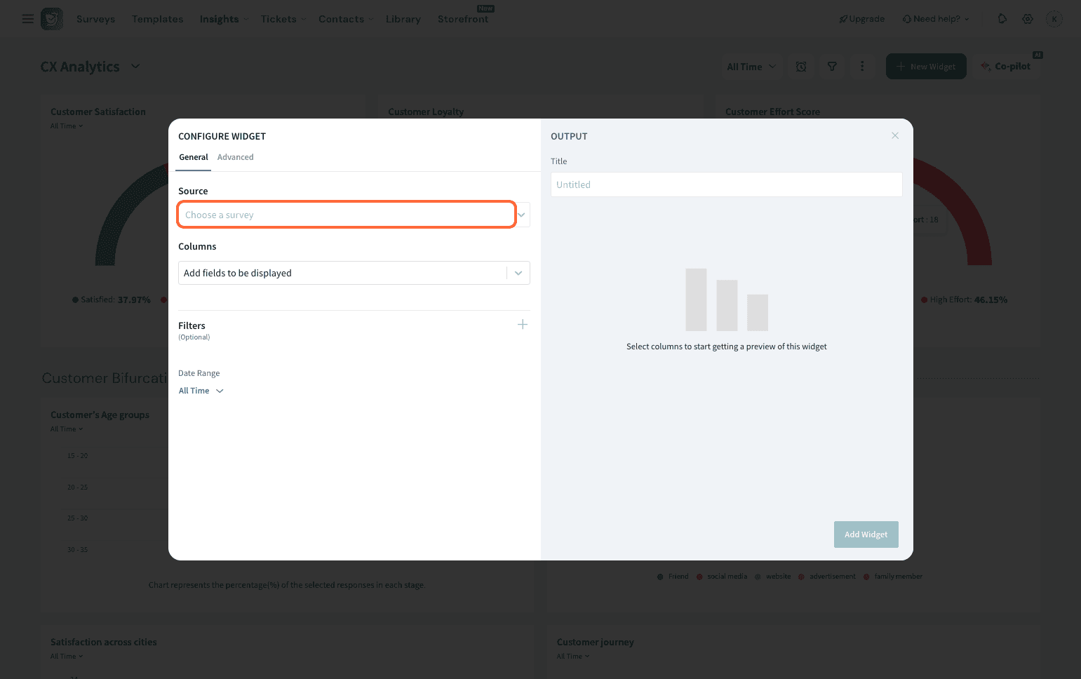
5. Under Columns, select the data you want displayed. You can map everything or only specific fields.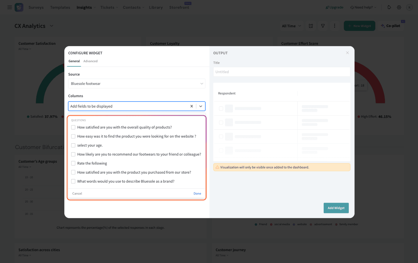
6. Once done, you can also apply some filters to the data.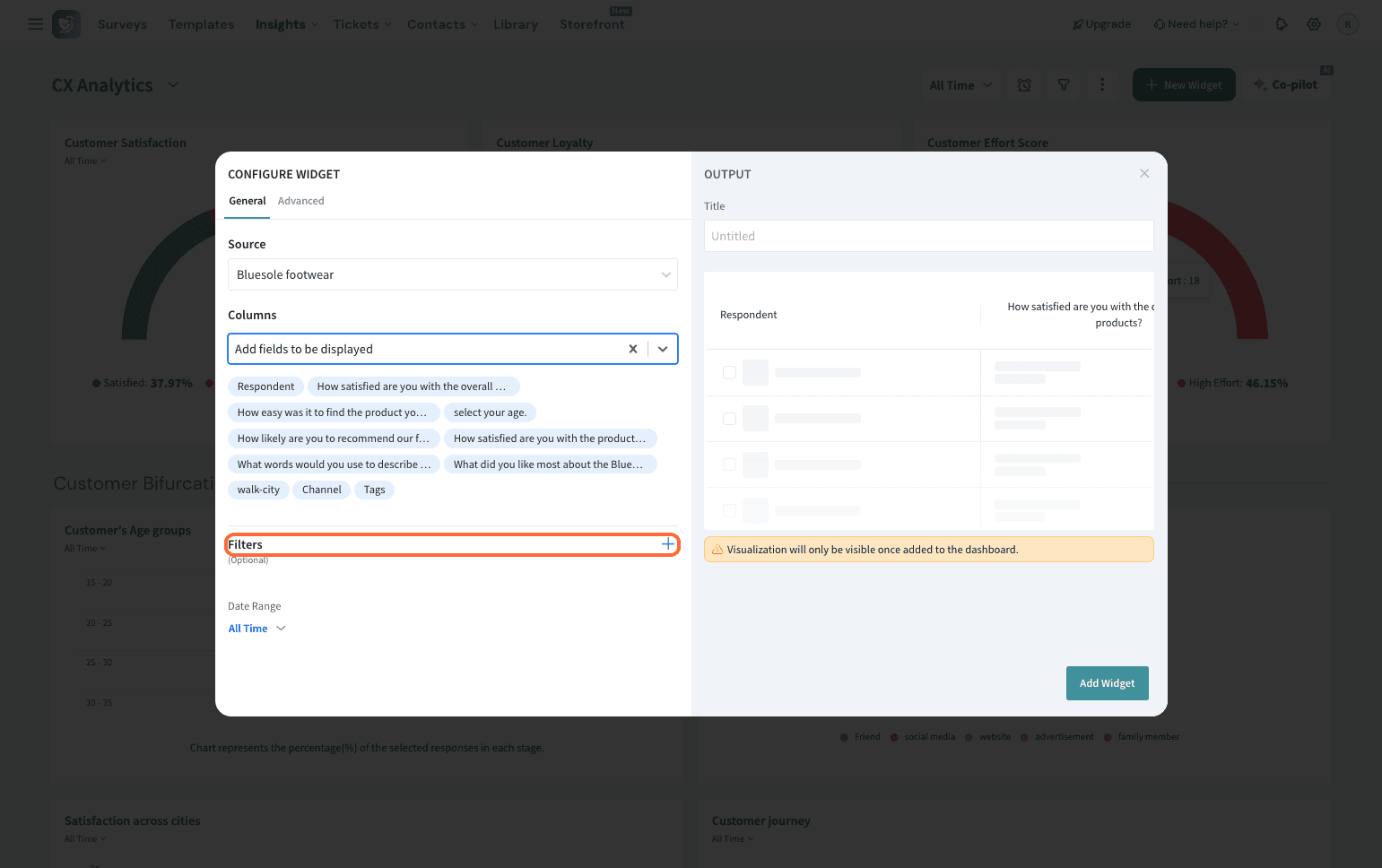
7. You can set a time range for the data as well.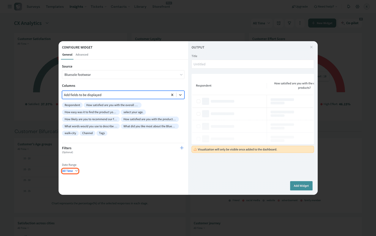
8. Set an appropriate title for the table. Here, we’re mapping post-purchase feedback, so the title is set to the same.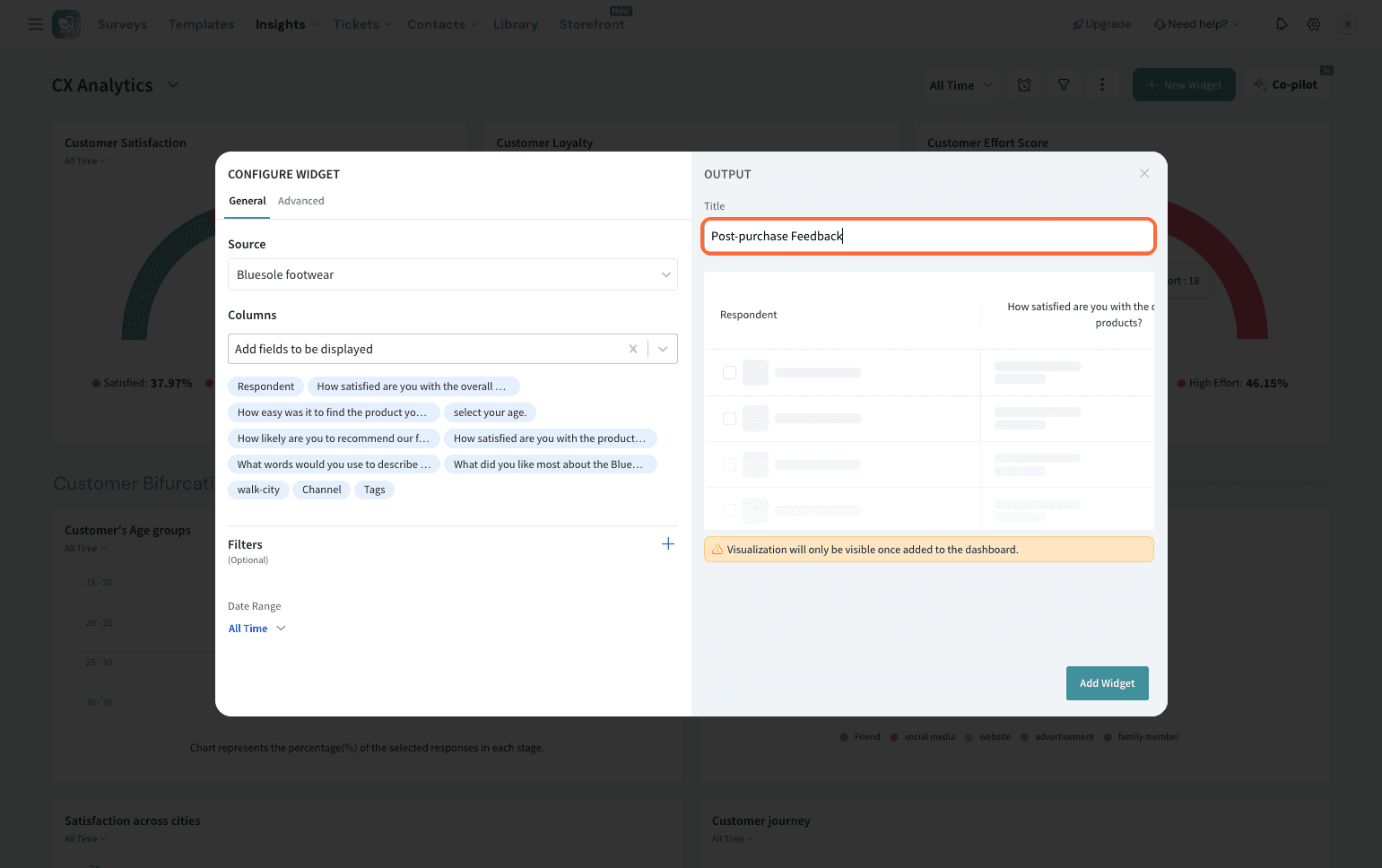
9. Go to Advanced.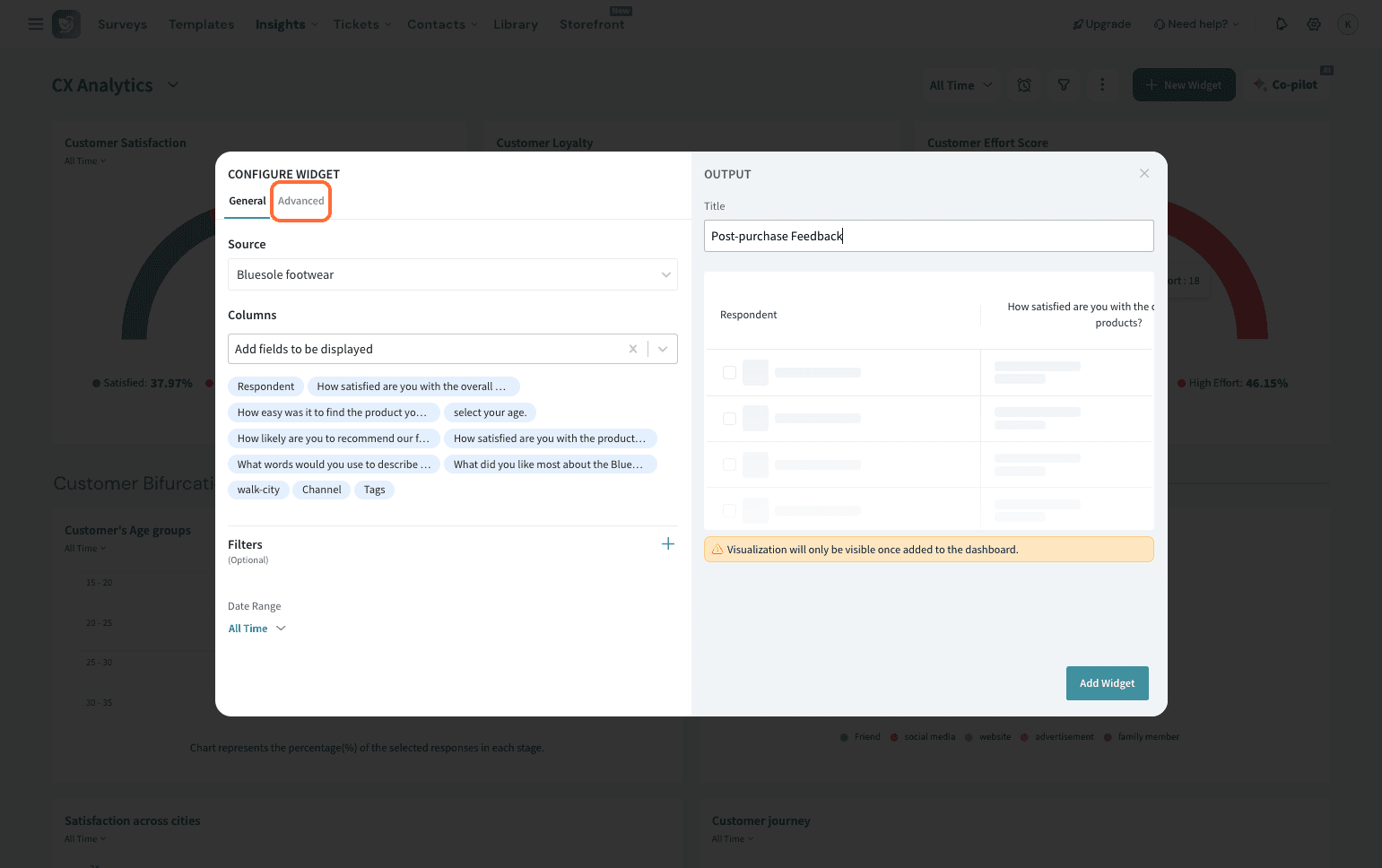
10. Here, you can choose the date format from the dropdown. This applies only to data that contains a date and controls how it will be displayed inside the table cells.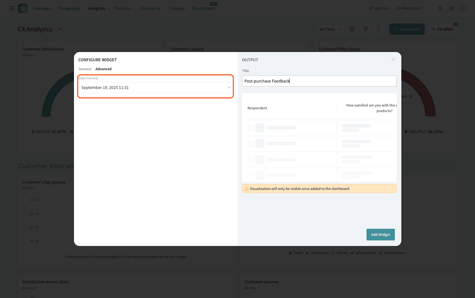
11. Once you’ve set everything to your liking, hit Add Widget.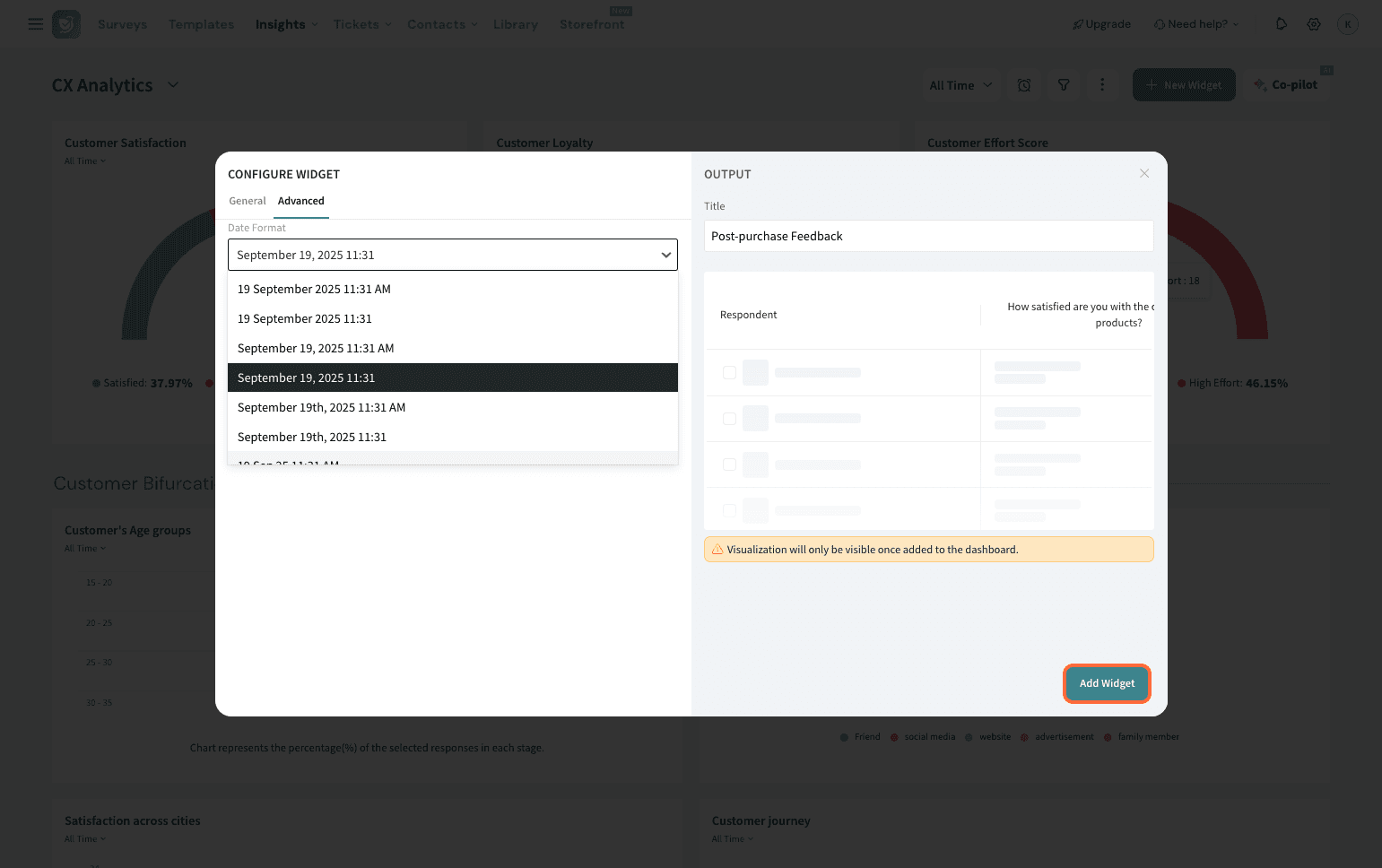
1. In the dashboard, you can choose to filter the time range as well if needed.
2. Now, you can choose from the options below to sort and present your data however you wish.
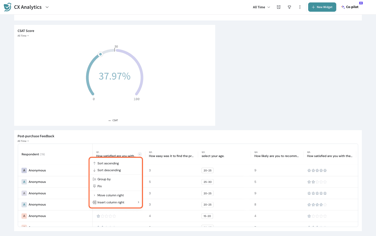
Note: All actions here mirror what you find in the Survey Responses page, giving you the same flexibility to sort, group, and display data inside the dashboard.
3. You can choose to have the data sorted in ascending or descending order of a column.
4. Next is “Group by”. You can use this to group the data by the categories of one column. Let’s group the table by the first column, which is a CSAT question.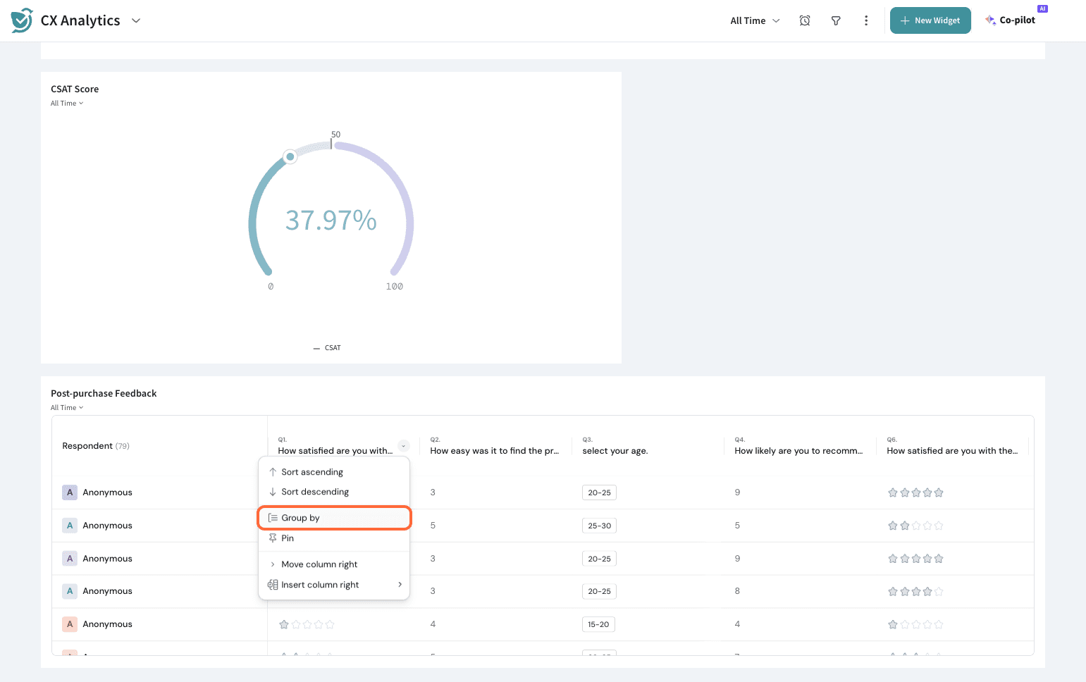
5. You now see that the data is nested under each rating, which can be expanded or collapsed for a comprehensive view.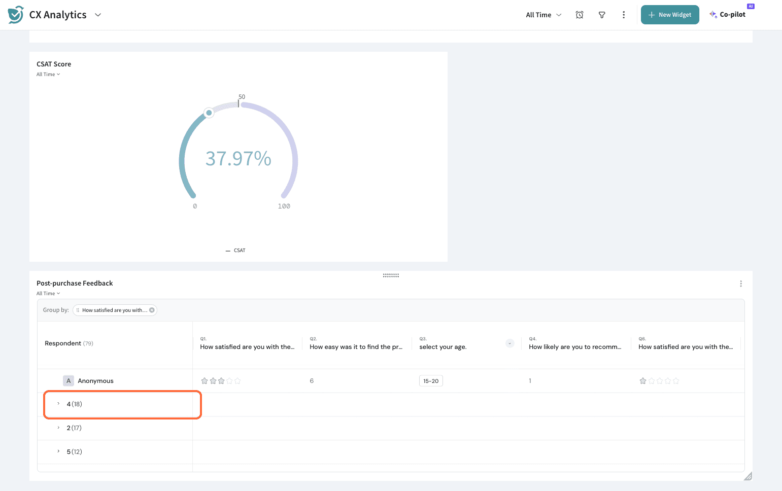
6. Now, if you pin the column, that column fixes as static while you can scroll through the rest. This can be used when you want to have certain data, like name, email ID, etc., fixed and see what that individual respondent has to say.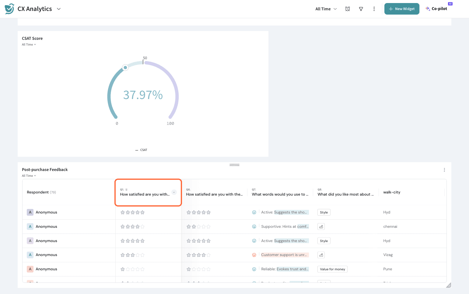
7. You can represent your data better by re-arranging your columns with the help of “Move column right”, which can move an individual column to its right.
8. Lastly, if you wish to add further columns, you can do it easily here with the help of “Insert column right”, which adds additional columns to the right of the existing column.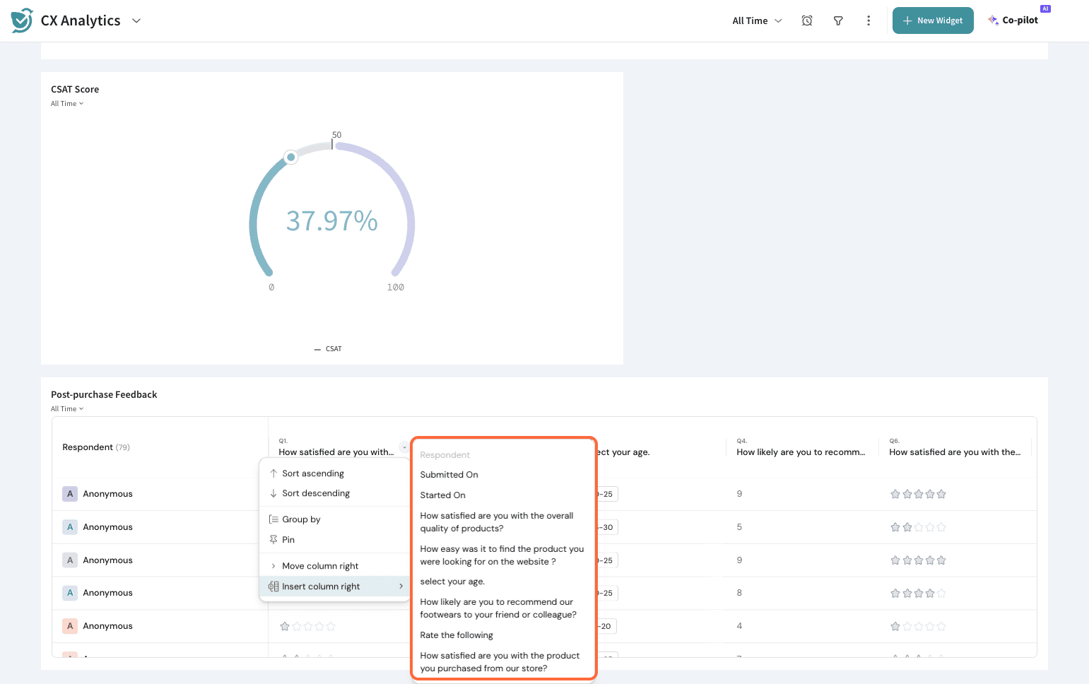
9. If you wish to take further actions, you can click on the 3 dots in the right corner of the table.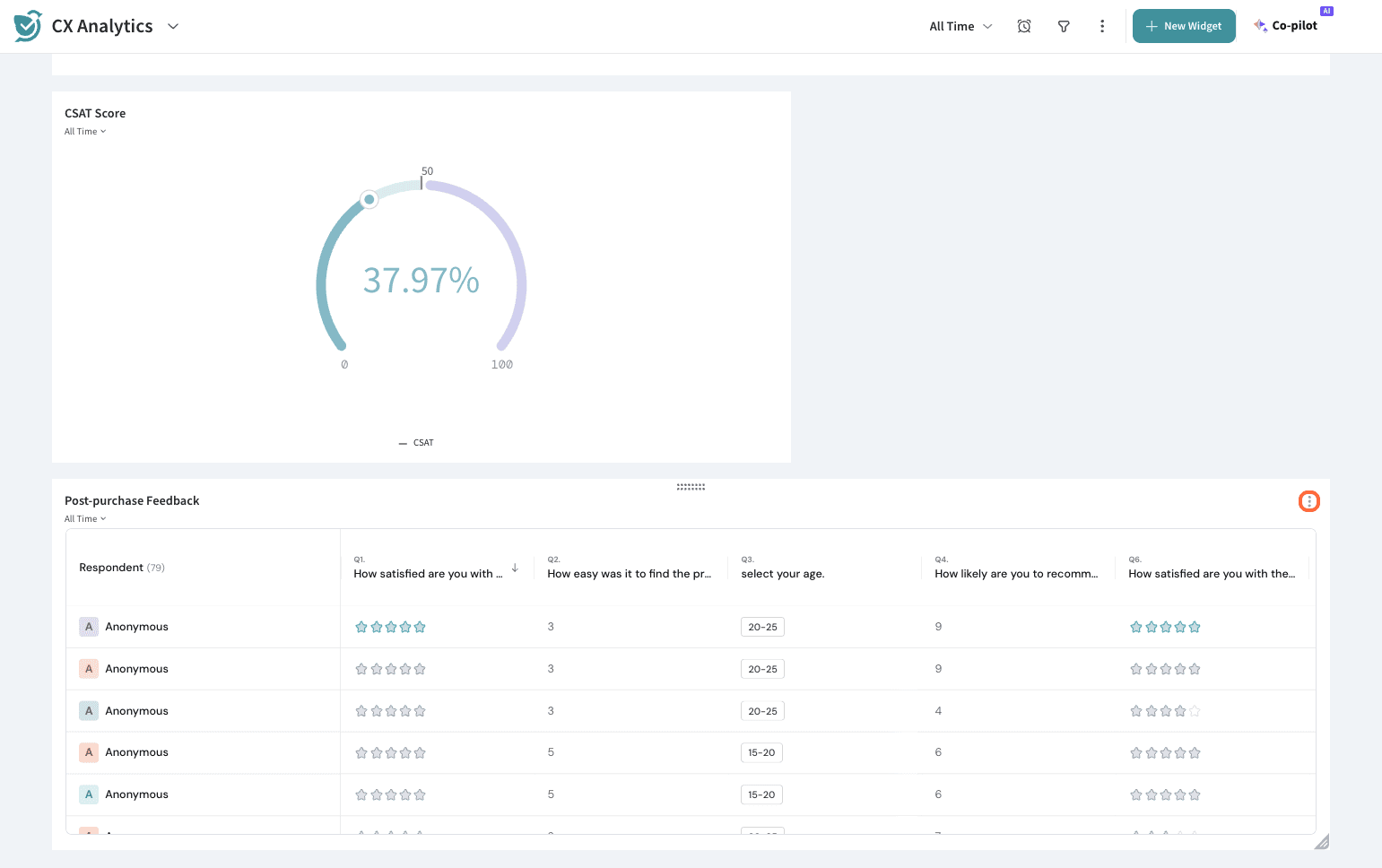
10. You can edit the table setup further, clone it, or delete it. This can also be exported as CSV or XLSX from here.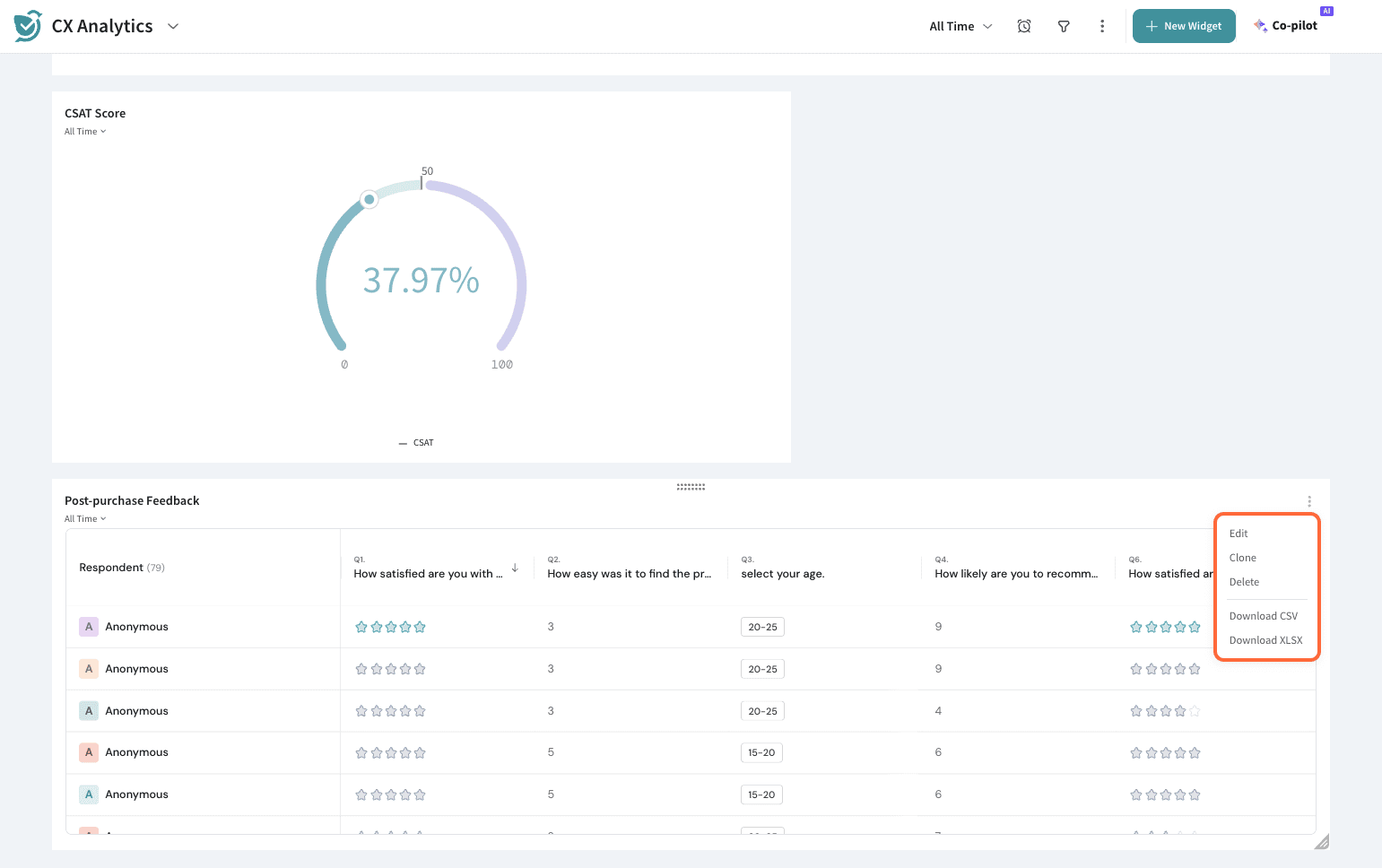
That’s about it on Grid Widget.
Feel free to reach out to our community if you have any questions.
Powered By SparrowDesk