Search
The Radial Chart widget is designed to highlight a single KPI in a clear Gauge format. It shows your score in relation to a defined range, so you can instantly see whether performance is on track, falling behind, or exceeding expectations.
Think of it as a single-score snapshot that anyone can interpret at a glance.
Example:
Your Support Head wants to monitor CSAT trends across all active support surveys. With the Radial Chart, you can combine questions from multiple surveys, aggregate the data, and instantly track the average CSAT score against a benchmark, so it’s easy to spot dips or improvements without going through detailed reports.
1. Inside the Executive Dashboard, click New Widget.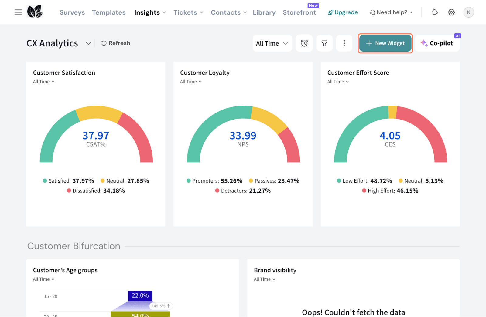
2. Select By Chart Type 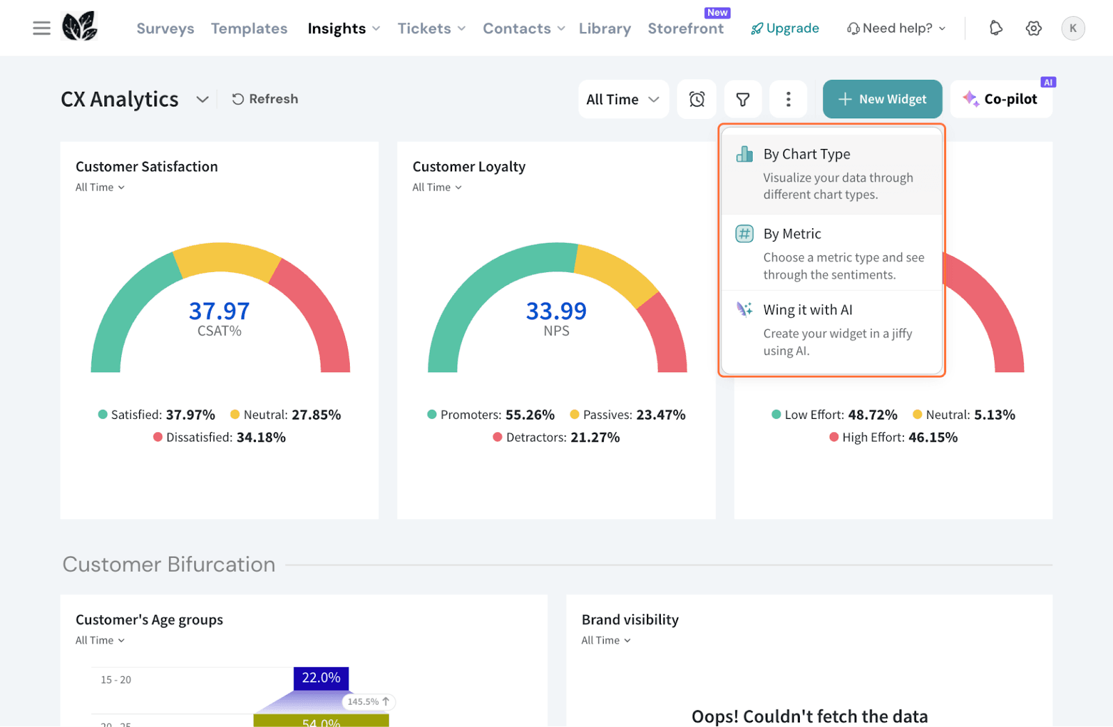
3. Choose Radial Chart from the given list.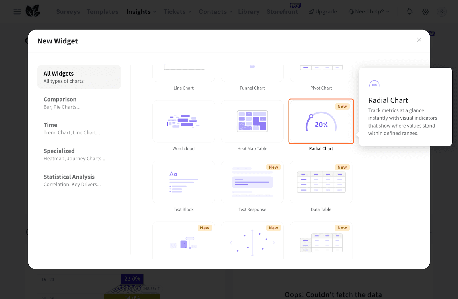
4. Select a survey and choose a question from the survey.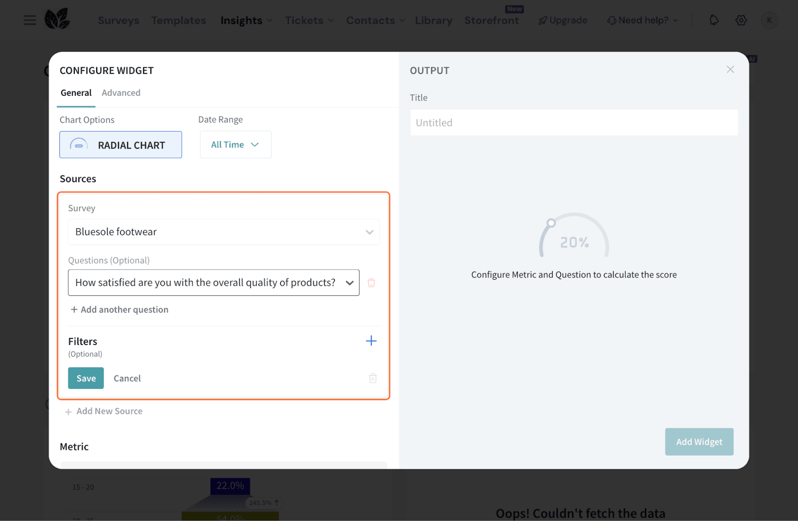
5. To refine the dataset, click the + icon to add filters.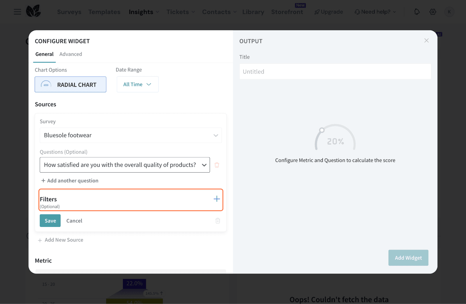
6. You can choose a preset filter, use a custom variable, or create an AI-based filter. 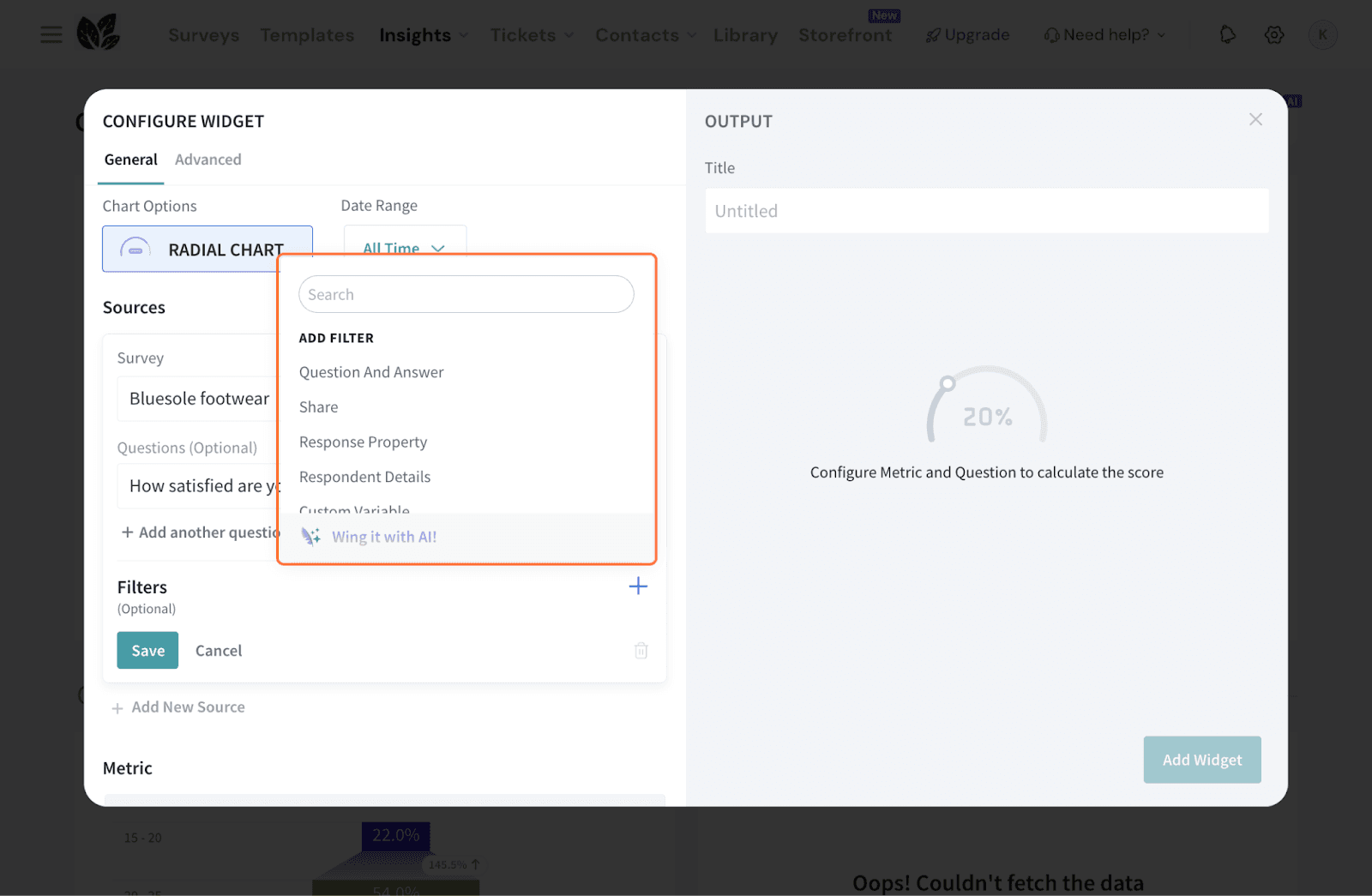
7. To bring in more data, click Add New Source and repeat the previous steps.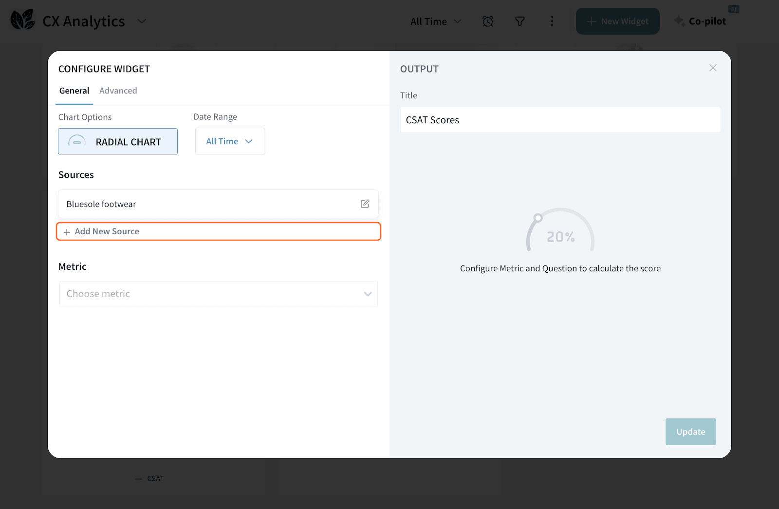
Note: You can add up to 5 sources for this widget.
8. Choose a Metric for the widget. You can select:
a. Standard CX metrics: NPS, CES, CSAT, or the SUM or AVERAGE of the question data.
b. Custom metrics: You can also choose your custom metric: both survey-based ones and question-based ones will be available.
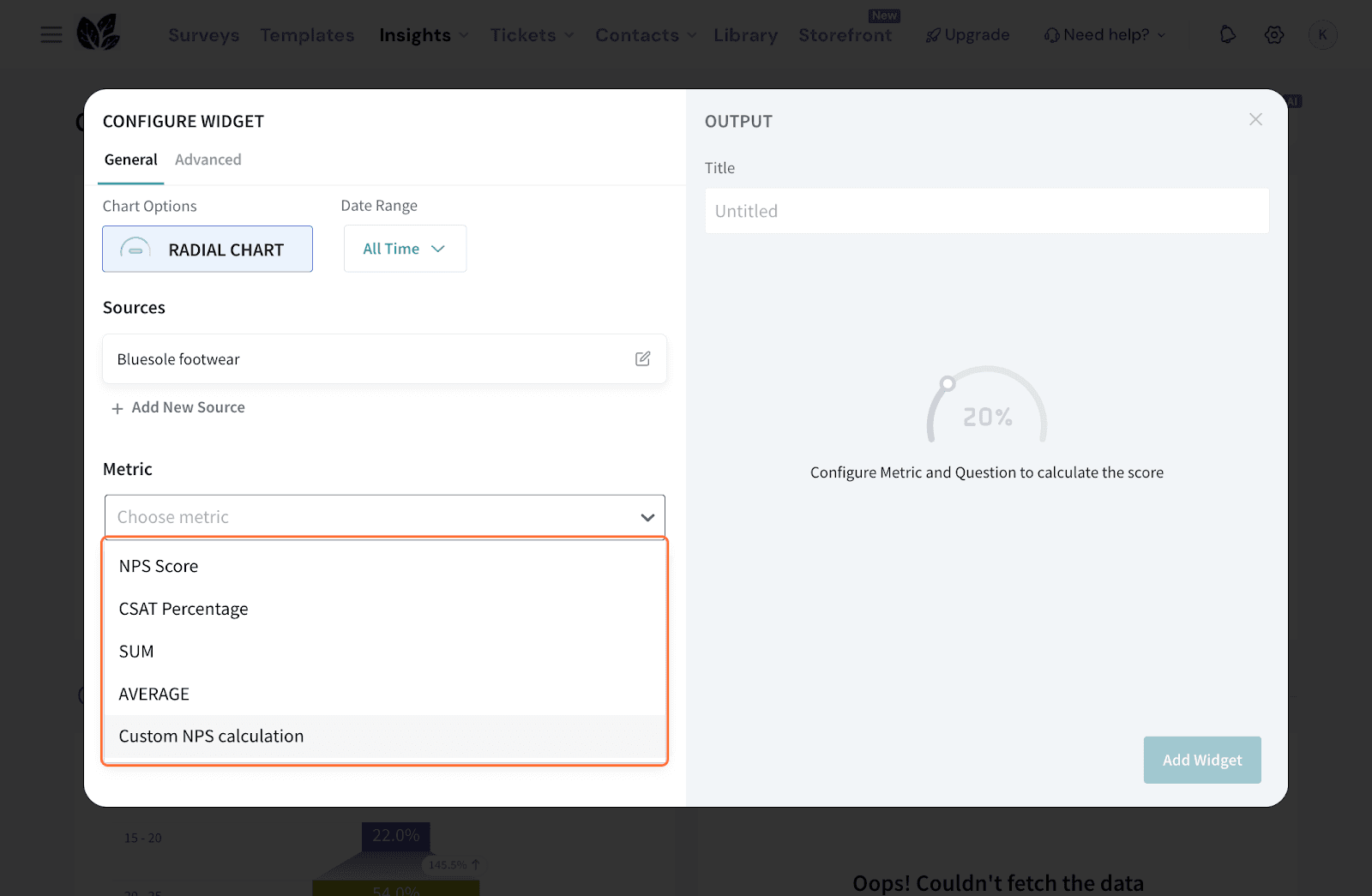
Note that the chart needn’t be configured only for a CX metric.
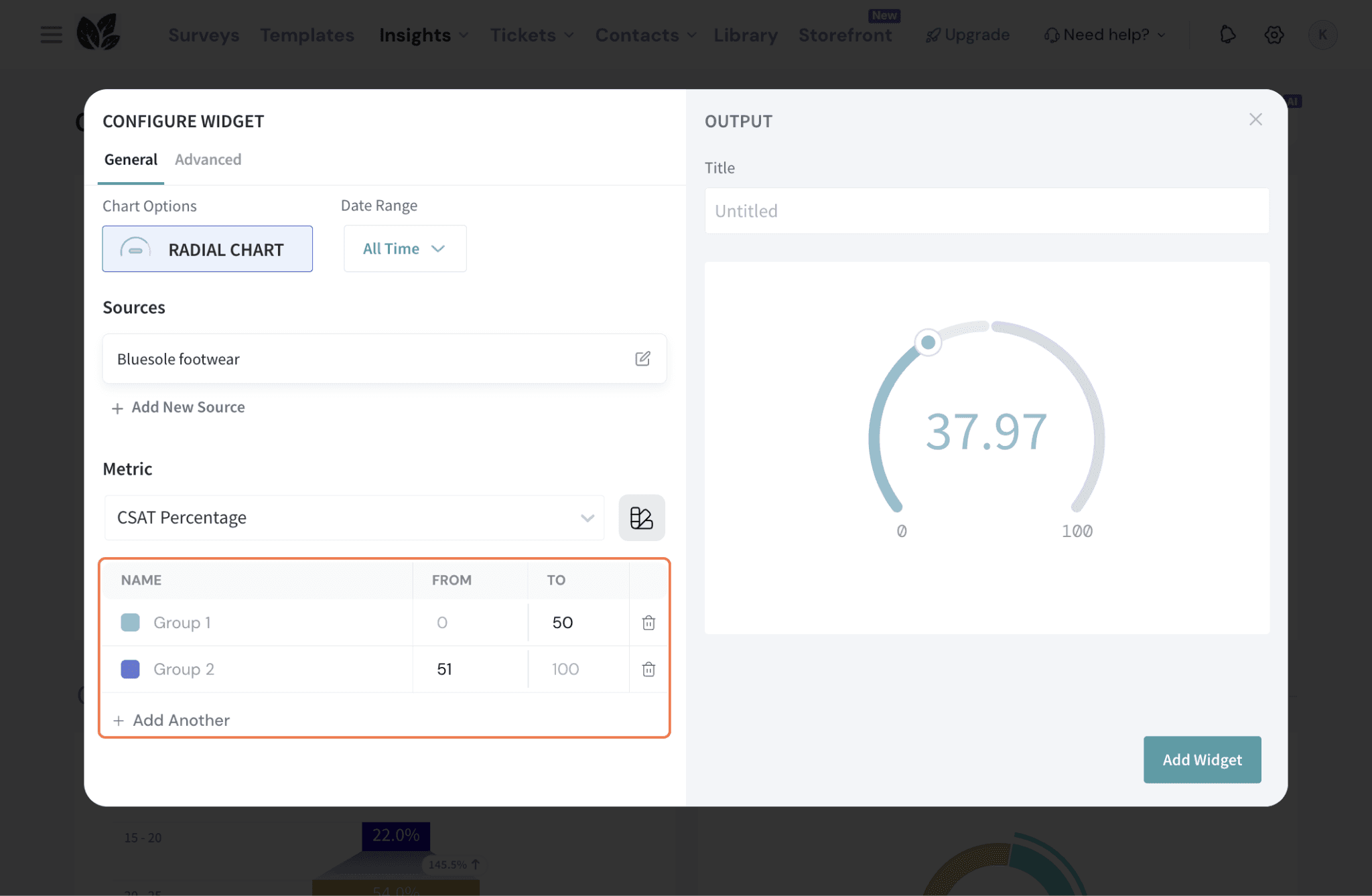
9. If you’d like to configure how values are displayed, you can create color groups. Click on this icon to do so.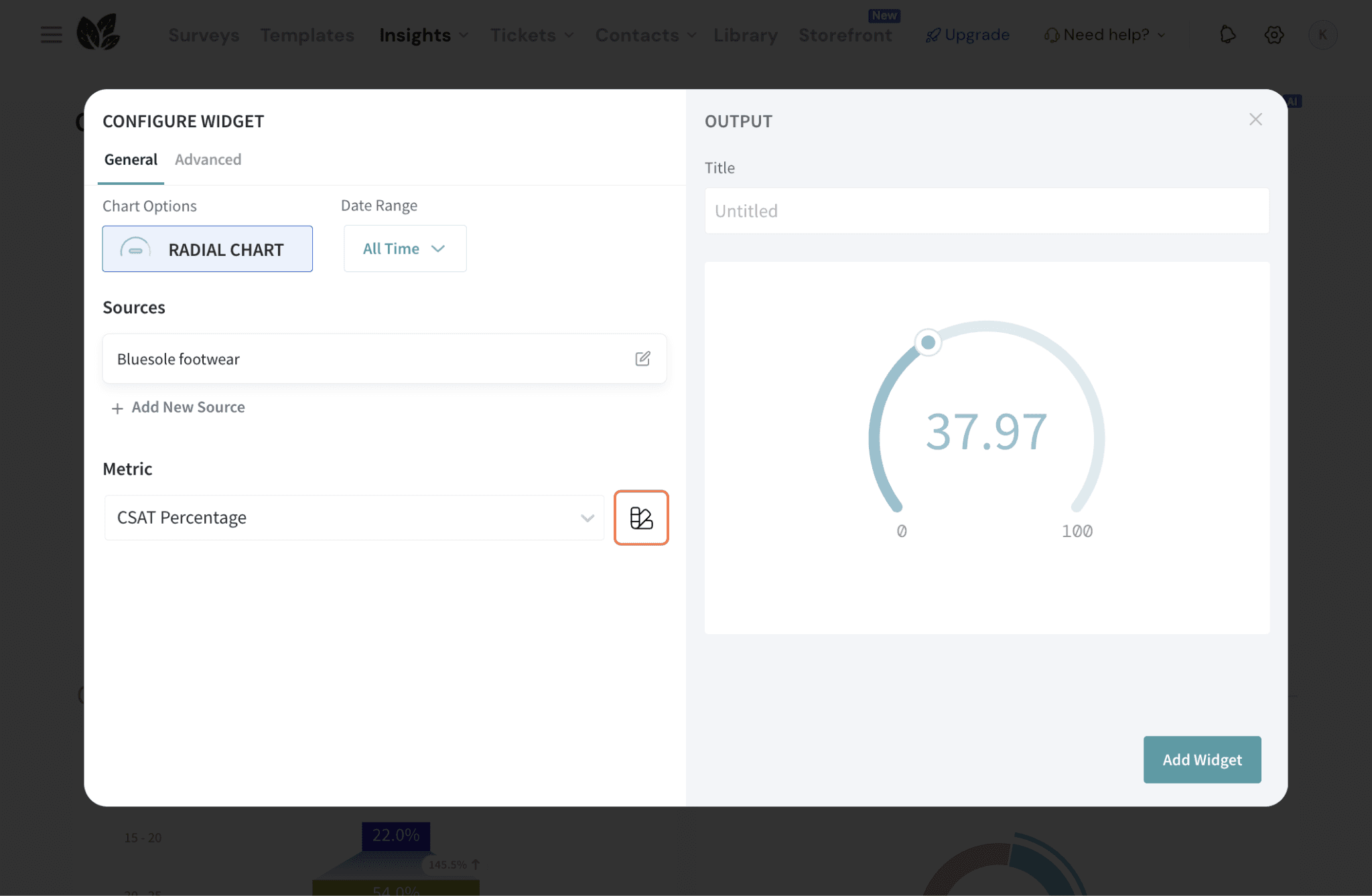
10. In case of:
11. Set the Date Range by default or choose a custom timeframe if you want to restrict the data displayed.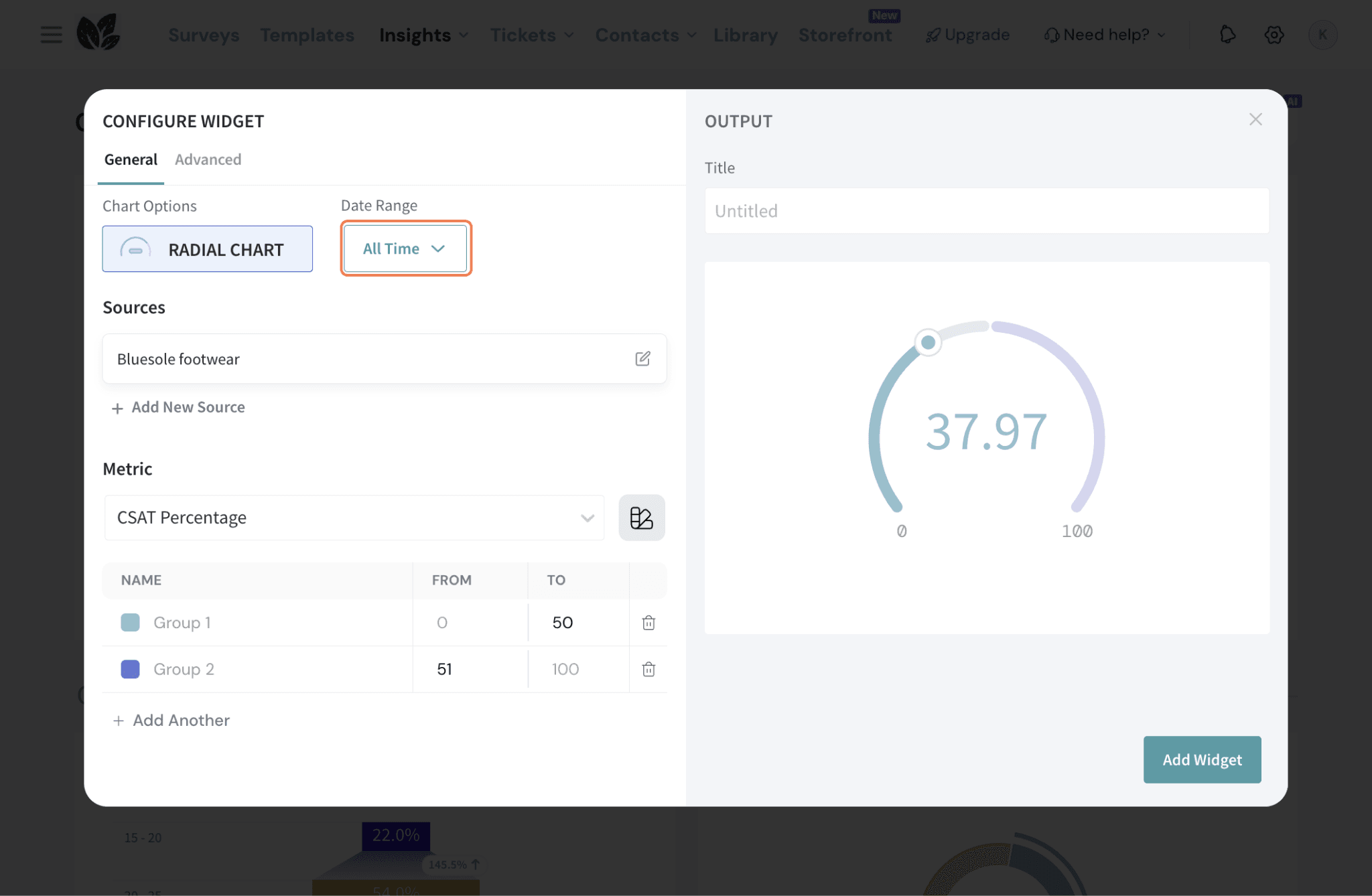
12. Enter a Title for your widget.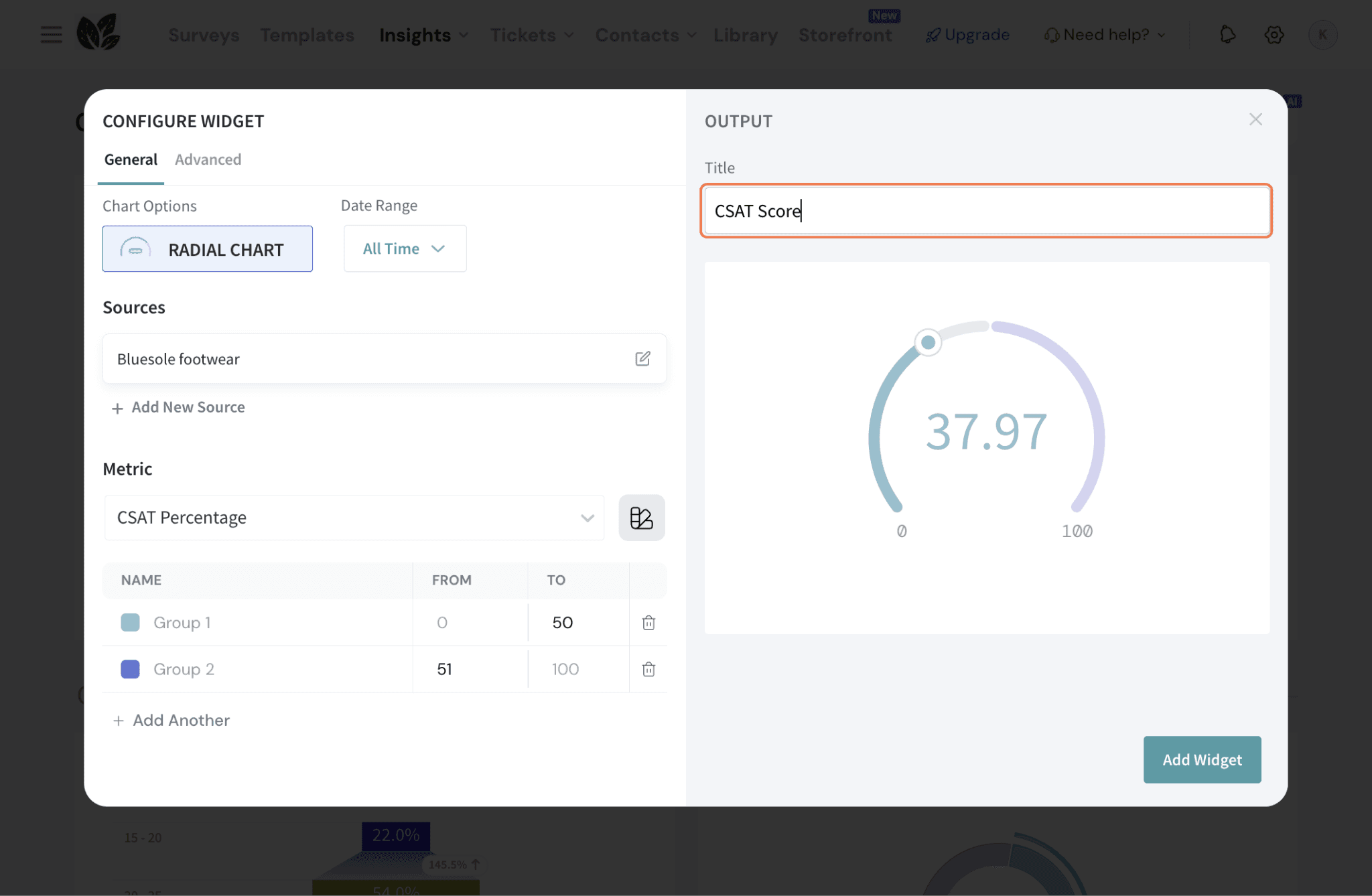
13. Now, go to the Advanced tab to configure additional display options. 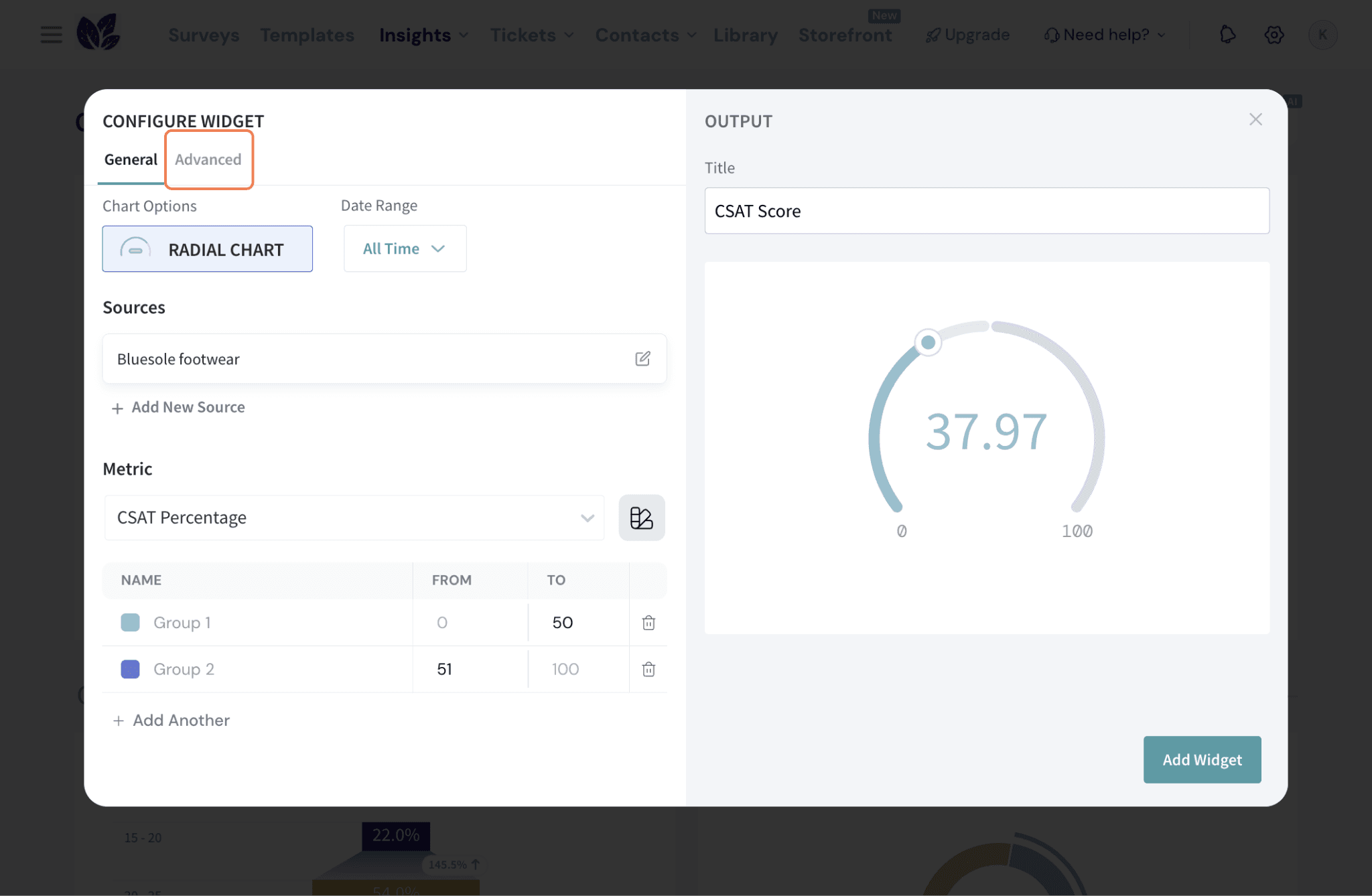
14. You can click on Show the record count to show the count along with the score. 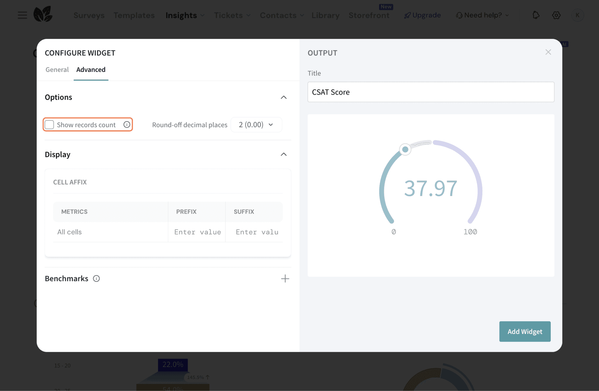
15. You can set the number of decimal points to up to two places for precision.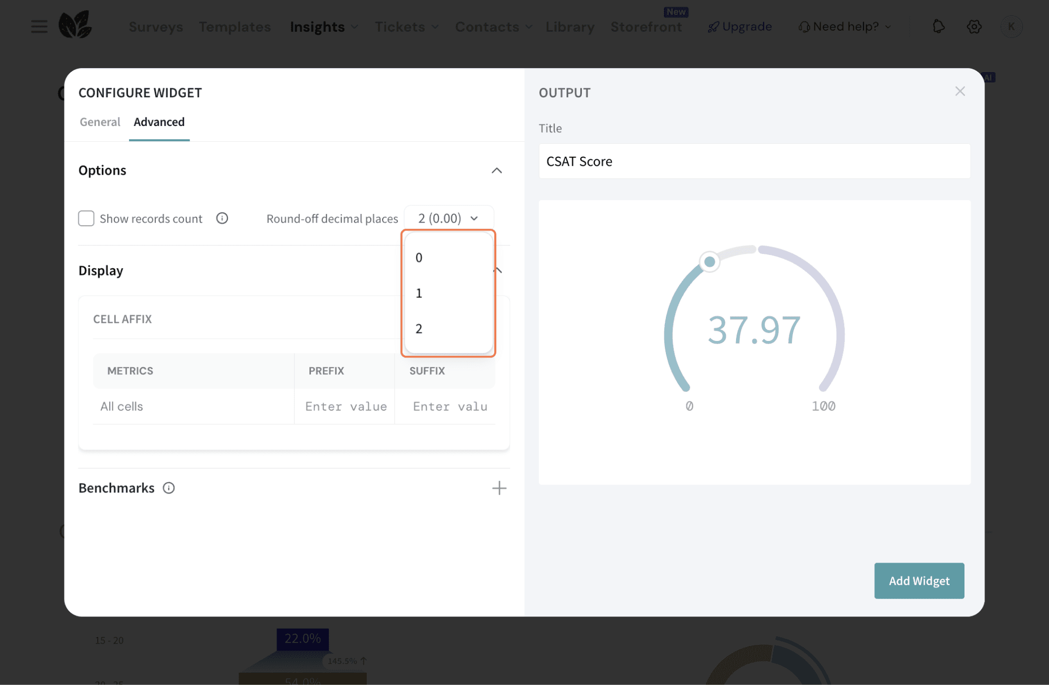
16. For your metric, you can add a prefix or suffix (e.g., %, pts) to the displayed score. Here, we’re adding a “%” as a suffix for the CSAT score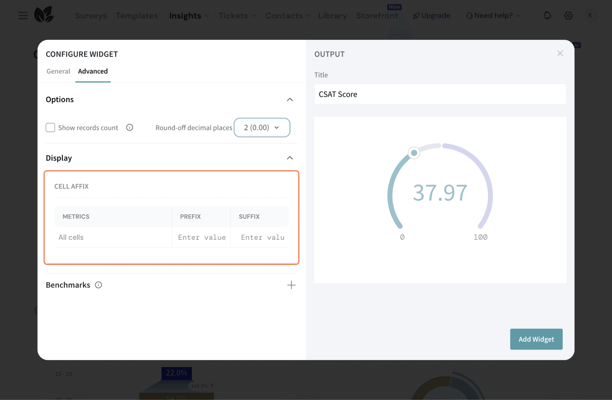
17. Define benchmarks to compare performance against goals.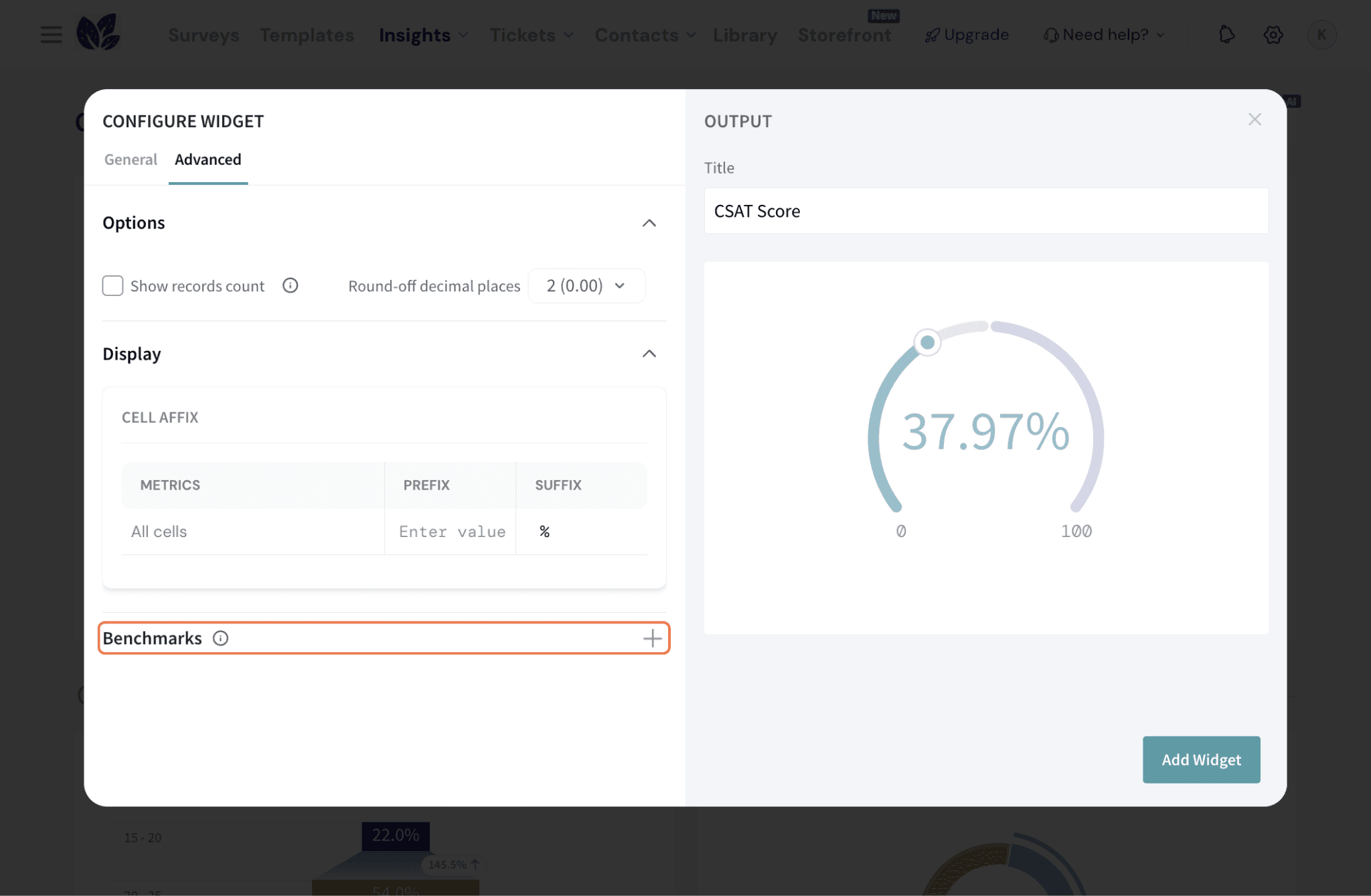
18. You can choose between these two:
a. Constant benchmark: to set a fixed value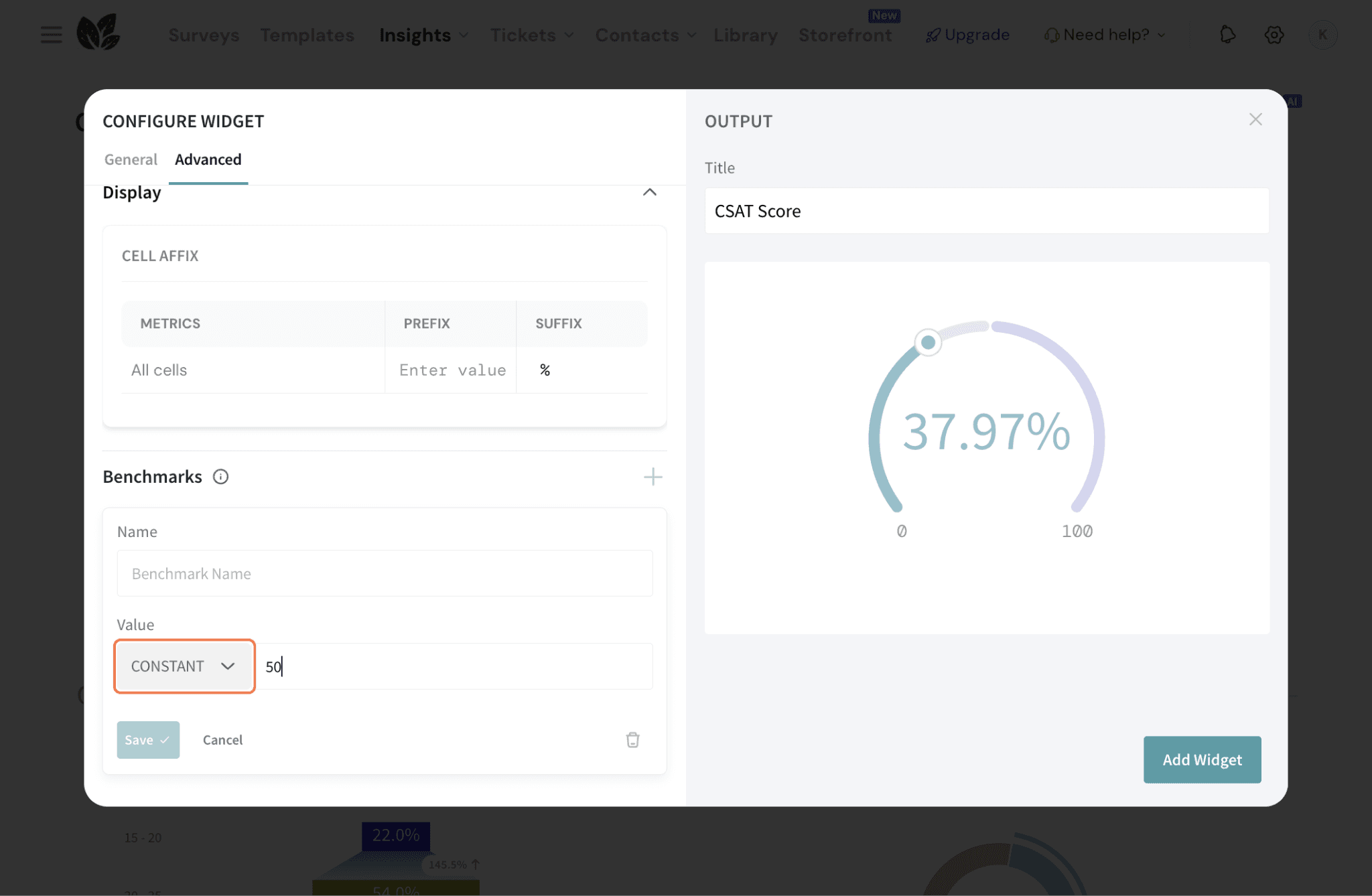
b. Dynamic benchmark: configure it against another metric (SUM, AVERAGE, standard CX metrics, or custom metrics applicable to the source data)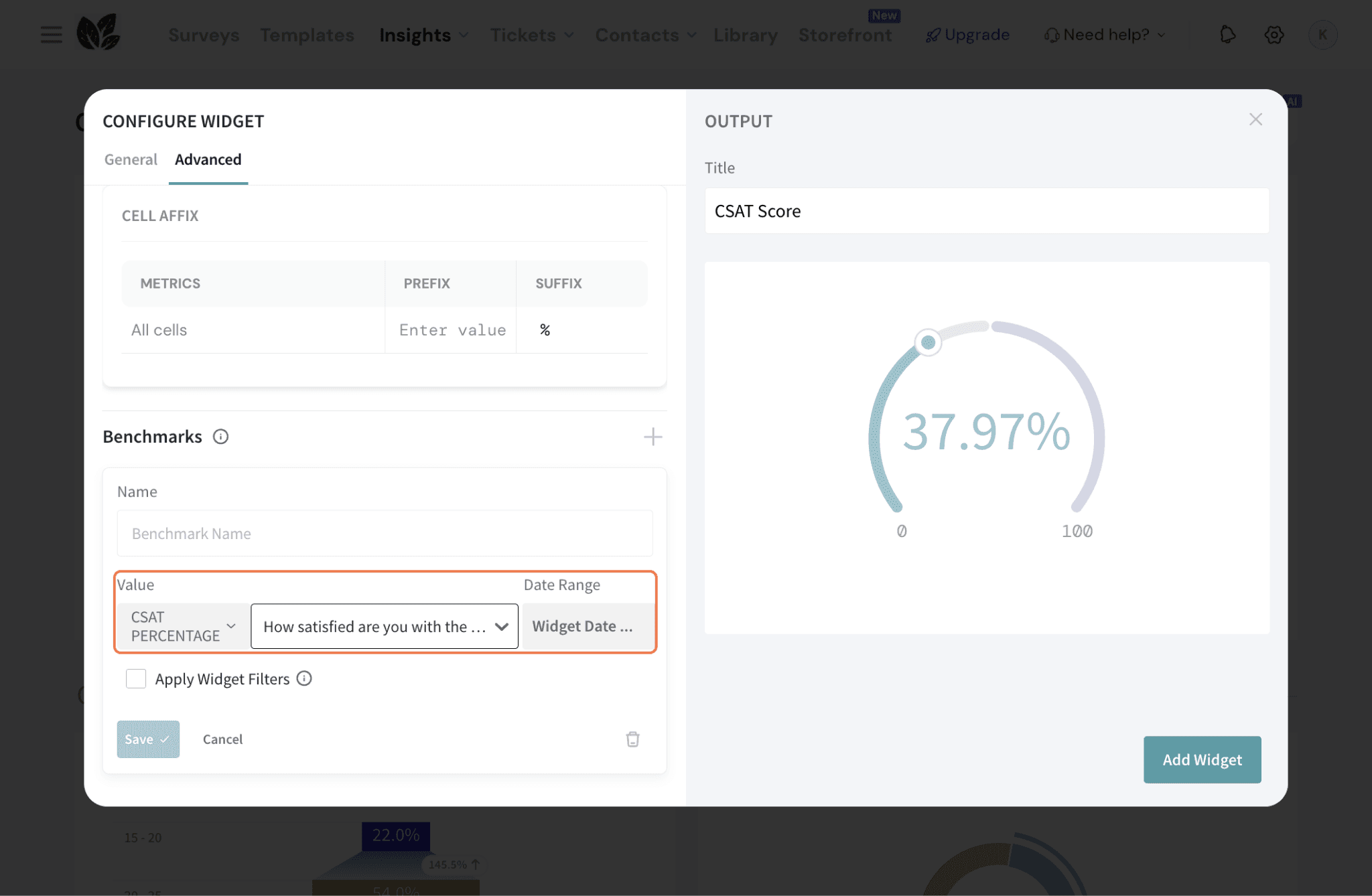
19. If you’re going with a dynamic benchmark, you can also choose to apply the widget filters to the benchmark data.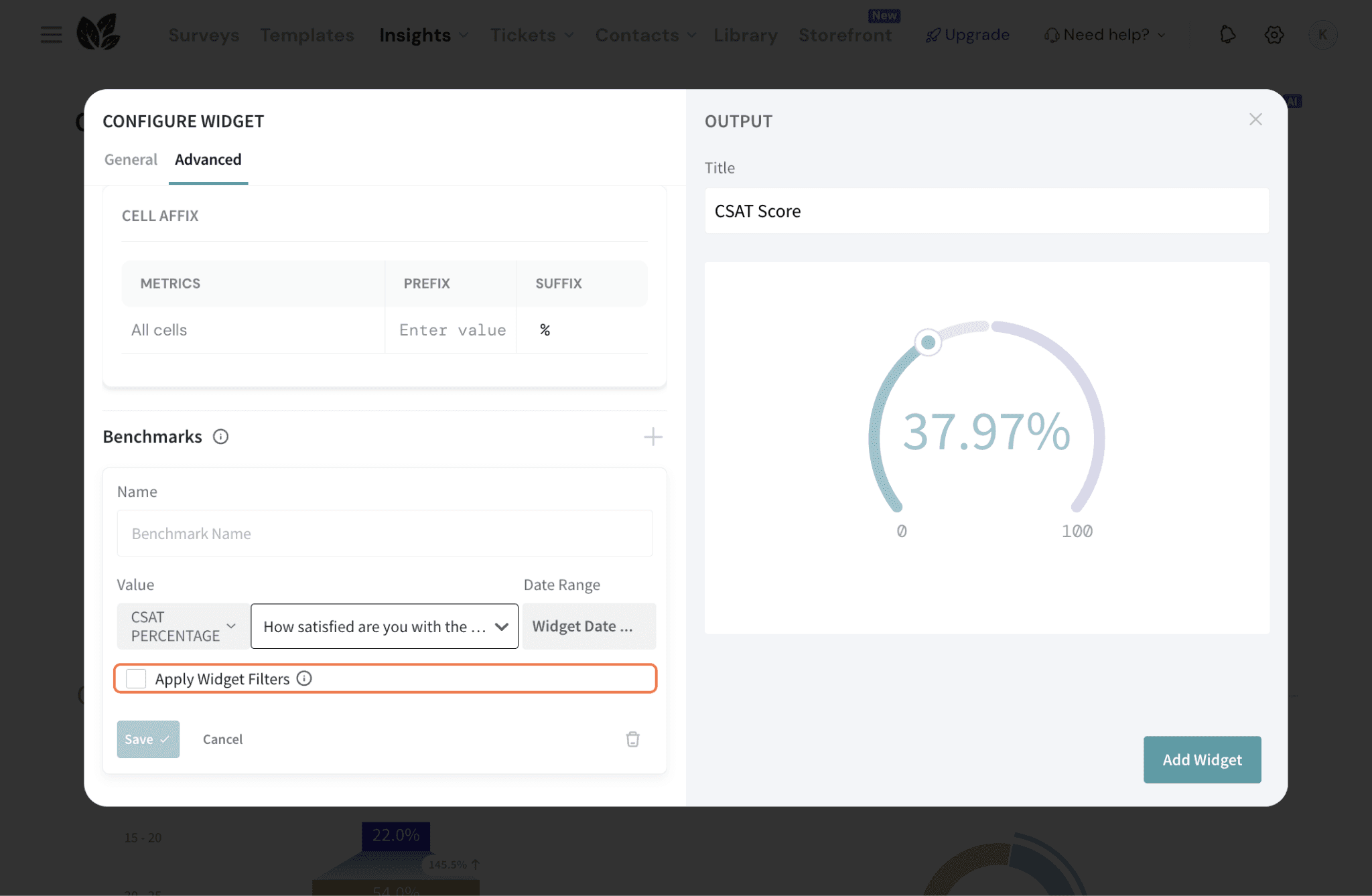
20. Once complete, click Add Widget to save the Radial Chart to your dashboard.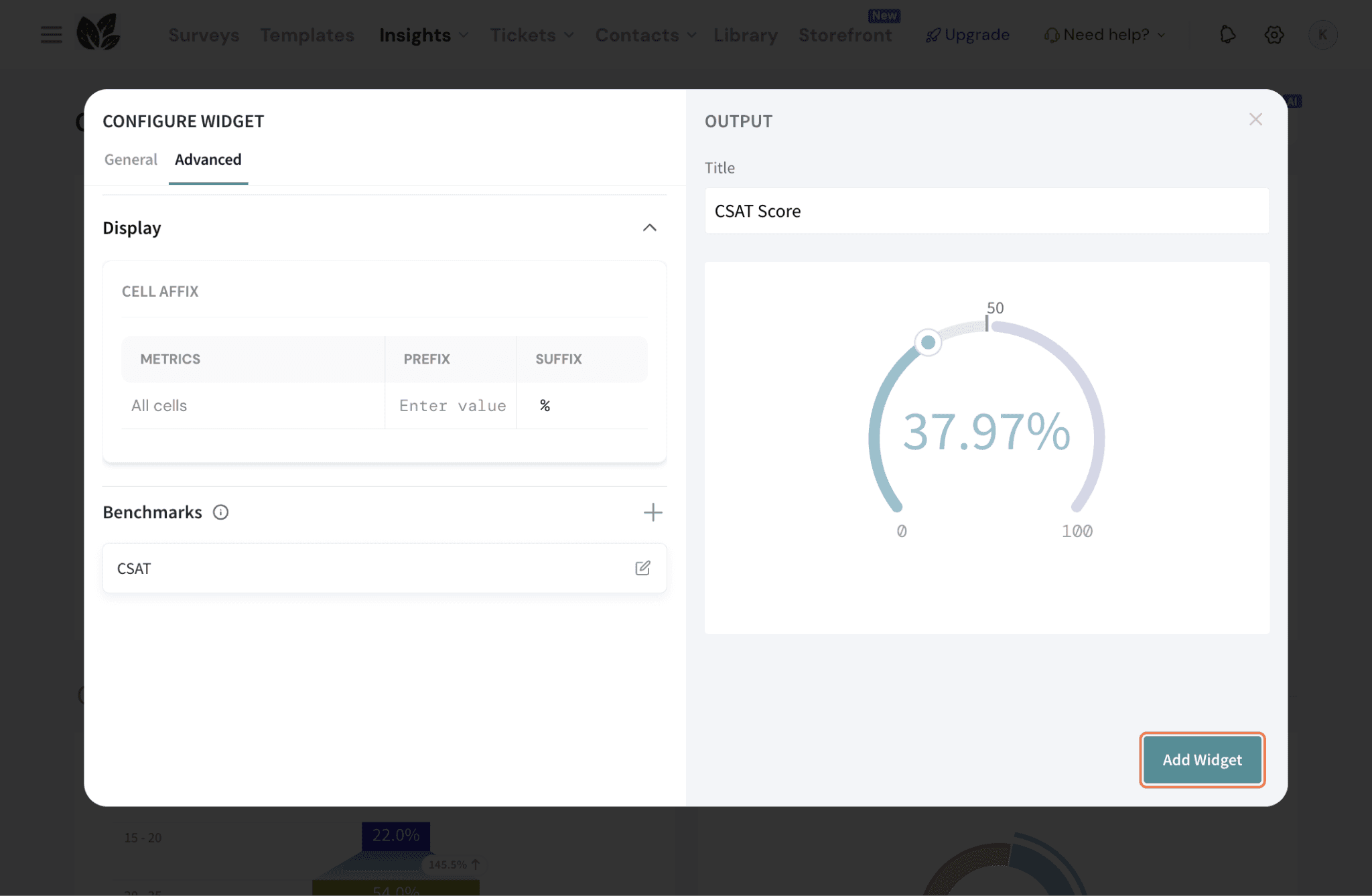
21. In the dashboard, you can filter to specific timeframes as well. You can choose a timeframe from the pre-set options or create a custom timeframe.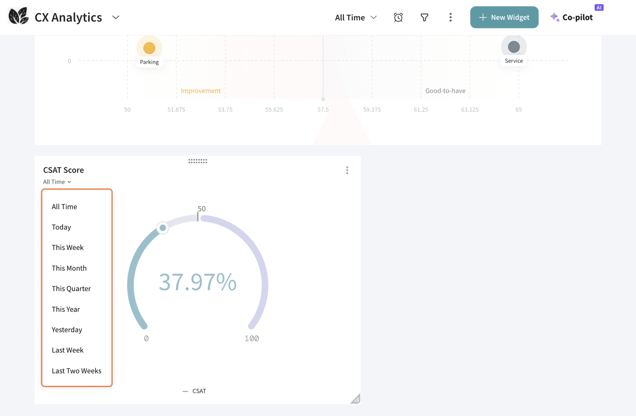
22. If you would like to make extensive changes, click on the three dots in the top right corner. 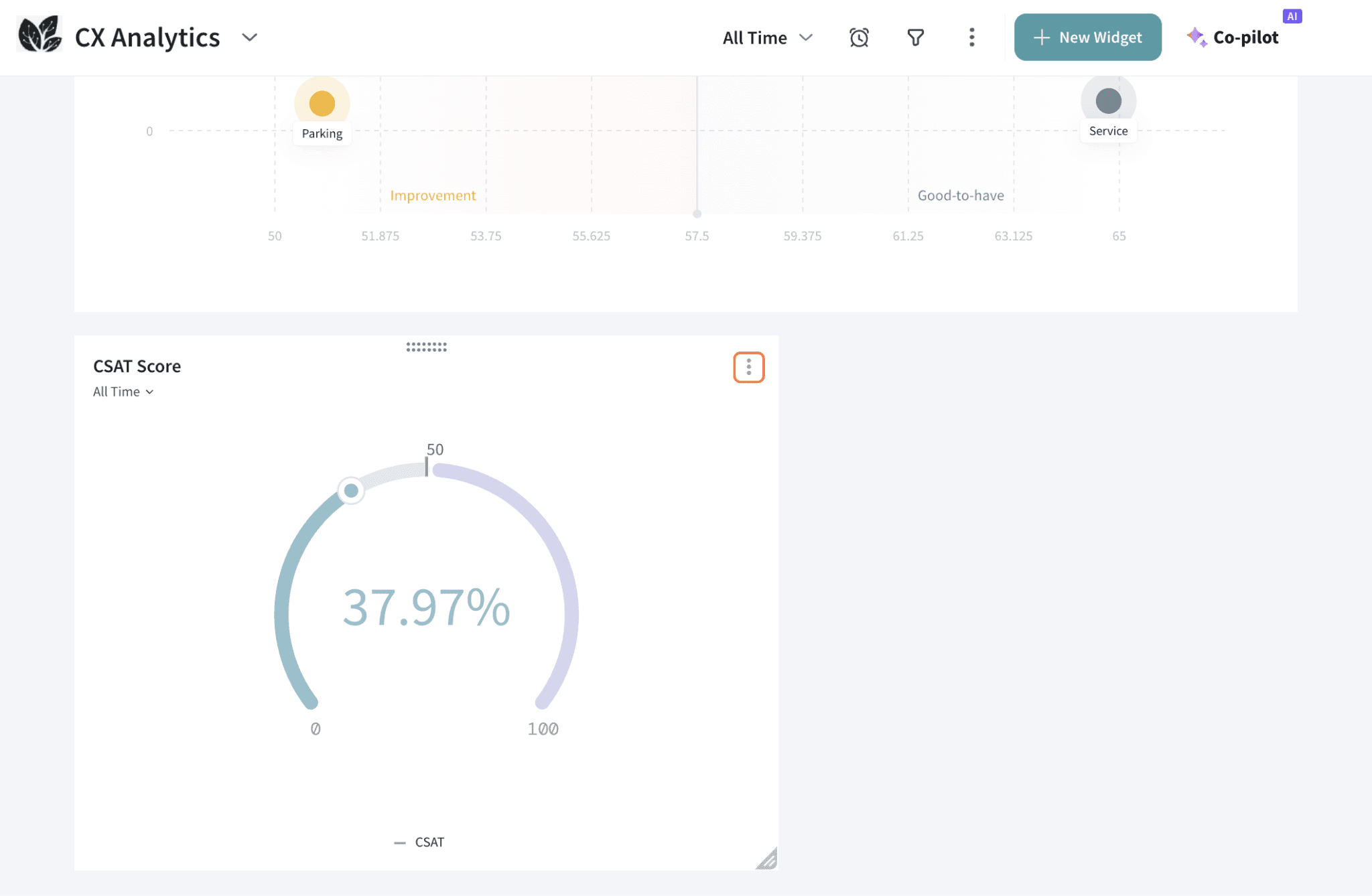
23. You can change the widget configuration by clicking Edit, or clone or delete the widget. 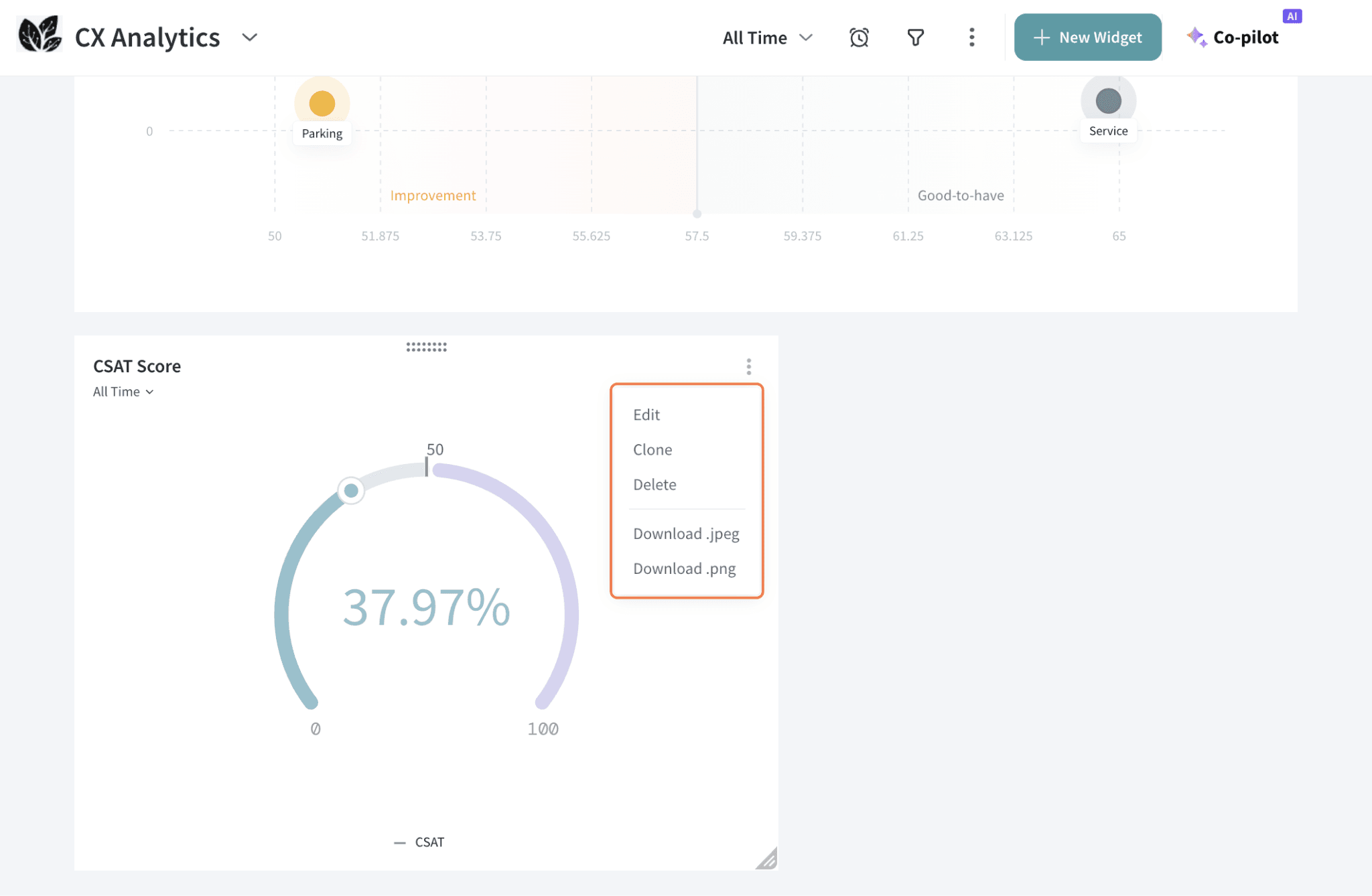
That's all about Radial Chart widget. Hope this helps!
Feel free to reach out to our community if you have any questions.
Powered By SparrowDesk