Search
Moving calculations smooth out trend lines by averaging past values over a set period, reducing short-term fluctuations. This makes it easier to spot overall trends and momentum, aiding with financial analysis, forecasting, and performance tracking.
Lets look at an example:
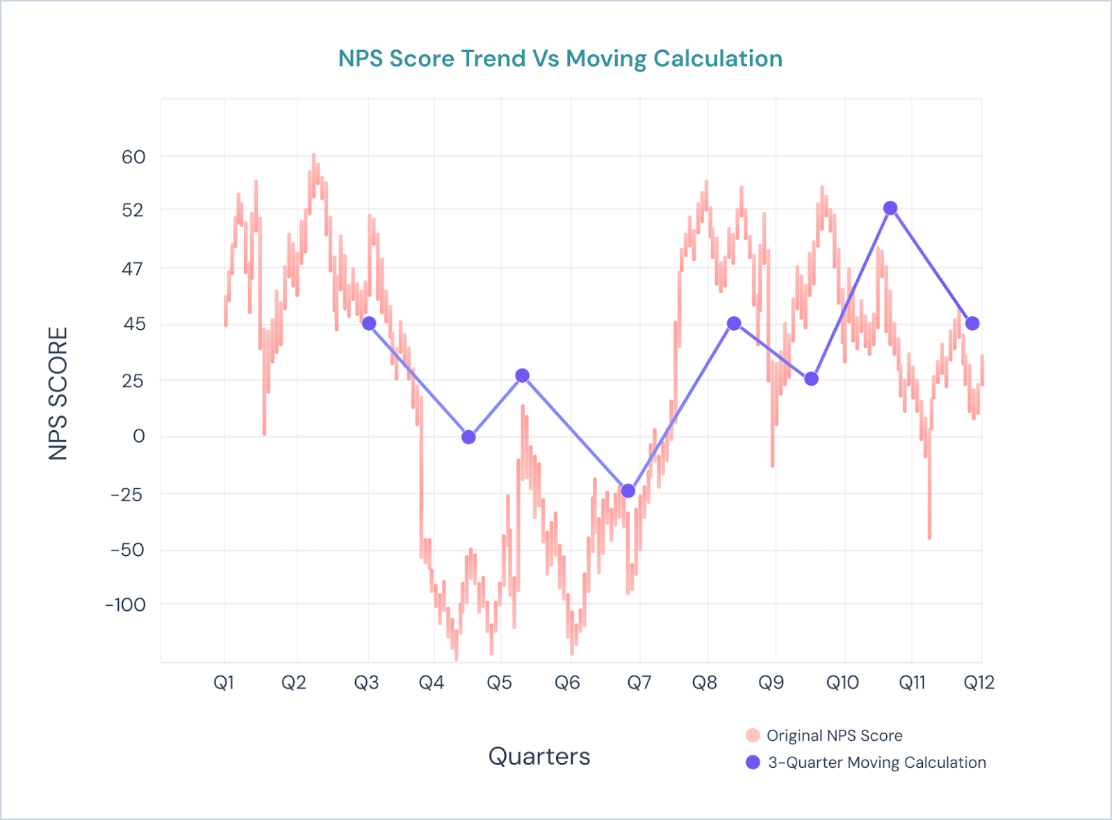
A company conducts NPS surveys every quarter to measure customer loyalty. However, they notice that the NPS score fluctuates frequently due to various factors like new product launches, seasonal trends, and marketing campaigns. One quarter, the score is high because of a successful product release, but the next quarter it dips due to a seasonal dip in customer engagement.
This makes it difficult for the company to understand the true, long-term trend in customer loyalty. To get a clearer picture, the company decides to use a moving average over the last three quarters.
By averaging the NPS scores from the previous three quarters, they can focus on the overall trend without being distracted by short-term fluctuations.
The following is a graph which shows the difference between a normal graph and a moving calculation trend graph for the above example.
Now let’s see how it works
1. Navigate to the Executive Dashboard and create a new widget.
All the widget types will be shown.
NOTE: The following are the supported charts for Moving Calculation
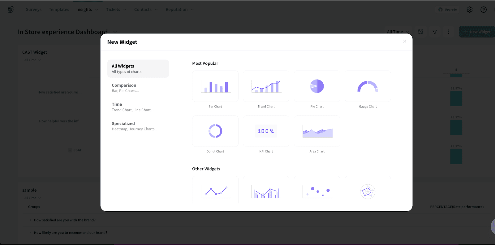
2. Choose the type of widget you want to create. Let us choose a Trend Chart.
3. Select the source survey for trend analysis.
Note: The X-axis should be set to submission time to track trends over time accurately.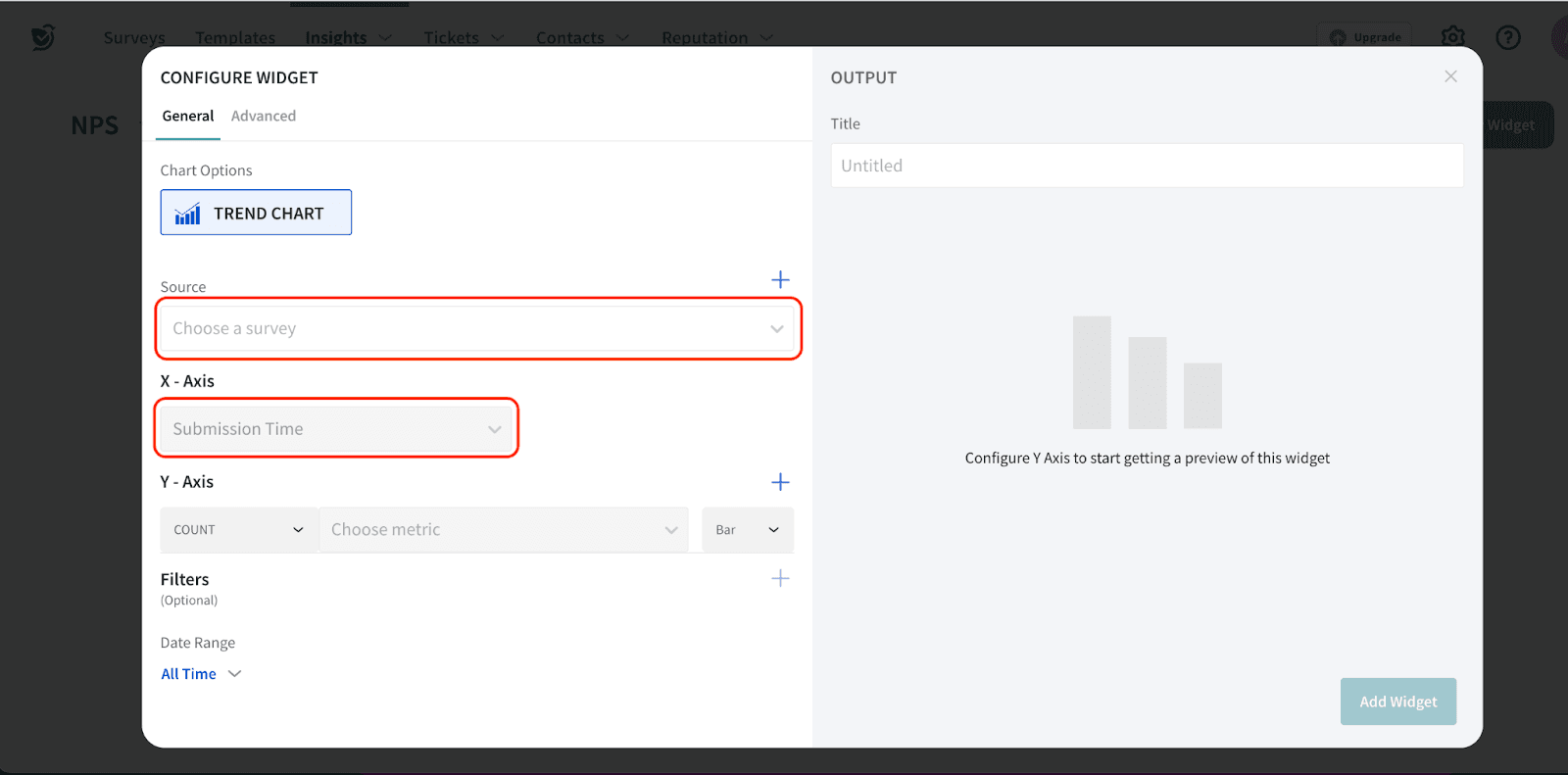
4. On the Y-axis, select Moving Calculation and choose the metric you want to analyze.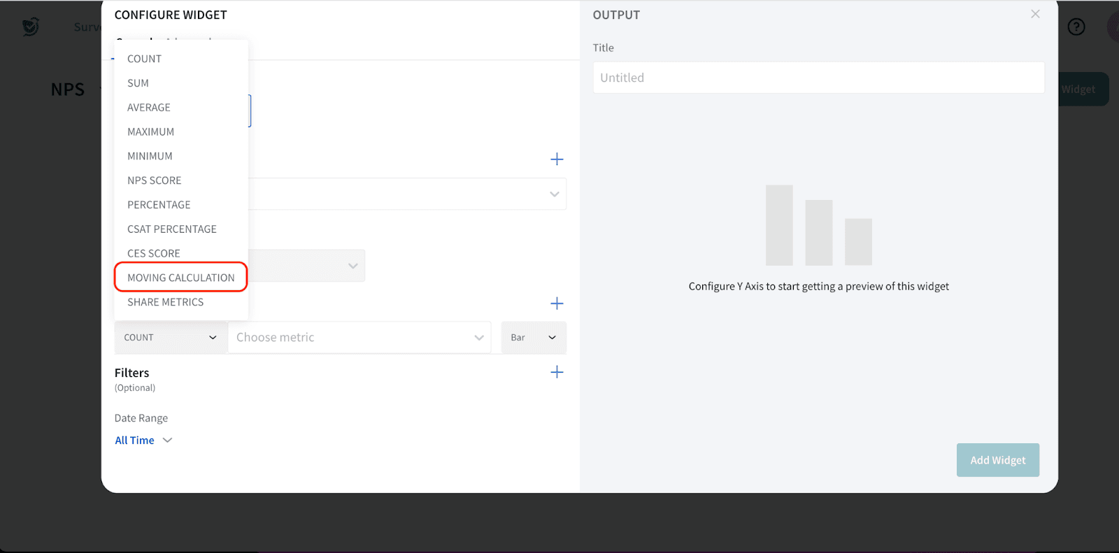
5. You can select the specific metric that defines how the data should be measured, depending on the type of analysis you need.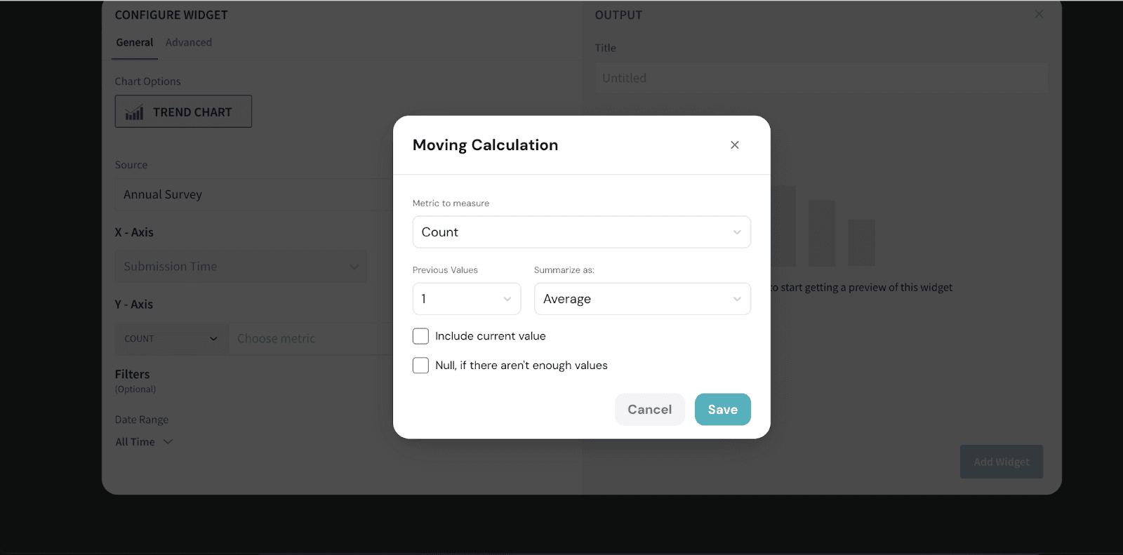
Include current value:
When checked, the moving calculation will include the current data point along with the specified number of previous values in the calculation.
If unchecked, the calculation will only use previous values without considering the current value.
Null, if there aren't enough values:
When checked, the calculations will not happen if enough previous values are not available.
If unchecked, the calculation will still proceed with whatever values are available, even if they are fewer than the specified number.
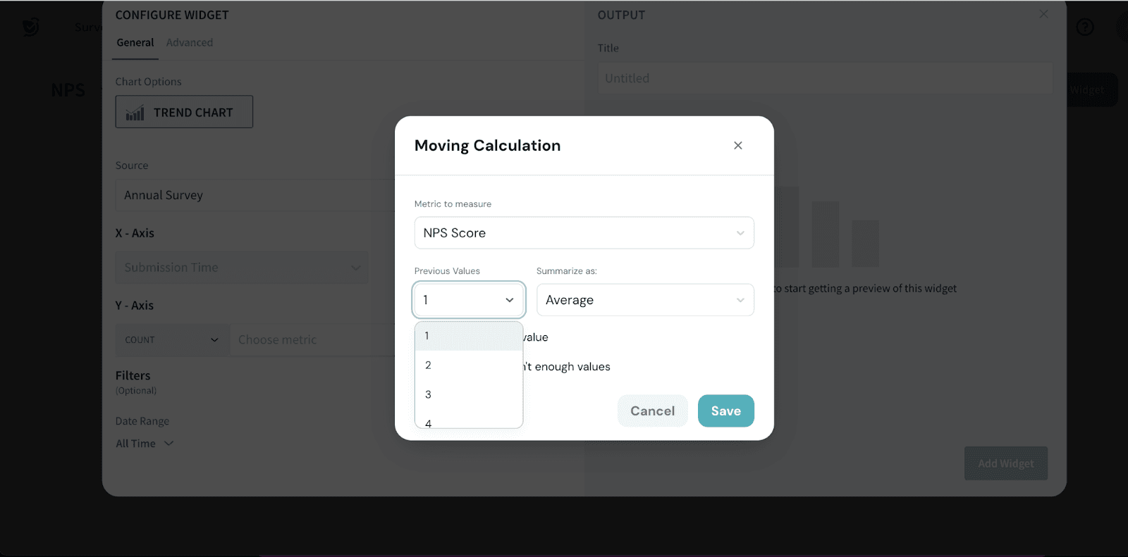
In our example, let’s choose NPS Score

6. You can select previous values, which refer to data from earlier time periods. This allows you to analyze trends based on past data, helping to identify patterns or changes over time.
For example, if you set a previous value of 3, the system will calculate the average score from the past 3 months. This can be set to months, quarters, or days, depending on the range defined in the widget.
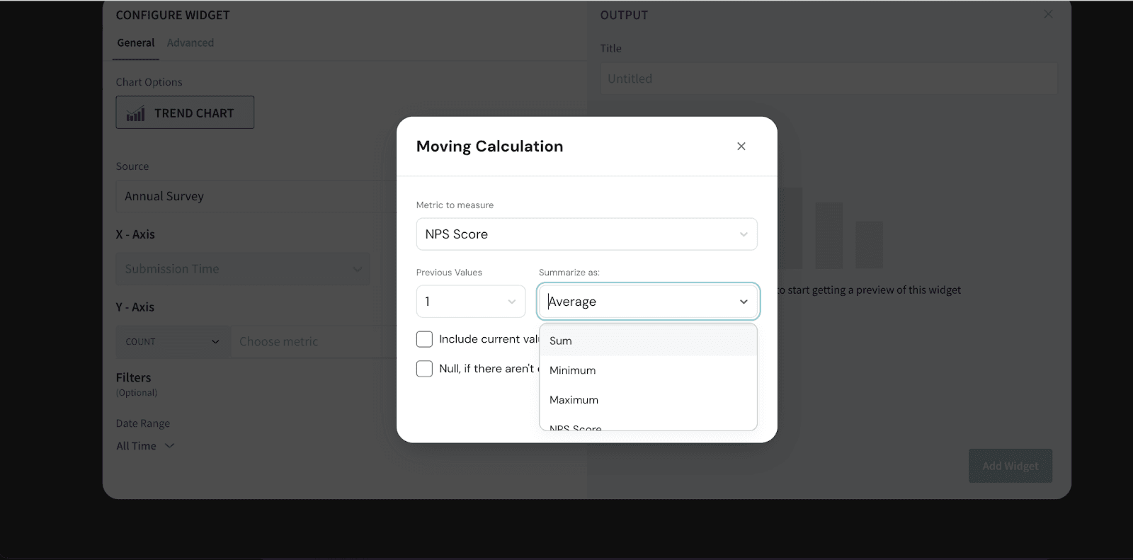
7. Summarize as- This allows you to decide how the final chart should appear and choose the approach for summarizing the trend.
8. You can choose to display the final chart as a line chart.
Add a title for the widget and click on Add Widget to create the widget. 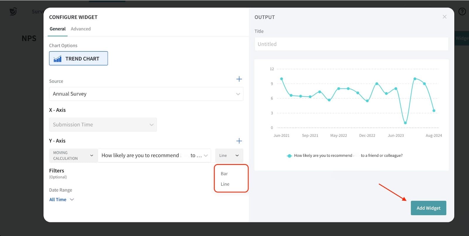
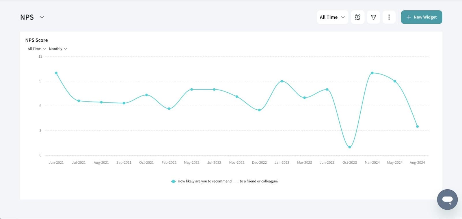
9. This is how the final widget will appear on the dashboard, clearly displaying the trends over time and smoothing out any fluctuations to highlight the overall patterns.
That's all about Moving Calculation.
Feel free to reach out to our community if you have any questions.
Powered By SparrowDesk