
Custom Groups
When you're analyzing data from multiple surveys in the executive dashboard, the way questions and response properties are structured doesn't always support the visualization you have in mind. For example: you might want to combine two similar questions from two different surveys. Perhaps you want to segment responses based on a bespoke time-frame that your business operates on. Or you want to create a custom scoring system for responses.
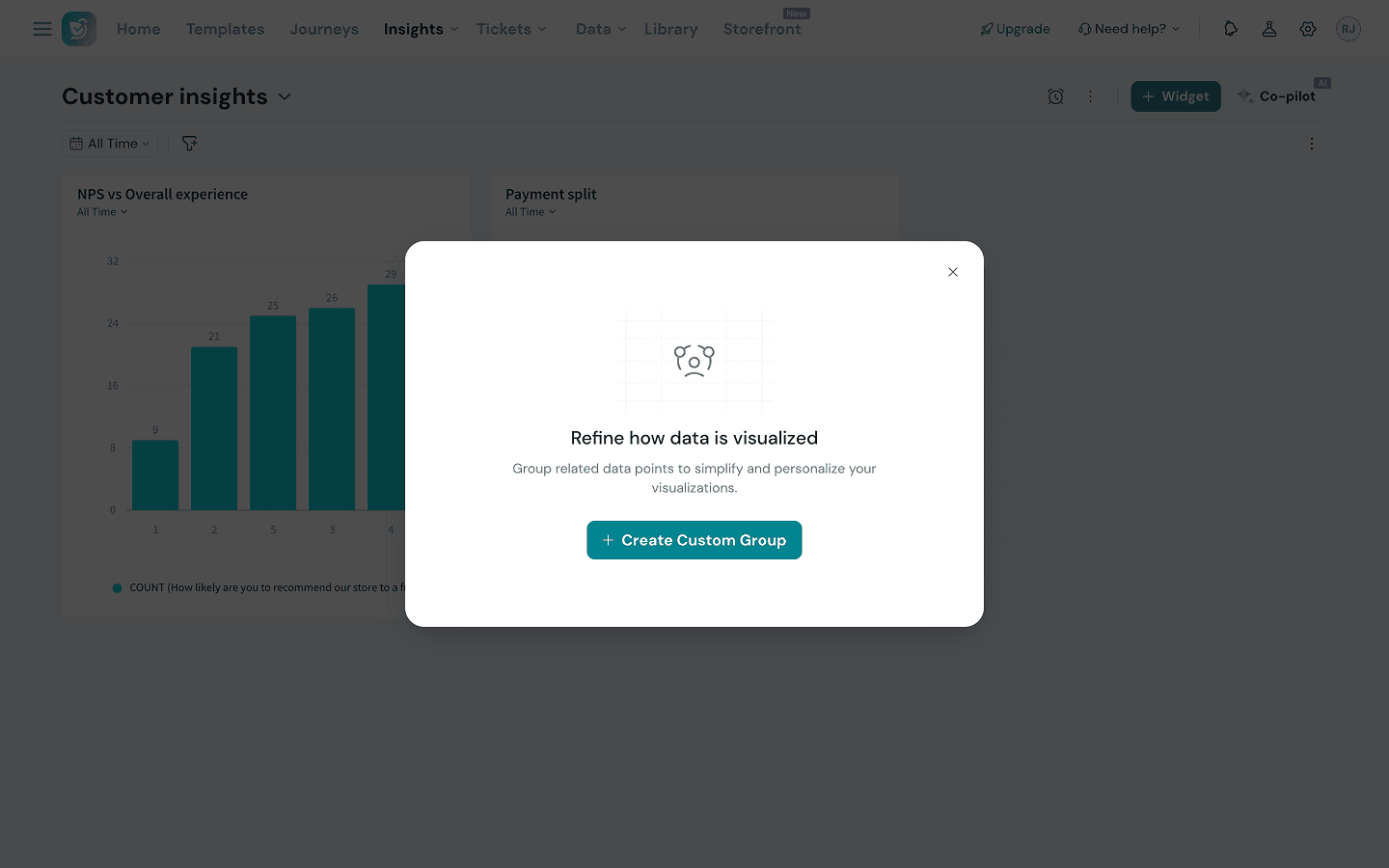
That's exactly what Custom Groups is designed for.
Custom Groups is a new feature that lets you create your own dimensions — all without touching the underlying response data. You decide how your data should be grouped, labeled, and calculated, and those groups instantly become available across all your widgets.
In this article, we’ll walk you through the steps of creating custom groups.
1. Inside the executive dashboard, click on the three-dot icon, and select Custom Groups.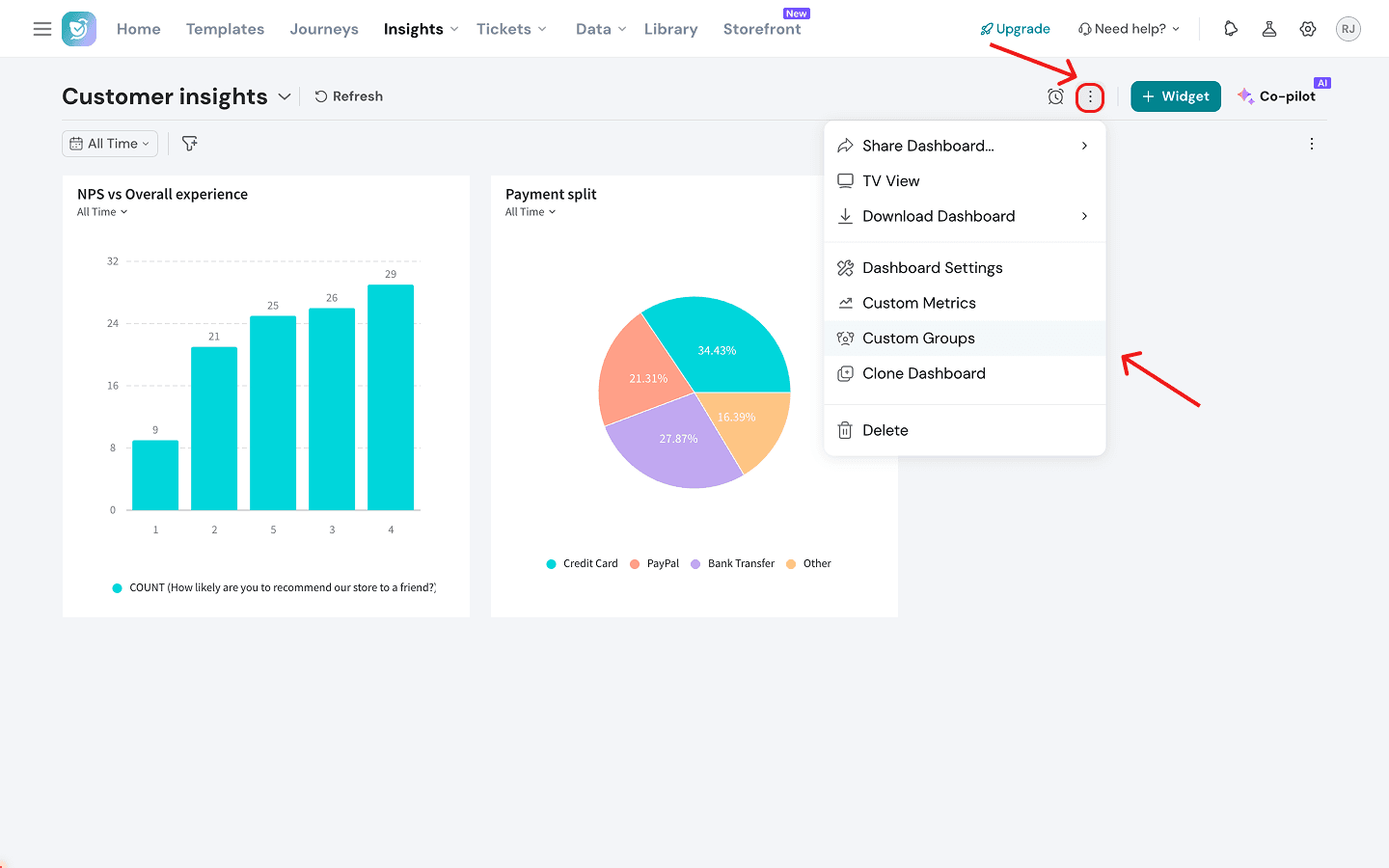
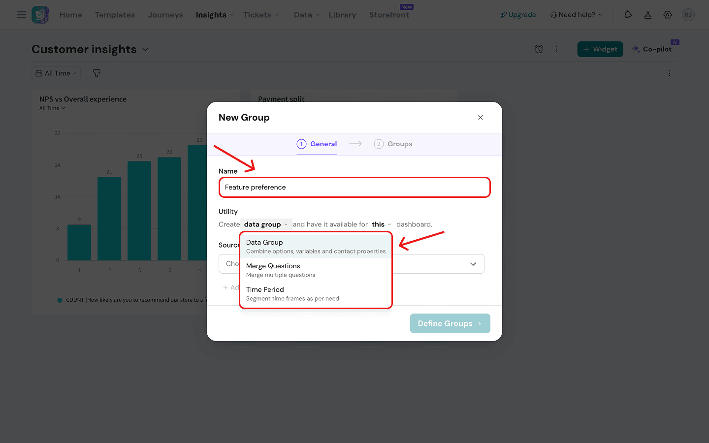
There are three kinds of custom groups you can build:
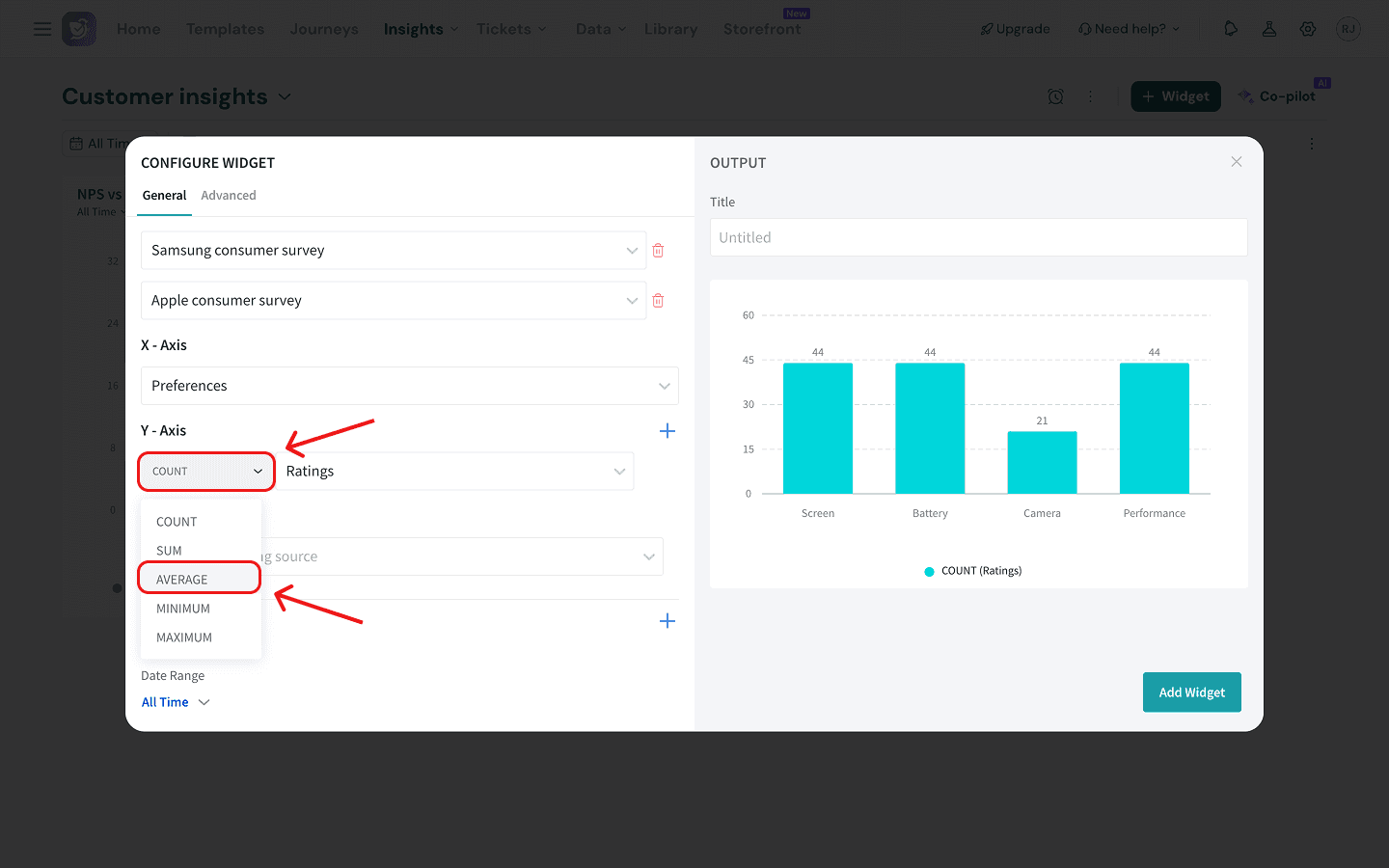
- Data Groups - you can combine multiple response options into meaningful buckets. For example, a data group which merges Likert scale ratings into 3 columns: Bad (1, 2, 3 and 4 stars), Average (5, 6, 7 and 8 stars) and Good (9 and 10 stars). Or a data group that merges options from similar MCQs into columns. You can even assign a numeric score to each group for weighted calculations. Inside widgets like bar graphs, this data group can be used as your X-axis dimension.
- Merged Questions - you can combine similar Likert scale questions from different surveys into a single, unified dimension. This gives you a bigger sample size and lets you make cleaner comparisons. In bar graphs and related widgets, this can only be used as a Y-axis dimension.
- Time Period - you can define timeframes in any manner that matches your business’s operational schedule and then use them as dimensions for historical breakdowns. For bar graphs and similar widgets, this can be used as an X-axis dimension.
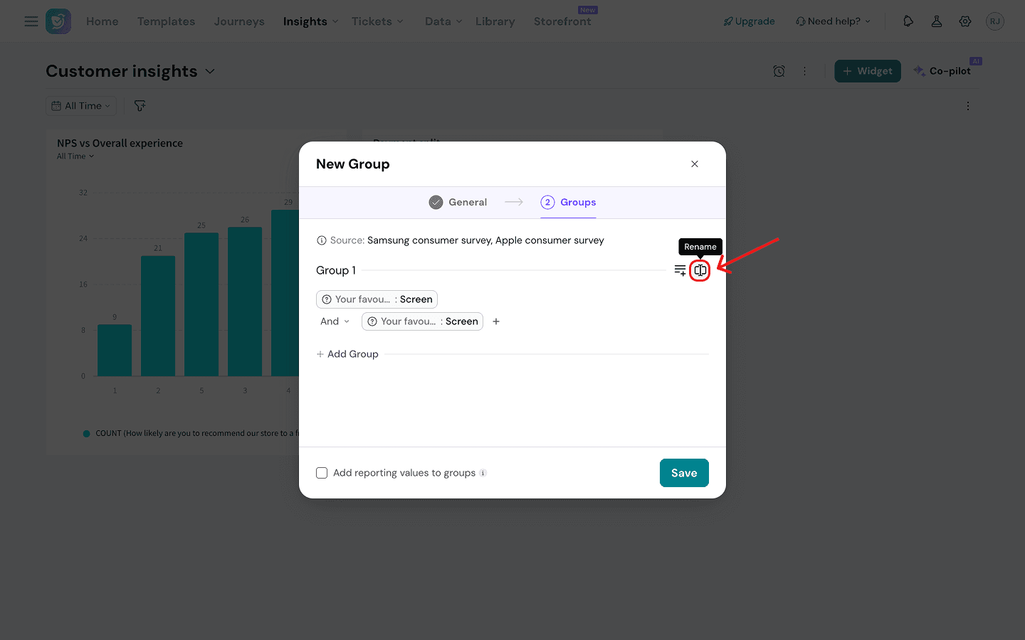
Note: You can make your custom group available for the current dashboard or all dashboards, by clicking on the drop-down.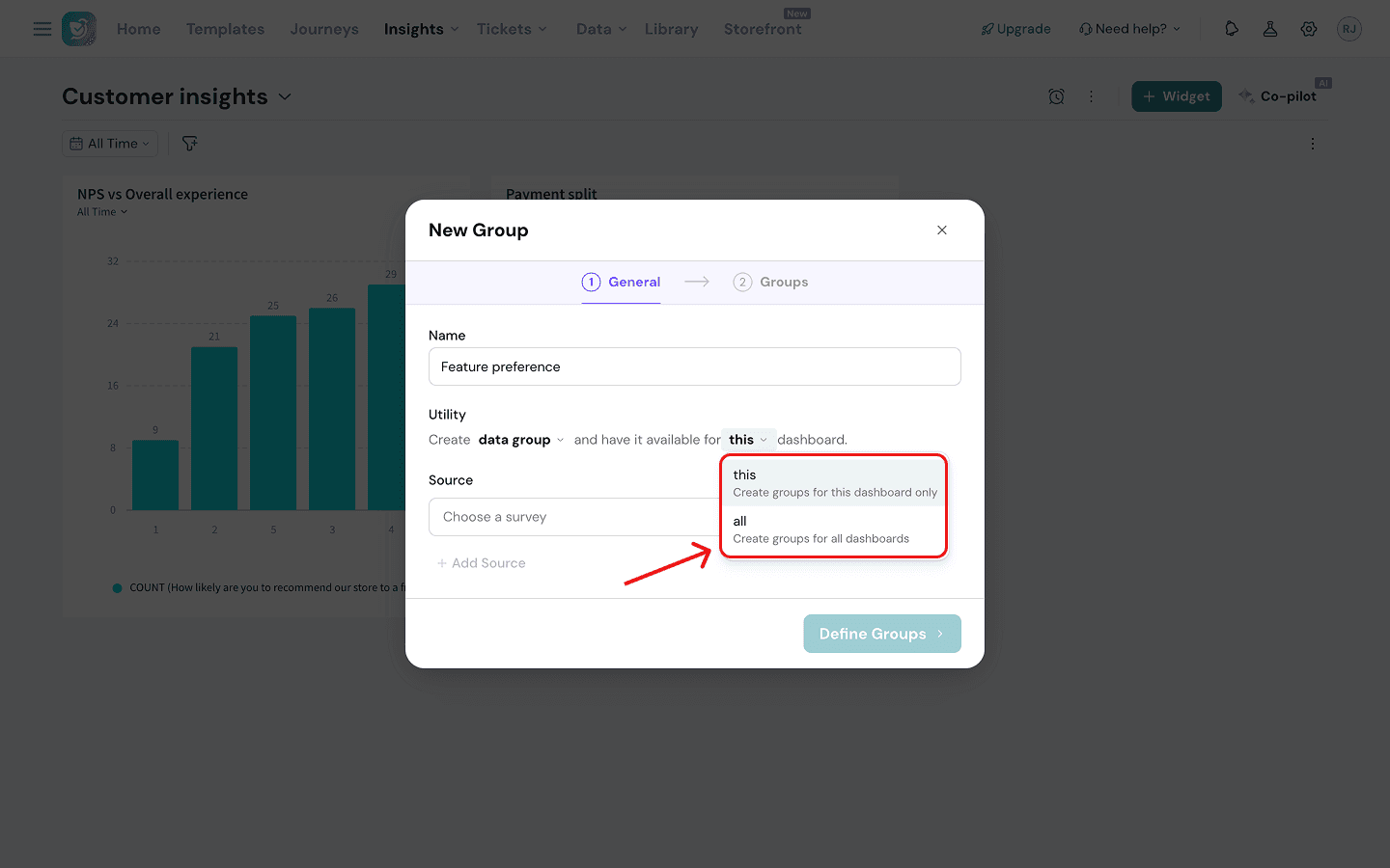
Data Groups
(For the purpose of this article, imagine you're an electronics retailer running identical surveys for Apple and Samsung, and you want to consolidate the responses into a single view. You’re going to create a data group that aggregates two identical MCQs from both surveys into one)
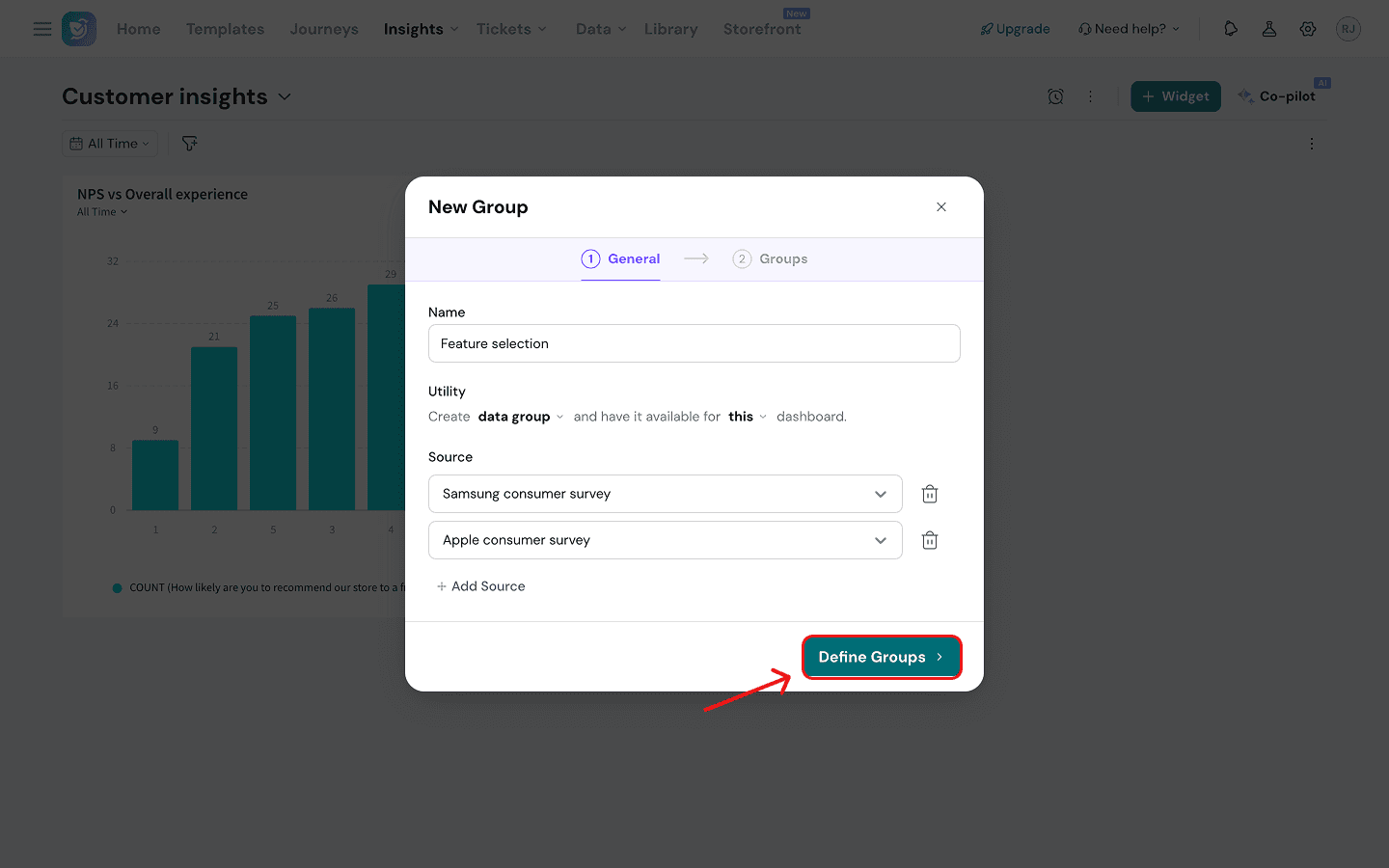
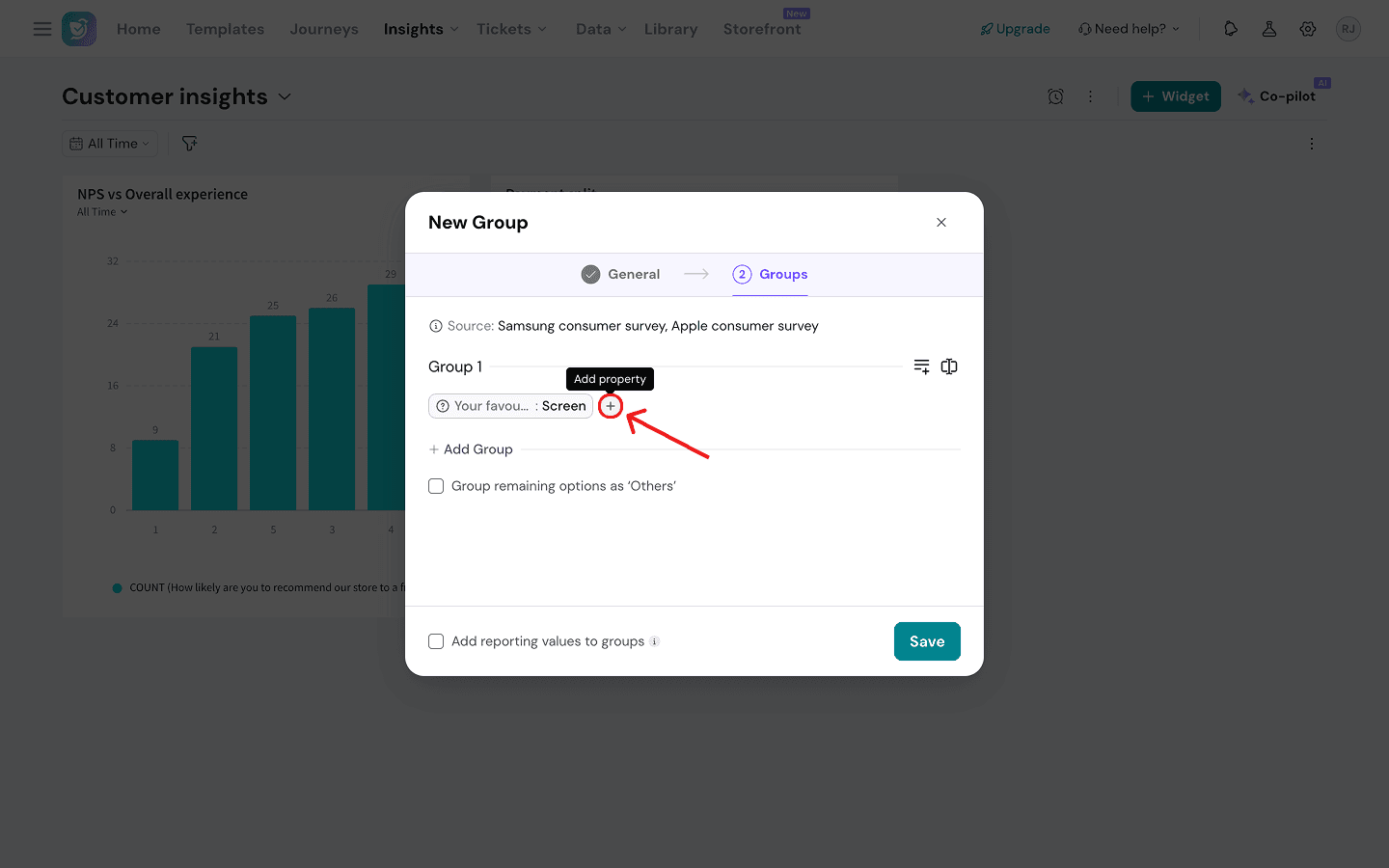
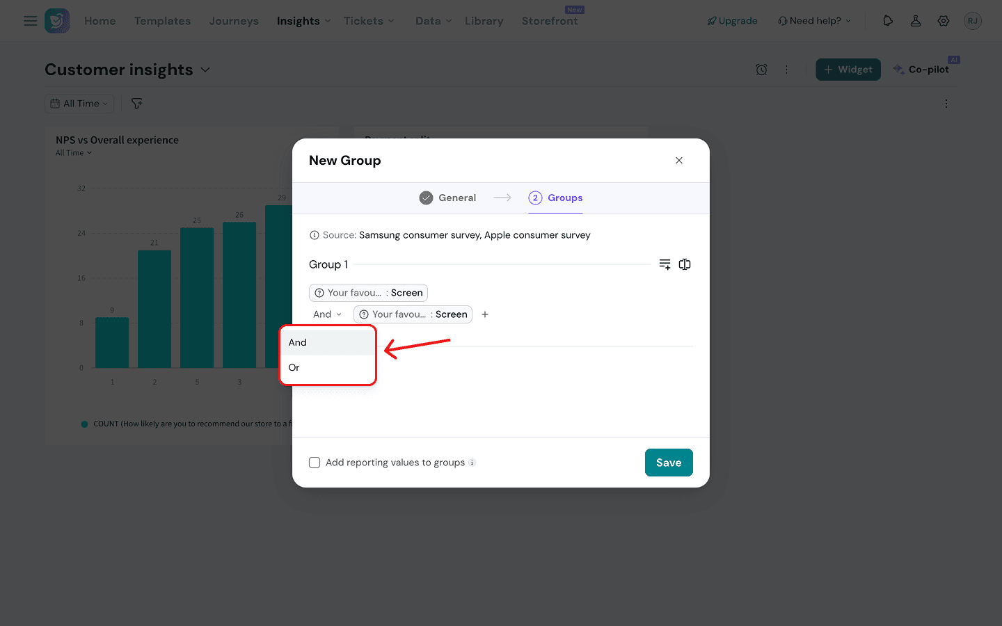
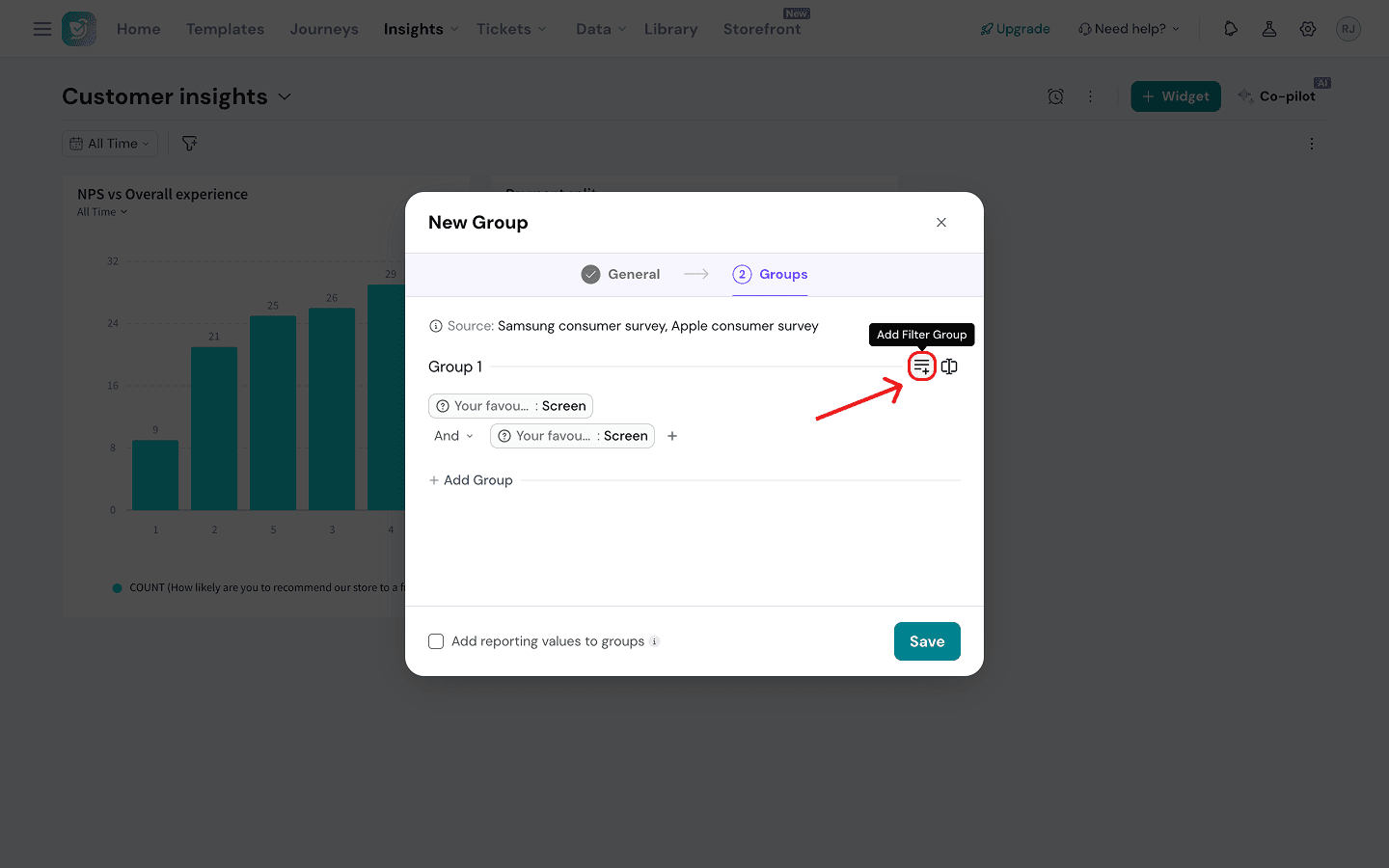
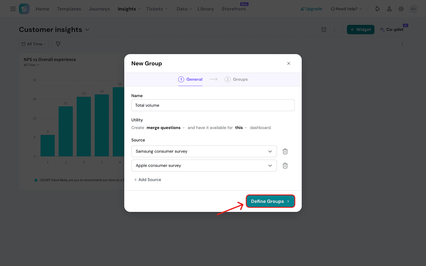
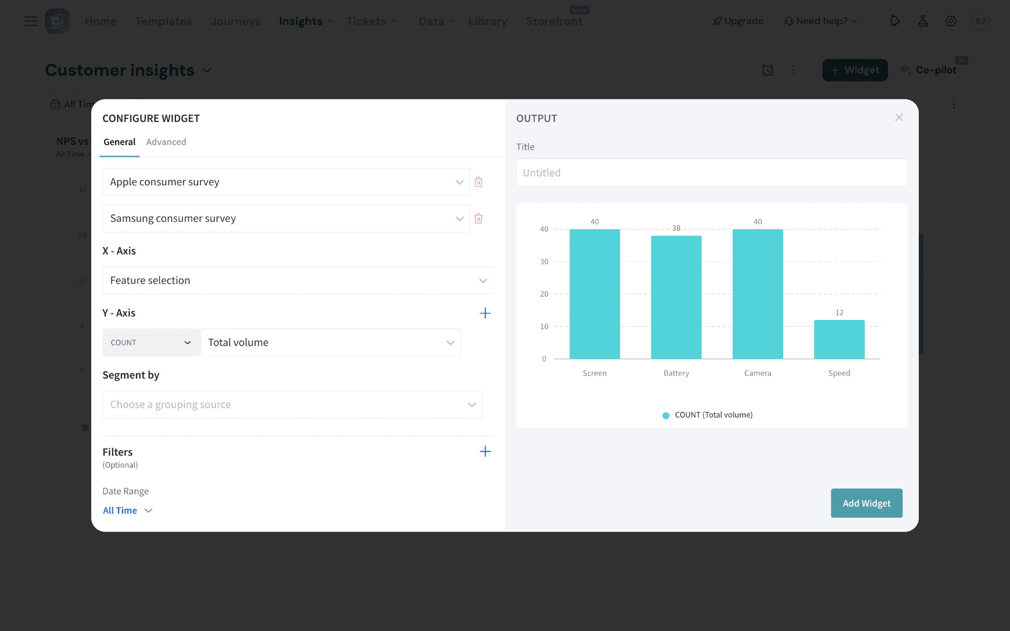
1. If you’ve decided to create a data group, the next thing to do is to select your source survey. Click on the drop-down under Source and choose from the options. You can add multiple sources.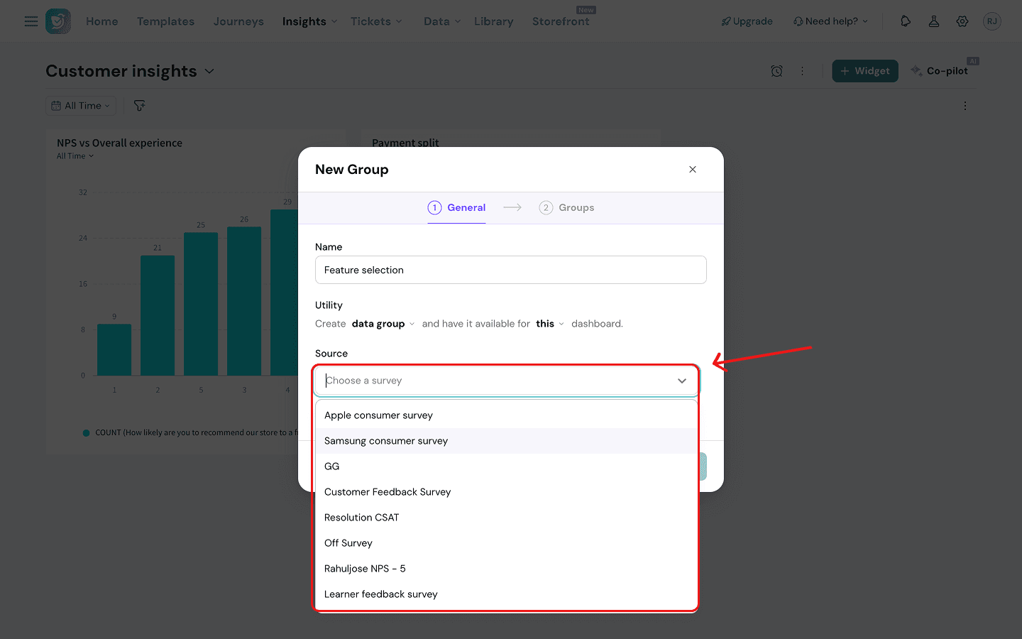
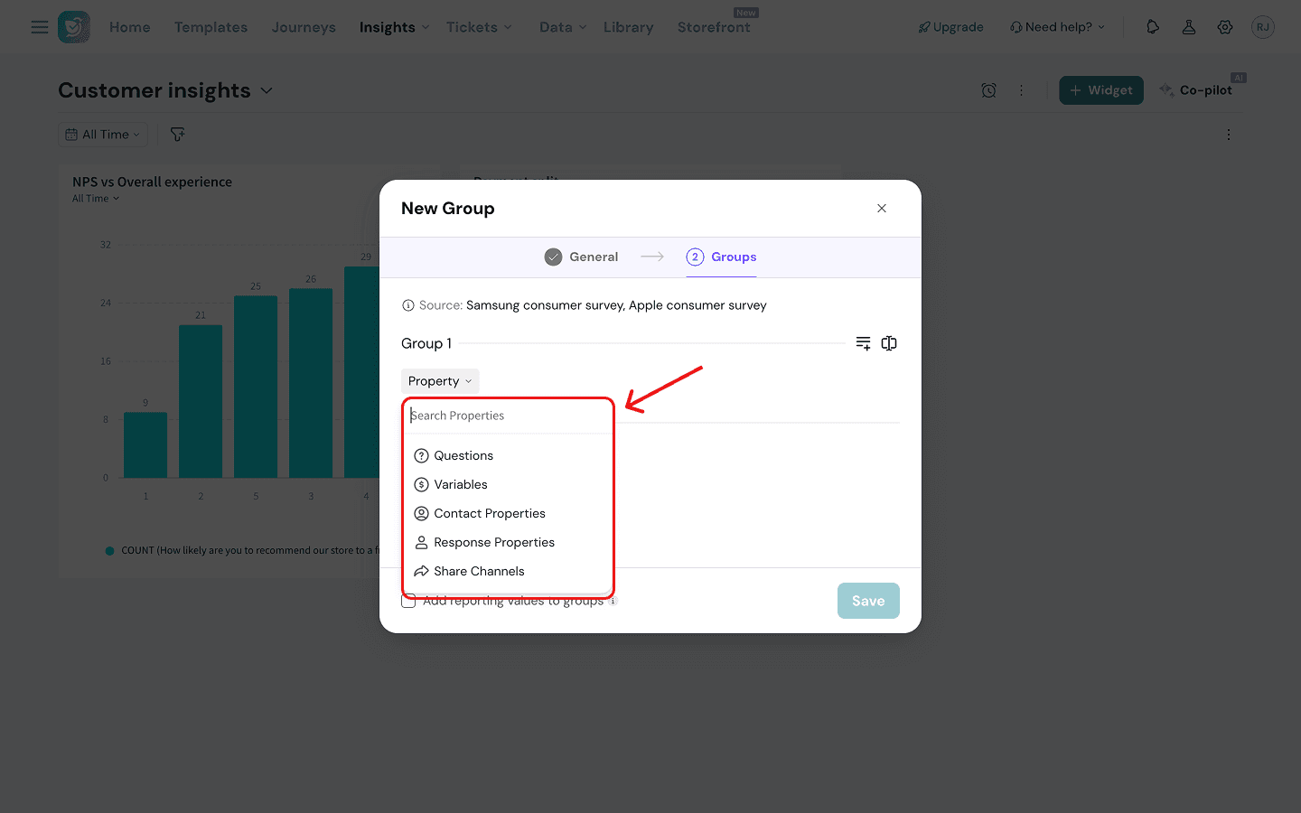
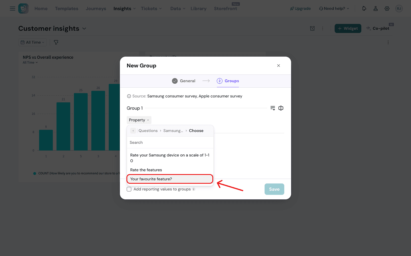
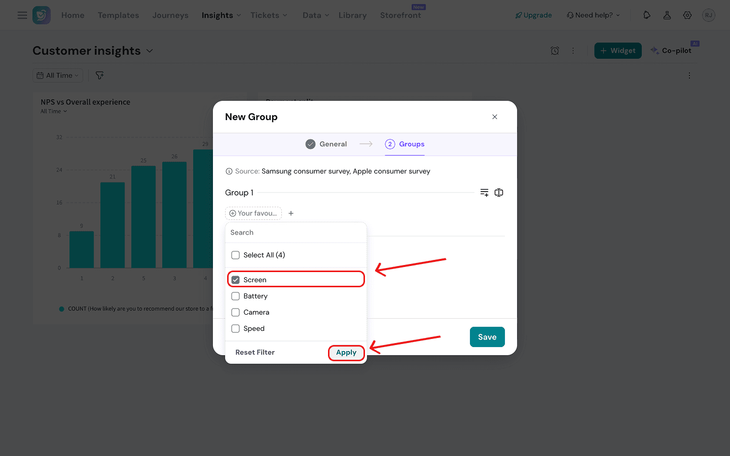
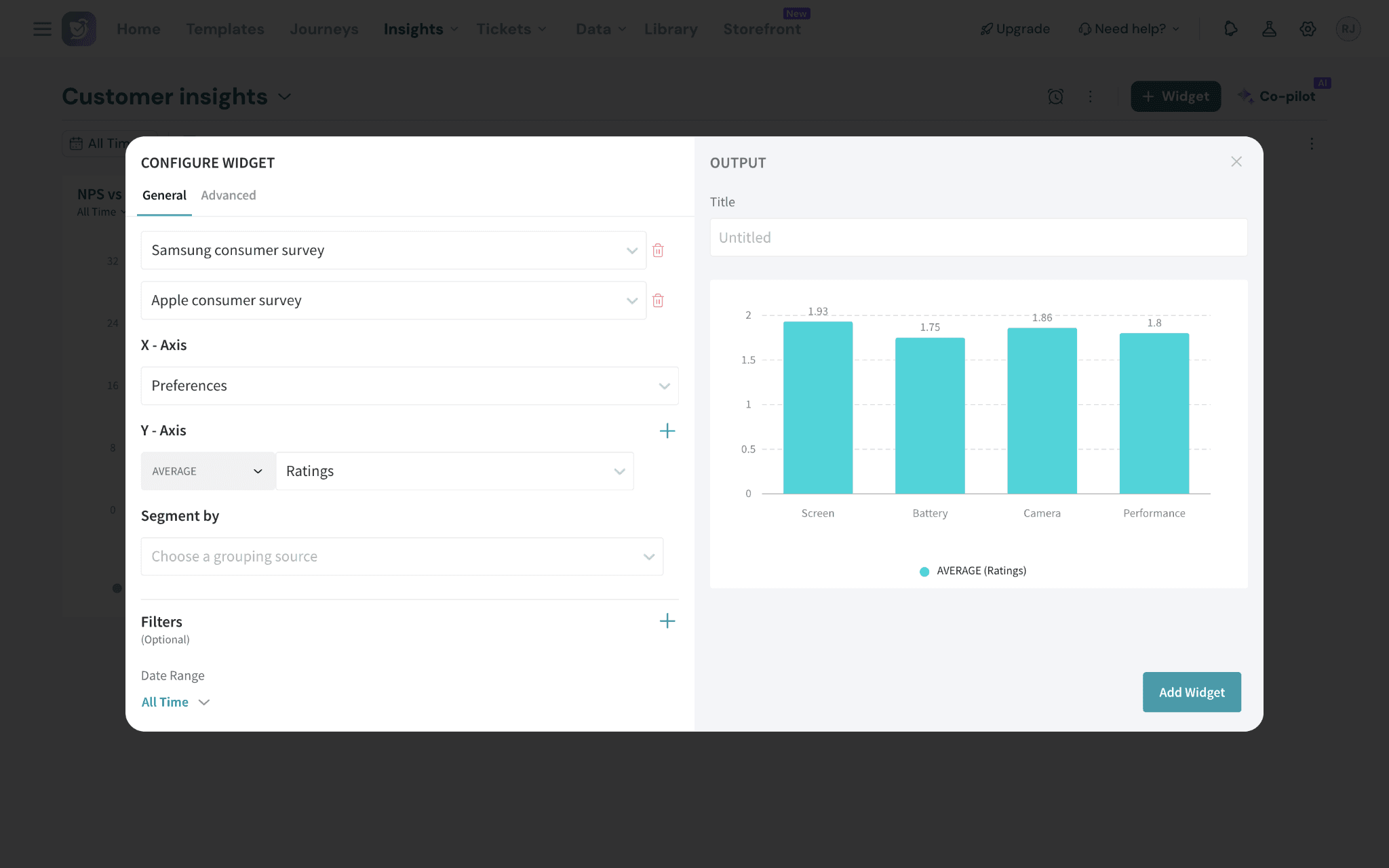
Imagine that the retailer from our example wants to understand feature preferences across Apple and Samsung buyers. Both surveys have an identical MCQ for feature selection (‘Your favourite feature?’) which can be clubbed into a custom group. (See the group created above.)
This group can be used as the X-axis in a bar chart widget. But in order to visualize it, you also need to combine both sets of survey responses into a Y-axis dimension. You will have to create a merged question group, which we’ll explore below.
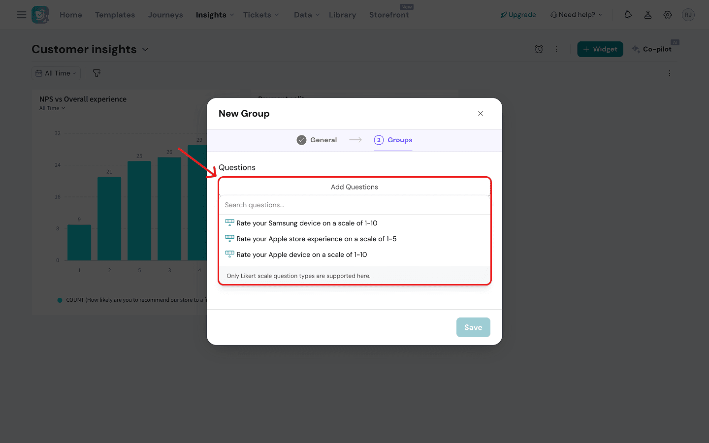
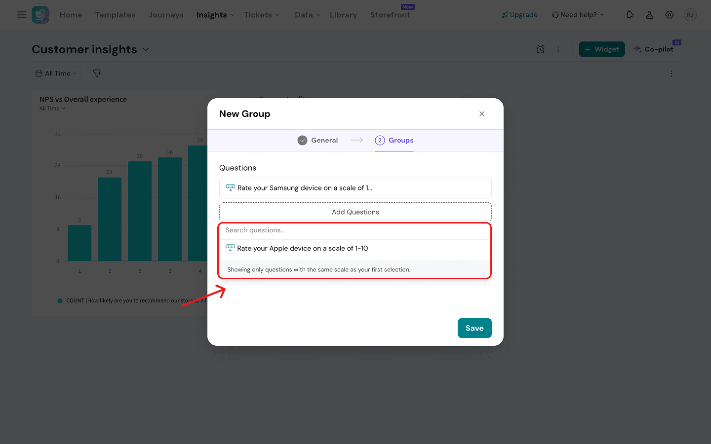
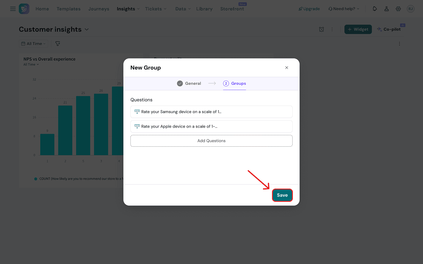
Merged Questions
This custom group lets you merge Likert scale questions (from one or multiple surveys) into one dimension, giving you a bigger sample size to measure across your X-axis dimensions. Let’s look at the setup. (In our example, we want to combine the ratings of Apple and Samsung buyers into one dimension.)
1. Just like above, after naming your group and choosing the merge questions type, proceed to select your survey sources by clicking on the drop-down menu under Source.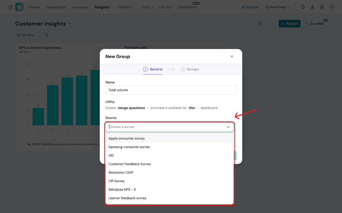
Reporting values inside Data Groups
When creating data groups, you can also add a numeric score in place of a text value, if you wish to perform calculations within the widgets for those values. Let’s explore this with the same example.
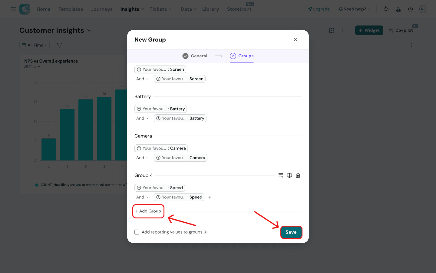
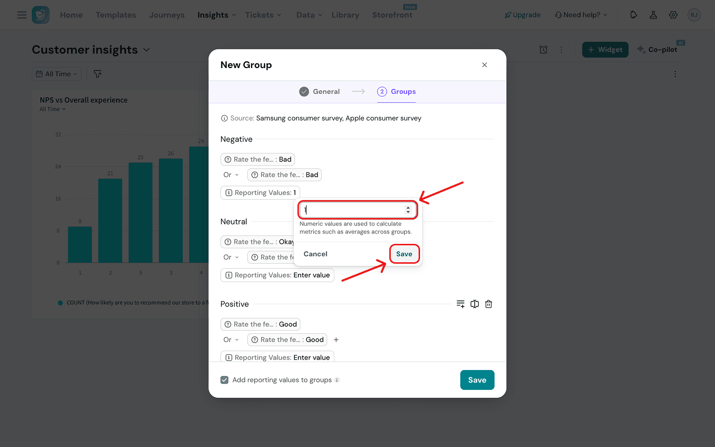
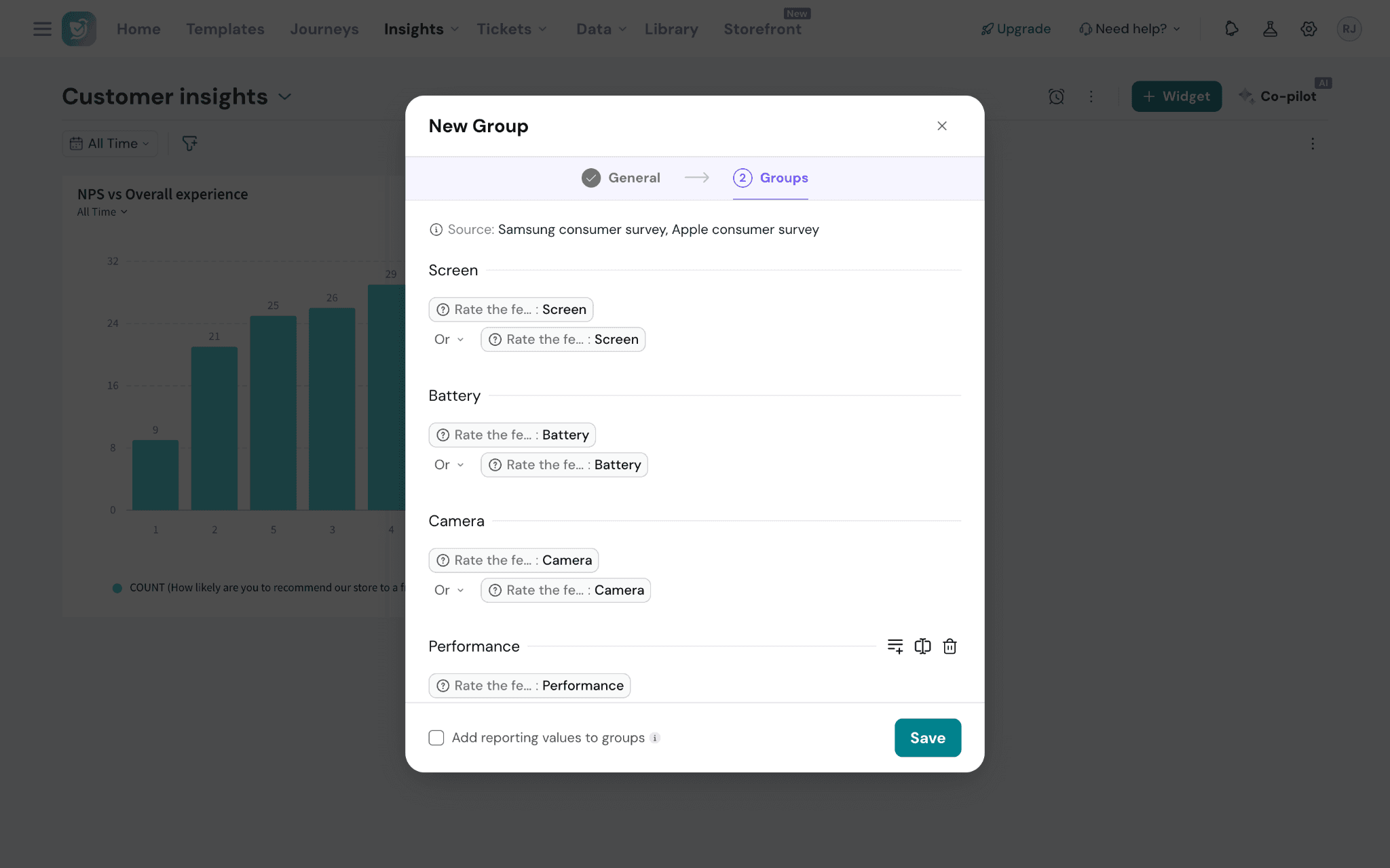
Suppose you have a matrix scale question in both surveys that asks users to grade features (screen, battery, camera, performance) as ‘Bad’, ‘Okay’ or ‘Good’. You want to understand which features are performing the best. But to understand how buyers of both brands perceive the quality of these features, you must assign reporting values to these ratings to get an average score.
1. Start by creating a data group combining the matrix question columns from both questions into 3 buckets. To assign reporting values, click on the checkbox at the bottom.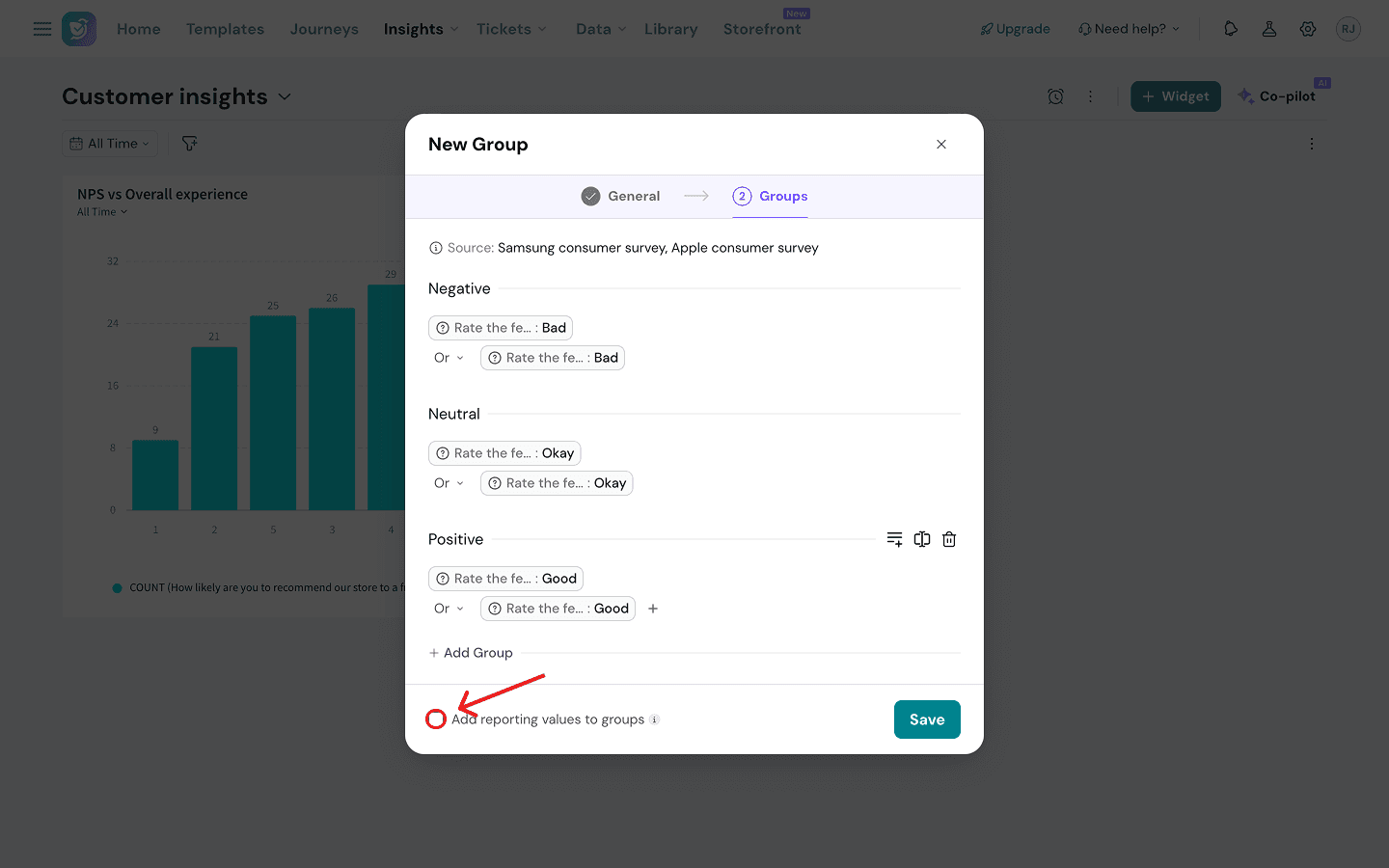
Time Period
In this question type, you can define your own timeframes on any scale. You can then use your time period groups as X-axis dimensions in graph type widgets. Let’s see the process.
1. After naming your group and choosing the time period type, proceed to select the property that you want to use by clicking on the drop-down menu.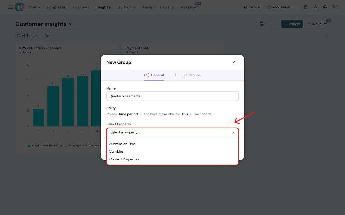
- Submission Time: when the response was received.
- Variables: any date-based variables of a specific survey.
- Contact properties: you can select the contact creation date.
2. Once you have selected the property category, click on Define Groups.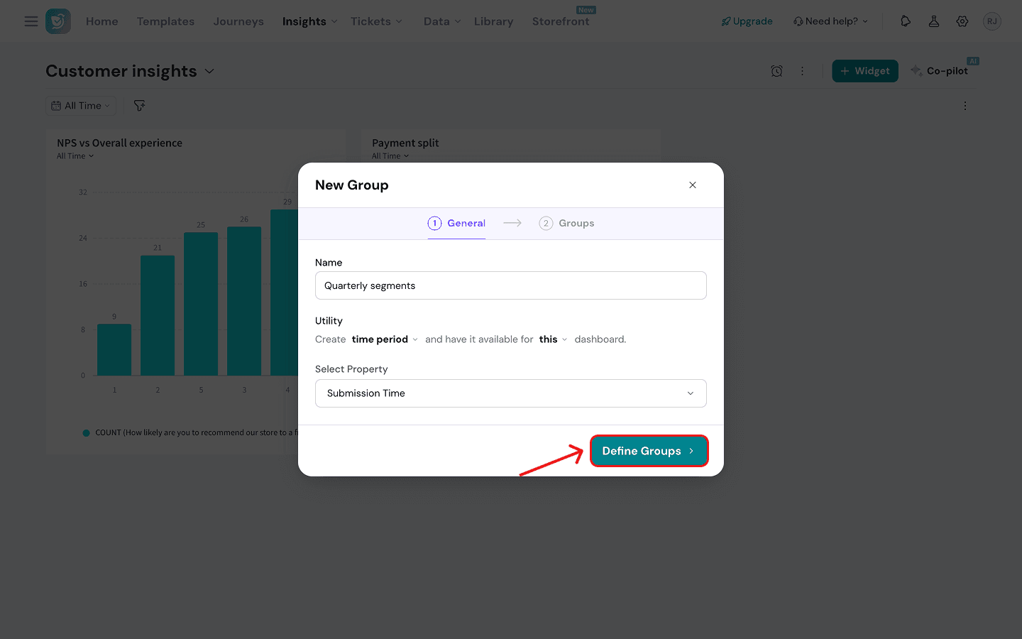
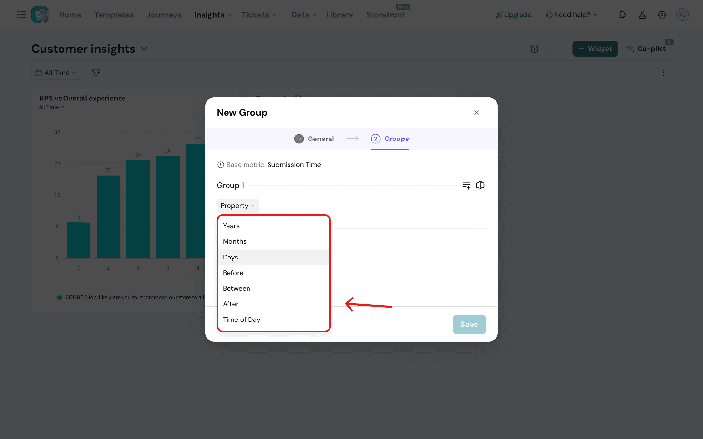
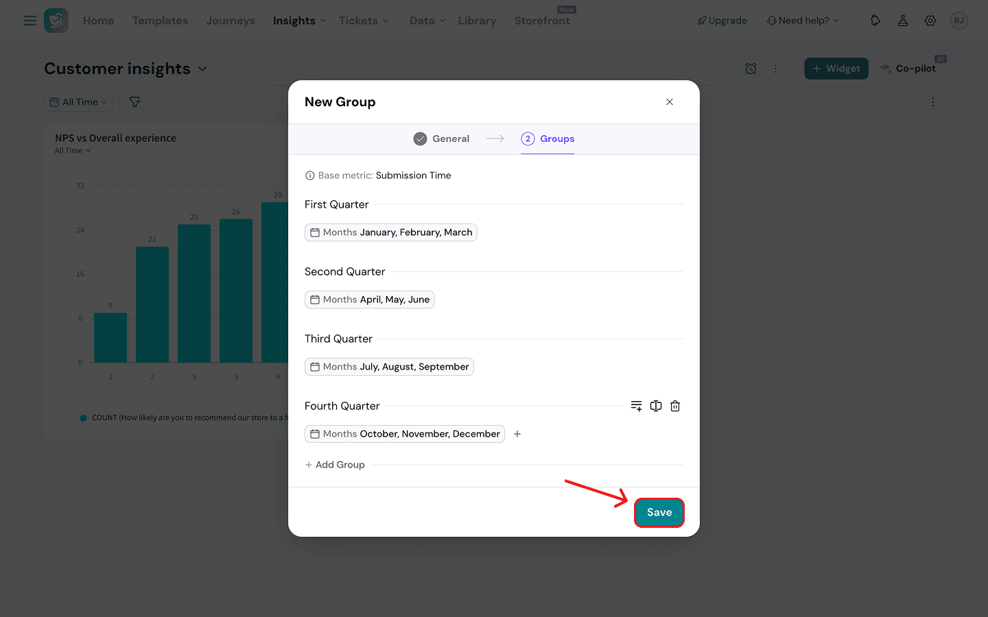
So they first create a time period group with buckets for each quarter. (See the group created above.) They then create a merged question group to combine the responses for both surveys. Then they create a bar chart widget where the merged group is the Y-axis and the data group is the X-axis.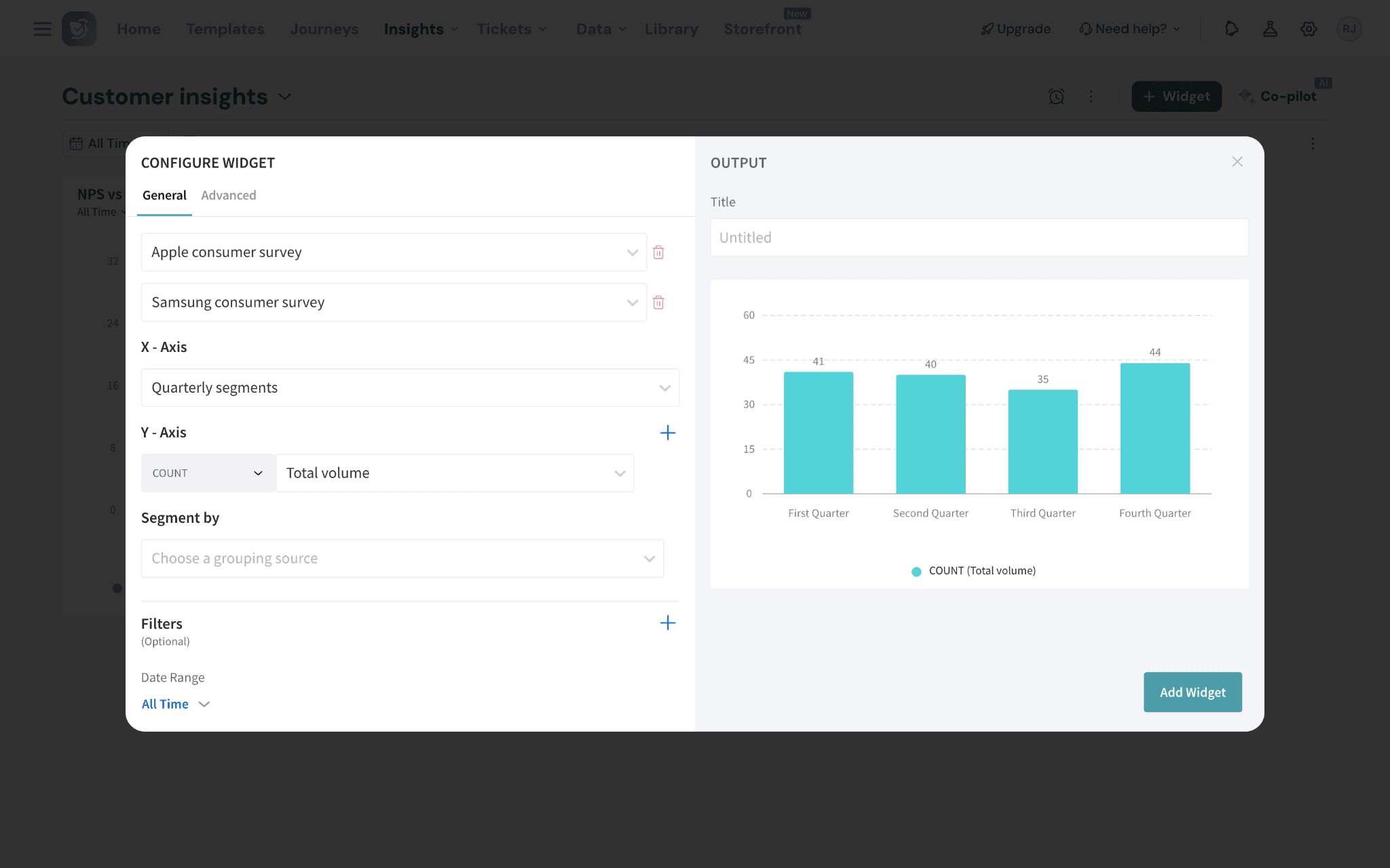
Now you’re all set to use custom groups in your widgets. Now, your data can be shaped to match your needs right inside your dashboard, not in spreadsheets or BI tools. Anyone on your team can build the views they need — without touching the underlying data or waiting for someone else to do it for them.
Feel free to reach out to our community in case you have questions!