Search
Heat Map tables are representations of data grouped along two categories. In SurveySparrow, users can use Heat Map tables to visualize their NPS, CES and CSAT data.
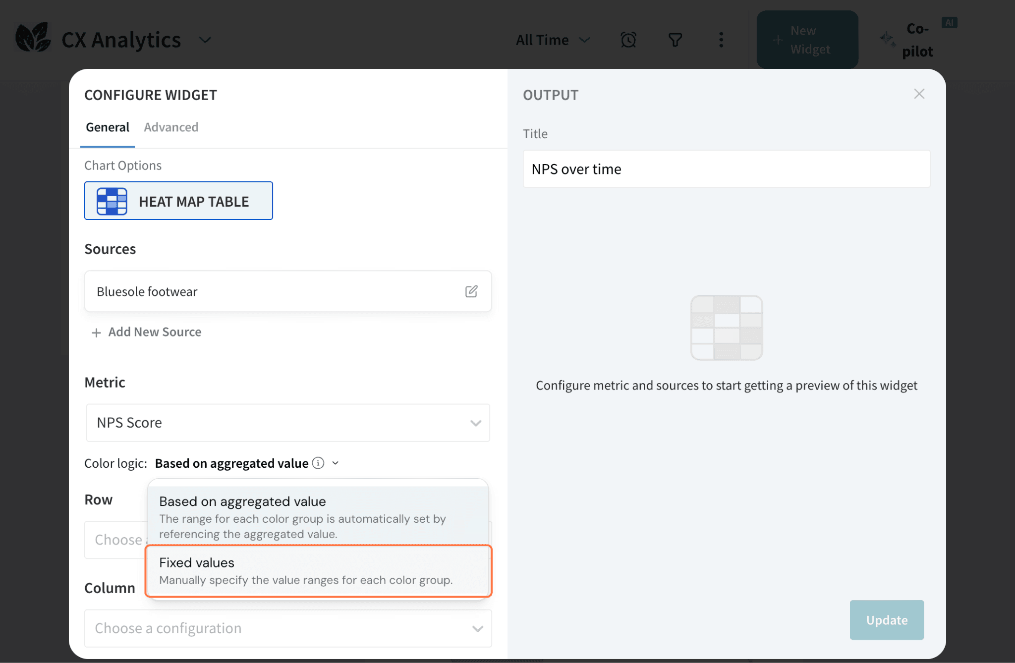
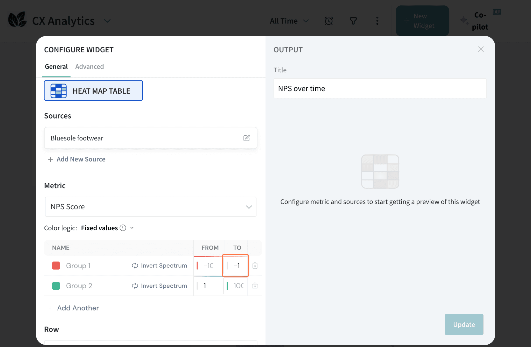
Each cell in a Heat Map table is color-coded in comparison to the overall metric. Viewers can then spot high-performing and underperforming categories quickly, as well as draw comparisons. Data can be drawn from multiple sources to gain a comprehensive understanding.
In this article we'll be covering:
Let’s explore the process of creating a Heat Map table in SurveySparrow.
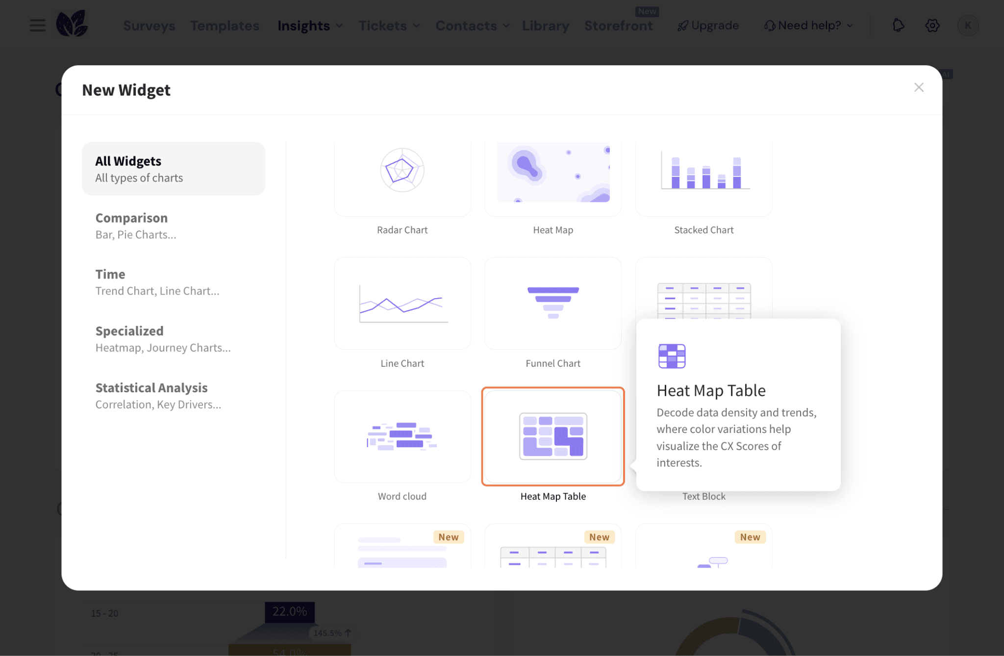
Inside the Executive Dashboard, click New Widget.

Then click By Chart Type to create the widget.

Click on Heatmap Table to proceed configuring it.
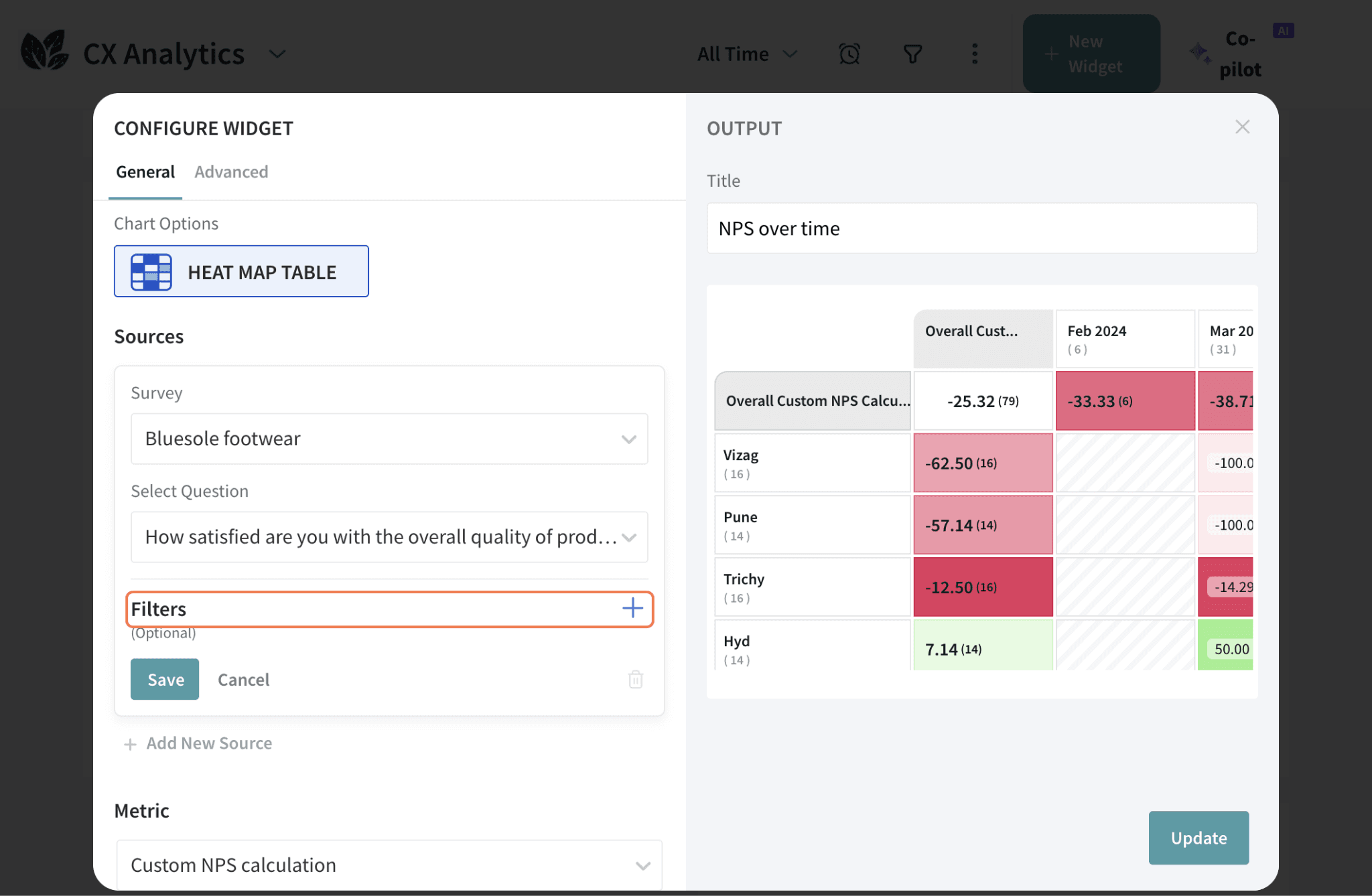
For Source, select a survey and choose a question from the survey.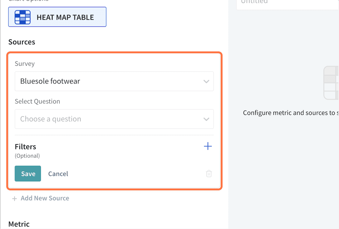
If you wish to filter the response data further, click the + sign to add the filters. You can either select a preset filter, use a custom variable or use AI to create a filter. Hit Save once done.
To add more sources, click Add New Source and repeat the previous steps.
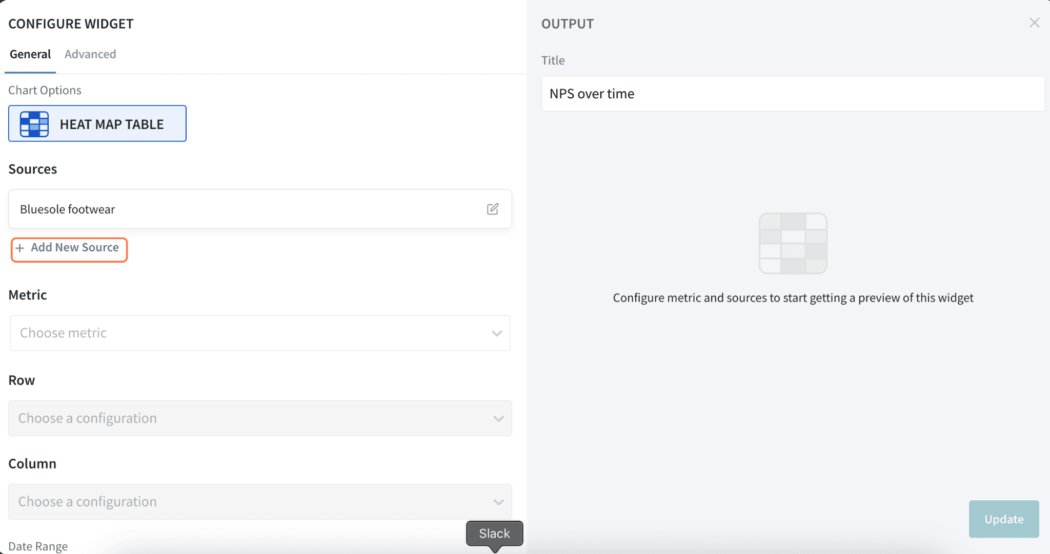
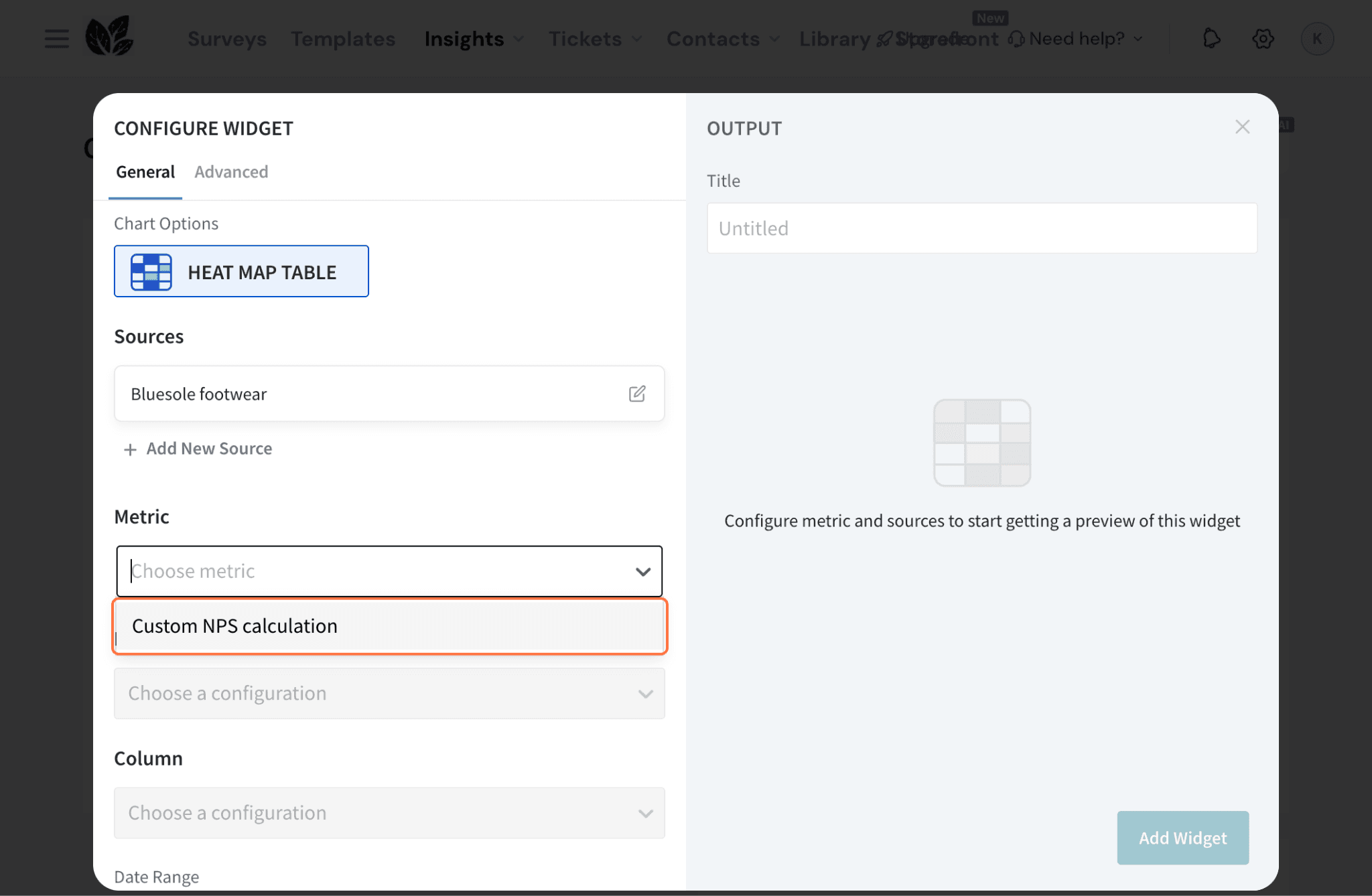
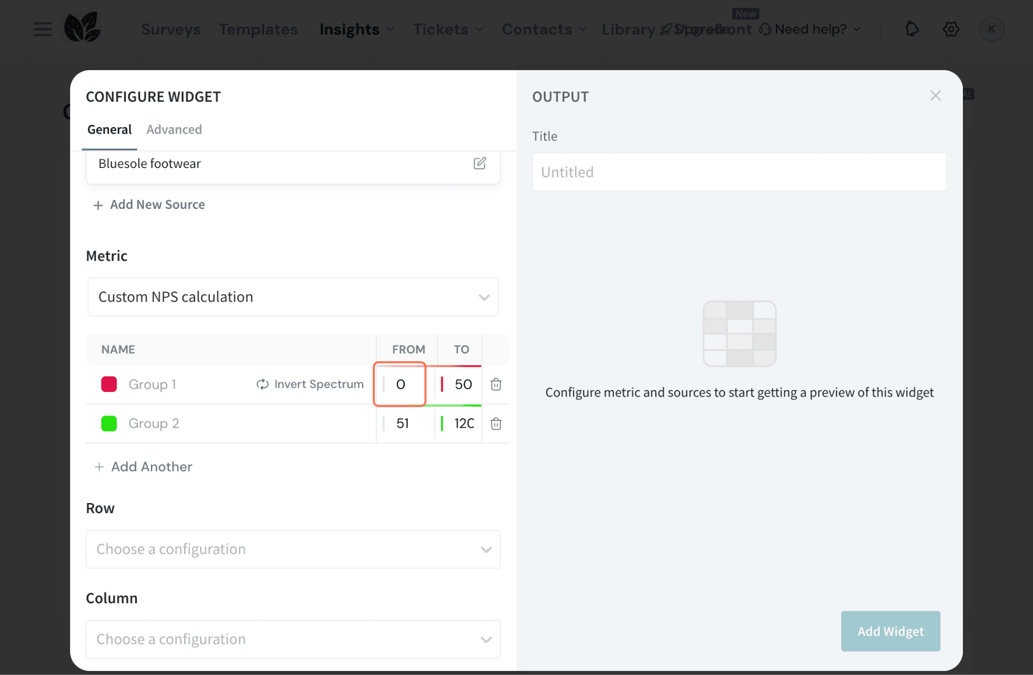
Choose a Metric for the widget. You can select:
In case of choosing a standard metric:
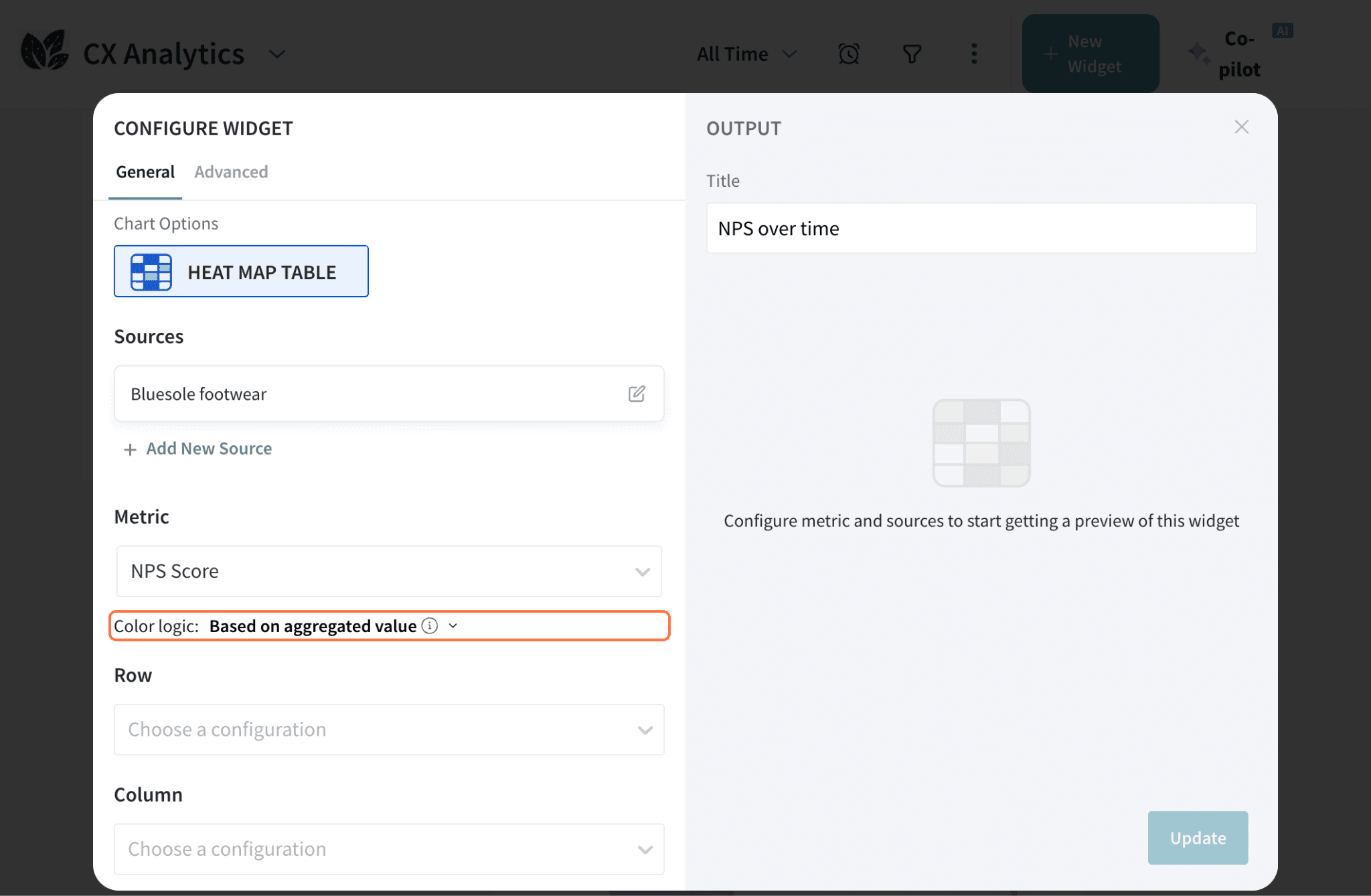
Now, let us explore configuring a custom metric:
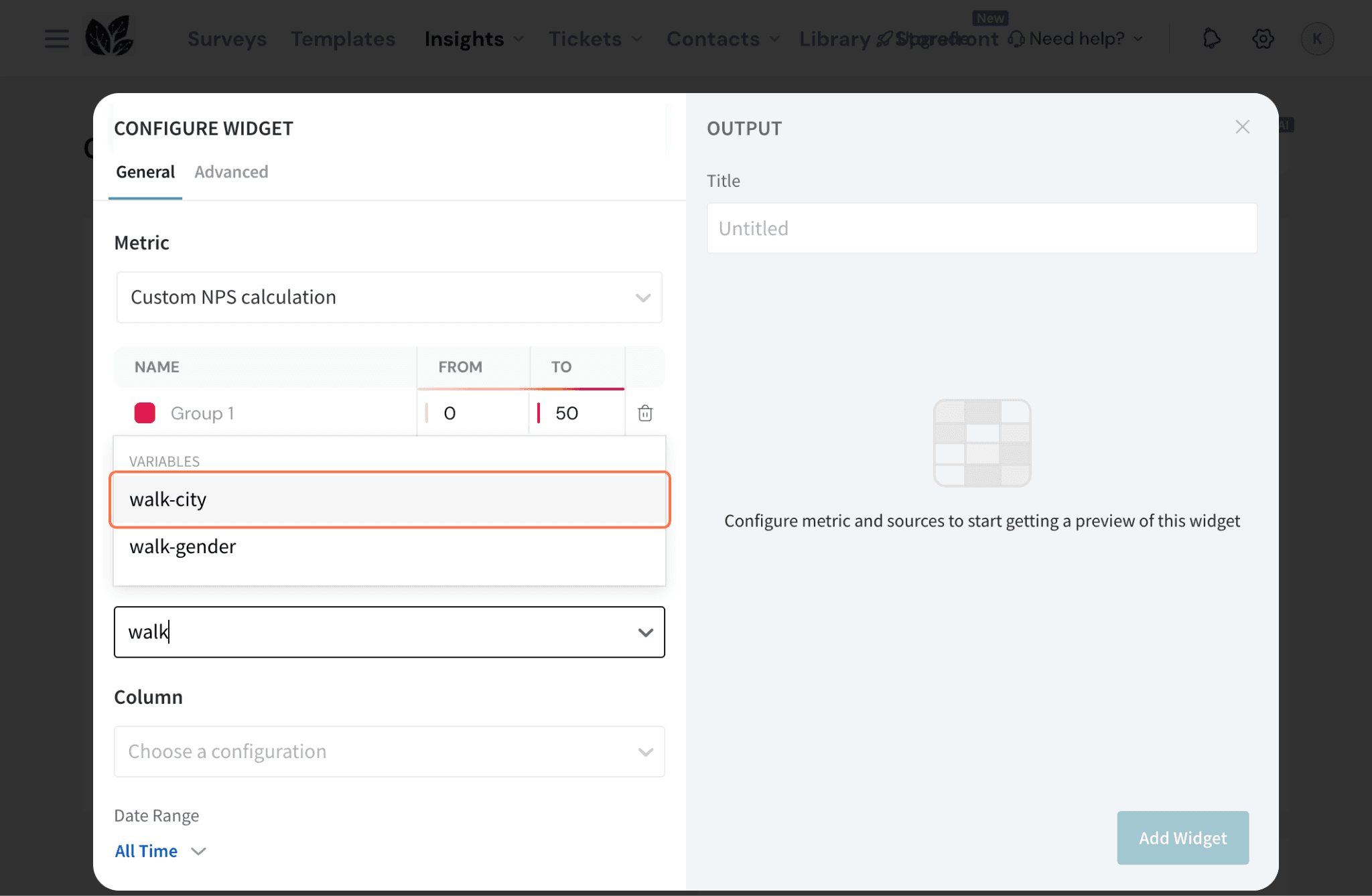
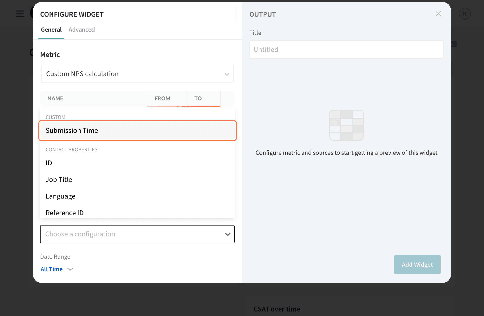
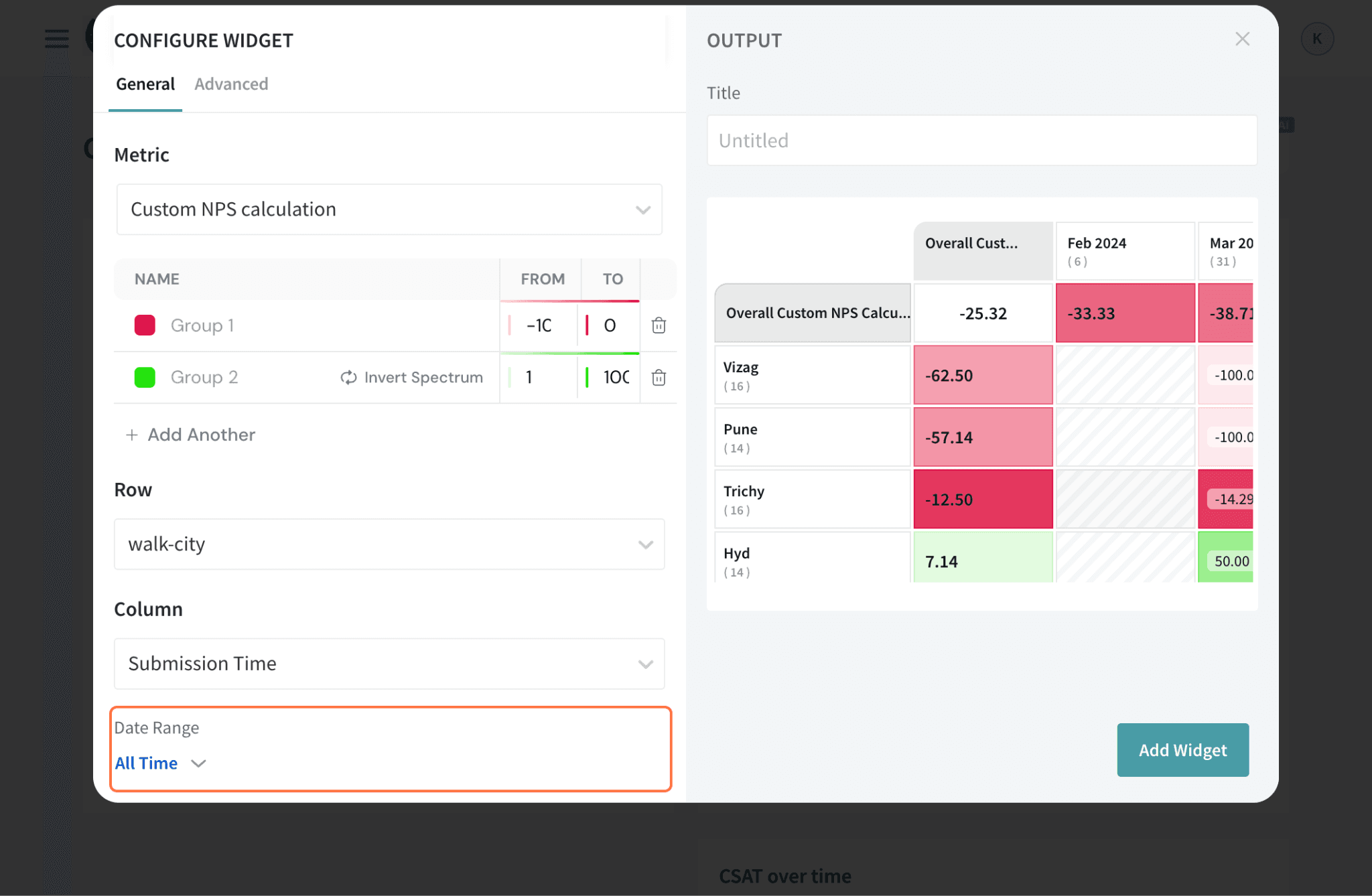
For the Heat Map table’s row, select a data category. You can choose between contact properties, Submission Time, variables or survey questions.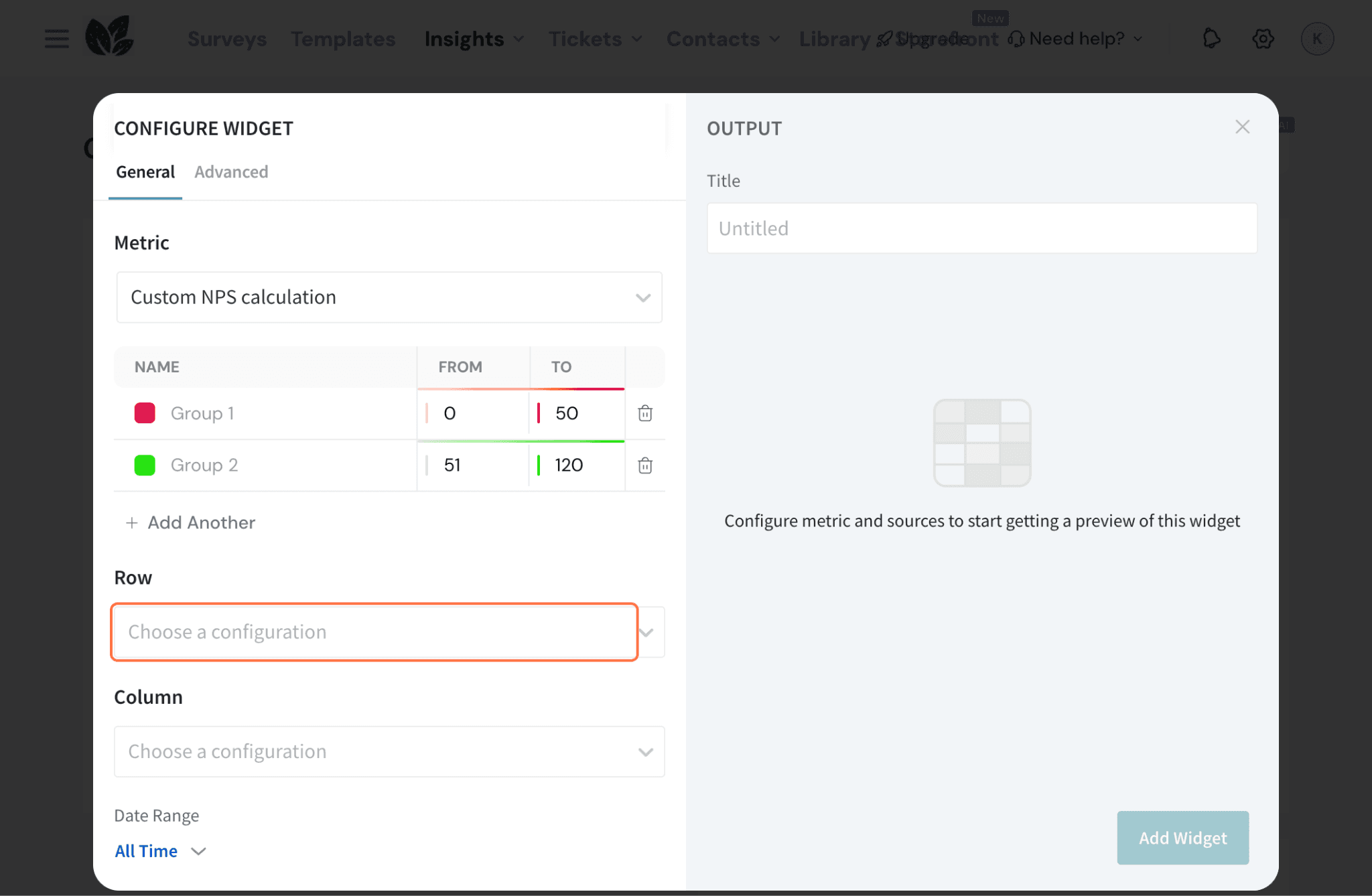
In this case, let’s set the city as the category.
For the Heat Map table’s column, select a data category. You can choose between contact properties, submission time, variables or survey questions. Here, let’s add Submission Time as the category.
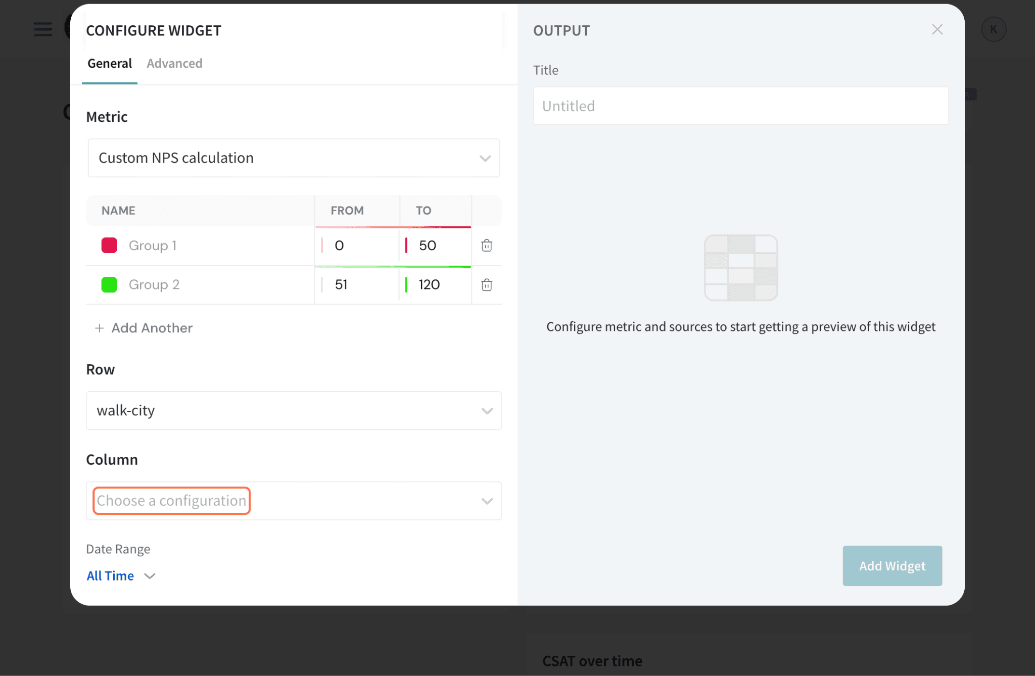
Here, let’s add Submission Time as the category.
To use data from a certain timeframe, click All Time under Date Range. Choose from the pre-set options or create a custom timeframe.
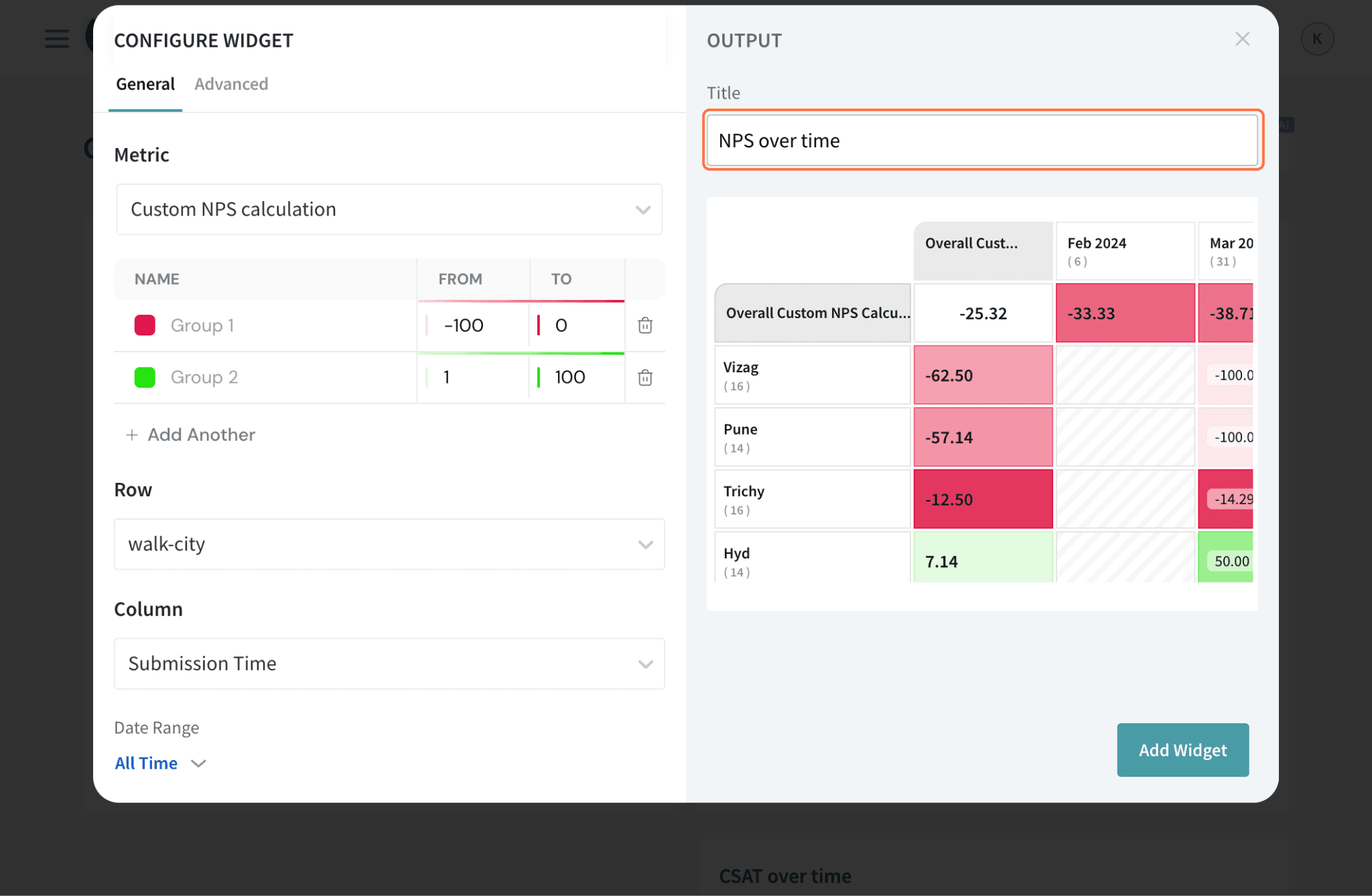
Type in the name of the widget in the Title box.
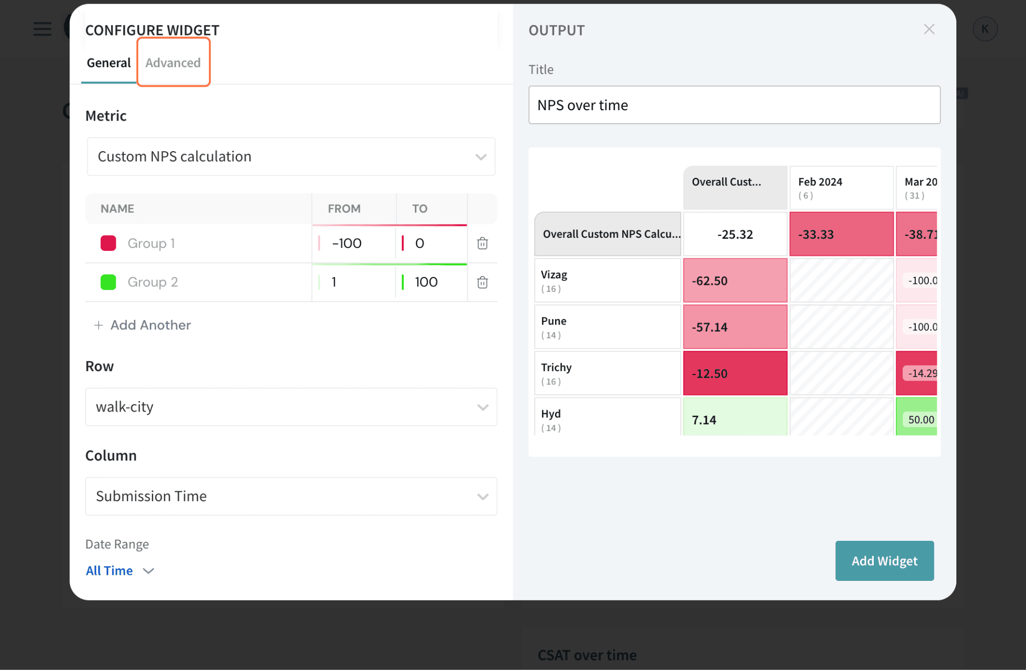
Go to the “Advanced” tab.
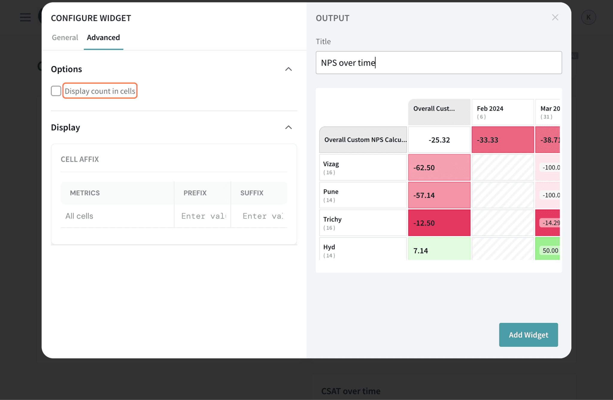
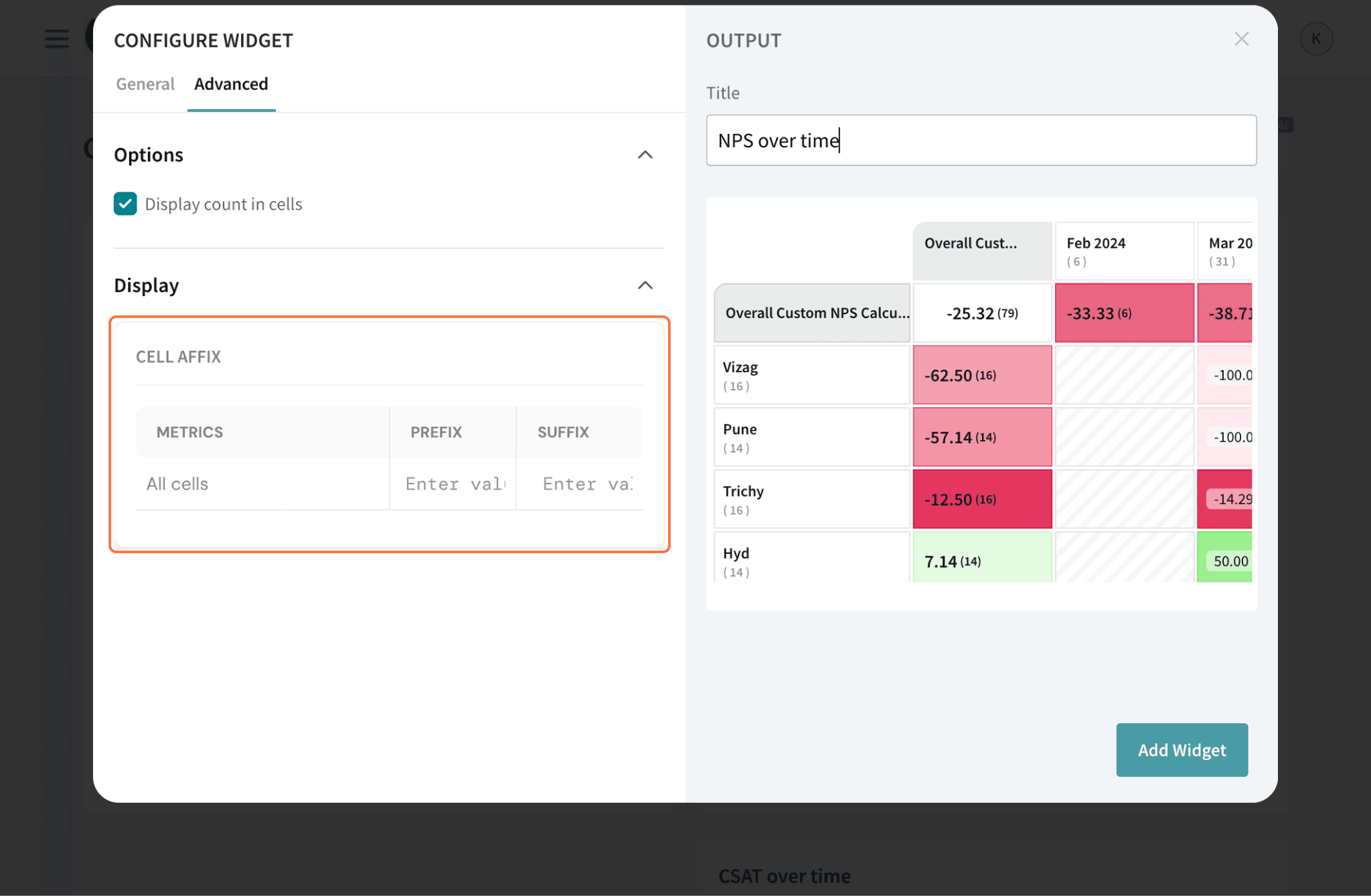
You can choose to Display count in cells if you choose to give the additional context in the Heatmap Table.
You can also add prefix and suffix to your table, depending on your metrics.
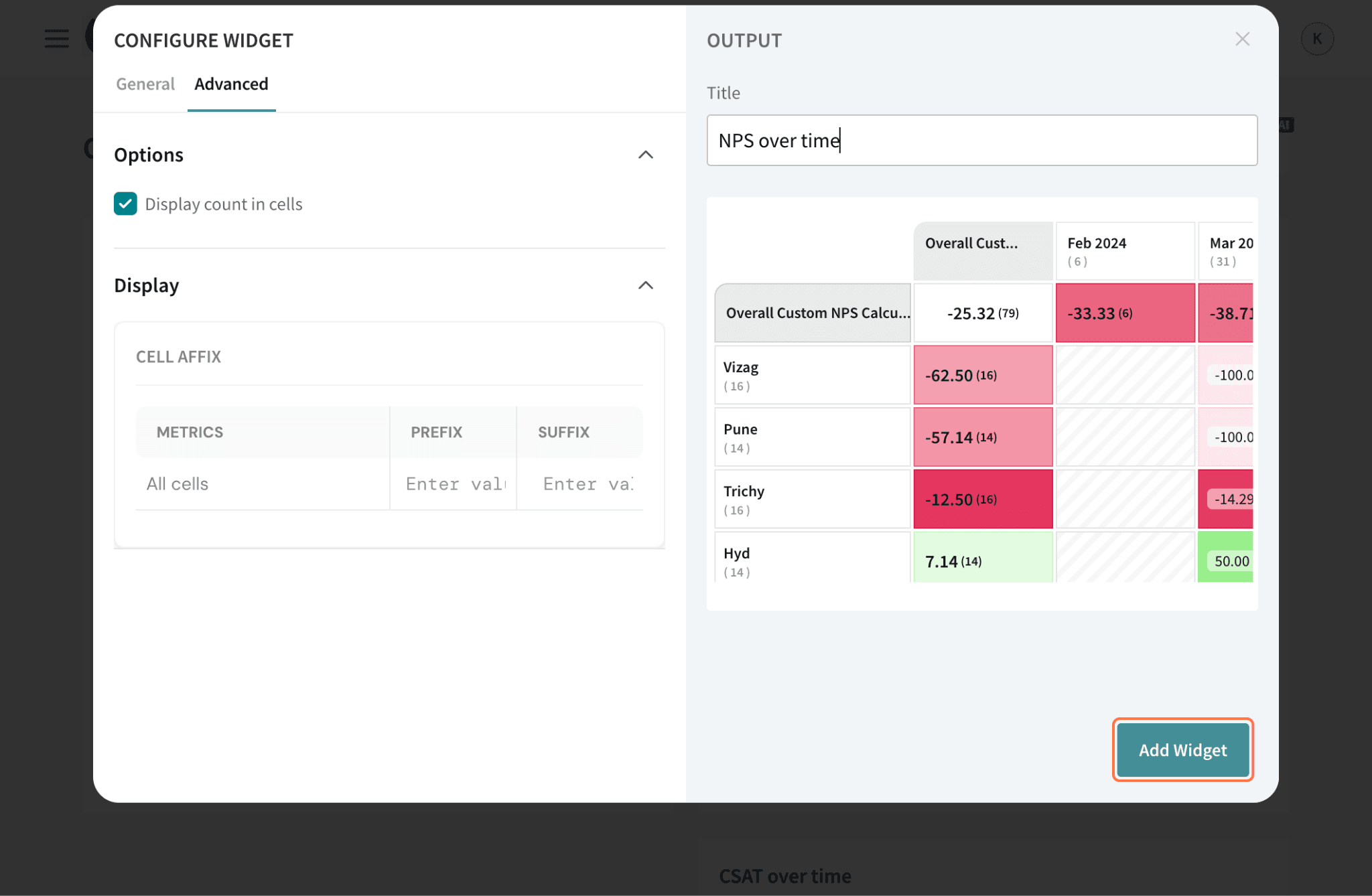
Once you are done, click Add Widget.
Now, you can proceed analyzing the Heat Map table!
Within the widget, there is a row and a column which show overall values for each of the row/column categories.
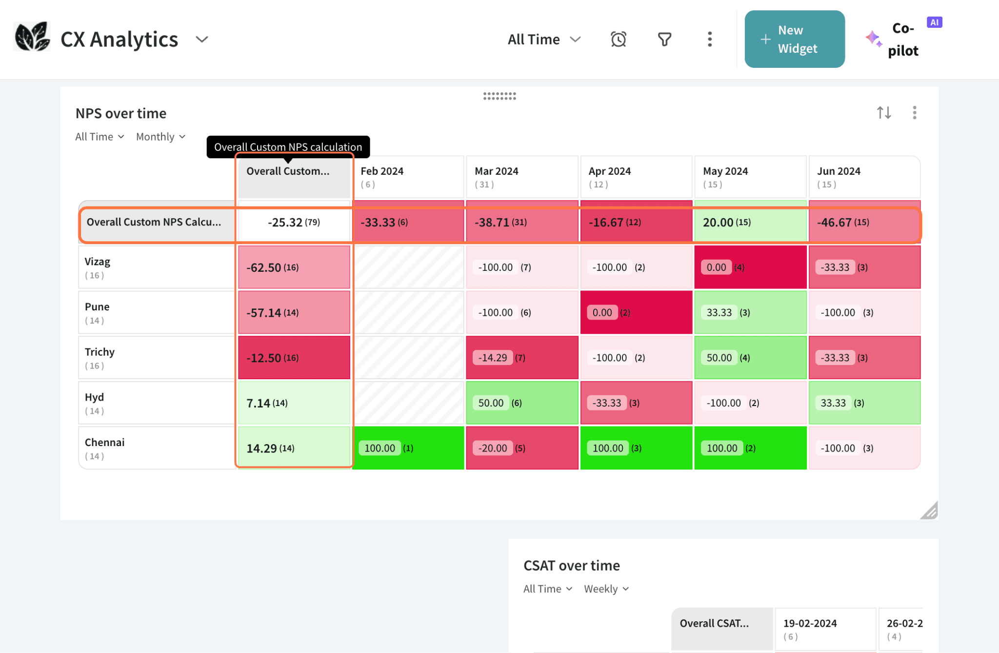
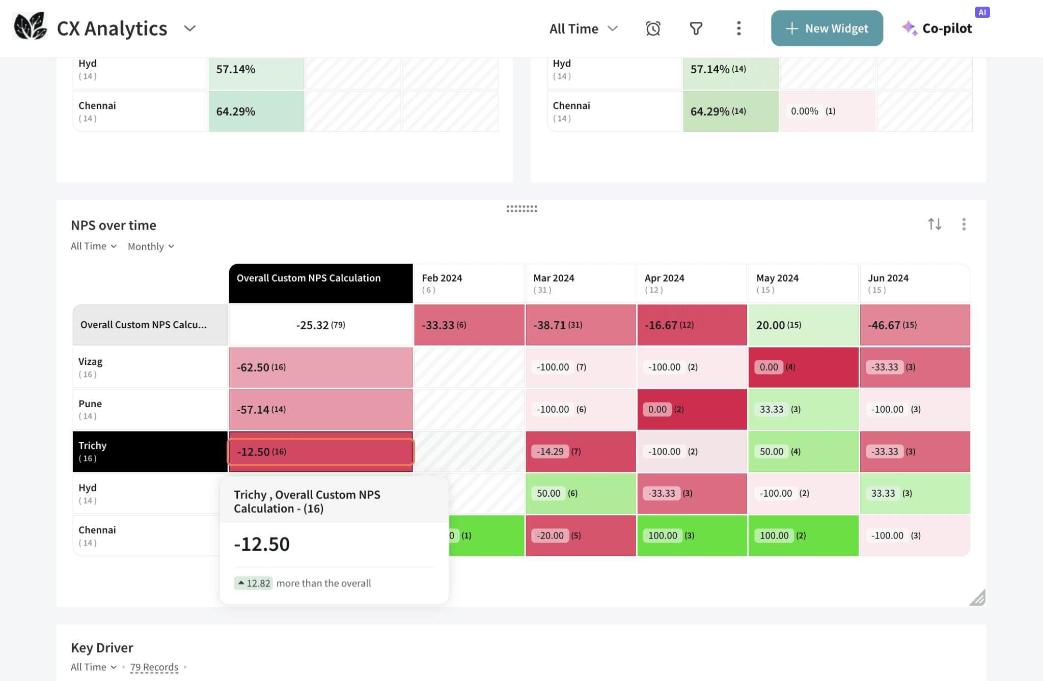
If you would like to compare any specific row/column against the overall values, click the row/column head to highlight it. To remove the highlight, click the head again.
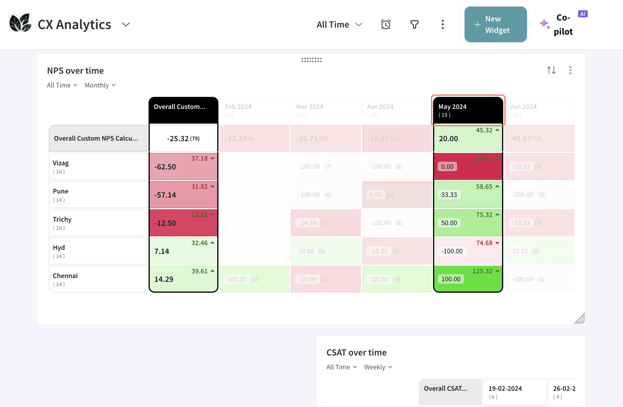
To inspect a cell, hover over it. You will also see the difference in points between the cell value and the overall metric, which sits in the top left cell.
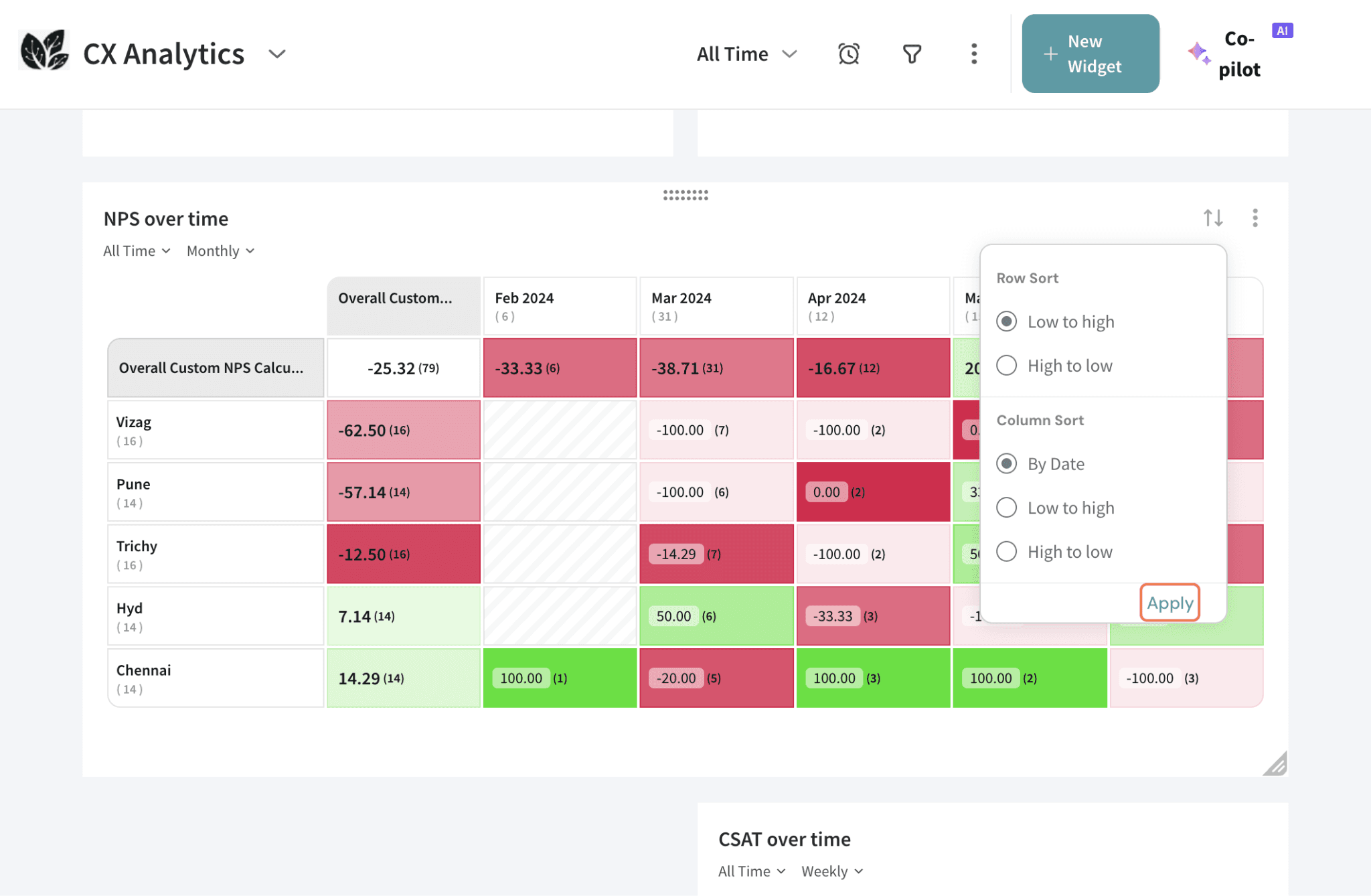
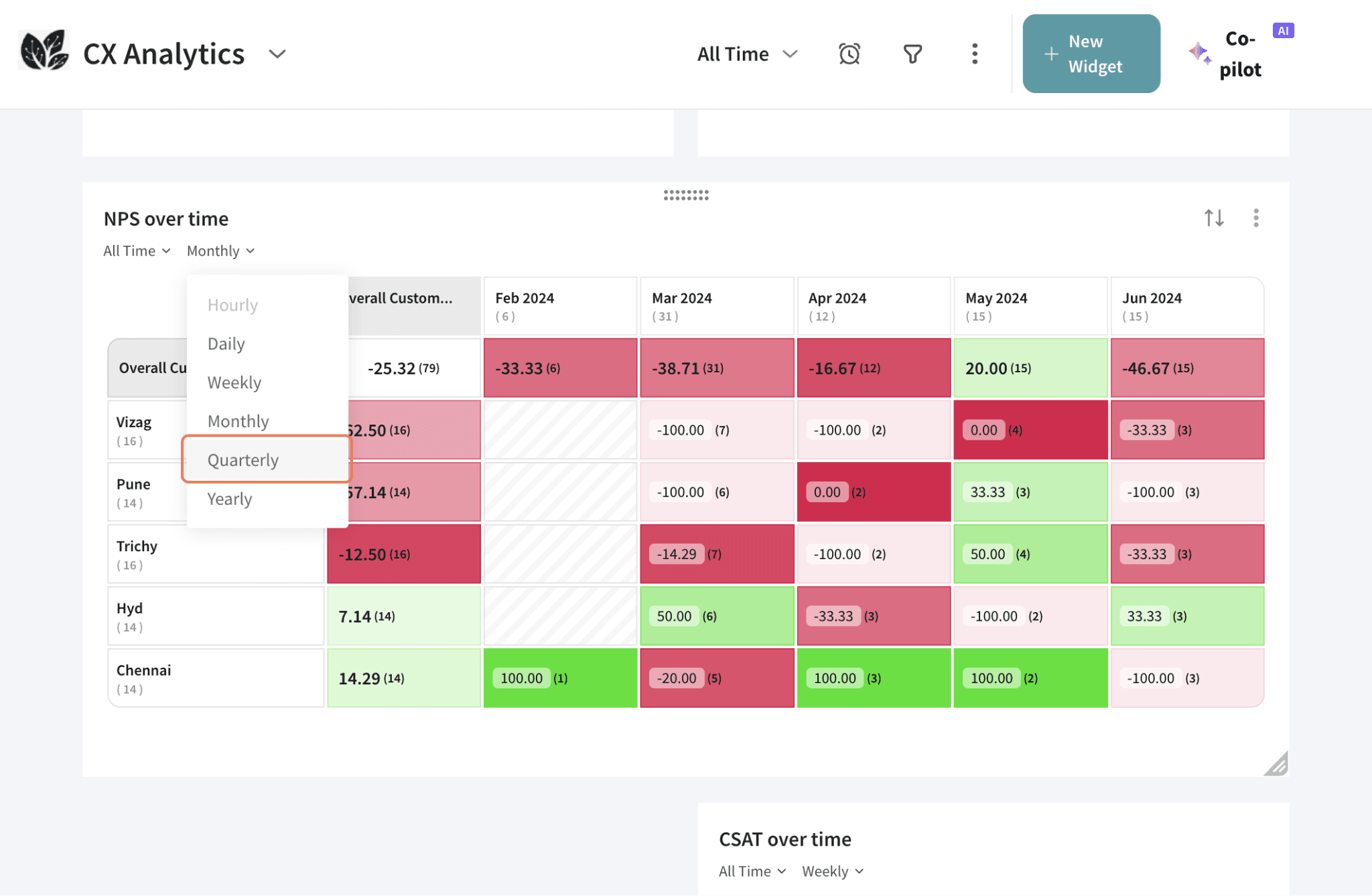
If you would like to change the sorting of data, click the icon highlighted as shown below.

You can sort the data across rows and columns, from high to low or vice versa. If you have used “Submission Time” as a data category, you will get the option to sort “By Date”.
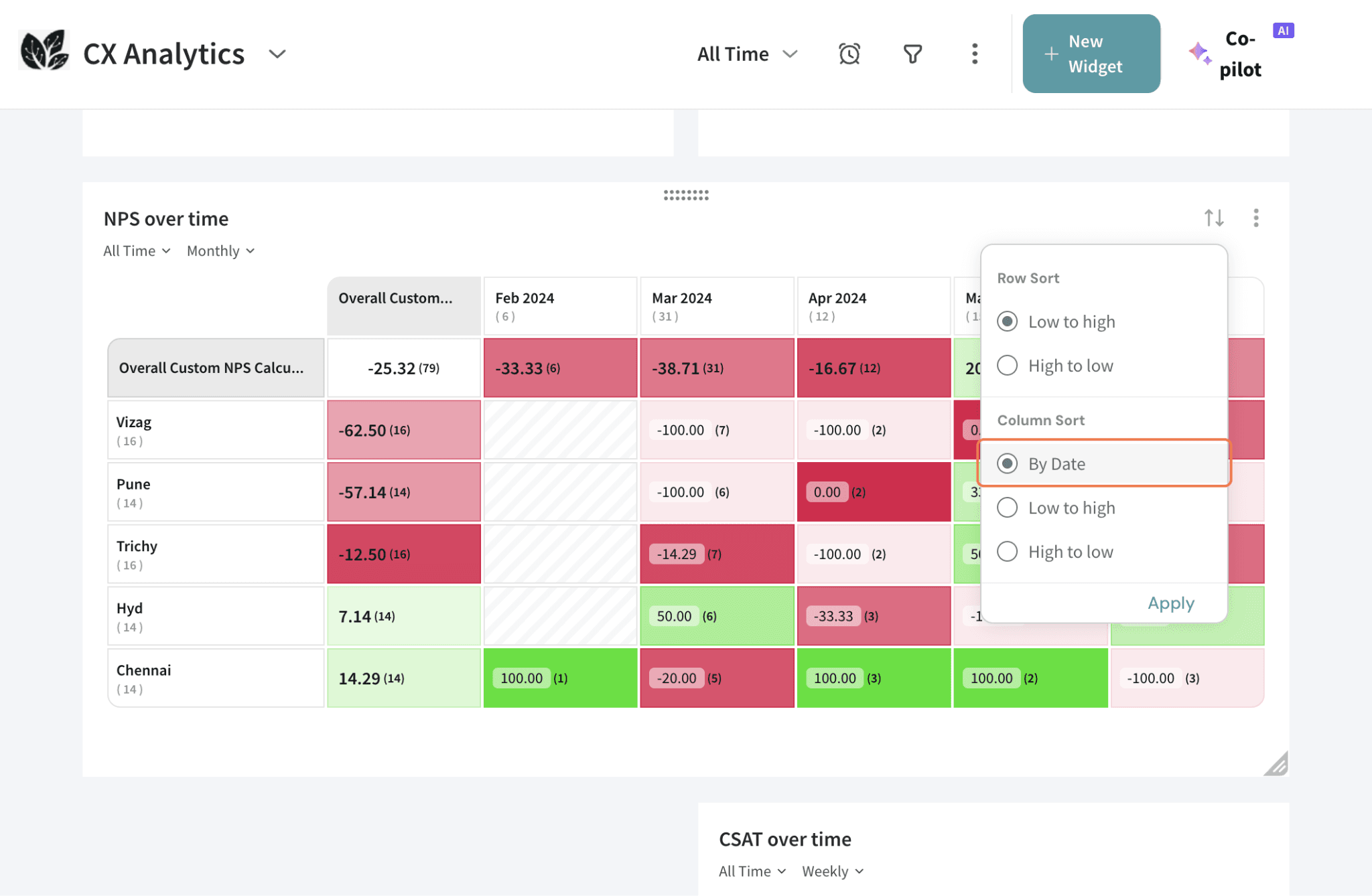
Once you have selected the sorting arrangements, click Apply.
You can choose a timeframe from the pre-set options or create a custom timeframe.
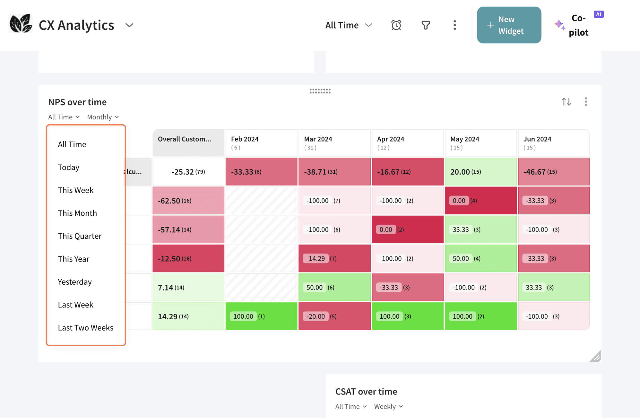
If you have used “Submission Time” as a data category, you will get this extra filter to apply to the table directly.
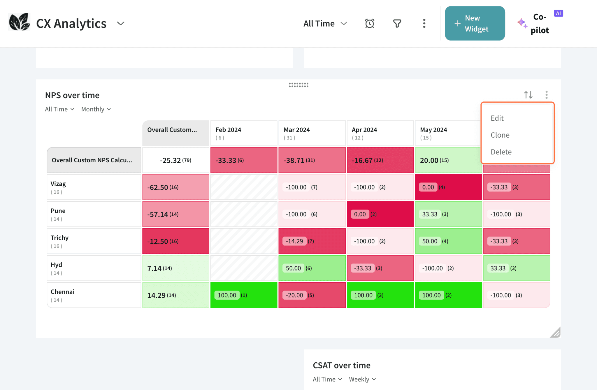
If you would like to make extensive changes, click on the three dots in the top right corner.

You can change the widget configuration by clicking Edit, or clone or delete the widget.
For large datasets, a heat map table is a great way to present it - since you can quickly identify notable aspects of the data within a glance. Other stakeholders can also view these metrics in relation to the overall metrics, to understand the degree of deviation.
Feel free to reach out to our community if you have any questions.
Powered By SparrowDesk