Search
To create a bell curve chart for the employees we need to calculate the mean, standard deviation and normal distribution.
Let’s create a bell curve chart for the following data.
Employee
Overall Score
Richard
4.5
Sam
3.3
John
2.8
Leo
4.6
Royce
4.3
Step 1: Calculate the Mean for all the values in the overall score column.
Mean = 3.9
Step 2: Calculate the standard deviation for all the values in the overall score column.
Standard deviation = STDEV.P(overall_score)
Standard Deviation = 0.71
Step 3: Based on the mean and standard deviation values, we have to define the distribution range.
Distribution Range
Data
(Mean-(3*S.D))
1.7450058
(Mean-(2*S.D))
2.4633372
(Mean-(1*S.D))
3.1816686
Mean
3.9
(Mean+(1*S.D))
4.6183314
(Mean+(2*S.D))
5.336628
(Mean+(3*S.D))
6.0529942
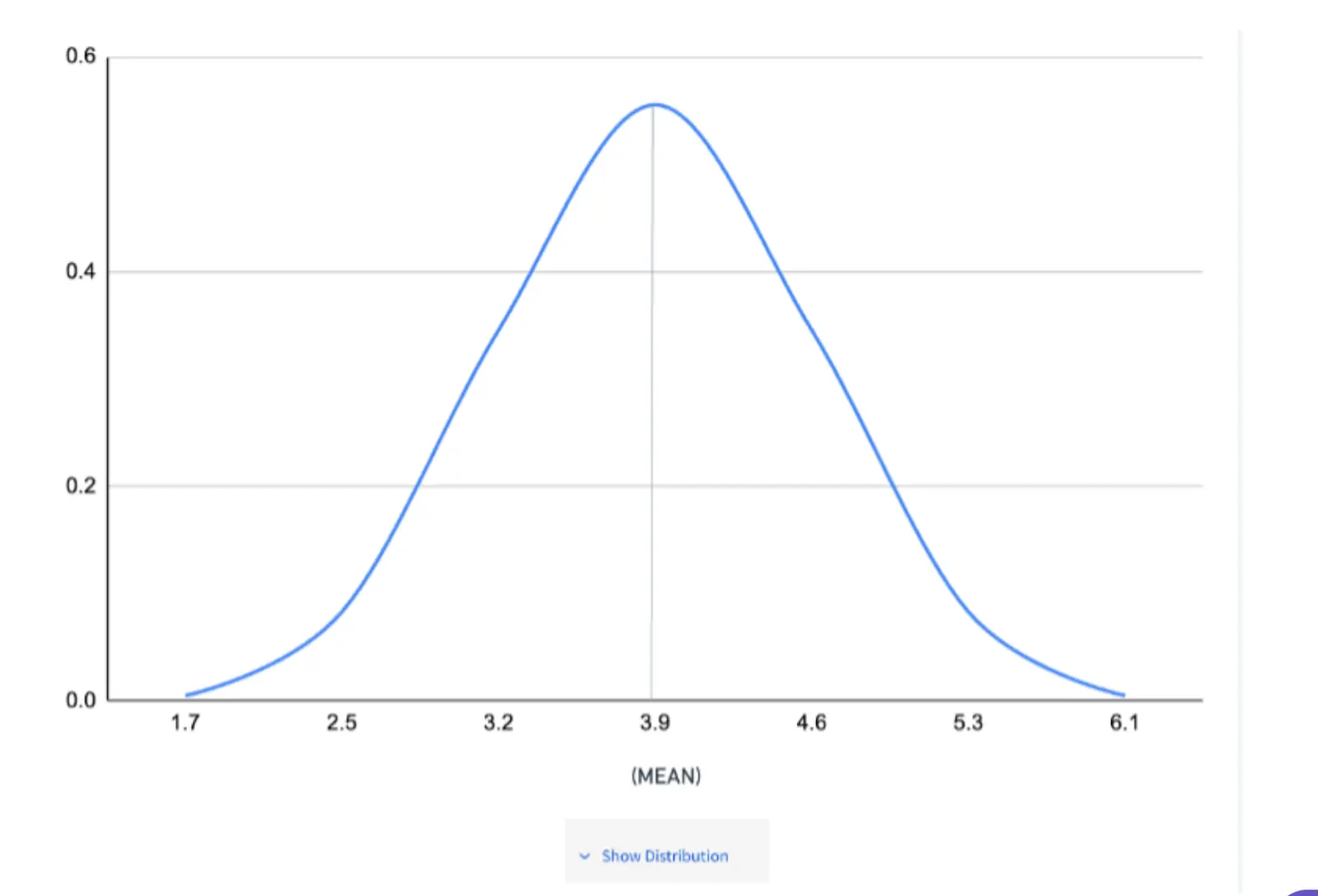
Step 4: Calculate the normal distribution for each value in the range.
Function in Google Sheet: Value =NORM.DIST(Distribution range, Mean, Standard_deviation,FALSE)
Range
Normal Distribution
1.7
0.006169643166
2.5
0.07516164061
3.2
0.3368511032
3.9
0.5553735789
4.6
0.3368511032
5.3
0.07516164061
6.1
0.006169643166
Step 5: Construct a bell-curve chart based on the values in the range and normal distribution.
The bell curve chart is available in
Now Let's see some FAQ's :
The bell curve will not be shown as the standard deviation becomes zero.
The bell curve is constructed based on comparing the values so more than one subject has to be part of the assessment to visualize the chart.
As mentioned above, the x-axis on the bell curve is plotted based on the standard deviation values, so the values could be more or less than the rating scale.
Score distribution shows the number of employees whose scores are present in the given range of values.
5) Sometimes, the distribution is above or below the rating scale; does that mean the employees have scored more than the rating scale?
No, we’re just showing the number of employees who fall within the given range, and they will not have a score above or below the rating scale.
Powered By SparrowDesk