
Search
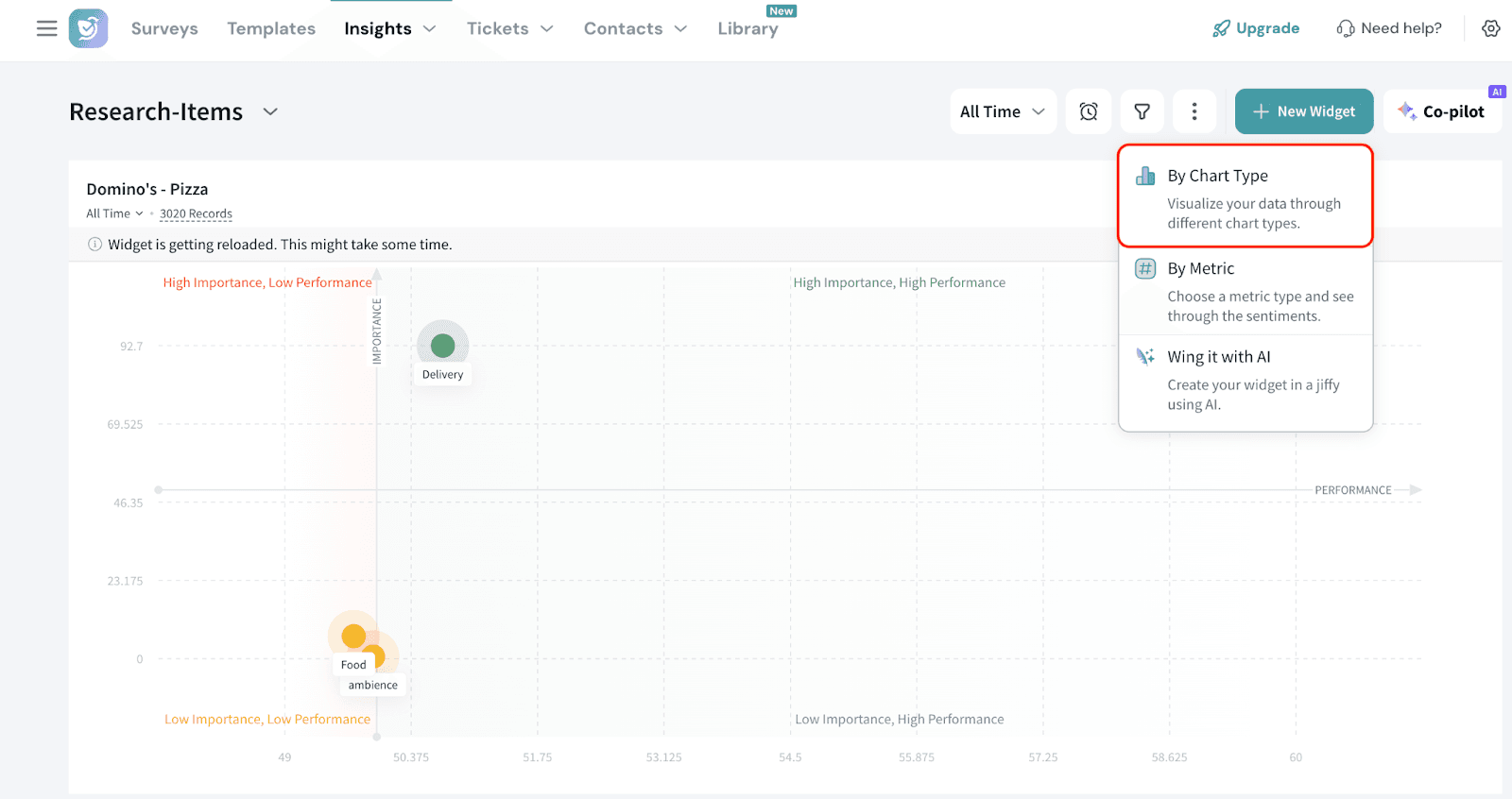
The Key Drivers provides a data-driven way to identify drivers of the outcome metric. It also helps understand how these drivers collectively influence a single outcome such as customer satisfaction, Overall Rating, NPS, CSAT, CES, or effort score. Using advanced regression-based statistical techniques, it evaluates all potential drivers together rather than individually. This approach reveals both the strength of each driver’s impact (importance) and your current performance on them, giving a clear, holistic view of what truly affects the outcome.
With these insights, you can prioritize which areas to improve, maintain, or adjust focusing your efforts on the factors that have the greatest effect on customer experience and loyalty.
What It does?
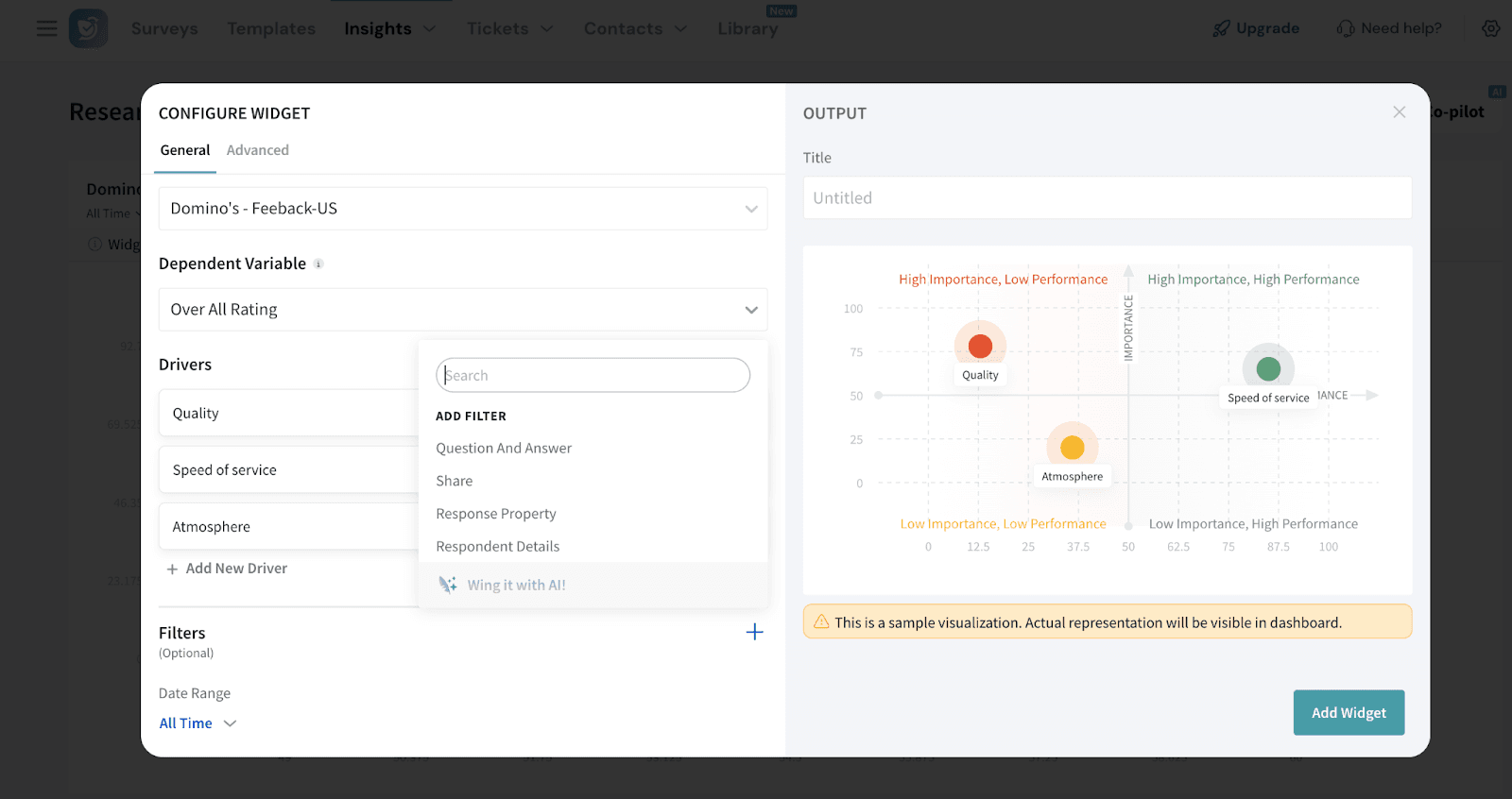
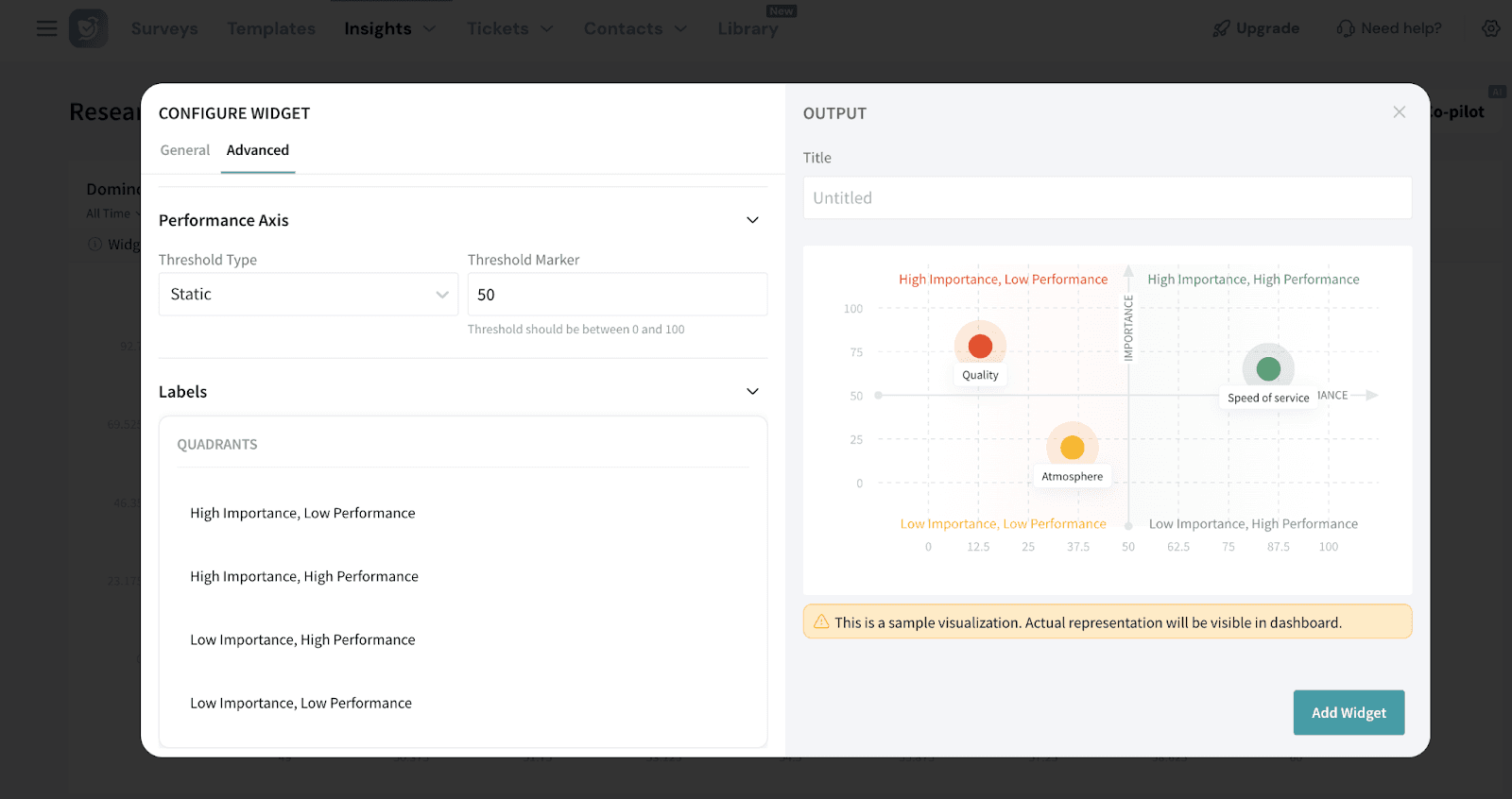
Visualizes each driver on a quadrant chart showing:a)Importance (Y-axis): Output of the RIA regression model (0 to 100)b)Performance (X-axis): Calculated using weighted average, converted to a 0–100% scale.
This helps identify:
Let’s look at an example to better understand.
A restaurant chain wants to improve its overall rating based on customer feedback collected after each visit. While they track several aspects of the dining experience like atmosphere, food quality, and speed of service, they’re not sure which of these has the greatest influence on how guests rate their experience.
Using the Key Driver Widget, they can:
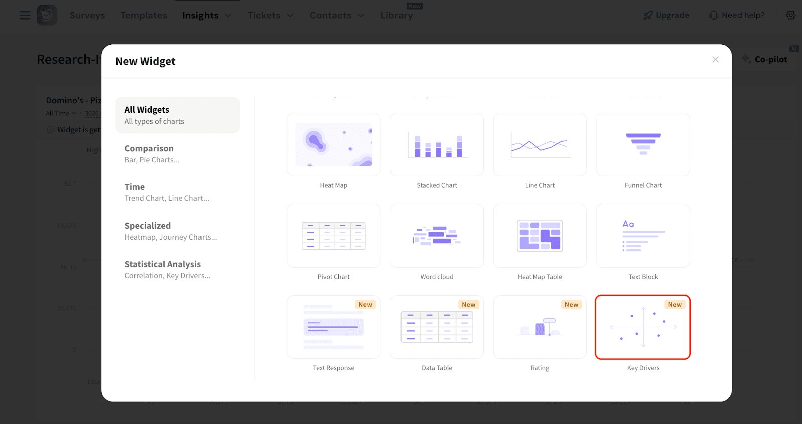
Let’s see how to create a Key Driver widget.
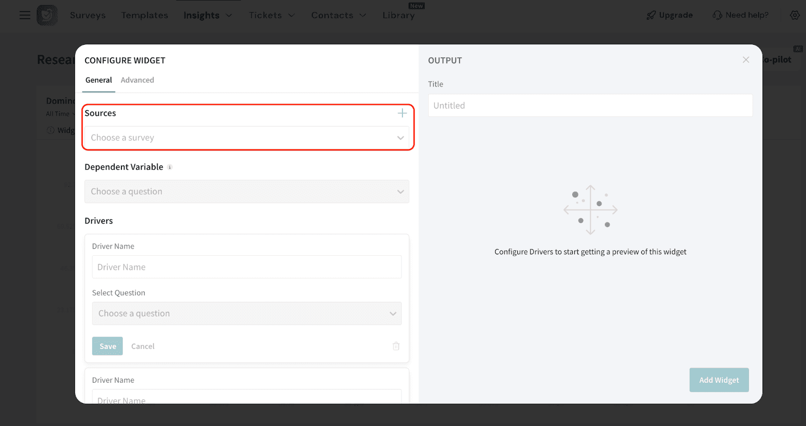
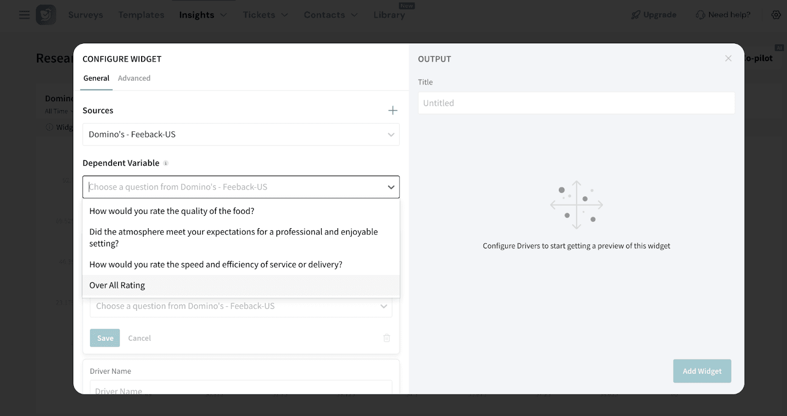
5. Choose the dependent variable: The dependent variable is the outcome or result you want to understand and improve. It’s the main metric that the Key Driver Widget will analyze.
Note: You will be able to add up to 15 drivers.
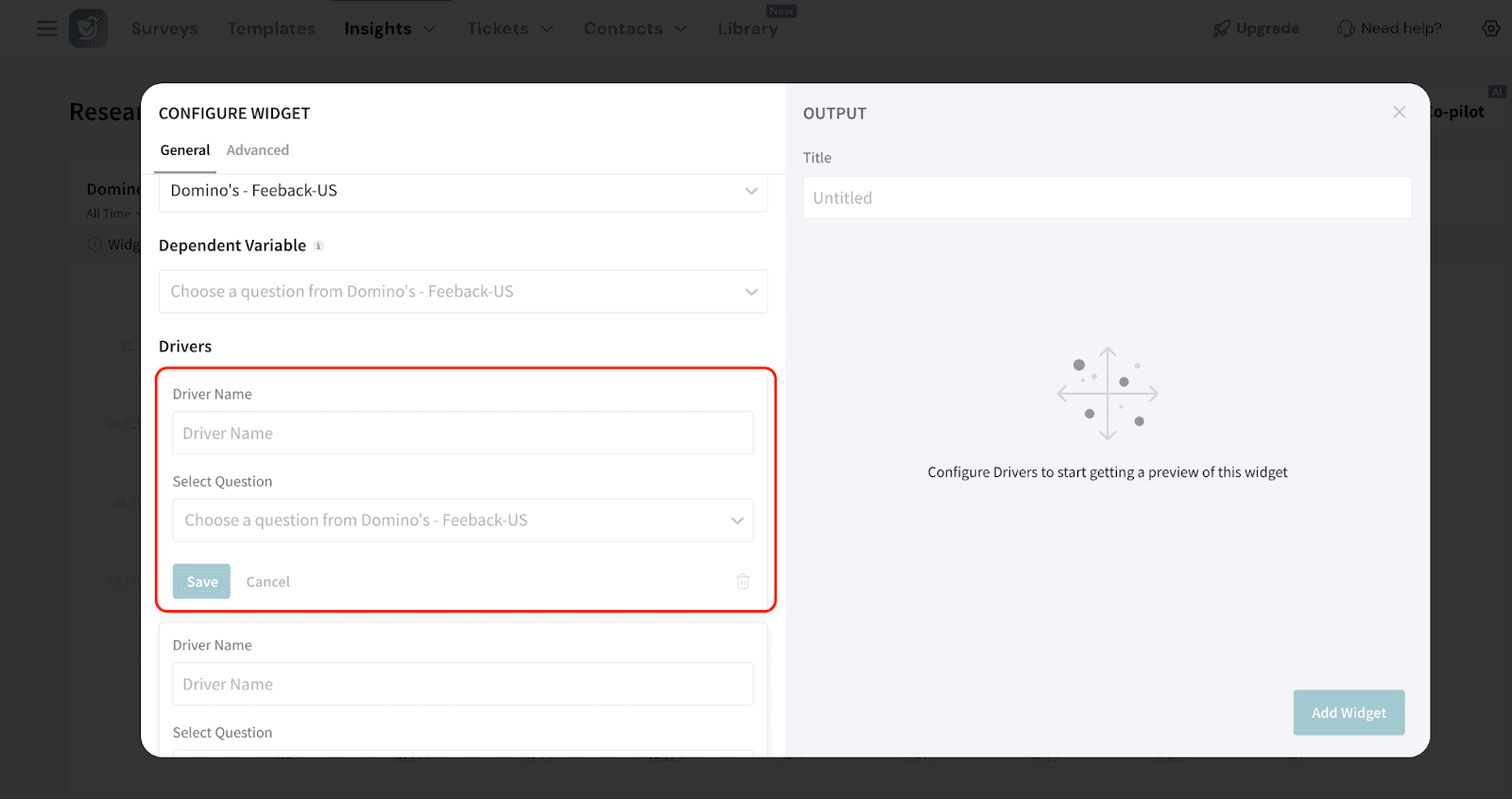
7. If you wish to filter the response data further, click the ‘+’ sign to add the filters. You can either select a preset filter, use a custom variable or use AI to create a filter.
8. You can also select the Date Range.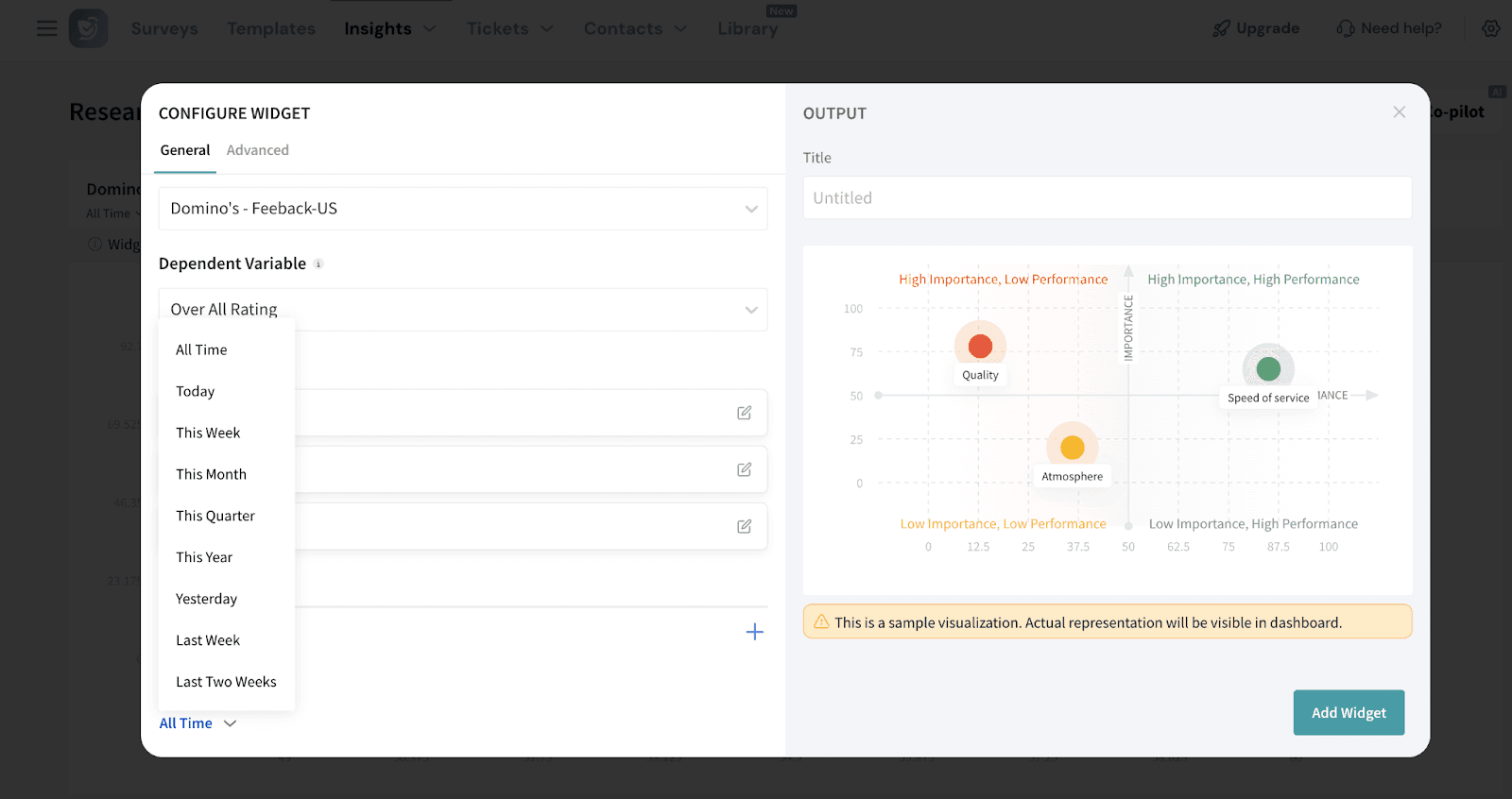
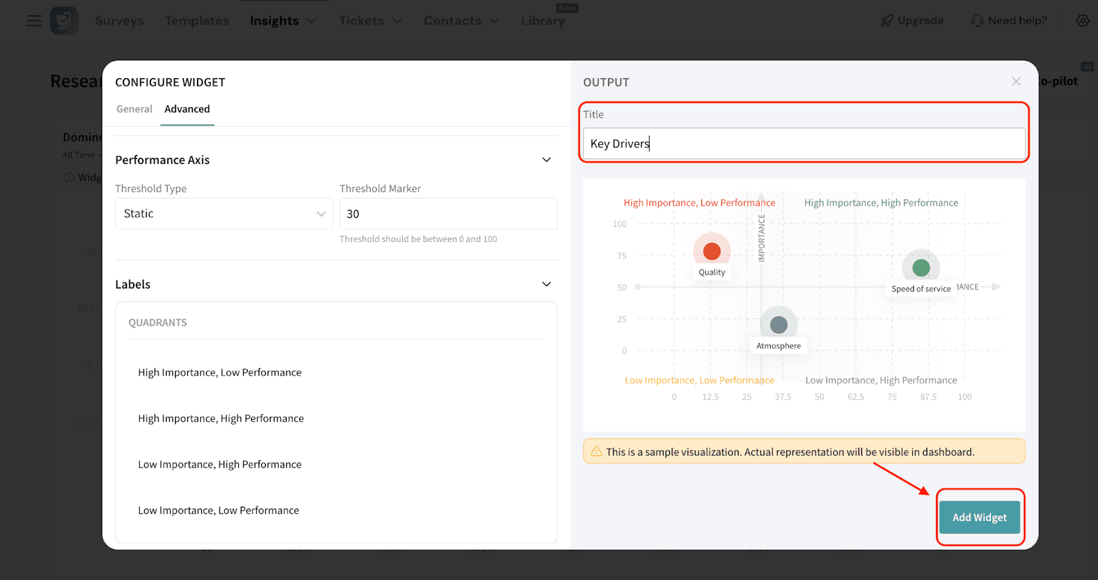
Advanced Configuration

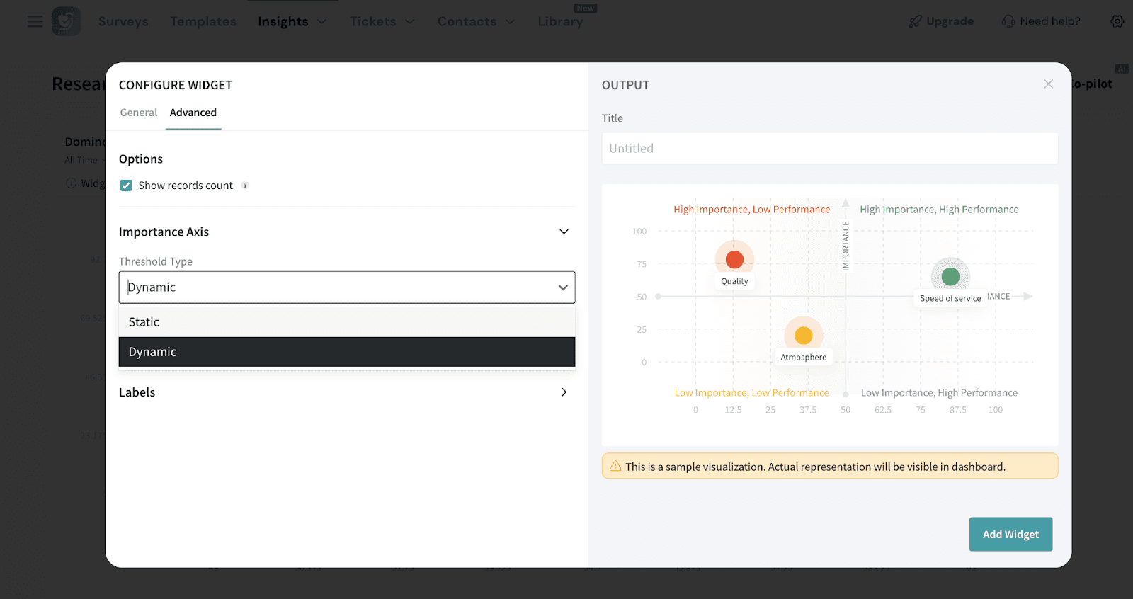
Note: By default, the importance axis is set to static, but you can switch to dynamic and define your own threshold.
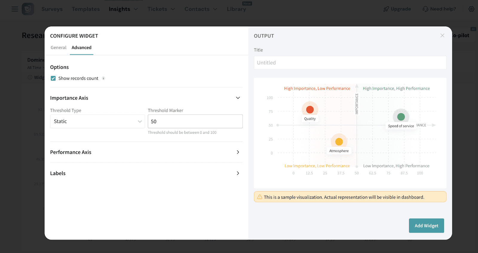
You can configure its threshold as follows:
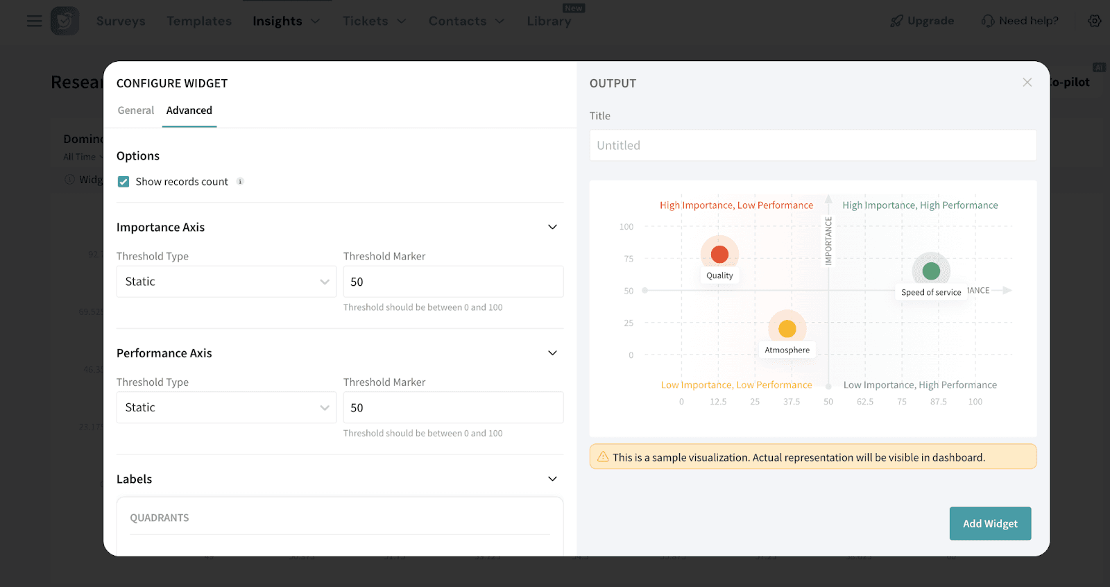
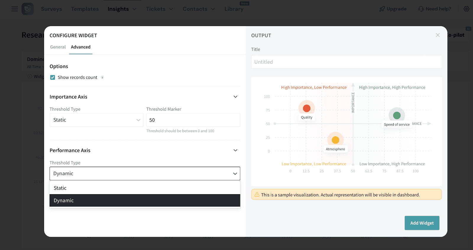
Note: By default, the performance axis is set to dynamic, but you can switch to static and define a custom threshold if needed.
5. Once done, add the title for the widget and click Add Widget. The widget will be displayed on your dashboard. You can move and resize the widget to your liking.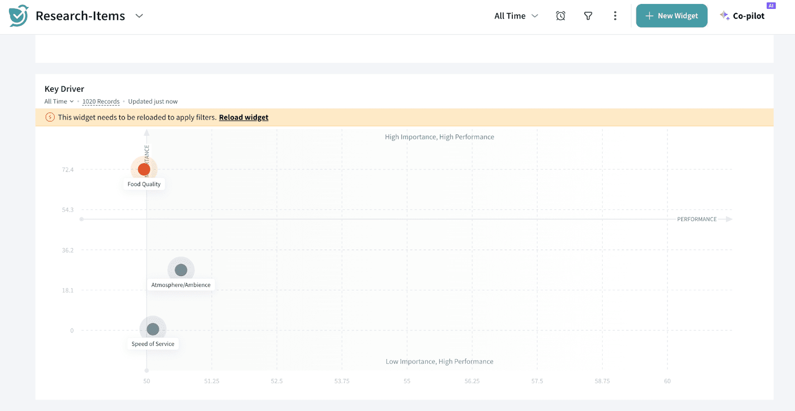
Note: The Key Driver Widget does not update in real time. If you apply filters at the dashboard level, you will need to manually refresh the widget for the changes to reflect.
If a new filter is applied while the widget is still recalculating, you can cancel the ongoing recalculation and restart it with the updated filter.
Filters cannot be applied to the Key Driver Widget by users with view-only access.
Performance Calculation.
Let’s take an example to understand the calculation.
A restaurant chain wants to understand their performance on the Speed of Service metric, based on customer ratings collected after each visit.
Customers rate service speed on a scale from 1 (poor) to 5 (excellent).
Here’s the distribution of ratings from 100 customers:
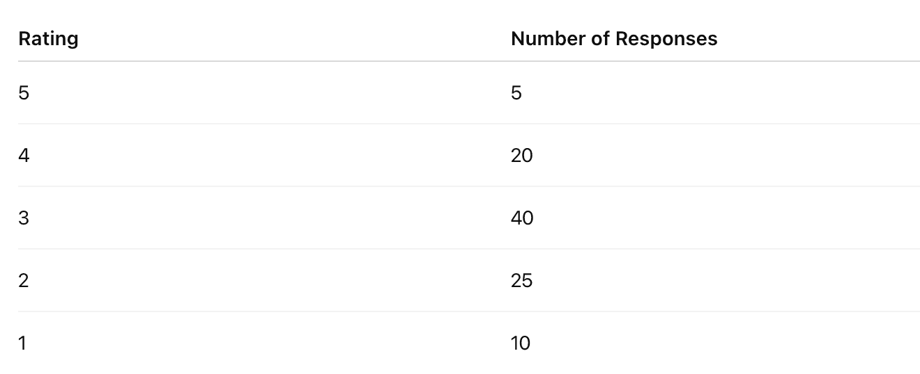
Step 1: Calculate the Weighted Average Rating
Multiply each rating by the number of customers who gave that rating, sum the results, and divide by the total number of customers.


Step 2: Convert Weighted Average to a Percentage
Since the rating scale ranges from 1 to 5, convert the weighted average to a percentage using the formula:


Powered By SparrowDesk