
Search
The Correlation Widget is a statistical tool to help understand the relationship between two variables. It measures the strength and direction of a linear relationship, showing how one variable changes as another does.
In other words, it helps determine whether and how two variables are connected, like how customer feedback scores might be influenced by factors such as delivery speed or product quality.
For example, when we say two variables are “correlated,” it means that as one changes, the other tends to change in a predictable way either in the same direction (positive correlation) or in the opposite direction (negative correlation).
Let’s look at an example to understand.
A home lifestyle brand that delivers furniture and decor items across the country wants to improve its customer experience (CX) and reduce churn. While they regularly collect CX scores after each delivery, they aren’t sure what exactly is influencing those ratings. Is it the look of the product, the delivery speed, or how the delivery agent interacts with customers?
Using the Correlation Widget, they can:
Let’s see how to create a Correlation widget.
1. Navigate to Insights and go to Dashboards. 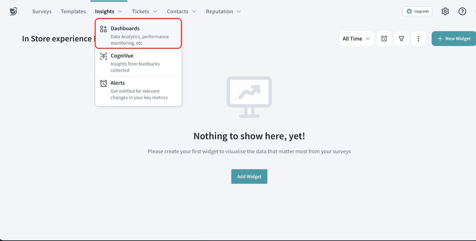
2. Click New Widget.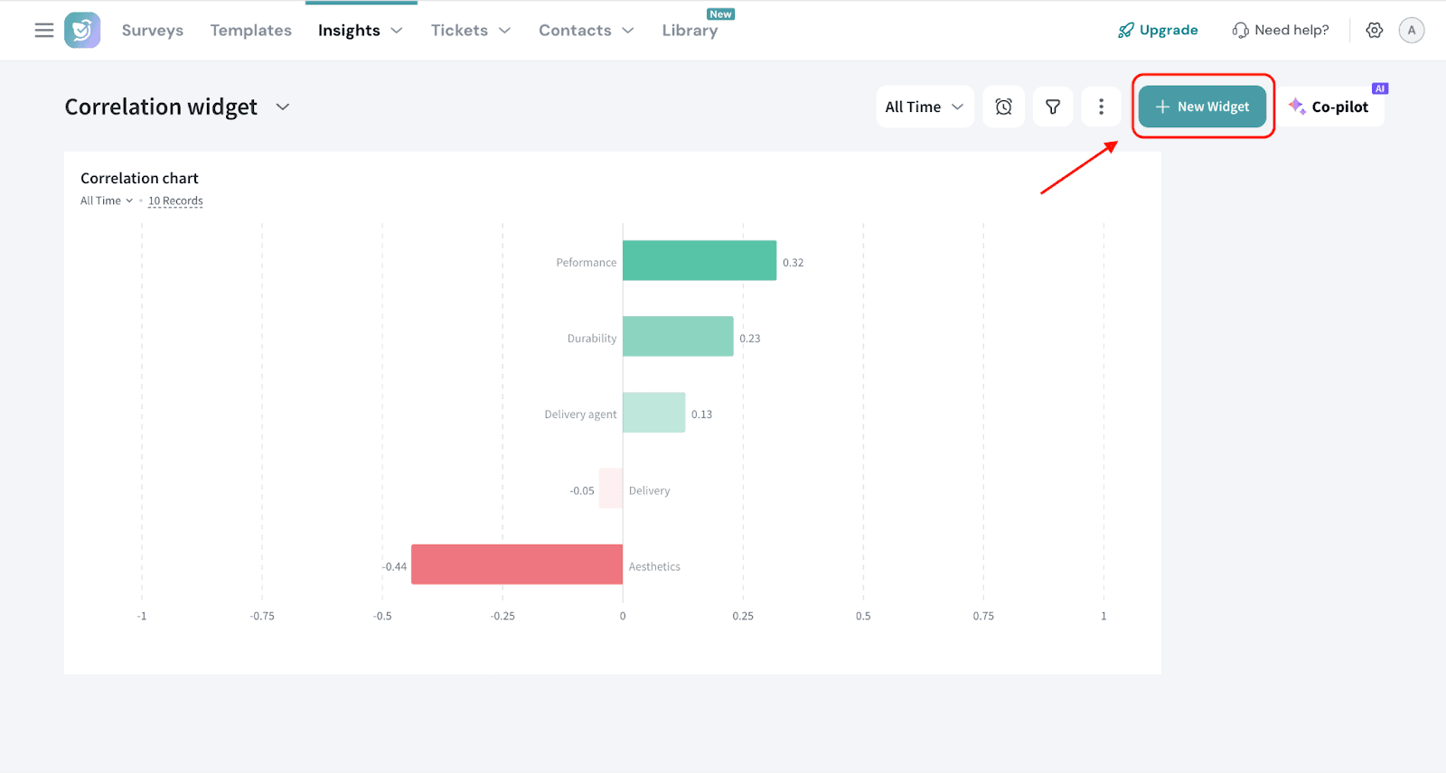
3. Choose By Chart Type.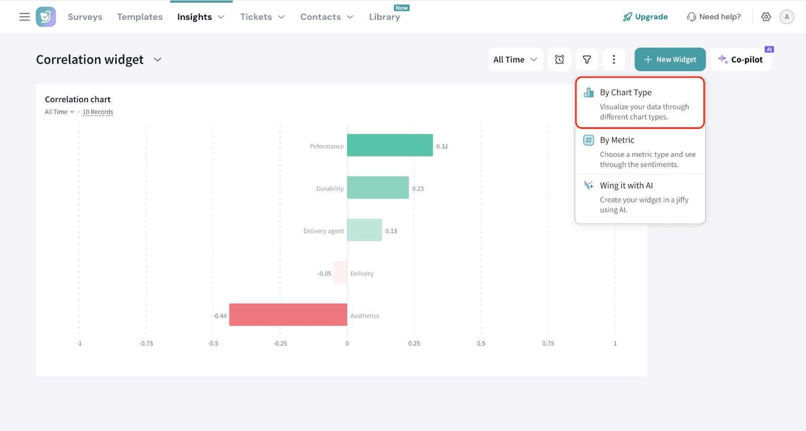
4. Select Correlation widget.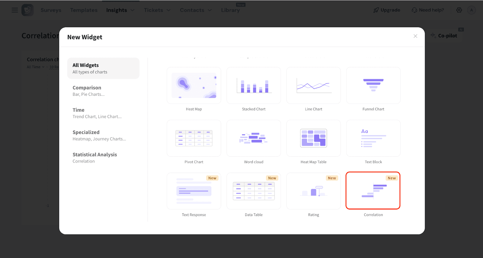
5. Select the survey (Source) for which you want to create the widget. YOu can use the dropdowns to choose the source survey.
You can also choose multiple surveys.
Pro Tip: When using multiple surveys, make sure the relevant questions are identical across all of them. This helps maintain data consistency and ensures the correlation results are accurate and meaningful.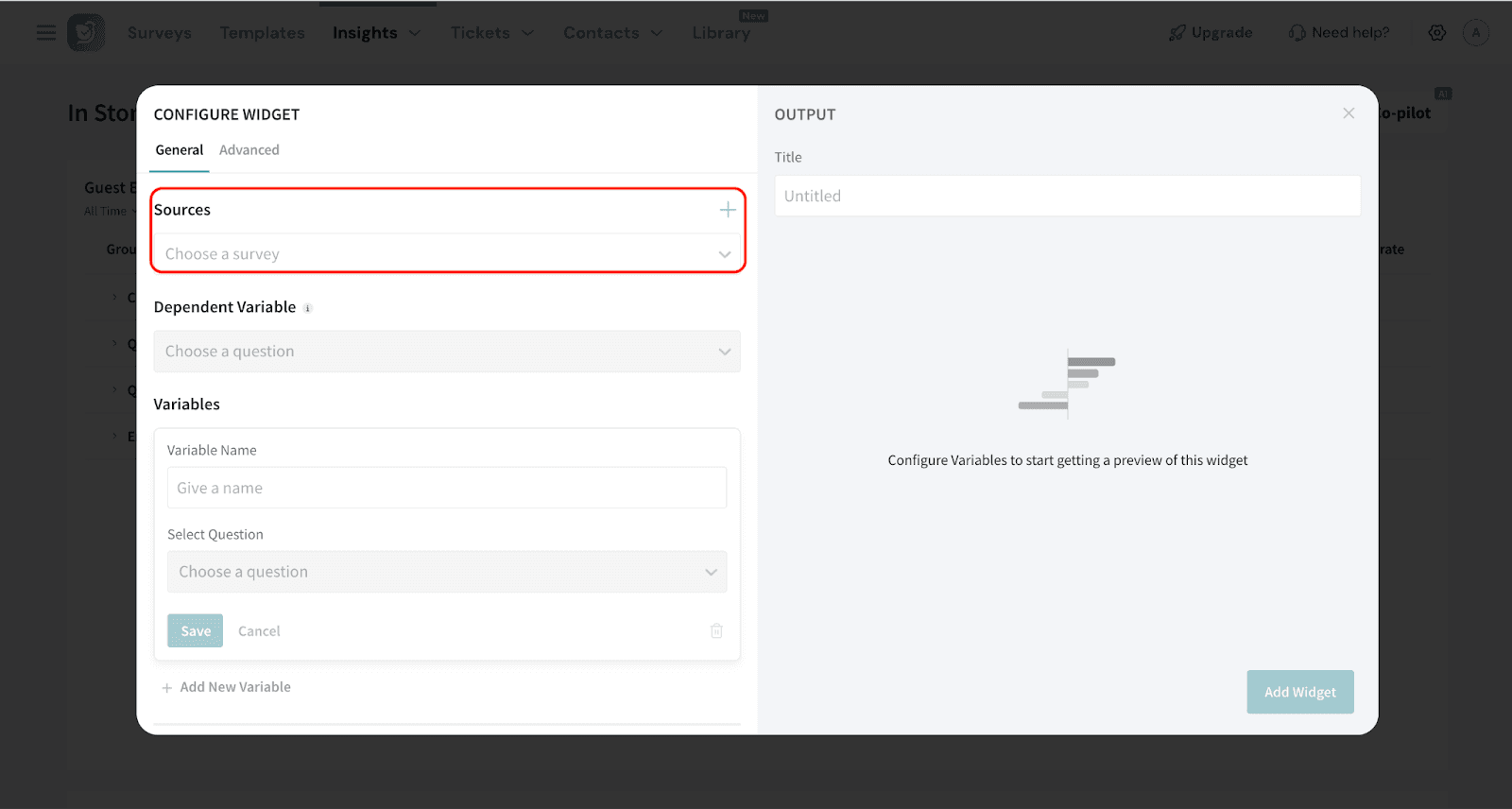
6. Choose the Dependent Variable.
The dependent variable is the outcome you're trying to measure or predict. It changes in response to other factors.
In our example, the dependent variable is the CX question, as it represents the customer’s overall experience that we're analyzing.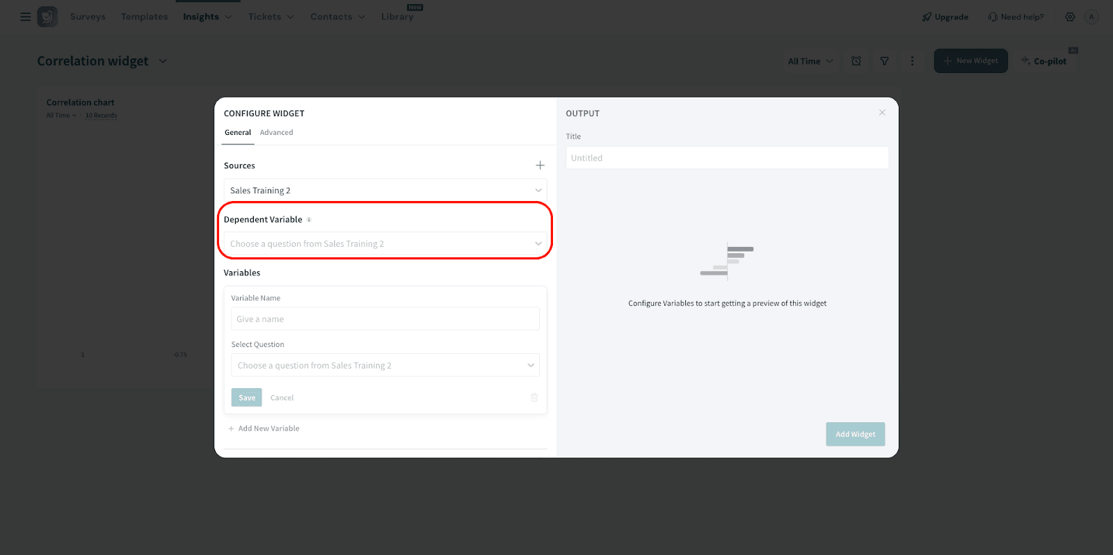
7. The next step is to enter the variables. To do this, enter the name for the variable, choose the variable you want to analyze, and save so that you can add the next variable.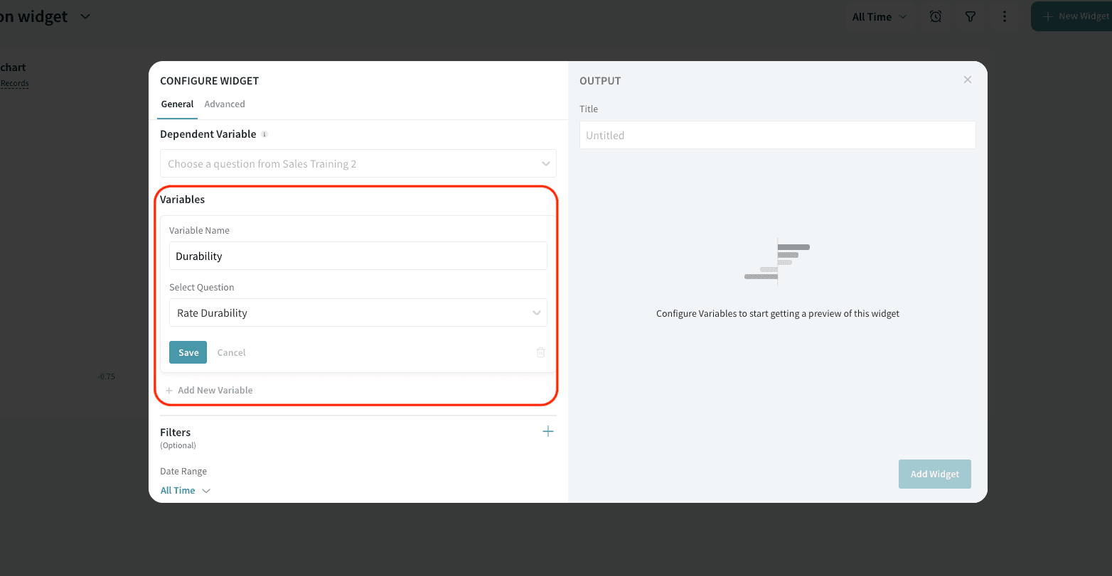
8. If you wish to filter the response data further, click the ‘+’ sign to add the filters. You can either select a preset filter, use a custom variable or use AI to create a filter.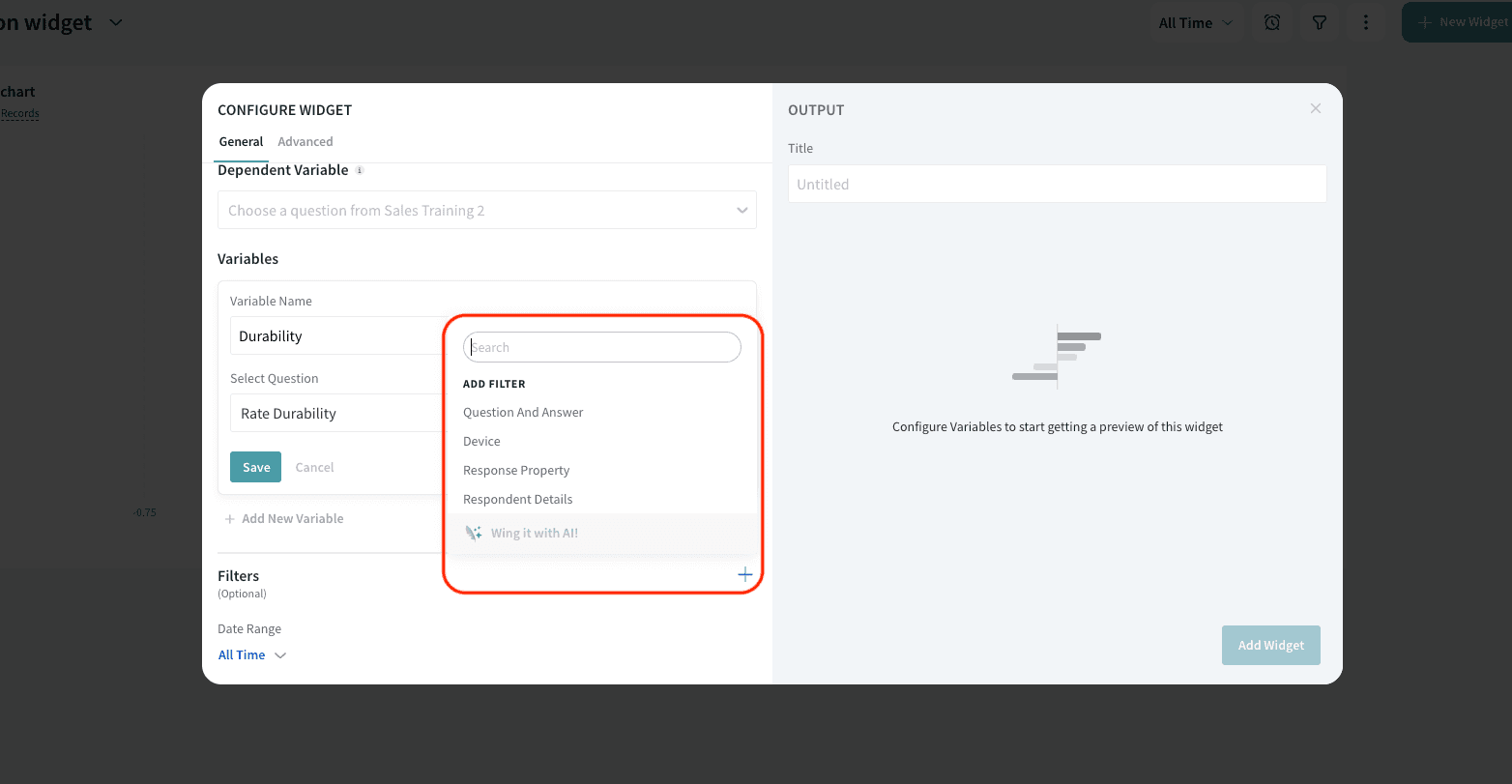
9. You can also select the Date Range.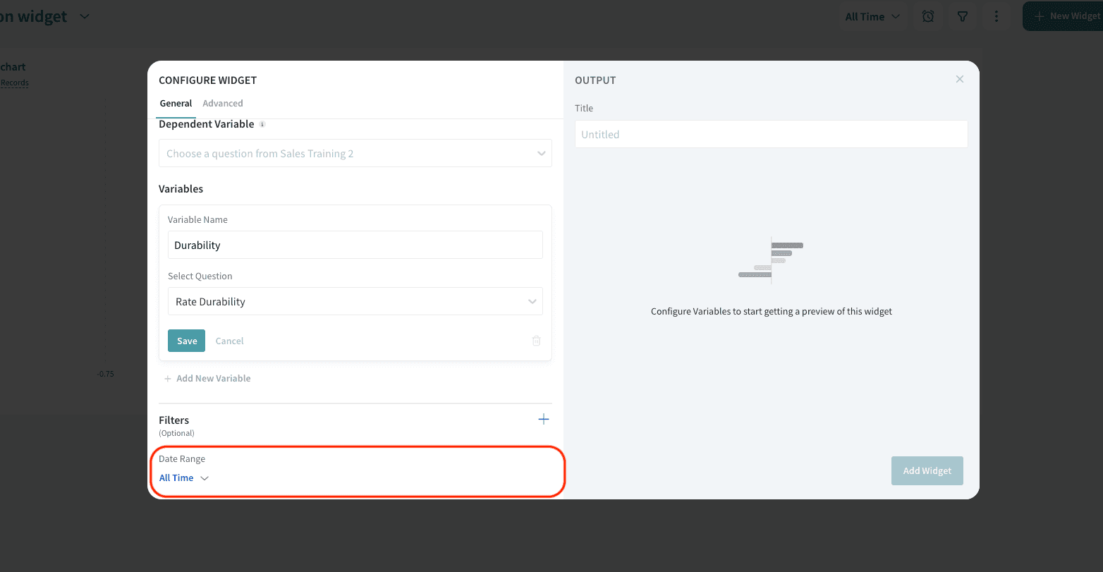
Advanced Settings
1. Under Advanced Settings, you have two options:
Set minimum response threshold: This lets you set a minimum number of responses required for a variable to be included in the analysis.
It ensures that only variables with enough data are considered, making the results more reliable.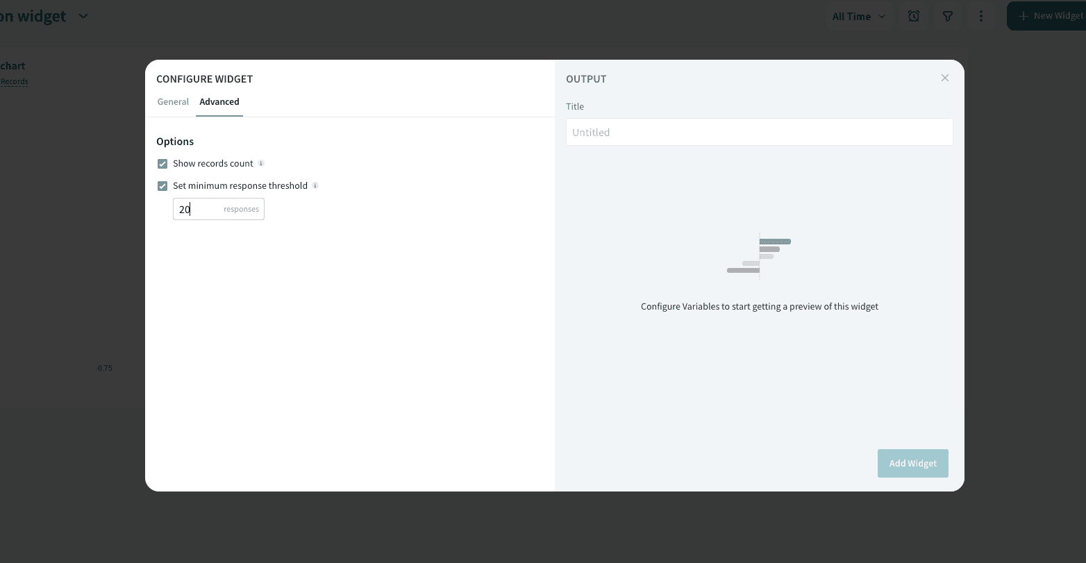
2. Once done, add the title for the widget and click Add Widget. 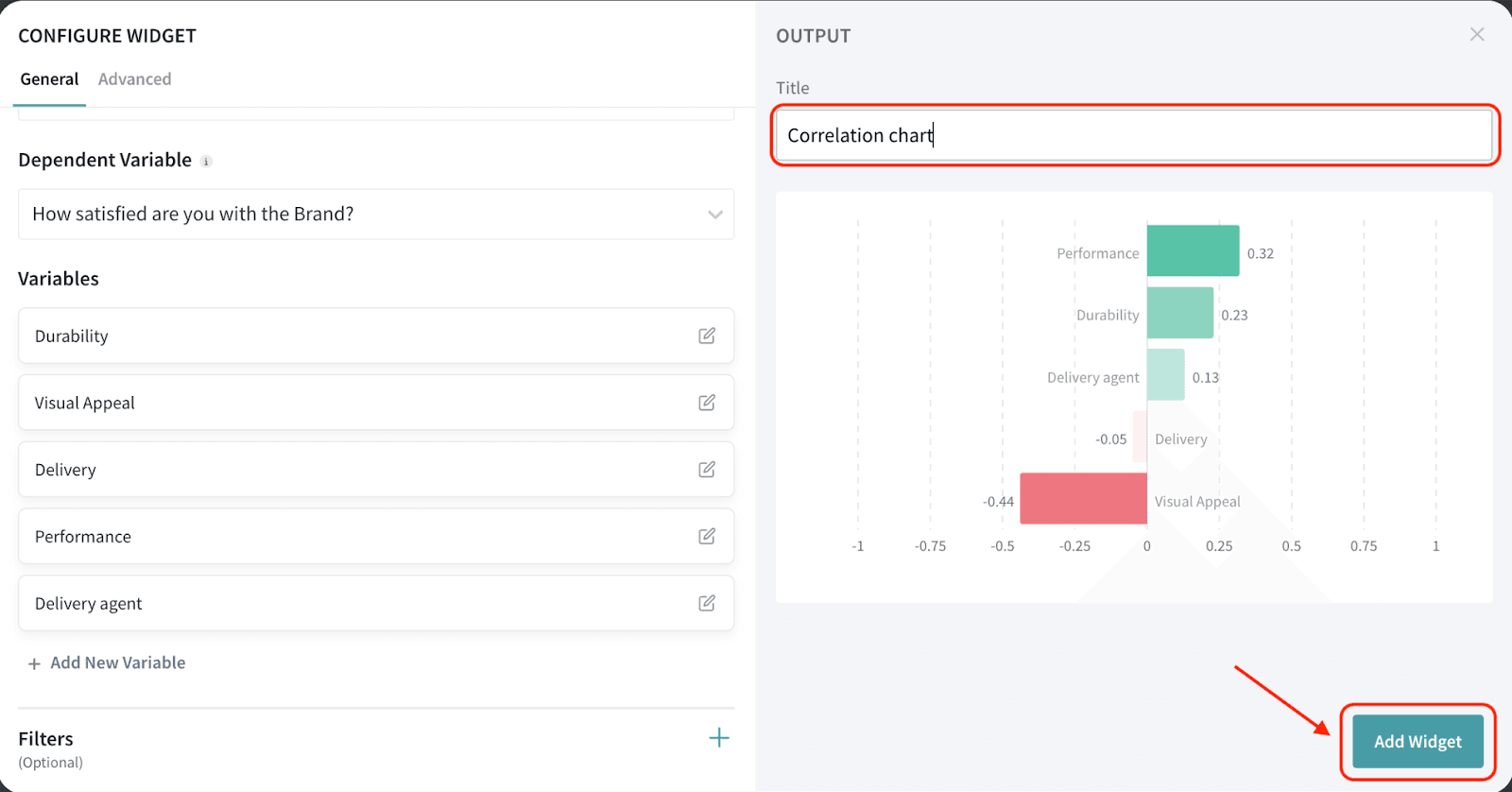
Interpreting Correlation Widget
Correlation values range from -1 to +1 and indicate the strength and direction of a linear relationship between two variables:
Let’s interpret the results we got in our example.
The widget will be displayed on your dashboard. You can move and resize the widget to your liking.
You can hover on the bar to view the correlation value.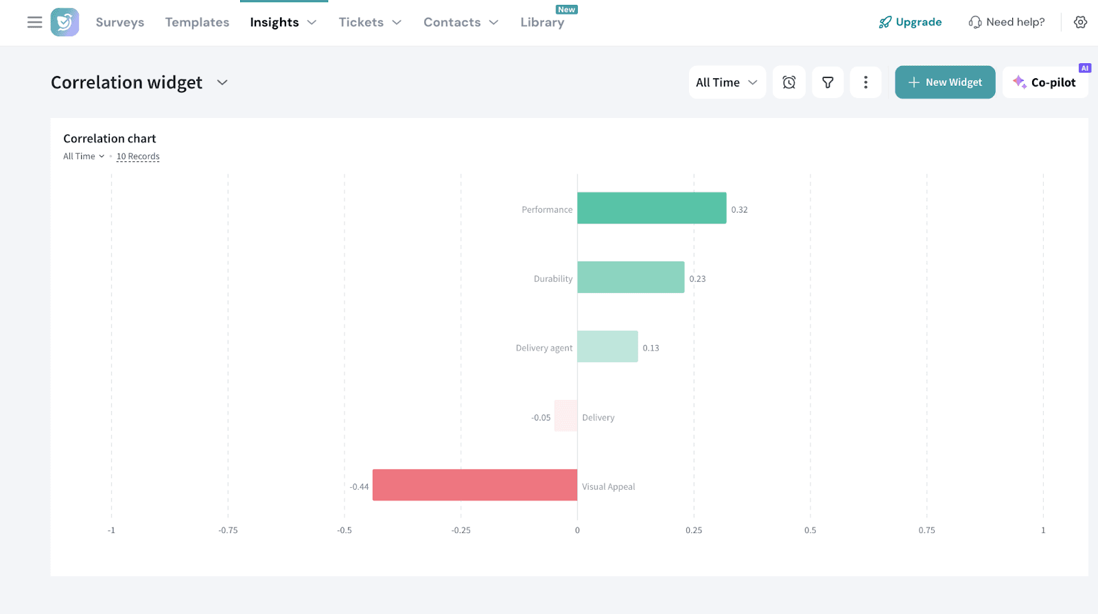
That's all about Correlation widget.
Feel free to reach out to our community if you have any questions.
Powered By SparrowDesk