
Search
The Data Table Widget helps organize, display, and manage large volumes of data in a structured, easy-to-read format. It allows users to group, compare, and analyze multiple metrics efficiently within a table layout, making it easier to identify trends, track performance, and draw meaningful insights at a glance.
Let's look at an example.
A brand wants to compare its NPS and CSAT scores across regions. The scores and regions are setup as a data table to monitor performance at a glance, over periods of time.
Let’s see how to create a Data Table Widget.
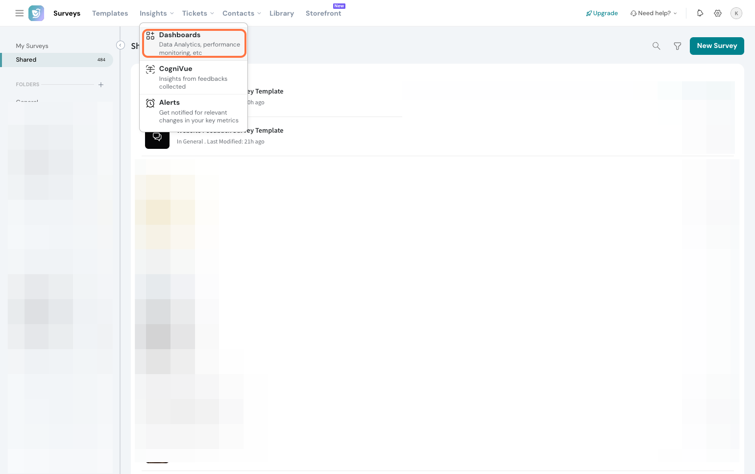
1. Navigate to Insights and go to Dashboards.
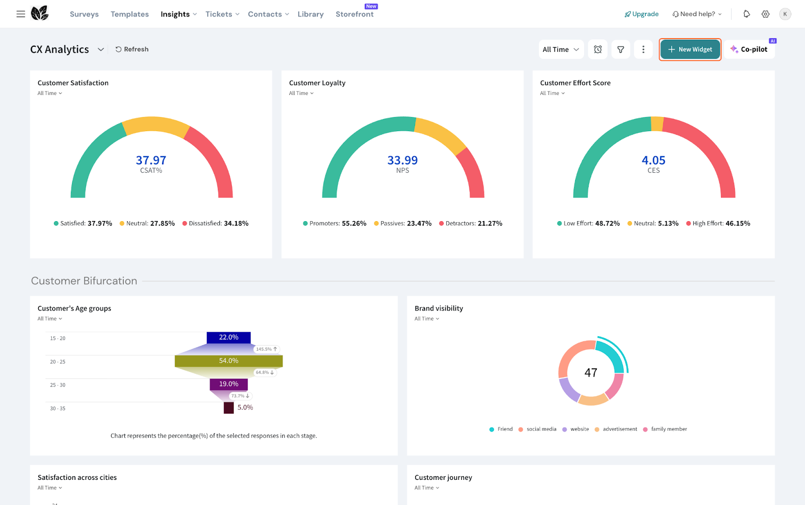
2. Click New Widget.
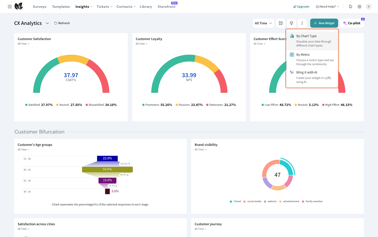
3. Select By Chart type.
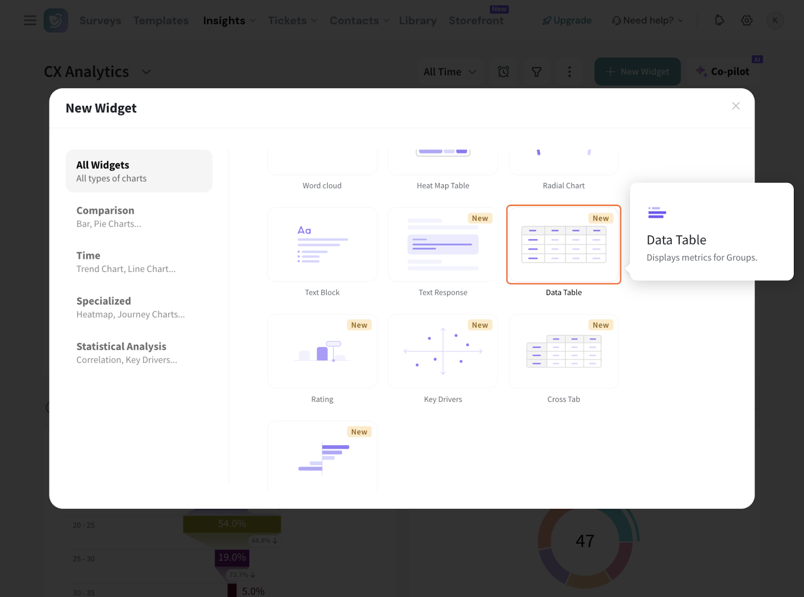
4. Choose Data Table Widget.
5. Select the survey (Source) for which you want to create the widget. You can choose multiple sources as well.
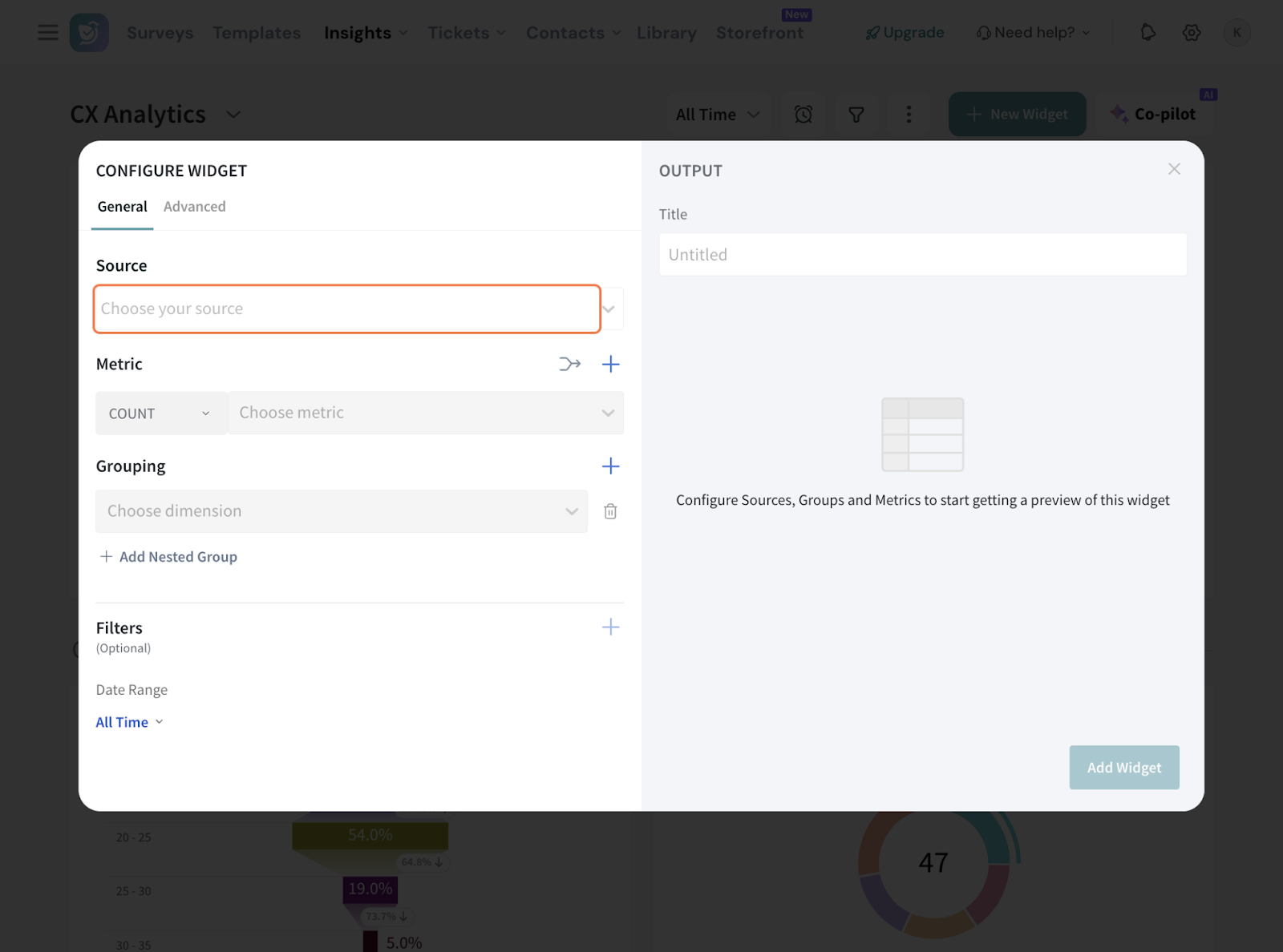
6. Now, configure the metrics to display. You can choose from standard aggregations like COUNT, AVERAGE, CX ones like NPS as well as custom metrics.
Note:
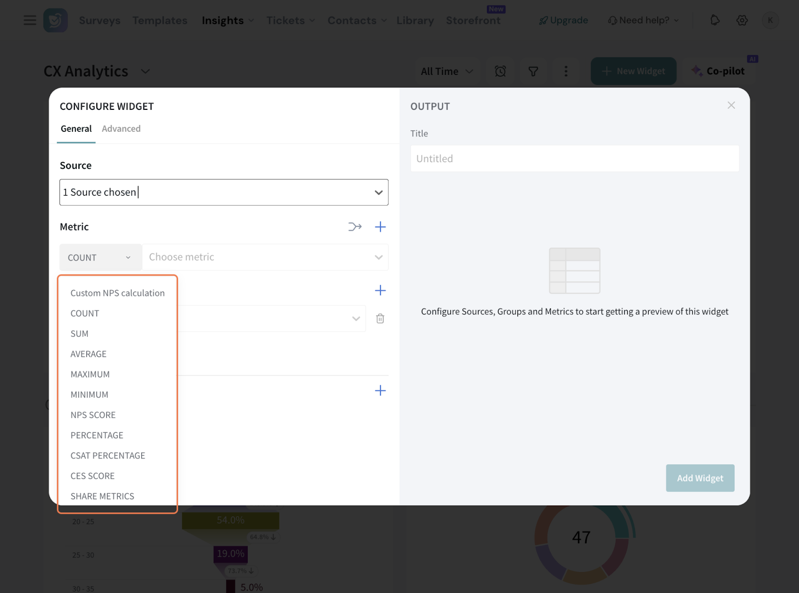
7. Share Metrics:
7.1 You can add Share metrics as well to categorize data by share method, helping you monitor responses across different channels, analyze engagement patterns, and optimize your outreach for better results.
7.2 Choose the specific metric you want to measure under Share Metrics.
7.3 There are several key metrics that you can choose from.
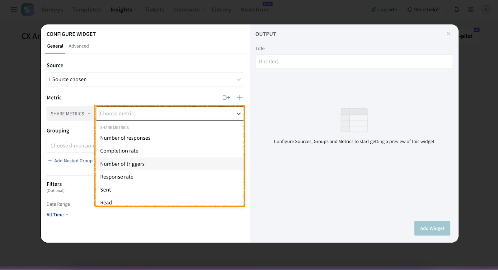
8. Here, we’re going with NPS Score and picking the NPS question from the survey.
9. In case you have multiple questions to configure under a single metric, click on the symbol.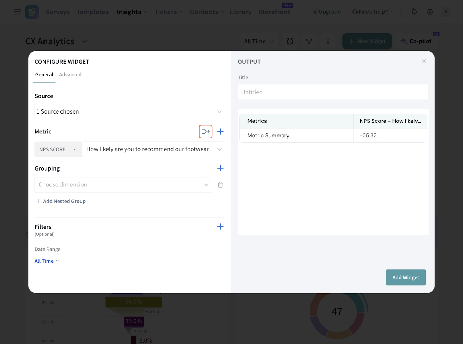
10. In this screen, pick your aggregation from the drop down. Note that custom metrics are not applicable here.
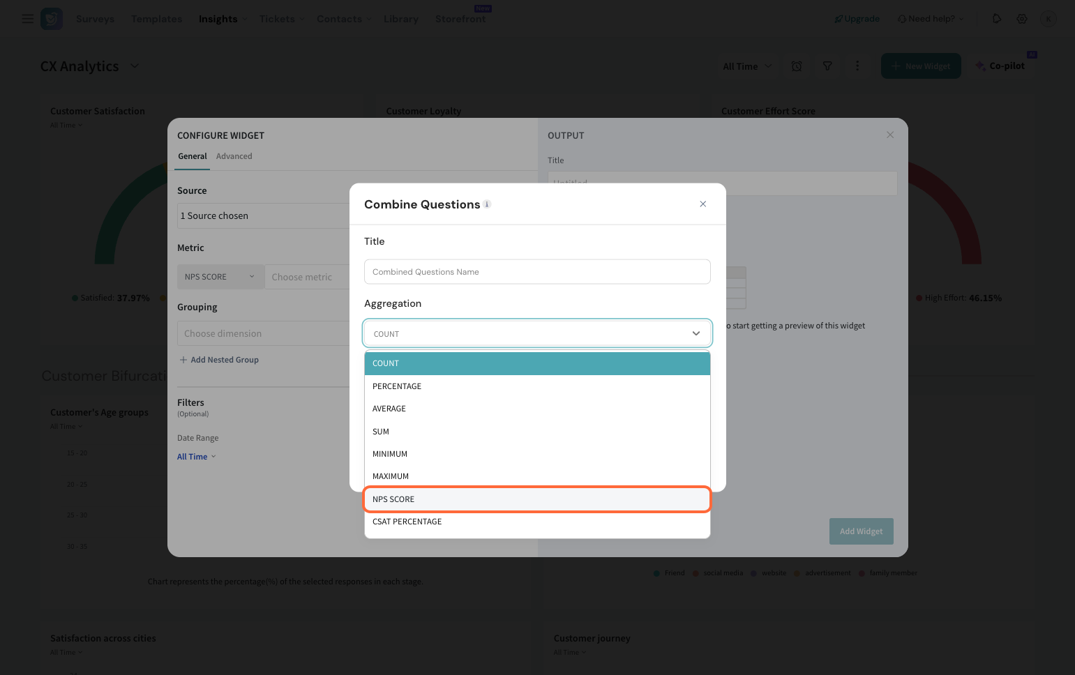
11. Select the questions to be combined, give this a suitable title, and hit save.
12. Click ‘+’ to add more metrics to the table.
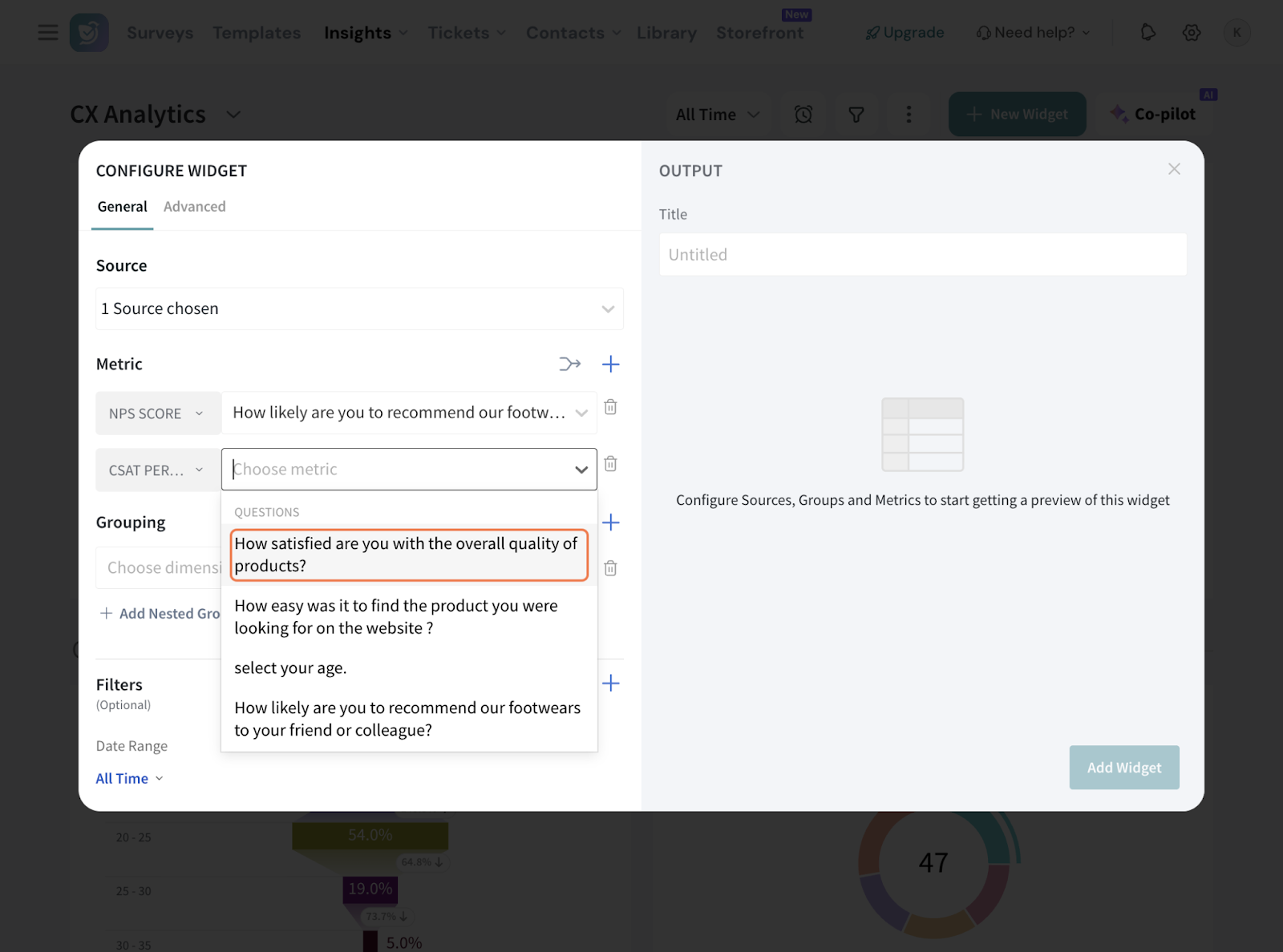
13. We’re adding a CSAT Score to be monitored as well here.
14. Now, under Grouping, you can select groups by choosing a dimension from the survey, such as share mode, location, or language. Each selected group will be added as a new row.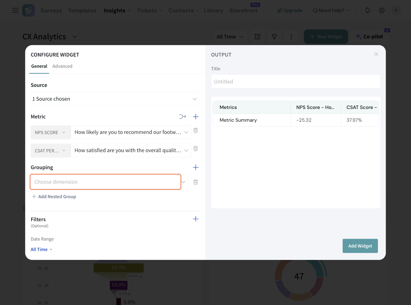
Note: You can add multiple groups.
15. You can add a nested group under a grouping as well. You can add only upto one nested group.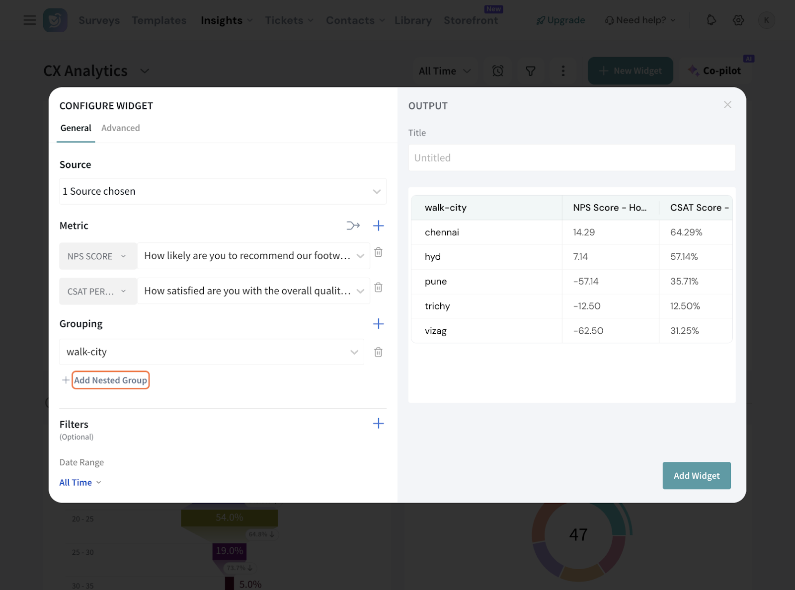
16. If you wish to filter the response data further, click the + sign to add the filters. You can either select a preset filter, use a custom variable or use AI to create a filter.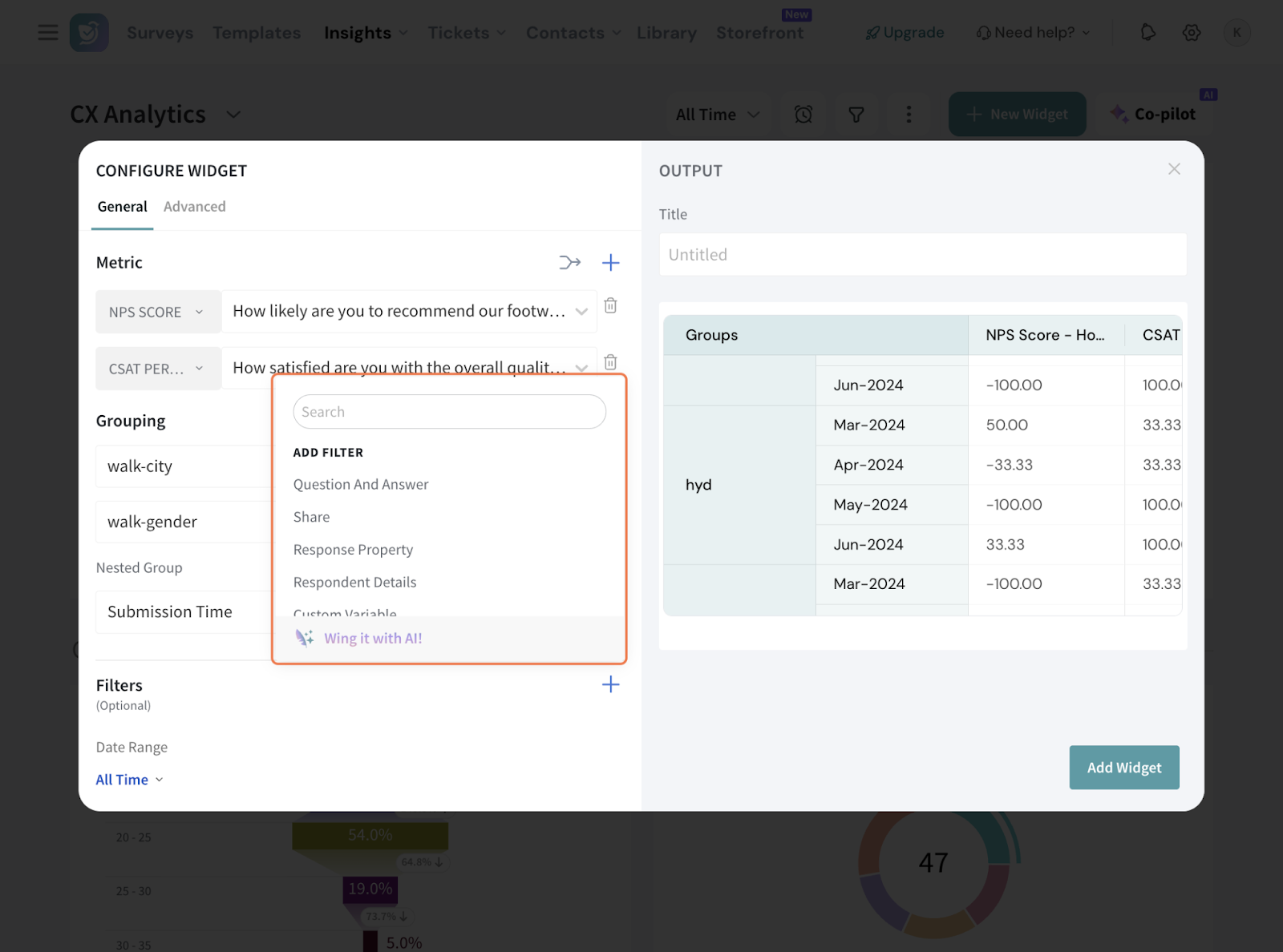
17. You can also select the Date Range and set up a comparison range, that compares and shows the % change for current data with preceding range’s data.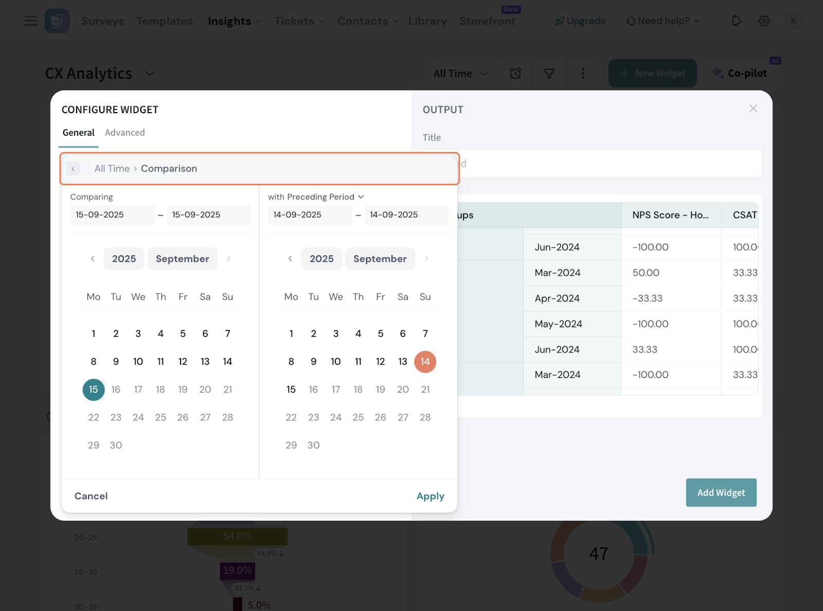
18. Give the table a suitable title.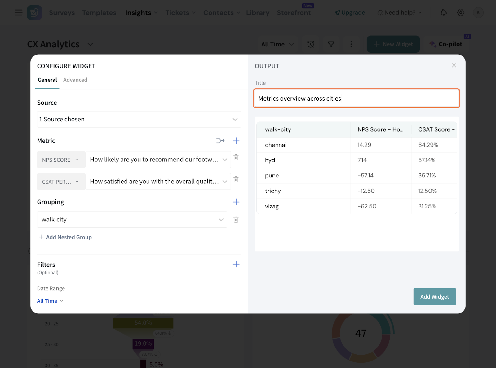
19. Now, go to the Advanced tab.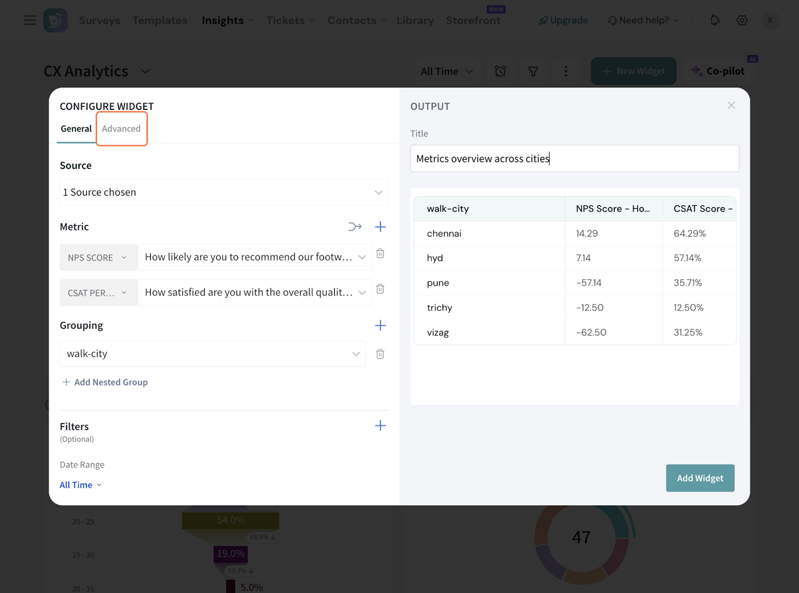
20. You can round-off decimal places upto 2 places.
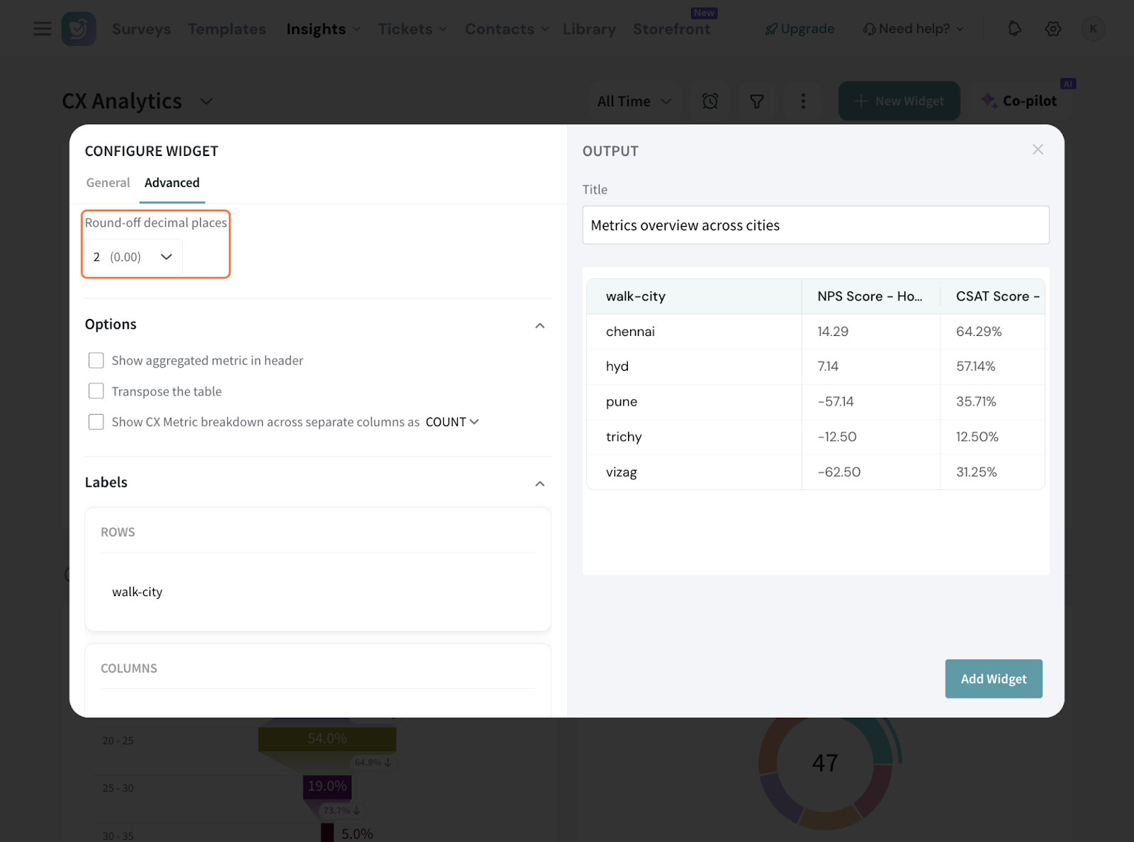
21. Under options, you have 3 things:
21.1 You can choose to have the aggregated metric in the header. So in our case, the overall NPS score will be displayed on top.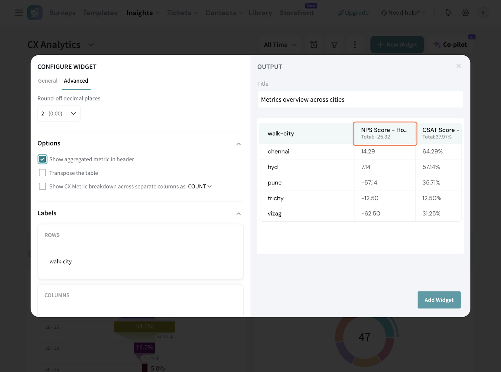
21.2 You can choose “Transpose the table” if you wish the rows and columns need to be switched. Note: This can work only if there is only one grouping configured.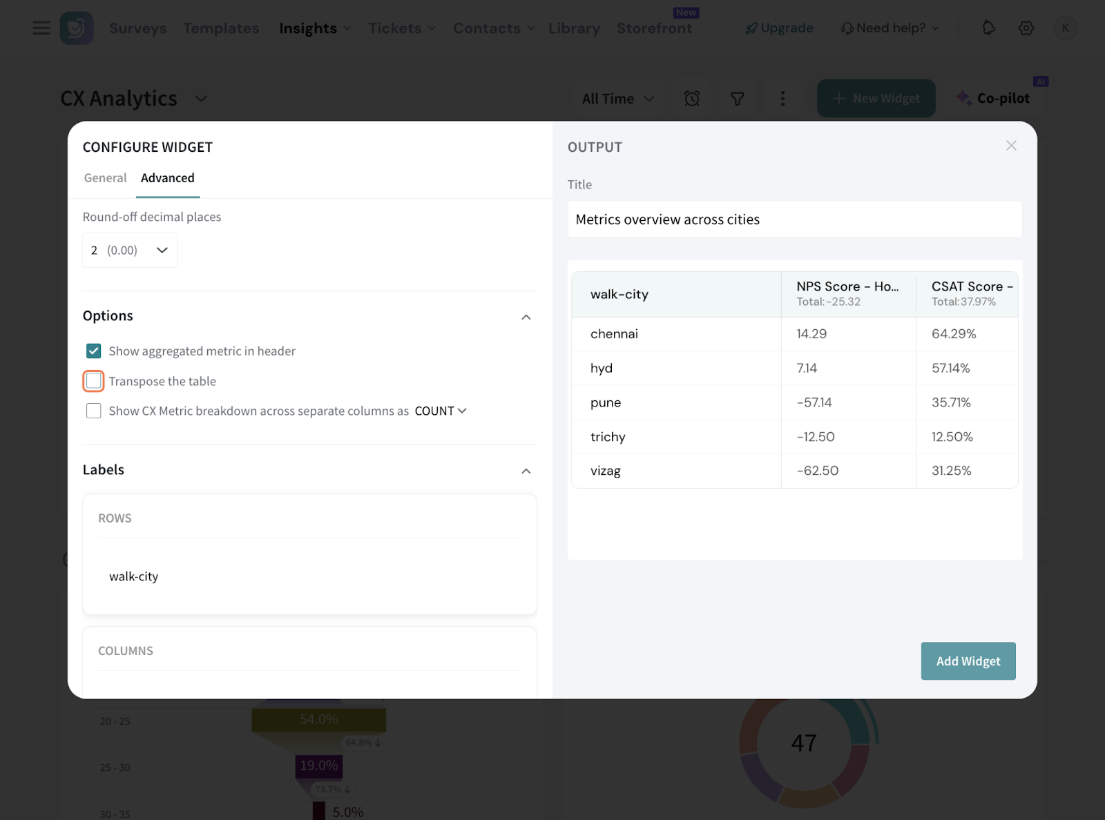
21.3 When you choose “Show CX metric breakdown across separate column”, the metric data will be shown as separate columns, either as COUNT split or PERCENTAGE split. For NPS, this means separate columns for Promoters, Passives, and Detractors, shown as counts and/or percentages.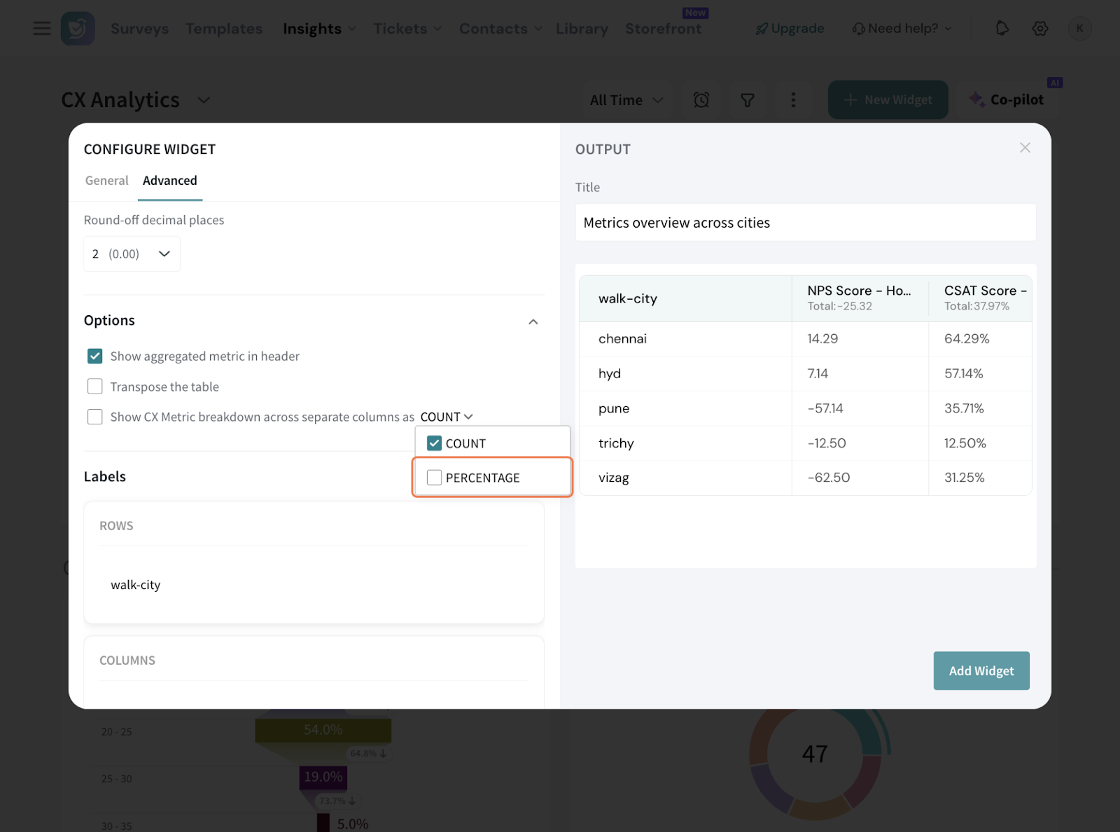
Note that this is applicable for standard CX metrics. So in our case, if we opt for both, the NPS and CSAT breakdown will be displayed.
22. Under Labels, you can choose to rename the labels displayed in the table for the row and column header to clean up the data.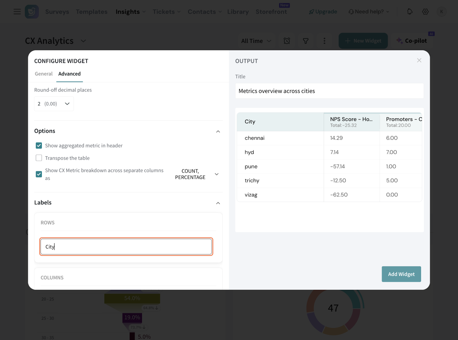
23. In the section “Affix”, you can add suitable prefix or suffix to your data.
23.1 You can choose for it to be commonly applicable for all metrics, or customise per individual columns.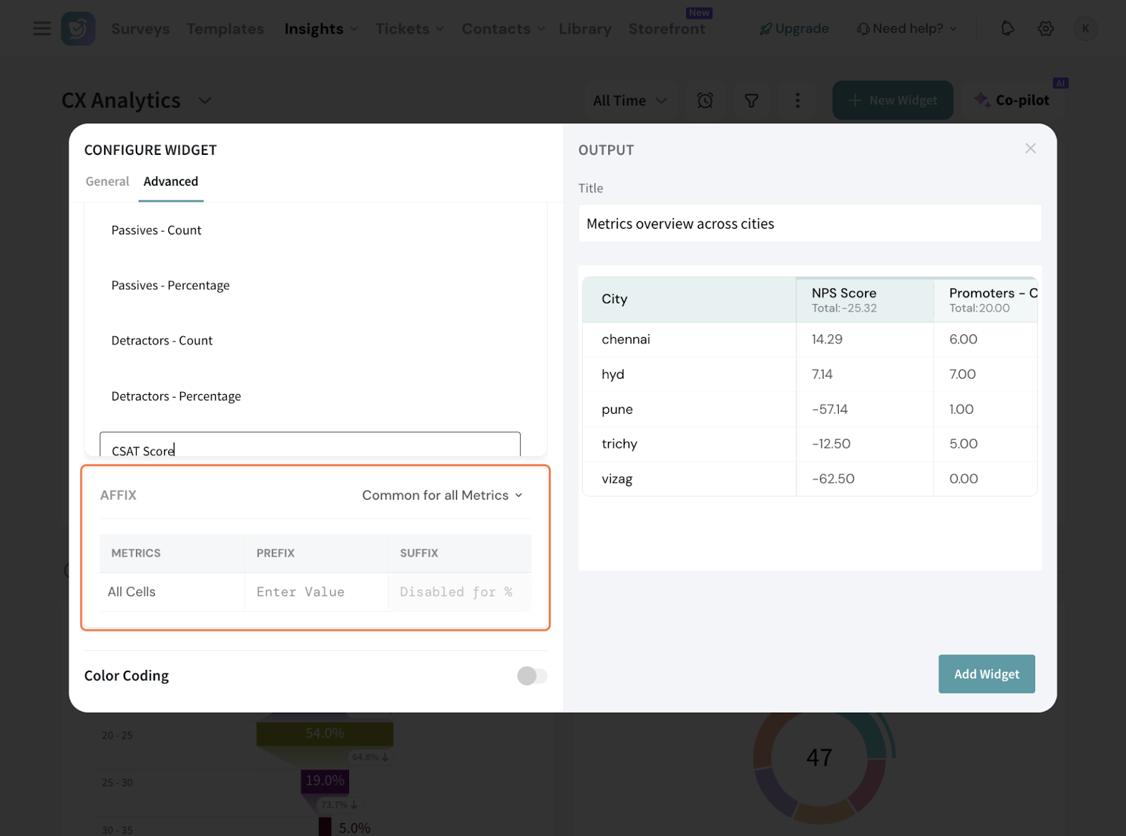
23.2 If you opt for Custom, this is how the table appears.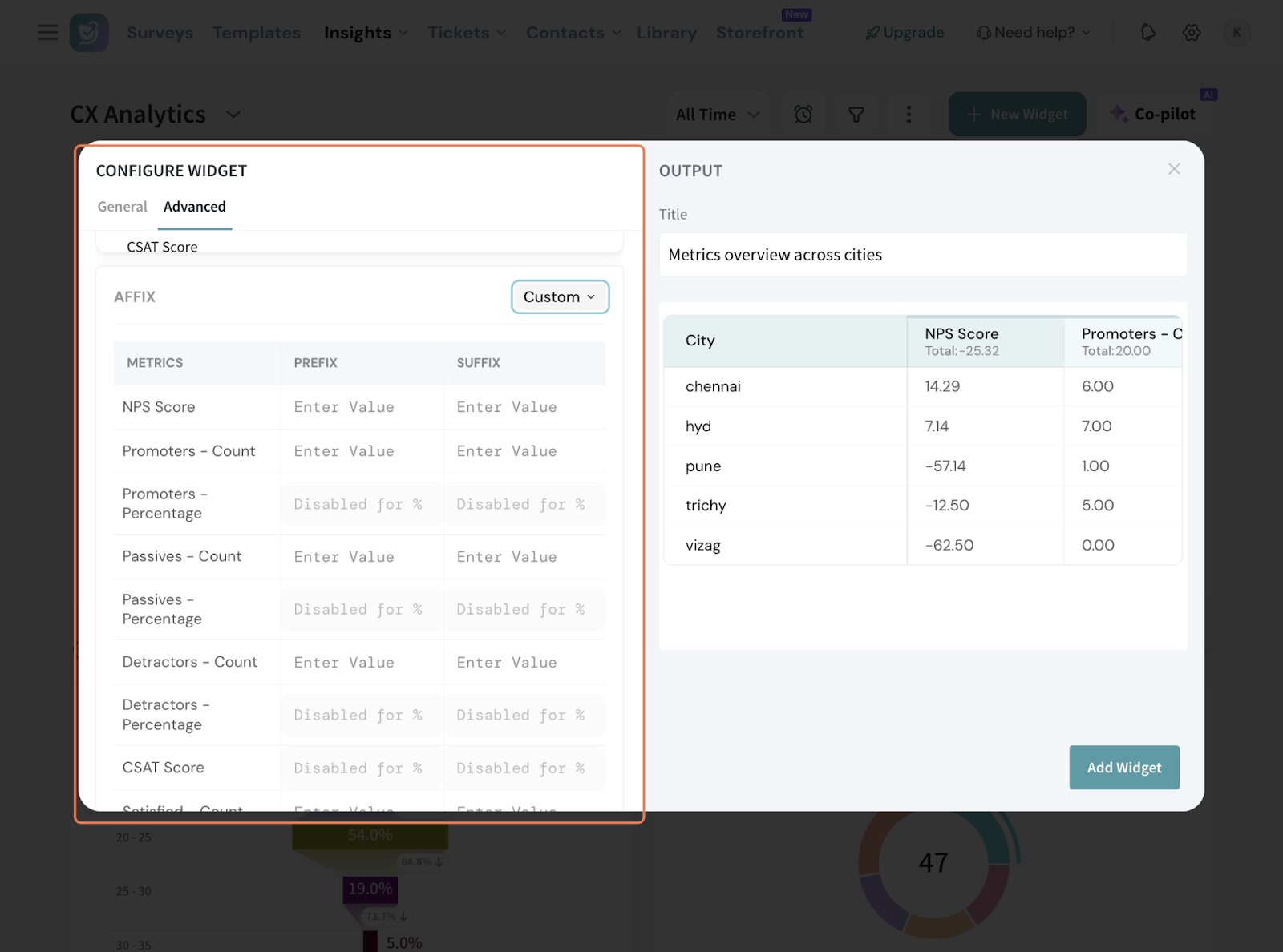
24. Now, coming to Color Coding. This is where you can set custom color rules per column, so at a scan, you know what the data is saying.
24.1 Click the toggle.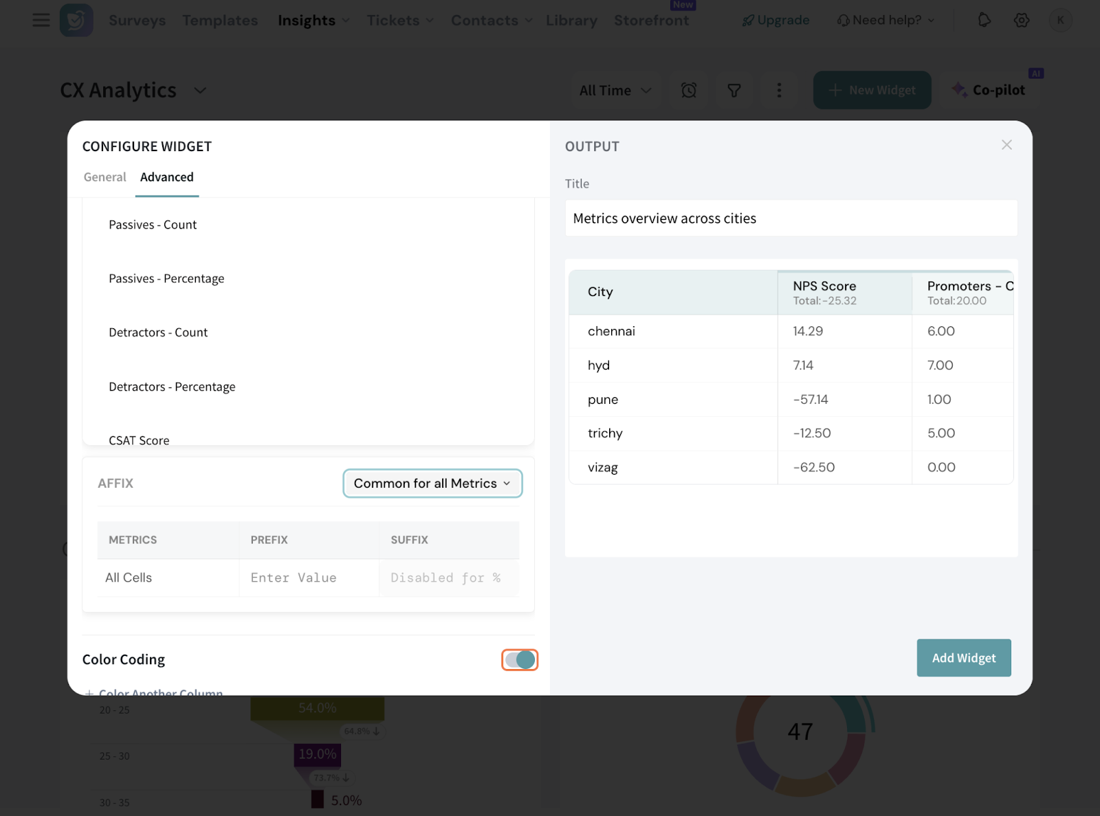
24.2 Add the column in question. Here, let’s set it up for NPS. The range is editable here, so it’s set up to show the regions which fall short of the aggregate NPS.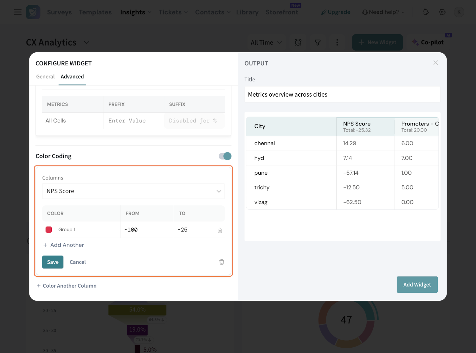
25. Now, once the setup is done to your satisfaction, hit “Add Widget”.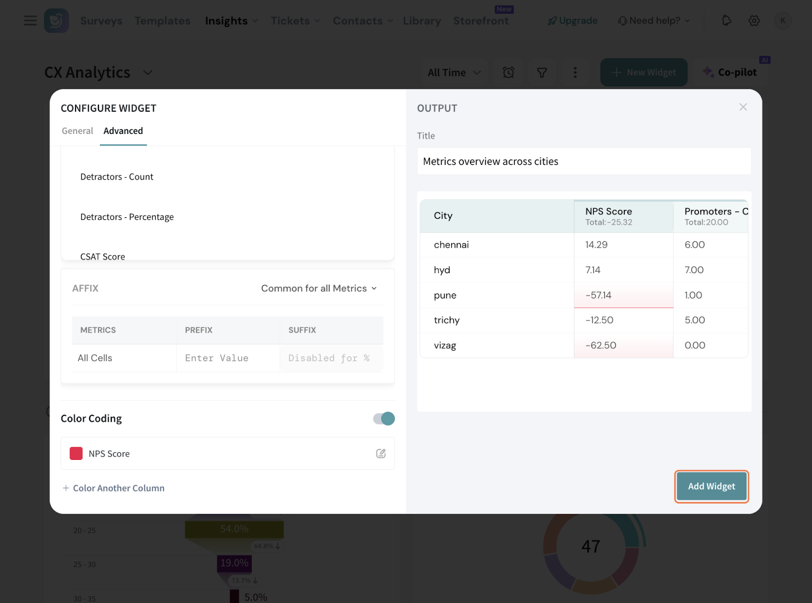
26. You can do a comparison anytime, even if not configured in setup.
26.1 Click on the date range and set it up.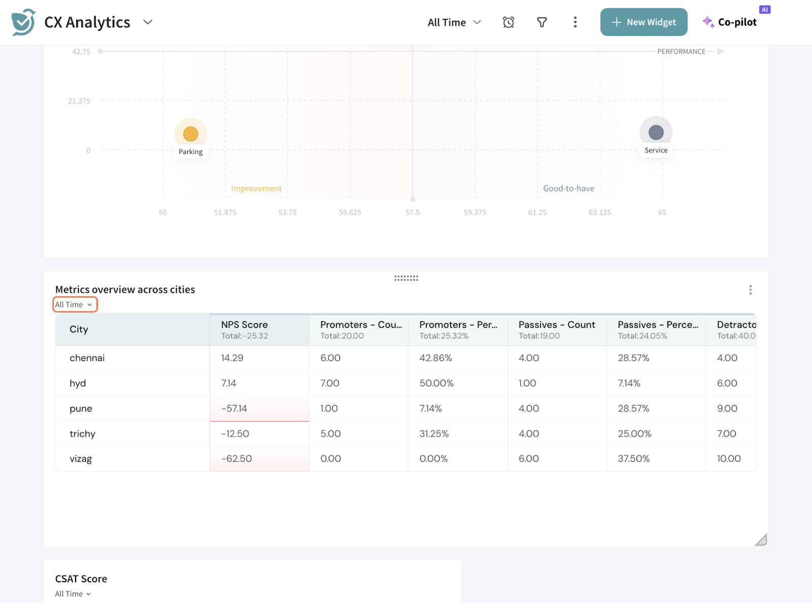
26.2 It can be fixed ranges or custom date ranges as well.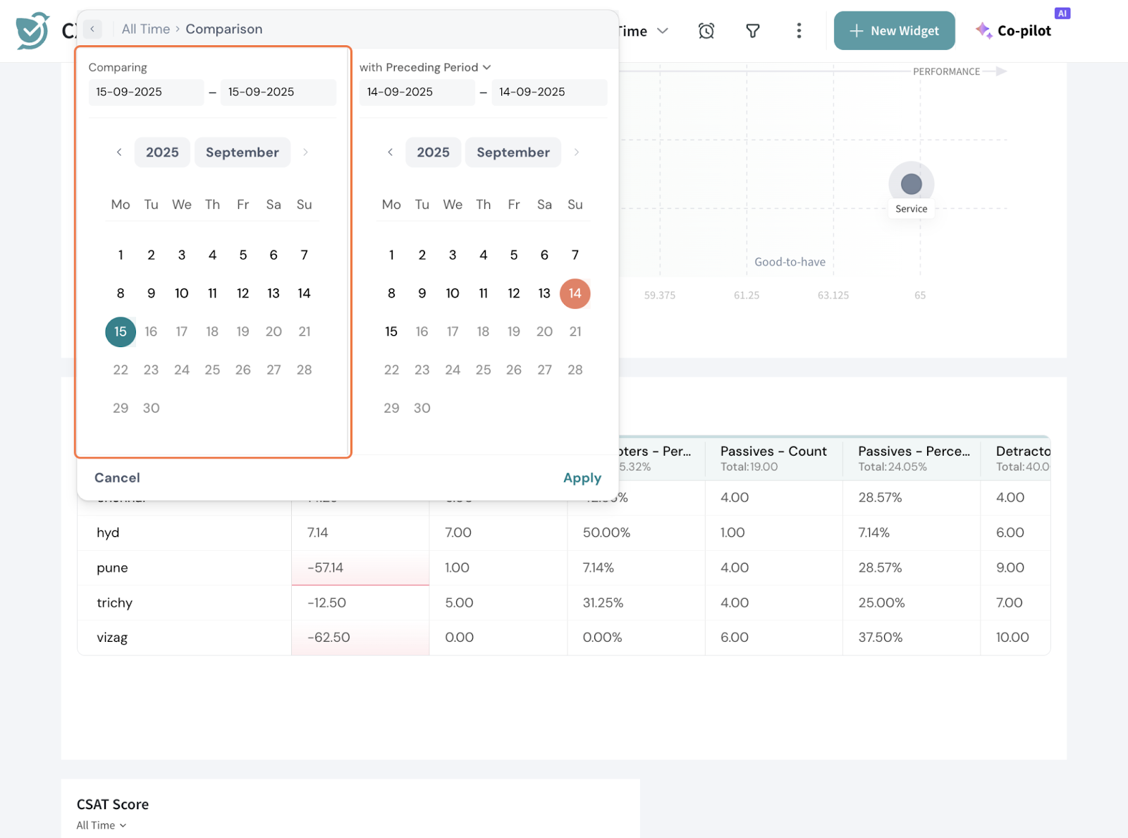
26.3 Once you apply, you will see the % change in every cell.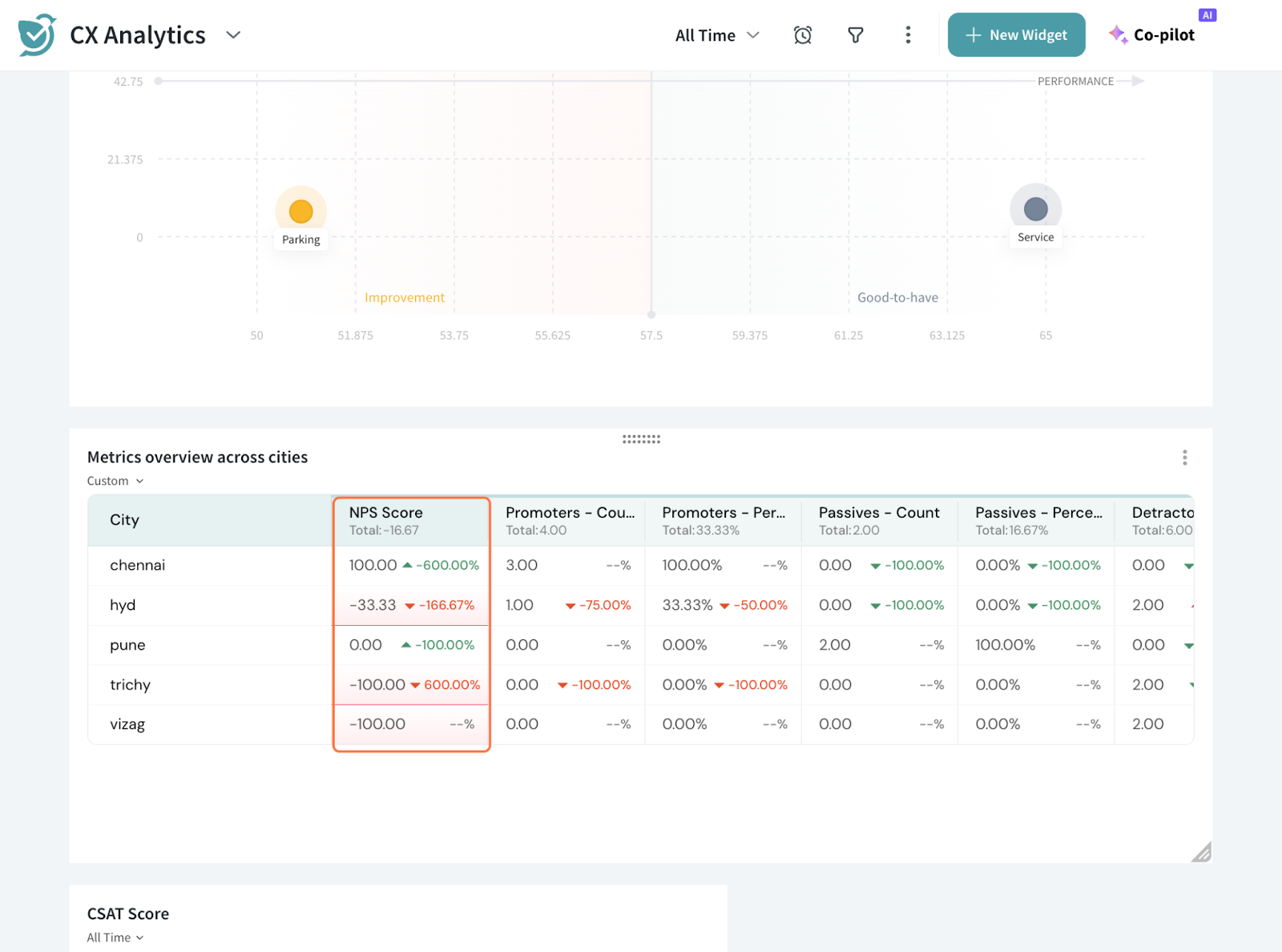
27. You can perform more actions. Click the 3 dots on the right side of the table.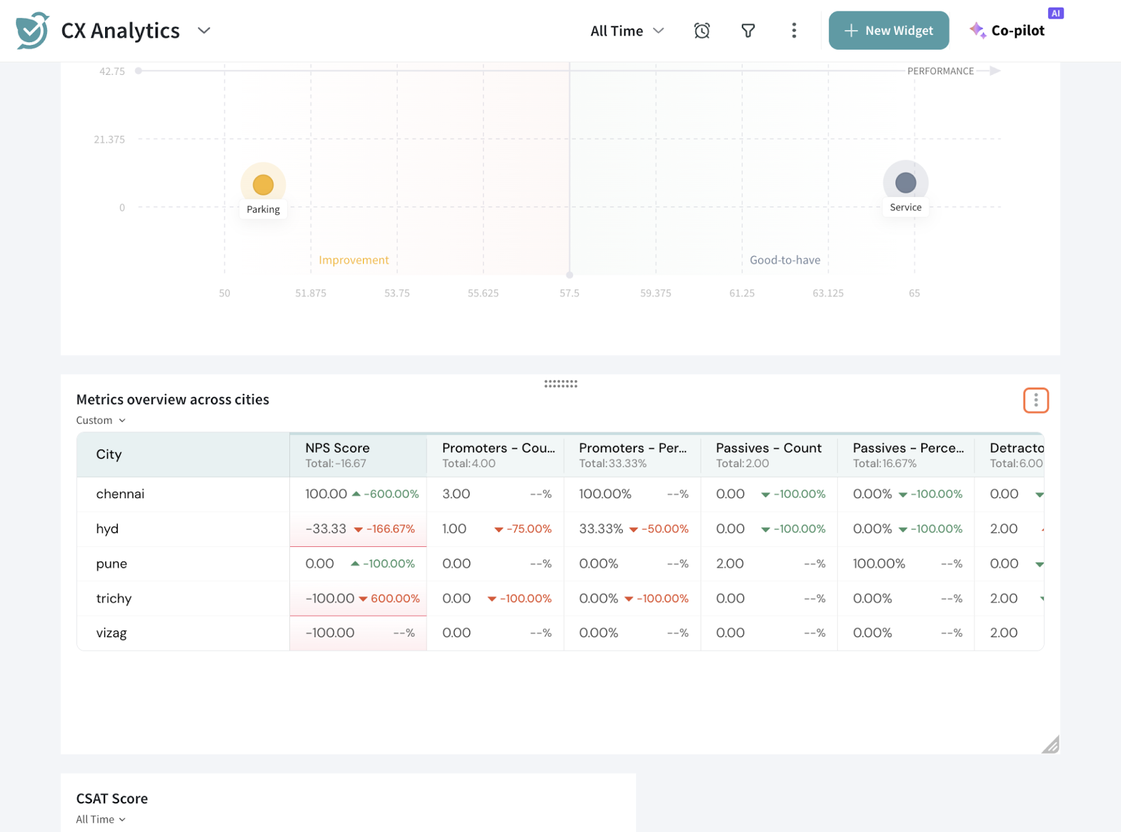
28. Here, you can edit, clone, delete the table. You can also export the table as JPEG, PNG, CSV OR XLSX.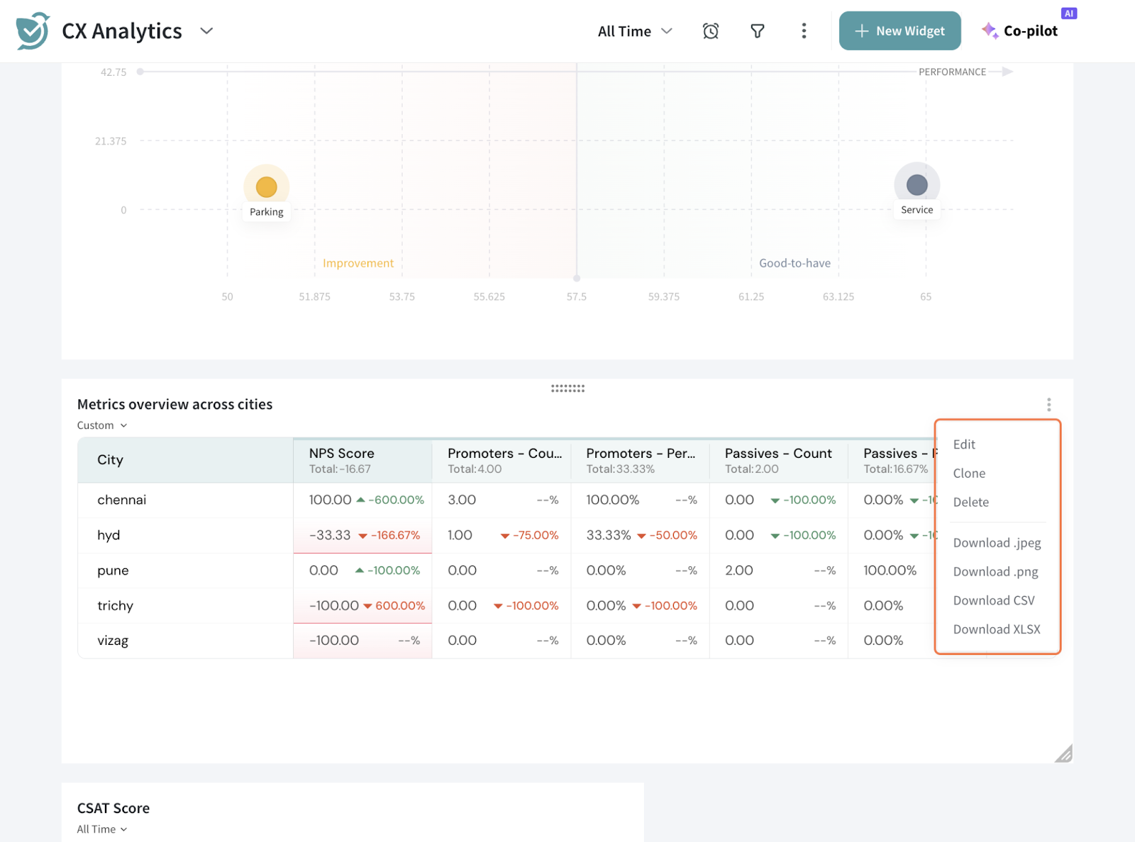
That’s how you setup a Data Table Widget.
Feel free to reach out to our community if you have any questions.
Powered By SparrowDesk