Search
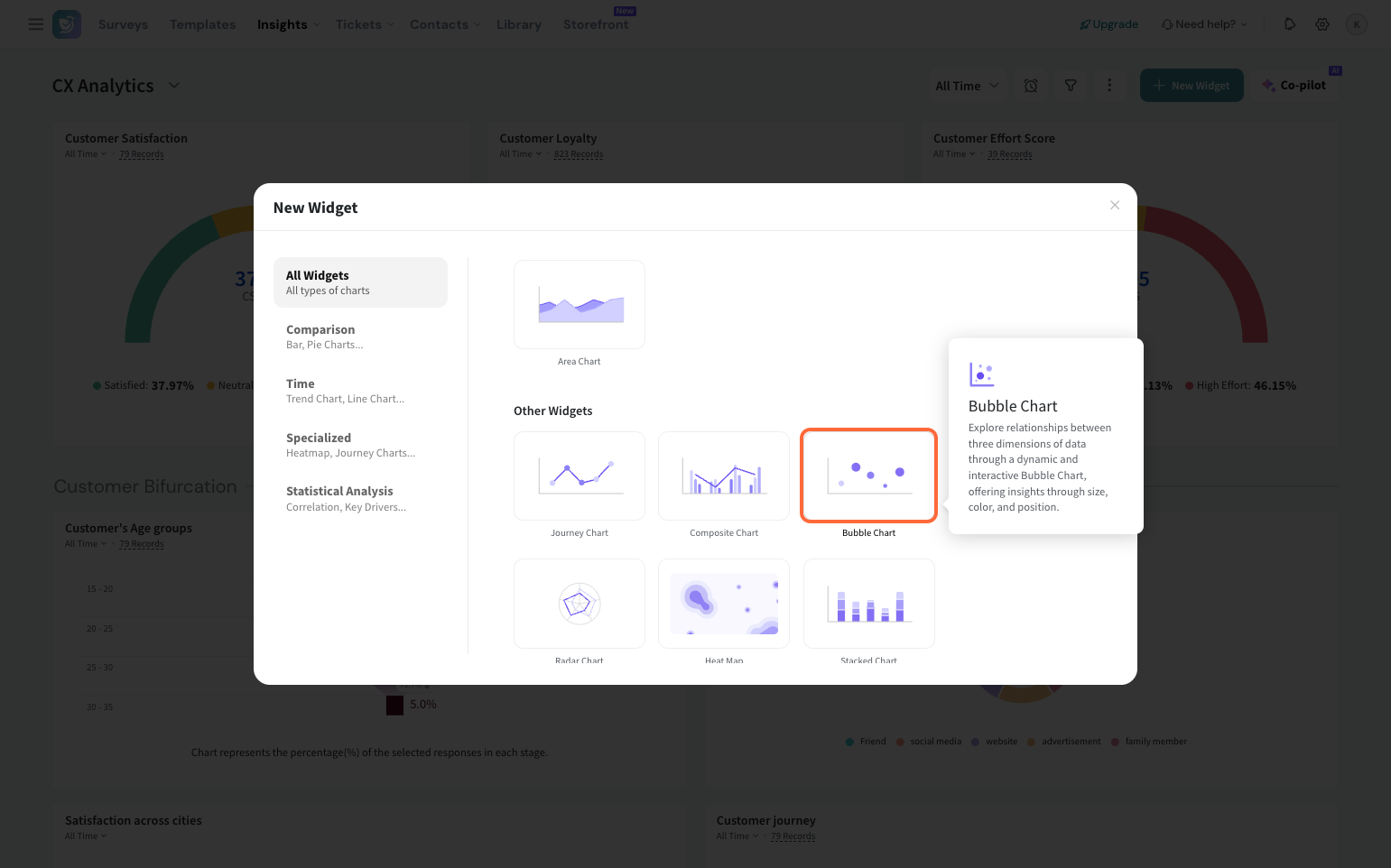
Bubble charts help you visualize data with more than two parameters. In addition to the X-axis and Y-axis categories, a third variable is represented by the bubble size. With this three-dimensional chart, you can identify the correlation between datasets that might be missed in simpler widgets.
Now, let’s see how to create a bubble chart on your dashboard.
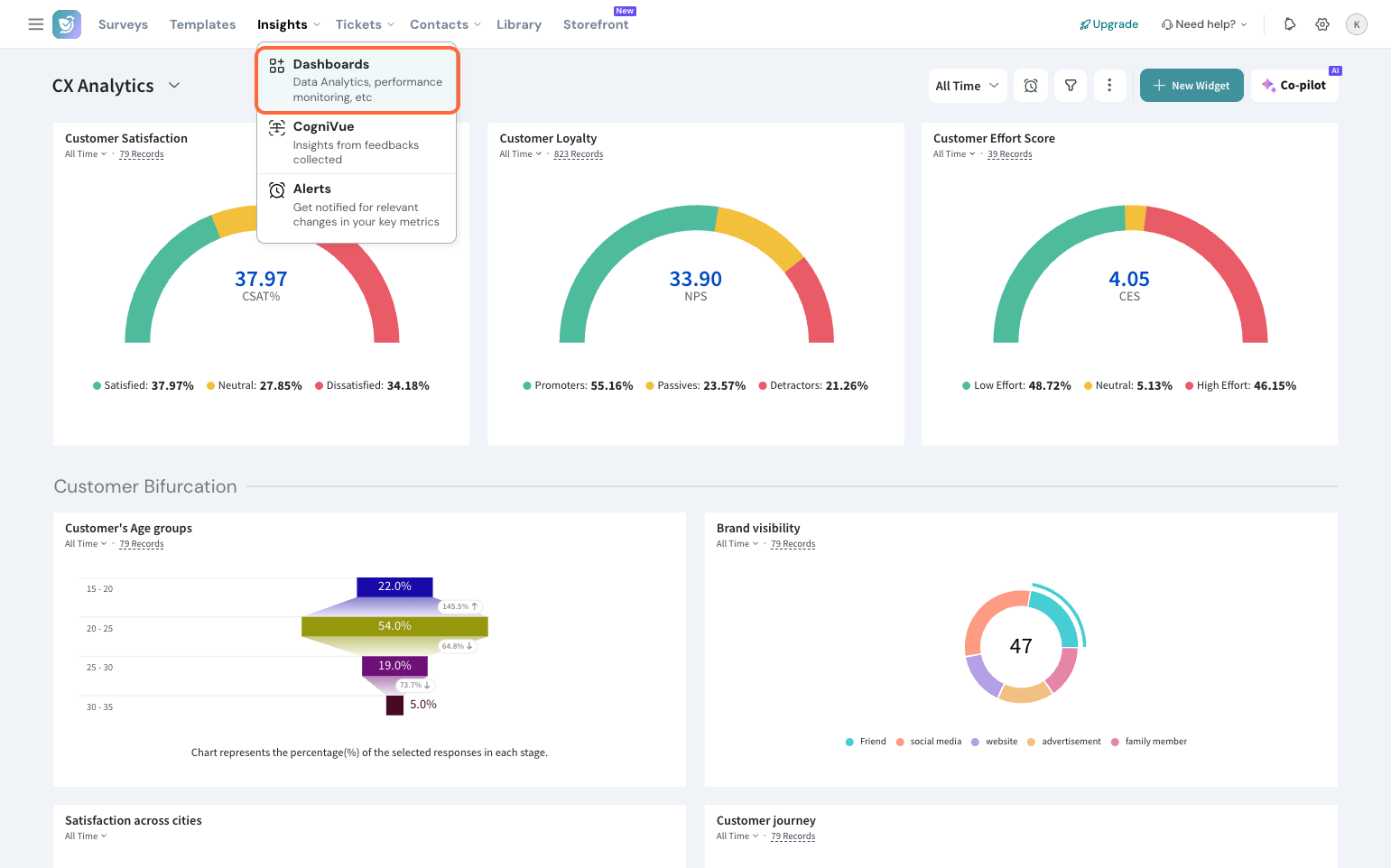
1. Navigate to the Insights section and click Dashboards.
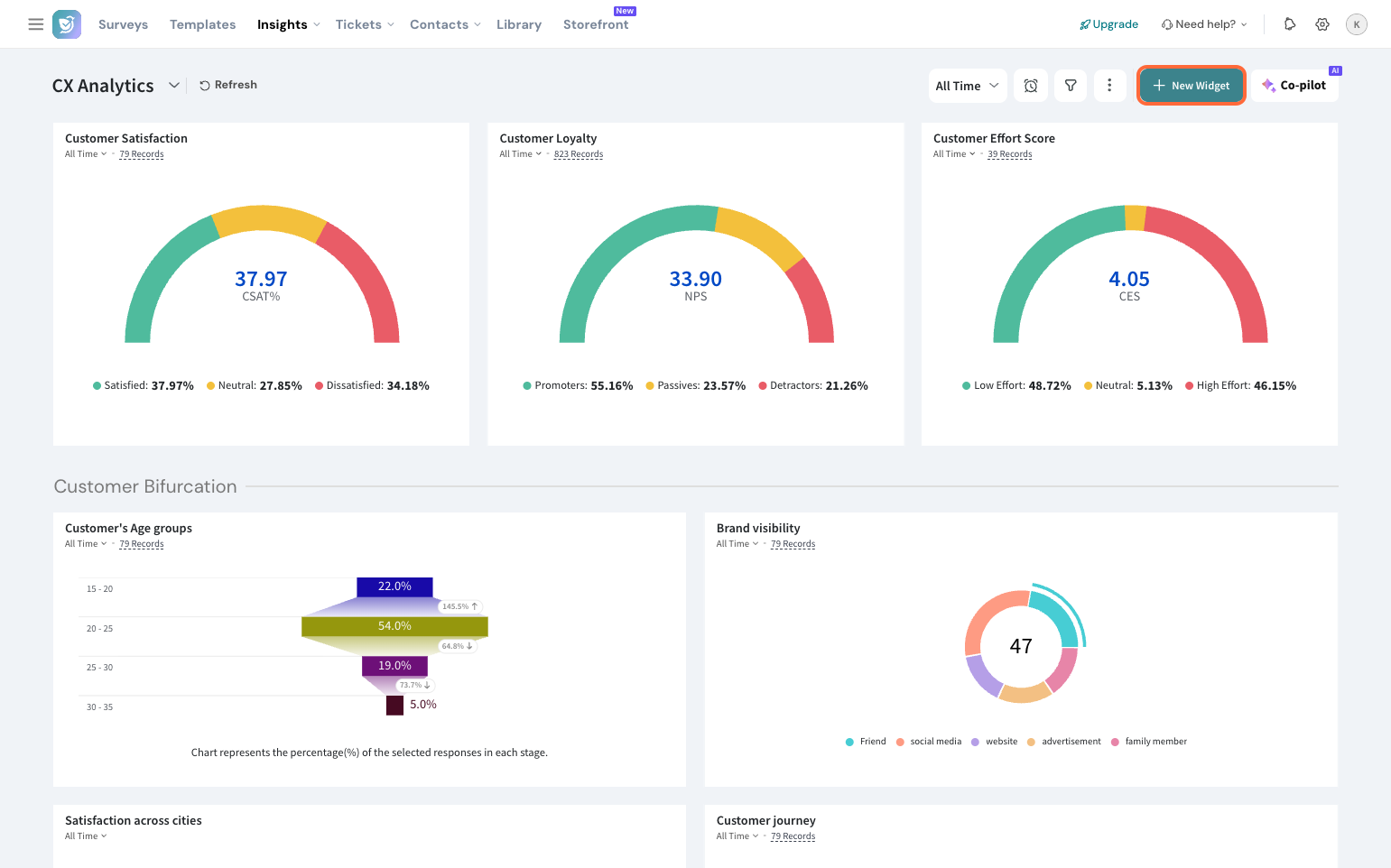
2. Click New Widget.
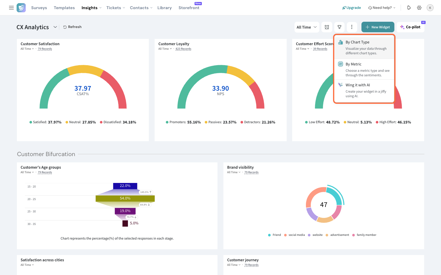
3. Select By Chart Type.
4. Choose the Bubble Chart.
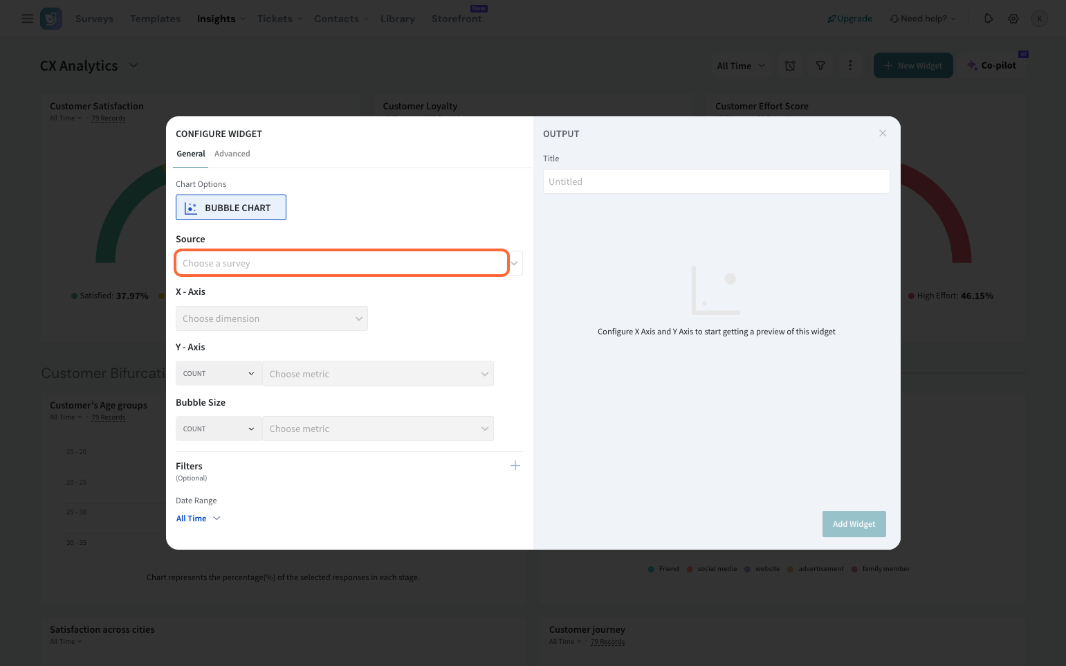
5. Select the survey (Source) you want to create the widget for.
6. Choose the X-axis dimension.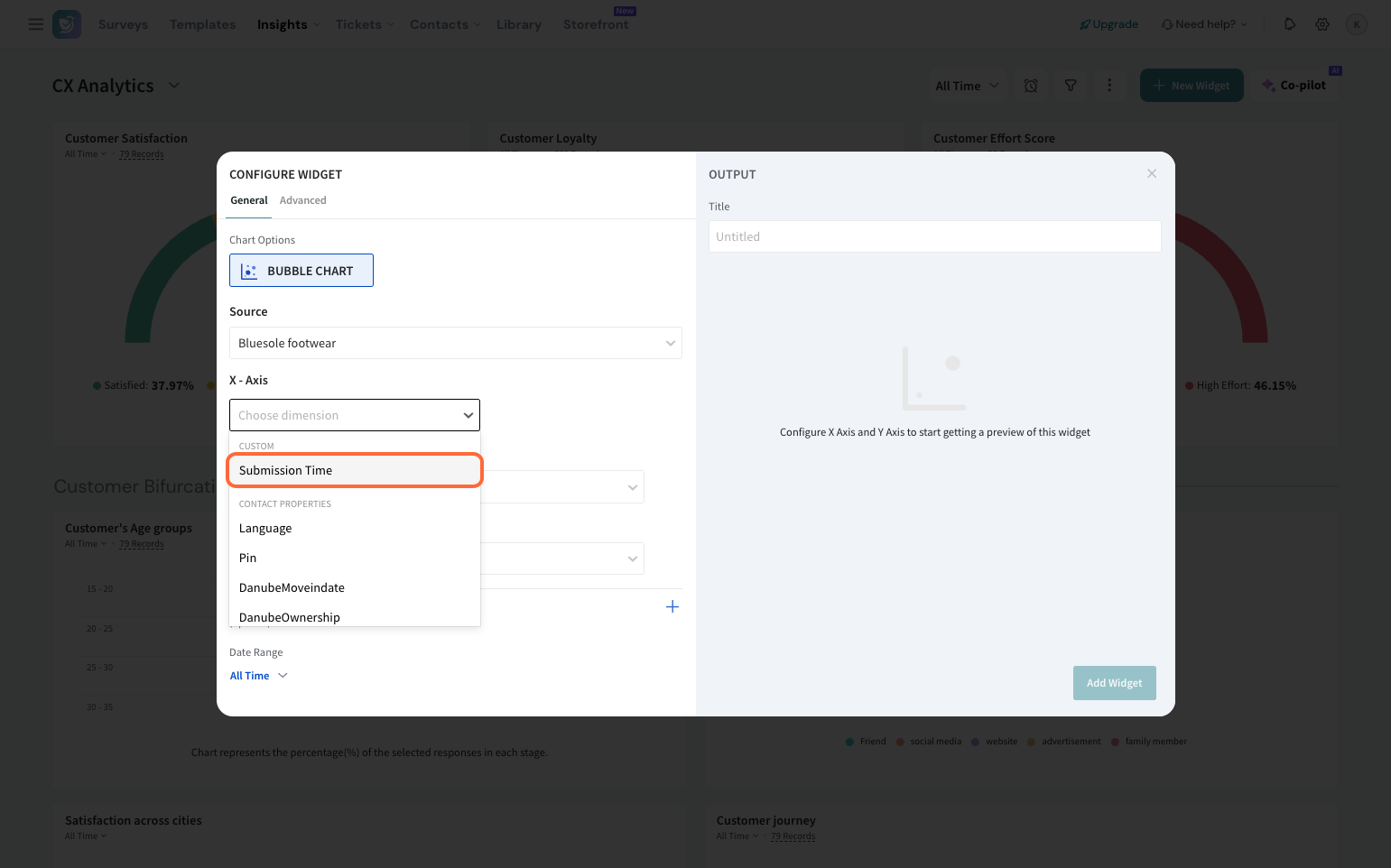
Note:
You can choose from custom properties, contact properties, variables, expressions, or questions.
7. Similarly, select the metric that you’d like to monitor on the Y-axis. Choose any one of the operations listed in the dropdown.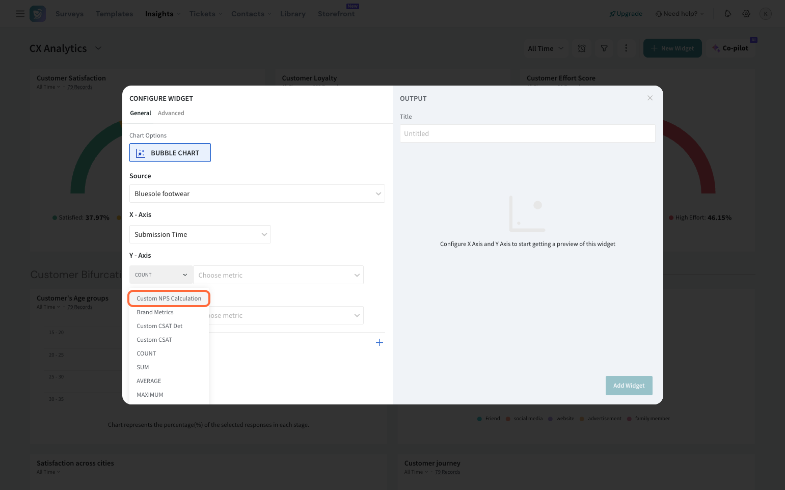
Note:
You can choose from contact properties, variables, or questions. You can pick standard metrics like NPS, CSAT, CES or custom metrics as well.
8. Select the metric to be represented in the size of each bubble and choose from the operations.
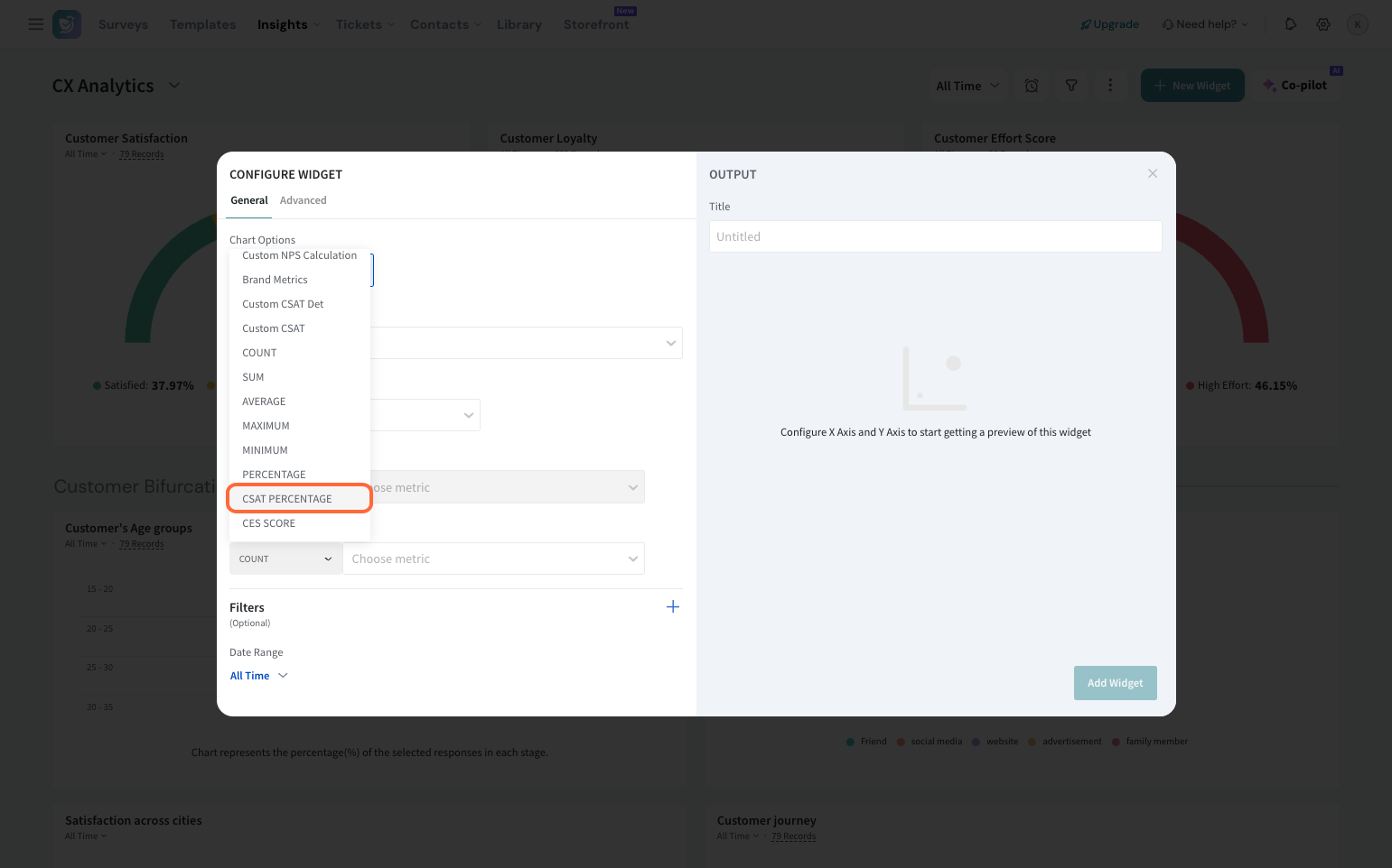 Note: This can be standard metrics like NPS, CSAT, CES, or a custom metric.
9. You can choose to apply filters for specific data analysis.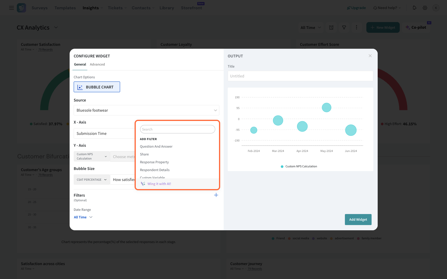
10. Also, you can filter your data by a date range.
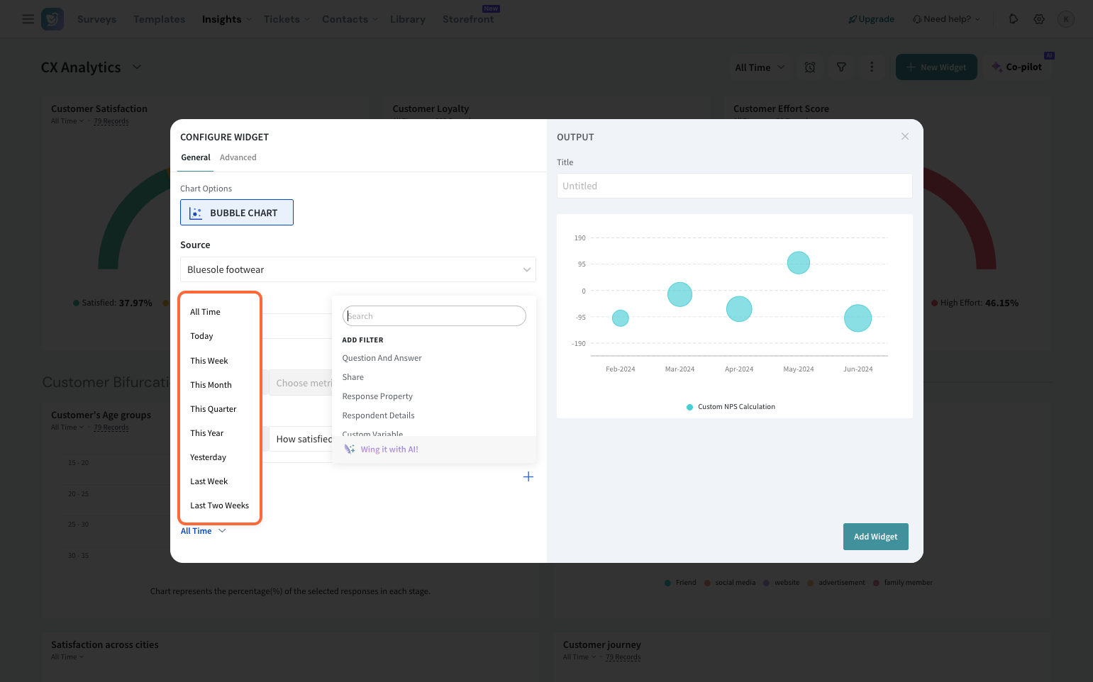
Customizing the Bubble chart
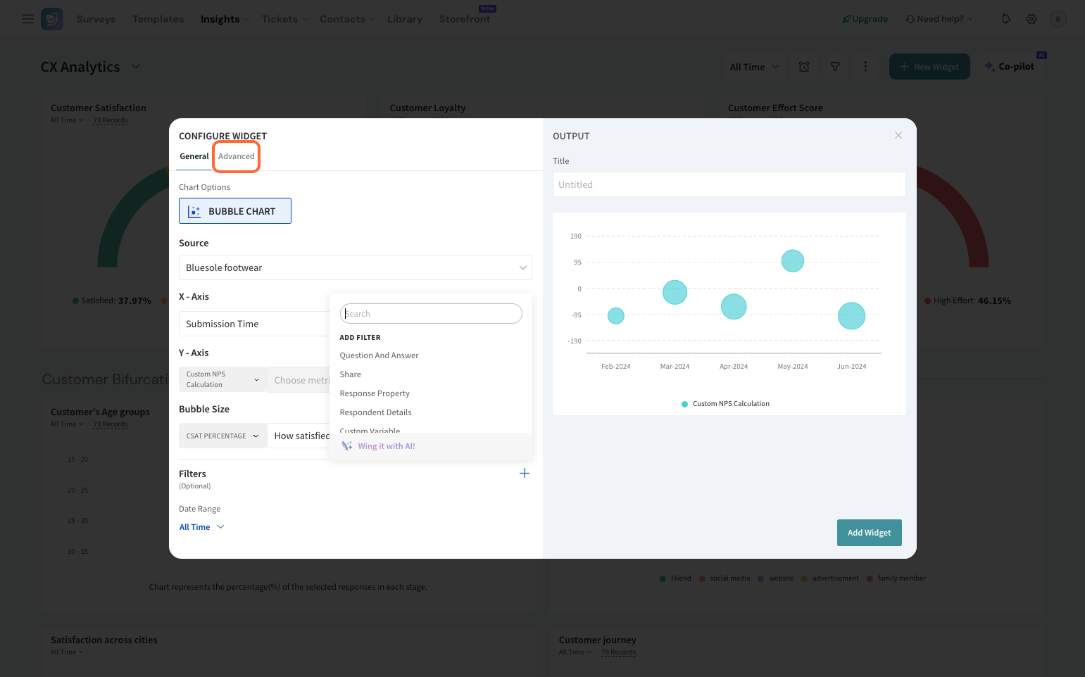
1. Click Advanced to make your widget visually appealing.
2. You can select the theme, round off decimal places, and customize the axis labels.
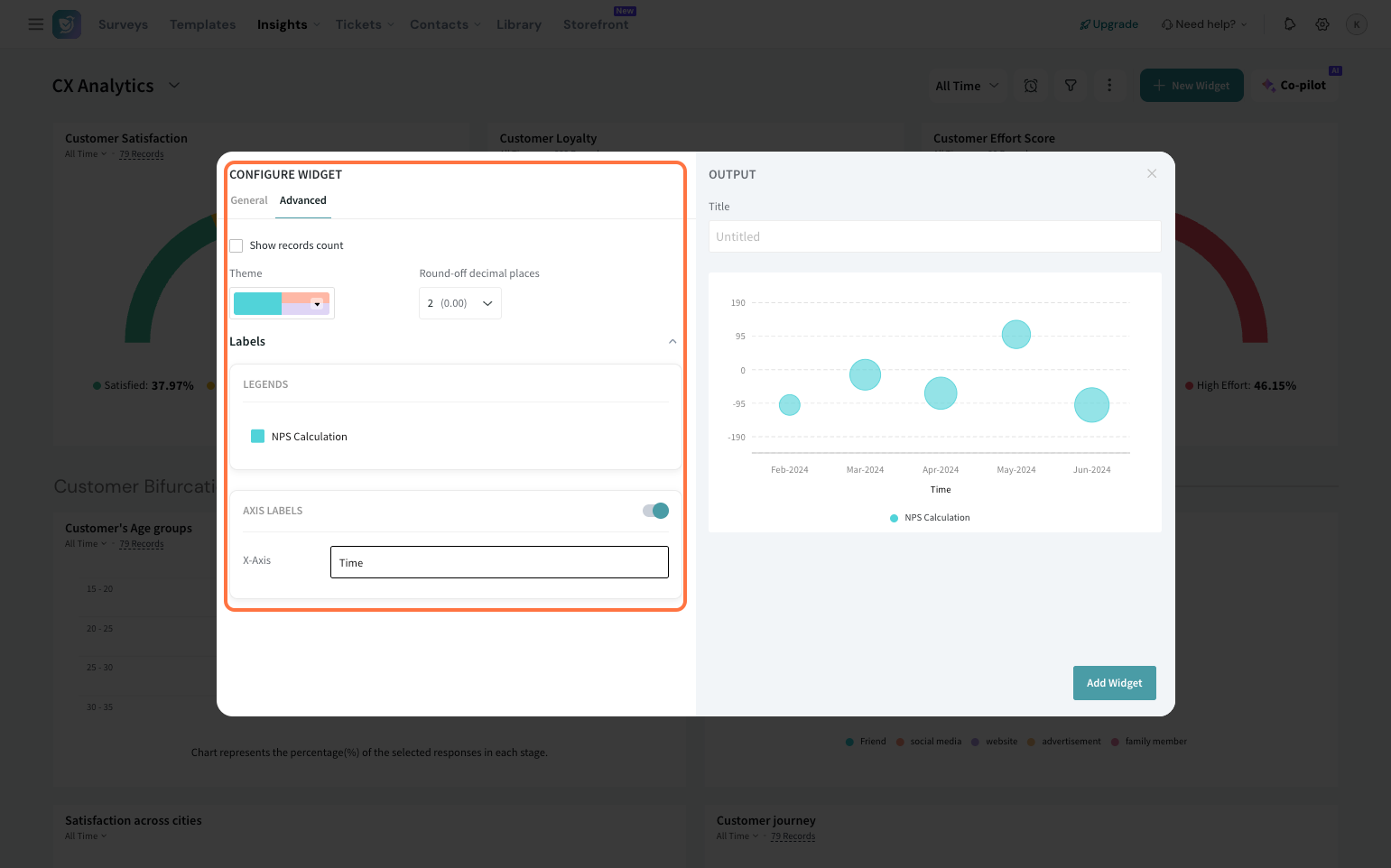
3. Enter the widget title for your reference.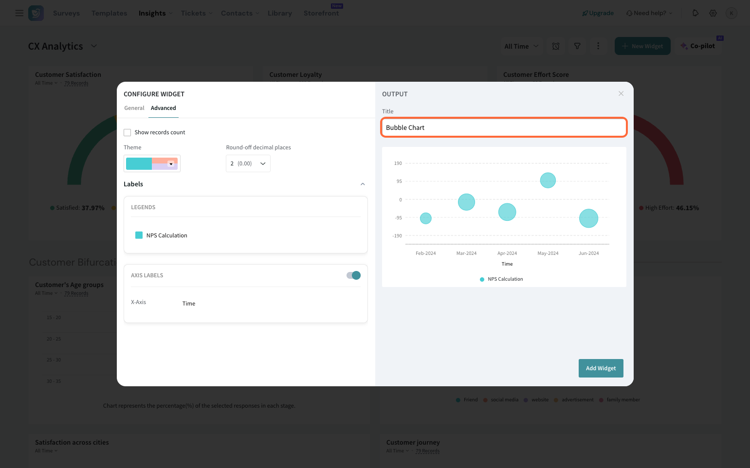
4. Preview your widget and click Add widget.
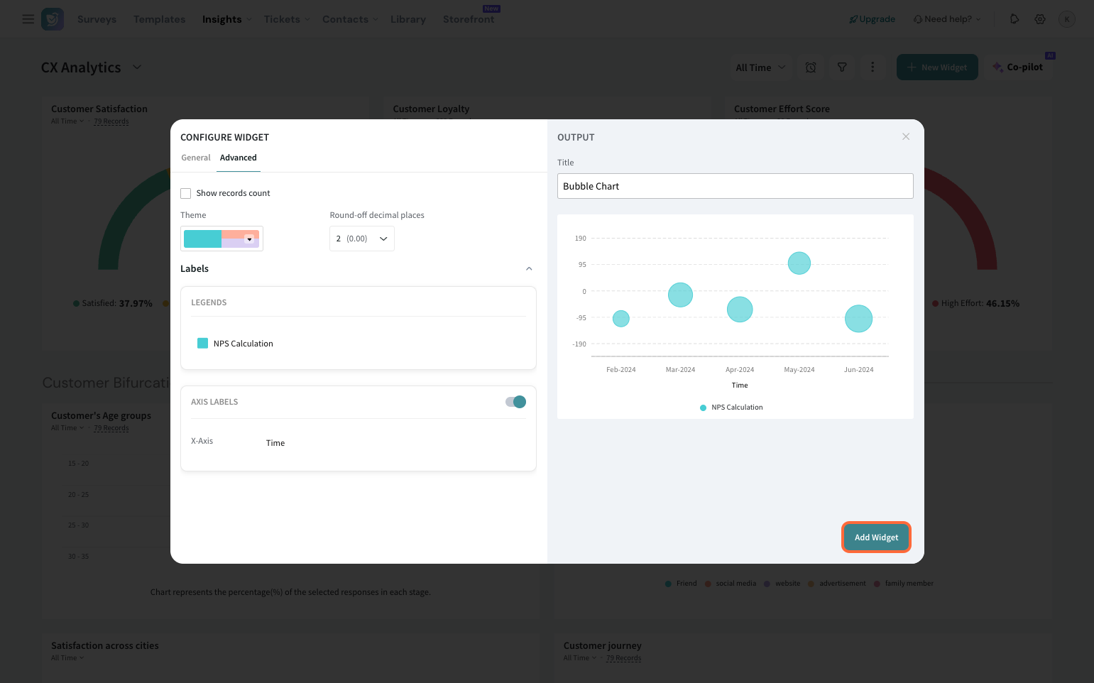
The widget will be displayed on your dashboard. You can move and resize the widget to your liking.
With the Bubble chart added to your dashboard, make informed decisions by analyzing complex data.
Feel free to reach out to our community if you have any questions.
Powered By SparrowDesk